| View previous topic :: View next topic |
| Author |
Message |
trifox


Joined: 14 May 2008
Posts: 3614
Location: UK
Expire: 2014-05-29
|
 Posted: Sun May 17, 2009 9:49 pm Post subject: Posted: Sun May 17, 2009 9:49 pm Post subject: |
 |
|
trifox wrote:
WOW!! that's a fascinating set!
tf
_________________
Flickr.com |
|
| Back to top |
|
 |
patrickh


Joined: 23 Aug 2007
Posts: 8551
Location: Oregon
Expire: 2011-11-18
|
 Posted: Sun May 17, 2009 9:58 pm Post subject: Posted: Sun May 17, 2009 9:58 pm Post subject: |
 |
|
patrickh wrote:
I agree with trifox, it's a great set (Loule).
Personally, I see 3D effect as coming from a combination of light, aperture and lens. All three have to be right. I have certainly seen strong 3D in virtually all formats. I cannot say if it is easier in one format or another, but I would point out that the medium and large formats tend to have very good quality lenses as a norm (unlike 35mm).
patrickh
_________________
DSLR: Nikon D300 Nikon D200 Nex 5N
MF Zooms: Kiron 28-85/3.5, 28-105/3.2, 75-150/3.5, Nikkor 50-135/3.5 AIS // MF Primes: Nikkor 20/4 AI, 24/2 AI, 28/2 AI, 28/2.8 AIS, 28/3.5 AI, 35/1.4 AIS, 35/2 AIS, 35/2.8 PC, 45/2.8 P, 50/1.4 AIS, 50/1.8 AIS, 50/2 AI, 55/2.8 AIS micro, 55/3.5 AI micro, 85/2 AI, 100/2,8 E, 105/1,8 AIS, 105/2,5 AIS, 135/2 AIS, 135/2.8 AIS, 200/4 AI, 200/4 AIS micro, 300/4.5 AI, 300/4.5 AI ED, Arsat 50/1.4, Kiron 28/2, Vivitar 28/2.5, Panagor 135/2.8, Tamron 28/2.5, Tamron 90/2.5 macro, Vivitar 90/2.5 macro (Tokina) Voigtlander 90/3.5 Vivitar 105/2.5 macro (Kiron) Kaleinar 100/2.8 AI Tamron 135/2.5, Vivitar 135/2.8CF, 200/3.5, Tokina 400/5,6
M42: Vivitar 28/2.5, Tamron 28/2.5, Formula5 28/2.8, Mamiya 28/2.8, Pentacon 29/2.8, Flektogon 35/2.4, Flektogon 35/2.8, Takumar 35/3.5, Curtagon 35/4, Takumar 50/1.4, Volna-6 50/2.8 macro, Mamiya 50/1.4, CZJ Pancolar 50/1,8, Oreston 50/1.8, Takumar 50/2, Industar 50/3.5, Sears 55/1.4, Helios 58/2, Jupiter 85/2, Helios 85/1.5, Takumar 105/2.8, Steinheil macro 105/4.5, Tamron 135/2.5, Jupiter 135/4, CZ 135/4, Steinheil Culminar 135/4,5, Jupiter 135/3.5, Takumar 135/3.5, Tair 135/2.8, Pentacon 135/2.8, CZ 135/2.8, Taika 135/3.5, Takumar 150/4, Jupiter 200/4, Takumar 200/4
Exakta: Topcon 100/2.8(M42), 35/2.8, 58/1.8, 135/2.8, 135/2.8 (M42), Kyoei Acall 135/3.5
C/Y: Yashica 28/2.8, 50/1.7, 135/2.8, Zeiss Planar 50/1.4, Distagon 25/2.8
Hexanon: 28/3.5, 35/2.8, 40/1.8, 50/1.7, 52/1.8, 135/3.2, 135/3.5, 35-70/3.5, 200/3.5
P6 : Mir 38 65/3.5, Biometar 80/2.8, Kaleinar 150/2.8, Sonnar 180/2.8
Minolta SR: 28/2.8, 28/3.5, 35/2.8, 45/2, 50/2, 58/1.4, 50/1.7, 135/2.8, 200/3.5
RF: Industar 53/2.8, Jupiter 8 50/2
Enlarg: Rodagon 50/5,6, 80/5,6, 105/5.6, Vario 44-52/4, 150/5.6 180/5.6 El Nikkor 50/2,8,63/2.8,75/4, 80/5,6, 105/5.6, 135/5.6 Schneider 60/5.6, 80/5.6, 80/4S,100/5.6S,105/5.6,135/5.6, 135/5.6S, 150/5.6S, Leica 95/4 |
|
| Back to top |
|
 |
Laurence


Joined: 26 Mar 2007
Posts: 4809
Location: Western Washington State
Expire: 2016-06-19
|
 Posted: Sun May 17, 2009 10:31 pm Post subject: Posted: Sun May 17, 2009 10:31 pm Post subject: |
 |
|
Laurence wrote:
Carlsson, your Loule' images are fantastic!
_________________
Assent, and you are sane;
Demur,—you ’re straightway dangerous,
And handled with a chain.
Emily Dickinson
Cameras and Lenses in Use:
Yashica Mat 124 w/ Yashinon 80/3.5,
CV Apo-Lanthar 90/3.5SL, (Thank you Klaus),
Pentax 645,
Flek 50,
Pentax-A 150
Pentax-A 120 Macro
Voigtlander Vitomatic I w/Color Skopar 50/2.8
Konica TC and zoom lenses (thanks Carsten)
Contax AX
Yashica ML 50/2
Yashica ML 35/2.8
Carl Zeiss Contax 50/1.4
Tamron Adaptall SP 17/3.5
Tamron Adaptall 28/2.5
Tamron Adaptall SP 300/2.8 LD (IF)
|
|
| Back to top |
|
 |
poilu

Joined: 26 Aug 2007
Posts: 10472
Location: Greece
Expire: 2019-08-29
|
 Posted: Mon May 18, 2009 4:02 am Post subject: Posted: Mon May 18, 2009 4:02 am Post subject: |
 |
|
poilu wrote:
| Laurence wrote: |
| Carlsson, your Loule' images are fantastic! |
wow! such color & bokeh! almost only keeper in this series
perfection of focusing at f2.8-4, and the 100mp is not easy to focus, heavy precise but slow barrel
impressive & fantastic
| Patrick wrote: |
| but I would point out that the medium and large formats tend to have very good quality lenses as a norm (unlike 35mm) |
exactly! I was always impressed by Hasselblad quality. later I understood that biggest part of this magic come from Zeiss lenses
_________________
T* |
|
| Back to top |
|
 |
rawhead


Joined: 09 Feb 2009
Posts: 1525
Location: Boston, MA
Expire: 2014-04-29
|
 Posted: Mon May 18, 2009 4:36 am Post subject: Posted: Mon May 18, 2009 4:36 am Post subject: |
 |
|
rawhead wrote:
Here's a hasty shot I took today for my "Project 365" that's ongoing on my Flickr account, and I had this thread in mind:

I stopped down enough (f2.8) to get most of the camera inside the DoF (the left edge is slightly outside; darn!). I think it did OK in the 3D department. What do you think?
Oh, BTW, that's my new toy, just got it yesterday :-)
_________________
Sony α7R, Pentax 67II, Kiev-60, Hasselblad 203FE, 903SWC, Graflex Norita 66, Mamiya M645 1000s, Burke & James 8x10, Graflex Pacemaker Speed Graphic (4x5 and 3x4), Century Graphic (2x3), R.B. Graflex Seried D, Rolleiflex SL66E, Rolleiflex 2.8C Xenotar, Mamiya C330f, a few M42, six P6, three OM, four Hasselblad, two Pentax 67, two Mamiya 645, one Noritar, and a sprinkle of EF. Oh, and an Aero Ektar and Leica Noctilux |
|
| Back to top |
|
 |
patrickh


Joined: 23 Aug 2007
Posts: 8551
Location: Oregon
Expire: 2011-11-18
|
 Posted: Mon May 18, 2009 4:49 am Post subject: Posted: Mon May 18, 2009 4:49 am Post subject: |
 |
|
patrickh wrote:
Love the pic love the toy
patrickh
_________________
DSLR: Nikon D300 Nikon D200 Nex 5N
MF Zooms: Kiron 28-85/3.5, 28-105/3.2, 75-150/3.5, Nikkor 50-135/3.5 AIS // MF Primes: Nikkor 20/4 AI, 24/2 AI, 28/2 AI, 28/2.8 AIS, 28/3.5 AI, 35/1.4 AIS, 35/2 AIS, 35/2.8 PC, 45/2.8 P, 50/1.4 AIS, 50/1.8 AIS, 50/2 AI, 55/2.8 AIS micro, 55/3.5 AI micro, 85/2 AI, 100/2,8 E, 105/1,8 AIS, 105/2,5 AIS, 135/2 AIS, 135/2.8 AIS, 200/4 AI, 200/4 AIS micro, 300/4.5 AI, 300/4.5 AI ED, Arsat 50/1.4, Kiron 28/2, Vivitar 28/2.5, Panagor 135/2.8, Tamron 28/2.5, Tamron 90/2.5 macro, Vivitar 90/2.5 macro (Tokina) Voigtlander 90/3.5 Vivitar 105/2.5 macro (Kiron) Kaleinar 100/2.8 AI Tamron 135/2.5, Vivitar 135/2.8CF, 200/3.5, Tokina 400/5,6
M42: Vivitar 28/2.5, Tamron 28/2.5, Formula5 28/2.8, Mamiya 28/2.8, Pentacon 29/2.8, Flektogon 35/2.4, Flektogon 35/2.8, Takumar 35/3.5, Curtagon 35/4, Takumar 50/1.4, Volna-6 50/2.8 macro, Mamiya 50/1.4, CZJ Pancolar 50/1,8, Oreston 50/1.8, Takumar 50/2, Industar 50/3.5, Sears 55/1.4, Helios 58/2, Jupiter 85/2, Helios 85/1.5, Takumar 105/2.8, Steinheil macro 105/4.5, Tamron 135/2.5, Jupiter 135/4, CZ 135/4, Steinheil Culminar 135/4,5, Jupiter 135/3.5, Takumar 135/3.5, Tair 135/2.8, Pentacon 135/2.8, CZ 135/2.8, Taika 135/3.5, Takumar 150/4, Jupiter 200/4, Takumar 200/4
Exakta: Topcon 100/2.8(M42), 35/2.8, 58/1.8, 135/2.8, 135/2.8 (M42), Kyoei Acall 135/3.5
C/Y: Yashica 28/2.8, 50/1.7, 135/2.8, Zeiss Planar 50/1.4, Distagon 25/2.8
Hexanon: 28/3.5, 35/2.8, 40/1.8, 50/1.7, 52/1.8, 135/3.2, 135/3.5, 35-70/3.5, 200/3.5
P6 : Mir 38 65/3.5, Biometar 80/2.8, Kaleinar 150/2.8, Sonnar 180/2.8
Minolta SR: 28/2.8, 28/3.5, 35/2.8, 45/2, 50/2, 58/1.4, 50/1.7, 135/2.8, 200/3.5
RF: Industar 53/2.8, Jupiter 8 50/2
Enlarg: Rodagon 50/5,6, 80/5,6, 105/5.6, Vario 44-52/4, 150/5.6 180/5.6 El Nikkor 50/2,8,63/2.8,75/4, 80/5,6, 105/5.6, 135/5.6 Schneider 60/5.6, 80/5.6, 80/4S,100/5.6S,105/5.6,135/5.6, 135/5.6S, 150/5.6S, Leica 95/4 |
|
| Back to top |
|
 |
Orio

Joined: 24 Feb 2007
Posts: 29545
Location: West Emilia
Expire: 2012-12-04
|
 Posted: Mon May 18, 2009 6:38 am Post subject: Posted: Mon May 18, 2009 6:38 am Post subject: |
 |
|
Orio wrote:
| A G Photography wrote: |
Hmmm... I think the most important factor to achieve a good tridimensionality in a shot is not the aperture, it's the light.
Look how in a lot of portraits it's used a backlight or a kicker to keep the subject separated from the background.
This issue was already well known by the good painters of the past. If you notice the paintings that really comes alive are the ones where the artist managed to work with light to create a "live 3d effect" on a bidimensional surface. Just a name: Caravaggio. |
But Alessandro, in my pictures of the flags in the air, the light would be perfect for a 3D effect, but the fact that I used a very stopped down aperture makes it lost, because the two planes (that of the flags and that of the castle wall) have the same quality of detail, with the result that the perceived space is flattened.
This is why I think aperture is the decisive factor. The other factors concur, but they are not enough by themselves.
_________________
Orio, Administrator
T*
NE CEDE MALIS AUDENTIOR ITO
Ferrania film is reborn! http://www.filmferrania.it/
Support the Ornano film chemicals company and help them survive!
http://forum.mflenses.com/ornano-chemical-products-t55525.html |
|
| Back to top |
|
 |
Orio

Joined: 24 Feb 2007
Posts: 29545
Location: West Emilia
Expire: 2012-12-04
|
 Posted: Mon May 18, 2009 7:07 am Post subject: Posted: Mon May 18, 2009 7:07 am Post subject: |
 |
|
Orio wrote:
@ Sandy : great to see some Carnival again. Excellent series! Please post it in a Gallery forum, they deserve it.
@ Rawhead : you asked for an opinion, so I give mine (I hope you will not be angry) the camera does not look 3D to me. You have a strong separation from the background (too blurred I think), which is nice to have in a portrait image, but that is more what I call the "binoculars effect".
If I concentrate on the camera itself (not minding the background), I do not see much volume.
First problem I see, there is perhaps a bit of sharpness issue. Secondly, there seems to be (but I might be wrong) some type of shadow compensation, like HDR, or curves, or similar procedure, because if you look at the values of the highlights (the chrome parts) and of the shadows (the black parts) they are not distant as they would be in reality, they look quite near. This is a major "flattening" cause.
To have dimensionality, objects should have both great sharpness and the widest possible spectrum from highlights to shadows.
If you closed more the aperture, you would have obtained two benefits: more sharpness in the focused object, and less blur in the background.
Like I wrote in a previous message, it seems to me that too blurred backgrounds do not help with "3D" perception, because the subject should not stand like in front of a flat "matte" painting, it should "stay" in a virtual space that has depth.
All this, in my humble opinion of course.
BTW gorgeous camera!
P.S. I was forgetting: it is much harder to get "3D" from a macro or closeup shot. This I know from experience.
Try with a normal distance shot instead.
_________________
Orio, Administrator
T*
NE CEDE MALIS AUDENTIOR ITO
Ferrania film is reborn! http://www.filmferrania.it/
Support the Ornano film chemicals company and help them survive!
http://forum.mflenses.com/ornano-chemical-products-t55525.html |
|
| Back to top |
|
 |
rawhead


Joined: 09 Feb 2009
Posts: 1525
Location: Boston, MA
Expire: 2014-04-29
|
 Posted: Mon May 18, 2009 7:24 am Post subject: Posted: Mon May 18, 2009 7:24 am Post subject: |
 |
|
rawhead wrote:
| Orio wrote: |
@ Sandy : great to see some Carnival again. Excellent series! Please post it in a Gallery forum, they deserve it.
@ Rawhead : you asked for an opinion, so I give mine (I hope you will not be angry) the camera does not look 3D to me. You have a strong separation from the background (too blurred I think), which is nice to have in a portrait image, but that is more what I call the "binoculars effect".
If I concentrate on the camera itself (not minding the background), I do not see much volume.
First problem I see, there is perhaps a bit of sharpness issue. Secondly, there seems to be (but I might be wrong) some type of shadow compensation, like HDR, or curves, or similar procedure, because if you look at the values of the highlights (the chrome parts) and of the shadows (the black parts) they are not distant as they would be in reality, they look quite near. This is a major "flattening" cause.
To have dimensionality, objects should have both great sharpness and the widest possible spectrum from highlights to shadows.
If you closed more the aperture, you would have obtained two benefits: more sharpness in the focused object, and less blur in the background.
Like I wrote in a previous message, it seems to me that too blurred backgrounds do not help with "3D" perception, because the subject should not stand like in front of a flat "matte" painting, it should "stay" in a virtual space that has depth.
All this, in my humble opinion of course.
BTW gorgeous camera!
P.S. I was forgetting: it is much harder to get "3D" from a macro or closeup shot. This I know from experience.
Try with a normal distance shot instead. |
Why should I be angry?  That would be hypocritical to ask for an opinion and then be angry with criticism. That would be hypocritical to ask for an opinion and then be angry with criticism.
Anyway, I think you are right. This shot was taken about 1 m away with a Zuiko 50/1.2 stopped down to f2.8. Seeing the lack of sharpness (especially visible near the left edge of the camera), I should have stopped down more, maybe f4. One problem was this was handheld (more like "pressed agains the desk with left hand while shooting the shutter with the right"), shot indoors, at night, with a couple of American-style indirect-lighting by compact fluorescent light bulbs, so shutter speed was a limiting factor.
Anyway, enough with excuses. There was actually, however, almost no postprocessing; I think I upped the exposure about 1 stop worth during RAW processing, and applied a small amount of unsharp mask in Photoshop to hide some of the softness.
_________________
Sony α7R, Pentax 67II, Kiev-60, Hasselblad 203FE, 903SWC, Graflex Norita 66, Mamiya M645 1000s, Burke & James 8x10, Graflex Pacemaker Speed Graphic (4x5 and 3x4), Century Graphic (2x3), R.B. Graflex Seried D, Rolleiflex SL66E, Rolleiflex 2.8C Xenotar, Mamiya C330f, a few M42, six P6, three OM, four Hasselblad, two Pentax 67, two Mamiya 645, one Noritar, and a sprinkle of EF. Oh, and an Aero Ektar and Leica Noctilux |
|
| Back to top |
|
 |
Orio

Joined: 24 Feb 2007
Posts: 29545
Location: West Emilia
Expire: 2012-12-04
|
 Posted: Mon May 18, 2009 8:05 am Post subject: Posted: Mon May 18, 2009 8:05 am Post subject: |
 |
|
Orio wrote:
| rawhead wrote: |
Why should I be angry?  |
Good 
To add some candy, I would say that I rarely managed to get any 3D look from a macro or closeup shot.
The reason is simple I think: when focusing so close, it is impossible to avoid background blur without stopping down to a value that would affect negatively a 3D perception.
I think composition would help to obtain 3D in closeup shots: place different objects along the way to the background, not just the main subject. This will help define the space that is between the object and the background.
But it remains a difficult task.
_________________
Orio, Administrator
T*
NE CEDE MALIS AUDENTIOR ITO
Ferrania film is reborn! http://www.filmferrania.it/
Support the Ornano film chemicals company and help them survive!
http://forum.mflenses.com/ornano-chemical-products-t55525.html |
|
| Back to top |
|
 |
Carlsson


Joined: 26 Jul 2008
Posts: 793
Location: Portugal
|
 Posted: Mon May 18, 2009 9:28 am Post subject: Posted: Mon May 18, 2009 9:28 am Post subject: |
 |
|
Carlsson wrote:
| poilu wrote: |
| and the 100mp is not easy to focus, heavy precise but slow barrel |
Thanks friends! Yep, it was work, but the MP was a good decision.
Felt like a little boy between all the "L" Pros with their great gear - nah, actually I did not! Just kidding. 
I'll post the set later in the gallery, with some more pictures from the carnaval infante.
_________________
Contax III, Zeiss Ikon ZM, Contax AX, EOS 5D, R-D1
https://mariaeero.com/contax/ |
|
| Back to top |
|
 |
A G Photography


Joined: 11 May 2008
Posts: 1480
Location: Bologna - Italy
|
 Posted: Mon May 18, 2009 9:57 am Post subject: Posted: Mon May 18, 2009 9:57 am Post subject: |
 |
|
A G Photography wrote:
| Orio wrote: |
| A G Photography wrote: |
Hmmm... I think the most important factor to achieve a good tridimensionality in a shot is not the aperture, it's the light.
Look how in a lot of portraits it's used a backlight or a kicker to keep the subject separated from the background.
This issue was already well known by the good painters of the past. If you notice the paintings that really comes alive are the ones where the artist managed to work with light to create a "live 3d effect" on a bidimensional surface. Just a name: Caravaggio. |
But Alessandro, in my pictures of the flags in the air, the light would be perfect for a 3D effect, but the fact that I used a very stopped down aperture makes it lost, because the two planes (that of the flags and that of the castle wall) have the same quality of detail, with the result that the perceived space is flattened.
This is why I think aperture is the decisive factor. The other factors concur, but they are not enough by themselves. |
The light wasn't perfect at all, reason why you had to separate the planes using the aperture. It's a photographical trick.
It's light that put in evidence shapes, textures and depth, if it weren't for light to create a tridimensional quality in bidimensional images there would haven't been any great painters.
Anyway you can test it by yourself, get an object on a white plane and shoot it while moving a light around it, use reflectors or black flags to change the contrast and the shadows and look at the results. It will be pretty evident.
_________________
Alessandro
My Photography Website
My Blog about Photography and Italian Cuisine
My Photostream on Flickr
--------------------------------------------------------
DSLR: Nikon d80, Olympus e410
SLR: Chinon CX, Fujica ST605n, Nikon f601, Pentacon FM, Pentax Spotmatic SPII, Praktica FX, Praktica FX2, Voigtlander VST1, Yashica FX-3, Zeiss Contaflex
RF: Altissa Altix, Zorki Ie, Kiev 4b
Medium Format: Pentacon Six TL, Zeiss Ikonta 520/2, Mockba 4, Voigtlander Bessa I, Agfa Isolette II, Agfa Isola
Large Format: Cambo SC 4x5, Rodenstock Sinaron 150/5.6, Rodenstock Rodagon 150/5.6, Schneider Kreuznach Symmar 180/5.6
Lenses
Nikkors: 28/3.5 AIS, 35/2, 50/1.8, 50/2 H, Micro 55/3.5, Micro 60/2.8, 85/1.8, 135/3.5 AI, 200/4 NAI, 18-55/3.5-5.6, 28-80/3.5-5.6, 55-200/4-5.6
CY: Distagon 28/2.8, Planar 50/1.4, Yashika 50/1.7, Sonnar 135/2.8
CZJ m42-Exakta: Flektogon 20/4, Flektogon 35/2.8, Tessar 40/4.5, Tessar 50/2.8, Pancolar 50/1.8, Pancolar 50/2, Biotar 58/2, Biotar 75/1.5, Tessar 80/2.8, Sonnar 135/3.5, Sonnar 135/4, Triotar 135/4
CZJ P6: Flektogon 50/4, Flektogon 65/2.8, Biometar 80/2.8, Biometar 120/2.8, Sonnar 180/2.8
Meyer-Pentacon: Orestegon 29/2.8, Pentacon 29/2.8, Lydith 30/3.5, Primagon 35/4.5, Helioplan 40/4.5, Domiplan 50/2.8, Primotar 50/3.5, Oreston 50/1.8, Primoplan 58/1.9, Orestor 100/2.8, Trioplan 100/2.8, Helioplan 135/4.5, Orestor 135/2.8, Pentacon 135/2.8, Primotar 135/3.5, Primotar 180/3.5, Telemegor 180/5.5, Orestegor 200/4, Pentacon 200/4, Orestegor 300/4, Telemegor 300/4.5, Telemegor 400/5.5
Schneider-Kreuznach: Curtagon 28/4, Curtagon 35/2.8, Xenon 50/1.9, Xenar 50/2.8, Tele Xenar 135/3.5, Tele Xenar 200/4
Russians: Arsat Zodiak 30/3.5, Mir-I 37/2.8, Volna-9 50/2.8, Industar-50 50/3.5, Industar-61 50/2.8, Helios 44 58/2, Helios 44-2 58/2, Helios 44-M-4 58/2, Volna-3 80/2.8, Helios 40 85/1.5, Jupiter 9 85/2, Jupiter 11 135/4
Others: Chinon-Tomioka 55/1.4, Helios 28/2.8, Isco Iscotar 50/2.8, Konica Hexanon 40/1.8, Ludwig Meritar 50/2.9, Schacht Travegon 35/3.5, Schacht Travenon 135/4.5, Sekor 55/1.8, Sigma MF 28/2.8, S-Takumar, 28/3.5, S-Takumar 50/1.4, S-Takumar 55/1.8, S-Takumar 55/2, Steinheil Quinar 135/2.8, Steinheil Culminar 135/4.5, Vivitar 135/2.8, Voigtlander Ultron 50/1.8, Yashica Yashinon DX 50/1.4, Zuiko MC Auto-W 28/2.8
|
|
| Back to top |
|
 |
Orio

Joined: 24 Feb 2007
Posts: 29545
Location: West Emilia
Expire: 2012-12-04
|
 Posted: Mon May 18, 2009 10:19 am Post subject: Posted: Mon May 18, 2009 10:19 am Post subject: |
 |
|
Orio wrote:
| A G Photography wrote: |
The light wasn't perfect at all |
Lateral direction, strong contrast: what was wrong in that light?
_________________
Orio, Administrator
T*
NE CEDE MALIS AUDENTIOR ITO
Ferrania film is reborn! http://www.filmferrania.it/
Support the Ornano film chemicals company and help them survive!
http://forum.mflenses.com/ornano-chemical-products-t55525.html |
|
| Back to top |
|
 |
A G Photography


Joined: 11 May 2008
Posts: 1480
Location: Bologna - Italy
|
 Posted: Mon May 18, 2009 10:32 am Post subject: Posted: Mon May 18, 2009 10:32 am Post subject: |
 |
|
A G Photography wrote:
| Orio wrote: |
| A G Photography wrote: |
The light wasn't perfect at all |
Lateral direction, strong contrast: what was wrong in that light? |
Cloudy day, light was too much diffused. It flats out shapes.
_________________
Alessandro
My Photography Website
My Blog about Photography and Italian Cuisine
My Photostream on Flickr
--------------------------------------------------------
DSLR: Nikon d80, Olympus e410
SLR: Chinon CX, Fujica ST605n, Nikon f601, Pentacon FM, Pentax Spotmatic SPII, Praktica FX, Praktica FX2, Voigtlander VST1, Yashica FX-3, Zeiss Contaflex
RF: Altissa Altix, Zorki Ie, Kiev 4b
Medium Format: Pentacon Six TL, Zeiss Ikonta 520/2, Mockba 4, Voigtlander Bessa I, Agfa Isolette II, Agfa Isola
Large Format: Cambo SC 4x5, Rodenstock Sinaron 150/5.6, Rodenstock Rodagon 150/5.6, Schneider Kreuznach Symmar 180/5.6
Lenses
Nikkors: 28/3.5 AIS, 35/2, 50/1.8, 50/2 H, Micro 55/3.5, Micro 60/2.8, 85/1.8, 135/3.5 AI, 200/4 NAI, 18-55/3.5-5.6, 28-80/3.5-5.6, 55-200/4-5.6
CY: Distagon 28/2.8, Planar 50/1.4, Yashika 50/1.7, Sonnar 135/2.8
CZJ m42-Exakta: Flektogon 20/4, Flektogon 35/2.8, Tessar 40/4.5, Tessar 50/2.8, Pancolar 50/1.8, Pancolar 50/2, Biotar 58/2, Biotar 75/1.5, Tessar 80/2.8, Sonnar 135/3.5, Sonnar 135/4, Triotar 135/4
CZJ P6: Flektogon 50/4, Flektogon 65/2.8, Biometar 80/2.8, Biometar 120/2.8, Sonnar 180/2.8
Meyer-Pentacon: Orestegon 29/2.8, Pentacon 29/2.8, Lydith 30/3.5, Primagon 35/4.5, Helioplan 40/4.5, Domiplan 50/2.8, Primotar 50/3.5, Oreston 50/1.8, Primoplan 58/1.9, Orestor 100/2.8, Trioplan 100/2.8, Helioplan 135/4.5, Orestor 135/2.8, Pentacon 135/2.8, Primotar 135/3.5, Primotar 180/3.5, Telemegor 180/5.5, Orestegor 200/4, Pentacon 200/4, Orestegor 300/4, Telemegor 300/4.5, Telemegor 400/5.5
Schneider-Kreuznach: Curtagon 28/4, Curtagon 35/2.8, Xenon 50/1.9, Xenar 50/2.8, Tele Xenar 135/3.5, Tele Xenar 200/4
Russians: Arsat Zodiak 30/3.5, Mir-I 37/2.8, Volna-9 50/2.8, Industar-50 50/3.5, Industar-61 50/2.8, Helios 44 58/2, Helios 44-2 58/2, Helios 44-M-4 58/2, Volna-3 80/2.8, Helios 40 85/1.5, Jupiter 9 85/2, Jupiter 11 135/4
Others: Chinon-Tomioka 55/1.4, Helios 28/2.8, Isco Iscotar 50/2.8, Konica Hexanon 40/1.8, Ludwig Meritar 50/2.9, Schacht Travegon 35/3.5, Schacht Travenon 135/4.5, Sekor 55/1.8, Sigma MF 28/2.8, S-Takumar, 28/3.5, S-Takumar 50/1.4, S-Takumar 55/1.8, S-Takumar 55/2, Steinheil Quinar 135/2.8, Steinheil Culminar 135/4.5, Vivitar 135/2.8, Voigtlander Ultron 50/1.8, Yashica Yashinon DX 50/1.4, Zuiko MC Auto-W 28/2.8
|
|
| Back to top |
|
 |
Carlsson


Joined: 26 Jul 2008
Posts: 793
Location: Portugal
|
 Posted: Mon May 18, 2009 10:45 am Post subject: Posted: Mon May 18, 2009 10:45 am Post subject: |
 |
|
Carlsson wrote:
| A G Photography wrote: |
| Cloudy day, light was too much diffused. It flats out shapes. |
Interesting point, but I'm not sure if it's right.
I had some good results creating a 3D look on overcast days.
_________________
Contax III, Zeiss Ikon ZM, Contax AX, EOS 5D, R-D1
https://mariaeero.com/contax/ |
|
| Back to top |
|
 |
A G Photography


Joined: 11 May 2008
Posts: 1480
Location: Bologna - Italy
|
 Posted: Mon May 18, 2009 10:52 am Post subject: Posted: Mon May 18, 2009 10:52 am Post subject: |
 |
|
A G Photography wrote:
| Carlsson wrote: |
| A G Photography wrote: |
| Cloudy day, light was too much diffused. It flats out shapes. |
Interesting point, but I'm not sure if it's right.
I had some good results creating a 3D look on overcast days. |
A good 3d effect is created by light that exalts shapes. So you need a strong directional light, usually from lateral and/or back (frontal light flats out) and not coming from zenith.
On a cloud day you can achieve it, but not under the sky which scatters light everywhere. You need walls, or other "flags", to make the diffuse light directional.
Anyway it's simple, it just takes a window, an object and a white plane. Put the plane near the window, the object on it and move yourself around the object, up and down and you'll see the differences.
_________________
Alessandro
My Photography Website
My Blog about Photography and Italian Cuisine
My Photostream on Flickr
--------------------------------------------------------
DSLR: Nikon d80, Olympus e410
SLR: Chinon CX, Fujica ST605n, Nikon f601, Pentacon FM, Pentax Spotmatic SPII, Praktica FX, Praktica FX2, Voigtlander VST1, Yashica FX-3, Zeiss Contaflex
RF: Altissa Altix, Zorki Ie, Kiev 4b
Medium Format: Pentacon Six TL, Zeiss Ikonta 520/2, Mockba 4, Voigtlander Bessa I, Agfa Isolette II, Agfa Isola
Large Format: Cambo SC 4x5, Rodenstock Sinaron 150/5.6, Rodenstock Rodagon 150/5.6, Schneider Kreuznach Symmar 180/5.6
Lenses
Nikkors: 28/3.5 AIS, 35/2, 50/1.8, 50/2 H, Micro 55/3.5, Micro 60/2.8, 85/1.8, 135/3.5 AI, 200/4 NAI, 18-55/3.5-5.6, 28-80/3.5-5.6, 55-200/4-5.6
CY: Distagon 28/2.8, Planar 50/1.4, Yashika 50/1.7, Sonnar 135/2.8
CZJ m42-Exakta: Flektogon 20/4, Flektogon 35/2.8, Tessar 40/4.5, Tessar 50/2.8, Pancolar 50/1.8, Pancolar 50/2, Biotar 58/2, Biotar 75/1.5, Tessar 80/2.8, Sonnar 135/3.5, Sonnar 135/4, Triotar 135/4
CZJ P6: Flektogon 50/4, Flektogon 65/2.8, Biometar 80/2.8, Biometar 120/2.8, Sonnar 180/2.8
Meyer-Pentacon: Orestegon 29/2.8, Pentacon 29/2.8, Lydith 30/3.5, Primagon 35/4.5, Helioplan 40/4.5, Domiplan 50/2.8, Primotar 50/3.5, Oreston 50/1.8, Primoplan 58/1.9, Orestor 100/2.8, Trioplan 100/2.8, Helioplan 135/4.5, Orestor 135/2.8, Pentacon 135/2.8, Primotar 135/3.5, Primotar 180/3.5, Telemegor 180/5.5, Orestegor 200/4, Pentacon 200/4, Orestegor 300/4, Telemegor 300/4.5, Telemegor 400/5.5
Schneider-Kreuznach: Curtagon 28/4, Curtagon 35/2.8, Xenon 50/1.9, Xenar 50/2.8, Tele Xenar 135/3.5, Tele Xenar 200/4
Russians: Arsat Zodiak 30/3.5, Mir-I 37/2.8, Volna-9 50/2.8, Industar-50 50/3.5, Industar-61 50/2.8, Helios 44 58/2, Helios 44-2 58/2, Helios 44-M-4 58/2, Volna-3 80/2.8, Helios 40 85/1.5, Jupiter 9 85/2, Jupiter 11 135/4
Others: Chinon-Tomioka 55/1.4, Helios 28/2.8, Isco Iscotar 50/2.8, Konica Hexanon 40/1.8, Ludwig Meritar 50/2.9, Schacht Travegon 35/3.5, Schacht Travenon 135/4.5, Sekor 55/1.8, Sigma MF 28/2.8, S-Takumar, 28/3.5, S-Takumar 50/1.4, S-Takumar 55/1.8, S-Takumar 55/2, Steinheil Quinar 135/2.8, Steinheil Culminar 135/4.5, Vivitar 135/2.8, Voigtlander Ultron 50/1.8, Yashica Yashinon DX 50/1.4, Zuiko MC Auto-W 28/2.8
|
|
| Back to top |
|
 |
poilu

Joined: 26 Aug 2007
Posts: 10472
Location: Greece
Expire: 2019-08-29
|
 Posted: Mon May 18, 2009 11:11 am Post subject: Posted: Mon May 18, 2009 11:11 am Post subject: |
 |
|
poilu wrote:
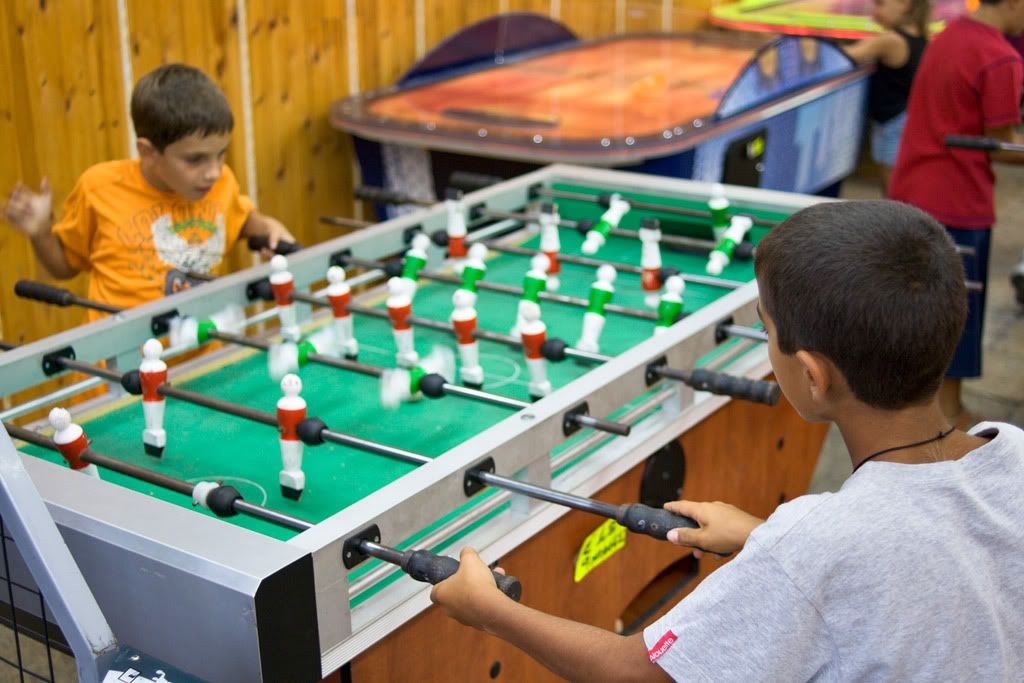
not the best sample, but to argument about light
the light is coming from diffused artificial neon light
wide open, 400 iso, 1/60s not very sharp
I still see 3D in this shot and for me only the lens did it
distagon 28:2
_________________
T* |
|
| Back to top |
|
 |
Orio

Joined: 24 Feb 2007
Posts: 29545
Location: West Emilia
Expire: 2012-12-04
|
 Posted: Mon May 18, 2009 11:48 am Post subject: Posted: Mon May 18, 2009 11:48 am Post subject: |
 |
|
Orio wrote:
| A G Photography wrote: |
| Orio wrote: |
| A G Photography wrote: |
The light wasn't perfect at all |
Lateral direction, strong contrast: what was wrong in that light? |
Cloudy day, light was too much diffused. It flats out shapes. |
Absolutely not what you say. There were clouds on the background, but not on the sun. There was direct sunlight, and if you look at the shadow on the wall, you can see it clearly.
_________________
Orio, Administrator
T*
NE CEDE MALIS AUDENTIOR ITO
Ferrania film is reborn! http://www.filmferrania.it/
Support the Ornano film chemicals company and help them survive!
http://forum.mflenses.com/ornano-chemical-products-t55525.html |
|
| Back to top |
|
 |
Orio

Joined: 24 Feb 2007
Posts: 29545
Location: West Emilia
Expire: 2012-12-04
|
 Posted: Mon May 18, 2009 11:49 am Post subject: Posted: Mon May 18, 2009 11:49 am Post subject: |
 |
|
Orio wrote:
| A G Photography wrote: |
| Carlsson wrote: |
| A G Photography wrote: |
| Cloudy day, light was too much diffused. It flats out shapes. |
Interesting point, but I'm not sure if it's right.
I had some good results creating a 3D look on overcast days. |
A good 3d effect is created by light that exalts shapes. So you need a strong directional light, |
The first picture I posted in this thread, was taken on a dull overcast day. Yet, there is 3D look.
_________________
Orio, Administrator
T*
NE CEDE MALIS AUDENTIOR ITO
Ferrania film is reborn! http://www.filmferrania.it/
Support the Ornano film chemicals company and help them survive!
http://forum.mflenses.com/ornano-chemical-products-t55525.html |
|
| Back to top |
|
 |
Orio

Joined: 24 Feb 2007
Posts: 29545
Location: West Emilia
Expire: 2012-12-04
|
 Posted: Mon May 18, 2009 11:52 am Post subject: Posted: Mon May 18, 2009 11:52 am Post subject: |
 |
|
Orio wrote:
| poilu wrote: |
not the best sample, but to argument about light
the light is coming from diffused artificial neon light
wide open, 400 iso, 1/60s not very sharp
I still see 3D in this shot and for me only the lens did it
distagon 28:2
 |
yes, the lens is very important, but the right aperture value is also very important. If you shoot this image at f/11, no more 3D look.
_________________
Orio, Administrator
T*
NE CEDE MALIS AUDENTIOR ITO
Ferrania film is reborn! http://www.filmferrania.it/
Support the Ornano film chemicals company and help them survive!
http://forum.mflenses.com/ornano-chemical-products-t55525.html |
|
| Back to top |
|
 |
F16SUNSHINE


Joined: 20 Aug 2007
Posts: 5486
Location: Left Coast
Expire: 2011-11-18
|
 Posted: Mon May 18, 2009 2:49 pm Post subject: Posted: Mon May 18, 2009 2:49 pm Post subject: |
 |
|
F16SUNSHINE wrote:
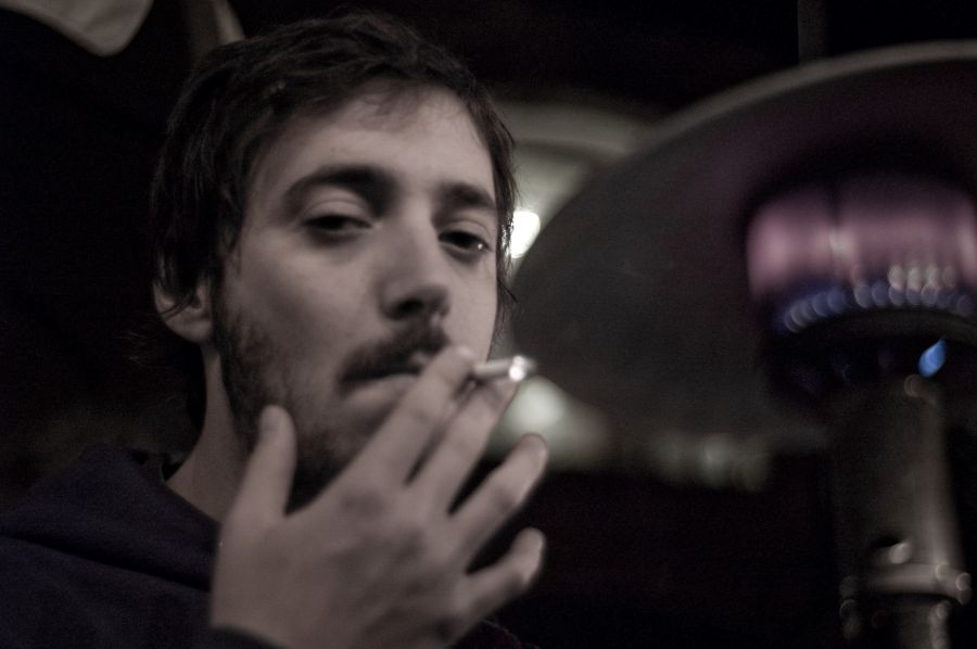
Here is a less conventional 3D pic.
Sometimes the realities of a digital sensor and grainy high ISO can come into play with Perspective and lighting to create some unusual 3D effect.
My feeling is this shot on film........would not look so.
This shot was in very poor light and the subject was too close to get focus with the lens fully open.
It may not seem to look right here as a small jpg so I add a link also.
RD1 CV1.4/40

_________________
Moderator |
|
| Back to top |
|
 |
F16SUNSHINE


Joined: 20 Aug 2007
Posts: 5486
Location: Left Coast
Expire: 2011-11-18
|
 Posted: Mon May 18, 2009 2:56 pm Post subject: Posted: Mon May 18, 2009 2:56 pm Post subject: |
 |
|
F16SUNSHINE wrote:
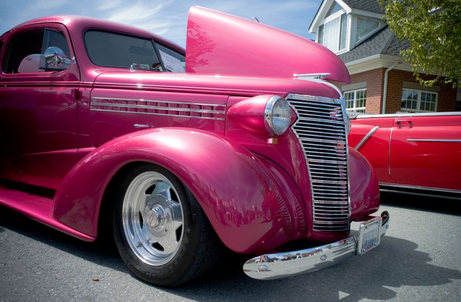
Here I think is more conventional "Zeiss style" 3D.
M8 Hexanon Dual FL 21/35 no UV?IR cut filter

_________________
Moderator |
|
| Back to top |
|
 |
F16SUNSHINE


Joined: 20 Aug 2007
Posts: 5486
Location: Left Coast
Expire: 2011-11-18
|
 Posted: Mon May 18, 2009 3:05 pm Post subject: Posted: Mon May 18, 2009 3:05 pm Post subject: |
 |
|
F16SUNSHINE wrote:
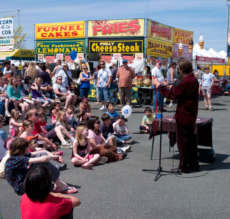
On this one you have to tell me. I think the image is 3D but as to it showing lots of microcontrast maybe well....you tell me 
The perspective coming from the boy in the LH bottom corner gives my the 3D effect.
Also the acidic colors of mid-afternoon really create a lot of Bang!.
Look at the signs of the food stands.
I think the extended range of UV and IR from the M8 sensor plays a role in here somewhere.
Please go to the full size by clicking thumb and then click image again in next window.
M8 Hex Dual FL 21/35 at 21

_________________
Moderator |
|
| Back to top |
|
 |
F16SUNSHINE


Joined: 20 Aug 2007
Posts: 5486
Location: Left Coast
Expire: 2011-11-18
|
 Posted: Mon May 18, 2009 3:24 pm Post subject: Posted: Mon May 18, 2009 3:24 pm Post subject: |
 |
|
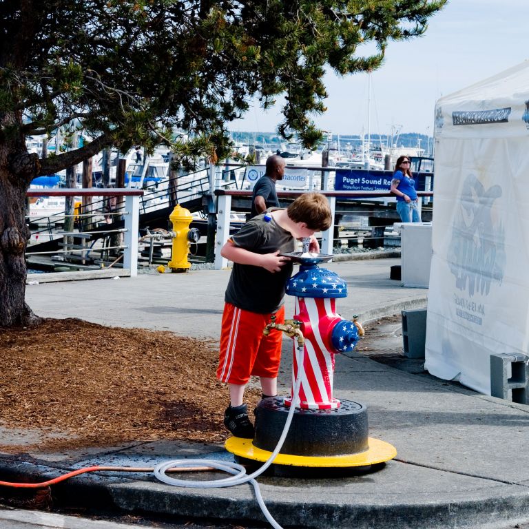
F16SUNSHINE wrote:
One more.
This one is a pretty big crop so please go to full size.
Again the extended and acidic colors make extra pop.
M8 Hex Dual 21/35 at 35

_________________
Moderator |
|
| Back to top |
|
 |
poilu

Joined: 26 Aug 2007
Posts: 10472
Location: Greece
Expire: 2019-08-29
|
 Posted: Mon May 18, 2009 4:09 pm Post subject: Posted: Mon May 18, 2009 4:09 pm Post subject: |
 |
|
poilu wrote:
sunshine, color pop is not exactly the same as 3D pop
3D is difficult to obtain when very stopped down and sun is coming from zenith
_________________
T* |
|
| Back to top |
|
 |
|
|
