| View previous topic :: View next topic |
| Author |
Message |
Orio

Joined: 24 Feb 2007
Posts: 29545
Location: West Emilia
Expire: 2012-12-04
|
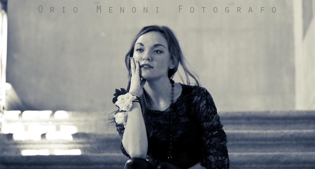
 Posted: Wed Mar 07, 2012 12:29 pm Post subject: Anna on the stairs Posted: Wed Mar 07, 2012 12:29 pm Post subject: Anna on the stairs |
 |
|
Orio wrote:

Planar 1.4/85
Custom duotone made in Lightroom.
_________________
Orio, Administrator
T*
NE CEDE MALIS AUDENTIOR ITO
Ferrania film is reborn! http://www.filmferrania.it/
Support the Ornano film chemicals company and help them survive!
http://forum.mflenses.com/ornano-chemical-products-t55525.html |
|
| Back to top |
|
 |
martinsmith99


Joined: 31 Aug 2008
Posts: 6950
Location: S Glos, UK
Expire: 2013-11-18
|
 Posted: Wed Mar 07, 2012 7:03 pm Post subject: Posted: Wed Mar 07, 2012 7:03 pm Post subject: |
 |
|
martinsmith99 wrote:
I really like that, but I would crop the right side out as I think it could improve it.
Was this @1.4? If so, amazing job with the focus.
_________________
Casual attendance these days |
|
| Back to top |
|
 |
Orio

Joined: 24 Feb 2007
Posts: 29545
Location: West Emilia
Expire: 2012-12-04
|
 Posted: Wed Mar 07, 2012 7:04 pm Post subject: Posted: Wed Mar 07, 2012 7:04 pm Post subject: |
 |
|
Orio wrote:
I don't remember, quite some time has passed, but judging on the DOF I would say I used something around f/2.8 or f/4
(which is how I use this lens most of the time...)
_________________
Orio, Administrator
T*
NE CEDE MALIS AUDENTIOR ITO
Ferrania film is reborn! http://www.filmferrania.it/
Support the Ornano film chemicals company and help them survive!
http://forum.mflenses.com/ornano-chemical-products-t55525.html |
|
| Back to top |
|
 |
stingOM


Joined: 27 Sep 2007
Posts: 3168
Location: Ireland
Expire: 2012-12-27
|
 Posted: Wed Mar 07, 2012 8:45 pm Post subject: Posted: Wed Mar 07, 2012 8:45 pm Post subject: |
 |
|
stingOM wrote:
Looks kind of cinematic - I like it Orio!! |
|
| Back to top |
|
 |
bhargav


Joined: 24 Nov 2011
Posts: 938
Location: Helsinki, Finland
Expire: 2014-11-24
|
 Posted: Wed Mar 07, 2012 10:24 pm Post subject: Posted: Wed Mar 07, 2012 10:24 pm Post subject: |
 |
|
bhargav wrote:
| stingOM wrote: |
| Looks kind of cinematic - I like it Orio!! |
+1 |
|
| Back to top |
|
 |
Orio

Joined: 24 Feb 2007
Posts: 29545
Location: West Emilia
Expire: 2012-12-04
|
 Posted: Wed Mar 07, 2012 11:20 pm Post subject: Posted: Wed Mar 07, 2012 11:20 pm Post subject: |
 |
|
Orio wrote:
Thanks! In fact I made this for use as a cover to my Facebook artist page (hence the writing), but then I liked it as a photo solution too, the empty space works well I think, like you say, it sort of creates a story around her. 
_________________
Orio, Administrator
T*
NE CEDE MALIS AUDENTIOR ITO
Ferrania film is reborn! http://www.filmferrania.it/
Support the Ornano film chemicals company and help them survive!
http://forum.mflenses.com/ornano-chemical-products-t55525.html |
|
| Back to top |
|
 |
Himself

Joined: 01 Mar 2007
Posts: 3245
Location: Montreal
Expire: 2013-05-30
|
 Posted: Wed Mar 07, 2012 11:29 pm Post subject: Posted: Wed Mar 07, 2012 11:29 pm Post subject: |
 |
|
Himself wrote:
I like the pose.
As Martin said, I would crop/heal/clone that burned area in the background.
_________________
Moderator Himself |
|
| Back to top |
|
 |
Orio

Joined: 24 Feb 2007
Posts: 29545
Location: West Emilia
Expire: 2012-12-04
|
 Posted: Wed Mar 07, 2012 11:33 pm Post subject: Posted: Wed Mar 07, 2012 11:33 pm Post subject: |
 |
|
Orio wrote:
| Himself wrote: |
I like the pose.
As Martin said, I would crop/heal/clone that burned area in the background. |
Yeah, I thought about that possibility. I'm afraid it would turn out boring If I clone the stairs. Somehow those highlights seem to give the scene a character. I don't know...
_________________
Orio, Administrator
T*
NE CEDE MALIS AUDENTIOR ITO
Ferrania film is reborn! http://www.filmferrania.it/
Support the Ornano film chemicals company and help them survive!
http://forum.mflenses.com/ornano-chemical-products-t55525.html |
|
| Back to top |
|
 |
Orio

Joined: 24 Feb 2007
Posts: 29545
Location: West Emilia
Expire: 2012-12-04
|
 Posted: Wed Mar 07, 2012 11:40 pm Post subject: Posted: Wed Mar 07, 2012 11:40 pm Post subject: |
 |
|
Orio wrote:
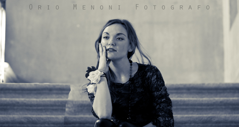
see what I mean?
(just a draft)

_________________
Orio, Administrator
T*
NE CEDE MALIS AUDENTIOR ITO
Ferrania film is reborn! http://www.filmferrania.it/
Support the Ornano film chemicals company and help them survive!
http://forum.mflenses.com/ornano-chemical-products-t55525.html |
|
| Back to top |
|
 |
tanheis

Joined: 05 Sep 2007
Posts: 507
Location: Finland
|
 Posted: Thu Mar 08, 2012 7:14 am Post subject: Posted: Thu Mar 08, 2012 7:14 am Post subject: |
 |
|
tanheis wrote:
Very nice shot. Like the color tone too.
_________________
EOS 5D mk II
Lenses: Zeiss Distagon T* 15/2.8, Nikkor 24mm 2.8, Pentacon 30 3.5, SMC Takumar 50 1.4, Nikon 50mm 1.4 AI-S & non-AI ones,Olympus OM Zuiko 28/2,Pentacon 50 1.8,Industar-50 50mm 3.5(silver & black) Tamron SP 90mm 2.5, Tokina 28-85 4, Tamron SP 35-80 2.8-3.8, Zeiss 15mm 2.8 ZE Distagon, Zeiss Tessar 45/2.8, Zeiss Planar 85/1.4,Nikon 105mm 1.8,Nikon 200/2 ED-IF AI-S,Seimar 135 2.8, Tamron SP 300mm 5.6, Tamron SP 60-300 3.8-5.4, Tamron SP 500mm 8.0 Mirror, Zenit Photosniper + Tair-3, Canon FD 800 5.6L - EOS converted
-----------------------------------------------
Canon EOS M
Canon EF-M 22mm f/2 STM
Olympus PEN-F 42mm f/1.2 |
|
| Back to top |
|
 |
Orio

Joined: 24 Feb 2007
Posts: 29545
Location: West Emilia
Expire: 2012-12-04
|
 Posted: Thu Mar 08, 2012 9:33 am Post subject: Posted: Thu Mar 08, 2012 9:33 am Post subject: |
 |
|
Orio wrote:
| tanheis wrote: |
| Very nice shot. Like the color tone too. |
Thanks! Split Toning in Lightroom is a very powerful instrument. You can make duotones, as I did in this case, or you can make tinting of colour photos, in a much subtler way than you can do with Curves in Photoshop.
It has a lot of potential, if only people would take the time to dig in it.
_________________
Orio, Administrator
T*
NE CEDE MALIS AUDENTIOR ITO
Ferrania film is reborn! http://www.filmferrania.it/
Support the Ornano film chemicals company and help them survive!
http://forum.mflenses.com/ornano-chemical-products-t55525.html |
|
| Back to top |
|
 |
tobbsman


Joined: 25 Jul 2008
Posts: 2578
Location: Austria
|
 Posted: Thu Mar 08, 2012 11:54 am Post subject: Posted: Thu Mar 08, 2012 11:54 am Post subject: |
 |
|
tobbsman wrote:
This photograph is a beauty! I don't have any problems with the burnt area.
For me it fits nicely to the whole concept with dual-tone and the
"arty" look of the model.
Cheers
Tobias
_________________
Camera Pentax K10D, K20D, Super A
SMC K28 3.5, SMC K24 2.8, SMC K28/2, SMC K50/1.4,SMC A50/1.7, SMC M28/3.5, SMC A 50/1.7, SMC K135 2.5, SMC A50 1.2
SMC A35-105 3.5, SMC A70-210 4, SMC A20 2.8, SMC M28 2.8,K28/3.5 SMC A28 2.8, SMC A100 2.8 Macro, CZJ Flektogon 20 2.8 (MC), 35 2.4 (MC),S.M.C Takumar 85mm 1.8, Helios 44M-4, A.Schacht Travenar 90/2.8, C.Zeiss J. Sonnar 180/2.8
Check out my: 2012 New "Advanced Guide to Panorama Stiching" !
Check out my "Beginner's Guide to Panorama Stiching !
Visit my Asahi and Zeiss MF lens samples database ! |
|
| Back to top |
|
 |
Spotmatic


Joined: 18 Aug 2008
Posts: 4045
Location: Netherlands
|
 Posted: Thu Mar 08, 2012 11:59 am Post subject: Posted: Thu Mar 08, 2012 11:59 am Post subject: |
 |
|
Spotmatic wrote:
I like the duotone look and the model's expression!
One question: how would the photo look when you cut off exactly at the vertical lines left and right?
_________________
Peter - Moderator
Pentax K-5 + Pentax 645 + Canon 5D + Bessa RF 10,5cm Heliar, and a 'little' bag full of MF lenses. The lens list is * here *.
My fast 80s: Asahi-Kogaku Takumar 83mm f/1.9 - Super-Takumar 85mm f/1.9 - FA 77mm f/1.8 Limited - Cyclop 85/1.5 (Helios-40 innards) - Komura 80mm f/1.8 - Meyer Görlitz Primoplan 7,5cm 1:1.9 - Carl Zeiss Jena 80mm f/1.8 Pancolar - Canon 85mm f/1.8 S.S.C. - Canon 85mm f/1.2 S.S.C. Aspherical |
|
| Back to top |
|
 |
skida


Joined: 02 Mar 2012
Posts: 1826
Location: North East England
|
 Posted: Thu Mar 08, 2012 12:29 pm Post subject: Posted: Thu Mar 08, 2012 12:29 pm Post subject: |
 |
|
skida wrote:
A beautiful shot! I like it as is. The highlight is part of it and the fact that her face appears to be looking towards it suggests an idea or dream. I love it. The processing gives it a fashion mag feel too. |
|
| Back to top |
|
 |
Orio

Joined: 24 Feb 2007
Posts: 29545
Location: West Emilia
Expire: 2012-12-04
|
 Posted: Thu Mar 08, 2012 12:36 pm Post subject: Posted: Thu Mar 08, 2012 12:36 pm Post subject: |
 |
|
Orio wrote:
Thanks all!
| Spotmatic wrote: |
One question: how would the photo look when you cut off exactly at the vertical lines left and right? |
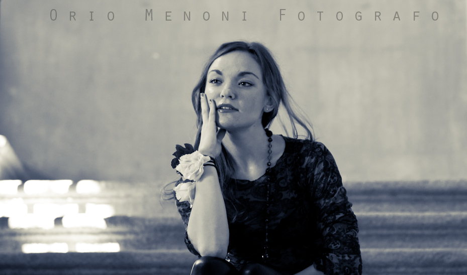
You mean like this?

It's a possibility.
It becomes a different photo. This way, the emphasis is much more on her face, which becomes stronger and more emotional.
At the same time, the ambient loses character, it becomes more anonymous background, like it could be any blurred background.
Thanks for pointing out this alternative, it is an excellent example of how a simple different cropping can change dramatically the meaning of a photo!
_________________
Orio, Administrator
T*
NE CEDE MALIS AUDENTIOR ITO
Ferrania film is reborn! http://www.filmferrania.it/
Support the Ornano film chemicals company and help them survive!
http://forum.mflenses.com/ornano-chemical-products-t55525.html |
|
| Back to top |
|
 |
Himself

Joined: 01 Mar 2007
Posts: 3245
Location: Montreal
Expire: 2013-05-30
|
 Posted: Thu Mar 08, 2012 1:31 pm Post subject: Posted: Thu Mar 08, 2012 1:31 pm Post subject: |
 |
|
Himself wrote:
| Orio wrote: |
You mean like this?

..... it is an excellent example of how a simple different cropping can change dramatically the meaning of a photo! |
Now it looks like a cinematic format. Very trendy these days.
_________________
Moderator Himself |
|
| Back to top |
|
 |
F16SUNSHINE


Joined: 20 Aug 2007
Posts: 5486
Location: Left Coast
Expire: 2011-11-18
|
 Posted: Thu Mar 08, 2012 1:47 pm Post subject: Posted: Thu Mar 08, 2012 1:47 pm Post subject: |
 |
|
F16SUNSHINE wrote:
This photo is well chosen. Her expression makes the viewer curious to what she is feeling or thinking.
I like the crop version and I also like the energy of the highlights.
Nice post work as well!
_________________
Moderator |
|
| Back to top |
|
 |
Orio

Joined: 24 Feb 2007
Posts: 29545
Location: West Emilia
Expire: 2012-12-04
|
 Posted: Thu Mar 08, 2012 3:50 pm Post subject: Posted: Thu Mar 08, 2012 3:50 pm Post subject: |
 |
|
Orio wrote:
Thanks! 
_________________
Orio, Administrator
T*
NE CEDE MALIS AUDENTIOR ITO
Ferrania film is reborn! http://www.filmferrania.it/
Support the Ornano film chemicals company and help them survive!
http://forum.mflenses.com/ornano-chemical-products-t55525.html |
|
| Back to top |
|
 |
dani9batan


Joined: 19 Jan 2012
Posts: 218
Location: Madrid (Spain)
|
 Posted: Thu Mar 08, 2012 5:08 pm Post subject: Posted: Thu Mar 08, 2012 5:08 pm Post subject: |
 |
|
dani9batan wrote:
Orio, I like very much your portraits 
_________________
Canon EOS 5D Mark II, Contax 167MT
Contax Distagon T* 2,8/28
Contax Planar T* 1,7/50 (x2)
Contax Planar T* 1,4/85
Contax Sonnar T* 2,8/135
|
|
| Back to top |
|
 |
Orio

Joined: 24 Feb 2007
Posts: 29545
Location: West Emilia
Expire: 2012-12-04
|
 Posted: Thu Mar 08, 2012 5:18 pm Post subject: Posted: Thu Mar 08, 2012 5:18 pm Post subject: |
 |
|
Orio wrote:
Thanks Dani 
_________________
Orio, Administrator
T*
NE CEDE MALIS AUDENTIOR ITO
Ferrania film is reborn! http://www.filmferrania.it/
Support the Ornano film chemicals company and help them survive!
http://forum.mflenses.com/ornano-chemical-products-t55525.html |
|
| Back to top |
|
 |
Spotmatic


Joined: 18 Aug 2008
Posts: 4045
Location: Netherlands
|
 Posted: Thu Mar 08, 2012 6:44 pm Post subject: Posted: Thu Mar 08, 2012 6:44 pm Post subject: |
 |
|
Spotmatic wrote:
Yes, the cropped version was exactly what I liked to see. IMHO it works VERY well. Of course you lose something of the setting but as a portrait it's now perfect! I'm envious 
_________________
Peter - Moderator
Pentax K-5 + Pentax 645 + Canon 5D + Bessa RF 10,5cm Heliar, and a 'little' bag full of MF lenses. The lens list is * here *.
My fast 80s: Asahi-Kogaku Takumar 83mm f/1.9 - Super-Takumar 85mm f/1.9 - FA 77mm f/1.8 Limited - Cyclop 85/1.5 (Helios-40 innards) - Komura 80mm f/1.8 - Meyer Görlitz Primoplan 7,5cm 1:1.9 - Carl Zeiss Jena 80mm f/1.8 Pancolar - Canon 85mm f/1.8 S.S.C. - Canon 85mm f/1.2 S.S.C. Aspherical |
|
| Back to top |
|
 |
Nikos


Joined: 17 May 2010
Posts: 1077
Location: Greece
Expire: 2015-01-02
|
 Posted: Thu Mar 08, 2012 7:09 pm Post subject: Posted: Thu Mar 08, 2012 7:09 pm Post subject: |
 |
|
Nikos wrote:
Very nice Orio!
I prefer it as you first showed it to us, without crop etc.
It is like you have frozen the action in a movie.
To tell you the truth, I would be very willing to watch this movie 
_________________
Νίκος • www.diafragma.gr

Cameras: Canon EOS 5D Mark II, Sony α7R, Sony NEX-5N
MF lenses:
SLR:
Canon TS-E 17mm f/4, Zeiss 2.8/21 ZE, Zeiss 2/28 Contax, Zeiss 2/35 ZE, Zeiss 1.4/50 Contax, Zeiss 1.4/85 Contax, Zeiss Makro 2/100 ZE,
Zeiss 2/135 Contax, Zeiss 2.8/135 Contax, Zeiss Vario-Sonnar 35-70 Contax, Zeiss Vario-Sonnar 100-300 Contax, Zeiss F-Distagon Rollei, Canon FD 24mm f2, Minolta MD Rokkor 35mm f2.8
Rangefinder:
Zeiss 4.5/21 C Biogon ZM, Zeiss 2/35 Biogon ZM, Voigtländer 15mm f/4.5 Heliar L39, Leica Tele-Elmarit 2.8/90mm, Zeiss 2/45 Contax G, Zeiss 2.8/90 Contax G, Canon 50mm 1.8 LTM
AF lenses: Canon 15mm f/2.8 Fisheye, Canon 24-70 f/2.8 L, Canon 70-200 f/2.8 L IS II, Canon 70-200 f/4 L, Canon 300 f/4 L IS, Canon 100 f/2.8 macro
|
|
| Back to top |
|
 |
Orio

Joined: 24 Feb 2007
Posts: 29545
Location: West Emilia
Expire: 2012-12-04
|
 Posted: Thu Mar 08, 2012 7:57 pm Post subject: Posted: Thu Mar 08, 2012 7:57 pm Post subject: |
 |
|
Orio wrote:
Thanks guys! I agree with both you Peter and Nikos. I know, it's not possible 
_________________
Orio, Administrator
T*
NE CEDE MALIS AUDENTIOR ITO
Ferrania film is reborn! http://www.filmferrania.it/
Support the Ornano film chemicals company and help them survive!
http://forum.mflenses.com/ornano-chemical-products-t55525.html |
|
| Back to top |
|
 |
Spotmatic


Joined: 18 Aug 2008
Posts: 4045
Location: Netherlands
|
 Posted: Thu Mar 08, 2012 8:03 pm Post subject: Posted: Thu Mar 08, 2012 8:03 pm Post subject: |
 |
|
Spotmatic wrote:
I know the solution! The first version is only viewable at even days, the other one at odd days  
_________________
Peter - Moderator
Pentax K-5 + Pentax 645 + Canon 5D + Bessa RF 10,5cm Heliar, and a 'little' bag full of MF lenses. The lens list is * here *.
My fast 80s: Asahi-Kogaku Takumar 83mm f/1.9 - Super-Takumar 85mm f/1.9 - FA 77mm f/1.8 Limited - Cyclop 85/1.5 (Helios-40 innards) - Komura 80mm f/1.8 - Meyer Görlitz Primoplan 7,5cm 1:1.9 - Carl Zeiss Jena 80mm f/1.8 Pancolar - Canon 85mm f/1.8 S.S.C. - Canon 85mm f/1.2 S.S.C. Aspherical |
|
| Back to top |
|
 |
|
|
