| View previous topic :: View next topic |
| Author |
Message |
Orio

Joined: 24 Feb 2007
Posts: 29545
Location: West Emilia
Expire: 2012-12-04
|
 Posted: Wed May 25, 2011 12:26 am Post subject: Piease help me choose Posted: Wed May 25, 2011 12:26 am Post subject: Piease help me choose |
 |
|
Orio wrote:
I am making a selection of not more than 100 photos (but if I'll be able to keep it at 50 photos, even better), to represent my 20 years as more or less "committed" photographer.
These selected photos will end up in my main web site. I will not host my full series there, or at least, not immediately. I want that the site that represents me, only hosts a restricted selection.
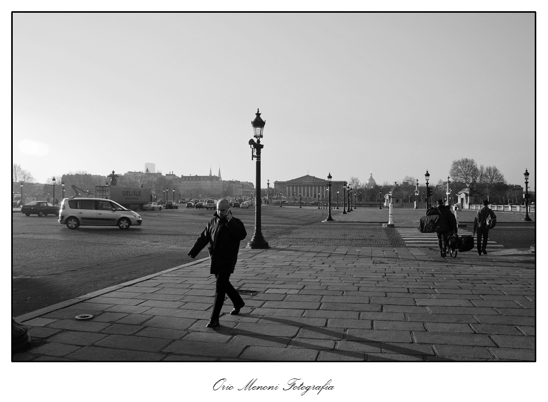
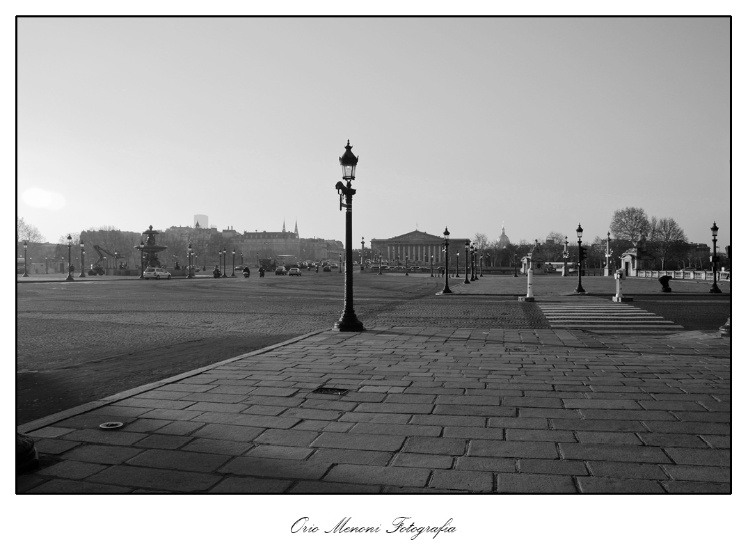
I need to choose one between these two Paris photographs. I am undecided, and I can use your best judgement to make a choice.
They are of course two completely different photos, although taken exactly in the same position at only a few seconds difference. I can not however keep both:


_________________
Orio, Administrator
T*
NE CEDE MALIS AUDENTIOR ITO
Ferrania film is reborn! http://www.filmferrania.it/
Support the Ornano film chemicals company and help them survive!
http://forum.mflenses.com/ornano-chemical-products-t55525.html |
|
| Back to top |
|
 |
Katastrofo

Joined: 26 Feb 2007
Posts: 10405
Location: USA
Expire: 2013-11-19
|
 Posted: Wed May 25, 2011 1:48 am Post subject: Posted: Wed May 25, 2011 1:48 am Post subject: |
 |
|
Katastrofo wrote:
First photo, without a doubt. The human element adds considerably more
interest to the scene. |
|
| Back to top |
|
 |
rbelyell


Joined: 13 Oct 2009
Posts: 4269
Location: somewhere in the mountains of central NY
Expire: 2014-01-31
|
 Posted: Wed May 25, 2011 2:00 am Post subject: Posted: Wed May 25, 2011 2:00 am Post subject: |
 |
|
rbelyell wrote:
i like the balance and uncluttered feel of 2 better, as well as the way the subjects line up. it conveys a feeling, or mood, like a lonely early morning...
_________________
Epson RD1 + Elmarit 21/2.8; Summarit 50/1.5; Summarit 75/2.5; Elmar-c 90/4; Sankyo Komura 135/2.8, Hektor 135/4.5; Braun Paxina 29 6x6; Photax Boyer Paris; Holga 120 Pano
GREAT STUFF FOR SALE:
Contax T
Hasselblad XPan + 45/4, 90/4
Kodak Retina Reflex IV + full set of Schneider Krueznach lenses
Mercury 2 half frame 35mm
Kodak Pro slr/n
Fuji GM670+100/3.5+65/8!
Praktisix 6x6 medium format + ZeissBiometar 120/2.8
Bessa T 101 Anniversary Edition in Navy Blue
Mamiya Six Folder with Zuiko 75/3.5
Adaptall: Tamron SP 28-85 macro
Cameras: Canon IX
PM for more complete descriptions/pix. All in great shape!
_________________________
'buy me a drink, sing me a song,
take me as i come 'cause i can't stay long' |
|
| Back to top |
|
 |
DigiChromeEd


Joined: 29 Dec 2009
Posts: 3462
Location: Northern Ireland
|
 Posted: Wed May 25, 2011 6:03 am Post subject: Posted: Wed May 25, 2011 6:03 am Post subject: |
 |
|
DigiChromeEd wrote:
No.2 for me definately! The car in the foreground in No.1 spoils it for me.
_________________
"I've got a Nikon camera, I like to take a photograph" - Paul Simon |
|
| Back to top |
|
 |
tobbsman


Joined: 25 Jul 2008
Posts: 2578
Location: Austria
|
 Posted: Wed May 25, 2011 6:44 am Post subject: Posted: Wed May 25, 2011 6:44 am Post subject: |
 |
|
tobbsman wrote:
definitly #1 for me, the car doesn't desturb me, it's "street life" photography anyway.
Cheers
Tobias
_________________
Camera Pentax K10D, K20D, Super A
SMC K28 3.5, SMC K24 2.8, SMC K28/2, SMC K50/1.4,SMC A50/1.7, SMC M28/3.5, SMC A 50/1.7, SMC K135 2.5, SMC A50 1.2
SMC A35-105 3.5, SMC A70-210 4, SMC A20 2.8, SMC M28 2.8,K28/3.5 SMC A28 2.8, SMC A100 2.8 Macro, CZJ Flektogon 20 2.8 (MC), 35 2.4 (MC),S.M.C Takumar 85mm 1.8, Helios 44M-4, A.Schacht Travenar 90/2.8, C.Zeiss J. Sonnar 180/2.8
Check out my: 2012 New "Advanced Guide to Panorama Stiching" !
Check out my "Beginner's Guide to Panorama Stiching !
Visit my Asahi and Zeiss MF lens samples database ! |
|
| Back to top |
|
 |
eddieitman


Joined: 12 Apr 2011
Posts: 1246
Location: United Kingdom
|
 Posted: Wed May 25, 2011 6:53 am Post subject: Posted: Wed May 25, 2011 6:53 am Post subject: |
 |
|
eddieitman wrote:
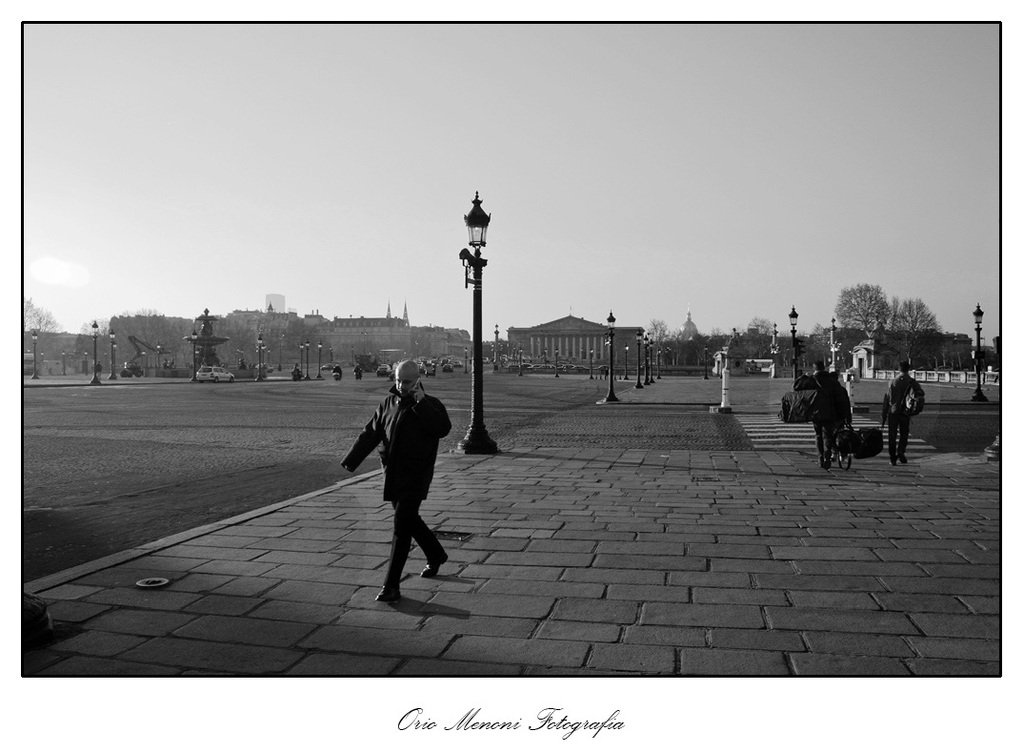
I would say a combination of Both, I have done this so you can see the effect its a 2 minute cut and paste job before i go to work so dont have teh time to do it correctly but just to get the feel.
I know that it is terrible if i get the opportunity this afternoon i will do it properly

_________________
My web site www.digital-darkroom.weebly.com
Life is like a camera. Focus on what's important, capture the good times, develop from the negatives and if things don't work out, just take another shot. |
|
| Back to top |
|
 |
Orio

Joined: 24 Feb 2007
Posts: 29545
Location: West Emilia
Expire: 2012-12-04
|
 Posted: Wed May 25, 2011 7:49 am Post subject: Posted: Wed May 25, 2011 7:49 am Post subject: |
 |
|
Orio wrote:
Thanks for the opinions!
_________________
Orio, Administrator
T*
NE CEDE MALIS AUDENTIOR ITO
Ferrania film is reborn! http://www.filmferrania.it/
Support the Ornano film chemicals company and help them survive!
http://forum.mflenses.com/ornano-chemical-products-t55525.html |
|
| Back to top |
|
 |
my_photography

Joined: 03 Nov 2008
Posts: 2772
Location: Pearl of the Orient
Expire: 2016-12-25
|
 Posted: Wed May 25, 2011 7:58 am Post subject: Posted: Wed May 25, 2011 7:58 am Post subject: |
 |
|
my_photography wrote:
I like the human factor + the movement but without the car.
_________________
Zeiss: CJZ Flektogon 20/2.8, CJZ Flektogon 20/4, , CJZ Pentacon 29/2.8, CJZ Flektogon 35/2.4, CJZ Pancolar 50/1.8, Tessar 50/2.8, Biotar 7.5cm/1.5, CJZ Pancolar 80/1.8, CJZ Sonnar 135/3.5, CJZ Pentacon 135/2.8 CJZ Sonnar 200/2.8
Other Germany: Meyer Primoplan 50/1.8, Meyer Trioplan 100/2.8
Takumar: SMC 50/1.4 Super Tak 55/2, Super Tak 85/1.9, S-M-C 135/3.5, Super Tak 150/4
Russian: Zenith 16/2.8, Mir-24M 2/35, Volna-9 50/2.8, Helios 44M (58/2), Helios 44M-3 MC (58/2), Helios 40 (85/1.5), Tair 11A (135/2.8 )
Others: Sears 28/2.8, Sankor 35/2.8, Enna M�nchen Tele-Ennalyt 135/3.5
Zoom Sigma Zoom 28-85/3.5-4.5
|
|
| Back to top |
|
 |
Jesito


Joined: 24 Aug 2007
Posts: 5745
Location: Olivella, Catalonia, (Spain)
Expire: 2015-01-07
|
 Posted: Wed May 25, 2011 8:16 am Post subject: Posted: Wed May 25, 2011 8:16 am Post subject: |
 |
|
Jesito wrote:
I vould vote for the #2, I like the lonelyness it transmits.
Regards.
Jes.
_________________
Jesito, Moderator 
Jesito's backsack:
Zooms Sigma 70-300, Tamron 35-135 and 70-210 short, 70-210 long, 28-70 CF Macro, 35-70, 35-80, Vivitar 70-210 KA, Tamron 70-250.
Fixed Industar-50, , Tamron 24mm, Tamron 135mm, Sands Hunter 135mm, Pancolar 50mm, Volna-3, many Exakta lenses
DSLR SIGMA SD9 & SD14, EOS 5D, Sony A700 and NEXF3, Oly E-330, E-400, E-450, E-1
TLR/6x6/645 YashicaMat, Petri 6x45, Nettar, Franka Solida, Brilliant
SLR Minolta X300, Fuji STX II, Praktica VLC3, Pentax P30t, EXA500, EXA 1A, Spotmatic(2), Chinon CM-4S, Ricoh, Contax, Konica TC-X , Minolta 5000, 7000i, 3Sxi, EOS 500 and CX
Rangefinders Chinon 35EE, Konica C35 auto, Canonet 28, Yashica Lynx, FED-2, Yashica electro 35, Argus C3 & C4, Regula Cita III, Voigtlander Vitoret (many), Welta Welti-I, Kodak Signette 35, Zorki-4, Bessa-R & L, Minolta Weathermatic, olympus XA2
Compact Film Konica C35V, Voigtlander Vitorets, Canon Prima Super 105, Olympus XA2 and XA3
Compact Digital Olympus C-5050, Aiptek Slim 3000, Canon Powershot A540, Nikon 5200, SIGMA DP1s, Polaroid X530, IXUS55, Kodak 6490, Powershot G9 and G10
CSCCanon EOS-M, Samsung NX100 and NX210, Lumix G5, NEX-F3 |
|
| Back to top |
|
 |
tobbsman


Joined: 25 Jul 2008
Posts: 2578
Location: Austria
|
 Posted: Wed May 25, 2011 11:19 am Post subject: Posted: Wed May 25, 2011 11:19 am Post subject: |
 |
|
tobbsman wrote:
it's much more easy to clone other way round:

1 minute work, can be optimized still ...
Cheers
Tobias
_________________
Camera Pentax K10D, K20D, Super A
SMC K28 3.5, SMC K24 2.8, SMC K28/2, SMC K50/1.4,SMC A50/1.7, SMC M28/3.5, SMC A 50/1.7, SMC K135 2.5, SMC A50 1.2
SMC A35-105 3.5, SMC A70-210 4, SMC A20 2.8, SMC M28 2.8,K28/3.5 SMC A28 2.8, SMC A100 2.8 Macro, CZJ Flektogon 20 2.8 (MC), 35 2.4 (MC),S.M.C Takumar 85mm 1.8, Helios 44M-4, A.Schacht Travenar 90/2.8, C.Zeiss J. Sonnar 180/2.8
Check out my: 2012 New "Advanced Guide to Panorama Stiching" !
Check out my "Beginner's Guide to Panorama Stiching !
Visit my Asahi and Zeiss MF lens samples database ! |
|
| Back to top |
|
 |
Gurdie


Joined: 29 Jul 2008
Posts: 997
Location: Finland
Expire: 2013-02-20
|
 Posted: Wed May 25, 2011 2:31 pm Post subject: Posted: Wed May 25, 2011 2:31 pm Post subject: |
 |
|
Gurdie wrote:
I think it depends of what kind of feeling You´d like to convey. There are people and cars in #1, but they don´t seem to be the subject of the pic, so at least for me, the subject of #1 is the MOMENT.
#2, without people, creates a mood of loneliness, like Jesito said.
I´d crop the lamppost feet from both corners, too. 
_________________
Markku
Give me two hours a day of activity, and I'll take the other twenty-two in dreams.
― Salvador Dali
----------------------------------------- |
|
| Back to top |
|
 |
visualopsins


Joined: 05 Mar 2009
Posts: 11064
Location: California
Expire: 2025-04-11
|
 Posted: Wed May 25, 2011 2:49 pm Post subject: Posted: Wed May 25, 2011 2:49 pm Post subject: |
 |
|
visualopsins wrote:
What a dilemma! Both are very strong images. After seeing action in #1, #2 looks very stark, deserted and bare, the action is distant, everything is moving away from the scene. Exposures appear slightly different, #1 is slightly better, note highlights on distant dome & spire (follow the light poles). I think the car in #1 is necessary for overall balance, but it does distract some attention from the rest of the scene. I cannot decide between them which I like best! 
_________________
☮☮☮☮☮☮☮☮☮☮☮☮☮☮☮☮☮☮☮☮☮☮☮☮☮☮☮☮☮☮☮☮ like attracts like! ☮☮☮☮☮☮☮☮☮☮☮☮☮☮☮☮☮☮☮☮☮☮☮☮☮☮☮☮☮☮☮☮
Cameras: Sony ILCE-7RM2, Spotmatics II, F, and ESII, Nikon P4
Lenses:
M42 Asahi Optical Co., Takumar 1:4 f=35mm, 1:2 f=58mm (Sonnar), 1:2.4 f=58mm (Heliar), 1:2.2 f=55mm (Gaussian), 1:2.8 f=105mm (Model I), 1:2.8/105 (Model II), 1:5.6/200, Tele-Takumar 1:5.6/200, 1:6.3/300, Macro-Takumar 1:4/50, Auto-Takumar 1:2.3 f=35, 1:1.8 f=55mm, 1:2.2 f=55mm, Super-TAKUMAR 1:3.5/28 (fat), 1:2/35 (Fat), 1:1.4/50 (8-element), Super-Multi-Coated Fisheye-TAKUMAR 1:4/17, Super-Multi-Coated TAKUMAR 1:4.5/20, 1:3.5/24, 1:3.5/28, 1:2/35, 1:3.5/35, 1:1.8/85, 1:1.9/85 1:2.8/105, 1:3.5/135, 1:2.5/135 (II), 1:4/150, 1:4/200, 1:4/300, 1:4.5/500, Super-Multi-Coated Macro-TAKUMAR 1:4/50, 1:4/100, Super-Multi-Coated Bellows-TAKUMAR 1:4/100, SMC TAKUMAR 1:1.4/50, 1:1.8/55
M42 Carl Zeiss Jena Flektogon 2.4/35
Contax Carl Zeiss Vario-Sonnar T* 28-70mm F3.5-4.5
Pentax K-mount SMC PENTAX-A ZOOM 1:3.5 35~105mm, SMC PENTAX ZOOM 1:4 45~125mm
Nikon Micro-NIKKOR-P-C Auto 1:3.5 f=55mm, NIKKOR-P Auto 105mm f/2.5 Pre-AI (Sonnar), Micro-NIKKOR 105mm 1:4 AI, NIKKOR AI-S 35-135mm f/3,5-4,5
Tamron SP 17mm f/3.5 (51B), Tamron SP 17mm f/3.5 (151B), SP 500mm f/8 (55BB), SP 70-210mm f/3.5 (19AH)
Vivitar 100mm 1:2.8 MC 1:1 Macro Telephoto (Kiron)
|
|
| Back to top |
|
 |
mmelvis

Joined: 24 May 2010
Posts: 1326
Location: Florida,USA
Expire: 2015-05-09
|
 Posted: Wed May 25, 2011 4:13 pm Post subject: Posted: Wed May 25, 2011 4:13 pm Post subject: |
 |
|
mmelvis wrote:
The first image as the people add movement to the image. This causes the eye to wonder more around the image. There is more going on in the first image, appeals to my eye. |
|
| Back to top |
|
 |
LucisPictor


Joined: 26 Feb 2007
Posts: 17633
Location: Oberhessen, Germany / Maidstone ('95-'96)
Expire: 2013-12-03
|
 Posted: Wed May 25, 2011 4:19 pm Post subject: Posted: Wed May 25, 2011 4:19 pm Post subject: |
 |
|
LucisPictor wrote:
| eddieitman wrote: |
| I would say a combination of Both, .. |
+1
_________________
Personal forum activity on pause every now and again (due to job obligations)!
Carsten, former Moderator 
Things ON SALE
Carsten = "KAPCTEH" = "Karusutenu" | T-shirt?.........................My photos from Emilia: http://www.schouler.net/emilia/emilia2011.html
My gear: http://retrocameracs.wordpress.com/ausrustung/
Old list: http://forum.mflenses.com/viewtopic.php?t=65 (Not up-to-date, sorry!) | http://www.lucispictor.de | http://www.alensaweek.wordpress.com |
http://www.retrocamera.de |
|
| Back to top |
|
 |
Laurence


Joined: 26 Mar 2007
Posts: 4809
Location: Western Washington State
Expire: 2016-06-19
|
 Posted: Wed May 25, 2011 6:14 pm Post subject: Posted: Wed May 25, 2011 6:14 pm Post subject: |
 |
|
Laurence wrote:
Number 2, for all the reasons mentioned above.
_________________
Assent, and you are sane;
Demur,—you ’re straightway dangerous,
And handled with a chain.
Emily Dickinson
Cameras and Lenses in Use:
Yashica Mat 124 w/ Yashinon 80/3.5,
CV Apo-Lanthar 90/3.5SL, (Thank you Klaus),
Pentax 645,
Flek 50,
Pentax-A 150
Pentax-A 120 Macro
Voigtlander Vitomatic I w/Color Skopar 50/2.8
Konica TC and zoom lenses (thanks Carsten)
Contax AX
Yashica ML 50/2
Yashica ML 35/2.8
Carl Zeiss Contax 50/1.4
Tamron Adaptall SP 17/3.5
Tamron Adaptall 28/2.5
Tamron Adaptall SP 300/2.8 LD (IF)
|
|
| Back to top |
|
 |
Orio

Joined: 24 Feb 2007
Posts: 29545
Location: West Emilia
Expire: 2012-12-04
|
 Posted: Thu May 26, 2011 12:33 am Post subject: Posted: Thu May 26, 2011 12:33 am Post subject: |
 |
|
Orio wrote:
Thank you all for your advices!
When it comes to snapshots, I am usually against altering the reality beyond the simple fixing of defects;
however, if Robert Capa's and Doisneau's most famous snapshots are actually fakes, and the people knows it, and the critics know it,
and yet they keep being celebrated for those photos, well... who am I to not try to do the same? 
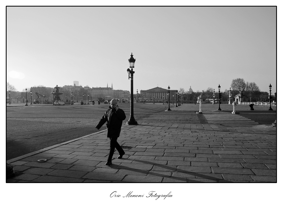
So, I took the advice of mixing the pictures, and I only used the man - not the cars, not the other people crossing the road.
This way I hope that the frankensteinized photo might keep the best of both: the human element adding interest, and the vastness of the square suggesting loneliness.
Well, you let me know. At this point, the choice will be between this frankenstein version, and the #2 - I reckon that #1 with all the closer traffic is not my choice in any case:

_________________
Orio, Administrator
T*
NE CEDE MALIS AUDENTIOR ITO
Ferrania film is reborn! http://www.filmferrania.it/
Support the Ornano film chemicals company and help them survive!
http://forum.mflenses.com/ornano-chemical-products-t55525.html |
|
| Back to top |
|
 |
IAZA


Joined: 16 Apr 2010
Posts: 2587
Location: Indonesia
|
 Posted: Thu May 26, 2011 4:36 am Post subject: Posted: Thu May 26, 2011 4:36 am Post subject: |
 |
|
IAZA wrote:
#2
_________________
nex5, Olympus EPM1, yashica half 14, Canon eos 650 want to see samples of mine? please click My lenses
and My gallery
~Suat~ |
|
| Back to top |
|
 |
poilu

Joined: 26 Aug 2007
Posts: 10472
Location: Greece
Expire: 2019-08-29
|
 Posted: Thu May 26, 2011 5:57 am Post subject: Posted: Thu May 26, 2011 5:57 am Post subject: |
 |
|
poilu wrote:
| Quote: |
| who am I to not try to do the same? |
it's take only one fake to be a faker
_________________
T* |
|
| Back to top |
|
 |
eddieitman


Joined: 12 Apr 2011
Posts: 1246
Location: United Kingdom
|
 Posted: Thu May 26, 2011 6:05 am Post subject: Posted: Thu May 26, 2011 6:05 am Post subject: |
 |
|
eddieitman wrote:
Removing the people on the crossing causes a huge empty space that causes my eyes to only focus on one element thats the person walking. The people on the crossing add balance making my eye focus on the building first and then make the eyes wander and examine the whole scene.
_________________
My web site www.digital-darkroom.weebly.com
Life is like a camera. Focus on what's important, capture the good times, develop from the negatives and if things don't work out, just take another shot. |
|
| Back to top |
|
 |
|
|
