| View previous topic :: View next topic |
| Author |
Message |
Orio

Joined: 24 Feb 2007
Posts: 29545
Location: West Emilia
Expire: 2012-12-04
|
 Posted: Fri Mar 25, 2011 2:04 am Post subject: Cinque Terre 2010, re-edit Posted: Fri Mar 25, 2011 2:04 am Post subject: Cinque Terre 2010, re-edit |
 |
|
Orio wrote:
I have re-edited a few photos from my Cinque Terre tour of 2010:
Vario-Sonnar 28-85:

Distagon 2.8/21:

Distagon 2.8/21:

Vario-Sonnar 100-300:

Vario-Sonnar 100-300:

The original versions are on this page:
http://forum.mflenses.com/cinque-terre-part-3-t32898,highlight,%2Bcinque+%2Bterre.html
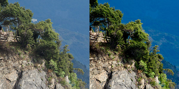
The idea was that of making the images feel more like slides than digital.
And, strange as it might seem, the colours of the sea and the sky in the new versions are more like to what I remember them than in the non-PP version.
_
_________________
Orio, Administrator
T*
NE CEDE MALIS AUDENTIOR ITO
Ferrania film is reborn! http://www.filmferrania.it/
Support the Ornano film chemicals company and help them survive!
http://forum.mflenses.com/ornano-chemical-products-t55525.html
Last edited by Orio on Fri Mar 25, 2011 2:42 am; edited 1 time in total |
|
| Back to top |
|
 |
Himself

Joined: 01 Mar 2007
Posts: 3240
Location: Montreal
Expire: 2013-05-30
|
| Posted: Fri Mar 25, 2011 3:04 am Post subject: |
|
|
Himself wrote:
Quite a difference.
Sometimes PP is necessary.
_________________
Moderator Himself |
|
| Back to top |
|
|
Attila

Joined: 24 Feb 2007
Posts: 57865
Location: Hungary
Expire: 2025-11-18
|
| Posted: Fri Mar 25, 2011 8:49 am Post subject: |
|
|
Attila wrote:
+10 better than ever. Nice, crisp , rocks almost touchable!
_________________
-------------------------------
Items on sale on Ebay
Sony NEX-7 Carl Zeiss Planar 85mm f1.4, Minolta MD 35mm f1.8, Konica 135mm f2.5, Minolta MD 50mm f1.2, Minolta MD 250mm f5.6, Carl Zeiss Sonnar 180mm f2.8
|
|
| Back to top |
|
|
Orio
Joined: 24 Feb 2007
Posts: 29545
Location: West Emilia
Expire: 2012-12-04
|
| Posted: Fri Mar 25, 2011 9:39 am Post subject: |
|
|
Orio wrote:
Thanks for the comments. In fact it's interesting, the images appear crisper but I did not apply any further sharpening, I only worked on the colours and on the black/white points. Which proves something that I always believed, that is, that it is possible to make an image look sharper only with some selective work on the colours and the dynamic range. In fact, after this treatment, it's obvious that I could actually use less sharpening of the original image than what I needed when the image had the duller default colours.
_________________
Orio, Administrator
T*
NE CEDE MALIS AUDENTIOR ITO
Ferrania film is reborn! http://www.filmferrania.it/
Support the Ornano film chemicals company and help them survive!
http://forum.mflenses.com/ornano-chemical-products-t55525.html |
|
| Back to top |
|
|
pich900


Joined: 10 Jun 2007
Posts: 1745
Location: The Netherlands/Zwolle
Expire: 2012-12-27
|
| Posted: Fri Mar 25, 2011 12:27 pm Post subject: |
|
|
pich900 wrote:
Beautiful place, Shining colors and Great lenses as well  ... ...
Lovely serie orio!
_________________
All my lenses are for sale, nikkor, Angenieux, Zeiss etc.....
Regards,
Pascal
-------------------------------------------------------
Nikon D700 |
|
| Back to top |
|
|
danikatia

Joined: 13 Nov 2009
Posts: 653
Location: Cernobbio Italy
Expire: 2013-10-26
|
| Posted: Fri Mar 25, 2011 1:43 pm Post subject: |
|
|
danikatia wrote:
I have not seen as they were before, they seem beautiful, the light is fantastic ...
_________________
Daniele |
|
| Back to top |
|
|
Nikos

Joined: 17 May 2010
Posts: 1077
Location: Greece
Expire: 2015-01-02
|
| Posted: Fri Mar 25, 2011 6:48 pm Post subject: Re: Cinque Terre 2010, re-edit |
|
|
Nikos wrote:
| Orio wrote: |
The idea was that of making the images feel more like slides than digital.
And, strange as it might seem, the colours of the sea and the sky in the new versions are more like to what I remember them than in the non-PP version.
|
I like them a lot, Orio!
Will you try to explain what you did in a different way?
Aimed for more contrast?
The green in the last one is impressive even for color blind people like me...
BTW, this is not fair! I am trying to persuade myself to save money and skip the trip to Cinque Terre for now, and you come up with this post !!
_________________
Νίκος • www.diafragma.gr

Cameras: Canon EOS 5D Mark II, Sony α7R, Sony NEX-5N
MF lenses:
SLR:
Canon TS-E 17mm f/4, Zeiss 2.8/21 ZE, Zeiss 2/28 Contax, Zeiss 2/35 ZE, Zeiss 1.4/50 Contax, Zeiss 1.4/85 Contax, Zeiss Makro 2/100 ZE,
Zeiss 2/135 Contax, Zeiss 2.8/135 Contax, Zeiss Vario-Sonnar 35-70 Contax, Zeiss Vario-Sonnar 100-300 Contax, Zeiss F-Distagon Rollei, Canon FD 24mm f2, Minolta MD Rokkor 35mm f2.8
Rangefinder:
Zeiss 4.5/21 C Biogon ZM, Zeiss 2/35 Biogon ZM, Voigtländer 15mm f/4.5 Heliar L39, Leica Tele-Elmarit 2.8/90mm, Zeiss 2/45 Contax G, Zeiss 2.8/90 Contax G, Canon 50mm 1.8 LTM
AF lenses: Canon 15mm f/2.8 Fisheye, Canon 24-70 f/2.8 L, Canon 70-200 f/2.8 L IS II, Canon 70-200 f/4 L, Canon 300 f/4 L IS, Canon 100 f/2.8 macro
|
|
| Back to top |
|
|
tobbsman

Joined: 25 Jul 2008
Posts: 2578
Location: Austria
|
| Posted: Fri Mar 25, 2011 8:11 pm Post subject: |
|
|
tobbsman wrote:
those are beauties! nicely composed all of them, I like especially #1 with the couple ...
Cheers
Tobias
_________________
Camera Pentax K10D, K20D, Super A
SMC K28 3.5, SMC K24 2.8, SMC K28/2, SMC K50/1.4,SMC A50/1.7, SMC M28/3.5, SMC A 50/1.7, SMC K135 2.5, SMC A50 1.2
SMC A35-105 3.5, SMC A70-210 4, SMC A20 2.8, SMC M28 2.8,K28/3.5 SMC A28 2.8, SMC A100 2.8 Macro, CZJ Flektogon 20 2.8 (MC), 35 2.4 (MC),S.M.C Takumar 85mm 1.8, Helios 44M-4, A.Schacht Travenar 90/2.8, C.Zeiss J. Sonnar 180/2.8
Check out my: 2012 New "Advanced Guide to Panorama Stiching" !
Check out my "Beginner's Guide to Panorama Stiching !
Visit my Asahi and Zeiss MF lens samples database ! |
|
| Back to top |
|
|
poilu
Joined: 26 Aug 2007
Posts: 10472
Location: Greece
Expire: 2019-08-29
|
| Posted: Fri Mar 25, 2011 8:24 pm Post subject: |
|
|
poilu wrote:
I prefer old version, the newer one lose in the shadows, colors get artificial and sharpness look overdone
I prefer edit the curve manually to a S shape, at least colors are not altered
example, in the last pic, background get blue and subtle gradation turn in a uniform green
the white houses even disappear  

_________________
T* |
|
| Back to top |
|
|
Orio
Joined: 24 Feb 2007
Posts: 29545
Location: West Emilia
Expire: 2012-12-04
|
| Posted: Fri Mar 25, 2011 11:01 pm Post subject: |
|
|
Orio wrote:
| poilu wrote: |
I prefer old version, the newer one lose in the shadows, colors get artificial and sharpness look overdone
I prefer edit the curve manually to a S shape, at least colors are not altered
example, in the last pic, background get blue and subtle gradation turn in a uniform green
the white houses even disappear
|
I bombed that house with a digital Tomahawk 
Yes, I see what you mean about the colours. My idea was to do something that could look like a slightly underexposed Provia 100 slide. Of course I know that this means to leave some realism behind. But in fact if you do a Provia slide in that scene, the mountain will look blue, too. 
And if you want to saturate colours in a slide, you get some "closed blacks" (as we say in Italic photo-jargon) unavoidably. But with regards to this, I have to say that I am not a "read all in a photo" person. When blacks help define the mass of an object, or the atmosphere, I take them gladly. In fact that's the main problem I find with HDR images, by taking away the black they make pictures taht are flat and without any mystery.
I agree about the sharpness, that was an unwanted side effect, because I worked on the already developed image - I should have worked on the RAW, or, prepare a new develop with less sharpening to start with.
_________________
Orio, Administrator
T*
NE CEDE MALIS AUDENTIOR ITO
Ferrania film is reborn! http://www.filmferrania.it/
Support the Ornano film chemicals company and help them survive!
http://forum.mflenses.com/ornano-chemical-products-t55525.html |
|
| Back to top |
|
|
Orio
Joined: 24 Feb 2007
Posts: 29545
Location: West Emilia
Expire: 2012-12-04
|
| Posted: Fri Mar 25, 2011 11:16 pm Post subject: Re: Cinque Terre 2010, re-edit |
|
|
Orio wrote:
| nkanellopoulos wrote: |
I like them a lot, Orio!
Will you try to explain what you did in a different way?
Aimed for more contrast? |
OK
my idea was to do in the colour image, what I normally would do in a black and white image: filter colours to select/enhance elements in the image.
I assumed that this could also be (roughly) the result of slide film capturing image through dfferent layers for the colours - some unavoidably are enhanced more than others.
I start with the three couples of primary and secondary
red-green
orange-blue
yellow-purple
and you of course have to keep the 6 colours in mind as a sequence:
purple-red-orange-yellow-green-blue
So I imagined to use a yellow filter in the images. In B&W, that would mean to brighten yellow things a lot, darken purple things a lot, brighten orange and green a bit, darken blue and red a bit.
Of course if you would do that with another colour as filter, you would have to shift accordingly to the colour wheel.
That step would create the "new base" for the image. I then adjusted the saturation individually for the six colours, and to do that I acted psychologically not scientifically. Since both brightening and darkening in a B&W image draw attention on the elements, I did enhance saturation for both the chosen filter colour and it's complementary, and a bit also for the neighbouring colours as well.
Finally, I adjusted the black and white points, to create the typical contrast of a slide (which usually in days with a strong light lose dynamic range at both ends).
I hope the descritpion is clear. You can do this technique in Photoshop, via the Selective Colour tool, but I find it easier to do it in Lightroom.
_
_________________
Orio, Administrator
T*
NE CEDE MALIS AUDENTIOR ITO
Ferrania film is reborn! http://www.filmferrania.it/
Support the Ornano film chemicals company and help them survive!
http://forum.mflenses.com/ornano-chemical-products-t55525.html |
|
| Back to top |
|
|
|
|
|
You cannot post new topics in this forum
You cannot reply to topics in this forum
You cannot edit your posts in this forum
You cannot delete your posts in this forum
You cannot vote in polls in this forum
|