| View previous topic :: View next topic |
| Author |
Message |
Orio

Joined: 24 Feb 2007
Posts: 29545
Location: West Emilia
Expire: 2012-12-04
|
 Posted: Sat Oct 03, 2009 11:19 pm Post subject: [Contax G2] Some Biogon and Planar photos Posted: Sat Oct 03, 2009 11:19 pm Post subject: [Contax G2] Some Biogon and Planar photos |
 |
|
Orio wrote:
Some film and rangefinder photos for a change 
taken with the Contax G2 and Biogon lenses 21mm and 28mm and Planar 45mm.
The film is Ferrania Solaris (colour), converted to B&W because the colours turned out kind of funky.
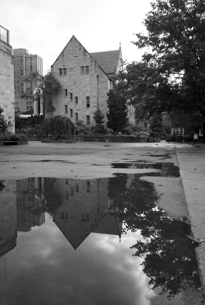
Bologna under the rain (Biogon 21mm):

At a country "sagra" (Planar 45mm):

(Planar 45mm)

(Biogon 28mm)

At another country "sagra" (Biogon 21mm):

(Biogon 21mm)

(Biogon 21mm)

(Biogon 21mm)

_________________
Orio, Administrator
T*
NE CEDE MALIS AUDENTIOR ITO
Ferrania film is reborn! http://www.filmferrania.it/
Support the Ornano film chemicals company and help them survive!
http://forum.mflenses.com/ornano-chemical-products-t55525.html |
|
| Back to top |
|
 |
Attila


Joined: 24 Feb 2007
Posts: 57865
Location: Hungary
Expire: 2025-11-18
|
| Posted: Sat Oct 03, 2009 11:21 pm Post subject: |
|
|
Attila wrote:
Hey I have been there, nice to see again! I like portrait from Monica even if B&W 
_________________
-------------------------------
Items on sale on Ebay
Sony NEX-7 Carl Zeiss Planar 85mm f1.4, Minolta MD 35mm f1.8, Konica 135mm f2.5, Minolta MD 50mm f1.2, Minolta MD 250mm f5.6, Carl Zeiss Sonnar 180mm f2.8
|
|
| Back to top |
|
|
Carlsson


Joined: 26 Jul 2008
Posts: 793
Location: Portugal
|
| Posted: Sun Oct 04, 2009 12:08 am Post subject: |
|
|
Carlsson wrote:
My favourites #1 and #5, the portrait of Monica and #6 for the composition.
Great B+W conversion!
_________________
Contax III, Zeiss Ikon ZM, Contax AX, EOS 5D, R-D1
https://mariaeero.com/contax/ |
|
| Back to top |
|
|
Farside

Joined: 01 Sep 2007
Posts: 6557
Location: Ireland
Expire: 2013-12-27
|
| Posted: Sun Oct 04, 2009 12:34 am Post subject: |
|
|
Farside wrote:
Love the old Landini.
_________________
Dave - Moderator
Camera Fiend and Biograph Operator
If I wanted soot and whitewash I'd be a chimney sweep and house painter.
The Lenses of Farside (click)
BUY FRESH FOMAPAN TO HELP KEEP THE FACTORY ALIVE ---
Foma Campaign topic -
http://forum.mflenses.com/foma-campaign-t55443.html
FOMAPAN on forum -
http://www.mflenses.com/fs.php?sw=Fomapan
Webshop Norway
http://www.fomafoto.com/
Webshop Czech
https://fomaobchod.cz/inshop/scripts/shop.aspx?action=DoChangeLanguage&LangID=4 |
|
| Back to top |
|
|
Laurence

Joined: 26 Mar 2007
Posts: 4809
Location: Western Washington State
Expire: 2016-06-19
|
| Posted: Sun Oct 04, 2009 5:08 am Post subject: |
|
|
Laurence wrote:
Wow, look at the tonality in the tractor image! NICE NICE shot, Orio! I really love the degrees of grays and blacks. The image balances nicely.
_________________
Assent, and you are sane;
Demur,—you ’re straightway dangerous,
And handled with a chain.
Emily Dickinson
Cameras and Lenses in Use:
Yashica Mat 124 w/ Yashinon 80/3.5,
CV Apo-Lanthar 90/3.5SL, (Thank you Klaus),
Pentax 645,
Flek 50,
Pentax-A 150
Pentax-A 120 Macro
Voigtlander Vitomatic I w/Color Skopar 50/2.8
Konica TC and zoom lenses (thanks Carsten)
Contax AX
Yashica ML 50/2
Yashica ML 35/2.8
Carl Zeiss Contax 50/1.4
Tamron Adaptall SP 17/3.5
Tamron Adaptall 28/2.5
Tamron Adaptall SP 300/2.8 LD (IF)
|
|
| Back to top |
|
|
supahmario

Joined: 18 Mar 2009
Posts: 615
Location: Berlin, Germany
|
| Posted: Sun Oct 04, 2009 2:19 pm Post subject: |
|
|
supahmario wrote:
| Laurence wrote: |
| Wow, look at the tonality in the tractor image! NICE NICE shot, Orio! I really love the degrees of grays and blacks. The image balances nicely. |
absolutely what i thought, looking at this picture! great contrast and tonality! simply... WOW!
_________________
EOS 5D, EOS 30
Leica-R: Summicron 2/50
QBM: Distagon 2.8/35
PK: Tokina 3.5/17, Porst 1.2/55
M42: S-M-C Takumar 3.5/24, S-M-C Takumar 1.8/55, CZJ MC Sonnar 3.5/135, Jupiter 21M 4/200
|
|
| Back to top |
|
|
Orio
Joined: 24 Feb 2007
Posts: 29545
Location: West Emilia
Expire: 2012-12-04
|
| Posted: Sun Oct 04, 2009 2:36 pm Post subject: |
|
|
Orio wrote:
Thanks guys!
Making my own B&W prints out of the film has taught me a LOT about how B&W images should be. So now, I feel I have improved in B&W digital conversions, too, thanks to that experience.
_________________
Orio, Administrator
T*
NE CEDE MALIS AUDENTIOR ITO
Ferrania film is reborn! http://www.filmferrania.it/
Support the Ornano film chemicals company and help them survive!
http://forum.mflenses.com/ornano-chemical-products-t55525.html |
|
| Back to top |
|
|
koji

Joined: 21 Jul 2008
Posts: 2106
Location: Hiroshima, Japan
Expire: 2012-12-27
|
| Posted: Sun Oct 04, 2009 2:39 pm Post subject: |
|
|
koji wrote:
Biogon 21 mm rules. 
I have never shot in B&W even converted from color photo,
so these nice photos makes my eyes open wider. Mmmm
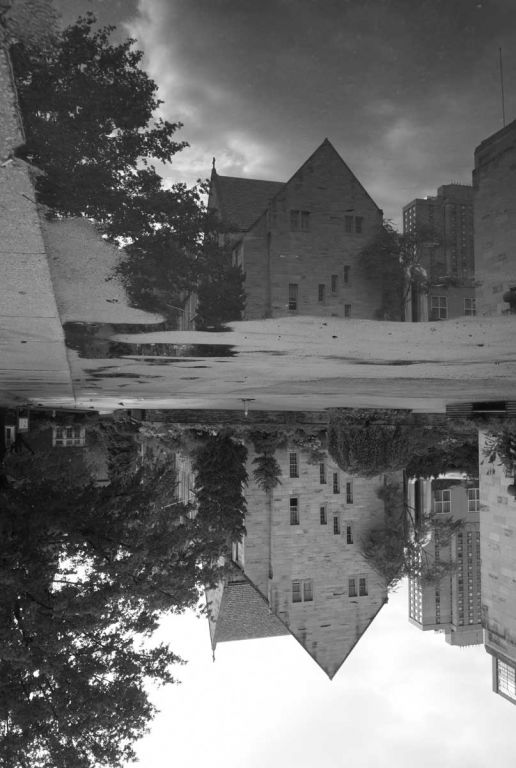
Yesterday's morning shot by G-Biogon 21 mm (click the photo to enlarge please)>
Tonality is good even though I used a simple greyscale mode in PSE.
I should increase more contrast?

_________________
Our Home Page has 18,200 photos in 575 directories today.
Lenses: https://www.pbase.com/kkawakami/top_level_my_lenses |
|
| Back to top |
|
|
Orio
Joined: 24 Feb 2007
Posts: 29545
Location: West Emilia
Expire: 2012-12-04
|
| Posted: Sun Oct 04, 2009 3:17 pm Post subject: |
|
|
Orio wrote:
I like the flipping of the image! 
The contrast of the middle range is the key to good B&W in my opinion. Try the "zeissifier" on your scan - but careful not to burn the sky (or lake, or whatever )
_________________
Orio, Administrator
T*
NE CEDE MALIS AUDENTIOR ITO
Ferrania film is reborn! http://www.filmferrania.it/
Support the Ornano film chemicals company and help them survive!
http://forum.mflenses.com/ornano-chemical-products-t55525.html |
|
| Back to top |
|
|
koji
Joined: 21 Jul 2008
Posts: 2106
Location: Hiroshima, Japan
Expire: 2012-12-27
|
| Posted: Sun Oct 04, 2009 3:32 pm Post subject: |
|
|
koji wrote:
I do not think your "zeissfier" works for PSE (Element), which does not
accept .atn file. I do not know much about PLUGIN files tho.
_________________
Our Home Page has 18,200 photos in 575 directories today.
Lenses: https://www.pbase.com/kkawakami/top_level_my_lenses |
|
| Back to top |
|
|
Orio
Joined: 24 Feb 2007
Posts: 29545
Location: West Emilia
Expire: 2012-12-04
|
| Posted: Sun Oct 04, 2009 3:40 pm Post subject: |
|
|
Orio wrote:
| koji wrote: |
I do not think your "zeissfier" works for PSE (Element), which does not
accept .atn file. I do not know much about PLUGIN files tho. |
ok, then simply use Unsharp Mask filter (if Elements has it) and set threshold to 0, range to anything from 50 to 90 depending on the size of your image, and amount just as much as you like
_________________
Orio, Administrator
T*
NE CEDE MALIS AUDENTIOR ITO
Ferrania film is reborn! http://www.filmferrania.it/
Support the Ornano film chemicals company and help them survive!
http://forum.mflenses.com/ornano-chemical-products-t55525.html |
|
| Back to top |
|
|
koji
Joined: 21 Jul 2008
Posts: 2106
Location: Hiroshima, Japan
Expire: 2012-12-27
|
| Posted: Sun Oct 04, 2009 4:25 pm Post subject: |
|
|
koji wrote:
Thanks for information, Orio. I applied "zeissfiler" method to the original
colour photo, then converted to greyscale. The result>

I don't remember radius (~32) and %(~80) well. More experiment is due.
_________________
Our Home Page has 18,200 photos in 575 directories today.
Lenses: https://www.pbase.com/kkawakami/top_level_my_lenses |
|
| Back to top |
|
|
Orio
Joined: 24 Feb 2007
Posts: 29545
Location: West Emilia
Expire: 2012-12-04
|
| Posted: Sun Oct 04, 2009 4:41 pm Post subject: |
|
|
Orio wrote:
Koji, I have best results when I "zeissify" the B&W (not the original)
This way you can also easier calibrate the amount.
_________________
Orio, Administrator
T*
NE CEDE MALIS AUDENTIOR ITO
Ferrania film is reborn! http://www.filmferrania.it/
Support the Ornano film chemicals company and help them survive!
http://forum.mflenses.com/ornano-chemical-products-t55525.html |
|
| Back to top |
|
|
Laurence
Joined: 26 Mar 2007
Posts: 4809
Location: Western Washington State
Expire: 2016-06-19
|
| Posted: Sun Oct 04, 2009 4:53 pm Post subject: |
|
|
Laurence wrote:
Interesting how the tonality (especially in the tractor image) tends
to increase the three-dimensionality. I would think that the middle
tones would be the paramount influence, because the mid-tones
could be something to "work off of" in increasing or decreasing
the whites and blacks?
Orio, have you found any cause-and-effect as stated above, for
the maniuplation of the mid-tones?
As a side note, I totally agree that it is OBVIOUS that your expertise is
soaring to new levels as you learn and gain insight into the vagaries of
black and white developing.
_________________
Assent, and you are sane;
Demur,—you ’re straightway dangerous,
And handled with a chain.
Emily Dickinson
Cameras and Lenses in Use:
Yashica Mat 124 w/ Yashinon 80/3.5,
CV Apo-Lanthar 90/3.5SL, (Thank you Klaus),
Pentax 645,
Flek 50,
Pentax-A 150
Pentax-A 120 Macro
Voigtlander Vitomatic I w/Color Skopar 50/2.8
Konica TC and zoom lenses (thanks Carsten)
Contax AX
Yashica ML 50/2
Yashica ML 35/2.8
Carl Zeiss Contax 50/1.4
Tamron Adaptall SP 17/3.5
Tamron Adaptall 28/2.5
Tamron Adaptall SP 300/2.8 LD (IF)
|
|
| Back to top |
|
|
koji
Joined: 21 Jul 2008
Posts: 2106
Location: Hiroshima, Japan
Expire: 2012-12-27
|
| Posted: Sun Oct 04, 2009 4:57 pm Post subject: |
|
|
koji wrote:
OOOPS, I re-tried "zeissifing" to B&W. This time 120% and radious 35.

One mystery to me is this, so much of USM applied but B&W photo
does not show much of ill_effect of what you are calling too much USM.
Very interesting experience for me.
_________________
Our Home Page has 18,200 photos in 575 directories today.
Lenses: https://www.pbase.com/kkawakami/top_level_my_lenses |
|
| Back to top |
|
|
Orio
Joined: 24 Feb 2007
Posts: 29545
Location: West Emilia
Expire: 2012-12-04
|
| Posted: Sun Oct 04, 2009 5:14 pm Post subject: |
|
|
Orio wrote:
| koji wrote: |
One mystery to me is this, so much of USM applied but B&W photo
does not show much of ill_effect of what you are calling too much USM.
Very interesting experience for me. |
it's really difficult to set a solid ground, each image tends to react in it's own way... one should always experiment.
_________________
Orio, Administrator
T*
NE CEDE MALIS AUDENTIOR ITO
Ferrania film is reborn! http://www.filmferrania.it/
Support the Ornano film chemicals company and help them survive!
http://forum.mflenses.com/ornano-chemical-products-t55525.html |
|
| Back to top |
|
|
Orio
Joined: 24 Feb 2007
Posts: 29545
Location: West Emilia
Expire: 2012-12-04
|
| Posted: Sun Oct 04, 2009 5:22 pm Post subject: |
|
|
Orio wrote:
| Laurence wrote: |
Interesting how the tonality (especially in the tractor image) tends
to increase the three-dimensionality. I would think that the middle
tones would be the paramount influence, because the mid-tones
could be something to "work off of" in increasing or decreasing
the whites and blacks?
Orio, have you found any cause-and-effect as stated above, for
the maniuplation of the mid-tones? |
Well, I would not say that I have found any cause-effect because I am not an expert, but my observations started from the acknowledgement that setting the white and black points to a B&W image does not prevent it to be "muddified" if the tonal range looks flat/compressed.
What I learned from printing with the enlarger is that the chemical paper does not apply contrast in the way Photoshop thinks contrast is, like auto-contrast that sets the white and black points. The chemical paper sort of boosts the middle range more. Sure you always lose something at both ends when you increase that contrast, but the key point is that an aesthetically wise contrast boosts the medium range "inherent" contrast more than pushing the white and black ends over the limits.
A big part is played by the lens, a lens like the Biogon that I used for the tractor inherently has a lot of microcontrast, which has the visual effect of boosting the middle tones. This is where the "textural" effect that you have appreciated in the image, comes from.
The texture in a black and white photo is appreciated mostly in the micro-contrast that takes place in the middle part of the spectrum.
If you analyze Ansel Adams Yosemite rocks pictures, you will see exactly that.
Shooting B&W with Zeiss lenses makes it easier because they are lenses that natively boost that range in the images. With other lenses that might be more difficult - but still doable.
That's my thoughts, I hope they can help somehow
_________________
Orio, Administrator
T*
NE CEDE MALIS AUDENTIOR ITO
Ferrania film is reborn! http://www.filmferrania.it/
Support the Ornano film chemicals company and help them survive!
http://forum.mflenses.com/ornano-chemical-products-t55525.html |
|
| Back to top |
|
|
|
|
|
You cannot post new topics in this forum
You cannot reply to topics in this forum
You cannot edit your posts in this forum
You cannot delete your posts in this forum
You cannot vote in polls in this forum
|