| View previous topic :: View next topic |
| Author |
Message |
tobbsman


Joined: 25 Jul 2008
Posts: 2578
Location: Austria
|
 Posted: Sat Jul 28, 2012 10:12 pm Post subject: "Island of Terschelling" |
|
Posted: Sat Jul 28, 2012 10:12 pm Post subject: "Island of Terschelling" |
|
|
tobbsman wrote:
Just spend some days on the Dutch island of "Terschelling".
We have experienced some beautiful sunsets ... terrific landscape everywhere ...
- 2,3 and 4 are stiched
#1
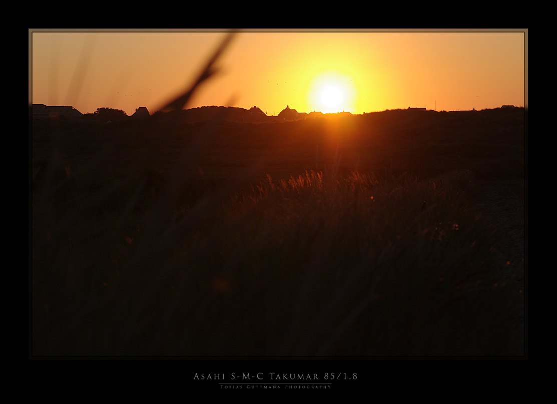
#2
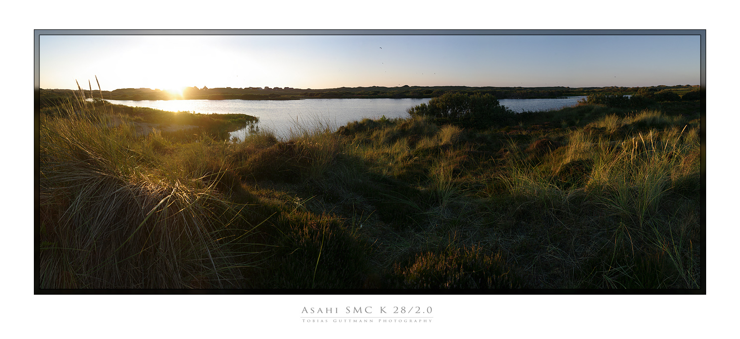
#3
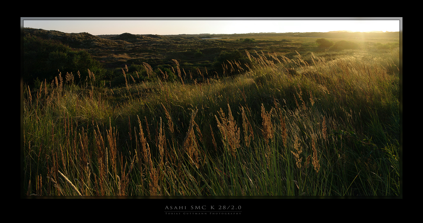
#4
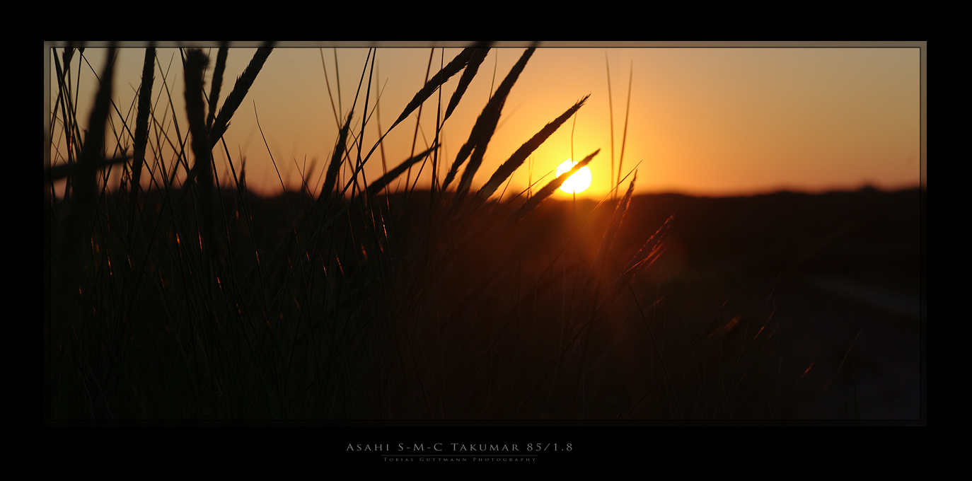
(I am just very consciously breaking the rule of 3 photographs,
but this set just needs to be together  ) )
Cheers
Tobias
_________________
Camera Pentax K10D, K20D, Super A
SMC K28 3.5, SMC K24 2.8, SMC K28/2, SMC K50/1.4,SMC A50/1.7, SMC M28/3.5, SMC A 50/1.7, SMC K135 2.5, SMC A50 1.2
SMC A35-105 3.5, SMC A70-210 4, SMC A20 2.8, SMC M28 2.8,K28/3.5 SMC A28 2.8, SMC A100 2.8 Macro, CZJ Flektogon 20 2.8 (MC), 35 2.4 (MC),S.M.C Takumar 85mm 1.8, Helios 44M-4, A.Schacht Travenar 90/2.8, C.Zeiss J. Sonnar 180/2.8
Check out my: 2012 New "Advanced Guide to Panorama Stiching" !
Check out my "Beginner's Guide to Panorama Stiching !
Visit my Asahi and Zeiss MF lens samples database ! |
|
| Back to top |
|
 |
fish4570

Joined: 06 Jan 2010
Posts: 4514
Location: At the confluence of the Locust Fork of the Warrior River and Black Creek, Alabama
Expire: 2012-03-21
|
Posted: Sat Jul 28, 2012 11:27 pm Post subject: |
|
Posted: Sat Jul 28, 2012 11:27 pm Post subject: |
|
|
fish4570 wrote:
nice works, tobbs ...
_________________
Paul
I chase Light
http://blackcreekjournal.blogspot.com/ |
|
| Back to top |
|
|
David

Joined: 13 Apr 2011
Posts: 1869
Location: Denver, Colorado
Expire: 2013-01-25
|
Posted: Sun Jul 29, 2012 6:27 am Post subject: |
|
Posted: Sun Jul 29, 2012 6:27 am Post subject: |
|
|
David wrote:
Regarding the two sunset images, I prefer the second because the foreground is in focus. In the first, the background is great and sharp, but the blurry grass on the left is distracting. If only the two could be combined.
_________________
http://www.youtube.com/user/hancockDavidM |
|
| Back to top |
|
|
erkie


Joined: 08 Oct 2011
Posts: 308
Location: Missouri
|
Posted: Sun Jul 29, 2012 4:12 pm Post subject: |
|
Posted: Sun Jul 29, 2012 4:12 pm Post subject: |
|
|
erkie wrote:
#3 is especially wonderful for me ! Very nice light 
_________________
I shoot film and meter with digital
Asahi H3v, Praktica FX3, Retina IIa, Spotmatic sp1000, Fujica V2, Yashica lynx5000, Pentax Sf1, Minolta SRT102, Minolta7000i, Pentax MX, Pentax ME, Pentax Kx
lensesM42- Isco Gottingen Westanar 50/2.8, Isco Gottingen Westron 35/2.8, Rikenon 35/2.8, Spiratone Tc 105/2.5, Spiratone Tc 200/4.5, Sankyo Kohki Komura 300/5, Sankyo Kohki Komura 135/3.5, Auto Tak 35/3.5, Super Tak 150/4, S-M-C Tak 50/1.4, S-M-C Tak 28/3.5, SMC Tak 55/2, Mamya Sekor 55/1.8
K- mount- Helios 44-K-4, Jc penny 28/2.8, Da 18-55, Da 55-300, Pentax F 35-70, SMCP M 50/1.4, SMCP M 50/1.7
|
|
| Back to top |
|
|
tobbsman
Joined: 25 Jul 2008
Posts: 2578
Location: Austria
|
Posted: Mon Jul 30, 2012 8:15 am Post subject: |
|
Posted: Mon Jul 30, 2012 8:15 am Post subject: |
|
|
tobbsman wrote:
thanks for commenting guys !
@David
| Quote: |
| If only the two could be combined. |
I think I have both versions of same shot on my SD-card

Could try to stack them together, however this will be not
perfectly working because of the heavily blurred background,
and only two shots ...
Cheers
TObias
_________________
Camera Pentax K10D, K20D, Super A
SMC K28 3.5, SMC K24 2.8, SMC K28/2, SMC K50/1.4,SMC A50/1.7, SMC M28/3.5, SMC A 50/1.7, SMC K135 2.5, SMC A50 1.2
SMC A35-105 3.5, SMC A70-210 4, SMC A20 2.8, SMC M28 2.8,K28/3.5 SMC A28 2.8, SMC A100 2.8 Macro, CZJ Flektogon 20 2.8 (MC), 35 2.4 (MC),S.M.C Takumar 85mm 1.8, Helios 44M-4, A.Schacht Travenar 90/2.8, C.Zeiss J. Sonnar 180/2.8
Check out my: 2012 New "Advanced Guide to Panorama Stiching" !
Check out my "Beginner's Guide to Panorama Stiching !
Visit my Asahi and Zeiss MF lens samples database ! |
|
| Back to top |
|
|
Attila

Joined: 24 Feb 2007
Posts: 57978
Expire: 2025-11-18
|
Posted: Mon Jul 30, 2012 11:36 am Post subject: |
|
Posted: Mon Jul 30, 2012 11:36 am Post subject: |
|
|
Attila wrote:
 wow, wow beautiful! wow, wow beautiful! |
|
| Back to top |
|
|
skida

Joined: 02 Mar 2012
Posts: 1826
Location: North East England
|
Posted: Mon Jul 30, 2012 9:34 pm Post subject: |
|
Posted: Mon Jul 30, 2012 9:34 pm Post subject: |
|
|
skida wrote:
I am not a great fan of sunsets, but 2 and 3 look great with the light shining through the grass. |
|
| Back to top |
|
|
ForenSeil

Joined: 15 Apr 2011
Posts: 2731
Location: Kappeln, Schleswig-Holstein, Germany.
|
Posted: Fri Aug 10, 2012 12:20 am Post subject: |
|
Posted: Fri Aug 10, 2012 12:20 am Post subject: |
|
|
ForenSeil wrote:
To be honest #1 is a bit boring imho, as the silhuette of the skyline is nothing special. But I like #2; technically good and has a good composition and #3 is also good (maybe I would crop a bit from the ground away but I'm not sure) and the last one is also really nice, but I think it would carry a smooth and warm athmosphere better with a little less brightness.
_________________
I'm not a collector, I'm a tester
My camera: Sony A7+Zeiss Sonnar 55/1.8
Current favourite lenses (I have many more):
A few macro-Tominons, Samyang 12/2.8, Noritsu 50.7/9.5, Rodagon 105/5.6 on bellows, Samyang 135/2, Celestron C8 2000mm F10
Most wanted: Samyang 24/1.4, Laowa 100/2.8 2x, Nikon 200/2 ED |
|
| Back to top |
|
|
miran

Joined: 01 Aug 2012
Posts: 1364
Location: Slovenia
|
Posted: Fri Aug 10, 2012 6:58 am Post subject: |
|
Posted: Fri Aug 10, 2012 6:58 am Post subject: |
|
|
miran wrote:
I love all of them except #1. For me it's too dark and the foreground blur is too distracting. #2 is my favourite followed by #3. Would put those two on a wall printed large. Minus the frame, I'm not a fan of those... |
|
| Back to top |
|
|
SonicScot

Joined: 01 Dec 2011
Posts: 2697
Location: Scottish Highlands
|
Posted: Fri Aug 10, 2012 12:44 pm Post subject: |
|
Posted: Fri Aug 10, 2012 12:44 pm Post subject: |
|
|
SonicScot wrote:
The last one is easily my favourite, though I can't explain why.  It just appeals to me more than the others. It just appeals to me more than the others.
_________________
Gary
Currently active gear....
Sony a7
E-M1 Mkll
Rubinar 1000/10 + 2x matched extender
Tamron 500/8 55BB
Sigma 100-300/4
Vivitar Series 1.... 200/3, 70-210/3.5 (V1 by Kiron), 135/2.3, 105/2.5 macro, 90/2.5 macro (Bokina), 90-180/4.5 Flat Field Macro, 28-90mm f/2.8-3.5
Carl Zeiss.... 180/2.8, 135/3.5, 85/1.4, 35/2.4 Flektagon, 21/2.8 Distagon
Nikon.... 55/3.5 micro, 50/1.2
Elicar 90/2.5 V-HQ Macro
Zhongyi Speedmaster 85/1.2
Jupiter-9 85/2
Helios.... 58/2 44-3
Hartblei 45/3.5 Super-Rotator TS-PC
Zenitar 16/2.8 fisheye
Samyang 8/3.5 fisheye
Nodal Ninja 4, Neewer leveling tripod base
Flickr http://www.flickr.com/photos/gazsus/ Website http://garianphotography.co.uk/ |
|
| Back to top |
|
|
Katastrofo
Joined: 26 Feb 2007
Posts: 10405
Location: USA
Expire: 2013-11-19
|
Posted: Fri Aug 10, 2012 10:22 pm Post subject: |
|
Posted: Fri Aug 10, 2012 10:22 pm Post subject: |
|
|
Katastrofo wrote:
| SonicScot wrote: |
| The last one is easily my favourite, though I can't explain why. It just appeals to me more than the others. |
+1 It's about the colors for me, but #2 is a close second. |
|
| Back to top |
|
|
Laurence

Joined: 26 Mar 2007
Posts: 4809
Location: Western Washington State
Expire: 2016-06-19
|
Posted: Fri Aug 10, 2012 10:40 pm Post subject: |
|
Posted: Fri Aug 10, 2012 10:40 pm Post subject: |
|
|
Laurence wrote:
| skida wrote: |
| I am not a great fan of sunsets, but 2 and 3 look great with the light shining through the grass. |
+100 on that comment! Gorgeous!
_________________
Assent, and you are sane;
Demur,—you ’re straightway dangerous,
And handled with a chain.
Emily Dickinson
Cameras and Lenses in Use:
Yashica Mat 124 w/ Yashinon 80/3.5,
CV Apo-Lanthar 90/3.5SL, (Thank you Klaus),
Pentax 645,
Flek 50,
Pentax-A 150
Pentax-A 120 Macro
Voigtlander Vitomatic I w/Color Skopar 50/2.8
Konica TC and zoom lenses (thanks Carsten)
Contax AX
Yashica ML 50/2
Yashica ML 35/2.8
Carl Zeiss Contax 50/1.4
Tamron Adaptall SP 17/3.5
Tamron Adaptall 28/2.5
Tamron Adaptall SP 300/2.8 LD (IF)
|
|
| Back to top |
|
|
tobbsman
Joined: 25 Jul 2008
Posts: 2578
Location: Austria
|
Posted: Sat Aug 11, 2012 2:04 pm Post subject: |
|
Posted: Sat Aug 11, 2012 2:04 pm Post subject: |
|
|
tobbsman wrote:
great comments guys, thanks a lot.
Always interesting to analyze so many different opinions.
Cheers
Tobias
_________________
Camera Pentax K10D, K20D, Super A
SMC K28 3.5, SMC K24 2.8, SMC K28/2, SMC K50/1.4,SMC A50/1.7, SMC M28/3.5, SMC A 50/1.7, SMC K135 2.5, SMC A50 1.2
SMC A35-105 3.5, SMC A70-210 4, SMC A20 2.8, SMC M28 2.8,K28/3.5 SMC A28 2.8, SMC A100 2.8 Macro, CZJ Flektogon 20 2.8 (MC), 35 2.4 (MC),S.M.C Takumar 85mm 1.8, Helios 44M-4, A.Schacht Travenar 90/2.8, C.Zeiss J. Sonnar 180/2.8
Check out my: 2012 New "Advanced Guide to Panorama Stiching" !
Check out my "Beginner's Guide to Panorama Stiching !
Visit my Asahi and Zeiss MF lens samples database ! |
|
| Back to top |
|
|
|
|
|
You cannot post new topics in this forum
You cannot reply to topics in this forum
You cannot edit your posts in this forum
You cannot delete your posts in this forum
You cannot vote in polls in this forum
|