| View previous topic :: View next topic |
| Author |
Message |
RenseH


Joined: 13 Jun 2009
Posts: 570
Location: Zetten - The Netherlands
Expire: 2013-01-14
|
 Posted: Sat May 15, 2010 8:41 am Post subject: Grand Cliché with the SMC Pentax-A 28/2.8 Posted: Sat May 15, 2010 8:41 am Post subject: Grand Cliché with the SMC Pentax-A 28/2.8 |
 |
|
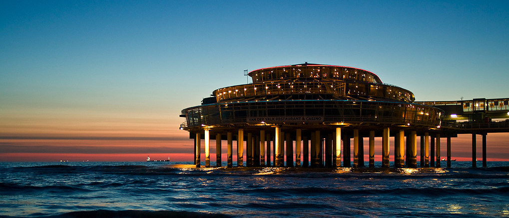
RenseH wrote:
Which happens to be one of my favourite lenses...
But I'd like to know your opinion about these two photos: which one do you like best?


EDIT: Re the comments on the unballanced composition I have (several) other ones with the building (it's the Pier in Scheveningen indeed  ) more in the center. Like this one: ) more in the center. Like this one:

_________________
Rense
My Blog - My Website - My PPG
Last edited by RenseH on Sat May 15, 2010 11:16 am; edited 1 time in total |
|
| Back to top |
|
 |
poilu

Joined: 26 Aug 2007
Posts: 10472
Location: Greece
Expire: 2019-08-29
|
| Posted: Sat May 15, 2010 9:04 am Post subject: |
|
|
poilu wrote:
about same for me, pics are unbalanced to the right, horizon in the middle not the best, reflections doesn't help in the reading so I prefer #1
_________________
T* |
|
| Back to top |
|
|
trifox

Joined: 14 May 2008
Posts: 3614
Location: UK
Expire: 2014-05-29
|
| Posted: Sat May 15, 2010 9:17 am Post subject: |
|
|
trifox wrote:
both are great -
I would go for the number 2 - I like the reflection in the water ..
tf
_________________
Flickr.com |
|
| Back to top |
|
|
womble

Joined: 28 Sep 2009
Posts: 987
Location: Hertfordshire
|
| Posted: Sat May 15, 2010 9:21 am Post subject: |
|
|
womble wrote:
They are both excellent but the second one edges it for me. The central horizon doesn't bother me at all. Breaking 'the rules' in this case works for me.
Best wishes, Kris.
_________________
Kris Lockyear
Digital: Pentax K-3iii
35mm film SLRs: various Pentax bodies from a H2 to a SF7, favourites the MX and LX
Rangefinder: Zeiss Super Ikonta IV, FED2, Zorkii-4, Industar 26m, Jupiter 8, 11 and 12 lenses
Medium format: various folders, Yashica Mat 124 G. Lubitel 2
LF: Horseman LE 5x4 view camera.
MF lenses (favourites) Pentax "K" 200mm f/2.5; "K" 135mm f/2.5; "K" 50mm f/1.2; "K" 35mm f/2; "K" 30mm f/2.8; "K" 28mm f/3.5 shift; "K" 15mm f/3.5; M 100mm f/2.8; M 40mm f/2.8; Jupiter-9 85mm |
|
| Back to top |
|
|
Jieffe

Joined: 04 Nov 2007
Posts: 754
Location: Belgium
|
| Posted: Sat May 15, 2010 9:58 am Post subject: |
|
|
Jieffe wrote:
Same as Womble ... the reflection gives a "plus" to the picture.
And the Pentax 28mm is also one of my fav ! |
|
| Back to top |
|
|
JWH

Joined: 26 Aug 2009
Posts: 120
Location: Netherlands
|
| Posted: Sat May 15, 2010 10:39 am Post subject: |
|
|
JWH wrote:
I like the colours and the pier of Scheveningen is always something. |
|
| Back to top |
|
|
Nesster

Joined: 24 Apr 2008
Posts: 5883
Location: NJ, USA
Expire: 2014-02-20
|
| Posted: Sat May 15, 2010 10:51 am Post subject: |
|
|
Nesster wrote:
The reflection in #2 adds interest, though I agree re. the unbalanced composition, maybe crop the left side some?
The A 28 is one of my favorites as well, for whatever reason it doesn't get the respect some other lenses do, but I find it always very resolute and dependable.
_________________
-Jussi
Camera photos
Print Photographica
|
|
| Back to top |
|
|
RenseH
Joined: 13 Jun 2009
Posts: 570
Location: Zetten - The Netherlands
Expire: 2013-01-14
|
| Posted: Sat May 15, 2010 11:17 am Post subject: |
|
|
RenseH wrote:
Thank you! I added a third one re the comments on the composition!
_________________
Rense
My Blog - My Website - My PPG |
|
| Back to top |
|
|
LucisPictor

Joined: 26 Feb 2007
Posts: 17633
Location: Oberhessen, Germany / Maidstone ('95-'96)
Expire: 2013-12-03
|
| Posted: Sat May 15, 2010 11:50 am Post subject: |
|
|
LucisPictor wrote:
In my eyes nothing is wrong with an "unbalanced" composition if it works as well as in your shots.
The first two show a fantastic exposure and are really "WOW"-shots!
In the third one I don't like that the building on the right is cropped.
_________________
Personal forum activity on pause every now and again (due to job obligations)!
Carsten, former Moderator 
Things ON SALE
Carsten = "KAPCTEH" = "Karusutenu" | T-shirt?.........................My photos from Emilia: http://www.schouler.net/emilia/emilia2011.html
My gear: http://retrocameracs.wordpress.com/ausrustung/
Old list: http://forum.mflenses.com/viewtopic.php?t=65 (Not up-to-date, sorry!) | http://www.lucispictor.de | http://www.alensaweek.wordpress.com |
http://www.retrocamera.de |
|
| Back to top |
|
|
poilu
Joined: 26 Aug 2007
Posts: 10472
Location: Greece
Expire: 2019-08-29
|
| Posted: Sat May 15, 2010 12:00 pm Post subject: |
|
|
poilu wrote:
I prefer #3, it is also brighter than first 2 who look dark in comparison
_________________
T* |
|
| Back to top |
|
|
Heathcliff

Joined: 24 Jan 2010
Posts: 58
|
| Posted: Sat May 15, 2010 12:00 pm Post subject: |
|
|
Heathcliff wrote:
There is much more drama in the first one i think !
_________________
www.macabre.net
www.lechatquifume.com - the funkiest home video editor on earth |
|
| Back to top |
|
|
poilu
Joined: 26 Aug 2007
Posts: 10472
Location: Greece
Expire: 2019-08-29
|
| Posted: Sat May 15, 2010 12:02 pm Post subject: |
|
|
poilu wrote:
| Carsten wrote: |
| In the third one I don't like that the building on the right is cropped |
Google 'pier Scheveningen' and review pics, it is not a easy subject to crop
_________________
T* |
|
| Back to top |
|
|
LucisPictor
Joined: 26 Feb 2007
Posts: 17633
Location: Oberhessen, Germany / Maidstone ('95-'96)
Expire: 2013-12-03
|
| Posted: Sat May 15, 2010 1:57 pm Post subject: |
|
|
LucisPictor wrote:
| poilu wrote: |
| Carsten wrote: |
| In the third one I don't like that the building on the right is cropped |
Google 'pier Scheveningen' and review pics, it is not a easy subject to crop |
That's why I prefer the way it is cropped in the first two shots.
_________________
Personal forum activity on pause every now and again (due to job obligations)!
Carsten, former Moderator
Things ON SALE
Carsten = "KAPCTEH" = "Karusutenu" | T-shirt?.........................My photos from Emilia: http://www.schouler.net/emilia/emilia2011.html
My gear: http://retrocameracs.wordpress.com/ausrustung/
Old list: http://forum.mflenses.com/viewtopic.php?t=65 (Not up-to-date, sorry!) | http://www.lucispictor.de | http://www.alensaweek.wordpress.com |
http://www.retrocamera.de |
|
| Back to top |
|
|
LucisPictor
Joined: 26 Feb 2007
Posts: 17633
Location: Oberhessen, Germany / Maidstone ('95-'96)
Expire: 2013-12-03
|
| Posted: Sat May 15, 2010 1:58 pm Post subject: |
|
|
LucisPictor wrote:
| poilu wrote: |
| I prefer #3, it is also brighter than first 2 who look dark in comparison |
Well, it's an evening shot, right? It can be, no it must be a bit darker to convey the right mood.
There is no important area in the shot that is completely black at least on my monitor.
_________________
Personal forum activity on pause every now and again (due to job obligations)!
Carsten, former Moderator
Things ON SALE
Carsten = "KAPCTEH" = "Karusutenu" | T-shirt?.........................My photos from Emilia: http://www.schouler.net/emilia/emilia2011.html
My gear: http://retrocameracs.wordpress.com/ausrustung/
Old list: http://forum.mflenses.com/viewtopic.php?t=65 (Not up-to-date, sorry!) | http://www.lucispictor.de | http://www.alensaweek.wordpress.com |
http://www.retrocamera.de |
|
| Back to top |
|
|
Minolfan

Joined: 30 Dec 2008
Posts: 3438
Location: Netherlands
|
| Posted: Sat May 15, 2010 2:34 pm Post subject: |
|
|
Minolfan wrote:
And so I prefer the second. |
|
| Back to top |
|
|
lulalake

Joined: 22 Apr 2007
Posts: 1191
Location: Near Austin Texas
Expire: 2011-11-18
|
| Posted: Sat May 15, 2010 2:37 pm Post subject: |
|
|
lulalake wrote:
| trifox wrote: |
both are great -
I would go for the number 2 - I like the reflection in the water ..
tf |
Agreed. |
|
| Back to top |
|
|
karabud

Joined: 11 Apr 2009
Posts: 843
Location: Lodz
|
| Posted: Sat May 15, 2010 6:20 pm Post subject: |
|
|
karabud wrote:
Great - i prefer first than second 
_________________
http://www.flickr.com/photos/atheist_lenses/
old
http://www.flickr.com/photos/piotr_p/ |
|
| Back to top |
|
|
RenseH
Joined: 13 Jun 2009
Posts: 570
Location: Zetten - The Netherlands
Expire: 2013-01-14
|
| Posted: Sat May 15, 2010 8:51 pm Post subject: |
|
|
RenseH wrote:
Thanks again for your opinions! Hardly united eh?
_________________
Rense
My Blog - My Website - My PPG |
|
| Back to top |
|
|
tobbsman

Joined: 25 Jul 2008
Posts: 2578
Location: Austria
|
| Posted: Sat May 15, 2010 10:15 pm Post subject: |
|
|
tobbsman wrote:
#1 more restful and to the point (the restaurant is the subject)
#2 a more funky style, great reflection
I decide for #1
Cheers
TObias
_________________
Camera Pentax K10D, K20D, Super A
SMC K28 3.5, SMC K24 2.8, SMC K28/2, SMC K50/1.4,SMC A50/1.7, SMC M28/3.5, SMC A 50/1.7, SMC K135 2.5, SMC A50 1.2
SMC A35-105 3.5, SMC A70-210 4, SMC A20 2.8, SMC M28 2.8,K28/3.5 SMC A28 2.8, SMC A100 2.8 Macro, CZJ Flektogon 20 2.8 (MC), 35 2.4 (MC),S.M.C Takumar 85mm 1.8, Helios 44M-4, A.Schacht Travenar 90/2.8, C.Zeiss J. Sonnar 180/2.8
Check out my: 2012 New "Advanced Guide to Panorama Stiching" !
Check out my "Beginner's Guide to Panorama Stiching !
Visit my Asahi and Zeiss MF lens samples database ! |
|
| Back to top |
|
|
fish4570

Joined: 06 Jan 2010
Posts: 4514
Location: At the confluence of the Locust Fork of the Warrior River and Black Creek, Alabama
Expire: 2012-03-21
|
| Posted: Sun May 16, 2010 3:39 am Post subject: |
|
|
fish4570 wrote:
No. 1.
_________________
Paul
I chase Light
http://blackcreekjournal.blogspot.com/ |
|
| Back to top |
|
|
Tom in Delaware
Joined: 17 Apr 2010
Posts: 42
Location: Delaware, USA
|
| Posted: Tue May 18, 2010 1:00 am Post subject: |
|
|
Tom in Delaware wrote:
No. 2 is the best in my opinion. Having the horizon closer to the center is a non-issue since the visual point of interest is the building and you have that closer to the 1/3 line. Having the center of the building a bit off center is better composition, the reflection really makes that image. Nice! |
|
| Back to top |
|
|
propellor

Joined: 29 Apr 2010
Posts: 205
Location: Amsterdam
|
| Posted: Tue May 18, 2010 3:43 pm Post subject: |
|
|
propellor wrote:
No1. is better colour and contrastwise. The horizon is to high though.
If you crop the underside halfway through the black wave, the pier pops out of the picture. The reflection in No2 distracts from the object.
Mooie dag en lucht. |
|
| Back to top |
|
|
propellor
Joined: 29 Apr 2010
Posts: 205
Location: Amsterdam
|
| Posted: Tue May 18, 2010 3:47 pm Post subject: |
|
|
propellor wrote:
I mean like this:
 |
|
| Back to top |
|
|
|
|
|
You cannot post new topics in this forum
You cannot reply to topics in this forum
You cannot edit your posts in this forum
You cannot delete your posts in this forum
You cannot vote in polls in this forum
|


