| View previous topic :: View next topic |
| Author |
Message |
David

Joined: 13 Apr 2011
Posts: 1869
Location: Denver, Colorado
Expire: 2013-01-25
|
 Posted: Wed Aug 15, 2012 7:02 am Post subject: The Chicago Project Posted: Wed Aug 15, 2012 7:02 am Post subject: The Chicago Project |
 |
|
David wrote:
For the first time in 18 months, I have no idea where to put a thread. So, here seems as good a spot as any. In April I went to Chicago and took printouts of a number of my girlfriend's father's slides from when he lived there from 1971 to 1973. The aim was to them compare the city then and now. So, the first image was taken with his (then, now my) Pentax Spotmatic II and 50mm 1:1.4 Takumar on Ekachrome, Fujichrome, or Agfachrome film. I'm not sure which. The second image is mine from April, Pentax K-7, Sigma 35-80mm.
1

2

I had in my mind the idea, for months now, to somehow blend the two images. I loaded the images into a stack and tried to get Photoshop to blend them. It didn't like the slightly different perspectives. Some free transform work, though, and the images layered enough for Photoshop to give me these two results.
3

4

Both those images are fairly displeasing to look at, though. The results are not up to how I imagined the image blend, so I decided to manually blend the images. I used the eraser tool, at various sizes, with opacities ranging from 7% to 65%. To remove the sky in the new image, I used 85% and two passes. Most of the work was done at 30%.
5

The idea was to create a 'seamless' image blend where the two shots became one and elements from 41 years apart merged into one image. Some elements would be solid (e.g., the people on the left from 1971) and others ephemeral (e.g., the lamps left of the people from 1971.) The cars posed a challenge and I decided to have them merge together, neither year's offering being fully material nor fully ephemeral.
In sum, I'm fairly pleased with the third result as an experiment and artistic exploration. On my trip I managed to get eight total shot replictions. In the coming weeks, I'll share others as I finish them.
_________________
http://www.youtube.com/user/hancockDavidM |
|
| Back to top |
|
 |
yinyangbt


Joined: 08 Oct 2010
Posts: 1973
Location: Romania
Expire: 2012-12-27
|
 Posted: Wed Aug 15, 2012 11:03 am Post subject: Posted: Wed Aug 15, 2012 11:03 am Post subject: |
 |
|
yinyangbt wrote:
Interesting idea !
at first sight one can say : " Wow , why did thy let go the film and invented the digital instead ?"
The problem is that you had a big amount of difference in light quality here apart from the (slightly) different perspective .Not speaking about the cars that gived you much trouble to get rid off.
All in all ,interesting attempt. I am curious about the other merged pictures you'll post .It's a fair amount of work and artistic effort.
PS Maybe you should put this thread in "Techniques" ?
_________________
Cheers , Teo
http://photo.net/photodb/member-photos?user_id=5778915 |
|
| Back to top |
|
 |
Orio

Joined: 24 Feb 2007
Posts: 29545
Location: West Emilia
Expire: 2012-12-04
|
 Posted: Wed Aug 15, 2012 11:10 am Post subject: Posted: Wed Aug 15, 2012 11:10 am Post subject: |
 |
|
Orio wrote:
I think it was a good idea to re-photograph the same place after many years, the comparison is always interesting!
I'm not so sure about the "mix" thing - of course if the light colour and direction were the same, that would have helped the task.
_________________
Orio, Administrator
T*
NE CEDE MALIS AUDENTIOR ITO
Ferrania film is reborn! http://www.filmferrania.it/
Support the Ornano film chemicals company and help them survive!
http://forum.mflenses.com/ornano-chemical-products-t55525.html |
|
| Back to top |
|
 |
David

Joined: 13 Apr 2011
Posts: 1869
Location: Denver, Colorado
Expire: 2013-01-25
|
 Posted: Thu Aug 16, 2012 5:27 am Post subject: Posted: Thu Aug 16, 2012 5:27 am Post subject: |
 |
|
David wrote:
I had some time tonight to work on some more Chicago Project photos. Here are the new additions.
1

In 1971, Chicago opened the Michigan Street Bridge (now called the DuSable Bridge.) This was the original shot and features a super spiffy 70s car. More importantly, it features some guy pointing at some other guy.
2

Here's the shots from this April. Same location, slightly different angle.
3

When Photoshop merged the two files (after some resizing and realignment), this resulted. I was particularly displeased with this result as it made the two 70s guys look like ghosts and cut out the 2012 people on the bridge. But it did merge the sky and new skyscraper, which I really liked and went back to change in my version. (I do my manual adaptations first so I don't pollute my vision with Photoshop's blending.)
4

Here is my version, which keeps the much more detailed version of the bridge tower face from the 2012 shot. However, I did put the shadows from the 1971 image into the merged shot. I also made sure to keep all the people from both images.
5

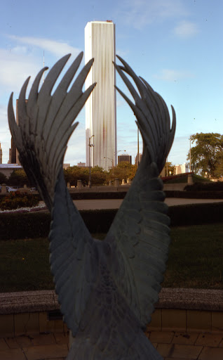
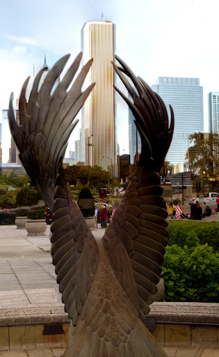
From the south end of Millenium Park, this silly statue shot (I really find the framing here silly, but it also gave me a shot I'd never have taken to play around with) showed substantial change in the city's skyline.
6

This 2012 re-shoot is slightly off angle and pitch (check the tile crack location in the lower left for the imperfect angle and the height of the Standard Oil Building between the wings for the pitch error (very slight).
7

Photoshop's merge here was not great, leaving ghosts for the buildings. I like the ghosts somewhat (seen in the next image), but not enough for it to be ALL of the buildings. This just looks like a ghost town through a light fog.
8

I made the buildings between the eagle's wings ghosts, but tried otherwise to make the area left of the statue represent the 1971 image and the area to the right the 2012 image. Each side has a few elements from the other picture. The area between the wings is intentionally a blending region for the two images.
9

This image pairing presented the greatest challenge as I couldn't get exactly where the image was taken.
10

I was about 15 feet to the right, maybe a bit less.
11

I actually kind of like this one more than the one I came up with.
12

I like how the cop blends into the old picture well, but the sky is very poorly done, so I may re-do this one. It's simply not an acceptable result.
13

In addition to being much different lighting, this image was taken at a different season, so I wanted to merge the image's Christmas tree with the new image.
14

I think I actually got this shot the closest to spot-on. It took next to not geometry changing to align.
15

I'm really not sure what Photoshop was thinking here...
16

It's not perfect, but not the most unpleasing result, either.
_________________
http://www.youtube.com/user/hancockDavidM |
|
| Back to top |
|
 |
miran


Joined: 01 Aug 2012
Posts: 1364
Location: Slovenia
|
 Posted: Thu Aug 16, 2012 6:55 am Post subject: Posted: Thu Aug 16, 2012 6:55 am Post subject: |
 |
|
miran wrote:
That's a great project. I'm thinking of doing something similar here where I live. A company has printed a few books with old postcards (up to about 100 years old) from my area and I was thinking I'd try to find the locations where they were taken and take comparison shots. See how things have changed.  |
|
| Back to top |
|
 |
|
|
|
You cannot post new topics in this forum
You cannot reply to topics in this forum
You cannot edit your posts in this forum
You cannot delete your posts in this forum
You cannot vote in polls in this forum
|
