| View previous topic :: View next topic |
| Author |
Message |
Orio

Joined: 24 Feb 2007
Posts: 29545
Location: West Emilia
Expire: 2012-12-04
|
 Posted: Wed Apr 18, 2012 3:41 am Post subject: Small Emilian towns (part 1): Guastalla Posted: Wed Apr 18, 2012 3:41 am Post subject: Small Emilian towns (part 1): Guastalla |
 |
|
Orio wrote:
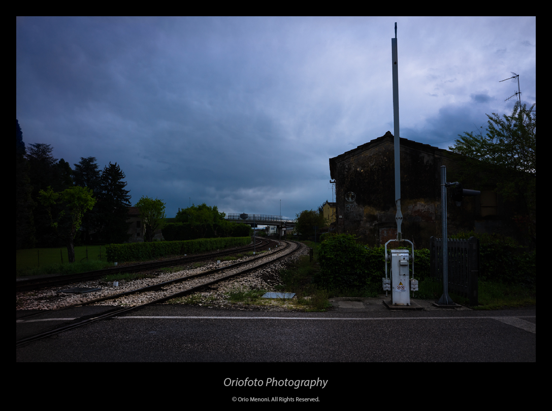
First series of a macroseries.
This series shows the town of Guastalla.
Founded by Etruscans, it reached the maximum splendor under the domination of the Gonzaga in the Renaissance.
Today, it is the Emilian district with the highest number of extra-EU immigrants (Pakistani and Indians the largest communities).
The main piazza was used by director Bernardo Bertolucci as set for an important scene of his movie "900" (1976).
All photos here captured with M9. Lenses are detailed above the pictures.
Thanks for viewing.
#1 - Voigtländer Snapshot-Skopar 4/25 (L39)
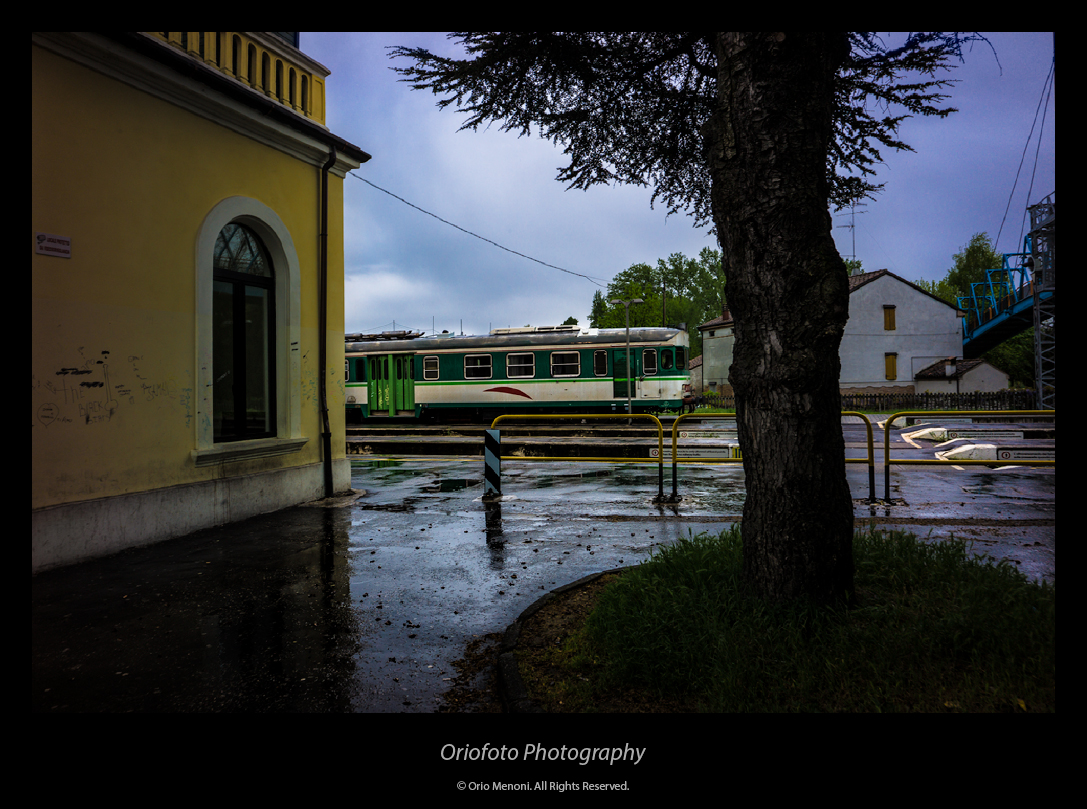
#2 - Voigtländer Snapshot-Skopar 4/25 (L39)
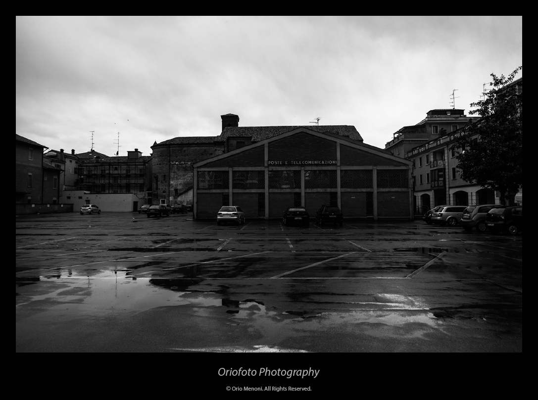
#3 - Voigtländer Snapshot-Skopar 4/25 (L39)
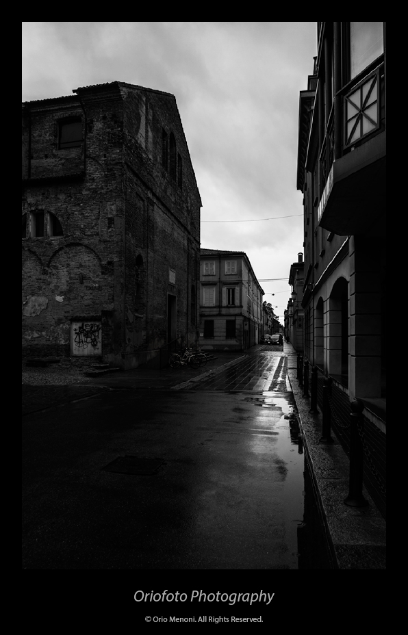
#4 - Voigtländer Snapshot-Skopar 4/25 (L39)
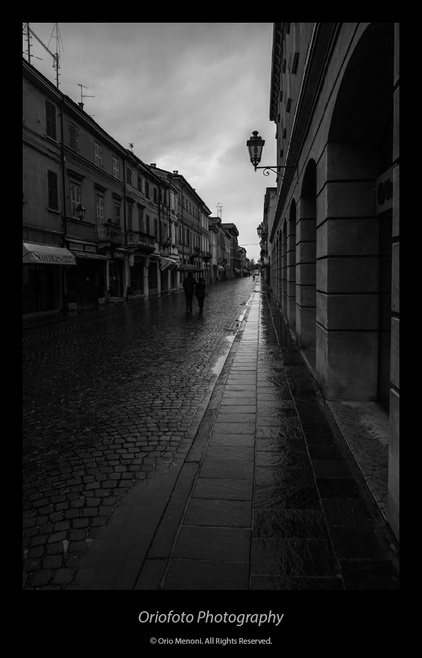
#5 - Voigtländer Snapshot-Skopar 4/25 (L39)
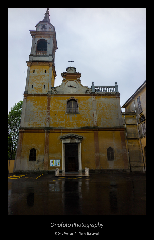
#6 - Voigtländer Snapshot-Skopar 4/25 (L39)

#7 - Voigtländer Snapshot-Skopar 4/25 (L39)
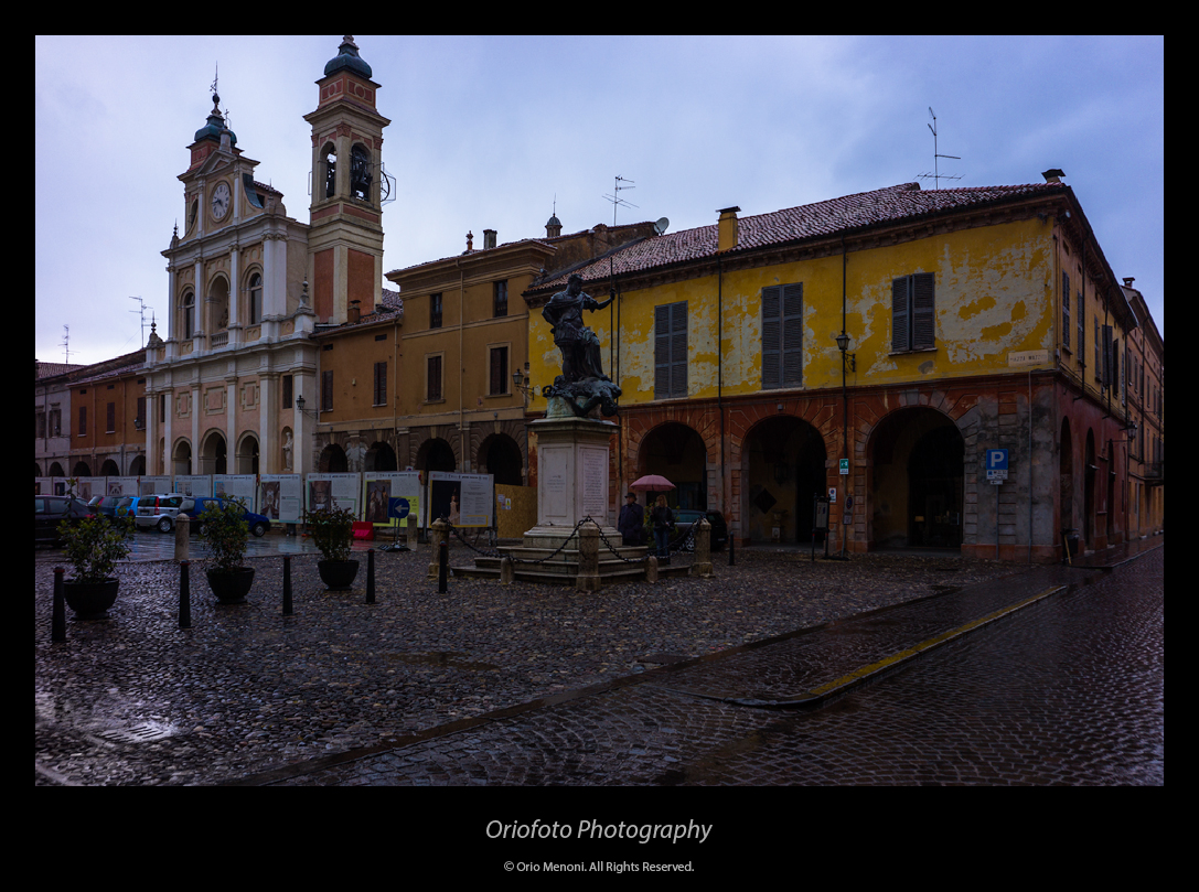
#8 - Carl Zeiss C Sonnar T* 1.5/50 ZM

#9 - Carl Zeiss C Sonnar T* 1.5/50 ZM
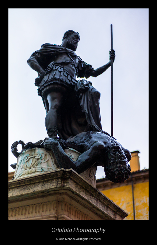
#10 - Carl Zeiss C Sonnar T* 1.5/50 ZM
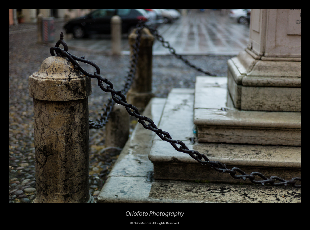
#11 - Carl Zeiss C Sonnar T* 1.5/50 ZM
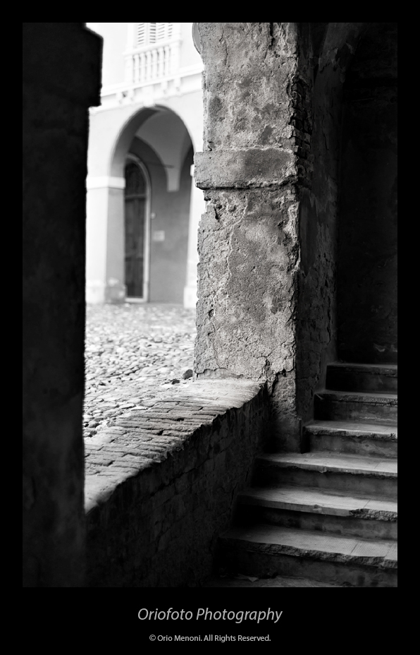
#12 - Voigtländer Snapshot-Skopar 4/25 (L39)
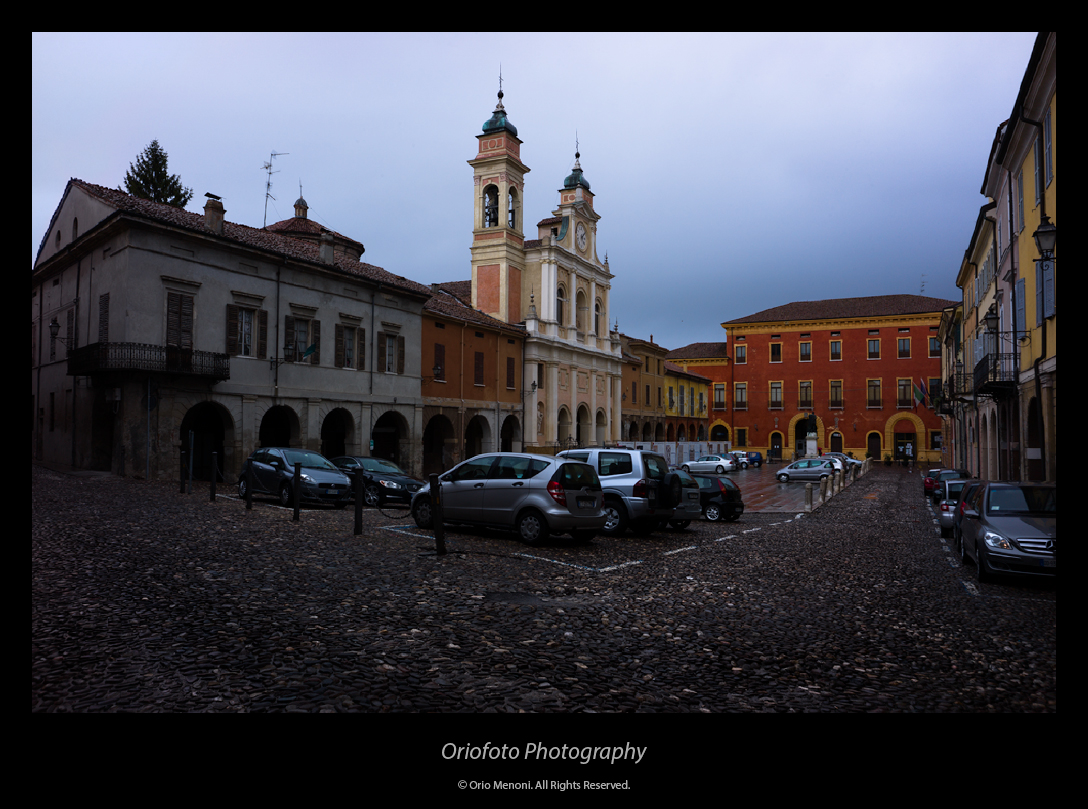
#14 - Voigtländer Snapshot-Skopar 4/25 (L39)
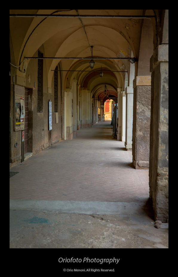
#15 - Voigtländer Snapshot-Skopar 4/25 (L39)
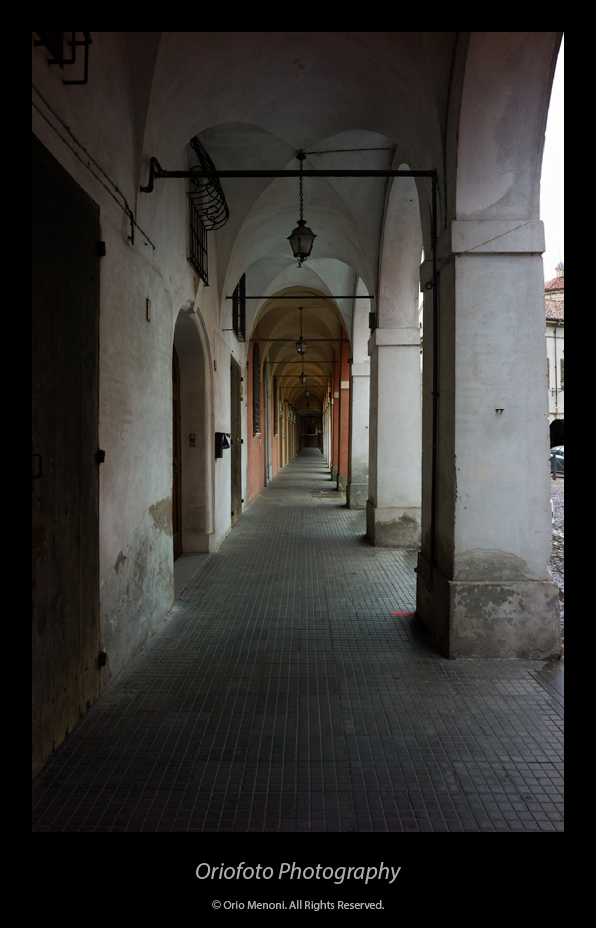
#16 - Voigtländer Snapshot-Skopar 4/25 (L39)
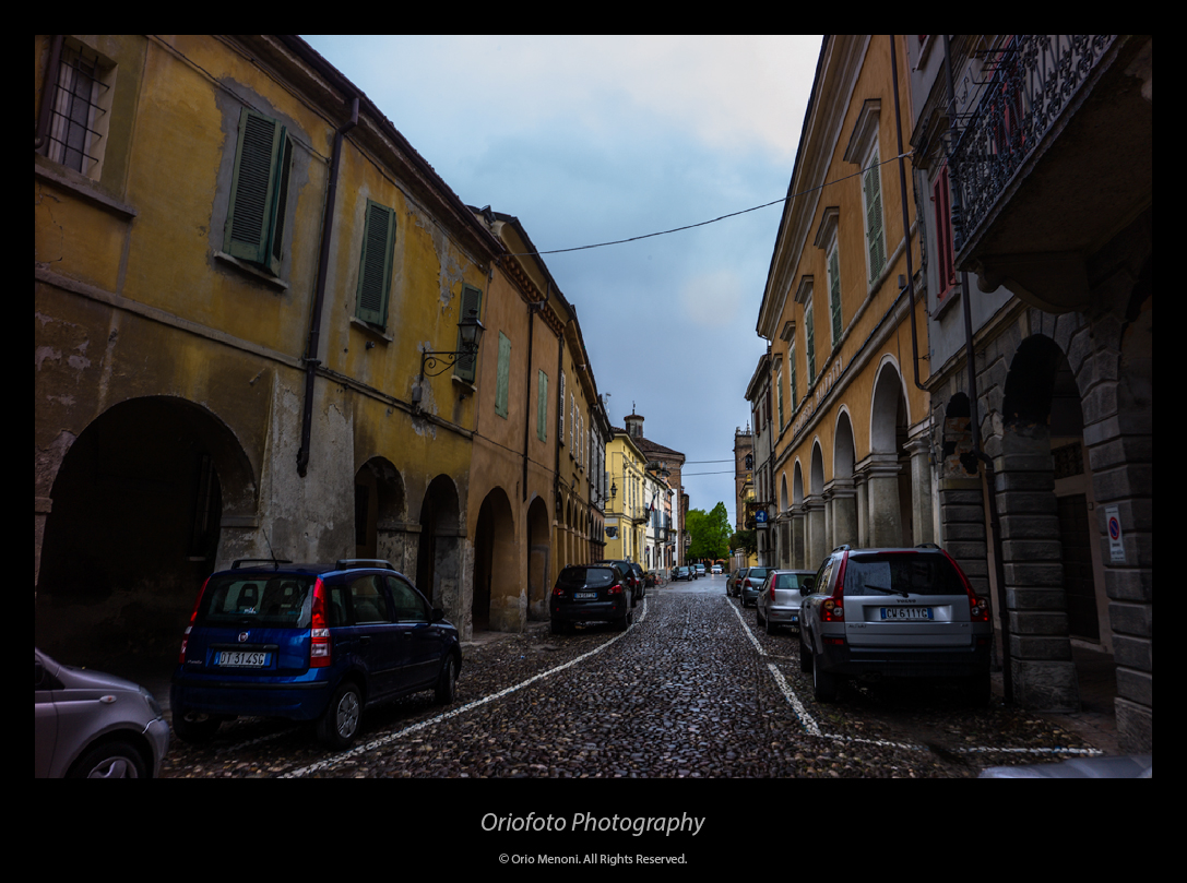
#18 - Voigtländer Snapshot-Skopar 4/25 (L39)
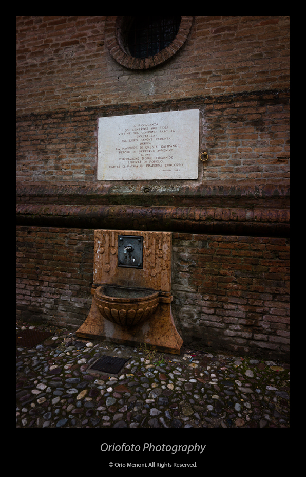
#19 - Voigtländer Snapshot-Skopar 4/25 (L39)
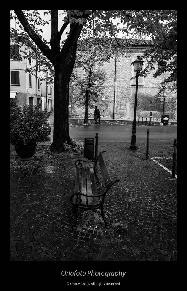
#20 - Voigtländer Snapshot-Skopar 4/25 (L39)
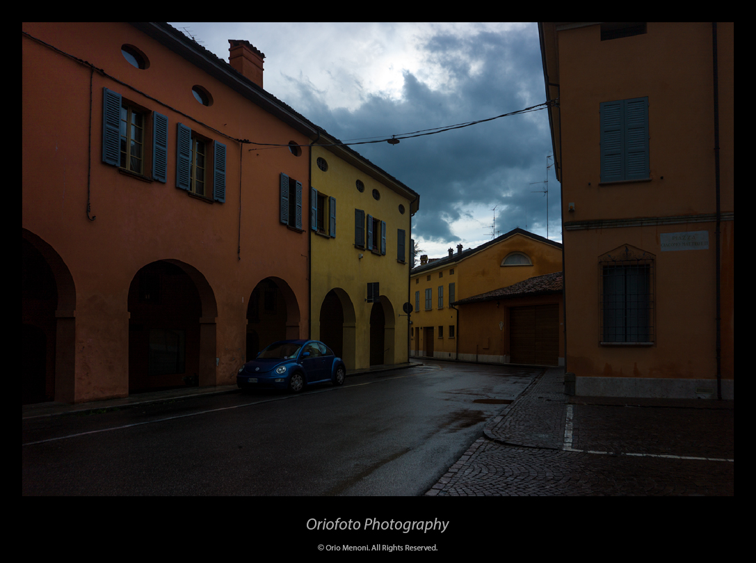
#21 - Voigtländer Snapshot-Skopar 4/25 (L39)
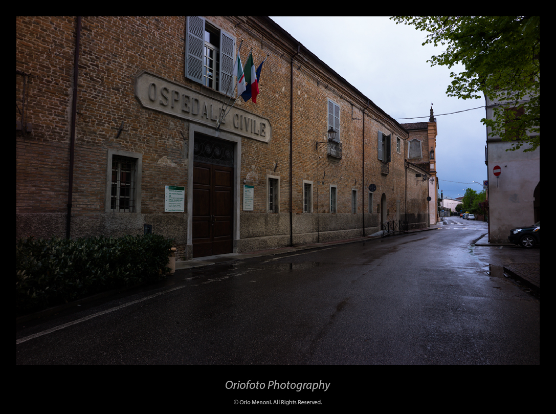
#22 - Voigtländer Snapshot-Skopar 4/25 (L39)
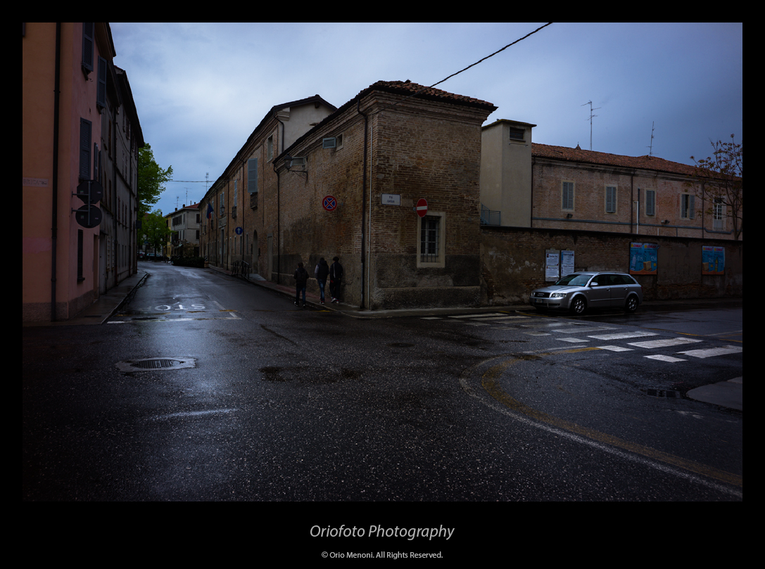
#23 - Voigtländer Snapshot-Skopar 4/25 (L39)
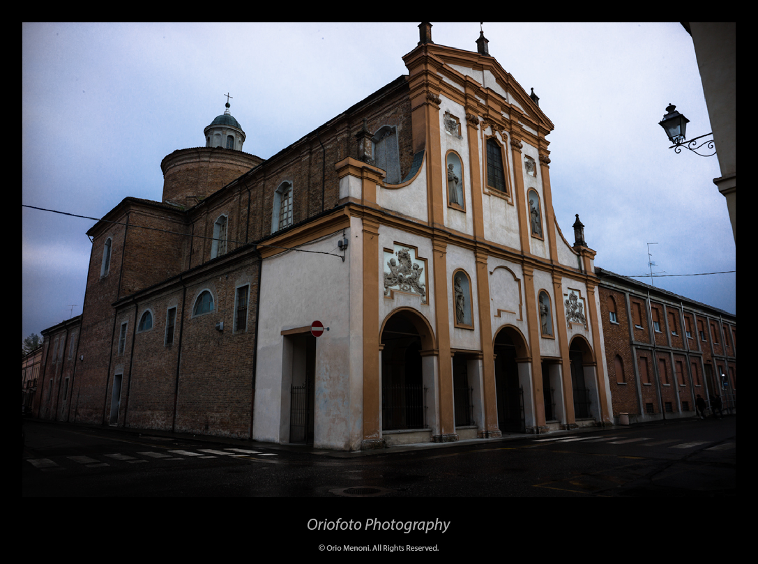
#24 - Voigtländer Snapshot-Skopar 4/25 (L39)
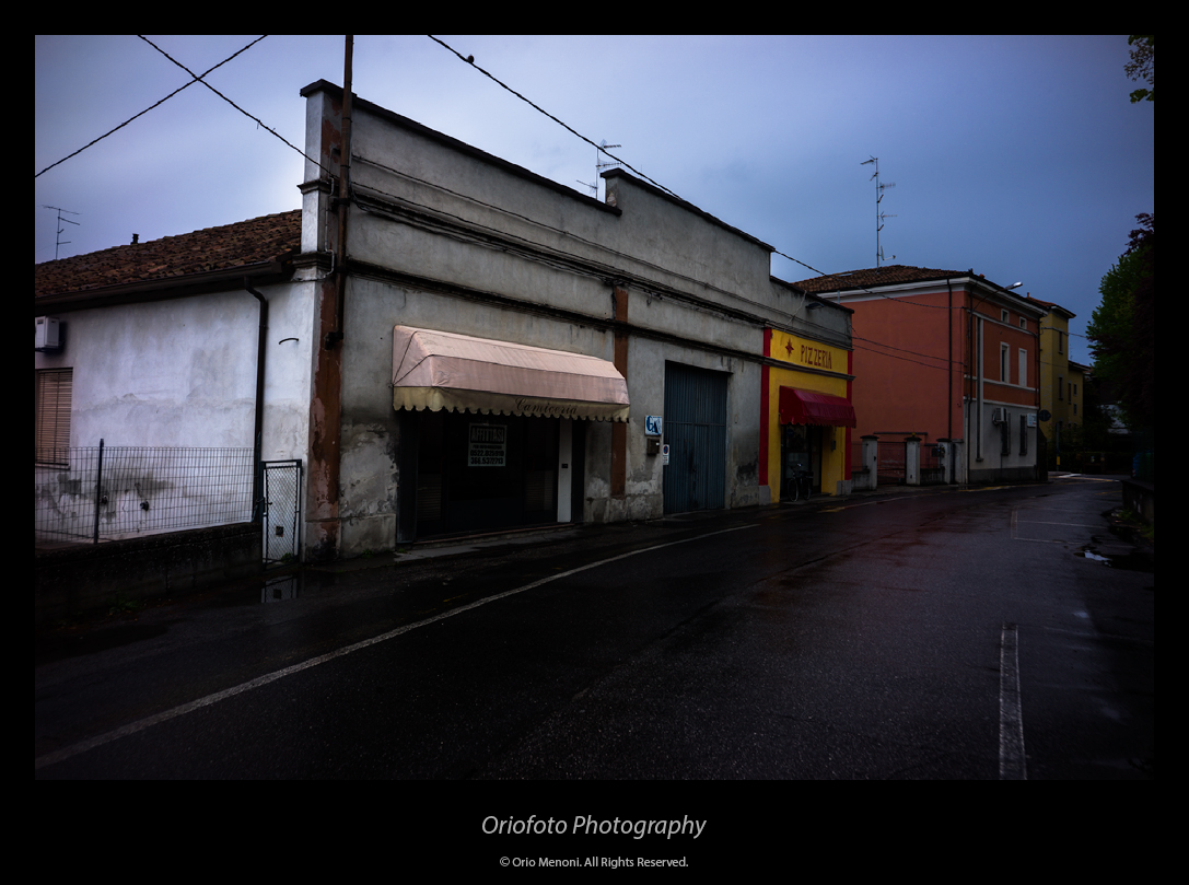
#25 - Voigtländer Snapshot-Skopar 4/25 (L39)
_________________
Orio, Administrator
T*
NE CEDE MALIS AUDENTIOR ITO
Ferrania film is reborn! http://www.filmferrania.it/
Support the Ornano film chemicals company and help them survive!
http://forum.mflenses.com/ornano-chemical-products-t55525.html |
|
| Back to top |
|
 |
patrickh


Joined: 23 Aug 2007
Posts: 8551
Location: Oregon
Expire: 2011-11-18
|
 Posted: Wed Apr 18, 2012 5:19 am Post subject: Posted: Wed Apr 18, 2012 5:19 am Post subject: |
 |
|
patrickh wrote:
Usual brilliant series Orio. Are they to be published anywhere?
patrickh
_________________
DSLR: Nikon D300 Nikon D200 Nex 5N
MF Zooms: Kiron 28-85/3.5, 28-105/3.2, 75-150/3.5, Nikkor 50-135/3.5 AIS // MF Primes: Nikkor 20/4 AI, 24/2 AI, 28/2 AI, 28/2.8 AIS, 28/3.5 AI, 35/1.4 AIS, 35/2 AIS, 35/2.8 PC, 45/2.8 P, 50/1.4 AIS, 50/1.8 AIS, 50/2 AI, 55/2.8 AIS micro, 55/3.5 AI micro, 85/2 AI, 100/2,8 E, 105/1,8 AIS, 105/2,5 AIS, 135/2 AIS, 135/2.8 AIS, 200/4 AI, 200/4 AIS micro, 300/4.5 AI, 300/4.5 AI ED, Arsat 50/1.4, Kiron 28/2, Vivitar 28/2.5, Panagor 135/2.8, Tamron 28/2.5, Tamron 90/2.5 macro, Vivitar 90/2.5 macro (Tokina) Voigtlander 90/3.5 Vivitar 105/2.5 macro (Kiron) Kaleinar 100/2.8 AI Tamron 135/2.5, Vivitar 135/2.8CF, 200/3.5, Tokina 400/5,6
M42: Vivitar 28/2.5, Tamron 28/2.5, Formula5 28/2.8, Mamiya 28/2.8, Pentacon 29/2.8, Flektogon 35/2.4, Flektogon 35/2.8, Takumar 35/3.5, Curtagon 35/4, Takumar 50/1.4, Volna-6 50/2.8 macro, Mamiya 50/1.4, CZJ Pancolar 50/1,8, Oreston 50/1.8, Takumar 50/2, Industar 50/3.5, Sears 55/1.4, Helios 58/2, Jupiter 85/2, Helios 85/1.5, Takumar 105/2.8, Steinheil macro 105/4.5, Tamron 135/2.5, Jupiter 135/4, CZ 135/4, Steinheil Culminar 135/4,5, Jupiter 135/3.5, Takumar 135/3.5, Tair 135/2.8, Pentacon 135/2.8, CZ 135/2.8, Taika 135/3.5, Takumar 150/4, Jupiter 200/4, Takumar 200/4
Exakta: Topcon 100/2.8(M42), 35/2.8, 58/1.8, 135/2.8, 135/2.8 (M42), Kyoei Acall 135/3.5
C/Y: Yashica 28/2.8, 50/1.7, 135/2.8, Zeiss Planar 50/1.4, Distagon 25/2.8
Hexanon: 28/3.5, 35/2.8, 40/1.8, 50/1.7, 52/1.8, 135/3.2, 135/3.5, 35-70/3.5, 200/3.5
P6 : Mir 38 65/3.5, Biometar 80/2.8, Kaleinar 150/2.8, Sonnar 180/2.8
Minolta SR: 28/2.8, 28/3.5, 35/2.8, 45/2, 50/2, 58/1.4, 50/1.7, 135/2.8, 200/3.5
RF: Industar 53/2.8, Jupiter 8 50/2
Enlarg: Rodagon 50/5,6, 80/5,6, 105/5.6, Vario 44-52/4, 150/5.6 180/5.6 El Nikkor 50/2,8,63/2.8,75/4, 80/5,6, 105/5.6, 135/5.6 Schneider 60/5.6, 80/5.6, 80/4S,100/5.6S,105/5.6,135/5.6, 135/5.6S, 150/5.6S, Leica 95/4 |
|
| Back to top |
|
 |
pich900


Joined: 10 Jun 2007
Posts: 1745
Location: The Netherlands/Zwolle
Expire: 2012-12-27
|
 Posted: Wed Apr 18, 2012 6:56 am Post subject: Posted: Wed Apr 18, 2012 6:56 am Post subject: |
 |
|
pich900 wrote:
That's a lovely serie, I especially like the colours rendering and the perfect rainy day's atmosphere from your shots......may be a little bit underexposed on some images  ... ...
_________________
All my lenses are for sale, nikkor, Angenieux, Zeiss etc.....
Regards,
Pascal
-------------------------------------------------------
Nikon D700 |
|
| Back to top |
|
 |
Excalibur


Joined: 19 Jul 2009
Posts: 5017
Location: UK
Expire: 2014-04-21
|
 Posted: Wed Apr 18, 2012 7:50 am Post subject: Posted: Wed Apr 18, 2012 7:50 am Post subject: |
 |
|
Excalibur wrote:
Orio's usual high standard with interesting subjects, and at difficult conditions.
_________________
Canon A1, AV1, T70 & T90, EOS 300 and EOS300v, Chinon CE and CP-7M. Contax 139, Fuji STX-2, Konica Autoreflex TC, FS-1, FT-1, Minolta X-700, X-300, XD-11, SRT101b, Nikon EM, FM, F4, F90X, Olympus OM2, Pentax S3, Spotmatic, Pentax ME super, Praktica TL 5B, & BC1, , Ricoh KR10super, Yashica T5D, Bronica Etrs, Mamiya RB67 pro AND drum roll:- a Sony Nex 3
.........past gear Tele Rolleiflex and Rollei SL66.
Many lenses from good to excellent. |
|
| Back to top |
|
 |
Jesito


Joined: 24 Aug 2007
Posts: 5745
Location: Olivella, Catalonia, (Spain)
Expire: 2015-01-07
|
 Posted: Wed Apr 18, 2012 8:32 am Post subject: Posted: Wed Apr 18, 2012 8:32 am Post subject: |
 |
|
Jesito wrote:
Thanks for sharing, Orio!.
I love the landscapes of the Emilia-Romana, those small villages, castles, hills...
I have to go back there sometime, there are plenty of photographic targets there 
Regards.
Jes.
_________________
Jesito, Moderator 
Jesito's backsack:
Zooms Sigma 70-300, Tamron 35-135 and 70-210 short, 70-210 long, 28-70 CF Macro, 35-70, 35-80, Vivitar 70-210 KA, Tamron 70-250.
Fixed Industar-50, , Tamron 24mm, Tamron 135mm, Sands Hunter 135mm, Pancolar 50mm, Volna-3, many Exakta lenses
DSLR SIGMA SD9 & SD14, EOS 5D, Sony A700 and NEXF3, Oly E-330, E-400, E-450, E-1
TLR/6x6/645 YashicaMat, Petri 6x45, Nettar, Franka Solida, Brilliant
SLR Minolta X300, Fuji STX II, Praktica VLC3, Pentax P30t, EXA500, EXA 1A, Spotmatic(2), Chinon CM-4S, Ricoh, Contax, Konica TC-X , Minolta 5000, 7000i, 3Sxi, EOS 500 and CX
Rangefinders Chinon 35EE, Konica C35 auto, Canonet 28, Yashica Lynx, FED-2, Yashica electro 35, Argus C3 & C4, Regula Cita III, Voigtlander Vitoret (many), Welta Welti-I, Kodak Signette 35, Zorki-4, Bessa-R & L, Minolta Weathermatic, olympus XA2
Compact Film Konica C35V, Voigtlander Vitorets, Canon Prima Super 105, Olympus XA2 and XA3
Compact Digital Olympus C-5050, Aiptek Slim 3000, Canon Powershot A540, Nikon 5200, SIGMA DP1s, Polaroid X530, IXUS55, Kodak 6490, Powershot G9 and G10
CSCCanon EOS-M, Samsung NX100 and NX210, Lumix G5, NEX-F3 |
|
| Back to top |
|
 |
Ultrapix

Joined: 06 Jan 2012
Posts: 577
Location: Italy
|
 Posted: Wed Apr 18, 2012 8:59 am Post subject: Posted: Wed Apr 18, 2012 8:59 am Post subject: |
 |
|
Ultrapix wrote:
Nice work, but I wouldn't expect to sell those pictures at the "pro-loco" (the local tourist board)  |
|
| Back to top |
|
 |
Orio

Joined: 24 Feb 2007
Posts: 29545
Location: West Emilia
Expire: 2012-12-04
|
 Posted: Wed Apr 18, 2012 9:01 am Post subject: Posted: Wed Apr 18, 2012 9:01 am Post subject: |
 |
|
Orio wrote:
| patrickh wrote: |
Usual brilliant series Orio. Are they to be published anywhere?
patrickh |
Thanks Patrick. Yes, in my dreams  
| pich900 wrote: |
That's a lovely serie, I especially like the colours rendering and the perfect rainy day's atmosphere from your shots......may be a little bit underexposed on some images  ... ... |
Thanks Pascal. Rainy day images require some more care than sunny day images, but I think they're worth it.
Rather than underexposed (in which case the white would turn grey), I would say that many photos were exposed
for the lights, yes. That's part of my "rainy day style" if you would like to put it that way 
| Excalibur wrote: |
| Orio's usual high standard with interesting subjects, and at difficult conditions. |
Thanks much, Excalibur!
I consider this type of day (rainy with high clouds in motion) a blessing for the photographer.
| Jesito wrote: |
Thanks for sharing, Orio!.
I love the landscapes of the Emilia-Romana, those small villages, castles, hills...
I have to go back there sometime, there are plenty of photographic targets there 
Regards.
Jes. |
Thanks Jes. I'd love to meet you again, too. You know that you're always welcome here 
_________________
Orio, Administrator
T*
NE CEDE MALIS AUDENTIOR ITO
Ferrania film is reborn! http://www.filmferrania.it/
Support the Ornano film chemicals company and help them survive!
http://forum.mflenses.com/ornano-chemical-products-t55525.html |
|
| Back to top |
|
 |
poilu

Joined: 26 Aug 2007
Posts: 10472
Location: Greece
Expire: 2019-08-29
|
 Posted: Wed Apr 18, 2012 9:13 am Post subject: Posted: Wed Apr 18, 2012 9:13 am Post subject: |
 |
|
poilu wrote:
nice series, great colors under bad weather
personally, I prefer to have a white sky than a dark background
skopar need cornerfix to clean the magenta tint
_________________
T* |
|
| Back to top |
|
 |
Orio

Joined: 24 Feb 2007
Posts: 29545
Location: West Emilia
Expire: 2012-12-04
|
 Posted: Wed Apr 18, 2012 9:24 am Post subject: Posted: Wed Apr 18, 2012 9:24 am Post subject: |
 |
|
Orio wrote:
| poilu wrote: |
skopar need cornerfix to clean the magenta tint |
Actually, most of it is fault of my colour processing. I quite pushed the magenta in most photos
in order to obtain the kind of cold look that I wanted.
If you look at photo #14, there is no colour processing there, and you can see, that magenta in the corner
is not even discernible.
It must be there, of course (otherwise it would not show when pushed), but under normal condition,
it's not a problem.
_________________
Orio, Administrator
T*
NE CEDE MALIS AUDENTIOR ITO
Ferrania film is reborn! http://www.filmferrania.it/
Support the Ornano film chemicals company and help them survive!
http://forum.mflenses.com/ornano-chemical-products-t55525.html |
|
| Back to top |
|
 |
iangreenhalgh1


Joined: 18 Mar 2011
Posts: 15679
Expire: 2014-01-07
|
 Posted: Wed Apr 18, 2012 9:37 am Post subject: Posted: Wed Apr 18, 2012 9:37 am Post subject: |
 |
|
iangreenhalgh1 wrote:
10, 11, 15, 16, 19, I really like.
Some of the early ones prior to 10 I find a little dark for my tastes.
Is the Snapshot-Skopar an old Voigtlander or a modern Cosina one?
_________________
I don't care who designed it, who made it or what country it comes from - I just enjoy using it! |
|
| Back to top |
|
 |
berraneck


Joined: 24 May 2009
Posts: 972
Location: prague, czech republic
|
 Posted: Wed Apr 18, 2012 9:48 am Post subject: Posted: Wed Apr 18, 2012 9:48 am Post subject: |
 |
|
berraneck wrote:
orio your photos always makes me wanting to make a trip to northern italy:)
_________________
equipment doesn´t count, good photographs do |
|
| Back to top |
|
 |
rbelyell


Joined: 13 Oct 2009
Posts: 4269
Location: somewhere in the mountains of central NY
Expire: 2014-01-31
|
 Posted: Wed Apr 18, 2012 12:16 pm Post subject: Posted: Wed Apr 18, 2012 12:16 pm Post subject: |
 |
|
rbelyell wrote:
wow! what a great series--i feel like i travelled there myself. i didnt know you had the skopar...what a great FL for FF digital street shots. i'm curious about your thoughts on this lens. i really love it on digital, and while i enjoy it on film, i've been a little disappointed with my fiom results. i shoot it mostly hyperfocally on film and i just dont get the clarity i get from digital. its probably me, but i cant figure it out.
tony
_________________
Epson RD1 + Elmarit 21/2.8; Summarit 50/1.5; Summarit 75/2.5; Elmar-c 90/4; Sankyo Komura 135/2.8, Hektor 135/4.5; Braun Paxina 29 6x6; Photax Boyer Paris; Holga 120 Pano
GREAT STUFF FOR SALE:
Contax T
Hasselblad XPan + 45/4, 90/4
Kodak Retina Reflex IV + full set of Schneider Krueznach lenses
Mercury 2 half frame 35mm
Kodak Pro slr/n
Fuji GM670+100/3.5+65/8!
Praktisix 6x6 medium format + ZeissBiometar 120/2.8
Bessa T 101 Anniversary Edition in Navy Blue
Mamiya Six Folder with Zuiko 75/3.5
Adaptall: Tamron SP 28-85 macro
Cameras: Canon IX
PM for more complete descriptions/pix. All in great shape!
_________________________
'buy me a drink, sing me a song,
take me as i come 'cause i can't stay long' |
|
| Back to top |
|
 |
LucisPictor


Joined: 26 Feb 2007
Posts: 17633
Location: Oberhessen, Germany / Maidstone ('95-'96)
Expire: 2013-12-03
|
 Posted: Wed Apr 18, 2012 1:56 pm Post subject: Posted: Wed Apr 18, 2012 1:56 pm Post subject: |
 |
|
LucisPictor wrote:
Amazing series, Orio. Photos that recall memories.
I like it that you did not only show the "beautiful" sides, but also the decay which as such has a beauty in its own.
Thanks for sharing!
| berraneck wrote: |
| orio your photos always makes me wanting to make a trip to northern italy:) |
You should go there. It's definitely worth it!
_________________
Personal forum activity on pause every now and again (due to job obligations)!
Carsten, former Moderator 
Things ON SALE
Carsten = "KAPCTEH" = "Karusutenu" | T-shirt?.........................My photos from Emilia: http://www.schouler.net/emilia/emilia2011.html
My gear: http://retrocameracs.wordpress.com/ausrustung/
Old list: http://forum.mflenses.com/viewtopic.php?t=65 (Not up-to-date, sorry!) | http://www.lucispictor.de | http://www.alensaweek.wordpress.com |
http://www.retrocamera.de |
|
| Back to top |
|
 |
skida


Joined: 02 Mar 2012
Posts: 1826
Location: North East England
|
 Posted: Wed Apr 18, 2012 2:51 pm Post subject: Posted: Wed Apr 18, 2012 2:51 pm Post subject: |
 |
|
skida wrote:
Some marvellous shots in that series, Orio, but I am now getting paranoid about my monitor because they look a shade dark. Does this mean all the photos I have posted look washed out? |
|
| Back to top |
|
 |
Aanything


Joined: 27 Aug 2011
Posts: 2187
Location: Piacenza, Italy
Expire: 2014-05-30
|
 Posted: Wed Apr 18, 2012 3:02 pm Post subject: Posted: Wed Apr 18, 2012 3:02 pm Post subject: |
 |
|
Aanything wrote:
Amazing series.
The exposition looks just perfect for my eyes/monitor combo, it really gives the feel of these rainy days 'round here.
I'm looking forward to see next town.
_________________
C&C and editing of my pics are always welcome
Samples from my lenses
My gear
My Flickr |
|
| Back to top |
|
 |
Ultrapix

Joined: 06 Jan 2012
Posts: 577
Location: Italy
|
 Posted: Wed Apr 18, 2012 3:51 pm Post subject: Posted: Wed Apr 18, 2012 3:51 pm Post subject: |
 |
|
Ultrapix wrote:
| skida wrote: |
| Some marvellous shots in that series, Orio, but I am now getting paranoid about my monitor because they look a shade dark. Does this mean all the photos I have posted look washed out? |
My monitor(s) are well calibrated, and I see these pictures dark, too; it's almost impossible, for instance, to detect in several points were ends the frame and starts the picture; BTW, looks obvious to me that it's a wanted choice, that adds mood to otherwise less meaningful subjects. |
|
| Back to top |
|
 |
LucisPictor


Joined: 26 Feb 2007
Posts: 17633
Location: Oberhessen, Germany / Maidstone ('95-'96)
Expire: 2013-12-03
|
 Posted: Wed Apr 18, 2012 4:16 pm Post subject: Posted: Wed Apr 18, 2012 4:16 pm Post subject: |
 |
|
LucisPictor wrote:
| Ultrapix wrote: |
| skida wrote: |
| Some marvellous shots in that series, Orio, but I am now getting paranoid about my monitor because they look a shade dark. Does this mean all the photos I have posted look washed out? |
My monitor(s) are well calibrated, and I see these pictures dark, too; it's almost impossible, for instance, to detect in several points were ends the frame and starts the picture; BTW, looks obvious to me that it's a wanted choice, that adds mood to otherwise less meaningful subjects. |
Colours, contrast and brightness are perfect here on my display!
_________________
Personal forum activity on pause every now and again (due to job obligations)!
Carsten, former Moderator 
Things ON SALE
Carsten = "KAPCTEH" = "Karusutenu" | T-shirt?.........................My photos from Emilia: http://www.schouler.net/emilia/emilia2011.html
My gear: http://retrocameracs.wordpress.com/ausrustung/
Old list: http://forum.mflenses.com/viewtopic.php?t=65 (Not up-to-date, sorry!) | http://www.lucispictor.de | http://www.alensaweek.wordpress.com |
http://www.retrocamera.de |
|
| Back to top |
|
 |
Ultrapix

Joined: 06 Jan 2012
Posts: 577
Location: Italy
|
 Posted: Wed Apr 18, 2012 4:49 pm Post subject: Posted: Wed Apr 18, 2012 4:49 pm Post subject: |
 |
|
Ultrapix wrote:
| LucisPictor wrote: |
Colours, contrast and brightness are perfect here on my display! |
Hopefully a screen capture is more useful than 1000 words 

I would say that the lower picture is "perfect" as usually said; do you see the upper one similar in exposure? |
|
| Back to top |
|
 |
skida


Joined: 02 Mar 2012
Posts: 1826
Location: North East England
|
 Posted: Wed Apr 18, 2012 4:58 pm Post subject: Posted: Wed Apr 18, 2012 4:58 pm Post subject: |
 |
|
skida wrote:
I agree with you, the lower one is fine but the upper looks quite dark. |
|
| Back to top |
|
 |
Ultrapix

Joined: 06 Jan 2012
Posts: 577
Location: Italy
|
 Posted: Wed Apr 18, 2012 5:03 pm Post subject: Posted: Wed Apr 18, 2012 5:03 pm Post subject: |
 |
|
Ultrapix wrote:
| skida wrote: |
| I agree with you, the lower one is fine but the upper looks quite dark. |
Yes, but it is supposed that it's the author choice  a little dark, but cool. a little dark, but cool. |
|
| Back to top |
|
 |
Orio

Joined: 24 Feb 2007
Posts: 29545
Location: West Emilia
Expire: 2012-12-04
|
 Posted: Wed Apr 18, 2012 5:17 pm Post subject: Posted: Wed Apr 18, 2012 5:17 pm Post subject: |
 |
|
Orio wrote:
Guys,
thanks for the comments! I'll try to answer individually.
But first, about the "dark photos".
I have to say, that I am quite impressed by the amount of astonishment that is apparently caused by my photos;
It makes me wonder if for some this is the first time that they see a dark photo 
Concern about monitor calibration is a good concern to have, so I'd like to reassure those who are concerned first.
In the guide to the galleries, I posted test images that are useful if you are in doubt
about the calibration of your monitor. I load them here too, for your convenience.
Let's begin with this first image:

In order to have your monitor decently calibrated, you must be able to distinguish all the different luminance boxes
of the image above. If you are not able to tell them all apart, you need to tweak your brightness and contrast settings.
The above image is a coarse one; enough to ensure a basic "workable" monitor.
Ideally, however, you should be able to distinguish all the levels of this following picture:
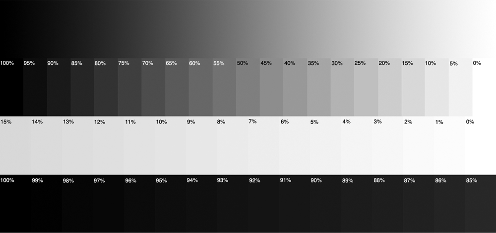
If you can't set your monitor to distinguish all the levels of the second image, don't despair: it's quite a torture test for most consumer
monitors, that do not have such a wide dynamic range. Just be content to distinguish as many as you can, and in any case
make sure that you see perfectly the first table.
About my photos: like I already said, I exposed them "for the lights". Which gergally means that I did care about the highlights,
and not so much about the shadows.
There is a main reason for that: I kept my photos dark, because it was a dark day! 
I don't like to artificially brighten days. I like to keep the mood of the moment, be it as it really was, or as I did feel it.
Average exposure creates average photographs.
Lapalissian? Perhaps, but also true.
Some photos benefit from an average exposure; some photos don't.
This is part of the aesthetical choices that every photographer has to make. I mean a photographer that wants to be in control.
Today's cameras are sophisticated enough to take control if you prefer them to: just activate the autopilot.
A good camera of today will give good average photographs.
If someone's idea of photography is that all photos should be average, then it's possible to go that way.
I prefer to take my choices. 
_________________
Orio, Administrator
T*
NE CEDE MALIS AUDENTIOR ITO
Ferrania film is reborn! http://www.filmferrania.it/
Support the Ornano film chemicals company and help them survive!
http://forum.mflenses.com/ornano-chemical-products-t55525.html |
|
| Back to top |
|
 |
LucisPictor


Joined: 26 Feb 2007
Posts: 17633
Location: Oberhessen, Germany / Maidstone ('95-'96)
Expire: 2013-12-03
|
 Posted: Wed Apr 18, 2012 5:18 pm Post subject: Posted: Wed Apr 18, 2012 5:18 pm Post subject: |
 |
|
LucisPictor wrote:
The first one is darker than the second one. But the subject is different, it needs to be darker to show the rainy condition.
And dark does not mean "vanished in black".
I can still see the whole tonality in the first picture of your screenshots.
_________________
Personal forum activity on pause every now and again (due to job obligations)!
Carsten, former Moderator 
Things ON SALE
Carsten = "KAPCTEH" = "Karusutenu" | T-shirt?.........................My photos from Emilia: http://www.schouler.net/emilia/emilia2011.html
My gear: http://retrocameracs.wordpress.com/ausrustung/
Old list: http://forum.mflenses.com/viewtopic.php?t=65 (Not up-to-date, sorry!) | http://www.lucispictor.de | http://www.alensaweek.wordpress.com |
http://www.retrocamera.de |
|
| Back to top |
|
 |
LucisPictor


Joined: 26 Feb 2007
Posts: 17633
Location: Oberhessen, Germany / Maidstone ('95-'96)
Expire: 2013-12-03
|
 Posted: Wed Apr 18, 2012 5:20 pm Post subject: Posted: Wed Apr 18, 2012 5:20 pm Post subject: |
 |
|
LucisPictor wrote:
Orio, in your diagrammes, the only thing I cannot distinguish is the 0% from the the 1% black in the second picture, third row from top on the right.
That's why I am really satisfied with my display.
_________________
Personal forum activity on pause every now and again (due to job obligations)!
Carsten, former Moderator 
Things ON SALE
Carsten = "KAPCTEH" = "Karusutenu" | T-shirt?.........................My photos from Emilia: http://www.schouler.net/emilia/emilia2011.html
My gear: http://retrocameracs.wordpress.com/ausrustung/
Old list: http://forum.mflenses.com/viewtopic.php?t=65 (Not up-to-date, sorry!) | http://www.lucispictor.de | http://www.alensaweek.wordpress.com |
http://www.retrocamera.de |
|
| Back to top |
|
 |
Orio

Joined: 24 Feb 2007
Posts: 29545
Location: West Emilia
Expire: 2012-12-04
|
 Posted: Wed Apr 18, 2012 5:28 pm Post subject: Posted: Wed Apr 18, 2012 5:28 pm Post subject: |
 |
|
Orio wrote:
| skida wrote: |
| I agree with you, the lower one is fine but the upper looks quite dark. |
My design with photo #12 was to keep the focus (I mean the viewer's focus) on the church.
I exposed for the darker part of the sky; this underexposed by purpose the foreground, which is
not important.
Not being able to remove the cars, it was important for me that the church would stand out and
that the cars did not "take over" the church.
Exposing for the dark clouds allowed me to keep the foreground underexposed and subdued in colors,
exactly what was needed; I then used the adjustment brush in Lightroom to dodge the church.
Final touch was to add a very subtle vignetting - I didn't want it to be noticed, but it had to help the
oval structure of the composition by darkening the corners; this way, the viewer's focus falls even more
on the church.
_________________
Orio, Administrator
T*
NE CEDE MALIS AUDENTIOR ITO
Ferrania film is reborn! http://www.filmferrania.it/
Support the Ornano film chemicals company and help them survive!
http://forum.mflenses.com/ornano-chemical-products-t55525.html |
|
| Back to top |
|
 |
Orio

Joined: 24 Feb 2007
Posts: 29545
Location: West Emilia
Expire: 2012-12-04
|
 Posted: Wed Apr 18, 2012 5:30 pm Post subject: Posted: Wed Apr 18, 2012 5:30 pm Post subject: |
 |
|
Orio wrote:
| LucisPictor wrote: |
Orio, in your diagrammes, the only thing I cannot distinguish is the 0% from the the 1% black in the second picture, third row from top on the right.
That's why I am really satisfied with my display. |
That's very good, Carsten. I too am able to tell all sections of picture 2 except the 0% and 1% white, third row from top 
I can't ask more from a 200 Euros Philips monitor, really 
One day I'll be able to afford a Eizo hopefully  
_________________
Orio, Administrator
T*
NE CEDE MALIS AUDENTIOR ITO
Ferrania film is reborn! http://www.filmferrania.it/
Support the Ornano film chemicals company and help them survive!
http://forum.mflenses.com/ornano-chemical-products-t55525.html |
|
| Back to top |
|
 |
|
|
