| View previous topic :: View next topic |
| Author |
Message |
Olivier


Joined: 18 Feb 2009
Posts: 5084
Location: France
Expire: 2015-08-06
|
 Posted: Wed May 11, 2016 9:00 pm Post subject: Posted: Wed May 11, 2016 9:00 pm Post subject: |
 |
|
Olivier wrote:
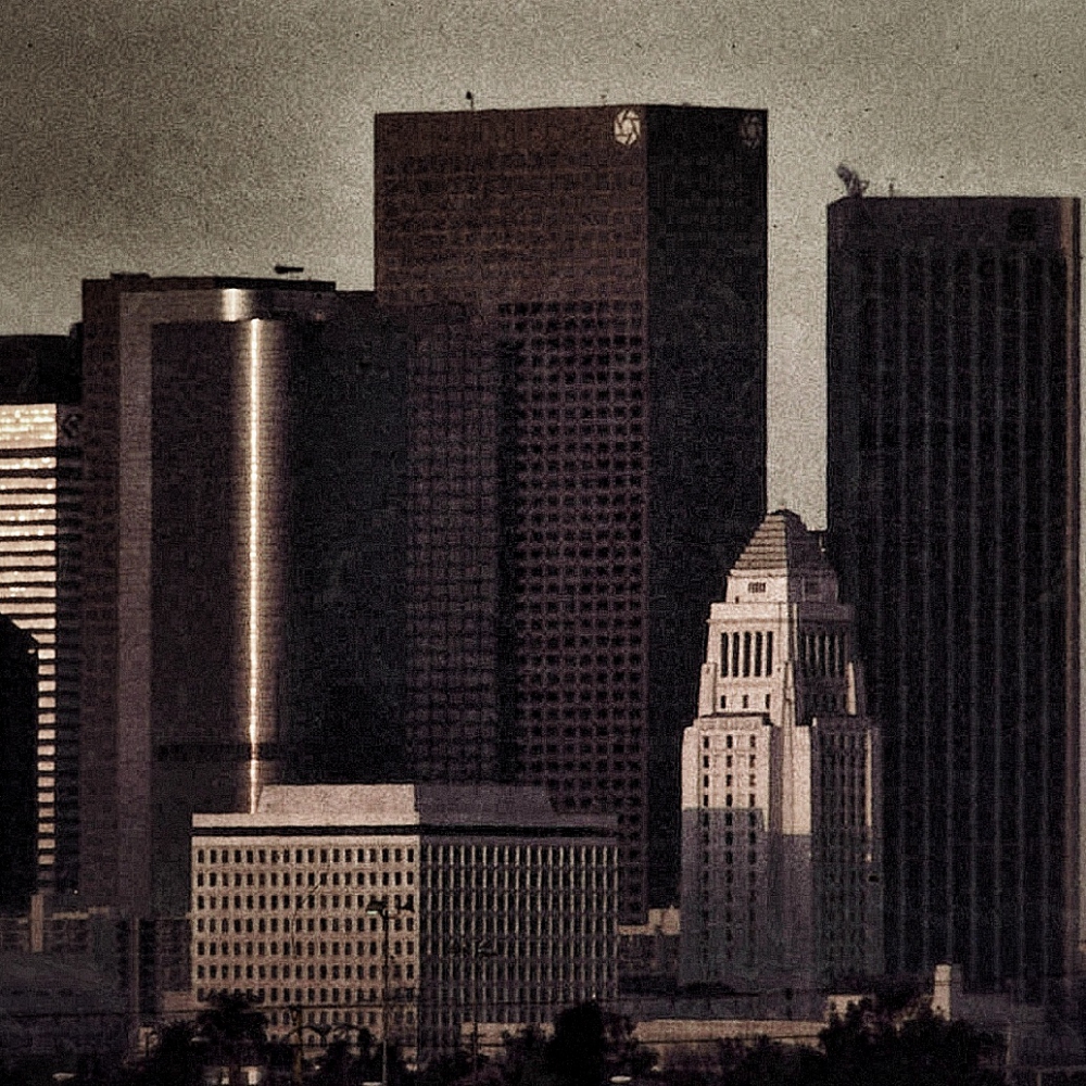
and a square version
_________________
Olivier - Moderator 
Dslr : Olympus Pen E-P2 - Fujifilm X-Pro2 - Canon 5D MkII.
SLr and MF lenses : for feedback and helping people, cameras and lenses I own : full list here http://forum.mflenses.com/viewtopic,p,1442740.html#1442740 |
|
| Back to top |
|
 |
cooltouch


Joined: 15 Jan 2009
Posts: 9096
Location: Houston, Texas
|
 Posted: Fri May 20, 2016 7:09 pm Post subject: Posted: Fri May 20, 2016 7:09 pm Post subject: |
 |
|
cooltouch wrote:
Okay, well it's been past long enough for me to make a decision. I was hoping somebody would try doing some color correction -- which is what I did with this image -- but so it goes.
I liked almost all of the submissions, but I must give the award to Olivier for this one. I like the sorta sepia toned one for its aged look.
I need to apologize for submitting such a poorly exposed image. I checked the original slide and, as it turns out, it is in much better shape than the image I posted. Oh well. Considering what you had to work with, I think y'all did a good job.
So, Olivier, whatcha got?
_________________
Michael
My Gear List: http://michaelmcbroom.com/photo/gear.html
My Gallery: http://michaelmcbroom.com/gallery3/index.php/
My Flickr Page: https://www.flickr.com/photos/11308754@N08/albums
My Music: https://soundcloud.com/michaelmcbroom/albums
My Blog: http://michaelmcbroom.com/blogistan/ |
|
| Back to top |
|
 |
Olivier


Joined: 18 Feb 2009
Posts: 5084
Location: France
Expire: 2015-08-06
|
 Posted: Fri May 20, 2016 9:13 pm Post subject: Posted: Fri May 20, 2016 9:13 pm Post subject: |
 |
|
Olivier wrote:
Well, thank you Michael.
Your image was fine like that as it demanded some work and thinking.
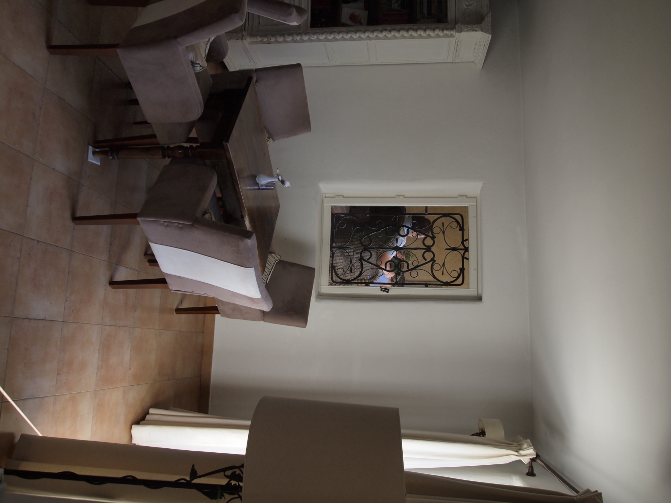
I have this one to propose you :
Sorry, I don't manage to upload it in the vertical way...
I feel there's something interesting to do with this one. Surely refine composition, maybe change format, or something else.
It's up to you. 
_________________
Olivier - Moderator 
Dslr : Olympus Pen E-P2 - Fujifilm X-Pro2 - Canon 5D MkII.
SLr and MF lenses : for feedback and helping people, cameras and lenses I own : full list here http://forum.mflenses.com/viewtopic,p,1442740.html#1442740 |
|
| Back to top |
|
 |
DigiChromeEd


Joined: 29 Dec 2009
Posts: 3462
Location: Northern Ireland
|
 Posted: Sat May 21, 2016 7:12 am Post subject: Posted: Sat May 21, 2016 7:12 am Post subject: |
 |
|
DigiChromeEd wrote:
_________________
"I've got a Nikon camera, I like to take a photograph" - Paul Simon |
|
| Back to top |
|
 |
DigiChromeEd


Joined: 29 Dec 2009
Posts: 3462
Location: Northern Ireland
|
 Posted: Sat May 21, 2016 7:24 am Post subject: Posted: Sat May 21, 2016 7:24 am Post subject: |
 |
|
DigiChromeEd wrote:
_________________
"I've got a Nikon camera, I like to take a photograph" - Paul Simon |
|
| Back to top |
|
 |
Snodge


Joined: 01 Jan 2015
Posts: 163
Location: Bristol, UK
Expire: 2016-12-27
|
 Posted: Sat May 21, 2016 7:53 am Post subject: Posted: Sat May 21, 2016 7:53 am Post subject: |
 |
|
Snodge wrote:
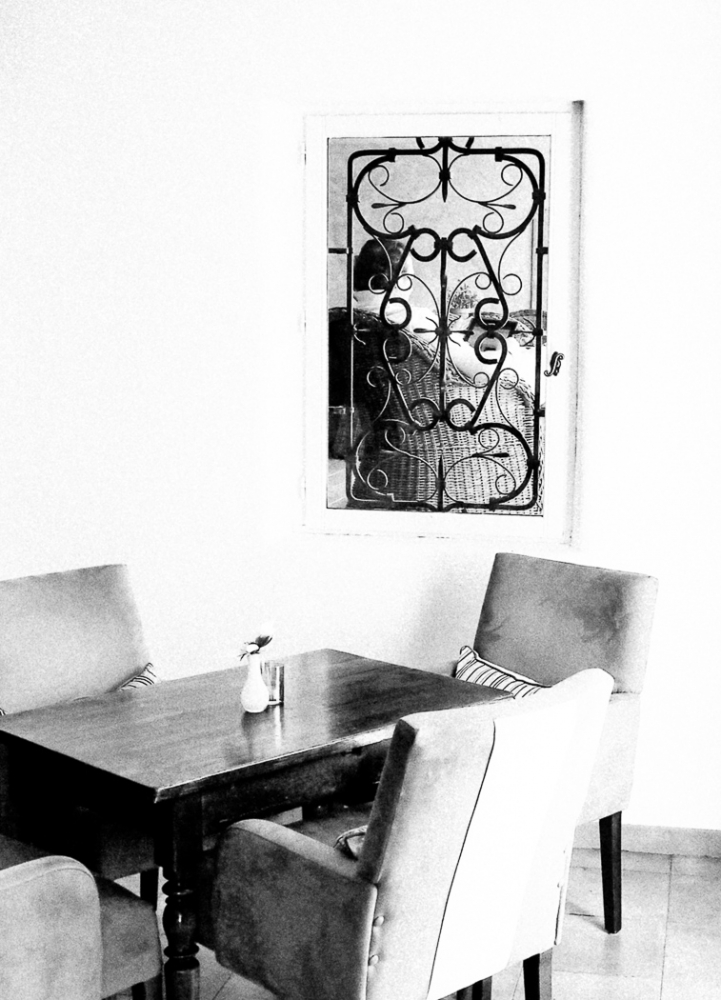
Here's something - I didn't quite know what to do with it...
_________________
Hugh
Camera bodies: Fujifilm X-E3 (digital), Praktika Super TL1000 (35mm film), Kershaw 450 (medium format 6x6 folder)
|
|
| Back to top |
|
 |
DigiChromeEd


Joined: 29 Dec 2009
Posts: 3462
Location: Northern Ireland
|
 Posted: Sat May 21, 2016 8:12 am Post subject: Posted: Sat May 21, 2016 8:12 am Post subject: |
 |
|
DigiChromeEd wrote:
_________________
"I've got a Nikon camera, I like to take a photograph" - Paul Simon |
|
| Back to top |
|
 |
Olivier


Joined: 18 Feb 2009
Posts: 5084
Location: France
Expire: 2015-08-06
|
 Posted: Sat May 21, 2016 3:18 pm Post subject: Posted: Sat May 21, 2016 3:18 pm Post subject: |
 |
|
Olivier wrote:
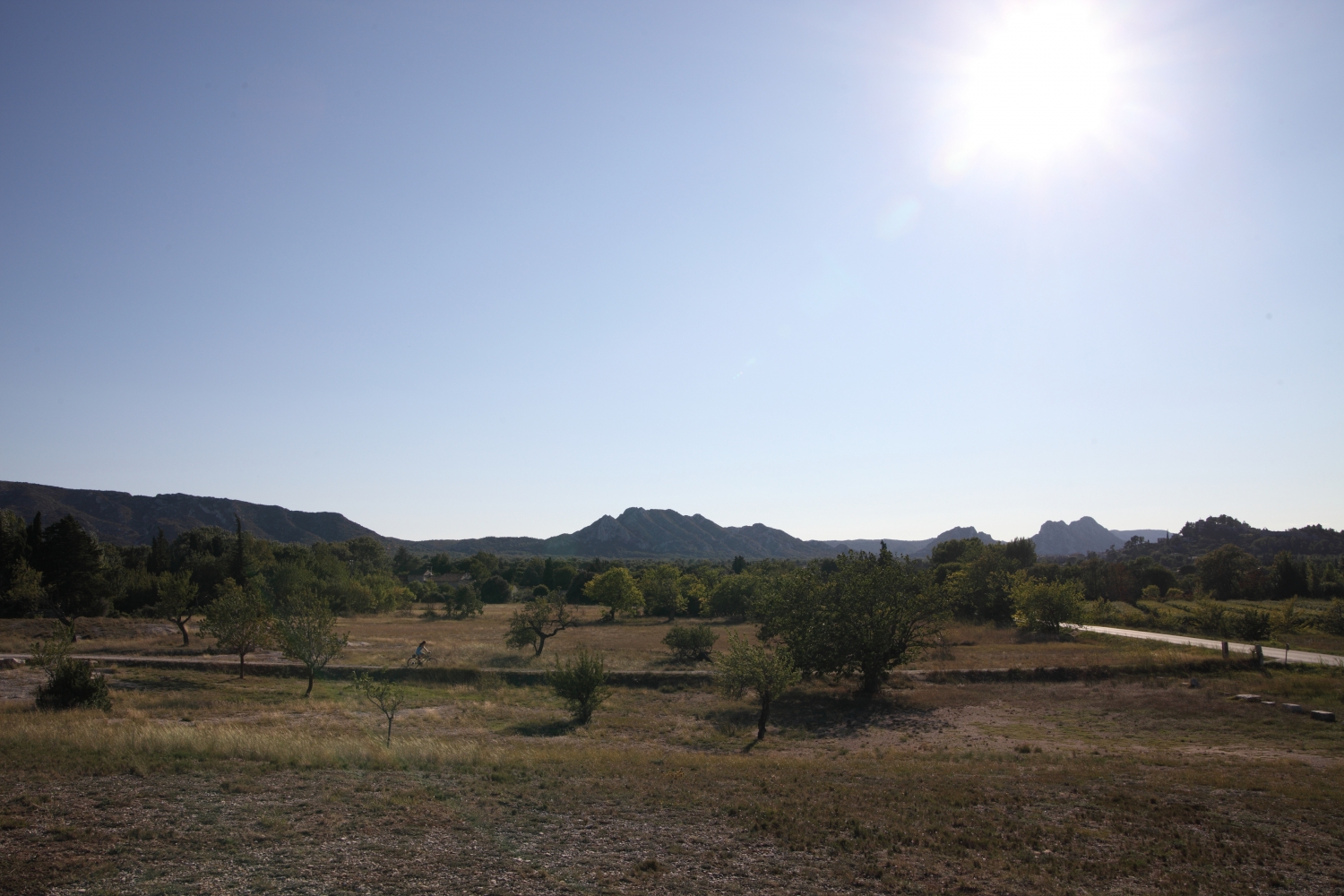
Sorry Hughes.
Maybe this one would be better.
_________________
Olivier - Moderator 
Dslr : Olympus Pen E-P2 - Fujifilm X-Pro2 - Canon 5D MkII.
SLr and MF lenses : for feedback and helping people, cameras and lenses I own : full list here http://forum.mflenses.com/viewtopic,p,1442740.html#1442740 |
|
| Back to top |
|
 |
cooltouch


Joined: 15 Jan 2009
Posts: 9096
Location: Houston, Texas
|
 Posted: Sun May 22, 2016 4:49 am Post subject: Posted: Sun May 22, 2016 4:49 am Post subject: |
 |
|
cooltouch wrote:
Okay, Olivier, I thought I'd give your scenic a try first. Really, it starts out pretty decent. Correctly exposed, focus is sharp, just the saturation is a bit soft. And then I noticed that a crop would be appropriate. So first thing I did was decide on an appropriate crop. And then, before adjusting saturation, I played around with Curves and Levels. I found the hard part was increasing contrast without blocking up the shadows, especially in that clump of trees on the far left. This was the big limiter for contrast adjustment. I came up with this:
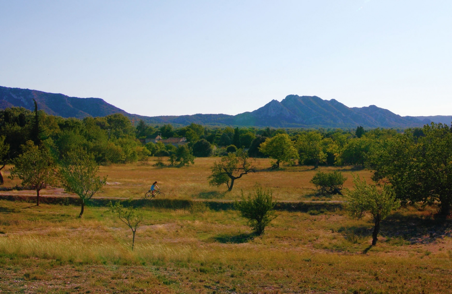
I decided to stay with the crop, but this time I played around some with saturation. And got this:
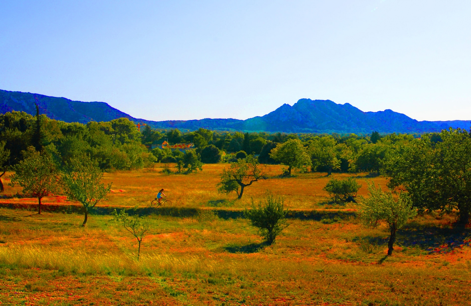
Next, I dove into some of the presets that my image processing software has and found that the infrared preset worked pretty well.
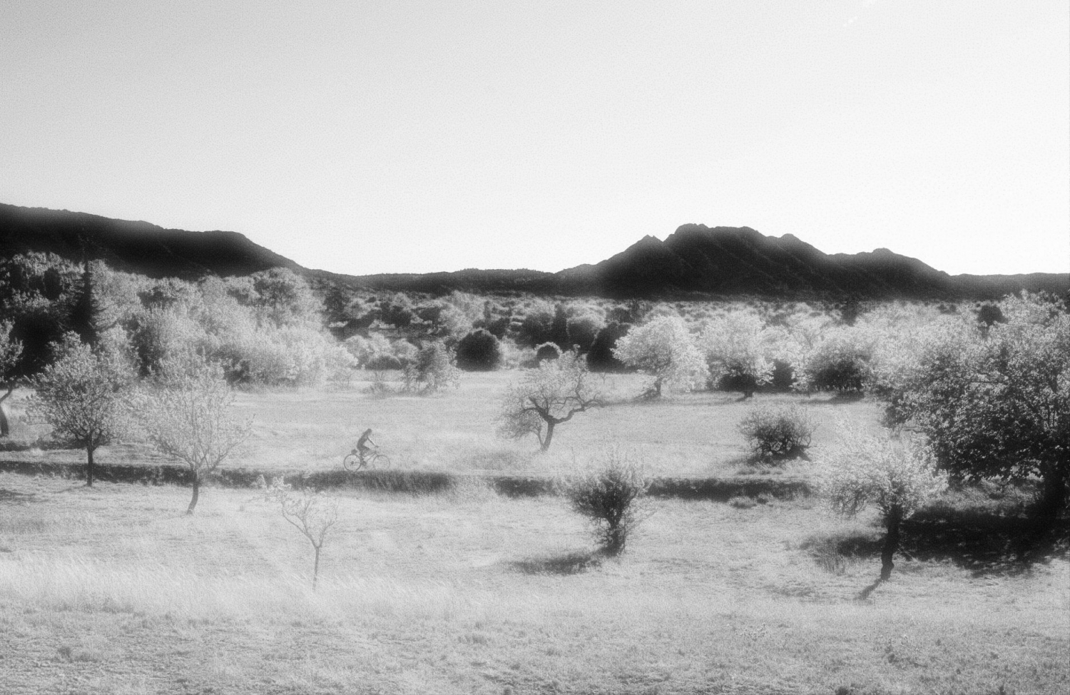
And finally, once I had the image moved into monochrome, I found I could actually do some pretty cool things to it.
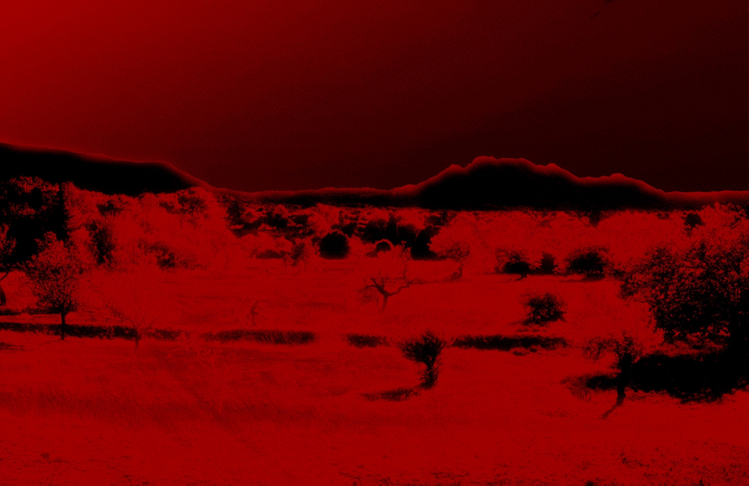
_________________
Michael
My Gear List: http://michaelmcbroom.com/photo/gear.html
My Gallery: http://michaelmcbroom.com/gallery3/index.php/
My Flickr Page: https://www.flickr.com/photos/11308754@N08/albums
My Music: https://soundcloud.com/michaelmcbroom/albums
My Blog: http://michaelmcbroom.com/blogistan/ |
|
| Back to top |
|
 |
cooltouch


Joined: 15 Jan 2009
Posts: 9096
Location: Houston, Texas
|
 Posted: Sun May 22, 2016 5:30 am Post subject: Posted: Sun May 22, 2016 5:30 am Post subject: |
 |
|
cooltouch wrote:
And, well, I found the first image intriguing as well. So here's my take on it:

_________________
Michael
My Gear List: http://michaelmcbroom.com/photo/gear.html
My Gallery: http://michaelmcbroom.com/gallery3/index.php/
My Flickr Page: https://www.flickr.com/photos/11308754@N08/albums
My Music: https://soundcloud.com/michaelmcbroom/albums
My Blog: http://michaelmcbroom.com/blogistan/ |
|
| Back to top |
|
 |
Olivier


Joined: 18 Feb 2009
Posts: 5084
Location: France
Expire: 2015-08-06
|
 Posted: Sun May 22, 2016 9:27 am Post subject: Posted: Sun May 22, 2016 9:27 am Post subject: |
 |
|
Olivier wrote:
Thanl you Michael ! 
_________________
Olivier - Moderator 
Dslr : Olympus Pen E-P2 - Fujifilm X-Pro2 - Canon 5D MkII.
SLr and MF lenses : for feedback and helping people, cameras and lenses I own : full list here http://forum.mflenses.com/viewtopic,p,1442740.html#1442740 |
|
| Back to top |
|
 |
Snodge


Joined: 01 Jan 2015
Posts: 163
Location: Bristol, UK
Expire: 2016-12-27
|
 Posted: Sun May 22, 2016 1:19 pm Post subject: Posted: Sun May 22, 2016 1:19 pm Post subject: |
 |
|
Snodge wrote:
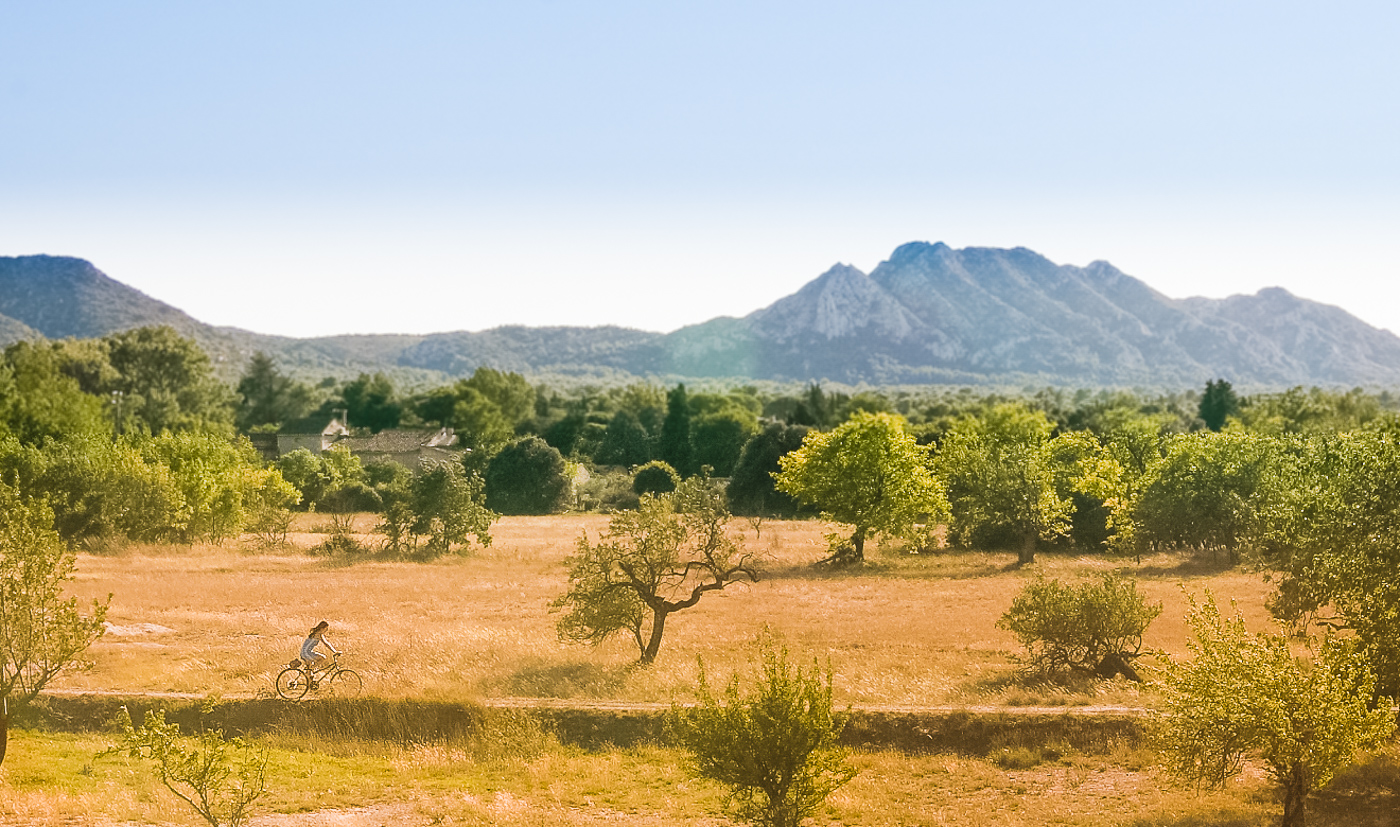
Cropped, then used one of my Lightroom presets as a starting point, grad with added blue for sky, grad with added orange for the foreground, radial filter with reduced sharpness outside to focus on the girl riding the bike... hopefully gives it a more of an evening feel rather than midday...
_________________
Hugh
Camera bodies: Fujifilm X-E3 (digital), Praktika Super TL1000 (35mm film), Kershaw 450 (medium format 6x6 folder)
|
|
| Back to top |
|
 |
Olivier


Joined: 18 Feb 2009
Posts: 5084
Location: France
Expire: 2015-08-06
|
 Posted: Mon Jun 27, 2016 10:32 am Post subject: Posted: Mon Jun 27, 2016 10:32 am Post subject: |
 |
|
Olivier wrote:
Wow... sorry for the delay.
For this least, last contest, I choose Snodge cycling girl version.
So, Snodge, if you wish, post a new contest. 
_________________
Olivier - Moderator 
Dslr : Olympus Pen E-P2 - Fujifilm X-Pro2 - Canon 5D MkII.
SLr and MF lenses : for feedback and helping people, cameras and lenses I own : full list here http://forum.mflenses.com/viewtopic,p,1442740.html#1442740 |
|
| Back to top |
|
 |
|
|
|
You cannot post new topics in this forum
You cannot reply to topics in this forum
You cannot edit your posts in this forum
You cannot delete your posts in this forum
You cannot vote in polls in this forum
|
