| View previous topic :: View next topic |
| Author |
Message |
Willem


Joined: 08 Jun 2011
Posts: 280
Location: Netherlands
|
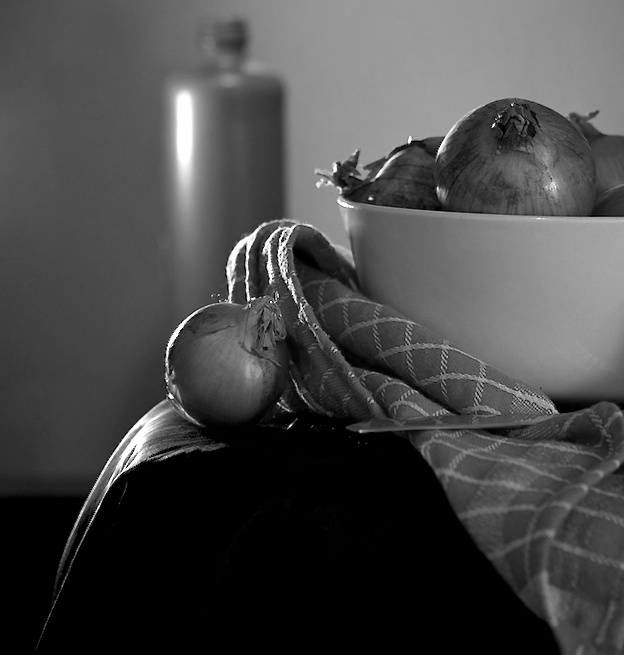
 Posted: Sun Mar 18, 2012 7:13 pm Post subject: Do you like these onions? (C&C) Posted: Sun Mar 18, 2012 7:13 pm Post subject: Do you like these onions? (C&C) |
 |
|
Willem wrote:
Or is it over the top? I am not sure yet.

_________________
www.willemvs.wordpress.com
Canon EOS 500D, Canon Powershot SX10IS, 2 x Asahi Pentax spotmatic F, iPod touch
AF lenses:
Canon 18-55 kit lens, Canon 1.8/50mm, Canon EF 85 1.8 USM, Canon EF-S 10-22
MF lenses:
SMC Takumar 1.8/55 (2x)
S-M-C Takumars 3.5/24, 3.5/28, 3.5/35, 4/50 Macro, 4/100 Macro, 2.5/135 (v2), 4/200
|
|
| Back to top |
|
 |
Orio

Joined: 24 Feb 2007
Posts: 29545
Location: West Emilia
Expire: 2012-12-04
|
| Posted: Sun Mar 18, 2012 7:30 pm Post subject: |
|
|
Orio wrote:
I'd like to see it unprocessed.
_________________
Orio, Administrator
T*
NE CEDE MALIS AUDENTIOR ITO
Ferrania film is reborn! http://www.filmferrania.it/
Support the Ornano film chemicals company and help them survive!
http://forum.mflenses.com/ornano-chemical-products-t55525.html |
|
| Back to top |
|
|
Willem
Joined: 08 Jun 2011
Posts: 280
Location: Netherlands
|
| Posted: Sun Mar 18, 2012 7:35 pm Post subject: |
|
|
Willem wrote:
_________________
www.willemvs.wordpress.com
Canon EOS 500D, Canon Powershot SX10IS, 2 x Asahi Pentax spotmatic F, iPod touch
AF lenses:
Canon 18-55 kit lens, Canon 1.8/50mm, Canon EF 85 1.8 USM, Canon EF-S 10-22
MF lenses:
SMC Takumar 1.8/55 (2x)
S-M-C Takumars 3.5/24, 3.5/28, 3.5/35, 4/50 Macro, 4/100 Macro, 2.5/135 (v2), 4/200
|
|
| Back to top |
|
|
Attila


Joined: 24 Feb 2007
Posts: 57865
Location: Hungary
Expire: 2025-11-18
|
| Posted: Sun Mar 18, 2012 7:38 pm Post subject: |
|
|
Attila wrote:
At first glance nice, if we start pixel peeping less nice , I suggest to you make some variant what you like and we can vote.
_________________
-------------------------------
Items on sale on Ebay
Sony NEX-7 Carl Zeiss Planar 85mm f1.4, Minolta MD 35mm f1.8, Konica 135mm f2.5, Minolta MD 50mm f1.2, Minolta MD 250mm f5.6, Carl Zeiss Sonnar 180mm f2.8
|
|
| Back to top |
|
|
David

Joined: 13 Apr 2011
Posts: 1869
Location: Denver, Colorado
Expire: 2013-01-25
|
| Posted: Sun Mar 18, 2012 8:02 pm Post subject: |
|
|
David wrote:
I like the onions in the bowl and the bowl itself. Those tones and contrasts don't seem to be over the top. The cloth and stray onion are over processed to the point of causing my eyes to strain. Also no sold on the cylinder in the background.
_________________
http://www.youtube.com/user/hancockDavidM |
|
| Back to top |
|
|
eddieitman

Joined: 12 Apr 2011
Posts: 1246
Location: United Kingdom
|
| Posted: Sun Mar 18, 2012 8:03 pm Post subject: |
|
|
eddieitman wrote:
Comparing to the unprocessed one you have overcooked it and the towel near the onion just looks a mess.
I like the black and white but try it a different way
Maybe something more like this

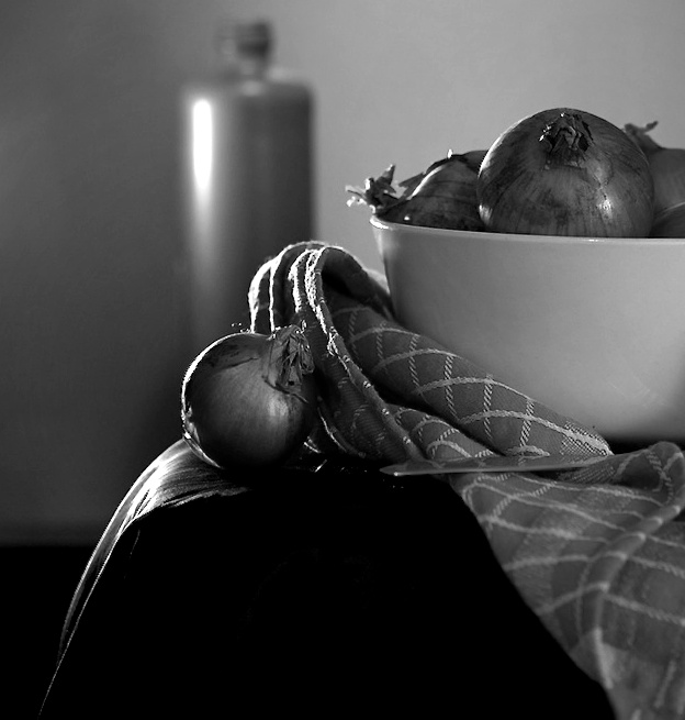
Orio
after your comments here is another amended version removing most of what you described on the onion
_________________
My web site www.digital-darkroom.weebly.com
Life is like a camera. Focus on what's important, capture the good times, develop from the negatives and if things don't work out, just take another shot.
Last edited by eddieitman on Sun Mar 18, 2012 9:00 pm; edited 1 time in total |
|
| Back to top |
|
|
Orio
Joined: 24 Feb 2007
Posts: 29545
Location: West Emilia
Expire: 2012-12-04
|
| Posted: Sun Mar 18, 2012 8:36 pm Post subject: |
|
|
Orio wrote:
OK, my objection is with the lighting.
You have a rim light, and a main light. The problem is that they don't fit.
In order to use one main light and one rim light, you need to make the rim light coming from
the approximate same direction as the main light. It must be consistent with it.
The fact is that the rim light is perceived by the viewer not as a full light, but as an accent of the main light.
So it must be consistent with it.
If you want to keep it in an opposite position, you need to use a third light, that should be placed not further away
than 45° from the rim light. This third light will become your main light, and the existing main light will become a fill light
(and will have to be lowered in power for that).
The contradiction in your current scheme is already evident when you consider that the strongest light point in your scene
is the rim light, yet, the deepest shadow is the one cast by the main light over the bowl.
This, in the eye of the viewer, does not work.
After your post work, the problem becomes even worse, because the increase in contrast creates a really dark area immediately
next to the rim light, which contradicts it, and fights against a believable perception of the scene.
My 2 cents of course.
POST SCRIPTUM: Eddie Leitmans' version proves the points above. He cut out the shadow from the bowl. This way, the impact
of the main light is really diminished, and might feel more like a fill light (as it should be).
Still not everything is consistent (a strong light accent on the onion remains), but it works better.
_________________
Orio, Administrator
T*
NE CEDE MALIS AUDENTIOR ITO
Ferrania film is reborn! http://www.filmferrania.it/
Support the Ornano film chemicals company and help them survive!
http://forum.mflenses.com/ornano-chemical-products-t55525.html |
|
| Back to top |
|
|
woodrim

Joined: 14 Jan 2010
Posts: 4060
Location: Charleston
|
| Posted: Sun Mar 18, 2012 10:50 pm Post subject: |
|
|
woodrim wrote:
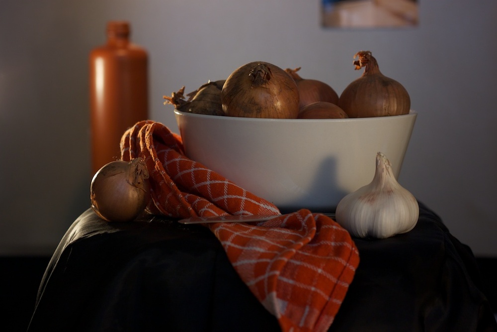
I like the color version and lighting.
_________________
Regards,
Woodrim |
|
| Back to top |
|
|
Willem
Joined: 08 Jun 2011
Posts: 280
Location: Netherlands
|
| Posted: Mon Mar 19, 2012 11:54 am Post subject: |
|
|
Willem wrote:
Thank you all for your comments and explanations. This is so helpful.
What i tried to create was the 'feel' of a painting but maintaining the detail of a photograph. The square crop was made because of the shadow of the garlic, wich i didn't like. Now the lighting issue is pointed out, i also see the inconsistency.
I'll go and shoot it again, maybe tomorrow. I think i quite like the postprocessing i did, except in the highlights. I'll have to work on that too.
Again, thanks everybody for your comments, this and practice is the best learning method.
Greetings.
_________________
www.willemvs.wordpress.com
Canon EOS 500D, Canon Powershot SX10IS, 2 x Asahi Pentax spotmatic F, iPod touch
AF lenses:
Canon 18-55 kit lens, Canon 1.8/50mm, Canon EF 85 1.8 USM, Canon EF-S 10-22
MF lenses:
SMC Takumar 1.8/55 (2x)
S-M-C Takumars 3.5/24, 3.5/28, 3.5/35, 4/50 Macro, 4/100 Macro, 2.5/135 (v2), 4/200
|
|
| Back to top |
|
|
rensA
Joined: 29 Feb 2012
Posts: 26
|
| Posted: Mon Mar 19, 2012 5:43 pm Post subject: |
|
|
rensA wrote:

I gave it a try, I liked the red towel with the red/brownish onions and flask.
I saturated all other colors out.
_________________
Camera Sony Alpha A230
MF LENSES
Pentacon 135 f2.8, Pentacon 50 f1.8, Tair 3A 300 f4.5
AF LENSES
minolta 70-210 F4, minolta 50mm F1.7,minolta 28-85 F3.5-4.5 |
|
| Back to top |
|
|
woodrim
Joined: 14 Jan 2010
Posts: 4060
Location: Charleston
|
| Posted: Wed Mar 21, 2012 12:33 am Post subject: |
|
|
woodrim wrote:
I suppose I'm a simple person; I still prefer the original color version... and think it's quite good.
_________________
Regards,
Woodrim |
|
| Back to top |
|
|
|
|
|
You cannot post new topics in this forum
You cannot reply to topics in this forum
You cannot edit your posts in this forum
You cannot delete your posts in this forum
You cannot vote in polls in this forum
|