| View previous topic :: View next topic |
| Author |
Message |
peterqd


Joined: 28 Feb 2007
Posts: 7448
Location: near High Wycombe, UK
Expire: 2014-01-04
|
 Posted: Sun Jan 20, 2008 8:04 pm Post subject: Disappointment Posted: Sun Jan 20, 2008 8:04 pm Post subject: Disappointment |
 |
|
peterqd wrote:
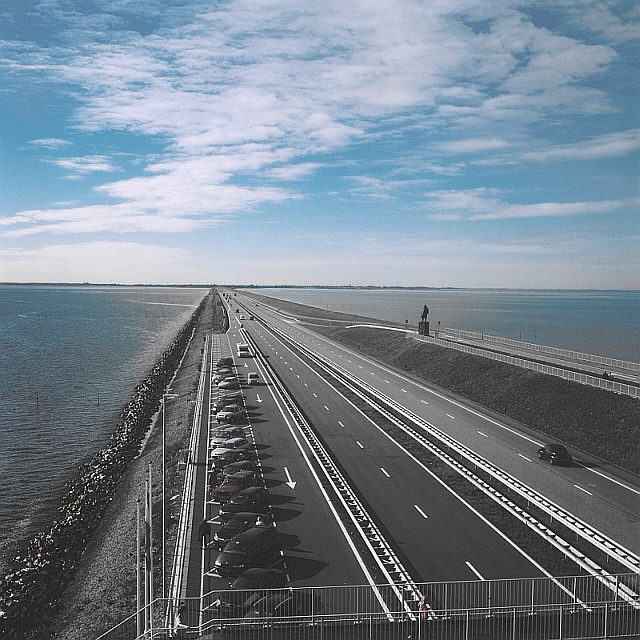
I've now scanned some of the first colour shots I took with the Yashica-Mat on my trip to Holland in October. The camera is great fun to use and I was asked about it a couple of times by strangers, which was nice. But the results from the Velvia 50 are way too saturated for my taste:

I had to lighten this a little due I think to metering more of the sky than the land, but apart from that I haven't changed anything in the scan except the size. This shot was taken at the same time with my Flek 2.8/20 on the 400D

Honest opinions please. I've always been a Kodachrome man but processing is a pain now. Does anyone know how Ektachrome E100 compares?
_________________
Peter - Moderator |
|
| Back to top |
|
 |
Attila

Joined: 24 Feb 2007
Posts: 57865
Location: Hungary
Expire: 2025-11-18
|
| Posted: Sun Jan 20, 2008 8:09 pm Post subject: |
|
|
Attila wrote:
First one is not real over saturated on bad way ...
_________________
-------------------------------
Items on sale on Ebay
Sony NEX-7 Carl Zeiss Planar 85mm f1.4, Minolta MD 35mm f1.8, Konica 135mm f2.5, Minolta MD 50mm f1.2, Minolta MD 250mm f5.6, Carl Zeiss Sonnar 180mm f2.8
|
|
| Back to top |
|
|
Attila
Joined: 24 Feb 2007
Posts: 57865
Location: Hungary
Expire: 2025-11-18
|
| Posted: Sun Jan 20, 2008 8:13 pm Post subject: |
|
|
Attila wrote:
I changed saturation, when sky is pretty ok landscape goes to b&w 
_________________
-------------------------------
Items on sale on Ebay
Sony NEX-7 Carl Zeiss Planar 85mm f1.4, Minolta MD 35mm f1.8, Konica 135mm f2.5, Minolta MD 50mm f1.2, Minolta MD 250mm f5.6, Carl Zeiss Sonnar 180mm f2.8
|
|
| Back to top |
|
|
Katastrofo
Joined: 26 Feb 2007
Posts: 10405
Location: USA
Expire: 2013-11-19
|
| Posted: Sun Jan 20, 2008 8:46 pm Post subject: |
|
|
Katastrofo wrote:
It's probably nostalgia, but I happen to like the first pic. Reminds me of
how the pics looked in National Geographic, etc, in the early 60'[s.
Oversaturated good, Bill like! 
Not to say I don't understand Peter's disappointment, looks like more experiments with different film. |
|
| Back to top |
|
|
Orio

Joined: 24 Feb 2007
Posts: 29545
Location: West Emilia
Expire: 2012-12-04
|
| Posted: Sun Jan 20, 2008 9:03 pm Post subject: |
|
|
Orio wrote:
Velvia 50 is not good for landscapes in my opinion.
_________________
Orio, Administrator
T*
NE CEDE MALIS AUDENTIOR ITO
Ferrania film is reborn! http://www.filmferrania.it/
Support the Ornano film chemicals company and help them survive!
http://forum.mflenses.com/ornano-chemical-products-t55525.html |
|
| Back to top |
|
|
LucisPictor

Joined: 26 Feb 2007
Posts: 17633
Location: Oberhessen, Germany / Maidstone ('95-'96)
Expire: 2013-12-03
|
| Posted: Sun Jan 20, 2008 9:28 pm Post subject: |
|
|
LucisPictor wrote:
Yes, Peter, that's the Velvia look.
I also only like it in suitable situations, like an autumn shot in a forest. This can blow you away.
Peter, you should try the Kodak Portra 160 NC.
The VC version produces strong colours (rather similar to the Velvia) but the NC version, which is perfect for portraits, shows less saturation and thus would surely be a film you like.
http://www.kodak.com/global/en/professional/products/films/portra/portraIndex.jhtml?id=0.1.18.14.13.14&lc=en
_________________
Personal forum activity on pause every now and again (due to job obligations)!
Carsten, former Moderator 
Things ON SALE
Carsten = "KAPCTEH" = "Karusutenu" | T-shirt?.........................My photos from Emilia: http://www.schouler.net/emilia/emilia2011.html
My gear: http://retrocameracs.wordpress.com/ausrustung/
Old list: http://forum.mflenses.com/viewtopic.php?t=65 (Not up-to-date, sorry!) | http://www.lucispictor.de | http://www.alensaweek.wordpress.com |
http://www.retrocamera.de |
|
| Back to top |
|
|
peterqd
Joined: 28 Feb 2007
Posts: 7448
Location: near High Wycombe, UK
Expire: 2014-01-04
|
| Posted: Sun Jan 20, 2008 10:19 pm Post subject: |
|
|
peterqd wrote:
| Katastrofo wrote: |
| looks like more experiments with different film. |
I was lucky to find a box of 5 rolls of Ektachrome E100G (135) going cheap and the first roll is going through my K2 right now, so it will be interesting to compare. The Yash-Mat is halfway through another roll of Velvia at present, so I'll see if I can find some really colourless subjects and finish it off - no shortage of them at present with this dull weather!
| LucisPictor wrote: |
Yes, Peter, that's the Velvia look.
I also only like it in suitable situations, like an autumn shot in a forest. This can blow you away. |
Right! I don't think I want to be blown away any more, I just want colors to look as natural as possible. The remaining three rolls will now wait till next autumn then. 
I remember years ago trying a roll of Agfa slide film, and the pics all had a strong magenta cast. I never bought another roll of Agfa, and I'm feeling the same about Fujifilm now.
Thanks for the info on Portra, that's a new one to me. I'll certainly give it a try, but it's a colour neg film and I'm keen to get back to slides as well as prints. The Portra 160 NC blurb about colours and skin tones is almost exactly the same as the blurb for Ektachrome E100 G, so I think I'll wait to see how this turns out.
@Attila - I've also tried reducing the saturation a little but I don't get results I like. I think there might be a better way to do it, possibly working on separate channels, so I'm going to have a play around and see what I can come up with. Chris bought me a great big heavy book about PS techniques for Christmas, so I'll dive into it and see what I can come up with.
_________________
Peter - Moderator |
|
| Back to top |
|
|
Attila
Joined: 24 Feb 2007
Posts: 57865
Location: Hungary
Expire: 2025-11-18
|
| Posted: Sun Jan 20, 2008 10:29 pm Post subject: |
|
|
Attila wrote:
I hope it will works for you I just do a quick try, because I was curious.
_________________
-------------------------------
Items on sale on Ebay
Sony NEX-7 Carl Zeiss Planar 85mm f1.4, Minolta MD 35mm f1.8, Konica 135mm f2.5, Minolta MD 50mm f1.2, Minolta MD 250mm f5.6, Carl Zeiss Sonnar 180mm f2.8
|
|
| Back to top |
|
|
patrickh

Joined: 23 Aug 2007
Posts: 8551
Location: Oregon
Expire: 2011-11-18
|
| Posted: Sun Jan 20, 2008 10:31 pm Post subject: |
|
|
patrickh wrote:
Dont touch the saturation - try the White balance levels. It looks to me as though the WB has not got it quite right and that is why when you try saturation you get changes throughout the picture - I suspect you have WB too high, try lowering it a bit and see what happens. Use that in conjunction with tint - not saturation. Saturation kills almost as many pics as sharpening
patrickh
_________________
DSLR: Nikon D300 Nikon D200 Nex 5N
MF Zooms: Kiron 28-85/3.5, 28-105/3.2, 75-150/3.5, Nikkor 50-135/3.5 AIS // MF Primes: Nikkor 20/4 AI, 24/2 AI, 28/2 AI, 28/2.8 AIS, 28/3.5 AI, 35/1.4 AIS, 35/2 AIS, 35/2.8 PC, 45/2.8 P, 50/1.4 AIS, 50/1.8 AIS, 50/2 AI, 55/2.8 AIS micro, 55/3.5 AI micro, 85/2 AI, 100/2,8 E, 105/1,8 AIS, 105/2,5 AIS, 135/2 AIS, 135/2.8 AIS, 200/4 AI, 200/4 AIS micro, 300/4.5 AI, 300/4.5 AI ED, Arsat 50/1.4, Kiron 28/2, Vivitar 28/2.5, Panagor 135/2.8, Tamron 28/2.5, Tamron 90/2.5 macro, Vivitar 90/2.5 macro (Tokina) Voigtlander 90/3.5 Vivitar 105/2.5 macro (Kiron) Kaleinar 100/2.8 AI Tamron 135/2.5, Vivitar 135/2.8CF, 200/3.5, Tokina 400/5,6
M42: Vivitar 28/2.5, Tamron 28/2.5, Formula5 28/2.8, Mamiya 28/2.8, Pentacon 29/2.8, Flektogon 35/2.4, Flektogon 35/2.8, Takumar 35/3.5, Curtagon 35/4, Takumar 50/1.4, Volna-6 50/2.8 macro, Mamiya 50/1.4, CZJ Pancolar 50/1,8, Oreston 50/1.8, Takumar 50/2, Industar 50/3.5, Sears 55/1.4, Helios 58/2, Jupiter 85/2, Helios 85/1.5, Takumar 105/2.8, Steinheil macro 105/4.5, Tamron 135/2.5, Jupiter 135/4, CZ 135/4, Steinheil Culminar 135/4,5, Jupiter 135/3.5, Takumar 135/3.5, Tair 135/2.8, Pentacon 135/2.8, CZ 135/2.8, Taika 135/3.5, Takumar 150/4, Jupiter 200/4, Takumar 200/4
Exakta: Topcon 100/2.8(M42), 35/2.8, 58/1.8, 135/2.8, 135/2.8 (M42), Kyoei Acall 135/3.5
C/Y: Yashica 28/2.8, 50/1.7, 135/2.8, Zeiss Planar 50/1.4, Distagon 25/2.8
Hexanon: 28/3.5, 35/2.8, 40/1.8, 50/1.7, 52/1.8, 135/3.2, 135/3.5, 35-70/3.5, 200/3.5
P6 : Mir 38 65/3.5, Biometar 80/2.8, Kaleinar 150/2.8, Sonnar 180/2.8
Minolta SR: 28/2.8, 28/3.5, 35/2.8, 45/2, 50/2, 58/1.4, 50/1.7, 135/2.8, 200/3.5
RF: Industar 53/2.8, Jupiter 8 50/2
Enlarg: Rodagon 50/5,6, 80/5,6, 105/5.6, Vario 44-52/4, 150/5.6 180/5.6 El Nikkor 50/2,8,63/2.8,75/4, 80/5,6, 105/5.6, 135/5.6 Schneider 60/5.6, 80/5.6, 80/4S,100/5.6S,105/5.6,135/5.6, 135/5.6S, 150/5.6S, Leica 95/4 |
|
| Back to top |
|
|
Laurence

Joined: 26 Mar 2007
Posts: 4809
Location: Western Washington State
Expire: 2016-06-19
|
| Posted: Sun Jan 20, 2008 11:20 pm Post subject: |
|
|
Laurence wrote:
On a GOOD note, your scan is absolutely TERRIFIC for sharpness!
Yeah, Velvia has its place, and its WONDERFUL for the right subjects. I've certainly made my "mistakes" with using it in the wrong places - the desert southwest with its strong orange colors comes to mind.
Provia has been a fantastic film for many of my slides - perhaps a tiny bit more saturated than I wanted, but awfully close to "true".
The deep forest has been good for Velvia (for me), because the colors can be muted in there, and the Velvia seems to bring them closer to "what I see".
I look forward to more shots from your Yashica! And, of course don't need to call it 'disappointment'! Call it 'different' is all! 
_________________
Assent, and you are sane;
Demur,—you ’re straightway dangerous,
And handled with a chain.
Emily Dickinson
Cameras and Lenses in Use:
Yashica Mat 124 w/ Yashinon 80/3.5,
CV Apo-Lanthar 90/3.5SL, (Thank you Klaus),
Pentax 645,
Flek 50,
Pentax-A 150
Pentax-A 120 Macro
Voigtlander Vitomatic I w/Color Skopar 50/2.8
Konica TC and zoom lenses (thanks Carsten)
Contax AX
Yashica ML 50/2
Yashica ML 35/2.8
Carl Zeiss Contax 50/1.4
Tamron Adaptall SP 17/3.5
Tamron Adaptall 28/2.5
Tamron Adaptall SP 300/2.8 LD (IF)
|
|
| Back to top |
|
|
peterqd
Joined: 28 Feb 2007
Posts: 7448
Location: near High Wycombe, UK
Expire: 2014-01-04
|
| Posted: Mon Jan 21, 2008 12:04 am Post subject: |
|
|
peterqd wrote:
| Laurence wrote: |
| On a GOOD note, your scan is absolutely TERRIFIC for sharpness! |
Thanks very much, that makes me happier! I think the setting was 4800. I used Digital ICE on this and when I compare it to an "ordinary" scan I can see the dust and marks that have been removed. Fantastic difference!
| Quote: |
Yeah, Velvia has its place, and its WONDERFUL for the right subjects. I've certainly made my "mistakes" with using it in the wrong places - the desert southwest with its strong orange colors comes to mind.
Provia has been a fantastic film for many of my slides - perhaps a tiny bit more saturated than I wanted, but awfully close to "true".
The deep forest has been good for Velvia (for me), because the colors can be muted in there, and the Velvia seems to bring them closer to "what I see".
I look forward to more shots from your Yashica! And, of course don't need to call it 'disappointment'! Call it 'different' is all! |
Well, thanks, it was a disappointment but you live and learn. Anyway, I took some B&W pics of Holland too.
I've got 4 rolls of Pan F to use up before the developer goes stale, so that will be next.
_________________
Peter - Moderator |
|
| Back to top |
|
|
peterqd
Joined: 28 Feb 2007
Posts: 7448
Location: near High Wycombe, UK
Expire: 2014-01-04
|
| Posted: Fri Feb 29, 2008 11:18 pm Post subject: |
|
|
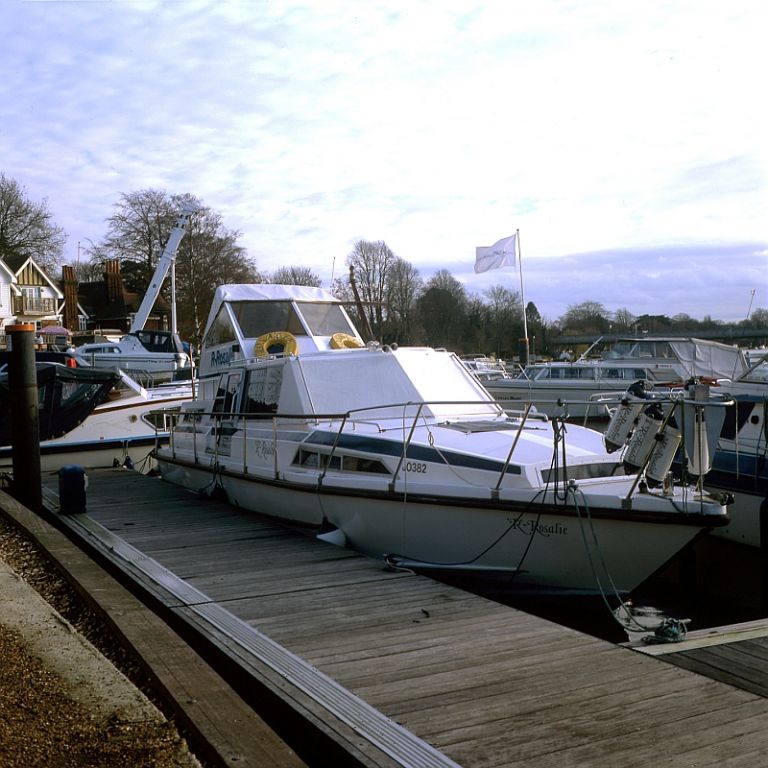
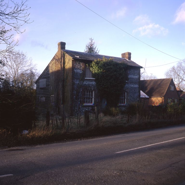
peterqd wrote:
Two shots from the second roll of Velvia 50 scanned with the V700. I'm much happier with the colour this time, but both shots were a little underexposed and I had to "rescue" them as best I could in PS, so I'm suspecting the camera meter is inaccurate.
1 - Boatyard on the Thames at Bourne End:
2 - Old deserted cottage near my home.
I've only included this to show how much better the colour is on this roll. The cottage is a precious example of local construction, probably built about 1800. The slated roof means it was built after the local canal was opened, and the walls are built of flints which continually come up through the soil in the fields on our chalk hills. It has a timber lean-to barn at the back where a horse or two, a cow and probably some pigs would have been "stabled" during the winter in former times. All the old windows and doors are still there and even an old fence and front porch of iron framing. It's rapidly deteriorating now (not helped by the ivy on the front wall) and I wanted to photograph it before it gets any worse. Late afternoon lighting in January isn't helpful and I'm not at all happy with this shot - I'll probably take it again in a few weeks time.
_________________
Peter - Moderator |
|
| Back to top |
|
|
Attila
Joined: 24 Feb 2007
Posts: 57865
Location: Hungary
Expire: 2025-11-18
|
| Posted: Fri Feb 29, 2008 11:21 pm Post subject: |
|
|
Attila wrote:
From the first one I really can't recognize this is a scanned picture... Looks you get a very nice scanner.
_________________
-------------------------------
Items on sale on Ebay
Sony NEX-7 Carl Zeiss Planar 85mm f1.4, Minolta MD 35mm f1.8, Konica 135mm f2.5, Minolta MD 50mm f1.2, Minolta MD 250mm f5.6, Carl Zeiss Sonnar 180mm f2.8
|
|
| Back to top |
|
|
peterqd
Joined: 28 Feb 2007
Posts: 7448
Location: near High Wycombe, UK
Expire: 2014-01-04
|
| Posted: Fri Feb 29, 2008 11:34 pm Post subject: |
|
|
peterqd wrote:
Thanks Attila. I'm very pleased with the results now I'm a getting bit more familiar with this scanner. This was scanned at 3200. All I need now is some of Laurence's talent
_________________
Peter - Moderator |
|
| Back to top |
|
|
Attila
Joined: 24 Feb 2007
Posts: 57865
Location: Hungary
Expire: 2025-11-18
|
| Posted: Fri Feb 29, 2008 11:40 pm Post subject: |
|
|
Attila wrote:
Seems you are going on good path!
_________________
-------------------------------
Items on sale on Ebay
Sony NEX-7 Carl Zeiss Planar 85mm f1.4, Minolta MD 35mm f1.8, Konica 135mm f2.5, Minolta MD 50mm f1.2, Minolta MD 250mm f5.6, Carl Zeiss Sonnar 180mm f2.8
|
|
| Back to top |
|
|
peterqd
Joined: 28 Feb 2007
Posts: 7448
Location: near High Wycombe, UK
Expire: 2014-01-04
|
| Posted: Fri Feb 29, 2008 11:50 pm Post subject: |
|
|
peterqd wrote:
I was wondering, is it possible the different colour tone and depth could be due to the processing? The second roll was done by a different lab.
_________________
Peter - Moderator |
|
| Back to top |
|
|
|
|


