| View previous topic :: View next topic |
| Author |
Message |
Nikos


Joined: 17 May 2010
Posts: 1077
Location: Greece
Expire: 2015-01-02
|
 Posted: Tue Nov 30, 2010 1:15 am Post subject: Comparison: Distagon 15mm vs Canon 17mm tilt-shift Posted: Tue Nov 30, 2010 1:15 am Post subject: Comparison: Distagon 15mm vs Canon 17mm tilt-shift |
 |
|
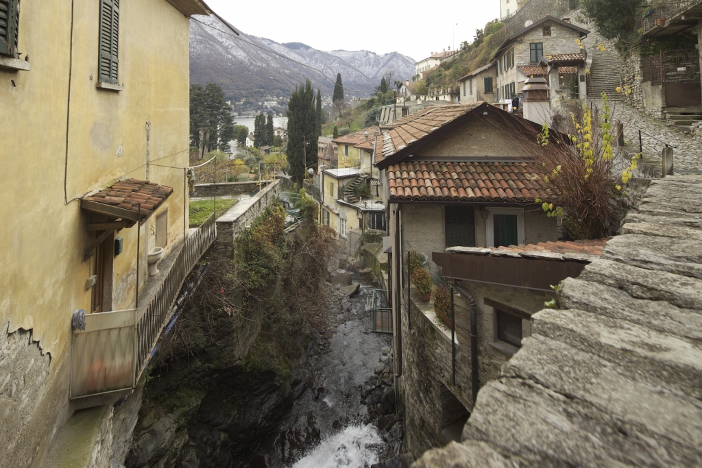
Nikos wrote:
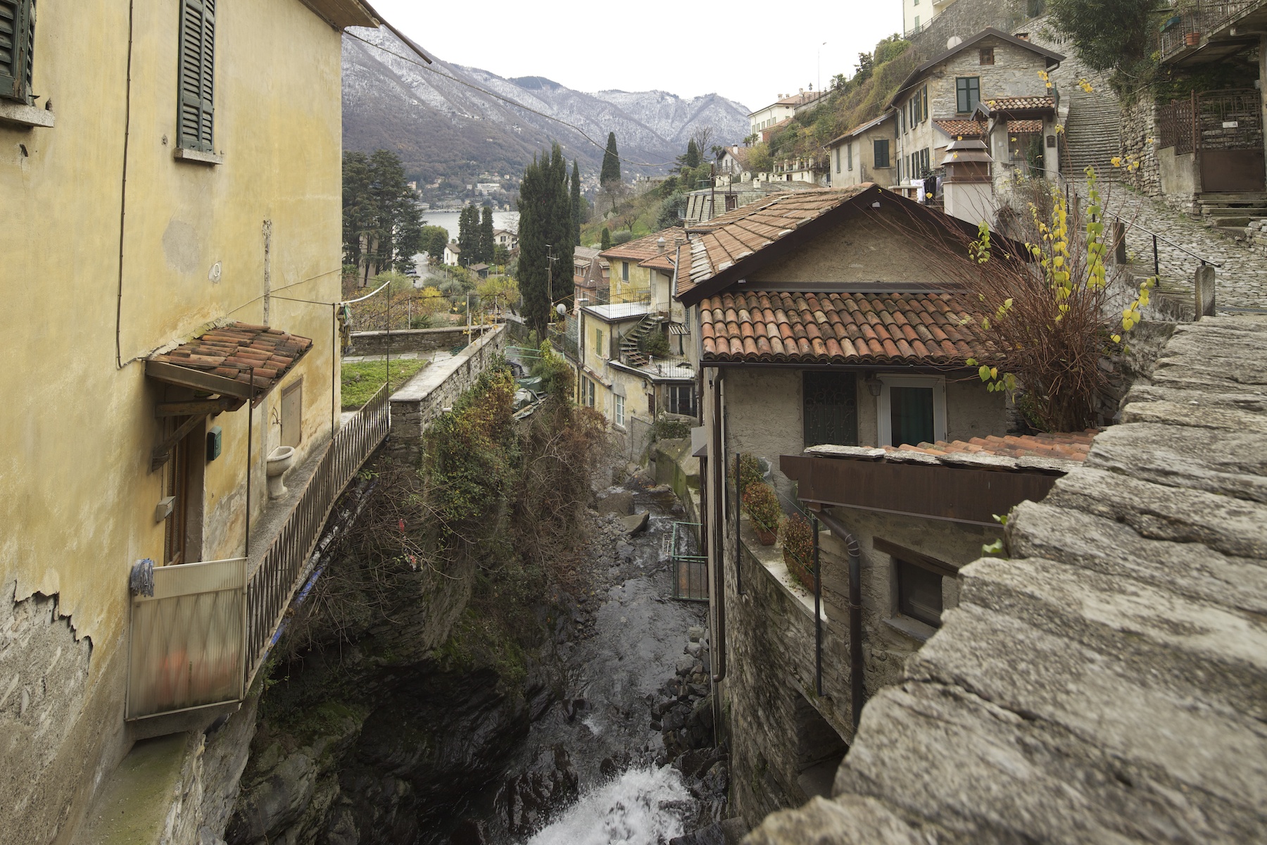
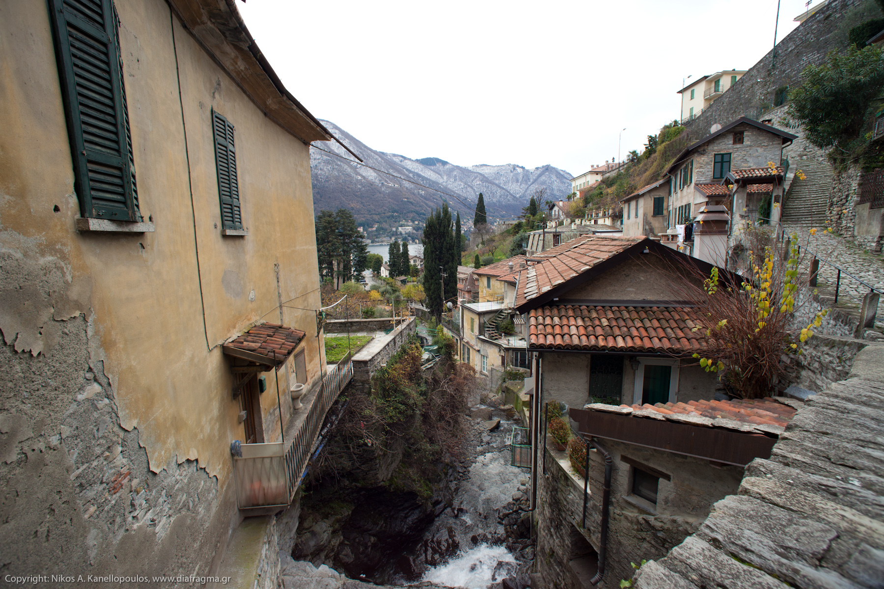
While we were in lake Como, I borrowed Orio's 15mm for a while.
I returned it quickly, so he could start breathing again  
Here is the same scene from the same point with both lenses.
I cannot remember how much I shifted the TS lens, but I guess 5-6 mm.
Unfortunately, it seems that I have tilted the camera downwards in the photo with the TS lens.
It needs to be level to control distortion effectively.
Even small movements have noticeable effect.
1. Contax Distagon 15mm @ f/8
2. Canon 17mm TS @ f/8
_________________
Νίκος • www.diafragma.gr

Cameras: Canon EOS 5D Mark II, Sony α7R, Sony NEX-5N
MF lenses:
SLR:
Canon TS-E 17mm f/4, Zeiss 2.8/21 ZE, Zeiss 2/28 Contax, Zeiss 2/35 ZE, Zeiss 1.4/50 Contax, Zeiss 1.4/85 Contax, Zeiss Makro 2/100 ZE,
Zeiss 2/135 Contax, Zeiss 2.8/135 Contax, Zeiss Vario-Sonnar 35-70 Contax, Zeiss Vario-Sonnar 100-300 Contax, Zeiss F-Distagon Rollei, Canon FD 24mm f2, Minolta MD Rokkor 35mm f2.8
Rangefinder:
Zeiss 4.5/21 C Biogon ZM, Zeiss 2/35 Biogon ZM, Voigtländer 15mm f/4.5 Heliar L39, Leica Tele-Elmarit 2.8/90mm, Zeiss 2/45 Contax G, Zeiss 2.8/90 Contax G, Canon 50mm 1.8 LTM
AF lenses: Canon 15mm f/2.8 Fisheye, Canon 24-70 f/2.8 L, Canon 70-200 f/2.8 L IS II, Canon 70-200 f/4 L, Canon 300 f/4 L IS, Canon 100 f/2.8 macro
|
|
| Back to top |
|
 |
Attila


Joined: 24 Feb 2007
Posts: 57865
Location: Hungary
Expire: 2025-11-18
|
| Posted: Tue Nov 30, 2010 1:50 am Post subject: |
|
|
Attila wrote:
Looks they are pretty much same to me,. but tilt shift has significant benefits on architecture shoots. To see images taken with these lenses rare opportunity even more rare to see comparatives . many thanks!
_________________
-------------------------------
Items on sale on Ebay
Sony NEX-7 Carl Zeiss Planar 85mm f1.4, Minolta MD 35mm f1.8, Konica 135mm f2.5, Minolta MD 50mm f1.2, Minolta MD 250mm f5.6, Carl Zeiss Sonnar 180mm f2.8
|
|
| Back to top |
|
|
Orio

Joined: 24 Feb 2007
Posts: 29545
Location: West Emilia
Expire: 2012-12-04
|
| Posted: Tue Nov 30, 2010 2:20 am Post subject: |
|
|
Orio wrote:
The Canon lens is a stunning performer for architecture. Of course distortion wise there is no competition for the poor Distagon 15, which is penalized not only for the lack of shift function but also for the two extra mm width (which in such a short focal lenght mean a lot distortion-wise).
On the other hand, it seems to me that contrast-wise, the Distagon performs much better.
_________________
Orio, Administrator
T*
NE CEDE MALIS AUDENTIOR ITO
Ferrania film is reborn! http://www.filmferrania.it/
Support the Ornano film chemicals company and help them survive!
http://forum.mflenses.com/ornano-chemical-products-t55525.html |
|
| Back to top |
|
|
rrkradio


Joined: 18 Nov 2010
Posts: 57
Location: Imperia - Italy
|
| Posted: Tue Nov 30, 2010 2:06 pm Post subject: |
|
|
rrkradio wrote:
Zeiss color and contrast .... this is the first difference in rendition. Of course the TS permits the best adjustment of one of the two distorsions.
I agree with Orio: 2mm in this focal range are meaningful.
roby
_________________
FUJI X-PRO 1 and Canon EOS 5D MKII with:
Leica R: 50mm Summicron - 60mm macro elmarit - 100mm apo macro elmarit f:2,8 - 135mm elmarit - 180 mm f:3.4 apo telyt - 35-70 f:4 vario elmar
Voigtlander: color skopar 21mm f:4.0
Contax Zeiss: Distagon 25mm f:2,8 |
|
| Back to top |
|
|
symphonic

Joined: 23 May 2010
Posts: 550
Location: SE Europe, Croatia
|
| Posted: Tue Nov 30, 2010 4:49 pm Post subject: |
|
|
symphonic wrote:
Both look very good, but Distagon image has much more contrast. 
Would be interesting to compare sharpness in ideal conditions.
_________________
Toni,
EOS 450D
CZJ Sonnar 135/3.5 MC | Pancolar 50/1.8 MC
Contax Planar 50/1.4 AEJ | Contax Sonnar 135/2.8 AEJ
Yashica ML 28/2.8 | Zuiko 28/3.5
Vivitar Series1 105/2.5 OM
AF: Tokina 12-24 |
|
| Back to top |
|
|
Nikos
Joined: 17 May 2010
Posts: 1077
Location: Greece
Expire: 2015-01-02
|
| Posted: Tue Nov 30, 2010 5:08 pm Post subject: |
|
|
Nikos wrote:
| symphonic wrote: |
Both look very good, but Distagon image has much more contrast.
Would be interesting to compare sharpness in ideal conditions. |
Regarding sharpness, the Canon wins hands down.
It also has zero CA.
_________________
Νίκος • www.diafragma.gr
Cameras: Canon EOS 5D Mark II, Sony α7R, Sony NEX-5N
MF lenses:
SLR:
Canon TS-E 17mm f/4, Zeiss 2.8/21 ZE, Zeiss 2/28 Contax, Zeiss 2/35 ZE, Zeiss 1.4/50 Contax, Zeiss 1.4/85 Contax, Zeiss Makro 2/100 ZE,
Zeiss 2/135 Contax, Zeiss 2.8/135 Contax, Zeiss Vario-Sonnar 35-70 Contax, Zeiss Vario-Sonnar 100-300 Contax, Zeiss F-Distagon Rollei, Canon FD 24mm f2, Minolta MD Rokkor 35mm f2.8
Rangefinder:
Zeiss 4.5/21 C Biogon ZM, Zeiss 2/35 Biogon ZM, Voigtländer 15mm f/4.5 Heliar L39, Leica Tele-Elmarit 2.8/90mm, Zeiss 2/45 Contax G, Zeiss 2.8/90 Contax G, Canon 50mm 1.8 LTM
AF lenses: Canon 15mm f/2.8 Fisheye, Canon 24-70 f/2.8 L, Canon 70-200 f/2.8 L IS II, Canon 70-200 f/4 L, Canon 300 f/4 L IS, Canon 100 f/2.8 macro
|
|
| Back to top |
|
|
William


Joined: 26 Nov 2009
Posts: 489
Location: London
|
| Posted: Tue Nov 30, 2010 5:53 pm Post subject: |
|
|
William wrote:
The Zeiss lens has more distortion but the Canon seems to have a light magenta tint, not sure if it is the WB setting. I prefer the colour rendition and contrast of the Zeiss too. The terracotta looks a lot nicer. Sharpness is very difficult to tell due to the differing focal lengths. Given the option I'd have a slightly narrower Distagon as <20mm is not for me. |
|
| Back to top |
|
|
Nikos
Joined: 17 May 2010
Posts: 1077
Location: Greece
Expire: 2015-01-02
|
| Posted: Tue Nov 30, 2010 6:06 pm Post subject: |
|
|
Nikos wrote:
| William wrote: |
| The Zeiss lens has more distortion but the Canon seems to have a light magenta tint, not sure if it is the WB setting. I prefer the colour rendition and contrast of the Zeiss too. The terracotta looks a lot nicer. Sharpness is very difficult to tell due to the differing focal lengths. Given the option I'd have a slightly narrower Distagon as <20mm is not for me. |
You cannot compare the sharpness from these photos.
I just happen to know the Canon well.
Unshifted, it has crazy sharp corners even wide open (f/4).
One needs f/8 with the Distagon to get sharp corners (said Orio). |
|
| Back to top |
|
|
trev
Joined: 30 Jun 2010
Posts: 580
Location: North Wales - UK
|
| Posted: Tue Nov 30, 2010 6:28 pm Post subject: |
|
|
trev wrote:
For my pennyworth I would say that the Canon lens has "cleaner" colours and is just a tad more sharper in the middle distance
_________________
Fuji X10, X-A1 and Samsung nx 20 |
|
| Back to top |
|
|
poilu
Joined: 26 Aug 2007
Posts: 10472
Location: Greece
Expire: 2019-08-29
|
| Posted: Tue Nov 30, 2010 7:40 pm Post subject: |
|
|
poilu wrote:
the Canon made a great job, it is not a cheap lens
at this size I cannot tell if the Canon have more resolution but contrast seems better on the Zeiss
_________________
T* |
|
| Back to top |
|
|
Orio
Joined: 24 Feb 2007
Posts: 29545
Location: West Emilia
Expire: 2012-12-04
|
| Posted: Tue Nov 30, 2010 7:47 pm Post subject: |
|
|
Orio wrote:
| trev wrote: |
| For my pennyworth I would say that the Canon lens has "cleaner" colours |
Colours in Nikos' images have a strong yellow/green cast, so difficult to compare.
Nikos, if you're using Lightroom, try the following settings on your raw file:
Temp= 5000
Tint= +10
Vibrance= +30
These are the settings I used on my raw file of the same subject.
_________________
Orio, Administrator
T*
NE CEDE MALIS AUDENTIOR ITO
Ferrania film is reborn! http://www.filmferrania.it/
Support the Ornano film chemicals company and help them survive!
http://forum.mflenses.com/ornano-chemical-products-t55525.html |
|
| Back to top |
|
|
Nikos
Joined: 17 May 2010
Posts: 1077
Location: Greece
Expire: 2015-01-02
|
| Posted: Tue Nov 30, 2010 8:38 pm Post subject: |
|
|
Nikos wrote:
| Orio wrote: |
Colours in Nikos' images have a strong yellow/green cast, so difficult to compare.
Nikos, if you're using Lightroom, try the following settings on your raw file:
Temp= 5000
Tint= +10
Vibrance= +30
These are the settings I used on my raw file of the same subject. |
I am trying to decide if I should switch to LR.
I like Aperture a lot, but some things get on my nerves.
Anyway. I have LR 3 trial installed, so here you are.
My initial versions were too yellow indeed (my "special" vision is getting on my nerves...)
However, isn't 5000K supposed to be the color temperature for sunny situations?
I selected no sharpening at all in the LR export options. High-res is 1800x1200.
1b. Contax Distagon 15mm

2b. Canon 17mm TS

I do not think it is a matter of contrast.
The Zeiss has definitely superior COLOR.
What appears as "less contrast" is, I think, the totally different rendering of the greens.
For example, look at the cypress tree in the middle of the photos.
Same exposure, same camera, same post processing. No comparison.
The Zeiss green is so much deeper and vibrant...
_________________
Νίκος • www.diafragma.gr
Cameras: Canon EOS 5D Mark II, Sony α7R, Sony NEX-5N
MF lenses:
SLR:
Canon TS-E 17mm f/4, Zeiss 2.8/21 ZE, Zeiss 2/28 Contax, Zeiss 2/35 ZE, Zeiss 1.4/50 Contax, Zeiss 1.4/85 Contax, Zeiss Makro 2/100 ZE,
Zeiss 2/135 Contax, Zeiss 2.8/135 Contax, Zeiss Vario-Sonnar 35-70 Contax, Zeiss Vario-Sonnar 100-300 Contax, Zeiss F-Distagon Rollei, Canon FD 24mm f2, Minolta MD Rokkor 35mm f2.8
Rangefinder:
Zeiss 4.5/21 C Biogon ZM, Zeiss 2/35 Biogon ZM, Voigtländer 15mm f/4.5 Heliar L39, Leica Tele-Elmarit 2.8/90mm, Zeiss 2/45 Contax G, Zeiss 2.8/90 Contax G, Canon 50mm 1.8 LTM
AF lenses: Canon 15mm f/2.8 Fisheye, Canon 24-70 f/2.8 L, Canon 70-200 f/2.8 L IS II, Canon 70-200 f/4 L, Canon 300 f/4 L IS, Canon 100 f/2.8 macro
|
|
| Back to top |
|
|
Orio
Joined: 24 Feb 2007
Posts: 29545
Location: West Emilia
Expire: 2012-12-04
|
| Posted: Tue Nov 30, 2010 8:48 pm Post subject: |
|
|
Orio wrote:
Ok, now the Distagon picture looks perfect
The Canon one looks a bit too magenta, but that's because I fine-tuned the temperature on my Distagon. If you move the "tint" slider to 0 value in the Canon picture, it should fix it.
Daylight conventional temperature is either 5200K or 5500K depending on the camera maker. But like I said, I like it slightly cooler, so here's why I set 5000.
The daylight value (5200K) is not really for sunlight - it's the mid-day value of the light source Sun. When you use 5200K, the pictures will appear warmer if there is sunlight and cooler if there is overcast - pretty much like reality, which is good. It is not rare that I set the camera to 5200K and leave it that way when I photograph from 10AM to 3PM (in the winter).
Near dawn or near sunset the quality of light changes enormously, and the camera at 5200K records those changes faithfully, but the problem is that our brains compensate for the colour changes, while the camera-computer system don't. So we need to change Kelvin setting in the camera in order for the camera-computer system to adapt to our subjective perception (or better said, to emulate our brain's adaptations).
_________________
Orio, Administrator
T*
NE CEDE MALIS AUDENTIOR ITO
Ferrania film is reborn! http://www.filmferrania.it/
Support the Ornano film chemicals company and help them survive!
http://forum.mflenses.com/ornano-chemical-products-t55525.html |
|
| Back to top |
|
|
Nikos
Joined: 17 May 2010
Posts: 1077
Location: Greece
Expire: 2015-01-02
|
| Posted: Tue Nov 30, 2010 9:06 pm Post subject: |
|
|
Nikos wrote:
By the way, we CAN tell from these photos which lens is sharper.
Below the window of the house on the left, there is a white circular cap.
Compare this in the high-res images.
In the Canon version, you can easily discern the grid on the cap...
The second version of the photos, from Lightroom, are not sharpened. |
|
| Back to top |
|
|
Orio
Joined: 24 Feb 2007
Posts: 29545
Location: West Emilia
Expire: 2012-12-04
|
| Posted: Tue Nov 30, 2010 9:46 pm Post subject: |
|
|
Orio wrote:
The Canon picture is surely sharper (there are more than 20 years distance between the two models), however the cap is not a good indicator, because it's small and there is a 7-8 degrees of Angle of View difference (about 30% Field of view difference) between a 17mm and a 15mm lens.
In other words, the grid is there in the Distagon image, too (if you look close, you see it), but the cap is too small in the Distagon image to properly distanciate the white lines, causing a reduced perception of sharpness.
_________________
Orio, Administrator
T*
NE CEDE MALIS AUDENTIOR ITO
Ferrania film is reborn! http://www.filmferrania.it/
Support the Ornano film chemicals company and help them survive!
http://forum.mflenses.com/ornano-chemical-products-t55525.html |
|
| Back to top |
|
|
|
|
|
You cannot post new topics in this forum
You cannot reply to topics in this forum
You cannot edit your posts in this forum
You cannot delete your posts in this forum
You cannot vote in polls in this forum
|