| View previous topic :: View next topic |
| Author |
Message |
tomasg

Joined: 01 Nov 2009
Posts: 1135
Expire: 2014-04-28
|
 Posted: Mon Oct 31, 2011 7:59 pm Post subject: Colourful forest, part #1 Posted: Mon Oct 31, 2011 7:59 pm Post subject: Colourful forest, part #1 |
 |
|
tomasg wrote:
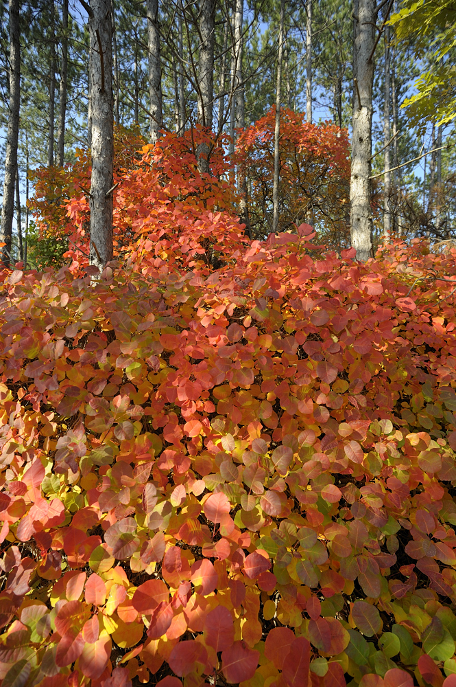
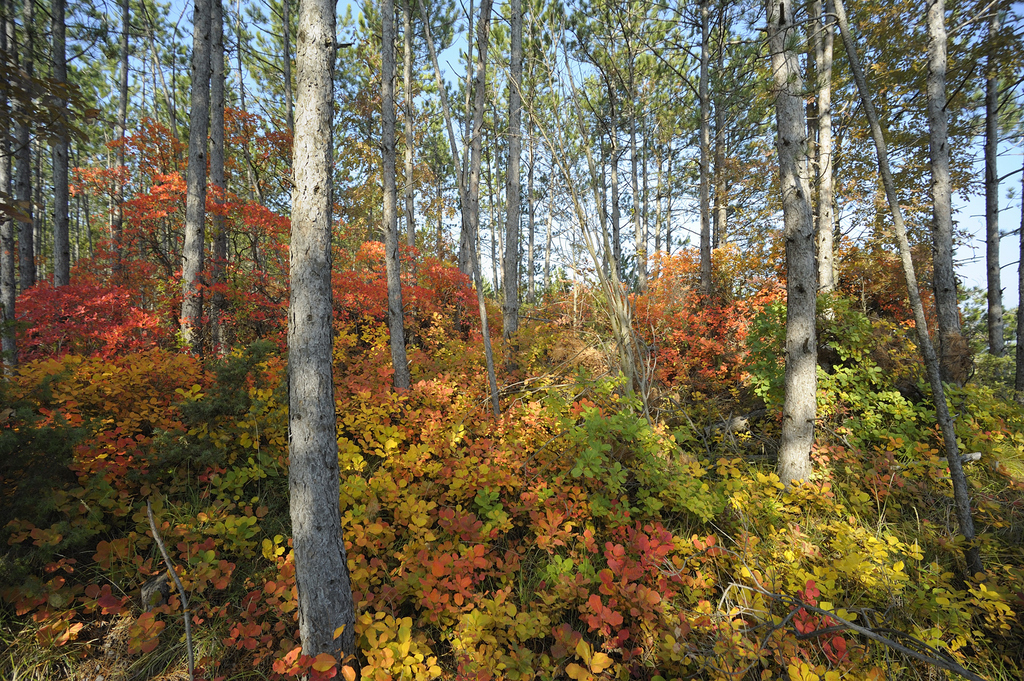
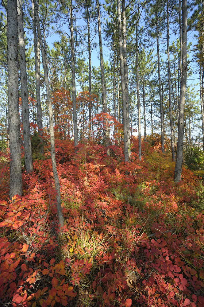
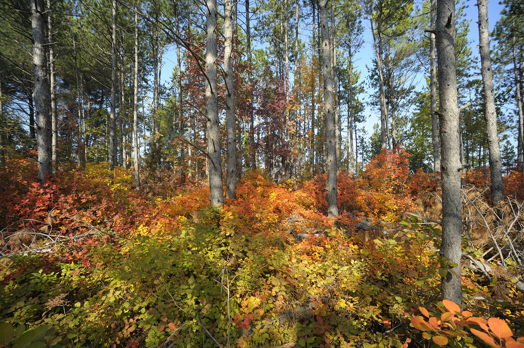
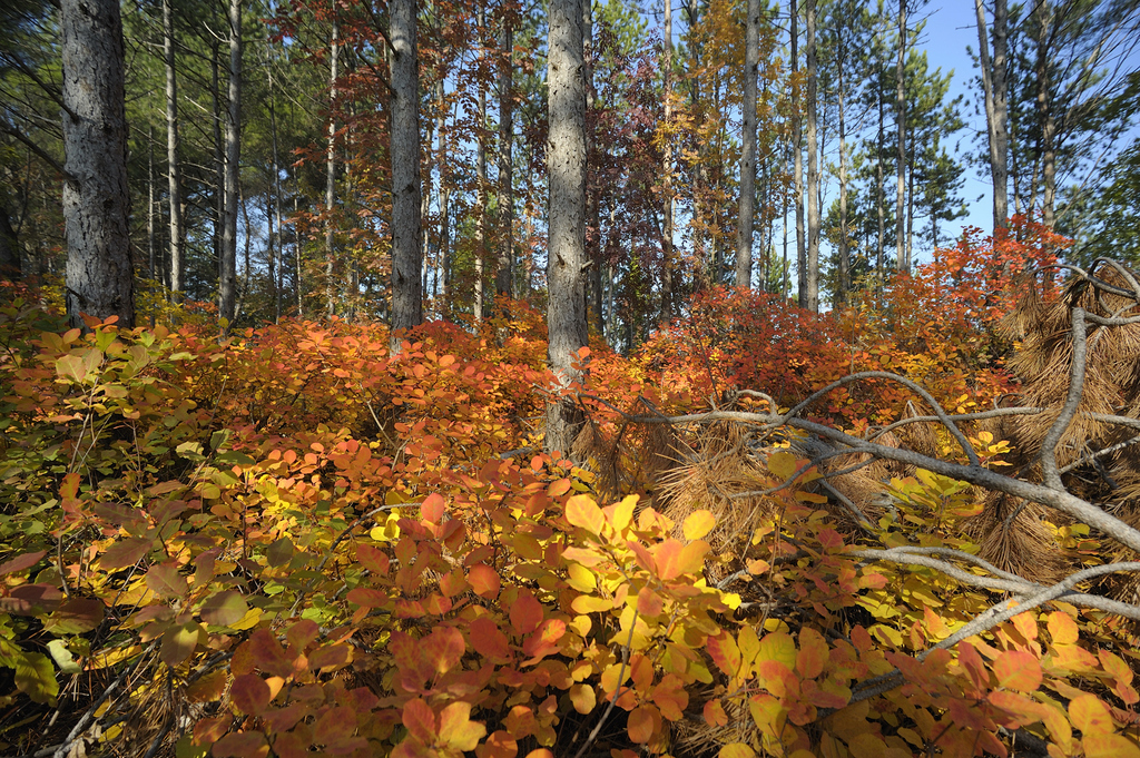
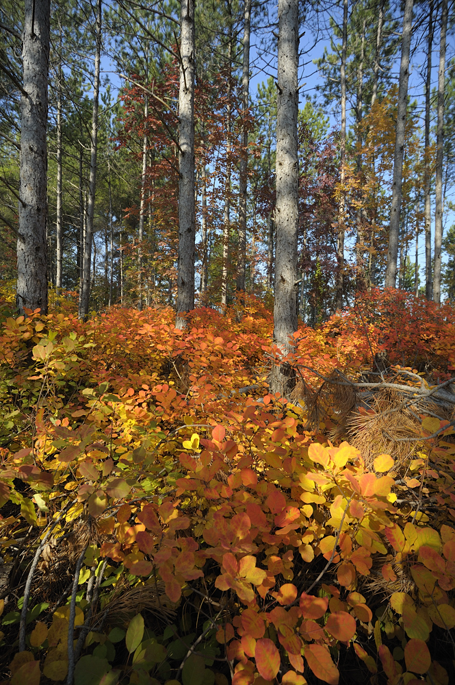
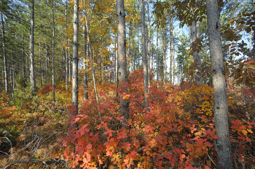
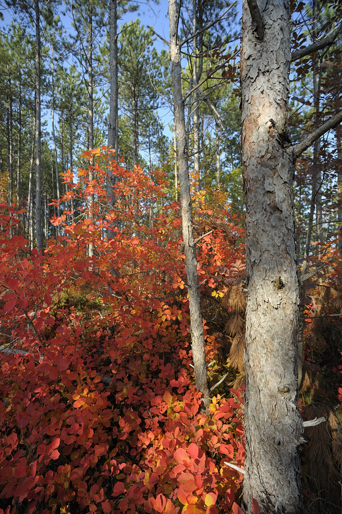
well, not a real forest, we don t have them where i live, but we have this colourful bush that grows at the foot of the trees, it s green during the spring and summer, but it gets of this colours in autumn. Part one becouse i took 130 pics...  Lens used a Vivitar 17/3.5, C&C is welcomed of course. Lens used a Vivitar 17/3.5, C&C is welcomed of course.
Tomas
#1
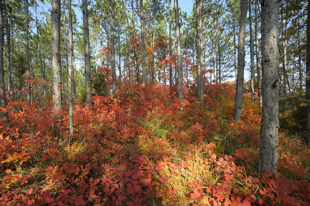
#2
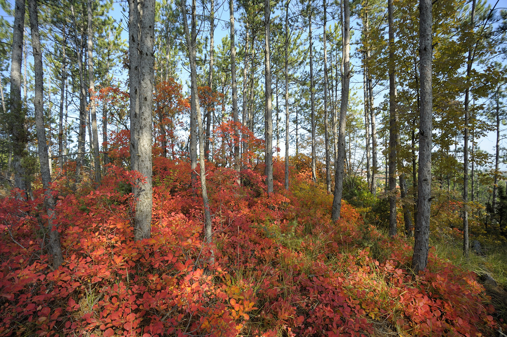
#3
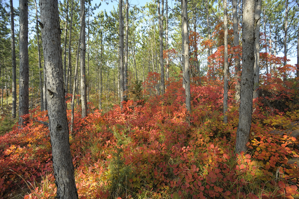
#4
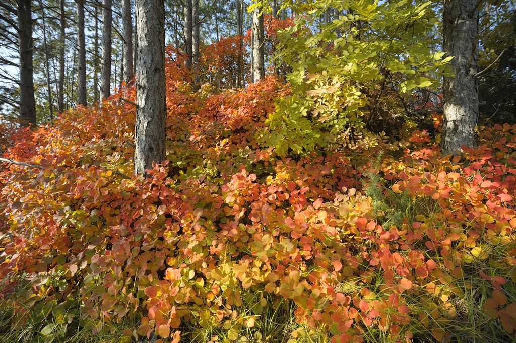
#5
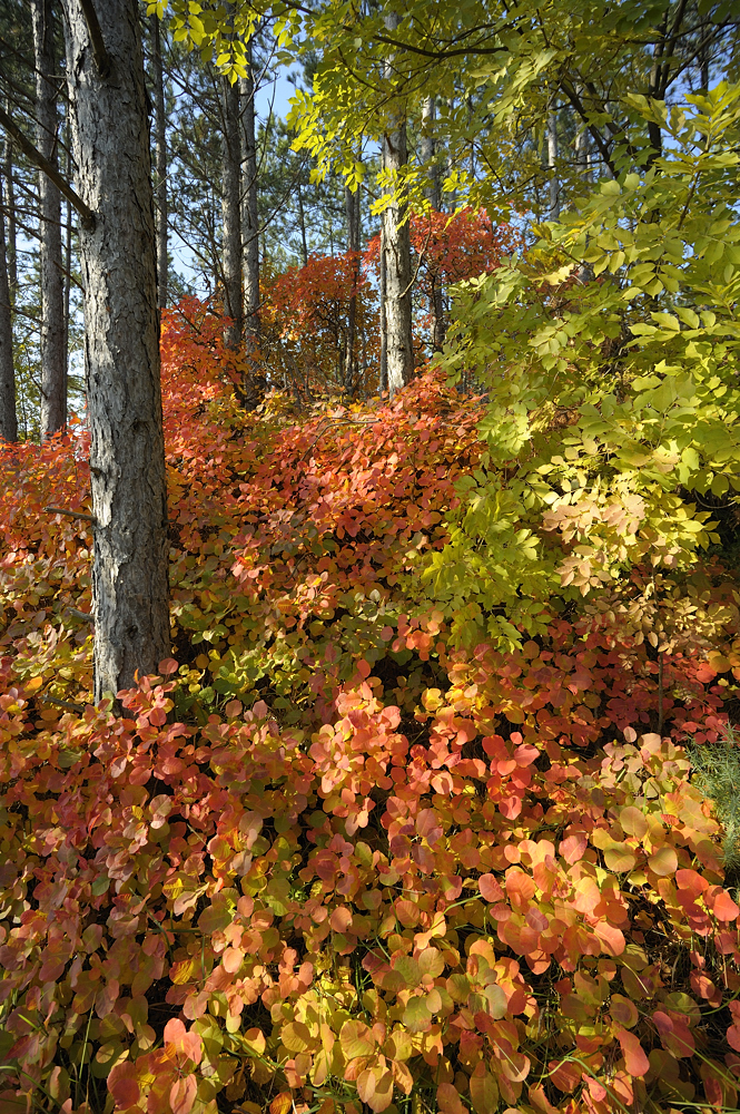
#6
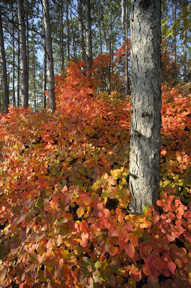
#7
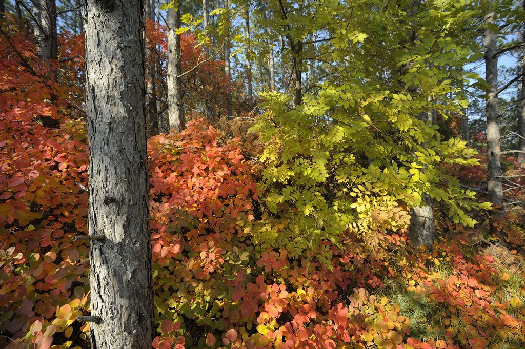
#8
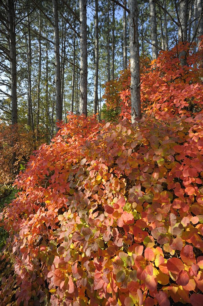
#9
#10
#11
#12
#13
#14
#15
#16
Thanx for looking
originals:
http://www.pbase.com/tomasg_71/col_forest_1
Tomas |
|
| Back to top |
|
 |
kds315*


Joined: 12 Mar 2008
Posts: 16664
Location: Weinheim, Germany
Expire: 2021-03-09
|
 Posted: Mon Oct 31, 2011 8:46 pm Post subject: Posted: Mon Oct 31, 2011 8:46 pm Post subject: |
 |
|
kds315* wrote:
Great shots and beautiful colors Tomas - but, ehemm, why not choose the best one (or three best ones)?
They're all basically the same but from different angles or vertical/horizontal.
Less is much more in my opinion...
The last one and 2nd to last one are great in my opinion! The colors come out great, the blue sky gets visible through the forest and the trees come out great.
_________________
Klaus - Admin
"S'il vient a point, me souviendra" [Thomas Bohier (1460-1523)]
http://www.macrolenses.de for macro and special lens info
http://www.pbase.com/kds315/uv_photos for UV Images and lens/filter info
https://www.flickr.com/photos/kds315/albums my albums using various lenses
http://photographyoftheinvisibleworld.blogspot.com/ my UV BLOG
http://www.travelmeetsfood.com/blog Food + Travel BLOG
https://galeriafotografia.com Architecture + Drone photography
Currently most FAV lens(es):
X80QF f3.2/80mm
Hypergon f11/26mm
ELCAN UV f5.6/52mm
Zeiss UV-Planar f4/60mm
Zeiss UV-Planar f2/62mm
Lomo Уфар-12 f2.5/41mm
Lomo Зуфар-2 f4.0/350mm
Lomo ZIKAR-1A f1.2/100mm
Nikon UV Nikkor f4.5/105mm
Zeiss UV-Sonnar f4.3/105mm
CERCO UV-VIS-NIR f1.8/45mm
CERCO UV-VIS-NIR f4.1/94mm
CERCO UV-VIS-NIR f2.8/100mm
Steinheil Quarzobjektiv f1.8/50mm
Pentax Quartz Takumar f3.5/85mm
Carl Zeiss Jena UV-Objektiv f4/60mm
NYE OPTICAL Lyman-Alpha II f1.1/90mm
NYE OPTICAL Lyman-Alpha I f2.8/200mm
COASTAL OPTICS f4/60mm UV-VIS-IR Apo
COASTAL OPTICS f4.5/105mm UV-Micro-Apo
Pentax Ultra-Achromatic Takumar f4.5/85mm
Pentax Ultra-Achromatic Takumar f5.6/300mm
Rodenstock UV-Rodagon f5.6/60mm + 105mm + 150mm
|
|
| Back to top |
|
 |
tomasg

Joined: 01 Nov 2009
Posts: 1135
Expire: 2014-04-28
|
 Posted: Mon Oct 31, 2011 8:53 pm Post subject: Posted: Mon Oct 31, 2011 8:53 pm Post subject: |
 |
|
tomasg wrote:
| Quote: |
but, ehemm, why not choose the best one (or three best ones)?
They're all basically the same but from different angles or vertical/horizonatl. Less is much more in my opinion... |
Thanx Klaus, then help me choose, for example which ones work better the vertical or the horizontal ones ?
Last edited by tomasg on Mon Oct 31, 2011 9:03 pm; edited 1 time in total |
|
| Back to top |
|
 |
kds315*


Joined: 12 Mar 2008
Posts: 16664
Location: Weinheim, Germany
Expire: 2021-03-09
|
 Posted: Mon Oct 31, 2011 9:02 pm Post subject: Posted: Mon Oct 31, 2011 9:02 pm Post subject: |
 |
|
kds315* wrote:
You could choose whatever you like to, ever show all 130 images.
But "less is more" and to concentrate on the really good ones helps you
to develop an eye for that - THAT is why I said that, not because there
are bad ones (there are not!). Image you woudl send in images for
a contest called "autumn in the forst" and you coudl ONLY send in one.
Which ones would you choose (and why)? It is not about the "technique",
it is about what that oen image will "tell" a possible viewer. Will he stop
and have a look, or will he pass by? Make him stop and look!!
_________________
Klaus - Admin
"S'il vient a point, me souviendra" [Thomas Bohier (1460-1523)]
http://www.macrolenses.de for macro and special lens info
http://www.pbase.com/kds315/uv_photos for UV Images and lens/filter info
https://www.flickr.com/photos/kds315/albums my albums using various lenses
http://photographyoftheinvisibleworld.blogspot.com/ my UV BLOG
http://www.travelmeetsfood.com/blog Food + Travel BLOG
https://galeriafotografia.com Architecture + Drone photography
Currently most FAV lens(es):
X80QF f3.2/80mm
Hypergon f11/26mm
ELCAN UV f5.6/52mm
Zeiss UV-Planar f4/60mm
Zeiss UV-Planar f2/62mm
Lomo Уфар-12 f2.5/41mm
Lomo Зуфар-2 f4.0/350mm
Lomo ZIKAR-1A f1.2/100mm
Nikon UV Nikkor f4.5/105mm
Zeiss UV-Sonnar f4.3/105mm
CERCO UV-VIS-NIR f1.8/45mm
CERCO UV-VIS-NIR f4.1/94mm
CERCO UV-VIS-NIR f2.8/100mm
Steinheil Quarzobjektiv f1.8/50mm
Pentax Quartz Takumar f3.5/85mm
Carl Zeiss Jena UV-Objektiv f4/60mm
NYE OPTICAL Lyman-Alpha II f1.1/90mm
NYE OPTICAL Lyman-Alpha I f2.8/200mm
COASTAL OPTICS f4/60mm UV-VIS-IR Apo
COASTAL OPTICS f4.5/105mm UV-Micro-Apo
Pentax Ultra-Achromatic Takumar f4.5/85mm
Pentax Ultra-Achromatic Takumar f5.6/300mm
Rodenstock UV-Rodagon f5.6/60mm + 105mm + 150mm
|
|
| Back to top |
|
 |
tomasg

Joined: 01 Nov 2009
Posts: 1135
Expire: 2014-04-28
|
 Posted: Mon Oct 31, 2011 9:10 pm Post subject: Posted: Mon Oct 31, 2011 9:10 pm Post subject: |
 |
|
tomasg wrote:
Yes, Klaus i understand what you mean and why it s important. As a Pbase user you know you can choose one "rapresentative" pic for the gallery, i never know which one to choose 
as i said, please help me to choose three then, (you said the last two if i am correct) i hope someone else will partecipate, this way i ll see which ones are the most popular.
Thanx Tomas |
|
| Back to top |
|
 |
Orio

Joined: 24 Feb 2007
Posts: 29545
Location: West Emilia
Expire: 2012-12-04
|
 Posted: Mon Oct 31, 2011 9:21 pm Post subject: Posted: Mon Oct 31, 2011 9:21 pm Post subject: |
 |
|
Orio wrote:
I would choose #14 because with this type of subject (that can easily look confused) it is very important
to have a visually strong and well sharp foreground subject.
The same good foreground is in #13 (same location but with camera horizontal), but I prefer #14
because the vertical framing "fits" better with the vertical element of the trunks.
_________________
Orio, Administrator
T*
NE CEDE MALIS AUDENTIOR ITO
Ferrania film is reborn! http://www.filmferrania.it/
Support the Ornano film chemicals company and help them survive!
http://forum.mflenses.com/ornano-chemical-products-t55525.html |
|
| Back to top |
|
 |
tomasg

Joined: 01 Nov 2009
Posts: 1135
Expire: 2014-04-28
|
 Posted: Mon Oct 31, 2011 9:39 pm Post subject: Posted: Mon Oct 31, 2011 9:39 pm Post subject: |
 |
|
tomasg wrote:
| Quote: |
but I prefer #14
because the vertical framing "fits" better with the vertical element of the trunks. |
Orio, this is a difficult one, in general i think horizontal is better for a "typical" landscape picture, horizontal also works much better with our monitors, it fits better thus can be displayed larger, but vertical is much better for trees in this case, or possibly with any tall subject. thanx again, with your help, at the end i ll leave the "best ones" in the Pbase gallery.
Tomas |
|
| Back to top |
|
 |
Orio

Joined: 24 Feb 2007
Posts: 29545
Location: West Emilia
Expire: 2012-12-04
|
 Posted: Mon Oct 31, 2011 9:45 pm Post subject: Posted: Mon Oct 31, 2011 9:45 pm Post subject: |
 |
|
Orio wrote:
| tomasg wrote: |
| Quote: |
but I prefer #14
because the vertical framing "fits" better with the vertical element of the trunks. |
Orio, this is a difficult one, in general i think horizontal is better for a "typical" landscape picture |
And that's why you don't want to make one 
Another advantage of vertical in this situation, is that it gives you a lot more foreground, and you can really use it
in this photo, since it adds a sense of depth.
_________________
Orio, Administrator
T*
NE CEDE MALIS AUDENTIOR ITO
Ferrania film is reborn! http://www.filmferrania.it/
Support the Ornano film chemicals company and help them survive!
http://forum.mflenses.com/ornano-chemical-products-t55525.html |
|
| Back to top |
|
 |
peterqd


Joined: 28 Feb 2007
Posts: 7448
Location: near High Wycombe, UK
Expire: 2014-01-04
|
 Posted: Mon Oct 31, 2011 9:55 pm Post subject: Posted: Mon Oct 31, 2011 9:55 pm Post subject: |
 |
|
peterqd wrote:
I agree about the portrait orientation, but ideally I'd like to see more at the bottom of the picture - perhaps the bottom of the tree if it's visible or a little area of bare ground. This would give me a better sense of distance and camera angle. Perhaps a slightly wider lens would help?
_________________
Peter - Moderator |
|
| Back to top |
|
 |
NikonD


Joined: 29 Jul 2008
Posts: 1922
Location: Slovenija
|
 Posted: Mon Oct 31, 2011 10:23 pm Post subject: Posted: Mon Oct 31, 2011 10:23 pm Post subject: |
 |
|
NikonD wrote:
very colorful bushes the grayness of the tree bark and cyan sky adds to the color contrast, I can't pick a favorite  |
|
| Back to top |
|
 |
tomasg

Joined: 01 Nov 2009
Posts: 1135
Expire: 2014-04-28
|
 Posted: Tue Nov 01, 2011 11:35 am Post subject: Posted: Tue Nov 01, 2011 11:35 am Post subject: |
 |
|
tomasg wrote:
Part #2 is in the autofocus gallery, as it was took with a Sigma 20/1.8, where i already reduced the selection a bit. Thanx again, for the C&C so far, i really appriciate it.
Tomas |
|
| Back to top |
|
 |
kds315*


Joined: 12 Mar 2008
Posts: 16664
Location: Weinheim, Germany
Expire: 2021-03-09
|
 Posted: Tue Nov 01, 2011 12:51 pm Post subject: Posted: Tue Nov 01, 2011 12:51 pm Post subject: |
 |
|
kds315* wrote:
This is the best I'd say after having looked at all them several times:

It shows the intense color in the foreground, also large enough to see what it is,
contrasts to the green on the right side, shows the trees of the forest and also
gives a depth perspective up that hill and allows the blue sky to come through.
Plus it is a very serene scene to sooth the mind....
_________________
Klaus - Admin
"S'il vient a point, me souviendra" [Thomas Bohier (1460-1523)]
http://www.macrolenses.de for macro and special lens info
http://www.pbase.com/kds315/uv_photos for UV Images and lens/filter info
https://www.flickr.com/photos/kds315/albums my albums using various lenses
http://photographyoftheinvisibleworld.blogspot.com/ my UV BLOG
http://www.travelmeetsfood.com/blog Food + Travel BLOG
https://galeriafotografia.com Architecture + Drone photography
Currently most FAV lens(es):
X80QF f3.2/80mm
Hypergon f11/26mm
ELCAN UV f5.6/52mm
Zeiss UV-Planar f4/60mm
Zeiss UV-Planar f2/62mm
Lomo Уфар-12 f2.5/41mm
Lomo Зуфар-2 f4.0/350mm
Lomo ZIKAR-1A f1.2/100mm
Nikon UV Nikkor f4.5/105mm
Zeiss UV-Sonnar f4.3/105mm
CERCO UV-VIS-NIR f1.8/45mm
CERCO UV-VIS-NIR f4.1/94mm
CERCO UV-VIS-NIR f2.8/100mm
Steinheil Quarzobjektiv f1.8/50mm
Pentax Quartz Takumar f3.5/85mm
Carl Zeiss Jena UV-Objektiv f4/60mm
NYE OPTICAL Lyman-Alpha II f1.1/90mm
NYE OPTICAL Lyman-Alpha I f2.8/200mm
COASTAL OPTICS f4/60mm UV-VIS-IR Apo
COASTAL OPTICS f4.5/105mm UV-Micro-Apo
Pentax Ultra-Achromatic Takumar f4.5/85mm
Pentax Ultra-Achromatic Takumar f5.6/300mm
Rodenstock UV-Rodagon f5.6/60mm + 105mm + 150mm
|
|
| Back to top |
|
 |
tomasg

Joined: 01 Nov 2009
Posts: 1135
Expire: 2014-04-28
|
 Posted: Tue Nov 01, 2011 1:06 pm Post subject: Posted: Tue Nov 01, 2011 1:06 pm Post subject: |
 |
|
tomasg wrote:
Thanx Klaus
Tomas |
|
| Back to top |
|
 |
yinyangbt


Joined: 08 Oct 2010
Posts: 1973
Location: Romania
Expire: 2012-12-27
|
 Posted: Tue Nov 01, 2011 9:05 pm Post subject: Posted: Tue Nov 01, 2011 9:05 pm Post subject: |
 |
|
yinyangbt wrote:
I vote also for Nr. 5 and 14
_________________
Cheers , Teo
http://photo.net/photodb/member-photos?user_id=5778915 |
|
| Back to top |
|
 |
tomasg

Joined: 01 Nov 2009
Posts: 1135
Expire: 2014-04-28
|
 Posted: Wed Nov 02, 2011 8:06 am Post subject: Posted: Wed Nov 02, 2011 8:06 am Post subject: |
 |
|
tomasg wrote:
Thanxs Teo
Tomas |
|
| Back to top |
|
 |
Jesito


Joined: 24 Aug 2007
Posts: 5745
Location: Olivella, Catalonia, (Spain)
Expire: 2015-01-07
|
 Posted: Wed Nov 02, 2011 8:38 am Post subject: Posted: Wed Nov 02, 2011 8:38 am Post subject: |
 |
|
Jesito wrote:
I like very much the colours, and join Klaus in the picture he has selected.
Regards.
Jes.
_________________
Jesito, Moderator 
Jesito's backsack:
Zooms Sigma 70-300, Tamron 35-135 and 70-210 short, 70-210 long, 28-70 CF Macro, 35-70, 35-80, Vivitar 70-210 KA, Tamron 70-250.
Fixed Industar-50, , Tamron 24mm, Tamron 135mm, Sands Hunter 135mm, Pancolar 50mm, Volna-3, many Exakta lenses
DSLR SIGMA SD9 & SD14, EOS 5D, Sony A700 and NEXF3, Oly E-330, E-400, E-450, E-1
TLR/6x6/645 YashicaMat, Petri 6x45, Nettar, Franka Solida, Brilliant
SLR Minolta X300, Fuji STX II, Praktica VLC3, Pentax P30t, EXA500, EXA 1A, Spotmatic(2), Chinon CM-4S, Ricoh, Contax, Konica TC-X , Minolta 5000, 7000i, 3Sxi, EOS 500 and CX
Rangefinders Chinon 35EE, Konica C35 auto, Canonet 28, Yashica Lynx, FED-2, Yashica electro 35, Argus C3 & C4, Regula Cita III, Voigtlander Vitoret (many), Welta Welti-I, Kodak Signette 35, Zorki-4, Bessa-R & L, Minolta Weathermatic, olympus XA2
Compact Film Konica C35V, Voigtlander Vitorets, Canon Prima Super 105, Olympus XA2 and XA3
Compact Digital Olympus C-5050, Aiptek Slim 3000, Canon Powershot A540, Nikon 5200, SIGMA DP1s, Polaroid X530, IXUS55, Kodak 6490, Powershot G9 and G10
CSCCanon EOS-M, Samsung NX100 and NX210, Lumix G5, NEX-F3 |
|
| Back to top |
|
 |
ManualFocus-G


Joined: 29 Dec 2008
Posts: 6622
Location: United Kingdom
Expire: 2014-11-24
|
 Posted: Wed Nov 02, 2011 8:58 pm Post subject: Posted: Wed Nov 02, 2011 8:58 pm Post subject: |
 |
|
ManualFocus-G wrote:
Great colours! I like the symmetry in number 1...it's funny how people like different things 
_________________
Graham - Moderator 
Shooter of choice: Fujifilm X-T20 with M42, PB and C/Y lenses
See my Flickr photos at http://www.flickr.com/photos/manualfocus-g |
|
| Back to top |
|
 |
kds315*


Joined: 12 Mar 2008
Posts: 16664
Location: Weinheim, Germany
Expire: 2021-03-09
|
 Posted: Wed Nov 02, 2011 9:20 pm Post subject: Posted: Wed Nov 02, 2011 9:20 pm Post subject: |
 |
|
kds315* wrote:
Absolutely true Graham! It is very subjective of course.
Just a few words about this discussion: Personally I like the "pars pro toto" approach a lot in photography and the "get closer". So I usually pick one piece for the whole, but get real close to show it in all details, colors etc., which then stands for ("symbolizes") the whole scene/thing. So in case of that forest scene, I may have just picked one impressive leave and a tree trunk and if I can a bit of blue sky to model the whole scenery. Or if that is had to do, use a wide angle and get real close to a few items and push the whole scenery into the background. That can be seen in my work, I hope at least...
_________________
Klaus - Admin
"S'il vient a point, me souviendra" [Thomas Bohier (1460-1523)]
http://www.macrolenses.de for macro and special lens info
http://www.pbase.com/kds315/uv_photos for UV Images and lens/filter info
https://www.flickr.com/photos/kds315/albums my albums using various lenses
http://photographyoftheinvisibleworld.blogspot.com/ my UV BLOG
http://www.travelmeetsfood.com/blog Food + Travel BLOG
https://galeriafotografia.com Architecture + Drone photography
Currently most FAV lens(es):
X80QF f3.2/80mm
Hypergon f11/26mm
ELCAN UV f5.6/52mm
Zeiss UV-Planar f4/60mm
Zeiss UV-Planar f2/62mm
Lomo Уфар-12 f2.5/41mm
Lomo Зуфар-2 f4.0/350mm
Lomo ZIKAR-1A f1.2/100mm
Nikon UV Nikkor f4.5/105mm
Zeiss UV-Sonnar f4.3/105mm
CERCO UV-VIS-NIR f1.8/45mm
CERCO UV-VIS-NIR f4.1/94mm
CERCO UV-VIS-NIR f2.8/100mm
Steinheil Quarzobjektiv f1.8/50mm
Pentax Quartz Takumar f3.5/85mm
Carl Zeiss Jena UV-Objektiv f4/60mm
NYE OPTICAL Lyman-Alpha II f1.1/90mm
NYE OPTICAL Lyman-Alpha I f2.8/200mm
COASTAL OPTICS f4/60mm UV-VIS-IR Apo
COASTAL OPTICS f4.5/105mm UV-Micro-Apo
Pentax Ultra-Achromatic Takumar f4.5/85mm
Pentax Ultra-Achromatic Takumar f5.6/300mm
Rodenstock UV-Rodagon f5.6/60mm + 105mm + 150mm
|
|
| Back to top |
|
 |
|
|
|
You cannot post new topics in this forum
You cannot reply to topics in this forum
You cannot edit your posts in this forum
You cannot delete your posts in this forum
You cannot vote in polls in this forum
|
