| View previous topic :: View next topic |
| Author |
Message |
Laurence


Joined: 26 Mar 2007
Posts: 4809
Location: Western Washington State
Expire: 2016-06-19
|
 Posted: Sat May 28, 2011 6:58 am Post subject: Yashica Mat - Fuji NPC160 Negative Film (Expired) Posted: Sat May 28, 2011 6:58 am Post subject: Yashica Mat - Fuji NPC160 Negative Film (Expired) |
 |
|
Laurence wrote:
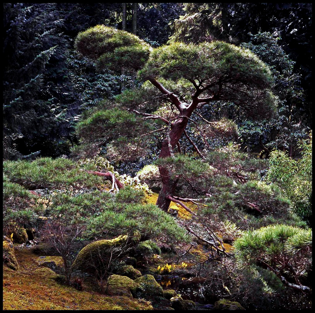
Trying to get a decent scan from negatives seems to be a difficult task
for me. This one is at least acceptable enough to show.
Yashica Mat 124
f:11 and 1/125th
ISO 160
_________________
Assent, and you are sane;
Demur,�you �re straightway dangerous,
And handled with a chain.
Emily Dickinson
Cameras and Lenses in Use:
Yashica Mat 124 w/ Yashinon 80/3.5,
CV Apo-Lanthar 90/3.5SL, (Thank you Klaus),
Pentax 645,
Flek 50,
Pentax-A 150
Pentax-A 120 Macro
Voigtlander Vitomatic I w/Color Skopar 50/2.8
Konica TC and zoom lenses (thanks Carsten)
Contax AX
Yashica ML 50/2
Yashica ML 35/2.8
Carl Zeiss Contax 50/1.4
Tamron Adaptall SP 17/3.5
Tamron Adaptall 28/2.5
Tamron Adaptall SP 300/2.8 LD (IF)
|
|
| Back to top |
|
 |
Jesito

Joined: 24 Aug 2007
Posts: 5745
Location: Olivella, Catalonia, (Spain)
Expire: 2015-01-07
|
| Posted: Sat May 28, 2011 9:06 am Post subject: |
|
|
Jesito wrote:
Acceptable?... You demand too much from yourself, Larry... This is an excellent picture and a really good scan to my eyes!.
Congrats for such a nice shot, and thanks for sharing.
Regards.
Jes.
_________________
Jesito, Moderator 
Jesito's backsack:
Zooms Sigma 70-300, Tamron 35-135 and 70-210 short, 70-210 long, 28-70 CF Macro, 35-70, 35-80, Vivitar 70-210 KA, Tamron 70-250.
Fixed Industar-50, , Tamron 24mm, Tamron 135mm, Sands Hunter 135mm, Pancolar 50mm, Volna-3, many Exakta lenses
DSLR SIGMA SD9 & SD14, EOS 5D, Sony A700 and NEXF3, Oly E-330, E-400, E-450, E-1
TLR/6x6/645 YashicaMat, Petri 6x45, Nettar, Franka Solida, Brilliant
SLR Minolta X300, Fuji STX II, Praktica VLC3, Pentax P30t, EXA500, EXA 1A, Spotmatic(2), Chinon CM-4S, Ricoh, Contax, Konica TC-X , Minolta 5000, 7000i, 3Sxi, EOS 500 and CX
Rangefinders Chinon 35EE, Konica C35 auto, Canonet 28, Yashica Lynx, FED-2, Yashica electro 35, Argus C3 & C4, Regula Cita III, Voigtlander Vitoret (many), Welta Welti-I, Kodak Signette 35, Zorki-4, Bessa-R & L, Minolta Weathermatic, olympus XA2
Compact Film Konica C35V, Voigtlander Vitorets, Canon Prima Super 105, Olympus XA2 and XA3
Compact Digital Olympus C-5050, Aiptek Slim 3000, Canon Powershot A540, Nikon 5200, SIGMA DP1s, Polaroid X530, IXUS55, Kodak 6490, Powershot G9 and G10
CSCCanon EOS-M, Samsung NX100 and NX210, Lumix G5, NEX-F3 |
|
| Back to top |
|
|
Minolfan

Joined: 30 Dec 2008
Posts: 3437
Location: Netherlands
|
| Posted: Sat May 28, 2011 9:43 am Post subject: |
|
|
Minolfan wrote:
+1! |
|
| Back to top |
|
|
DigiChromeEd

Joined: 29 Dec 2009
Posts: 3462
Location: Northern Ireland
|
| Posted: Sat May 28, 2011 10:31 am Post subject: |
|
|
DigiChromeEd wrote:
+1
_________________
"I've got a Nikon camera, I like to take a photograph" - Paul Simon |
|
| Back to top |
|
|
Attila

Joined: 24 Feb 2007
Posts: 57849
Location: Hungary
Expire: 2025-11-18
|
| Posted: Sat May 28, 2011 11:53 pm Post subject: |
|
|
Attila wrote:

_________________
-------------------------------
Items on sale on Ebay
Sony NEX-7 Carl Zeiss Planar 85mm f1.4, Minolta MD 35mm f1.8, Konica 135mm f2.5, Minolta MD 50mm f1.2, Minolta MD 250mm f5.6, Carl Zeiss Sonnar 180mm f2.8
|
|
| Back to top |
|
|
Laurence
Joined: 26 Mar 2007
Posts: 4809
Location: Western Washington State
Expire: 2016-06-19
|
| Posted: Sun May 29, 2011 12:18 am Post subject: |
|
|
Laurence wrote:
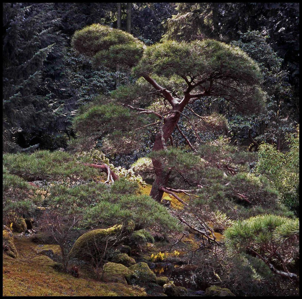
Hey Attila! NICE rendering of the image. It pops a little more. This is
what I like! It gives me a chance to see the image through your eyes
rather than mine.
I ALWAYS enjoy others' tweaking the images. And, you already know
this Attila, but ALL posters feel free to tweak ANY of my images. 
_________________
Assent, and you are sane;
Demur,�you �re straightway dangerous,
And handled with a chain.
Emily Dickinson
Cameras and Lenses in Use:
Yashica Mat 124 w/ Yashinon 80/3.5,
CV Apo-Lanthar 90/3.5SL, (Thank you Klaus),
Pentax 645,
Flek 50,
Pentax-A 150
Pentax-A 120 Macro
Voigtlander Vitomatic I w/Color Skopar 50/2.8
Konica TC and zoom lenses (thanks Carsten)
Contax AX
Yashica ML 50/2
Yashica ML 35/2.8
Carl Zeiss Contax 50/1.4
Tamron Adaptall SP 17/3.5
Tamron Adaptall 28/2.5
Tamron Adaptall SP 300/2.8 LD (IF)
|
|
| Back to top |
|
|
Attila
Joined: 24 Feb 2007
Posts: 57849
Location: Hungary
Expire: 2025-11-18
|
| Posted: Sun May 29, 2011 12:23 am Post subject: |
|
|
Attila wrote:
I did put more contrast on it. If you make a bit darker on green areas perhaps you can reach your goal to make it more crispy.
_________________
-------------------------------
Items on sale on Ebay
Sony NEX-7 Carl Zeiss Planar 85mm f1.4, Minolta MD 35mm f1.8, Konica 135mm f2.5, Minolta MD 50mm f1.2, Minolta MD 250mm f5.6, Carl Zeiss Sonnar 180mm f2.8
|
|
| Back to top |
|
|
Orio

Joined: 24 Feb 2007
Posts: 29545
Location: West Emilia
Expire: 2012-12-04
|
| Posted: Sun May 29, 2011 12:24 am Post subject: |
|
|
Orio wrote:
Larry, I understand and agree with you.
The photo is great, the composition also (like an old Japanese print)
Unfortunately, the film punishes your work with a flat rendering.
Take the same subject again with a Provia and I'm sure it will be a different world.
_________________
Orio, Administrator
T*
NE CEDE MALIS AUDENTIOR ITO
Ferrania film is reborn! http://www.filmferrania.it/
Support the Ornano film chemicals company and help them survive!
http://forum.mflenses.com/ornano-chemical-products-t55525.html |
|
| Back to top |
|
|
Laurence
Joined: 26 Mar 2007
Posts: 4809
Location: Western Washington State
Expire: 2016-06-19
|
| Posted: Sun May 29, 2011 12:26 am Post subject: |
|
|
Laurence wrote:
| Orio wrote: |
Larry, I understand and agree with you.
The photo is great, the composition also (like an old Japanese print)
Unfortunately, the film punishes your work with a flat rendering.
Take the same subject again with a Provia and I'm sure it will be a different world. |
YES! That describes the overall look perfectly, Orio...flat. I WILL try with
Provia next time I'm over to the Bloedel Gardens.
_________________
Assent, and you are sane;
Demur,�you �re straightway dangerous,
And handled with a chain.
Emily Dickinson
Cameras and Lenses in Use:
Yashica Mat 124 w/ Yashinon 80/3.5,
CV Apo-Lanthar 90/3.5SL, (Thank you Klaus),
Pentax 645,
Flek 50,
Pentax-A 150
Pentax-A 120 Macro
Voigtlander Vitomatic I w/Color Skopar 50/2.8
Konica TC and zoom lenses (thanks Carsten)
Contax AX
Yashica ML 50/2
Yashica ML 35/2.8
Carl Zeiss Contax 50/1.4
Tamron Adaptall SP 17/3.5
Tamron Adaptall 28/2.5
Tamron Adaptall SP 300/2.8 LD (IF)
|
|
| Back to top |
|
|
Attila
Joined: 24 Feb 2007
Posts: 57849
Location: Hungary
Expire: 2025-11-18
|
| Posted: Sun May 29, 2011 12:28 am Post subject: |
|
|
Attila wrote:

Brillance improved in color effect pro I think this is good as slide, need a tiff scan to make it more sharp and it would be not flat any more.
_________________
-------------------------------
Items on sale on Ebay
Sony NEX-7 Carl Zeiss Planar 85mm f1.4, Minolta MD 35mm f1.8, Konica 135mm f2.5, Minolta MD 50mm f1.2, Minolta MD 250mm f5.6, Carl Zeiss Sonnar 180mm f2.8
|
|
| Back to top |
|
|
Orio
Joined: 24 Feb 2007
Posts: 29545
Location: West Emilia
Expire: 2012-12-04
|
| Posted: Sun May 29, 2011 12:46 am Post subject: |
|
|
Orio wrote:
I think that with the colours as they come from film, there is not much to do to recover the shot.
I would personally rework it to a B&W that could bring out the "magic" that I think lies in the image but is oppressed by unadequate colours:

_________________
Orio, Administrator
T*
NE CEDE MALIS AUDENTIOR ITO
Ferrania film is reborn! http://www.filmferrania.it/
Support the Ornano film chemicals company and help them survive!
http://forum.mflenses.com/ornano-chemical-products-t55525.html |
|
| Back to top |
|
|
Orio
Joined: 24 Feb 2007
Posts: 29545
Location: West Emilia
Expire: 2012-12-04
|
| Posted: Sun May 29, 2011 12:58 am Post subject: |
|
|
Orio wrote:
also duotone is a possibility, for a more "clair de lune" look:

_________________
Orio, Administrator
T*
NE CEDE MALIS AUDENTIOR ITO
Ferrania film is reborn! http://www.filmferrania.it/
Support the Ornano film chemicals company and help them survive!
http://forum.mflenses.com/ornano-chemical-products-t55525.html |
|
| Back to top |
|
|
Attila
Joined: 24 Feb 2007
Posts: 57849
Location: Hungary
Expire: 2025-11-18
|
| Posted: Sun May 29, 2011 1:00 am Post subject: |
|
|
Attila wrote:
Second one for me Orio, nice!
_________________
-------------------------------
Items on sale on Ebay
Sony NEX-7 Carl Zeiss Planar 85mm f1.4, Minolta MD 35mm f1.8, Konica 135mm f2.5, Minolta MD 50mm f1.2, Minolta MD 250mm f5.6, Carl Zeiss Sonnar 180mm f2.8
|
|
| Back to top |
|
|
Orio
Joined: 24 Feb 2007
Posts: 29545
Location: West Emilia
Expire: 2012-12-04
|
| Posted: Sun May 29, 2011 1:07 am Post subject: |
|
|
Orio wrote:
| Attila wrote: |
| Second one for me Orio, nice! |
All merit in Larry's image, it has such a great romantic (in the artistic meaning of the word) potential.
It made me think of pictorialist photography and Gustave Le Grey.
Hence the duotone idea.
_________________
Orio, Administrator
T*
NE CEDE MALIS AUDENTIOR ITO
Ferrania film is reborn! http://www.filmferrania.it/
Support the Ornano film chemicals company and help them survive!
http://forum.mflenses.com/ornano-chemical-products-t55525.html |
|
| Back to top |
|
|
Laurence
Joined: 26 Mar 2007
Posts: 4809
Location: Western Washington State
Expire: 2016-06-19
|
| Posted: Sun May 29, 2011 1:35 am Post subject: |
|
|
Laurence wrote:
Attila, I like the first color image variation you made. This latest one feels
perhaps too saturated. However, you DID accomplish making the image
more dimensional.
There is definitely some weakness to the colors overall, and it might be
because the film expired about 4 years ago, I think.
I LOVE the rendition of the black and white image. It feels like almost an
infrared image, with some of the branches and leaves and needles turning
into white color variations. These are WONDERFUL ways to give me an
idea of what could become of the initial image. I will shoot this with Provia,
as suggested earlier, and I'll have the X100 along as well just to see if
it can render this with better dimensionality. I'm thinking of the X100 in
Astia mode, which creates a "dreamy" effect. There are also four
different black and white settings in the X100, so I should have a good
variety for comparison. Actually, there is also a Sepia setting as well, so
I guess I should say there are five settings for black and white.
Thanks VERY much Attila and Orio.  If you have more ideas, that would If you have more ideas, that would
be great; these ideas already posted have openend my eyes to more
possibilities. I will try to revisit this scene tomorrow. I'm pretty sure the
light will be quite different, as the weather will be heavy overcast skies.
In this case, I have to think that the overcast might be a help rather than
a hindrance to the image. I do love the tree, although I wish the
surrounding plants weren't so busy. I wonder if the owners of the
gardens would mind if I brought a power saw to "open up" the area. 
Seriously though, by seeing your interpretations, it brings excitement for
me, as well as indicating that I can approach this image in different ways.
_________________
Assent, and you are sane;
Demur,�you �re straightway dangerous,
And handled with a chain.
Emily Dickinson
Cameras and Lenses in Use:
Yashica Mat 124 w/ Yashinon 80/3.5,
CV Apo-Lanthar 90/3.5SL, (Thank you Klaus),
Pentax 645,
Flek 50,
Pentax-A 150
Pentax-A 120 Macro
Voigtlander Vitomatic I w/Color Skopar 50/2.8
Konica TC and zoom lenses (thanks Carsten)
Contax AX
Yashica ML 50/2
Yashica ML 35/2.8
Carl Zeiss Contax 50/1.4
Tamron Adaptall SP 17/3.5
Tamron Adaptall 28/2.5
Tamron Adaptall SP 300/2.8 LD (IF)
|
|
| Back to top |
|
|
Orio
Joined: 24 Feb 2007
Posts: 29545
Location: West Emilia
Expire: 2012-12-04
|
| Posted: Sun May 29, 2011 2:15 am Post subject: |
|
|
Orio wrote:
Larry, you don't really need any advice, the only suggestion I can make is to bring a B&W film with you in addition to Provia, and, if you have it, a strong yellow filter to use for B&W.
So you can try both slide and B&W, and decide later what you like better.
Also I would experiment with different apertures.
Let us see the new pictures!
_________________
Orio, Administrator
T*
NE CEDE MALIS AUDENTIOR ITO
Ferrania film is reborn! http://www.filmferrania.it/
Support the Ornano film chemicals company and help them survive!
http://forum.mflenses.com/ornano-chemical-products-t55525.html |
|
| Back to top |
|
|
Laurence
Joined: 26 Mar 2007
Posts: 4809
Location: Western Washington State
Expire: 2016-06-19
|
| Posted: Tue Jun 07, 2011 2:14 am Post subject: |
|
|
Laurence wrote:
| Orio wrote: |
Larry, you don't really need any advice, the only suggestion I can make is to bring a B&W film with you in addition to Provia, and, if you have it, a strong yellow filter to use for B&W.
So you can try both slide and B&W, and decide later what you like better.
Also I would experiment with different apertures.
Let us see the new pictures! |
Orio, I have some Rollei R25, a very fine grained b&w film that is good
for keeping the contrast from getting too strong. I think that might be a
good way to go. I also have a yellow and a red filter if I think the
saturation might not be ENOUGH. So, I'll certainly bracket the filter usage.
I think I'll have it processed as a black and white transparency, as I seem
to have very good luck in scanning b&w trannies.
I am in agreement that the image has potential, and I am amazed that you
must have "read my mind" in the artistic effect that I really wanted. 
Here's a typical Gustav le Grey image:

_________________
Assent, and you are sane;
Demur,�you �re straightway dangerous,
And handled with a chain.
Emily Dickinson
Cameras and Lenses in Use:
Yashica Mat 124 w/ Yashinon 80/3.5,
CV Apo-Lanthar 90/3.5SL, (Thank you Klaus),
Pentax 645,
Flek 50,
Pentax-A 150
Pentax-A 120 Macro
Voigtlander Vitomatic I w/Color Skopar 50/2.8
Konica TC and zoom lenses (thanks Carsten)
Contax AX
Yashica ML 50/2
Yashica ML 35/2.8
Carl Zeiss Contax 50/1.4
Tamron Adaptall SP 17/3.5
Tamron Adaptall 28/2.5
Tamron Adaptall SP 300/2.8 LD (IF)
|
|
| Back to top |
|
|
|
|