| View previous topic :: View next topic |
| Author |
Message |
tomasg

Joined: 01 Nov 2009
Posts: 1135
Expire: 2014-04-28
|
 Posted: Thu Oct 20, 2011 3:33 pm Post subject: A road Posted: Thu Oct 20, 2011 3:33 pm Post subject: A road |
 |
|
tomasg wrote:
Sigma 20/1.8
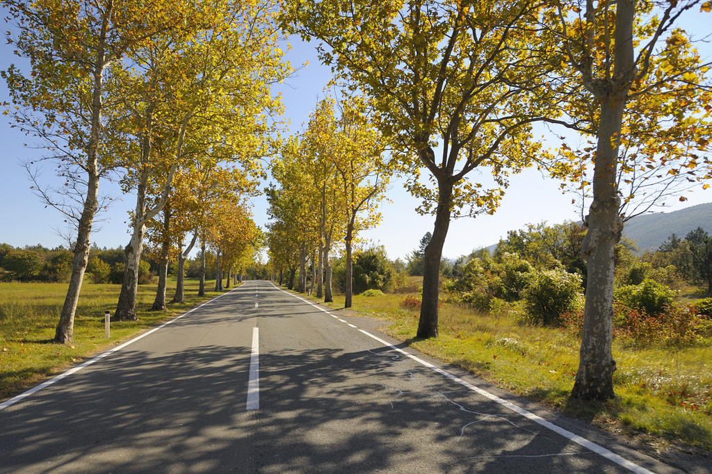
#1

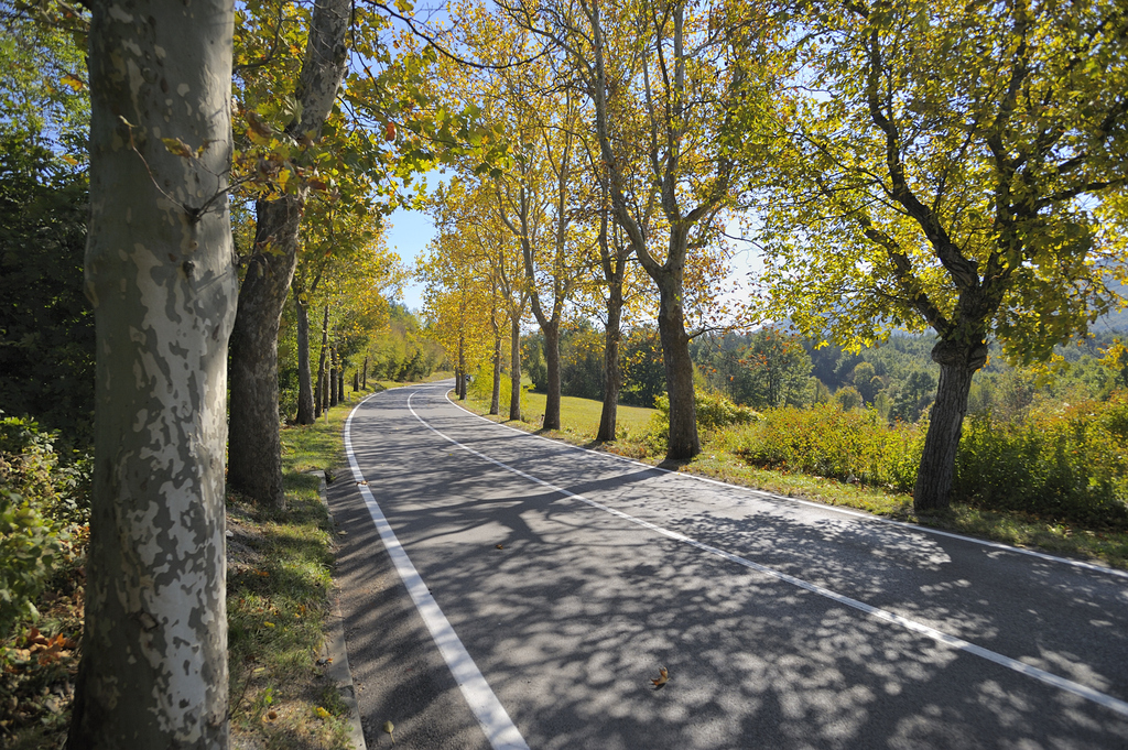
#2

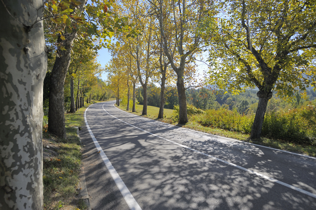
#3

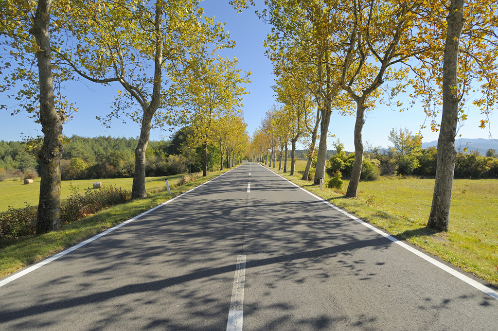
#4

thanx for looking and C&C is welcomed
Tomas |
|
| Back to top |
|
 |
Olivier


Joined: 18 Feb 2009
Posts: 5083
Location: France
Expire: 2015-08-06
|
 Posted: Fri Oct 21, 2011 9:37 pm Post subject: Posted: Fri Oct 21, 2011 9:37 pm Post subject: |
 |
|
Olivier wrote:
Hello Tomas.
I like the autumn colors very much.
Your pictures are lightfull. 
We used to have such beautiful roads in France in the past.
Nowadays, trees along the roads have been cut... too dangerous.
#2 and #3 are quite similar but I prefer #2 because picture is not closed on the left side. On the contrary, #3 has a tree closing the left side.
_________________
Olivier - Moderator 
Dslr : Olympus Pen E-P2 - Fujifilm X-Pro2 - Canon 5D MkII.
SLr and MF lenses : for feedback and helping people, cameras and lenses I own : full list here http://forum.mflenses.com/viewtopic,p,1442740.html#1442740 |
|
| Back to top |
|
 |
David

Joined: 13 Apr 2011
Posts: 1869
Location: Denver, Colorado
Expire: 2013-01-25
|
 Posted: Fri Oct 21, 2011 10:16 pm Post subject: Posted: Fri Oct 21, 2011 10:16 pm Post subject: |
 |
|
David wrote:
Did you need the auto focus because the subject was moving so quickly?  Just kidding. For me, #2 and #4 are the best. For #4, I like the symmetrical framing and perspective. For #2, I like it because it's the opposite. Also, you have a nice color balance in each of the photos. Just kidding. For me, #2 and #4 are the best. For #4, I like the symmetrical framing and perspective. For #2, I like it because it's the opposite. Also, you have a nice color balance in each of the photos.
_________________
http://www.youtube.com/user/hancockDavidM |
|
| Back to top |
|
 |
fuzzywuzzy


Joined: 18 Dec 2010
Posts: 1258
Location: Down East, Canada, eh?
Expire: 2013-11-30
|
 Posted: Fri Oct 21, 2011 11:16 pm Post subject: Posted: Fri Oct 21, 2011 11:16 pm Post subject: |
 |
|
fuzzywuzzy wrote:
| David wrote: |
| For me, #2 and #4 are the best. For #4, I like the symmetrical framing and perspective. For #2, I like it because it's the opposite. Also, you have a nice color balance in each of the photos. |
ditto.
_________________
I welcome C&C, editing my pics and reposting them on the forum is fine.
NEX-F3
~~~~~~~~~
CZJ Sonnar 135/4, Biotar 58/2, Pancolar 50/2, Tessar 50/2.8, Flek 35/2.8, Flek 25/4
Super Takumar 135/2.5, 135/3.5, 100/4 bellows, 50/1.4, 28/3.5
Helios 58/2, 3M-5A 500/8, Mir 20M
Vivitar Series 1 70-210 - - - - - - - - Nikkor 200/4
Rikenon 28/2.8 - - - - - - - - Zeiss 50/1.7 Planar
PB 50/2.4, 135/2.8
Yashica 50/1.9, 28/2.8, 135/2.8
Hexanon 28/3.5, 50/1.4 |
|
| Back to top |
|
 |
tomasg

Joined: 01 Nov 2009
Posts: 1135
Expire: 2014-04-28
|
 Posted: Sat Oct 22, 2011 7:35 am Post subject: Posted: Sat Oct 22, 2011 7:35 am Post subject: |
 |
|
tomasg wrote:
Thanx for the comments.
| Quote: |
| Did you need the auto focus because the subject was moving so quickly? |
no, but the cars and more so big trucks, are just "flying" on this road, no time to focus if you want to stay alive, it s a secondary road, i never seen a police patrol on it    |
|
| Back to top |
|
 |
Rolf


Joined: 02 May 2009
Posts: 4123
Location: NRW/Germany
Expire: 2015-12-26
|
 Posted: Sat Oct 22, 2011 8:08 am Post subject: Posted: Sat Oct 22, 2011 8:08 am Post subject: |
 |
|
Rolf wrote:
My faves are 2 and 4 too. Perhaps you should darken the blue (sky) a little bit to make it a little bit m o r e colourful and dramatically. Anyway - good eye for the scenery.

_________________
Rolf |
|
| Back to top |
|
 |
tomasg

Joined: 01 Nov 2009
Posts: 1135
Expire: 2014-04-28
|
 Posted: Sat Oct 22, 2011 8:23 am Post subject: Posted: Sat Oct 22, 2011 8:23 am Post subject: |
 |
|
tomasg wrote:
Thanx Rolf, yes i agree about the sky. I have two Sigma lenses now, the 20/1.8 used here and the 24-60/2.8, one of the most under rated lenses i think. In the past i owned the 10-20/4-5.6, one trait of the Sigma lenses i noticed, is that when you have the sun in the frame or just out of it, the sky gets brighter of course, but not only that, it changes from blue to cyan, in other words it changes the hue in the blue. I never noticed this in any other lens i owned.
Tomas |
|
| Back to top |
|
 |
Orio

Joined: 24 Feb 2007
Posts: 29545
Location: West Emilia
Expire: 2012-12-04
|
 Posted: Sat Oct 22, 2011 8:50 am Post subject: Posted: Sat Oct 22, 2011 8:50 am Post subject: |
 |
|
Orio wrote:
Nice road, Tomas, and good captures, but I think it was a subject for 1 or 2 photos, not 4. What do you think?
I'm saying this in a constructive spirit, not for polemics. 
If a professional (such as a newspaper editor for instance) would see this page, he would be annoyed by the fact that the photographer did not select his material but let the viewer do what is a part of the photographer's job.
In my opinion, #2 and #3 are almost identical, but also #1 and #4 have nearly the same subject with the same frontal point of view.
I say this, because in my opinion not choosing diminishes the impact of your work!
If there were only two different photos, the viewer would just think "wow, nice autumn road!".
With four similar photos, the viewer instead is distracted "hm... but this is the same as that..." and so on.
Think of photos like wine: two very similar photos in a show is like to have one glass of wine divided in two glasses and the rest filled with water. Not the best way to savor your good wine 
_________________
Orio, Administrator
T*
NE CEDE MALIS AUDENTIOR ITO
Ferrania film is reborn! http://www.filmferrania.it/
Support the Ornano film chemicals company and help them survive!
http://forum.mflenses.com/ornano-chemical-products-t55525.html |
|
| Back to top |
|
 |
Olivier


Joined: 18 Feb 2009
Posts: 5083
Location: France
Expire: 2015-08-06
|
 Posted: Sat Oct 22, 2011 9:51 am Post subject: Posted: Sat Oct 22, 2011 9:51 am Post subject: |
 |
|
Olivier wrote:
About the blue sky, I wonder what #4 would render with a polarizer filter.
To help Tomas choose between its pictures, I would say #2 and #4 for reasons already said. 
_________________
Olivier - Moderator 
Dslr : Olympus Pen E-P2 - Fujifilm X-Pro2 - Canon 5D MkII.
SLr and MF lenses : for feedback and helping people, cameras and lenses I own : full list here http://forum.mflenses.com/viewtopic,p,1442740.html#1442740 |
|
| Back to top |
|
 |
yinyangbt


Joined: 08 Oct 2010
Posts: 1973
Location: Romania
Expire: 2012-12-27
|
 Posted: Sat Oct 22, 2011 11:46 am Post subject: Posted: Sat Oct 22, 2011 11:46 am Post subject: |
 |
|
yinyangbt wrote:
| Orio wrote: |
Nice road, Tomas, and good captures, but I think it was a subject for 1 or 2 photos, not 4. What do you think?
I'm saying this in a constructive spirit, not for polemics. 
If a professional (such as a newspaper editor for instance) would see this page, he would be annoyed by the fact that the photographer did not select his material but let the viewer do what is a part of the photographer's job.
In my opinion, #2 and #3 are almost identical, but also #1 and #4 have nearly the same subject with the same frontal point of view.
I say this, because in my opinion not choosing diminishes the impact of your work!
If there were only two different photos, the viewer would just think "wow, nice autumn road!".
With four similar photos, the viewer instead is distracted "hm... but this is the same as that..." and so on.
Think of photos like wine: two very similar photos in a show is like to have one glass of wine divided in two glasses and the rest filled with water. Not the best way to savor your good wine  |
Perfect point of view !
And beautiful places , also .I love these roads with trees , mainly in autumn .My favorites : the second and the fourth image.
_________________
Cheers , Teo
http://photo.net/photodb/member-photos?user_id=5778915 |
|
| Back to top |
|
 |
Orio

Joined: 24 Feb 2007
Posts: 29545
Location: West Emilia
Expire: 2012-12-04
|
 Posted: Sat Oct 22, 2011 11:53 am Post subject: Posted: Sat Oct 22, 2011 11:53 am Post subject: |
 |
|
Orio wrote:
| Olivier wrote: |
To help Tomas choose between its pictures, I would say #2 and #4 for reasons already said.  |
I would choose #1 and #2
I prefer #1 over #4 because it has a more varied sideground.
_________________
Orio, Administrator
T*
NE CEDE MALIS AUDENTIOR ITO
Ferrania film is reborn! http://www.filmferrania.it/
Support the Ornano film chemicals company and help them survive!
http://forum.mflenses.com/ornano-chemical-products-t55525.html |
|
| Back to top |
|
 |
Olivier


Joined: 18 Feb 2009
Posts: 5083
Location: France
Expire: 2015-08-06
|
 Posted: Sat Oct 22, 2011 12:56 pm Post subject: Posted: Sat Oct 22, 2011 12:56 pm Post subject: |
 |
|
Olivier wrote:
| Orio wrote: |
| Olivier wrote: |
To help Tomas choose between its pictures, I would say #2 and #4 for reasons already said.  |
I would choose #1 and #2
I prefer #1 over #4 because it has a more varied sideground. |
Interesting, Orio. 
I prefer #4 because I see more horizon.
and in #1 bushes and trees on the mid plan at the right hide the far hills.
_________________
Olivier - Moderator 
Dslr : Olympus Pen E-P2 - Fujifilm X-Pro2 - Canon 5D MkII.
SLr and MF lenses : for feedback and helping people, cameras and lenses I own : full list here http://forum.mflenses.com/viewtopic,p,1442740.html#1442740 |
|
| Back to top |
|
 |
tikkathree


Joined: 19 Jun 2010
Posts: 755
Location: Lovely Suffolk in Great Britain
Expire: 2012-12-28
|
 Posted: Sat Oct 22, 2011 2:37 pm Post subject: Posted: Sat Oct 22, 2011 2:37 pm Post subject: |
 |
|
tikkathree wrote:
numbers 1 ans 4 for me 
_________________
I used to think digital was fun but then I discovered film, then I found old lenses and then, eventually I found rangefinders.
EOS 5DII, loadsalenses
Canon G9 IR conv,
MF: TLR, 645 and folders
35mm: Oly OM Pro bodies 1, 2, 3 and 4; Soviet RF kit |
|
| Back to top |
|
 |
tomasg

Joined: 01 Nov 2009
Posts: 1135
Expire: 2014-04-28
|
 Posted: Sun Oct 23, 2011 7:20 am Post subject: Posted: Sun Oct 23, 2011 7:20 am Post subject: |
 |
|
tomasg wrote:
Thanx guys for the comments! I am a bit surprised it got so many comments, it s alwasy a pleasure to see this.
Oliver, yes these roads are also disapearing here in Slovenia, to dangerous 
| Quote: |
Nice road, Tomas, and good captures, but I think it was a subject for 1 or 2 photos, not 4. What do you think?
I'm saying this in a constructive spirit, not for polemics. Smile
If a professional (such as a newspaper editor for instance) would see this page, he would be annoyed by the fact that the photographer did not select his material but let the viewer do what is a part of the photographer's job.
In my opinion, #2 and #3 are almost identical, but also #1 and #4 have nearly the same subject with the same frontal point of view.
I say this, because in my opinion not choosing diminishes the impact of your work!
If there were only two different photos, the viewer would just think "wow, nice autumn road!".
With four similar photos, the viewer instead is distracted "hm... but this is the same as that..." and so on.
Think of photos like wine: two very similar photos in a show is like to have one glass of wine divided in two glasses and the rest filled with water. Not the best way to savor your good wine Wink |
Orio, no worries about being to harsh with critics, i prefer an honest and direct one, all too often on different forums you can only see positive comments on poor photos. And don t worry, after all i work in an aftersales job, i developed a thick skin  You are right, presenting my work is not my strongest point, just look at my pbase gallery You are right, presenting my work is not my strongest point, just look at my pbase gallery  I have to be less lazy I have to be less lazy  If we admit it or not, we are all flattered, we all care about how our pictures are accepted. If we admit it or not, we are all flattered, we all care about how our pictures are accepted.
Intrestingly, a friend of mine who s a doctor, said that only a pearson with the left eye as a dominant one can like the first picture (my favourite) and in fact the left eye is my dominant eye 
Thanks again
Tomas |
|
| Back to top |
|
 |
Orio

Joined: 24 Feb 2007
Posts: 29545
Location: West Emilia
Expire: 2012-12-04
|
 Posted: Sun Oct 23, 2011 12:47 pm Post subject: Posted: Sun Oct 23, 2011 12:47 pm Post subject: |
 |
|
Orio wrote:
| tomasg wrote: |
Orio, no worries about being to harsh with critics, i prefer an honest and direct one, all too often on different forums you can only see positive comments on poor photos. And don t worry, after all i work in an aftersales job, i developed a thick skin  You are right, presenting my work is not my strongest point, just look at my pbase gallery You are right, presenting my work is not my strongest point, just look at my pbase gallery  I have to be less lazy I have to be less lazy  If we admit it or not, we are all flattered, we all care about how our pictures are accepted. If we admit it or not, we are all flattered, we all care about how our pictures are accepted. |
Actually, I have no critique on your photos, I think they are good!
But you need to select them so to avoid duplicates. Duplicates make your show weaker, and this is a damage that you do to yourself.
This is a trap where we all fall in from time to time. Made worse by digital, because it lets you take many photos at zero cost, while film forced people to be more sparing.
You know what apple cultivators do? Often apples tend to grow in bunches on the tree, because the flowers appear in bunches too.
When cultivators see a bunch of four apples growing together from the same stem, they remove two or three of them at an early stage,
so that the remaining one(s) can grow bigger and shops will buy. If they don't do that, they will obtain four small apples, that no shops want to buy.
Try to do like the apple cultivator when you select your photos 
| Quote: |
Intrestingly, a friend of mine who s a doctor, said that only a pearson with the left eye as a dominant one can like the first picture (my favourite) and in fact the left eye is my dominant eye  |
I think that your doctor has it right!!
_________________
Orio, Administrator
T*
NE CEDE MALIS AUDENTIOR ITO
Ferrania film is reborn! http://www.filmferrania.it/
Support the Ornano film chemicals company and help them survive!
http://forum.mflenses.com/ornano-chemical-products-t55525.html |
|
| Back to top |
|
 |
|
|
|
You cannot post new topics in this forum
You cannot reply to topics in this forum
You cannot edit your posts in this forum
You cannot delete your posts in this forum
You cannot vote in polls in this forum
|
