| View previous topic :: View next topic |
| Author |
Message |
F16SUNSHINE


Joined: 20 Aug 2007
Posts: 5486
Location: Left Coast
Expire: 2011-11-18
|
 Posted: Mon Sep 08, 2008 8:25 pm Post subject: Planar 85 rollei and contax quick comparison Posted: Mon Sep 08, 2008 8:25 pm Post subject: Planar 85 rollei and contax quick comparison |
 |
|
F16SUNSHINE wrote:
I mean really quick
But here you go.
I will comment later. I want to get a couple shots that make use of the Triangle for background texture.
I have seen some samples on someones flickr page. But I can't find it.
These are both at f4
Full size @ imageshack below Contax (LH)is first
Rollei Second(RH)
Contax AE
Rollie / contax
  |
|
| Back to top |
|
 |
Orio

Joined: 24 Feb 2007
Posts: 29545
Location: West Emilia
Expire: 2012-12-04
|
| Posted: Mon Sep 08, 2008 8:28 pm Post subject: |
|
|
Orio wrote:
The bokeh looks actually different !
_________________
Orio, Administrator
T*
NE CEDE MALIS AUDENTIOR ITO
Ferrania film is reborn! http://www.filmferrania.it/
Support the Ornano film chemicals company and help them survive!
http://forum.mflenses.com/ornano-chemical-products-t55525.html |
|
| Back to top |
|
|
F16SUNSHINE
Joined: 20 Aug 2007
Posts: 5486
Location: Left Coast
Expire: 2011-11-18
|
| Posted: Mon Sep 08, 2008 9:10 pm Post subject: |
|
|
F16SUNSHINE wrote:
It does for sure.
So here is another quick look with denser background highlights.
This is an awful shot just to inspire some thought.
The funky triangle Bokeh is in full effect here.
You can see how it could be used to actually "make" a nice corse background for Portraits etc..
F2.8 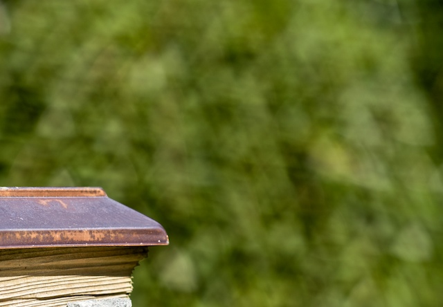 |
|
| Back to top |
|
|
Orio
Joined: 24 Feb 2007
Posts: 29545
Location: West Emilia
Expire: 2012-12-04
|
| Posted: Mon Sep 08, 2008 9:16 pm Post subject: |
|
|
Orio wrote:
yeah...looks like a Christmas tree 
However wide open the Rollei seems to have a smoother bokeh than the Contax - just a little bit not much.
It would be interesting to see if this happens thanks to less sharpness, or if the two things are independent.
_________________
Orio, Administrator
T*
NE CEDE MALIS AUDENTIOR ITO
Ferrania film is reborn! http://www.filmferrania.it/
Support the Ornano film chemicals company and help them survive!
http://forum.mflenses.com/ornano-chemical-products-t55525.html |
|
| Back to top |
|
|
peterqd

Joined: 28 Feb 2007
Posts: 7448
Location: near High Wycombe, UK
Expire: 2014-01-04
|
| Posted: Mon Sep 08, 2008 9:44 pm Post subject: |
|
|
peterqd wrote:
| F16SUNSHINE wrote: |
| The funky triangle Bokeh is in full effect here. |
How strange! I've never seen anything like it before. It's like looking through a wire fence or maybe patterned glass.
_________________
Peter - Moderator |
|
| Back to top |
|
|
bawang

Joined: 26 Mar 2008
Posts: 548
Location: Indiana, USA
|
| Posted: Tue Sep 09, 2008 2:49 am Post subject: |
|
|
bawang wrote:
I prefer the bokeh from the Contax ver. The one from the Rollei seems like lazy brush strokes, very careless and hurried strokes. I guess it's a matter of taste.
Andy, can you take/post a similar denser background with Contax. The triangle Rollei reminded me of the kaleidoscope my kids did at school |
|
| Back to top |
|
|
F16SUNSHINE
Joined: 20 Aug 2007
Posts: 5486
Location: Left Coast
Expire: 2011-11-18
|
| Posted: Tue Sep 09, 2008 4:15 am Post subject: |
|
|
F16SUNSHINE wrote:
Khidhir I will do when I can.
I know that it is a unique chance to compare these two.
I hope to get some nice human subjects to do so properly.
For those interested in an opinion.
The Contax is my first choice. I do like the very unique character from the Rollei.
Also this Bokeh is something that can be a tool like no other.
Especially considering the sharpness and classic "Zeissy" look of the lens.
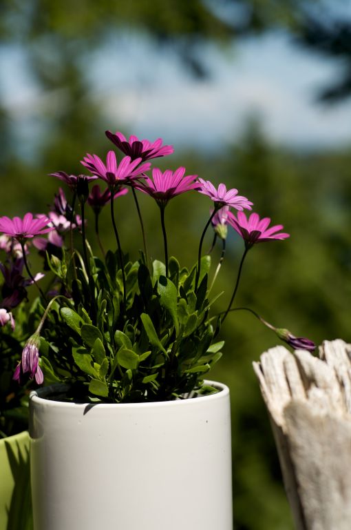
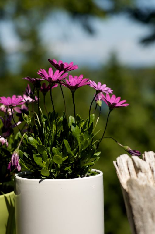
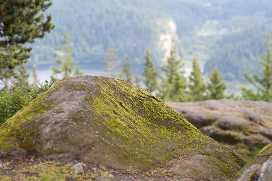
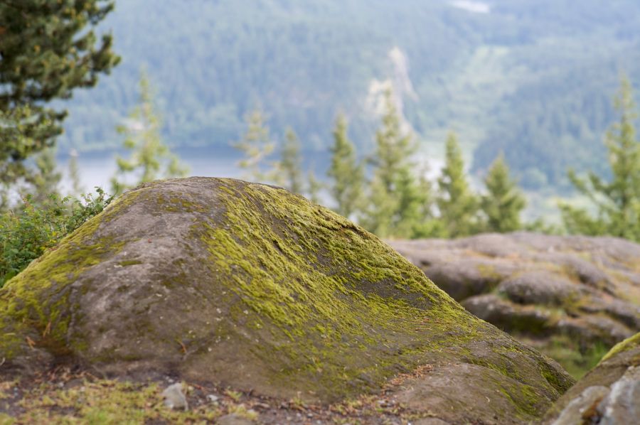
It is actually only in fairly intense highlights that this triangualr shape is apparent .Two sample without "hot" highlights are below both f4.
Used in a "softer" lighting or low light situation the Bokeh is as smooth as ever.
One should also not expect to find the Rollei for less money.
The HFT 1.4/85 is generally 1/3-2/3 more mooonaayee$ than a Contax MM version. There is the collector factor to consider.
All that said it is cool and I will pull it to the top of the Que and make more posts with it soon. 
Full size by request
Contax
Rollei
 |
|
| Back to top |
|
|
F16SUNSHINE
Joined: 20 Aug 2007
Posts: 5486
Location: Left Coast
Expire: 2011-11-18
|
| Posted: Tue Sep 09, 2008 4:57 am Post subject: |
|
|
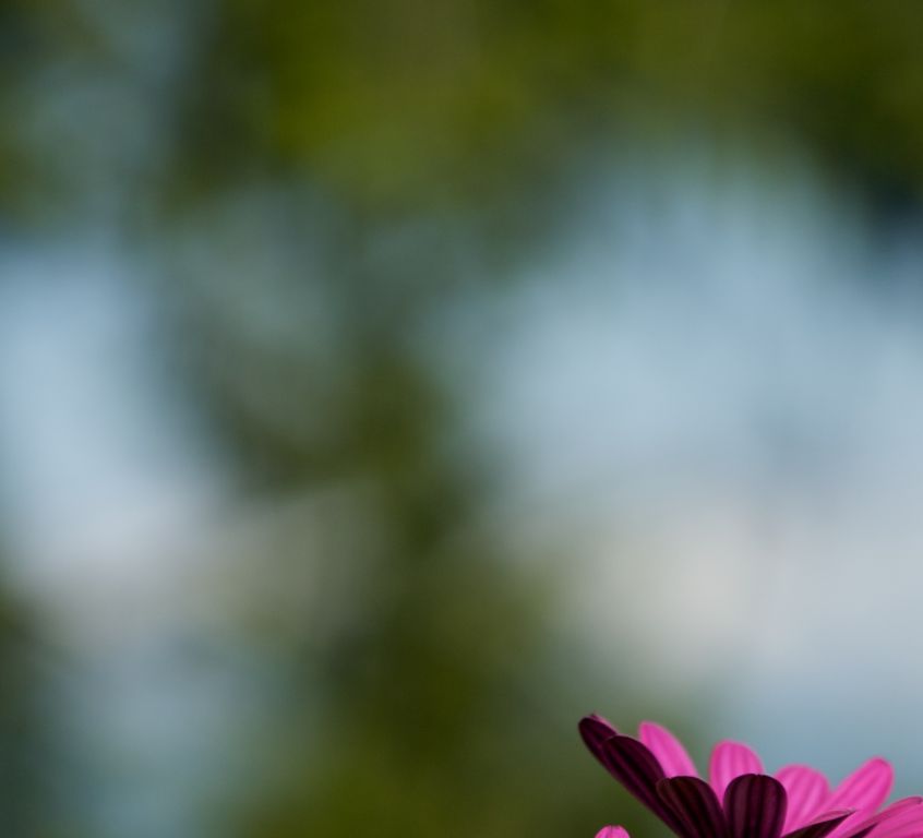
F16SUNSHINE wrote:
BTW
On these last two I prefer the Rollei version.
Look at the bright cliff face and lake in the far background 2/3's from the left edge of the image.
Subtle things of course but we are just having fun with techy stuff anyway.
Well maybe it could make a shot who knows.  |
|
| Back to top |
|
|
poilu
Joined: 26 Aug 2007
Posts: 10472
Location: Greece
Expire: 2019-08-29
|
| Posted: Tue Sep 09, 2008 8:15 am Post subject: |
|
|
poilu wrote:
for me it is exactly the same lens
the very little better contrast of the Contax is probably due to better coating
you are right about the collector factor
I could say you are Zeiss collector 
_________________
T* |
|
| Back to top |
|
|
Orio
Joined: 24 Feb 2007
Posts: 29545
Location: West Emilia
Expire: 2012-12-04
|
| Posted: Tue Sep 09, 2008 8:47 am Post subject: |
|
|
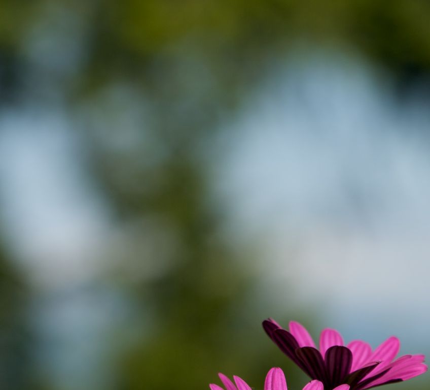
Orio wrote:
The Contax shot shows a tiny little more contrast and micro-contrast
Contrast test: if you look at the tree top left, you can see that the shadows densities of the two images are close (although the Contax shot is slightly darker overall); but if you look at the shadows on the hill over the lake, you can see that the difference in density is higher (the Rollei shot has less dense shadows)
Micro-contrast test: if you look at the OOF stone on the right, you can see that on the Contax picture it is easier to separate visually with a contour the white little blots that are on the top (lightened) part from the purplish base colour of the stone.
This of course translate also into the "smoother bokeh" category, so it will be a matter of preference, those who prefer the smoother bokeh will like the Rollei image better, those who prefer more micro-contrast will like the Contax image better.
We are speaking of really tiny differences anyway.
-
_________________
Orio, Administrator
T*
NE CEDE MALIS AUDENTIOR ITO
Ferrania film is reborn! http://www.filmferrania.it/
Support the Ornano film chemicals company and help them survive!
http://forum.mflenses.com/ornano-chemical-products-t55525.html |
|
| Back to top |
|
|
|
|
|
You cannot post new topics in this forum
You cannot reply to topics in this forum
You cannot edit your posts in this forum
You cannot delete your posts in this forum
You cannot vote in polls in this forum
|


