| View previous topic :: View next topic |
| Author |
Message |
Orio

Joined: 24 Feb 2007
Posts: 29545
Location: West Emilia
Expire: 2012-12-04
|
 Posted: Mon May 14, 2012 2:26 am Post subject: Budapest 2007, rack 7 Posted: Mon May 14, 2012 2:26 am Post subject: Budapest 2007, rack 7 |
 |
|
Orio wrote:
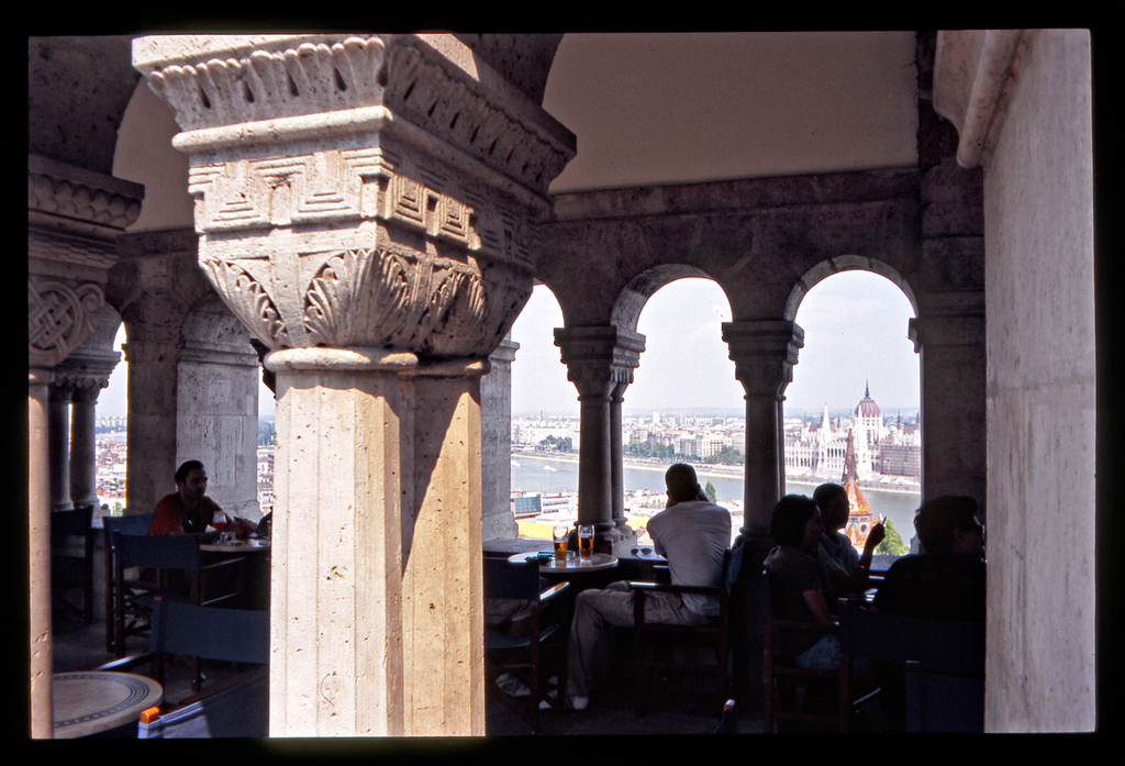
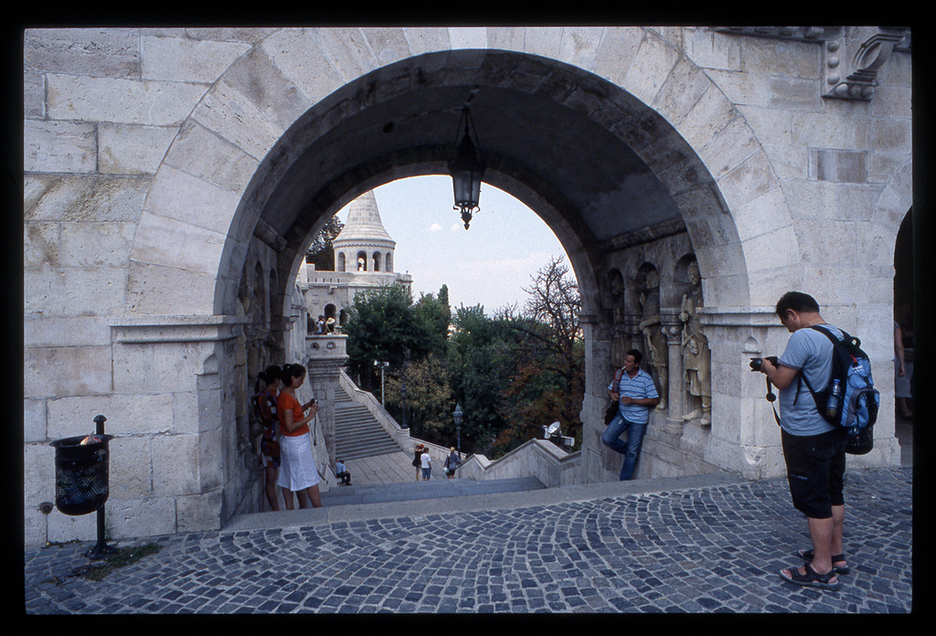
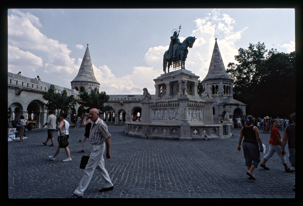
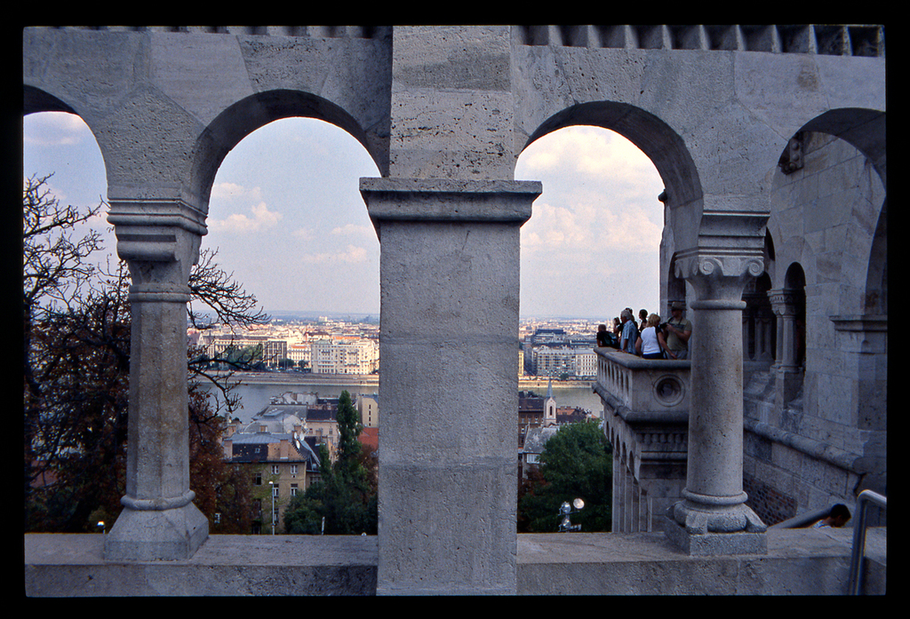
Agfachrome, Bessaflex TM camera.
List of lenses:
Flektogon 4/20, Tamron 2.5/28, Lydith 3.5/30, MIR-24M 2/35, Sonnar 2.8/85 Rollei M42, Jupiter-37AM 3.5/135, Jupiter-21M 4/200.
I also had a 50mm lens but can't remember which one.
Of these photos, I can recall only using the Sonnar for the portraits.
Click on image for a larger size:
#1
#2
#3
#4
#5
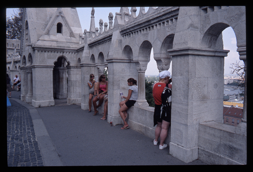
#6
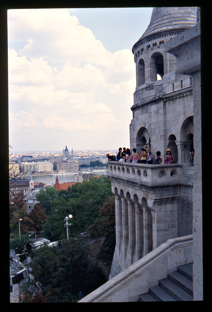
#7
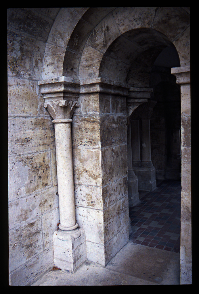
#8
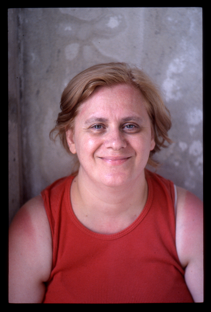
#9

#10
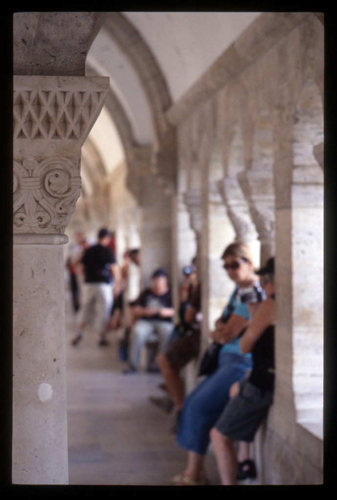
#11
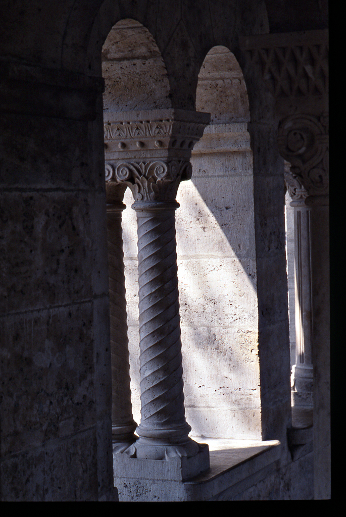
#12
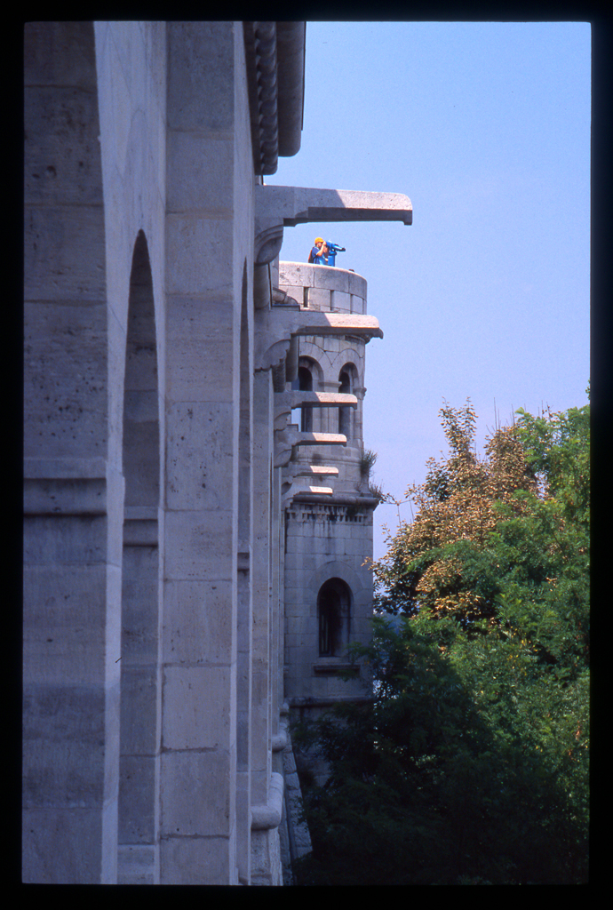
#13
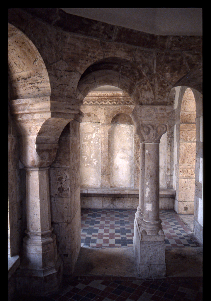
#14
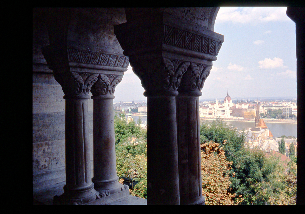
#15
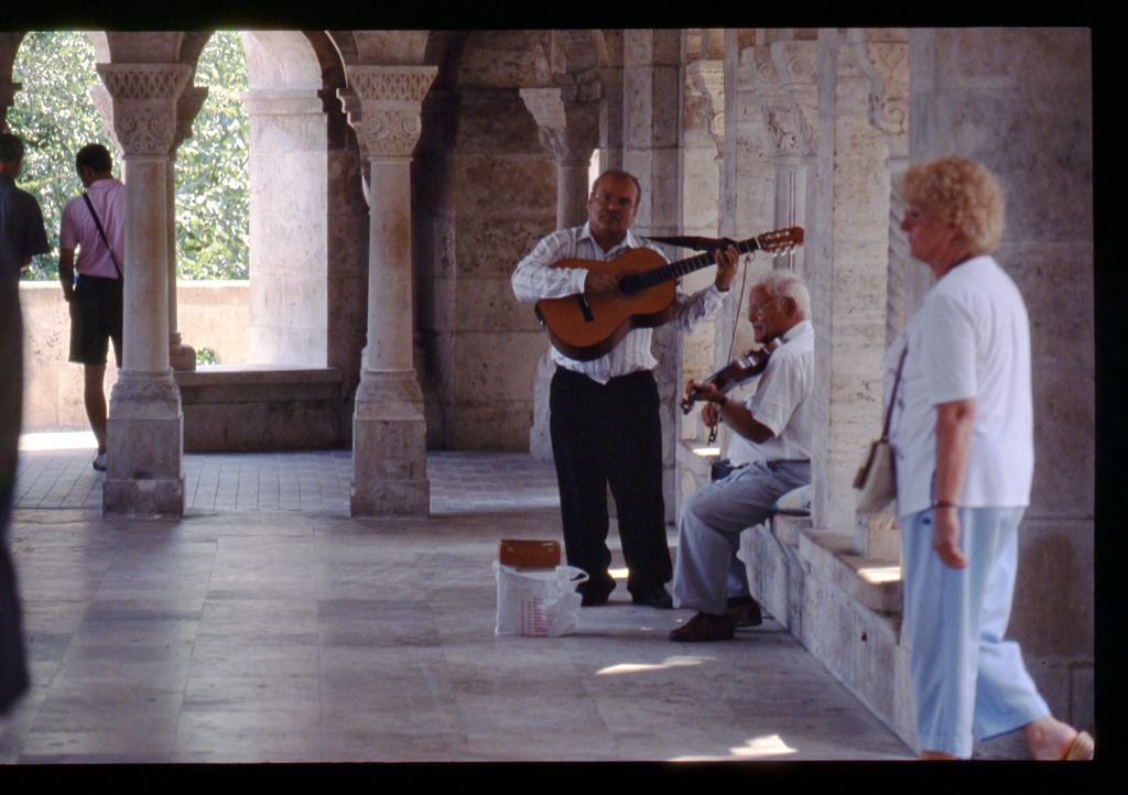
#16
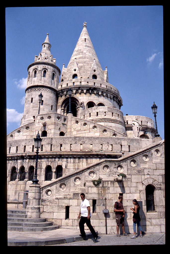
#17

#18
_________________
Orio, Administrator
T*
NE CEDE MALIS AUDENTIOR ITO
Ferrania film is reborn! http://www.filmferrania.it/
Support the Ornano film chemicals company and help them survive!
http://forum.mflenses.com/ornano-chemical-products-t55525.html |
|
| Back to top |
|
 |
Excalibur


Joined: 19 Jul 2009
Posts: 5017
Location: UK
Expire: 2014-04-21
|
 Posted: Mon May 14, 2012 6:40 am Post subject: Posted: Mon May 14, 2012 6:40 am Post subject: |
 |
|
Excalibur wrote:
Some different shots from Attila detailed coverage of the castle and views from it...well it looks like I'll have to use "google street view" for the rest of Budapest city 
_________________
Canon A1, AV1, T70 & T90, EOS 300 and EOS300v, Chinon CE and CP-7M. Contax 139, Fuji STX-2, Konica Autoreflex TC, FS-1, FT-1, Minolta X-700, X-300, XD-11, SRT101b, Nikon EM, FM, F4, F90X, Olympus OM2, Pentax S3, Spotmatic, Pentax ME super, Praktica TL 5B, & BC1, , Ricoh KR10super, Yashica T5D, Bronica Etrs, Mamiya RB67 pro AND drum roll:- a Sony Nex 3
.........past gear Tele Rolleiflex and Rollei SL66.
Many lenses from good to excellent. |
|
| Back to top |
|
 |
Attila


Joined: 24 Feb 2007
Posts: 57865
Location: Hungary
Expire: 2025-11-18
|
 Posted: Mon May 14, 2012 10:42 am Post subject: Posted: Mon May 14, 2012 10:42 am Post subject: |
 |
|
Attila wrote:
Nice to see them and remember thanks!
_________________
-------------------------------
Items on sale on Ebay
Sony NEX-7 Carl Zeiss Planar 85mm f1.4, Minolta MD 35mm f1.8, Konica 135mm f2.5, Minolta MD 50mm f1.2, Minolta MD 250mm f5.6, Carl Zeiss Sonnar 180mm f2.8
|
|
| Back to top |
|
 |
poilu

Joined: 26 Aug 2007
Posts: 10472
Location: Greece
Expire: 2019-08-29
|
 Posted: Mon May 14, 2012 11:33 am Post subject: Posted: Mon May 14, 2012 11:33 am Post subject: |
 |
|
poilu wrote:
nice memories series! my favs #10#13#15
_________________
T* |
|
| Back to top |
|
 |
Orio

Joined: 24 Feb 2007
Posts: 29545
Location: West Emilia
Expire: 2012-12-04
|
 Posted: Mon May 14, 2012 12:38 pm Post subject: Posted: Mon May 14, 2012 12:38 pm Post subject: |
 |
|
Orio wrote:
AM I the only one to think that these Agfachromes have done a fantastic job?
They were cheap compared to Fuji, yet I prefer them over Fuji.
Fuji are more spectacular but Agfachromes were more realistic in my opinion.
Also they deliver amazing detail (in spite of the cheap scanning).
_________________
Orio, Administrator
T*
NE CEDE MALIS AUDENTIOR ITO
Ferrania film is reborn! http://www.filmferrania.it/
Support the Ornano film chemicals company and help them survive!
http://forum.mflenses.com/ornano-chemical-products-t55525.html |
|
| Back to top |
|
 |
Laurence


Joined: 26 Mar 2007
Posts: 4809
Location: Western Washington State
Expire: 2016-06-19
|
 Posted: Thu May 31, 2012 12:04 am Post subject: Posted: Thu May 31, 2012 12:04 am Post subject: |
 |
|
Laurence wrote:
Gorgeous rendering of colors and detail from the Agfachrome! Image #13 is simply one of the
better shots I've seen on this forum. Professional all the way. 
Larry
_________________
Assent, and you are sane;
Demur,—you ’re straightway dangerous,
And handled with a chain.
Emily Dickinson
Cameras and Lenses in Use:
Yashica Mat 124 w/ Yashinon 80/3.5,
CV Apo-Lanthar 90/3.5SL, (Thank you Klaus),
Pentax 645,
Flek 50,
Pentax-A 150
Pentax-A 120 Macro
Voigtlander Vitomatic I w/Color Skopar 50/2.8
Konica TC and zoom lenses (thanks Carsten)
Contax AX
Yashica ML 50/2
Yashica ML 35/2.8
Carl Zeiss Contax 50/1.4
Tamron Adaptall SP 17/3.5
Tamron Adaptall 28/2.5
Tamron Adaptall SP 300/2.8 LD (IF)
|
|
| Back to top |
|
 |
pich900


Joined: 10 Jun 2007
Posts: 1745
Location: The Netherlands/Zwolle
Expire: 2012-12-27
|
 Posted: Thu May 31, 2012 6:44 am Post subject: Posted: Thu May 31, 2012 6:44 am Post subject: |
 |
|
pich900 wrote:
Nice to see this town on a different point of view as Attila, that's a great reportage with indeed very nice colors & details...
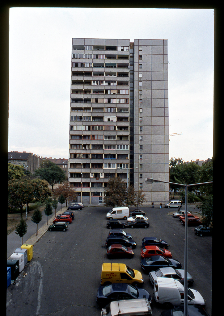
why did you take this flat building on the last picture  ? ?
_________________
All my lenses are for sale, nikkor, Angenieux, Zeiss etc.....
Regards,
Pascal
-------------------------------------------------------
Nikon D700 |
|
| Back to top |
|
 |
Orio

Joined: 24 Feb 2007
Posts: 29545
Location: West Emilia
Expire: 2012-12-04
|
 Posted: Thu May 31, 2012 6:47 am Post subject: Posted: Thu May 31, 2012 6:47 am Post subject: |
 |
|
Orio wrote:
| Laurence wrote: |
Gorgeous rendering of colors and detail from the Agfachrome! Image #13 is simply one of the
better shots I've seen on this forum. Professional all the way. 
Larry |
Thanks Larry, you're too good 
_________________
Orio, Administrator
T*
NE CEDE MALIS AUDENTIOR ITO
Ferrania film is reborn! http://www.filmferrania.it/
Support the Ornano film chemicals company and help them survive!
http://forum.mflenses.com/ornano-chemical-products-t55525.html |
|
| Back to top |
|
 |
Orio

Joined: 24 Feb 2007
Posts: 29545
Location: West Emilia
Expire: 2012-12-04
|
 Posted: Thu May 31, 2012 6:54 am Post subject: Posted: Thu May 31, 2012 6:54 am Post subject: |
 |
|
Orio wrote:
| pich900 wrote: |
Nice to see this town on a different point of view as Attila, that's a great reportage with indeed very nice colors & details...
why did you take this flat building on the last picture  ? ? |
Thanks pich 900 
I photographed this building because it's a good example of communist popular architecture, quite clashing with the classic, pre-war Budapest magnificent buildings,
and because I found it moving how people tried to enliven it by adding personal touches of colour.
It shows that even when living under a communist regime, that wanted to make all people feel gray and anonymous, the persons still tried to make their place the more personal and the less anonymous possible.
It's not the only building of this type that shows these touches of colours, I saw others, so I assumed that this was a common trait, and wanted to document it. 
_________________
Orio, Administrator
T*
NE CEDE MALIS AUDENTIOR ITO
Ferrania film is reborn! http://www.filmferrania.it/
Support the Ornano film chemicals company and help them survive!
http://forum.mflenses.com/ornano-chemical-products-t55525.html |
|
| Back to top |
|
 |
Attila


Joined: 24 Feb 2007
Posts: 57865
Location: Hungary
Expire: 2025-11-18
|
 Posted: Thu May 31, 2012 9:44 pm Post subject: Posted: Thu May 31, 2012 9:44 pm Post subject: |
 |
|
Attila wrote:
| Quote: |
| It shows that even when living under a communist regime, that wanted to make all people feel gray and anonymous |
I think it's made for mass amount of people , wasn't any homeless , this type of building was cheapest to build and produce all parts in 'house factory' if they not made it many people has no own home, just like at west or today Hungary.
_________________
-------------------------------
Items on sale on Ebay
Sony NEX-7 Carl Zeiss Planar 85mm f1.4, Minolta MD 35mm f1.8, Konica 135mm f2.5, Minolta MD 50mm f1.2, Minolta MD 250mm f5.6, Carl Zeiss Sonnar 180mm f2.8
|
|
| Back to top |
|
 |
Orio

Joined: 24 Feb 2007
Posts: 29545
Location: West Emilia
Expire: 2012-12-04
|
 Posted: Thu May 31, 2012 11:57 pm Post subject: Posted: Thu May 31, 2012 11:57 pm Post subject: |
 |
|
Orio wrote:
| Attila wrote: |
| Quote: |
| It shows that even when living under a communist regime, that wanted to make all people feel gray and anonymous |
I think it's made for mass amount of people , wasn't any homeless , this type of building was cheapest to build and produce all parts in 'house factory' if they not made it many people has no own home, just like at west or today Hungary. |
Yes, indeed it was a good social service that they provided. Better big concrete houses than people sleeping in the streets!
_________________
Orio, Administrator
T*
NE CEDE MALIS AUDENTIOR ITO
Ferrania film is reborn! http://www.filmferrania.it/
Support the Ornano film chemicals company and help them survive!
http://forum.mflenses.com/ornano-chemical-products-t55525.html |
|
| Back to top |
|
 |
Yebisu

Joined: 13 Feb 2011
Posts: 1299
|
 Posted: Fri Jun 01, 2012 10:05 am Post subject: Posted: Fri Jun 01, 2012 10:05 am Post subject: |
 |
|
Yebisu wrote:
It's a great series. But the colours and tones and textures of no.13 are beautiful. Definitely my favourite. |
|
| Back to top |
|
 |
skida


Joined: 02 Mar 2012
Posts: 1826
Location: North East England
|
 Posted: Fri Jun 01, 2012 7:57 pm Post subject: Posted: Fri Jun 01, 2012 7:57 pm Post subject: |
 |
|
skida wrote:
Lovely set. I especially like 17. |
|
| Back to top |
|
 |
Katastrofo

Joined: 26 Feb 2007
Posts: 10405
Location: USA
Expire: 2013-11-19
|
 Posted: Tue Jun 05, 2012 5:08 am Post subject: Posted: Tue Jun 05, 2012 5:08 am Post subject: |
 |
|
Katastrofo wrote:
My faves are 1,2, 8,9 (bring sunscreen next time), 10, 11, 14, and 15, excellent series!
This slide film is not available over here, but I like how it renders colors.
Are these from the new scanner? Larger files show some nice detail. |
|
| Back to top |
|
 |
Orio

Joined: 24 Feb 2007
Posts: 29545
Location: West Emilia
Expire: 2012-12-04
|
 Posted: Tue Jun 05, 2012 9:57 am Post subject: Posted: Tue Jun 05, 2012 9:57 am Post subject: |
 |
|
Orio wrote:
| Katastrofo wrote: |
Are these from the new scanner? Larger files show some nice detail. |
No Bill, these are from the Epson 4490.
Detail in the Epson has always been good for me. It has a different set of problems: chromatic aberration in B&W scans above all. Then also newton rings that seem to come out of nowhere. And awkward operation (flimsy cheap holders)
_________________
Orio, Administrator
T*
NE CEDE MALIS AUDENTIOR ITO
Ferrania film is reborn! http://www.filmferrania.it/
Support the Ornano film chemicals company and help them survive!
http://forum.mflenses.com/ornano-chemical-products-t55525.html |
|
| Back to top |
|
 |
eddieitman


Joined: 12 Apr 2011
Posts: 1246
Location: United Kingdom
|
 Posted: Tue Jun 05, 2012 12:48 pm Post subject: Posted: Tue Jun 05, 2012 12:48 pm Post subject: |
 |
|
eddieitman wrote:
I particulary like the colours a lot 17 and 18 display this nicely.
Constructivly i find many of the shots place the viewer at a slant with the objects goimg of to the left mostly, in some cases it may not be possible due to confined space, etc in others a step back and to the right may have fixed it
Example 1 a step back would display all the column and not cut the feet off
2' to much floor losing detail in the towers roof a step to the right and a crouch may have worked better
_________________
My web site www.digital-darkroom.weebly.com
Life is like a camera. Focus on what's important, capture the good times, develop from the negatives and if things don't work out, just take another shot. |
|
| Back to top |
|
 |
|
|
|
You cannot post new topics in this forum
You cannot reply to topics in this forum
You cannot edit your posts in this forum
You cannot delete your posts in this forum
You cannot vote in polls in this forum
|
