| View previous topic :: View next topic |
| Author |
Message |
Laurence


Joined: 26 Mar 2007
Posts: 4809
Location: Western Washington State
Expire: 2016-06-19
|
 Posted: Fri May 27, 2011 3:24 pm Post subject: Need Some Critique Help Here Posted: Fri May 27, 2011 3:24 pm Post subject: Need Some Critique Help Here |
 |
|
Laurence wrote:
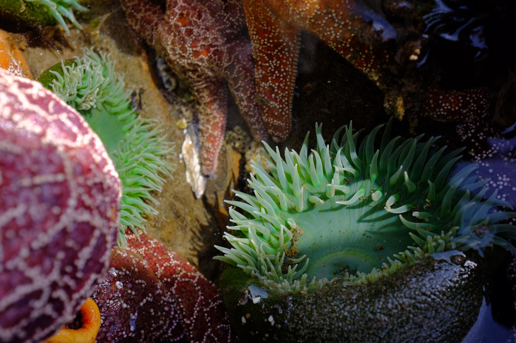
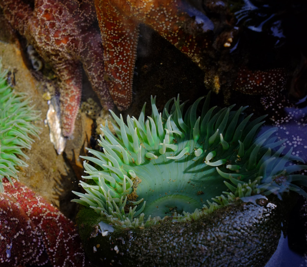
If you have time, would any of you mind taking a look at these two images
and give a choice as to which one might better?
I have someone who
wants a print of "sea life", but with a Sea Anemone as the central
point in the image. I thought that this had a good variety of
sea life and shows a typical ecotone of life in the lower tidal zone.
The original image is not cropped, and I am wondering if the Sea Star
on the left that is out of the focus zone, is too much of an intrusion
into the image. Or, does it help frame the rest?
The second image is, of course, cropped.
I haven't done anything to these post-processing, but it's hard to decide
sometimes which might be better. I do like the deep blue reflected areas
on the right side of the image, which helps to put color balance into
the overall image.
Original:

Cropped:

_________________
Assent, and you are sane;
Demur,—you ’re straightway dangerous,
And handled with a chain.
Emily Dickinson
Cameras and Lenses in Use:
Yashica Mat 124 w/ Yashinon 80/3.5,
CV Apo-Lanthar 90/3.5SL, (Thank you Klaus),
Pentax 645,
Flek 50,
Pentax-A 150
Pentax-A 120 Macro
Voigtlander Vitomatic I w/Color Skopar 50/2.8
Konica TC and zoom lenses (thanks Carsten)
Contax AX
Yashica ML 50/2
Yashica ML 35/2.8
Carl Zeiss Contax 50/1.4
Tamron Adaptall SP 17/3.5
Tamron Adaptall 28/2.5
Tamron Adaptall SP 300/2.8 LD (IF)
|
|
| Back to top |
|
 |
Attila


Joined: 24 Feb 2007
Posts: 57865
Location: Hungary
Expire: 2025-11-18
|
 Posted: Fri May 27, 2011 3:30 pm Post subject: Posted: Fri May 27, 2011 3:30 pm Post subject: |
 |
|
Attila wrote:
At first look both are nice, at more deeper look I found crop is better due on first picture bluring subject on left side a bit disturbing.
_________________
-------------------------------
Items on sale on Ebay
Sony NEX-7 Carl Zeiss Planar 85mm f1.4, Minolta MD 35mm f1.8, Konica 135mm f2.5, Minolta MD 50mm f1.2, Minolta MD 250mm f5.6, Carl Zeiss Sonnar 180mm f2.8
|
|
| Back to top |
|
 |
Laurence


Joined: 26 Mar 2007
Posts: 4809
Location: Western Washington State
Expire: 2016-06-19
|
 Posted: Fri May 27, 2011 3:34 pm Post subject: Posted: Fri May 27, 2011 3:34 pm Post subject: |
 |
|
Laurence wrote:
| Attila wrote: |
| At first look both are nice, at more deeper look I found crop is better due on first picture bluring subject on left side a bit disturbing. |
Thanks, Attila!
_________________
Assent, and you are sane;
Demur,—you ’re straightway dangerous,
And handled with a chain.
Emily Dickinson
Cameras and Lenses in Use:
Yashica Mat 124 w/ Yashinon 80/3.5,
CV Apo-Lanthar 90/3.5SL, (Thank you Klaus),
Pentax 645,
Flek 50,
Pentax-A 150
Pentax-A 120 Macro
Voigtlander Vitomatic I w/Color Skopar 50/2.8
Konica TC and zoom lenses (thanks Carsten)
Contax AX
Yashica ML 50/2
Yashica ML 35/2.8
Carl Zeiss Contax 50/1.4
Tamron Adaptall SP 17/3.5
Tamron Adaptall 28/2.5
Tamron Adaptall SP 300/2.8 LD (IF)
|
|
| Back to top |
|
 |
bazza59


Joined: 26 Mar 2011
Posts: 132
Location: County Down, Ireland
|
 Posted: Fri May 27, 2011 3:50 pm Post subject: Posted: Fri May 27, 2011 3:50 pm Post subject: |
 |
|
bazza59 wrote:
both are very good but I prefer the second!
For me its just a little less busy than the first. I suppose it also depends on the print size - imho the first would be better printed large (poster size), the second would work for a medium to large size.
_________________
SLR: Olympus E-520, OM-1, OM-10, OM-40, Canon AV-1, Canon T-70, EOS Rebel X, EOS 300V, Fujica ST801
Lenses
Zuiko: 50/1.8,
Tamron: 28/2.5 (02B), 35-70/3.5 (17A), 135/2.8 (JSG-28Au), 80-210/3.8-4 (103A), 70-210/4-5.6 (58A)
Fujinon: EBC 55/1.8
Others: Helios 44-2, Dollonds-S 135/3.5, Soligor 135/2.8, Sands Hunter 135/3.5, PrinzGalaxy 200/4.5, Danubia 135/2.8, Vivitar 300/5.6
Range/view finders: Olympus - ERC, XA, XA-3, MJU-1, MJU Zoom140 |
|
| Back to top |
|
 |
Orio

Joined: 24 Feb 2007
Posts: 29545
Location: West Emilia
Expire: 2012-12-04
|
 Posted: Fri May 27, 2011 4:19 pm Post subject: Posted: Fri May 27, 2011 4:19 pm Post subject: |
 |
|
Orio wrote:
hi Larry,
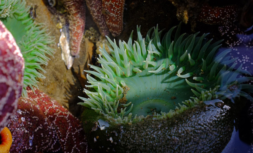
here's my crop:

I like to have the second anemone in the frame as it makes it clearer that Anemone's standing is the main there (it contextualizes the subject).
Also I like the idea of the cinemascope view (makes me think of nature movies - sort of evokes the feeling that the anemones are moving, better than a photographic framing).
You can easily clone out the two yellow dots at center top if they annoy you.
_________________
Orio, Administrator
T*
NE CEDE MALIS AUDENTIOR ITO
Ferrania film is reborn! http://www.filmferrania.it/
Support the Ornano film chemicals company and help them survive!
http://forum.mflenses.com/ornano-chemical-products-t55525.html |
|
| Back to top |
|
 |
DigiChromeEd


Joined: 29 Dec 2009
Posts: 3462
Location: Northern Ireland
|
 Posted: Fri May 27, 2011 4:25 pm Post subject: Posted: Fri May 27, 2011 4:25 pm Post subject: |
 |
|
DigiChromeEd wrote:
| Attila wrote: |
| At first look both are nice, at more deeper look I found crop is better due on first picture bluring subject on left side a bit disturbing. |
+1
_________________
"I've got a Nikon camera, I like to take a photograph" - Paul Simon |
|
| Back to top |
|
 |
Orio

Joined: 24 Feb 2007
Posts: 29545
Location: West Emilia
Expire: 2012-12-04
|
 Posted: Fri May 27, 2011 4:33 pm Post subject: Posted: Fri May 27, 2011 4:33 pm Post subject: |
 |
|
Orio wrote:
| DigiChromeEd wrote: |
| Attila wrote: |
| At first look both are nice, at more deeper look I found crop is better due on first picture bluring subject on left side a bit disturbing. |
+1 |
In the crop version (and in the original too), I find the top part too large compared with the subject, it diminishes impact of subject.
_________________
Orio, Administrator
T*
NE CEDE MALIS AUDENTIOR ITO
Ferrania film is reborn! http://www.filmferrania.it/
Support the Ornano film chemicals company and help them survive!
http://forum.mflenses.com/ornano-chemical-products-t55525.html |
|
| Back to top |
|
 |
rbelyell


Joined: 13 Oct 2009
Posts: 4269
Location: somewhere in the mountains of central NY
Expire: 2014-01-31
|
 Posted: Fri May 27, 2011 4:55 pm Post subject: Posted: Fri May 27, 2011 4:55 pm Post subject: |
 |
|
rbelyell wrote:
i like the original crop as i just find my eye travels more easily to the subject without distraction.
_________________
Epson RD1 + Elmarit 21/2.8; Summarit 50/1.5; Summarit 75/2.5; Elmar-c 90/4; Sankyo Komura 135/2.8, Hektor 135/4.5; Braun Paxina 29 6x6; Photax Boyer Paris; Holga 120 Pano
GREAT STUFF FOR SALE:
Contax T
Hasselblad XPan + 45/4, 90/4
Kodak Retina Reflex IV + full set of Schneider Krueznach lenses
Mercury 2 half frame 35mm
Kodak Pro slr/n
Fuji GM670+100/3.5+65/8!
Praktisix 6x6 medium format + ZeissBiometar 120/2.8
Bessa T 101 Anniversary Edition in Navy Blue
Mamiya Six Folder with Zuiko 75/3.5
Adaptall: Tamron SP 28-85 macro
Cameras: Canon IX
PM for more complete descriptions/pix. All in great shape!
_________________________
'buy me a drink, sing me a song,
take me as i come 'cause i can't stay long' |
|
| Back to top |
|
 |
Hexanon
Joined: 26 May 2011
Posts: 16
|
 Posted: Fri May 27, 2011 5:51 pm Post subject: Posted: Fri May 27, 2011 5:51 pm Post subject: |
 |
|
Hexanon wrote:
Another vote for the second, cropped image if you are still deciding. |
|
| Back to top |
|
 |
Laurence


Joined: 26 Mar 2007
Posts: 4809
Location: Western Washington State
Expire: 2016-06-19
|
 Posted: Fri May 27, 2011 6:39 pm Post subject: Posted: Fri May 27, 2011 6:39 pm Post subject: |
 |
|
Laurence wrote:
Thank you ALL. It looks like the majority feel as I do, that the cropped
image is better.
And, I think I also like the bit of cropping that Orio has done to the upper
part of the frame to reduce all that space.
So, I am going with the majority of suggestions, plus Orio's additional
suggestion.
I think the buyer will like his print. His main concern was to get
a "representative" image of one of the beautiful greenish-blue
Sea Anemones from the low tide zone, with a bit of "environment"
arount it. So, the "crop" suggestions were great, and Orio's "enhancing
the subject" suggestion was great.
And, as said earlier, I do like the purple reflections on the right side
and did want to keep them. Also, I think the way the anemone is
partly under water on that side, plus those white circles from a
Sea Star under the water, definitely add to the colorful feel of the print.
This will be a 12x18 print, a nice mid-size print size.
THANKS SO MUCH!
_________________
Assent, and you are sane;
Demur,—you ’re straightway dangerous,
And handled with a chain.
Emily Dickinson
Cameras and Lenses in Use:
Yashica Mat 124 w/ Yashinon 80/3.5,
CV Apo-Lanthar 90/3.5SL, (Thank you Klaus),
Pentax 645,
Flek 50,
Pentax-A 150
Pentax-A 120 Macro
Voigtlander Vitomatic I w/Color Skopar 50/2.8
Konica TC and zoom lenses (thanks Carsten)
Contax AX
Yashica ML 50/2
Yashica ML 35/2.8
Carl Zeiss Contax 50/1.4
Tamron Adaptall SP 17/3.5
Tamron Adaptall 28/2.5
Tamron Adaptall SP 300/2.8 LD (IF)
|
|
| Back to top |
|
 |
ylyad

Joined: 01 Jun 2010
Posts: 476
Location: Zentralschweiz
Expire: 2013-12-05
|
 Posted: Sat May 28, 2011 7:37 am Post subject: Posted: Sat May 28, 2011 7:37 am Post subject: |
 |
|
ylyad wrote:
I vote for Orio's version. I like the left subject, a bit blurry but on the original, it's a bit too large (and the sun on it makes it too much visible).
_________________
Camera: Fuji X-E2, Fuji X100T
MF: Canon nFD 50/1.4, Canon nFD 100/2.8, Tokina RMC 135/2.8
Tamron SP 24-48/3.5-3.8
http://www.flickr.com/derdide/
|
|
| Back to top |
|
 |
Himself

Joined: 01 Mar 2007
Posts: 3246
Location: Montreal
Expire: 2013-05-30
|
 Posted: Sat May 28, 2011 1:10 pm Post subject: Posted: Sat May 28, 2011 1:10 pm Post subject: |
 |
|
Himself wrote:
I'd go with your cropped version.
Orio's crop would be good only if that thing had a different color than pink. That blurred pink, as little as it is, is catching my eye unpleasantly.
_________________
Moderator Himself |
|
| Back to top |
|
 |
cooltouch


Joined: 15 Jan 2009
Posts: 9096
Location: Houston, Texas
|
 Posted: Sat May 28, 2011 5:07 pm Post subject: Posted: Sat May 28, 2011 5:07 pm Post subject: |
 |
|
cooltouch wrote:
I agree with Attila. I find the OOF thing to be distracting, and even including a bit of it, as Orio has done makes me think that I would have cropped that bit out, as well. Or gotten real fancy with PS and replaced it with something in focus.
_________________
Michael
My Gear List: http://michaelmcbroom.com/photo/gear.html
My Gallery: http://michaelmcbroom.com/gallery3/index.php/
My Flickr Page: https://www.flickr.com/photos/11308754@N08/albums
My Music: https://soundcloud.com/michaelmcbroom/albums
My Blog: http://michaelmcbroom.com/blogistan/ |
|
| Back to top |
|
 |
|
|
|
You cannot post new topics in this forum
You cannot reply to topics in this forum
You cannot edit your posts in this forum
You cannot delete your posts in this forum
You cannot vote in polls in this forum
|
