| View previous topic :: View next topic |
| Author |
Message |
torbod


Joined: 31 Jan 2010
Posts: 379
Location: Sweden
|
 Posted: Fri May 13, 2011 7:51 pm Post subject: Cropping contest of silly image Posted: Fri May 13, 2011 7:51 pm Post subject: Cropping contest of silly image |
 |
|
torbod wrote:
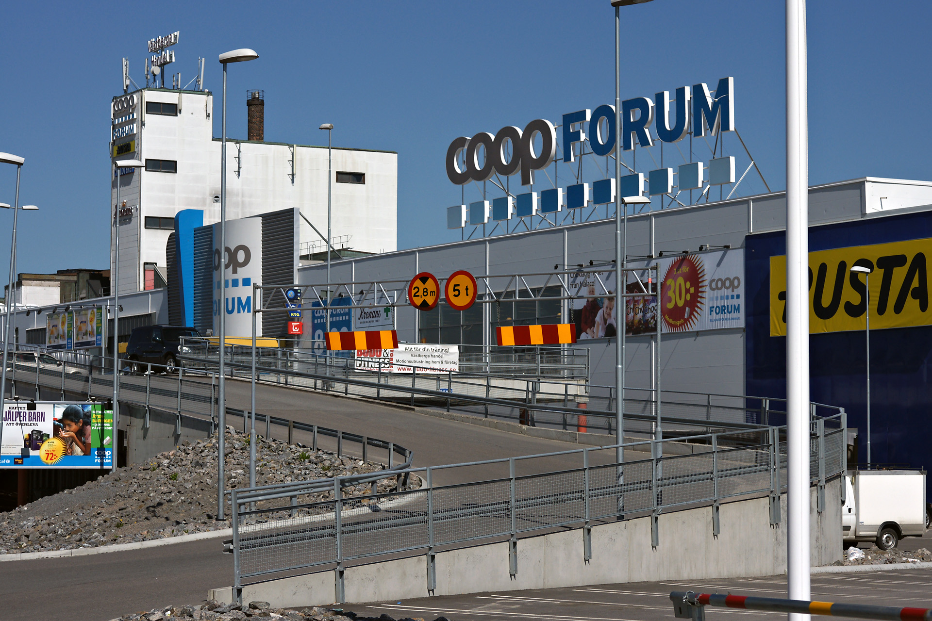
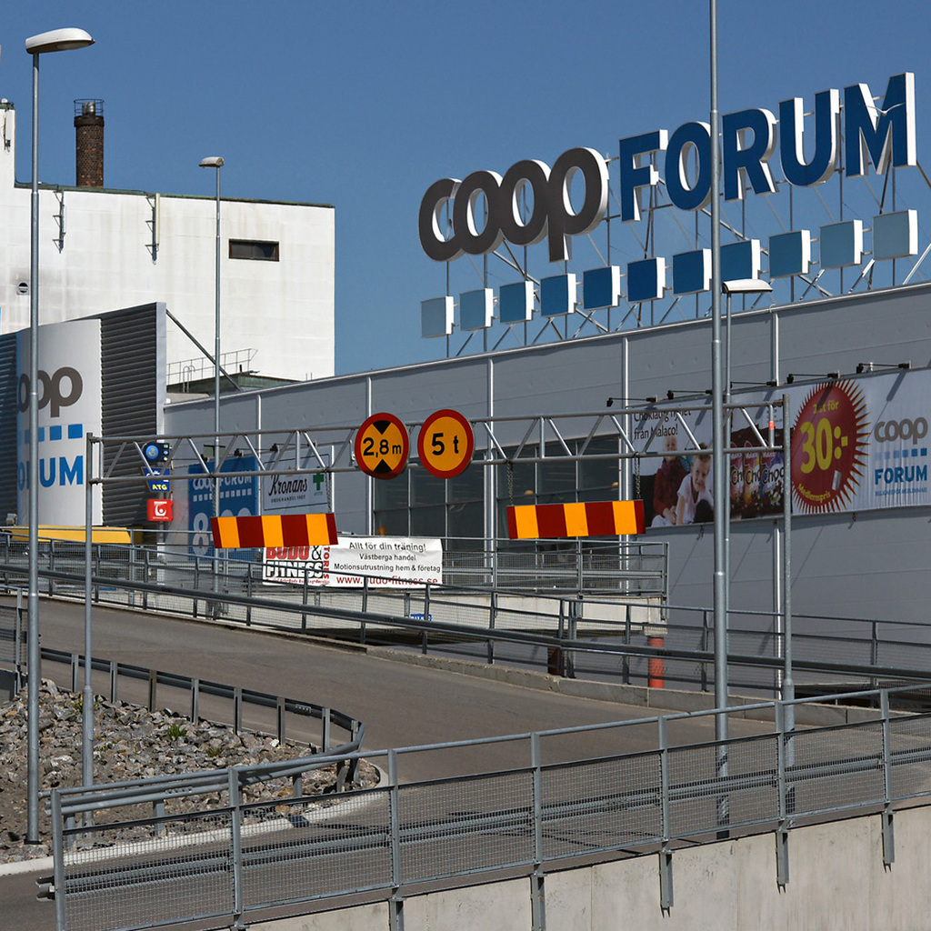
Well, the price is only honor, but feel free to crop this rather silly image to something good. It is also allowed to rotate, rescale, change sharpness and contrast to increase 3D-ness, but the cropping is my main interest. Nothing can be manipulated away from the image by other means than the cropping action.

I was out trying to test sharpness and contrast of my beloved Leitz Macro Elmarit-R 60 2.8 stopped down to f5.6 (I normally shoot wide open). So there is massive detail, objects close and far, diagonality, perspective etc. Still I find it very hard to crop since there is always something distracting left (flagpole, lightpost, road gate, poster sign, etc). I normally crop to square or 1x1.5 ratio, but I tried something in between and still I didn't get something I liked.
Is it really hopeless?
Click on it to get a larger version.
Cheers
/T
_________________
For Sale or Trade: Pick from the list below.
Manual Lenses: CV 15 4.5 | MIR-20H 20 3.5 | Elmarit-R 28 2.8 | Flektogon MC 35 2.4 | S-M-C Tak 50 1.4 | Rollei 50 1.8 HFT | Helios 44-3 MC 58 2 | MC ROKKOR-X 58 1.2 | MacroPlanar 60 2.8 | Vega-12b 90 2.8 | Tamron 52B 90 2.5 | CZJ 135 3.5 | Jupiter-21A 200 4 | Tair-3s 300 4.5 | KOHBEPTEP K-1 | Takumar x2 |
Camera: Sony Nex 5N |
|
|
| Back to top |
|
 |
cooltouch


Joined: 15 Jan 2009
Posts: 9096
Location: Houston, Texas
|
| Posted: Fri May 13, 2011 8:32 pm Post subject: |
|
|
cooltouch wrote:
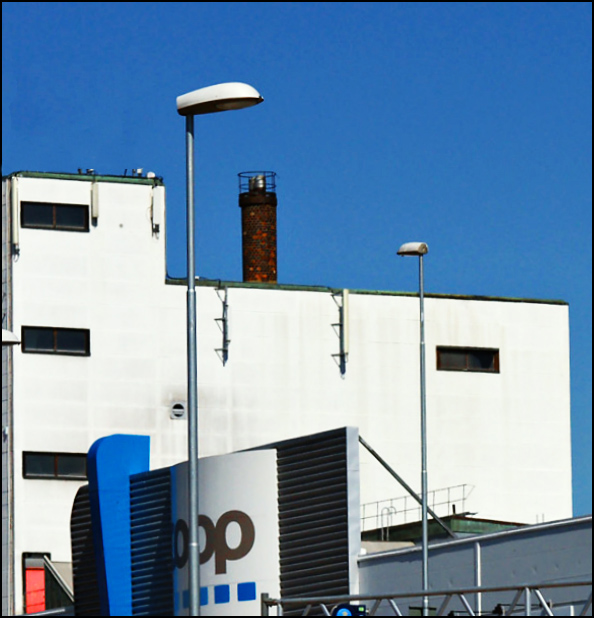
Rather than try cropping, why not try editing out the detail you don't like. Sometimes it takes a bit of patience, but often it can be done in such a way to make a big difference. For example:
From this:

To this:

From this:

To this:

From this:

To this:

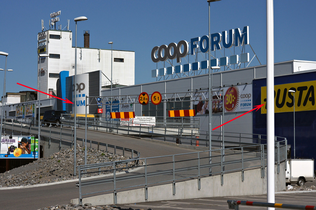
All those tall light poles in front of the building, and even that big one on the right side can be gotten rid of with a bit of patience.
_________________
Michael
My Gear List: http://michaelmcbroom.com/photo/gear.html
My Gallery: http://michaelmcbroom.com/gallery3/index.php/
My Flickr Page: https://www.flickr.com/photos/11308754@N08/albums
My Music: https://soundcloud.com/michaelmcbroom/albums
My Blog: http://michaelmcbroom.com/blogistan/ |
|
| Back to top |
|
|
torbod
Joined: 31 Jan 2010
Posts: 379
Location: Sweden
|
| Posted: Fri May 13, 2011 8:46 pm Post subject: |
|
|
torbod wrote:
Thank you for the examples. Pretty impressive stuff.
Removing things with PS tools can be fairly easy with some patience as you say. But I'd like to improve on my cropping style and composition and have some other persons view on what can be interesting. Perhaps some distracting elements can be left in the image to improve on 3D feeling. Or it can be a part of this rather messy place, to show perspective and lead the eyes into the image. Or it is best to avoid them totally.
Things like that is what I'd like to experiment with.
I could have made several different crops and have a discussion about that, but then I'd not get to see the results as made with different eyes.
cheers
/T
_________________
For Sale or Trade: Pick from the list below.
Manual Lenses: CV 15 4.5 | MIR-20H 20 3.5 | Elmarit-R 28 2.8 | Flektogon MC 35 2.4 | S-M-C Tak 50 1.4 | Rollei 50 1.8 HFT | Helios 44-3 MC 58 2 | MC ROKKOR-X 58 1.2 | MacroPlanar 60 2.8 | Vega-12b 90 2.8 | Tamron 52B 90 2.5 | CZJ 135 3.5 | Jupiter-21A 200 4 | Tair-3s 300 4.5 | KOHBEPTEP K-1 | Takumar x2 |
Camera: Sony Nex 5N |
|
|
| Back to top |
|
|
ludoo


Joined: 18 Sep 2009
Posts: 1397
Location: Milan, Italy
Expire: 2011-12-05
|
| Posted: Fri May 13, 2011 10:28 pm Post subject: |
|
|
ludoo wrote:
A quick edit in silkypix. Deciding on a crop for this image is not that easy, plus we don't know what you'd like the image to mean. 

_________________
My galleries
Digital: Samsung EX-1
Past Digital: Samsung NX10, Sigma SD9, Sigma SD10, SD14, DP2, Pentax *istD, Kx, Fuji S2 Pro, Canon 5D
Analog: packfilm Polaroids, 6x9 Kodak folders, Pentacon Taxona half-frame, Fujica ST605n, Walz Envoy, Olympus 35 S-II, Olympus Wide S
Past Analog: Polaroid 600se, Polaroid 110B, Canon IIF, various fixed-lens and Russian rangefinders, ...
Past Lenses: Nikkor 24/2.8, Nikkor SC 50/1.4, Nikkor 50/2, Nikkor H 85/1.8, Nikkor P 105/2.5, Nikkor Q 135/3.5, Fujinon 100/2.8, Fujinon EBC 100/2.8, Fujinon EBC 135/3.5, Fujinon EBC 200/4.5, Mamiya SX 135/2.8, CZJ Flektogon 35/2.4, CZJ Pancolar 50/1.8 zebra, CZJ Sonnar 135/3.5, ...
altroformato
|
|
| Back to top |
|
|
William

Joined: 26 Nov 2009
Posts: 489
Location: London
|
| Posted: Fri May 13, 2011 11:21 pm Post subject: |
|
|
William wrote:
To be honest I quite like the photo as it is although Ludoo's crop is good as well as that white pole through the right hand side is a little distracting. |
|
| Back to top |
|
|
Himself
Joined: 01 Mar 2007
Posts: 3242
Location: Montreal
Expire: 2013-05-30
|
| Posted: Sat May 14, 2011 12:45 am Post subject: |
|
|
Himself wrote:
No need to add more sharpness or contrast.
Just cropping won't do any justice to that picture. You have to remove those 2 poles, the barrier and the banner on the bottom left hand corner.
What letters were there?

_________________
Moderator Himself |
|
| Back to top |
|
|
cooltouch
Joined: 15 Jan 2009
Posts: 9096
Location: Houston, Texas
|
| Posted: Sat May 14, 2011 2:34 am Post subject: |
|
|
cooltouch wrote:
Okay, here's my quicky attempt. I cropped the image first to one that I thought worked better. I removed a lot more than two poles, but I didn't remove the banner. Taking the banner out would be easy enough to do, though.

_________________
Michael
My Gear List: http://michaelmcbroom.com/photo/gear.html
My Gallery: http://michaelmcbroom.com/gallery3/index.php/
My Flickr Page: https://www.flickr.com/photos/11308754@N08/albums
My Music: https://soundcloud.com/michaelmcbroom/albums
My Blog: http://michaelmcbroom.com/blogistan/ |
|
| Back to top |
|
|
torbod
Joined: 31 Jan 2010
Posts: 379
Location: Sweden
|
| Posted: Sat May 14, 2011 7:10 am Post subject: |
|
|
torbod wrote:
| Himself wrote: |
No need to add more sharpness or contrast.
Just cropping won't do any justice to that picture. You have to remove those 2 poles, the barrier and the banner on the bottom left hand corner.
What letters were there?
|
Both letters are R
I agree that the ad on lower left steals a lot of attention from the building.
_________________
For Sale or Trade: Pick from the list below.
Manual Lenses: CV 15 4.5 | MIR-20H 20 3.5 | Elmarit-R 28 2.8 | Flektogon MC 35 2.4 | S-M-C Tak 50 1.4 | Rollei 50 1.8 HFT | Helios 44-3 MC 58 2 | MC ROKKOR-X 58 1.2 | MacroPlanar 60 2.8 | Vega-12b 90 2.8 | Tamron 52B 90 2.5 | CZJ 135 3.5 | Jupiter-21A 200 4 | Tair-3s 300 4.5 | KOHBEPTEP K-1 | Takumar x2 |
Camera: Sony Nex 5N |
Last edited by torbod on Sat May 14, 2011 7:15 am; edited 1 time in total |
|
| Back to top |
|
|
torbod
Joined: 31 Jan 2010
Posts: 379
Location: Sweden
|
| Posted: Sat May 14, 2011 7:14 am Post subject: |
|
|
torbod wrote:
| cooltouch wrote: |
Okay, here's my quicky attempt. I cropped the image first to one that I thought worked better. I removed a lot more than two poles, but I didn't remove the banner. Taking the banner out would be easy enough to do, though.
|
That is very nice, at least the missing flag pole on the right. It clears up the image greatly together with the missing light posts on far left.
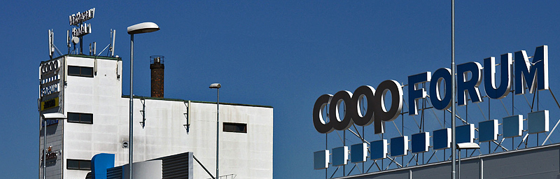
For me the focus of the image is the oddly built high building on top left (it is an old bakery, rebuilt to a super market) and the perspective (roof line) to the massive COOP FORUM letters on top of the roof. This in conjunction with the diagonals from the criss crossing road leading up to the upper parking deck.
What is left to distract me is the 72:- ad lower left, perhaps yellow banner mid right and road gate lower right.
Is the image getting a bit unrealistic when all clutter is removed?
Cheers
/T
_________________
For Sale or Trade: Pick from the list below.
Manual Lenses: CV 15 4.5 | MIR-20H 20 3.5 | Elmarit-R 28 2.8 | Flektogon MC 35 2.4 | S-M-C Tak 50 1.4 | Rollei 50 1.8 HFT | Helios 44-3 MC 58 2 | MC ROKKOR-X 58 1.2 | MacroPlanar 60 2.8 | Vega-12b 90 2.8 | Tamron 52B 90 2.5 | CZJ 135 3.5 | Jupiter-21A 200 4 | Tair-3s 300 4.5 | KOHBEPTEP K-1 | Takumar x2 |
Camera: Sony Nex 5N |
|
|
| Back to top |
|
|
cooltouch
Joined: 15 Jan 2009
Posts: 9096
Location: Houston, Texas
|
| Posted: Sat May 14, 2011 1:07 pm Post subject: |
|
|
cooltouch wrote:
No, I honestly think it looks better with the clutter removed. People who will view the image most likely won't even realize that the clutter is removed. We tend to tune out power poles and light poles and other parts of a city's infrastructure anyway.
Okay, so here's another quicky attempt, this time with the offending sign, gate, and banner removed. I also noticed two light poles that I had truncated, but not entirely removed. I went ahead and took them out too.

It does open up a rather large empty space there now, but you'll have to be the judge as to which is better. Me, I prefer this one without the advertising.
Also, just so you can better see what all I did, here's a copy of the image where you had already placed a few arrows. I added more, for each item I removed, and also showing the crop.

_________________
Michael
My Gear List: http://michaelmcbroom.com/photo/gear.html
My Gallery: http://michaelmcbroom.com/gallery3/index.php/
My Flickr Page: https://www.flickr.com/photos/11308754@N08/albums
My Music: https://soundcloud.com/michaelmcbroom/albums
My Blog: http://michaelmcbroom.com/blogistan/ |
|
| Back to top |
|
|
Himself
Joined: 01 Mar 2007
Posts: 3242
Location: Montreal
Expire: 2013-05-30
|
| Posted: Sat May 14, 2011 10:02 pm Post subject: |
|
|
Himself wrote:
Nice editing Michael!
_________________
Moderator Himself |
|
| Back to top |
|
|
Orio

Joined: 24 Feb 2007
Posts: 29545
Location: West Emilia
Expire: 2012-12-04
|
| Posted: Sat May 14, 2011 10:31 pm Post subject: |
|
|
Orio wrote:
_________________
Orio, Administrator
T*
NE CEDE MALIS AUDENTIOR ITO
Ferrania film is reborn! http://www.filmferrania.it/
Support the Ornano film chemicals company and help them survive!
http://forum.mflenses.com/ornano-chemical-products-t55525.html |
|
| Back to top |
|
|
poilu
Joined: 26 Aug 2007
Posts: 10472
Location: Greece
Expire: 2019-08-29
|
| Posted: Sat May 14, 2011 11:01 pm Post subject: |
|
|
poilu wrote:
| Orio wrote: |
|
+1 
_________________
T* |
|
| Back to top |
|
|
torbod
Joined: 31 Jan 2010
Posts: 379
Location: Sweden
|
| Posted: Sun May 15, 2011 12:47 pm Post subject: |
|
|
torbod wrote:
Michael. Good work, thats a lot of arrows. I tend to agree with you, less mess more focus on the real subject. Now it has become a more straight forward image without distractive elements.
Orio: Why not. Interesting idea. This is the purpose of the tread, to find different images within the image
I would probably have cropped less tight on the left side for a less compressed look. on the building and rotating sign.
/T
_________________
For Sale or Trade: Pick from the list below.
Manual Lenses: CV 15 4.5 | MIR-20H 20 3.5 | Elmarit-R 28 2.8 | Flektogon MC 35 2.4 | S-M-C Tak 50 1.4 | Rollei 50 1.8 HFT | Helios 44-3 MC 58 2 | MC ROKKOR-X 58 1.2 | MacroPlanar 60 2.8 | Vega-12b 90 2.8 | Tamron 52B 90 2.5 | CZJ 135 3.5 | Jupiter-21A 200 4 | Tair-3s 300 4.5 | KOHBEPTEP K-1 | Takumar x2 |
Camera: Sony Nex 5N |
|
|
| Back to top |
|
|
LucisPictor

Joined: 26 Feb 2007
Posts: 17633
Location: Oberhessen, Germany / Maidstone ('95-'96)
Expire: 2013-12-03
|
| Posted: Sun May 15, 2011 3:19 pm Post subject: |
|
|
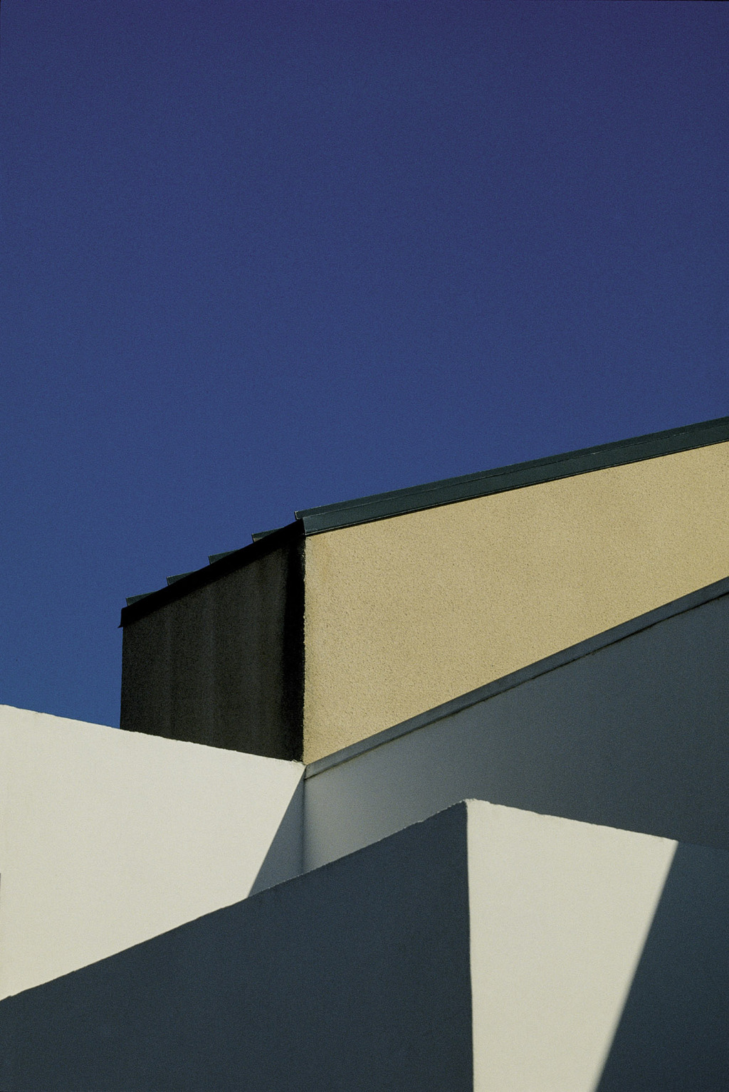
LucisPictor wrote:

The only crop I liked is an unconventional one. 
_________________
Personal forum activity on pause every now and again (due to job obligations)!
Carsten, former Moderator 
Things ON SALE
Carsten = "KAPCTEH" = "Karusutenu" | T-shirt?.........................My photos from Emilia: http://www.schouler.net/emilia/emilia2011.html
My gear: http://retrocameracs.wordpress.com/ausrustung/
Old list: http://forum.mflenses.com/viewtopic.php?t=65 (Not up-to-date, sorry!) | http://www.lucispictor.de | http://www.alensaweek.wordpress.com |
http://www.retrocamera.de |
|
| Back to top |
|
|
ludoo
Joined: 18 Sep 2009
Posts: 1397
Location: Milan, Italy
Expire: 2011-12-05
|
| Posted: Sun May 15, 2011 3:25 pm Post subject: |
|
|
ludoo wrote:
The one I personally prefer is Carsten's. But I wonder why nobody thought of straightening the white building: since it's the focus of the picture, I think it really should be straight.
_________________
My galleries
Digital: Samsung EX-1
Past Digital: Samsung NX10, Sigma SD9, Sigma SD10, SD14, DP2, Pentax *istD, Kx, Fuji S2 Pro, Canon 5D
Analog: packfilm Polaroids, 6x9 Kodak folders, Pentacon Taxona half-frame, Fujica ST605n, Walz Envoy, Olympus 35 S-II, Olympus Wide S
Past Analog: Polaroid 600se, Polaroid 110B, Canon IIF, various fixed-lens and Russian rangefinders, ...
Past Lenses: Nikkor 24/2.8, Nikkor SC 50/1.4, Nikkor 50/2, Nikkor H 85/1.8, Nikkor P 105/2.5, Nikkor Q 135/3.5, Fujinon 100/2.8, Fujinon EBC 100/2.8, Fujinon EBC 135/3.5, Fujinon EBC 200/4.5, Mamiya SX 135/2.8, CZJ Flektogon 35/2.4, CZJ Pancolar 50/1.8 zebra, CZJ Sonnar 135/3.5, ...
altroformato
|
|
| Back to top |
|
|
Orio
Joined: 24 Feb 2007
Posts: 29545
Location: West Emilia
Expire: 2012-12-04
|
| Posted: Sun May 15, 2011 5:07 pm Post subject: |
|
|
Orio wrote:
| ludoo wrote: |
| But I wonder why nobody thought of straightening the white building |
I did...
_________________
Orio, Administrator
T*
NE CEDE MALIS AUDENTIOR ITO
Ferrania film is reborn! http://www.filmferrania.it/
Support the Ornano film chemicals company and help them survive!
http://forum.mflenses.com/ornano-chemical-products-t55525.html |
|
| Back to top |
|
|
torbod
Joined: 31 Jan 2010
Posts: 379
Location: Sweden
|
| Posted: Sun May 15, 2011 6:17 pm Post subject: |
|
|
torbod wrote:
| LucisPictor wrote: |
The only crop I liked is an unconventional one. |
I like your crop. The only thing distracting is the light post to the right, but the crop gives a nice perspective.
/T
_________________
For Sale or Trade: Pick from the list below.
Manual Lenses: CV 15 4.5 | MIR-20H 20 3.5 | Elmarit-R 28 2.8 | Flektogon MC 35 2.4 | S-M-C Tak 50 1.4 | Rollei 50 1.8 HFT | Helios 44-3 MC 58 2 | MC ROKKOR-X 58 1.2 | MacroPlanar 60 2.8 | Vega-12b 90 2.8 | Tamron 52B 90 2.5 | CZJ 135 3.5 | Jupiter-21A 200 4 | Tair-3s 300 4.5 | KOHBEPTEP K-1 | Takumar x2 |
Camera: Sony Nex 5N |
|
|
| Back to top |
|
|
kuuan

Joined: 14 Jan 2008
Posts: 4569
Location: right now: Austria
Expire: 2014-12-26
|
| Posted: Sun May 15, 2011 6:42 pm Post subject: |
|
|
kuuan wrote:
amazing how you guys can make things disappear!
I hardly could but also found signs to the far left and right disturbing. took another route reducing contents / clustering of colors, made it square concentrating on the coop and forum letterings + having all the silver poles asf as prominent feature
_________________
my photos on flickr: https://www.flickr.com/photos/kuuan/collections |
|
| Back to top |
|
|
Orio
Joined: 24 Feb 2007
Posts: 29545
Location: West Emilia
Expire: 2012-12-04
|
| Posted: Sun May 15, 2011 11:48 pm Post subject: |
|
|
Orio wrote:
| torbod wrote: |
Orio: Why not. Interesting idea. This is the purpose of the tread, to find different images within the image
I would probably have cropped less tight on the left side for a less compressed look. on the building and rotating sign. |
My idea was to work on the pattern of 3 :

to give the image a "rhythm" that would depure it from the confusion of the many chaotic elements.
For that I needed a tight crop, because the larger I would go, the more confusing elements I would add, and the weaker the geometric composition would be
(also I needed the two big poles to be roughly at the thirds in the composition).
If I could edit out parts (which was not allowed) I would have erased the small elements on top left, to leave there only sky
_________________
Orio, Administrator
T*
NE CEDE MALIS AUDENTIOR ITO
Ferrania film is reborn! http://www.filmferrania.it/
Support the Ornano film chemicals company and help them survive!
http://forum.mflenses.com/ornano-chemical-products-t55525.html |
|
| Back to top |
|
|
Orio
Joined: 24 Feb 2007
Posts: 29545
Location: West Emilia
Expire: 2012-12-04
|
| Posted: Sun May 15, 2011 11:55 pm Post subject: |
|
|
Orio wrote:
| Orio wrote: |
If I could edit out parts (which was not allowed) I would have erased the small elements on top left, to leave there only sky |
quick fast example of what could be with a little erasing:
_________________
Orio, Administrator
T*
NE CEDE MALIS AUDENTIOR ITO
Ferrania film is reborn! http://www.filmferrania.it/
Support the Ornano film chemicals company and help them survive!
http://forum.mflenses.com/ornano-chemical-products-t55525.html |
|
| Back to top |
|
|
cooltouch
Joined: 15 Jan 2009
Posts: 9096
Location: Houston, Texas
|
| Posted: Mon May 16, 2011 6:03 am Post subject: |
|
|
cooltouch wrote:
So you wanna get rid of all the clutter, eh? Well, here's your answer:

_________________
Michael
My Gear List: http://michaelmcbroom.com/photo/gear.html
My Gallery: http://michaelmcbroom.com/gallery3/index.php/
My Flickr Page: https://www.flickr.com/photos/11308754@N08/albums
My Music: https://soundcloud.com/michaelmcbroom/albums
My Blog: http://michaelmcbroom.com/blogistan/ |
|
| Back to top |
|
|
torbod
Joined: 31 Jan 2010
Posts: 379
Location: Sweden
|
| Posted: Mon May 16, 2011 10:46 am Post subject: |
|
|
torbod wrote:
| Orio wrote: |
| Orio wrote: |
If I could edit out parts (which was not allowed) I would have erased the small elements on top left, to leave there only sky |
quick fast example of what could be with a little erasing:
|
Very nice. With your phenomenal explanation in the earlier post I now understand your though and it is this kind of thinking I'd like to learn more of. Hopefully I can start improving the composition and plan the shots better before taking them
Thank you all again for all contributions.
BR
/T
_________________
For Sale or Trade: Pick from the list below.
Manual Lenses: CV 15 4.5 | MIR-20H 20 3.5 | Elmarit-R 28 2.8 | Flektogon MC 35 2.4 | S-M-C Tak 50 1.4 | Rollei 50 1.8 HFT | Helios 44-3 MC 58 2 | MC ROKKOR-X 58 1.2 | MacroPlanar 60 2.8 | Vega-12b 90 2.8 | Tamron 52B 90 2.5 | CZJ 135 3.5 | Jupiter-21A 200 4 | Tair-3s 300 4.5 | KOHBEPTEP K-1 | Takumar x2 |
Camera: Sony Nex 5N |
|
|
| Back to top |
|
|
Orio
Joined: 24 Feb 2007
Posts: 29545
Location: West Emilia
Expire: 2012-12-04
|
| Posted: Mon May 16, 2011 12:30 pm Post subject: |
|
|
Orio wrote:
| torbod wrote: |
Very nice. With your phenomenal explanation in the earlier post I now understand your though and it is this kind of thinking I'd like to learn more of. Hopefully I can start improving the composition and plan the shots better before taking them
Thank you all again for all contributions.
BR
/T |
There is an Italian photographer who is famous for this type of geometrical compositions, Franco Fontana:


In the long run, I find this type of images sterile (I can stand a few of them, not a whole book). However, with some contemporary urban landscapes, it can be the only way to give the photos some aesthetical interest, as today's architecture per se can feel really cold.
_________________
Orio, Administrator
T*
NE CEDE MALIS AUDENTIOR ITO
Ferrania film is reborn! http://www.filmferrania.it/
Support the Ornano film chemicals company and help them survive!
http://forum.mflenses.com/ornano-chemical-products-t55525.html |
|
| Back to top |
|
|
torbod
Joined: 31 Jan 2010
Posts: 379
Location: Sweden
|
| Posted: Mon May 16, 2011 8:26 pm Post subject: |
|
|
torbod wrote:
Thank you Orio. Must check up on that guy.
_________________
For Sale or Trade: Pick from the list below.
Manual Lenses: CV 15 4.5 | MIR-20H 20 3.5 | Elmarit-R 28 2.8 | Flektogon MC 35 2.4 | S-M-C Tak 50 1.4 | Rollei 50 1.8 HFT | Helios 44-3 MC 58 2 | MC ROKKOR-X 58 1.2 | MacroPlanar 60 2.8 | Vega-12b 90 2.8 | Tamron 52B 90 2.5 | CZJ 135 3.5 | Jupiter-21A 200 4 | Tair-3s 300 4.5 | KOHBEPTEP K-1 | Takumar x2 |
Camera: Sony Nex 5N |
|
|
| Back to top |
|
|
|
|