| View previous topic :: View next topic |
| Author |
Message |
Orio

Joined: 24 Feb 2007
Posts: 29545
Location: West Emilia
Expire: 2012-12-04
|
 Posted: Mon Nov 29, 2010 1:26 am Post subject: Please help me choose Posted: Mon Nov 29, 2010 1:26 am Post subject: Please help me choose |
 |
|
Orio wrote:
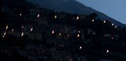
I need to choose one of the two following photos for my Lake Como series.
I can not keep both because they are too similar, but I can not decide which one to choose.
Please choose one, left or right:
 _ _
(both taken with Distagon 1.4/35)
_________________
Orio, Administrator
T*
NE CEDE MALIS AUDENTIOR ITO
Ferrania film is reborn! http://www.filmferrania.it/
Support the Ornano film chemicals company and help them survive!
http://forum.mflenses.com/ornano-chemical-products-t55525.html |
|
| Back to top |
|
 |
Attila


Joined: 24 Feb 2007
Posts: 57865
Location: Hungary
Expire: 2025-11-18
|
| Posted: Mon Nov 29, 2010 1:32 am Post subject: |
|
|
Attila wrote:
Right. Better light on center part.
_________________
-------------------------------
Items on sale on Ebay
Sony NEX-7 Carl Zeiss Planar 85mm f1.4, Minolta MD 35mm f1.8, Konica 135mm f2.5, Minolta MD 50mm f1.2, Minolta MD 250mm f5.6, Carl Zeiss Sonnar 180mm f2.8
|
|
| Back to top |
|
|
Himself
Joined: 01 Mar 2007
Posts: 3240
Location: Montreal
Expire: 2013-05-30
|
| Posted: Mon Nov 29, 2010 1:38 am Post subject: |
|
|
Himself wrote:
I agree.
The second one. The 2 central buildings/houses are better exposed.
Just tell me it wasn't hand held.
_________________
Moderator Himself |
|
| Back to top |
|
|
Nikos


Joined: 17 May 2010
Posts: 1077
Location: Greece
Expire: 2015-01-02
|
| Posted: Mon Nov 29, 2010 1:42 am Post subject: |
|
|
Nikos wrote:
| Himself wrote: |
I agree.
The second one. The 2 central buildings/houses are better exposed.
Just tell me it wasn't hand held. |
It was handheld. He has a witness...
_________________
Νίκος • www.diafragma.gr

Cameras: Canon EOS 5D Mark II, Sony α7R, Sony NEX-5N
MF lenses:
SLR:
Canon TS-E 17mm f/4, Zeiss 2.8/21 ZE, Zeiss 2/28 Contax, Zeiss 2/35 ZE, Zeiss 1.4/50 Contax, Zeiss 1.4/85 Contax, Zeiss Makro 2/100 ZE,
Zeiss 2/135 Contax, Zeiss 2.8/135 Contax, Zeiss Vario-Sonnar 35-70 Contax, Zeiss Vario-Sonnar 100-300 Contax, Zeiss F-Distagon Rollei, Canon FD 24mm f2, Minolta MD Rokkor 35mm f2.8
Rangefinder:
Zeiss 4.5/21 C Biogon ZM, Zeiss 2/35 Biogon ZM, Voigtländer 15mm f/4.5 Heliar L39, Leica Tele-Elmarit 2.8/90mm, Zeiss 2/45 Contax G, Zeiss 2.8/90 Contax G, Canon 50mm 1.8 LTM
AF lenses: Canon 15mm f/2.8 Fisheye, Canon 24-70 f/2.8 L, Canon 70-200 f/2.8 L IS II, Canon 70-200 f/4 L, Canon 300 f/4 L IS, Canon 100 f/2.8 macro
|
|
| Back to top |
|
|
visualopsins

Joined: 05 Mar 2009
Posts: 10960
Location: California
Expire: 2025-04-11
|
| Posted: Mon Nov 29, 2010 1:45 am Post subject: |
|
|
visualopsins wrote:
Well, on the hill left side, in right photo the highlights look like unnatural flare; I wasn't there, maybe that is how it looks.
Can more dark detail be recovered from left photo original?
But the water. On right I see S-curving from foreground to extreme background, not in left side photo, that wave lower right helps lead the eye.
Must keep only one?
_________________
☮☮☮☮☮☮☮☮☮☮☮☮☮☮☮☮☮☮☮☮☮☮☮☮☮☮☮☮☮☮☮☮ like attracts like! ☮☮☮☮☮☮☮☮☮☮☮☮☮☮☮☮☮☮☮☮☮☮☮☮☮☮☮☮☮☮☮☮
Cameras: Sony ILCE-7RM2, Spotmatics II, F, and ESII, Nikon P4
Lenses:
M42 Asahi Optical Co., Takumar 1:4 f=35mm, 1:2 f=58mm (Sonnar), 1:2.4 f=58mm (Heliar), 1:2.2 f=55mm (Gaussian), 1:2.8 f=105mm (Model I), 1:2.8/105 (Model II), 1:5.6/200, Tele-Takumar 1:5.6/200, 1:6.3/300, Macro-Takumar 1:4/50, Auto-Takumar 1:2.3 f=35, 1:1.8 f=55mm, 1:2.2 f=55mm, Super-TAKUMAR 1:3.5/28 (fat), 1:2/35 (Fat), 1:1.4/50 (8-element), Super-Multi-Coated Fisheye-TAKUMAR 1:4/17, Super-Multi-Coated TAKUMAR 1:4.5/20, 1:3.5/24, 1:3.5/28, 1:2/35, 1:3.5/35, 1:1.8/85, 1:1.9/85 1:2.8/105, 1:3.5/135, 1:2.5/135 (II), 1:4/150, 1:4/200, 1:4/300, 1:4.5/500, Super-Multi-Coated Macro-TAKUMAR 1:4/50, 1:4/100, Super-Multi-Coated Bellows-TAKUMAR 1:4/100, SMC TAKUMAR 1:1.4/50, 1:1.8/55
M42 Carl Zeiss Jena Flektogon 2.4/35
Contax Carl Zeiss Vario-Sonnar T* 28-70mm F3.5-4.5
Pentax K-mount SMC PENTAX-A ZOOM 1:3.5 35~105mm, SMC PENTAX ZOOM 1:4 45~125mm
Nikon Micro-NIKKOR-P-C Auto 1:3.5 f=55mm, NIKKOR-P Auto 105mm f/2.5 Pre-AI (Sonnar), Micro-NIKKOR 105mm 1:4 AI, NIKKOR AI-S 35-135mm f/3,5-4,5
Tamron SP 17mm f/3.5 (51B), Tamron SP 17mm f/3.5 (151B), SP 500mm f/8 (55BB), SP 70-210mm f/3.5 (19AH)
Vivitar 100mm 1:2.8 MC 1:1 Macro Telephoto (Kiron)
|
|
| Back to top |
|
|
Orio
Joined: 24 Feb 2007
Posts: 29545
Location: West Emilia
Expire: 2012-12-04
|
| Posted: Mon Nov 29, 2010 1:58 am Post subject: |
|
|
Orio wrote:
@ Sorin: yes, handheld, f/1.4, ISO 1600, 1/250 shutter time the left one, 1/200 shutter time the right one.
@visualopsins: doesn't it suck when you need to necessarily choose one?  Yeah, I need to make a choice, it would look redundant in the series to keep both. Yeah, I need to make a choice, it would look redundant in the series to keep both.
I'm not sure to understand the flare part 
Aside from the small shutter speed difference, there is another difference between the images:
in the right image, I slightly stretched the highlights to the right of the histogram
(which created the "better central light" impression that Attila and Sorin noticed).
The left image is "as nature created", or maybe better said, "as camera recorded".
Thanks for the comments, they are very interesting, and it's very instructive to read which things others would choose your image upon!
_
_________________
Orio, Administrator
T*
NE CEDE MALIS AUDENTIOR ITO
Ferrania film is reborn! http://www.filmferrania.it/
Support the Ornano film chemicals company and help them survive!
http://forum.mflenses.com/ornano-chemical-products-t55525.html |
|
| Back to top |
|
|
Orio
Joined: 24 Feb 2007
Posts: 29545
Location: West Emilia
Expire: 2012-12-04
|
| Posted: Mon Nov 29, 2010 2:30 am Post subject: |
|
|
Orio wrote:
Please keep your choices coming!
_________________
Orio, Administrator
T*
NE CEDE MALIS AUDENTIOR ITO
Ferrania film is reborn! http://www.filmferrania.it/
Support the Ornano film chemicals company and help them survive!
http://forum.mflenses.com/ornano-chemical-products-t55525.html |
|
| Back to top |
|
|
visualopsins
Joined: 05 Mar 2009
Posts: 10960
Location: California
Expire: 2025-04-11
|
| Posted: Mon Nov 29, 2010 2:34 am Post subject: |
|
|
visualopsins wrote:
I would keep both. To choose one for use is another matter. I have learned my tastes and selection abilities change with time, improve hopefully  , my selections change too, maybe I discover a missed winner or perfect photo for current project, sometimes by accident, among archive, or someone I don't know yet sees something I didn't. I also like sometimes to see all photos made during a time, imagination takes me there again with my memories of the time and, I get to review all the mistakes I made , get reminders for improvements, go nostalgic, whatever, it is fun sometimes in stead of tv to watch archive slide shows. , my selections change too, maybe I discover a missed winner or perfect photo for current project, sometimes by accident, among archive, or someone I don't know yet sees something I didn't. I also like sometimes to see all photos made during a time, imagination takes me there again with my memories of the time and, I get to review all the mistakes I made , get reminders for improvements, go nostalgic, whatever, it is fun sometimes in stead of tv to watch archive slide shows.
 , I meant comas not flares. The lights here have coma look similar to stars edge of star field photo. 100% I can't see if coma or maybe camera shake effects. , I meant comas not flares. The lights here have coma look similar to stars edge of star field photo. 100% I can't see if coma or maybe camera shake effects.
_________________
☮☮☮☮☮☮☮☮☮☮☮☮☮☮☮☮☮☮☮☮☮☮☮☮☮☮☮☮☮☮☮☮ like attracts like! ☮☮☮☮☮☮☮☮☮☮☮☮☮☮☮☮☮☮☮☮☮☮☮☮☮☮☮☮☮☮☮☮
Cameras: Sony ILCE-7RM2, Spotmatics II, F, and ESII, Nikon P4
Lenses:
M42 Asahi Optical Co., Takumar 1:4 f=35mm, 1:2 f=58mm (Sonnar), 1:2.4 f=58mm (Heliar), 1:2.2 f=55mm (Gaussian), 1:2.8 f=105mm (Model I), 1:2.8/105 (Model II), 1:5.6/200, Tele-Takumar 1:5.6/200, 1:6.3/300, Macro-Takumar 1:4/50, Auto-Takumar 1:2.3 f=35, 1:1.8 f=55mm, 1:2.2 f=55mm, Super-TAKUMAR 1:3.5/28 (fat), 1:2/35 (Fat), 1:1.4/50 (8-element), Super-Multi-Coated Fisheye-TAKUMAR 1:4/17, Super-Multi-Coated TAKUMAR 1:4.5/20, 1:3.5/24, 1:3.5/28, 1:2/35, 1:3.5/35, 1:1.8/85, 1:1.9/85 1:2.8/105, 1:3.5/135, 1:2.5/135 (II), 1:4/150, 1:4/200, 1:4/300, 1:4.5/500, Super-Multi-Coated Macro-TAKUMAR 1:4/50, 1:4/100, Super-Multi-Coated Bellows-TAKUMAR 1:4/100, SMC TAKUMAR 1:1.4/50, 1:1.8/55
M42 Carl Zeiss Jena Flektogon 2.4/35
Contax Carl Zeiss Vario-Sonnar T* 28-70mm F3.5-4.5
Pentax K-mount SMC PENTAX-A ZOOM 1:3.5 35~105mm, SMC PENTAX ZOOM 1:4 45~125mm
Nikon Micro-NIKKOR-P-C Auto 1:3.5 f=55mm, NIKKOR-P Auto 105mm f/2.5 Pre-AI (Sonnar), Micro-NIKKOR 105mm 1:4 AI, NIKKOR AI-S 35-135mm f/3,5-4,5
Tamron SP 17mm f/3.5 (51B), Tamron SP 17mm f/3.5 (151B), SP 500mm f/8 (55BB), SP 70-210mm f/3.5 (19AH)
Vivitar 100mm 1:2.8 MC 1:1 Macro Telephoto (Kiron)
|
|
| Back to top |
|
|
Orio
Joined: 24 Feb 2007
Posts: 29545
Location: West Emilia
Expire: 2012-12-04
|
| Posted: Mon Nov 29, 2010 3:00 am Post subject: |
|
|
Orio wrote:
| visualopsins wrote: |
, I meant comas not flares. The lights here have coma look similar to stars edge of star field photo. 100% I can't see if coma or maybe camera shake effects. |
Ah, ok, I understand what you mean. I'm not at optician expert, but I would say that it's mostly astigmatism. With perhaps a little hint of coma when it's very near the edges.
I'd say astigmatism because it shows the typical astigmatic symmetrical opposed lines which are very sharp. Coma instead looks like a single spread and fuzzy tail.
_________________
Orio, Administrator
T*
NE CEDE MALIS AUDENTIOR ITO
Ferrania film is reborn! http://www.filmferrania.it/
Support the Ornano film chemicals company and help them survive!
http://forum.mflenses.com/ornano-chemical-products-t55525.html |
|
| Back to top |
|
|
Katastrofo
Joined: 26 Feb 2007
Posts: 10405
Location: USA
Expire: 2013-11-19
|
| Posted: Mon Nov 29, 2010 3:39 am Post subject: |
|
|
Katastrofo wrote:
I like the second one better, the snowcapped peaks are brighter as are
the lights. |
|
| Back to top |
|
|
patrickh

Joined: 23 Aug 2007
Posts: 8551
Location: Oregon
Expire: 2011-11-18
|
| Posted: Mon Nov 29, 2010 8:06 am Post subject: |
|
|
patrickh wrote:
Definitely the right
patrickh
Light looks more natural
patrickh
_________________
DSLR: Nikon D300 Nikon D200 Nex 5N
MF Zooms: Kiron 28-85/3.5, 28-105/3.2, 75-150/3.5, Nikkor 50-135/3.5 AIS // MF Primes: Nikkor 20/4 AI, 24/2 AI, 28/2 AI, 28/2.8 AIS, 28/3.5 AI, 35/1.4 AIS, 35/2 AIS, 35/2.8 PC, 45/2.8 P, 50/1.4 AIS, 50/1.8 AIS, 50/2 AI, 55/2.8 AIS micro, 55/3.5 AI micro, 85/2 AI, 100/2,8 E, 105/1,8 AIS, 105/2,5 AIS, 135/2 AIS, 135/2.8 AIS, 200/4 AI, 200/4 AIS micro, 300/4.5 AI, 300/4.5 AI ED, Arsat 50/1.4, Kiron 28/2, Vivitar 28/2.5, Panagor 135/2.8, Tamron 28/2.5, Tamron 90/2.5 macro, Vivitar 90/2.5 macro (Tokina) Voigtlander 90/3.5 Vivitar 105/2.5 macro (Kiron) Kaleinar 100/2.8 AI Tamron 135/2.5, Vivitar 135/2.8CF, 200/3.5, Tokina 400/5,6
M42: Vivitar 28/2.5, Tamron 28/2.5, Formula5 28/2.8, Mamiya 28/2.8, Pentacon 29/2.8, Flektogon 35/2.4, Flektogon 35/2.8, Takumar 35/3.5, Curtagon 35/4, Takumar 50/1.4, Volna-6 50/2.8 macro, Mamiya 50/1.4, CZJ Pancolar 50/1,8, Oreston 50/1.8, Takumar 50/2, Industar 50/3.5, Sears 55/1.4, Helios 58/2, Jupiter 85/2, Helios 85/1.5, Takumar 105/2.8, Steinheil macro 105/4.5, Tamron 135/2.5, Jupiter 135/4, CZ 135/4, Steinheil Culminar 135/4,5, Jupiter 135/3.5, Takumar 135/3.5, Tair 135/2.8, Pentacon 135/2.8, CZ 135/2.8, Taika 135/3.5, Takumar 150/4, Jupiter 200/4, Takumar 200/4
Exakta: Topcon 100/2.8(M42), 35/2.8, 58/1.8, 135/2.8, 135/2.8 (M42), Kyoei Acall 135/3.5
C/Y: Yashica 28/2.8, 50/1.7, 135/2.8, Zeiss Planar 50/1.4, Distagon 25/2.8
Hexanon: 28/3.5, 35/2.8, 40/1.8, 50/1.7, 52/1.8, 135/3.2, 135/3.5, 35-70/3.5, 200/3.5
P6 : Mir 38 65/3.5, Biometar 80/2.8, Kaleinar 150/2.8, Sonnar 180/2.8
Minolta SR: 28/2.8, 28/3.5, 35/2.8, 45/2, 50/2, 58/1.4, 50/1.7, 135/2.8, 200/3.5
RF: Industar 53/2.8, Jupiter 8 50/2
Enlarg: Rodagon 50/5,6, 80/5,6, 105/5.6, Vario 44-52/4, 150/5.6 180/5.6 El Nikkor 50/2,8,63/2.8,75/4, 80/5,6, 105/5.6, 135/5.6 Schneider 60/5.6, 80/5.6, 80/4S,100/5.6S,105/5.6,135/5.6, 135/5.6S, 150/5.6S, Leica 95/4 |
|
| Back to top |
|
|
spleenone

Joined: 26 Dec 2009
Posts: 1130
Location: Slovakia
|
| Posted: Mon Nov 29, 2010 8:38 pm Post subject: |
|
|
spleenone wrote:
Right one... that third of shutter is very important to me. Also less sky is my reason.
_________________
Shoot on analog mainly with
Nikkor glass
then Pentacon6TL for squares
and Fujica GL690 in case of 6x9
Carpe diem! |
|
| Back to top |
|
|
hexi

Joined: 01 Jul 2009
Posts: 1631
Location: France
Expire: 2011-11-18
|
| Posted: Mon Nov 29, 2010 8:49 pm Post subject: |
|
|
hexi wrote:
The light on the second image is better, but in the same time composition in the first gives and equal part to each element, the famous 1/3 rule : ) if you can deal without it's fine.
I'd also like to see the shots in b&w version, maybe the decision would be easier and a new eye maybe. ah theories ^.^
_________________
Happy owner and user of :
SLR's > Contax Aria - RX
DSLR > Canon 5D
Lenses : C/Y Planar 1.4/50 - Distagon 2.8/35 - Planar 1.4/85
http://www.flickr.com/photos/sonnar85 |
|
| Back to top |
|
|
bogolisk

Joined: 20 Dec 2009
Posts: 448
Expire: 2011-11-18
|
| Posted: Mon Nov 29, 2010 9:09 pm Post subject: |
|
|
bogolisk wrote:
I like the 1st one... a bit more. It has more a sense greatness.
_________________
When I try to be a photographer I manage to add an f to art. |
|
| Back to top |
|
|
Nesster

Joined: 24 Apr 2008
Posts: 5883
Location: NJ, USA
Expire: 2014-02-20
|
| Posted: Mon Nov 29, 2010 9:26 pm Post subject: |
|
|
Nesster wrote:
the proportions of #2 + the lighting tricks make it sell more
_________________
-Jussi
Camera photos
Print Photographica
|
|
| Back to top |
|
|
Olivier

Joined: 18 Feb 2009
Posts: 5078
Location: France
Expire: 2015-08-06
|
| Posted: Mon Nov 29, 2010 9:37 pm Post subject: |
|
|
Olivier wrote:
Right because, for me, of a better eye traveling in the picture.
_________________
Olivier - Moderator 
Dslr : Olympus Pen E-P2 - Fujifilm X-Pro2 - Canon 5D MkII.
SLr and MF lenses : for feedback and helping people, cameras and lenses I own : full list here http://forum.mflenses.com/viewtopic,p,1442740.html#1442740 |
|
| Back to top |
|
|
fish4570

Joined: 06 Jan 2010
Posts: 4514
Location: At the confluence of the Locust Fork of the Warrior River and Black Creek, Alabama
Expire: 2012-03-21
|
| Posted: Mon Nov 29, 2010 10:23 pm Post subject: |
|
|
fish4570 wrote:
The left. There is too much water in the foreground of the one on the right. Water ceases to be interresting if there are no waves or fog or a boat to increase interest.
You might could go with the right one if you cropped about half the forewater out to add impact to the land features ...
_________________
Paul
I chase Light
http://blackcreekjournal.blogspot.com/ |
|
| Back to top |
|
|
Orio
Joined: 24 Feb 2007
Posts: 29545
Location: West Emilia
Expire: 2012-12-04
|
| Posted: Mon Nov 29, 2010 10:40 pm Post subject: |
|
|
Orio wrote:
| fish4570 wrote: |
| The left. There is too much water in the foreground of the one on the right. |
I think you have a point here.
_________________
Orio, Administrator
T*
NE CEDE MALIS AUDENTIOR ITO
Ferrania film is reborn! http://www.filmferrania.it/
Support the Ornano film chemicals company and help them survive!
http://forum.mflenses.com/ornano-chemical-products-t55525.html |
|
| Back to top |
|
|
|
|


