| View previous topic :: View next topic |
| Author |
Message |
mo


Joined: 27 Aug 2009
Posts: 8979
Location: Australia
Expire: 2016-07-30
|
 Posted: Thu Sep 09, 2010 7:12 am Post subject: Waterfall and cliff Posted: Thu Sep 09, 2010 7:12 am Post subject: Waterfall and cliff |
 |
|
mo wrote:
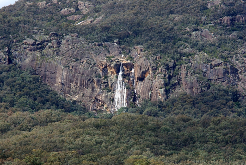
I have this as my screen saver and it looks good is it good enough to go here...CC please,I did do some small PP on it.(that sounds so bad when you read it...small PP   ) it does look better on the computer screen than here why is that?Thanks ) it does look better on the computer screen than here why is that?Thanks
_________________
Moira, Moderator 
Fuji XE-1,Pentax K-01,Panasonic G1,Panasonic G5,Pentax MX
Ricoh Singlex TLS,KR-5,KR-5Super,XR-10
Lenses
Auto Rikenon's 55/1.4, 1.8, 2.8... 50/1.7 Takumar 2/58 Preset Takumar 2.8/105 Auto Takumar 2.2/55, 3.5/35 Super Takumar 1.8/55...Macro Takumar F4/50... CZJ Biotar ALU M42 2/58 CZJ Tessar ALU M42 2.8/50
CZJ DDR Flektogon Zebra M42 2.8/35 CZJ Pancolar M42 2/50 CZJ Pancolar Exakta 2/50
Auto Mamiya/Sekor 1.8/55 ...Auto Mamiya/Sekor 2/50 Auto Mamiya/Sekor 2.8/50 Auto Mamiya/Sekor 200/3.5 Tamron SP500/8 Tamron SP350/5.6 Tamron SP90/2.5
Primoplan 1.9/58 Primagon 4.5/35 Telemegor 5.5/150 Angenieux 3.5/28 Angenieux 3,5/135 Y 2
Canon FL 58/1.2,Canon FL85/1.8,Canon FL 100/3.5,Canon SSC 2.8/100 ,Konica AR 100/2.8, Nikkor P 105/2.5
|
|
| Back to top |
|
 |
pich900


Joined: 10 Jun 2007
Posts: 1745
Location: The Netherlands/Zwolle
Expire: 2012-12-27
|
 Posted: Thu Sep 09, 2010 8:03 am Post subject: Posted: Thu Sep 09, 2010 8:03 am Post subject: |
 |
|
pich900 wrote:
It does looks much better when you click on the picture! The contrast is may be a little bit low (took in de middle of the day may be?) but it can also be easily adjust with some extra "small PP"  ... ...
Nice landscape btw! |
|
| Back to top |
|
 |
mo


Joined: 27 Aug 2009
Posts: 8979
Location: Australia
Expire: 2016-07-30
|
 Posted: Thu Sep 09, 2010 8:15 am Post subject: Posted: Thu Sep 09, 2010 8:15 am Post subject: |
 |
|
mo wrote:
Yes it would have been taken between 12noon and 1pm I will go back here at sunset when the weather is better as this waterfall does face the setting sun.
_________________
Moira, Moderator 
Fuji XE-1,Pentax K-01,Panasonic G1,Panasonic G5,Pentax MX
Ricoh Singlex TLS,KR-5,KR-5Super,XR-10
Lenses
Auto Rikenon's 55/1.4, 1.8, 2.8... 50/1.7 Takumar 2/58 Preset Takumar 2.8/105 Auto Takumar 2.2/55, 3.5/35 Super Takumar 1.8/55...Macro Takumar F4/50... CZJ Biotar ALU M42 2/58 CZJ Tessar ALU M42 2.8/50
CZJ DDR Flektogon Zebra M42 2.8/35 CZJ Pancolar M42 2/50 CZJ Pancolar Exakta 2/50
Auto Mamiya/Sekor 1.8/55 ...Auto Mamiya/Sekor 2/50 Auto Mamiya/Sekor 2.8/50 Auto Mamiya/Sekor 200/3.5 Tamron SP500/8 Tamron SP350/5.6 Tamron SP90/2.5
Primoplan 1.9/58 Primagon 4.5/35 Telemegor 5.5/150 Angenieux 3.5/28 Angenieux 3,5/135 Y 2
Canon FL 58/1.2,Canon FL85/1.8,Canon FL 100/3.5,Canon SSC 2.8/100 ,Konica AR 100/2.8, Nikkor P 105/2.5
|
|
| Back to top |
|
 |
rbelyell


Joined: 13 Oct 2009
Posts: 4269
Location: somewhere in the mountains of central NY
Expire: 2014-01-31
|
 Posted: Thu Sep 09, 2010 1:14 pm Post subject: Posted: Thu Sep 09, 2010 1:14 pm Post subject: |
 |
|
rbelyell wrote:
hey moira
that is a really nice capture and MUCH nicer when you click on it.
obviously to me there is a problem MANY of us have with the quality of uploaded photos to this site. i do not understand why no one pays attention to it and commenters seem to think the problem is lack of correct PP when a perfectly PPd version is viewable by clicking! why do we need to OVER process an image to get it to be correctly viewable on this site? this says to me the problem lies with the site and not with the photographer or the PP process.
i wish someone who actually knew something about this problem would correct it! you and i are not the only ones this happens to!
_________________
Epson RD1 + Elmarit 21/2.8; Summarit 50/1.5; Summarit 75/2.5; Elmar-c 90/4; Sankyo Komura 135/2.8, Hektor 135/4.5; Braun Paxina 29 6x6; Photax Boyer Paris; Holga 120 Pano
GREAT STUFF FOR SALE:
Contax T
Hasselblad XPan + 45/4, 90/4
Kodak Retina Reflex IV + full set of Schneider Krueznach lenses
Mercury 2 half frame 35mm
Kodak Pro slr/n
Fuji GM670+100/3.5+65/8!
Praktisix 6x6 medium format + ZeissBiometar 120/2.8
Bessa T 101 Anniversary Edition in Navy Blue
Mamiya Six Folder with Zuiko 75/3.5
Adaptall: Tamron SP 28-85 macro
Cameras: Canon IX
PM for more complete descriptions/pix. All in great shape!
_________________________
'buy me a drink, sing me a song,
take me as i come 'cause i can't stay long' |
|
| Back to top |
|
 |
patrickh


Joined: 23 Aug 2007
Posts: 8551
Location: Oregon
Expire: 2011-11-18
|
 Posted: Thu Sep 09, 2010 2:00 pm Post subject: Posted: Thu Sep 09, 2010 2:00 pm Post subject: |
 |
|
patrickh wrote:
Mo
You are right it really does look so much better when you look at the direct image. Lovely spot and nice shot
patrickh
_________________
DSLR: Nikon D300 Nikon D200 Nex 5N
MF Zooms: Kiron 28-85/3.5, 28-105/3.2, 75-150/3.5, Nikkor 50-135/3.5 AIS // MF Primes: Nikkor 20/4 AI, 24/2 AI, 28/2 AI, 28/2.8 AIS, 28/3.5 AI, 35/1.4 AIS, 35/2 AIS, 35/2.8 PC, 45/2.8 P, 50/1.4 AIS, 50/1.8 AIS, 50/2 AI, 55/2.8 AIS micro, 55/3.5 AI micro, 85/2 AI, 100/2,8 E, 105/1,8 AIS, 105/2,5 AIS, 135/2 AIS, 135/2.8 AIS, 200/4 AI, 200/4 AIS micro, 300/4.5 AI, 300/4.5 AI ED, Arsat 50/1.4, Kiron 28/2, Vivitar 28/2.5, Panagor 135/2.8, Tamron 28/2.5, Tamron 90/2.5 macro, Vivitar 90/2.5 macro (Tokina) Voigtlander 90/3.5 Vivitar 105/2.5 macro (Kiron) Kaleinar 100/2.8 AI Tamron 135/2.5, Vivitar 135/2.8CF, 200/3.5, Tokina 400/5,6
M42: Vivitar 28/2.5, Tamron 28/2.5, Formula5 28/2.8, Mamiya 28/2.8, Pentacon 29/2.8, Flektogon 35/2.4, Flektogon 35/2.8, Takumar 35/3.5, Curtagon 35/4, Takumar 50/1.4, Volna-6 50/2.8 macro, Mamiya 50/1.4, CZJ Pancolar 50/1,8, Oreston 50/1.8, Takumar 50/2, Industar 50/3.5, Sears 55/1.4, Helios 58/2, Jupiter 85/2, Helios 85/1.5, Takumar 105/2.8, Steinheil macro 105/4.5, Tamron 135/2.5, Jupiter 135/4, CZ 135/4, Steinheil Culminar 135/4,5, Jupiter 135/3.5, Takumar 135/3.5, Tair 135/2.8, Pentacon 135/2.8, CZ 135/2.8, Taika 135/3.5, Takumar 150/4, Jupiter 200/4, Takumar 200/4
Exakta: Topcon 100/2.8(M42), 35/2.8, 58/1.8, 135/2.8, 135/2.8 (M42), Kyoei Acall 135/3.5
C/Y: Yashica 28/2.8, 50/1.7, 135/2.8, Zeiss Planar 50/1.4, Distagon 25/2.8
Hexanon: 28/3.5, 35/2.8, 40/1.8, 50/1.7, 52/1.8, 135/3.2, 135/3.5, 35-70/3.5, 200/3.5
P6 : Mir 38 65/3.5, Biometar 80/2.8, Kaleinar 150/2.8, Sonnar 180/2.8
Minolta SR: 28/2.8, 28/3.5, 35/2.8, 45/2, 50/2, 58/1.4, 50/1.7, 135/2.8, 200/3.5
RF: Industar 53/2.8, Jupiter 8 50/2
Enlarg: Rodagon 50/5,6, 80/5,6, 105/5.6, Vario 44-52/4, 150/5.6 180/5.6 El Nikkor 50/2,8,63/2.8,75/4, 80/5,6, 105/5.6, 135/5.6 Schneider 60/5.6, 80/5.6, 80/4S,100/5.6S,105/5.6,135/5.6, 135/5.6S, 150/5.6S, Leica 95/4 |
|
| Back to top |
|
 |
Orio

Joined: 24 Feb 2007
Posts: 29545
Location: West Emilia
Expire: 2012-12-04
|
 Posted: Thu Sep 09, 2010 2:26 pm Post subject: Posted: Thu Sep 09, 2010 2:26 pm Post subject: |
 |
|
Orio wrote:
| rbelyell wrote: |
obviously to me there is a problem MANY of us have with the quality of uploaded photos to this site. i do not understand why no one pays attention to it and commenters seem to think the problem is lack of correct PP when a perfectly PPd version is viewable by clicking! why do we need to OVER process an image to get it to be correctly viewable on this site? this says to me the problem lies with the site and not with the photographer or the PP process.
i wish someone who actually knew something about this problem would correct it! you and i are not the only ones this happens to! |
Ryebell do you pay much to upload images on this site?
I ask because judging on the amount and tone of complaining, it seems that you are paying a high subscription fee and expect professional treatment in return.
P.S. we do not appreciate the use of all-capital words here. Thanks.
_________________
Orio, Administrator
T*
NE CEDE MALIS AUDENTIOR ITO
Ferrania film is reborn! http://www.filmferrania.it/
Support the Ornano film chemicals company and help them survive!
http://forum.mflenses.com/ornano-chemical-products-t55525.html |
|
| Back to top |
|
 |
marty

Joined: 09 Apr 2009
Posts: 767
Location: Italy
|
 Posted: Thu Sep 09, 2010 3:41 pm Post subject: Posted: Thu Sep 09, 2010 3:41 pm Post subject: |
 |
|
marty wrote:
Nice one, Mo. Wonderful wild place. Technically looks good to me, exposure and colors spot on. The full res version is gorgeous, this one should be watched for full enjoyment  . The small sized one directly attached to the thread suffers of a slight loss of sharpness probably due to the downward resizing. This is not an issue I think, since there is the big one . The small sized one directly attached to the thread suffers of a slight loss of sharpness probably due to the downward resizing. This is not an issue I think, since there is the big one  . .
Cheers, M.
_________________
Canon FD
Bodies: AT-1, A-1, T-90
Lenses: nFD 20mm f2.8, 24 f2.8, 28 f2.8, 35 f2, FD 50 f1.8 S.C., 85 f1.8, 100 f2.8, 135 f2.8, 200 f4, 300 f4
|
|
| Back to top |
|
 |
cooltouch


Joined: 15 Jan 2009
Posts: 9096
Location: Houston, Texas
|
 Posted: Thu Sep 09, 2010 3:55 pm Post subject: Posted: Thu Sep 09, 2010 3:55 pm Post subject: |
 |
|
cooltouch wrote:
I agree with Orio and Marty -- well, maybe except for the caps thing. Occasional usage of all caps for emphasis is acceptable to me. Some forums' italics fonts are not all that distinguishable from the regular ones -- although this one's is, so I try to use this feature instead of caps here.
Anyway, my immediate impression was that I would bump up the contrast slightly and add just a bit of saturation. Then I viewed the original, and decided that, while it might still could use some saturation and contrast, much less would be necessary.
I seldom upload images here because I have a website and use it for image storage among other things. So mine are not subject to these same restrictions, however, seldom do I post images that are larger than 900x600. So the amount of detail visible in my images is not so much either.
_________________
Michael
My Gear List: http://michaelmcbroom.com/photo/gear.html
My Gallery: http://michaelmcbroom.com/gallery3/index.php/
My Flickr Page: https://www.flickr.com/photos/11308754@N08/albums
My Music: https://soundcloud.com/michaelmcbroom/albums
My Blog: http://michaelmcbroom.com/blogistan/ |
|
| Back to top |
|
 |
Himself

Joined: 01 Mar 2007
Posts: 3245
Location: Montreal
Expire: 2013-05-30
|
 Posted: Thu Sep 09, 2010 9:21 pm Post subject: Posted: Thu Sep 09, 2010 9:21 pm Post subject: |
 |
|
Himself wrote:
Being taken in the middle of the day it lacks contrast and saturation.
I don't know if you shoot RAW ( is there such a thing for Pentax?) but if you did you can pull out of it some more contrast, saturation, etc.
Being a water fall, pretty big one, I'd go closer and look for a different angle and different time of the day. |
|
| Back to top |
|
 |
Attila


Joined: 24 Feb 2007
Posts: 57865
Location: Hungary
Expire: 2025-11-18
|
 Posted: Thu Sep 09, 2010 9:58 pm Post subject: Posted: Thu Sep 09, 2010 9:58 pm Post subject: |
 |
|
Attila wrote:
| rbelyell wrote: |
hey moira
that is a really nice capture and MUCH nicer when you click on it.
obviously to me there is a problem MANY of us have with the quality of uploaded photos to this site. i do not understand why no one pays attention to it and commenters seem to think the problem is lack of correct PP when a perfectly PPd version is viewable by clicking! why do we need to OVER process an image to get it to be correctly viewable on this site? this says to me the problem lies with the site and not with the photographer or the PP process.
i wish someone who actually knew something about this problem would correct it! you and i are not the only ones this happens to! |
Tony I did explain it at least three times why it have difference and you continuously say always same text ...
_________________
-------------------------------
Items on sale on Ebay
Sony NEX-7 Carl Zeiss Planar 85mm f1.4, Minolta MD 35mm f1.8, Konica 135mm f2.5, Minolta MD 50mm f1.2, Minolta MD 250mm f5.6, Carl Zeiss Sonnar 180mm f2.8
|
|
| Back to top |
|
 |
Attila


Joined: 24 Feb 2007
Posts: 57865
Location: Hungary
Expire: 2025-11-18
|
 Posted: Thu Sep 09, 2010 10:01 pm Post subject: Posted: Thu Sep 09, 2010 10:01 pm Post subject: |
 |
|
Attila wrote:
| Himself wrote: |
Being taken in the middle of the day it lacks contrast and saturation.
I don't know if you shoot RAW ( is there such a thing for Pentax?) but if you did you can pull out of it some more contrast, saturation, etc.
Being a water fall, pretty big one, I'd go closer and look for a different angle and different time of the day. |
+1
_________________
-------------------------------
Items on sale on Ebay
Sony NEX-7 Carl Zeiss Planar 85mm f1.4, Minolta MD 35mm f1.8, Konica 135mm f2.5, Minolta MD 50mm f1.2, Minolta MD 250mm f5.6, Carl Zeiss Sonnar 180mm f2.8
|
|
| Back to top |
|
 |
Attila


Joined: 24 Feb 2007
Posts: 57865
Location: Hungary
Expire: 2025-11-18
|
 Posted: Thu Sep 09, 2010 10:06 pm Post subject: Posted: Thu Sep 09, 2010 10:06 pm Post subject: |
 |
|
Attila wrote:
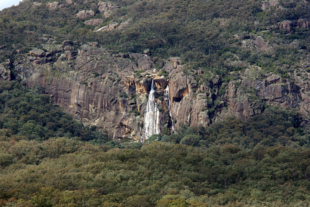
Here is contrast improved one and a bit sharpened too.
_________________
-------------------------------
Items on sale on Ebay
Sony NEX-7 Carl Zeiss Planar 85mm f1.4, Minolta MD 35mm f1.8, Konica 135mm f2.5, Minolta MD 50mm f1.2, Minolta MD 250mm f5.6, Carl Zeiss Sonnar 180mm f2.8
|
|
| Back to top |
|
 |
mo


Joined: 27 Aug 2009
Posts: 8979
Location: Australia
Expire: 2016-07-30
|
 Posted: Thu Sep 09, 2010 10:53 pm Post subject: Posted: Thu Sep 09, 2010 10:53 pm Post subject: |
 |
|
mo wrote:
Thanks to all who gave me advice.I held back from doing to much PPing I think less is best at first.
I have a photobucket account I could link too but have never tried linking between sites?
I have to rush off now but will try out some of your suggestions later on, Thanks again.
_________________
Moira, Moderator 
Fuji XE-1,Pentax K-01,Panasonic G1,Panasonic G5,Pentax MX
Ricoh Singlex TLS,KR-5,KR-5Super,XR-10
Lenses
Auto Rikenon's 55/1.4, 1.8, 2.8... 50/1.7 Takumar 2/58 Preset Takumar 2.8/105 Auto Takumar 2.2/55, 3.5/35 Super Takumar 1.8/55...Macro Takumar F4/50... CZJ Biotar ALU M42 2/58 CZJ Tessar ALU M42 2.8/50
CZJ DDR Flektogon Zebra M42 2.8/35 CZJ Pancolar M42 2/50 CZJ Pancolar Exakta 2/50
Auto Mamiya/Sekor 1.8/55 ...Auto Mamiya/Sekor 2/50 Auto Mamiya/Sekor 2.8/50 Auto Mamiya/Sekor 200/3.5 Tamron SP500/8 Tamron SP350/5.6 Tamron SP90/2.5
Primoplan 1.9/58 Primagon 4.5/35 Telemegor 5.5/150 Angenieux 3.5/28 Angenieux 3,5/135 Y 2
Canon FL 58/1.2,Canon FL85/1.8,Canon FL 100/3.5,Canon SSC 2.8/100 ,Konica AR 100/2.8, Nikkor P 105/2.5
|
|
| Back to top |
|
 |
mo


Joined: 27 Aug 2009
Posts: 8979
Location: Australia
Expire: 2016-07-30
|
 Posted: Fri Sep 10, 2010 7:50 am Post subject: Posted: Fri Sep 10, 2010 7:50 am Post subject: |
 |
|
mo wrote:
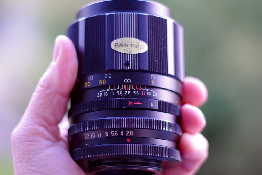
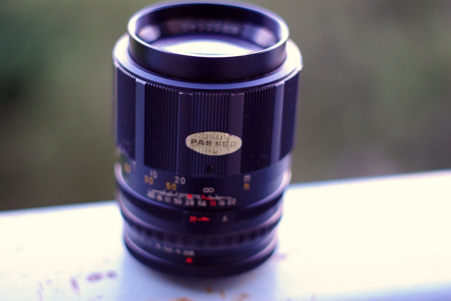
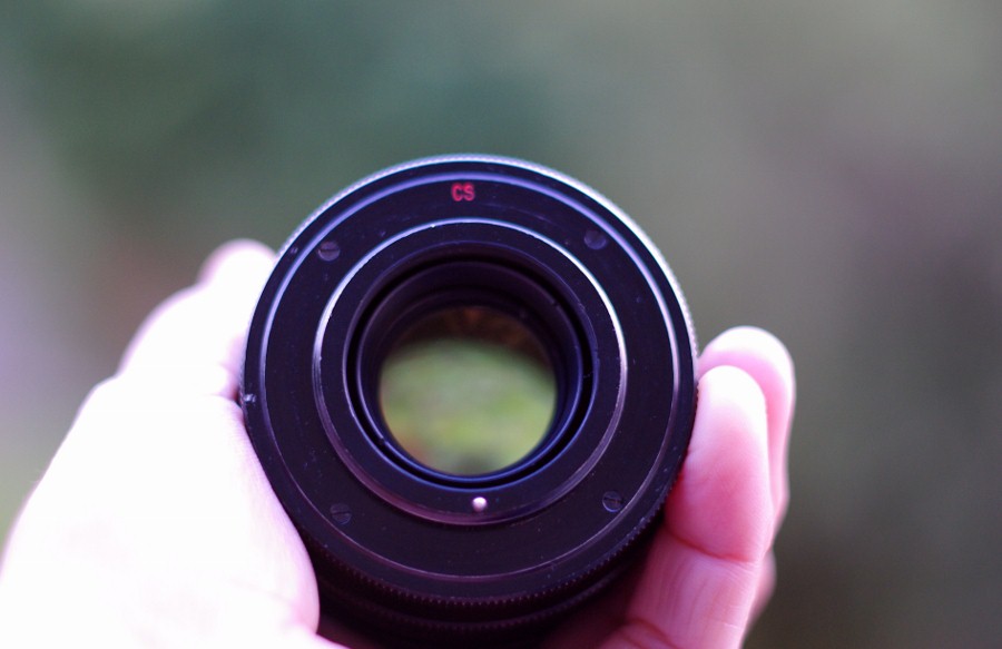
Here is the Soligor it is a nugget of a lens the serial number starts with H6679 it's aperture does not form a perfect hexagon but it takes nice pictures and that is what counts.Note it has a flat yellowish back element..that reflects light quite well...not sure if it is age yellowing or an actual coating?
_________________
Moira, Moderator 
Fuji XE-1,Pentax K-01,Panasonic G1,Panasonic G5,Pentax MX
Ricoh Singlex TLS,KR-5,KR-5Super,XR-10
Lenses
Auto Rikenon's 55/1.4, 1.8, 2.8... 50/1.7 Takumar 2/58 Preset Takumar 2.8/105 Auto Takumar 2.2/55, 3.5/35 Super Takumar 1.8/55...Macro Takumar F4/50... CZJ Biotar ALU M42 2/58 CZJ Tessar ALU M42 2.8/50
CZJ DDR Flektogon Zebra M42 2.8/35 CZJ Pancolar M42 2/50 CZJ Pancolar Exakta 2/50
Auto Mamiya/Sekor 1.8/55 ...Auto Mamiya/Sekor 2/50 Auto Mamiya/Sekor 2.8/50 Auto Mamiya/Sekor 200/3.5 Tamron SP500/8 Tamron SP350/5.6 Tamron SP90/2.5
Primoplan 1.9/58 Primagon 4.5/35 Telemegor 5.5/150 Angenieux 3.5/28 Angenieux 3,5/135 Y 2
Canon FL 58/1.2,Canon FL85/1.8,Canon FL 100/3.5,Canon SSC 2.8/100 ,Konica AR 100/2.8, Nikkor P 105/2.5
|
|
| Back to top |
|
 |
Univer

Joined: 30 Jun 2009
Posts: 282
|
 Posted: Fri Sep 10, 2010 7:10 pm Post subject: Posted: Fri Sep 10, 2010 7:10 pm Post subject: |
 |
|
Univer wrote:
Hi Mo,
Just lovely. Beautiful scenery, well captured.
My Soligor 135/2.8 preset is the version with the chrome "ears"; I haven't tested it thoroughly enough to know whether it's as capable as yours.
And as an aside - not at all intending to divert the conversation - I must say that I find the trivial inconvenience of clicking an image in order to view a higher-quality version to be wholly insignificant in comparison to the generous image-upload facilities accorded to all members. I've been a member of many other boards that have severely restricted (or eliminated altogether) such facilities, and I'm very grateful for this system.
Cheers,
Jon |
|
| Back to top |
|
 |
mo


Joined: 27 Aug 2009
Posts: 8979
Location: Australia
Expire: 2016-07-30
|
 Posted: Sat Sep 11, 2010 9:32 am Post subject: Posted: Sat Sep 11, 2010 9:32 am Post subject: |
 |
|
mo wrote:
Ok I revisited the water fall today and took 3 of my big lenses
#1 Soligor T4 90-230mm...some ok shots but found I did not nail the focus as well...I have to go back with this lens and the Auto Promura...and take more time and when there is better light.
#2 Auto promura 300mm The shot below was from this lens... some PP,not however good as the soligor 135/2.8 but that may have been tripod wobble and clouds above again middle of the day.
#3Astronar 300mm...no good what so ever as I found it does not focus on infinity 
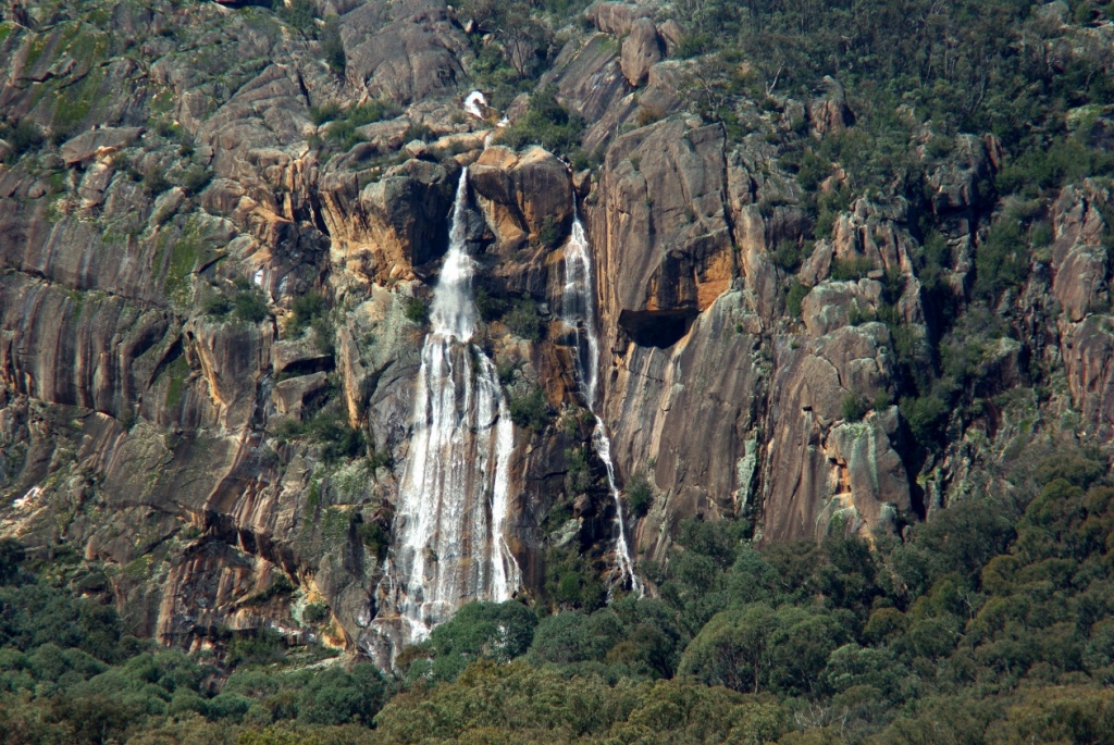
edited the soligor lens
_________________
Moira, Moderator 
Fuji XE-1,Pentax K-01,Panasonic G1,Panasonic G5,Pentax MX
Ricoh Singlex TLS,KR-5,KR-5Super,XR-10
Lenses
Auto Rikenon's 55/1.4, 1.8, 2.8... 50/1.7 Takumar 2/58 Preset Takumar 2.8/105 Auto Takumar 2.2/55, 3.5/35 Super Takumar 1.8/55...Macro Takumar F4/50... CZJ Biotar ALU M42 2/58 CZJ Tessar ALU M42 2.8/50
CZJ DDR Flektogon Zebra M42 2.8/35 CZJ Pancolar M42 2/50 CZJ Pancolar Exakta 2/50
Auto Mamiya/Sekor 1.8/55 ...Auto Mamiya/Sekor 2/50 Auto Mamiya/Sekor 2.8/50 Auto Mamiya/Sekor 200/3.5 Tamron SP500/8 Tamron SP350/5.6 Tamron SP90/2.5
Primoplan 1.9/58 Primagon 4.5/35 Telemegor 5.5/150 Angenieux 3.5/28 Angenieux 3,5/135 Y 2
Canon FL 58/1.2,Canon FL85/1.8,Canon FL 100/3.5,Canon SSC 2.8/100 ,Konica AR 100/2.8, Nikkor P 105/2.5
Last edited by mo on Sat Sep 11, 2010 11:14 am; edited 1 time in total |
|
| Back to top |
|
 |
NikonD


Joined: 29 Jul 2008
Posts: 1922
Location: Slovenija
|
 Posted: Sat Sep 11, 2010 9:50 am Post subject: Posted: Sat Sep 11, 2010 9:50 am Post subject: |
 |
|
NikonD wrote:
nice one... I like waterfalls very much
It's amazing how water makes its way  |
|
| Back to top |
|
 |
cooltouch


Joined: 15 Jan 2009
Posts: 9096
Location: Houston, Texas
|
 Posted: Sat Sep 11, 2010 1:45 pm Post subject: Posted: Sat Sep 11, 2010 1:45 pm Post subject: |
 |
|
cooltouch wrote:
Mo, it must be nice living so close to such spectacular scenery. Whereabouts in Australia is this?
_________________
Michael
My Gear List: http://michaelmcbroom.com/photo/gear.html
My Gallery: http://michaelmcbroom.com/gallery3/index.php/
My Flickr Page: https://www.flickr.com/photos/11308754@N08/albums
My Music: https://soundcloud.com/michaelmcbroom/albums
My Blog: http://michaelmcbroom.com/blogistan/ |
|
| Back to top |
|
 |
visualopsins


Joined: 05 Mar 2009
Posts: 11027
Location: California
Expire: 2025-04-11
|
 Posted: Sat Sep 11, 2010 3:58 pm Post subject: Posted: Sat Sep 11, 2010 3:58 pm Post subject: |
 |
|
visualopsins wrote:
I want to say: Vertical subject, Portrait orientation.
The rock formations either side of the waterfall are interesting, however, so I go back & forth, portrait or landscape orientation? I would have to make photos in both orientations, then decide later.
_________________
☮☮☮☮☮☮☮☮☮☮☮☮☮☮☮☮☮☮☮☮☮☮☮☮☮☮☮☮☮☮☮☮ like attracts like! ☮☮☮☮☮☮☮☮☮☮☮☮☮☮☮☮☮☮☮☮☮☮☮☮☮☮☮☮☮☮☮☮
Cameras: Sony ILCE-7RM2, Spotmatics II, F, and ESII, Nikon P4
Lenses:
M42 Asahi Optical Co., Takumar 1:4 f=35mm, 1:2 f=58mm (Sonnar), 1:2.4 f=58mm (Heliar), 1:2.2 f=55mm (Gaussian), 1:2.8 f=105mm (Model I), 1:2.8/105 (Model II), 1:5.6/200, Tele-Takumar 1:5.6/200, 1:6.3/300, Macro-Takumar 1:4/50, Auto-Takumar 1:2.3 f=35, 1:1.8 f=55mm, 1:2.2 f=55mm, Super-TAKUMAR 1:3.5/28 (fat), 1:2/35 (Fat), 1:1.4/50 (8-element), Super-Multi-Coated Fisheye-TAKUMAR 1:4/17, Super-Multi-Coated TAKUMAR 1:4.5/20, 1:3.5/24, 1:3.5/28, 1:2/35, 1:3.5/35, 1:1.8/85, 1:1.9/85 1:2.8/105, 1:3.5/135, 1:2.5/135 (II), 1:4/150, 1:4/200, 1:4/300, 1:4.5/500, Super-Multi-Coated Macro-TAKUMAR 1:4/50, 1:4/100, Super-Multi-Coated Bellows-TAKUMAR 1:4/100, SMC TAKUMAR 1:1.4/50, 1:1.8/55
M42 Carl Zeiss Jena Flektogon 2.4/35
Contax Carl Zeiss Vario-Sonnar T* 28-70mm F3.5-4.5
Pentax K-mount SMC PENTAX-A ZOOM 1:3.5 35~105mm, SMC PENTAX ZOOM 1:4 45~125mm
Nikon Micro-NIKKOR-P-C Auto 1:3.5 f=55mm, NIKKOR-P Auto 105mm f/2.5 Pre-AI (Sonnar), Micro-NIKKOR 105mm 1:4 AI, NIKKOR AI-S 35-135mm f/3,5-4,5
Tamron SP 17mm f/3.5 (51B), Tamron SP 17mm f/3.5 (151B), SP 500mm f/8 (55BB), SP 70-210mm f/3.5 (19AH)
Vivitar 100mm 1:2.8 MC 1:1 Macro Telephoto (Kiron)
|
|
| Back to top |
|
 |
cooltouch


Joined: 15 Jan 2009
Posts: 9096
Location: Houston, Texas
|
 Posted: Sat Sep 11, 2010 5:08 pm Post subject: Posted: Sat Sep 11, 2010 5:08 pm Post subject: |
 |
|
cooltouch wrote:
Yeah, even a very long telephoto shot of the waterfall (600mm or more, methinks) -- or getting closer to it -- so it could be framed vertically would also be interesting.
_________________
Michael
My Gear List: http://michaelmcbroom.com/photo/gear.html
My Gallery: http://michaelmcbroom.com/gallery3/index.php/
My Flickr Page: https://www.flickr.com/photos/11308754@N08/albums
My Music: https://soundcloud.com/michaelmcbroom/albums
My Blog: http://michaelmcbroom.com/blogistan/ |
|
| Back to top |
|
 |
mo


Joined: 27 Aug 2009
Posts: 8979
Location: Australia
Expire: 2016-07-30
|
 Posted: Sat Sep 11, 2010 7:50 pm Post subject: Posted: Sat Sep 11, 2010 7:50 pm Post subject: |
 |
|
mo wrote:
Michael
It is in one of Austalias national parks...in the mountains!
I have to think out side the box..... vertical shot  Thanks for the encouragement and ideas. Thanks for the encouragement and ideas.
This will be a bumper spring due to the drought is over and the rain has been amazing....I am hoping this waterfall will run through summer.
_________________
Moira, Moderator 
Fuji XE-1,Pentax K-01,Panasonic G1,Panasonic G5,Pentax MX
Ricoh Singlex TLS,KR-5,KR-5Super,XR-10
Lenses
Auto Rikenon's 55/1.4, 1.8, 2.8... 50/1.7 Takumar 2/58 Preset Takumar 2.8/105 Auto Takumar 2.2/55, 3.5/35 Super Takumar 1.8/55...Macro Takumar F4/50... CZJ Biotar ALU M42 2/58 CZJ Tessar ALU M42 2.8/50
CZJ DDR Flektogon Zebra M42 2.8/35 CZJ Pancolar M42 2/50 CZJ Pancolar Exakta 2/50
Auto Mamiya/Sekor 1.8/55 ...Auto Mamiya/Sekor 2/50 Auto Mamiya/Sekor 2.8/50 Auto Mamiya/Sekor 200/3.5 Tamron SP500/8 Tamron SP350/5.6 Tamron SP90/2.5
Primoplan 1.9/58 Primagon 4.5/35 Telemegor 5.5/150 Angenieux 3.5/28 Angenieux 3,5/135 Y 2
Canon FL 58/1.2,Canon FL85/1.8,Canon FL 100/3.5,Canon SSC 2.8/100 ,Konica AR 100/2.8, Nikkor P 105/2.5
|
|
| Back to top |
|
 |
|
|
