| View previous topic :: View next topic |
| Author |
Message |
Orio

Joined: 24 Feb 2007
Posts: 29545
Location: West Emilia
Expire: 2012-12-04
|
 Posted: Sun Nov 29, 2009 2:54 am Post subject: Other samples of Vario-Sonnar 40-80 Posted: Sun Nov 29, 2009 2:54 am Post subject: Other samples of Vario-Sonnar 40-80 |
 |
|
Orio wrote:
Here's some other samples from the Vario-Sonnar 40-80
They are actually the first samples that I shot with the lens - somehow they end up being the last published.
Since they are many, I put them on a web page instead of embedding here:
http://www.oriofoto.net/temp/vs4080web/album/index.html
I will post here some 100% crops that may be helpful in evaluating the lens.
_________________
Orio, Administrator
T*
NE CEDE MALIS AUDENTIOR ITO
Ferrania film is reborn! http://www.filmferrania.it/
Support the Ornano film chemicals company and help them survive!
http://forum.mflenses.com/ornano-chemical-products-t55525.html
Last edited by Orio on Sun Nov 29, 2009 11:28 am; edited 1 time in total |
|
| Back to top |
|
 |
Laurence


Joined: 26 Mar 2007
Posts: 4809
Location: Western Washington State
Expire: 2016-06-19
|
 Posted: Sun Nov 29, 2009 3:08 am Post subject: Posted: Sun Nov 29, 2009 3:08 am Post subject: |
 |
|
Laurence wrote:
Gosh, it looks so clean and clear, Orio.  You must be pleased with You must be pleased with
this lens? I LOVE the 4th shot. Just beautiful.
_________________
Assent, and you are sane;
Demur,—you ’re straightway dangerous,
And handled with a chain.
Emily Dickinson
Cameras and Lenses in Use:
Yashica Mat 124 w/ Yashinon 80/3.5,
CV Apo-Lanthar 90/3.5SL, (Thank you Klaus),
Pentax 645,
Flek 50,
Pentax-A 150
Pentax-A 120 Macro
Voigtlander Vitomatic I w/Color Skopar 50/2.8
Konica TC and zoom lenses (thanks Carsten)
Contax AX
Yashica ML 50/2
Yashica ML 35/2.8
Carl Zeiss Contax 50/1.4
Tamron Adaptall SP 17/3.5
Tamron Adaptall 28/2.5
Tamron Adaptall SP 300/2.8 LD (IF)
|
|
| Back to top |
|
 |
poilu

Joined: 26 Aug 2007
Posts: 10472
Location: Greece
Expire: 2019-08-29
|
 Posted: Sun Nov 29, 2009 6:53 am Post subject: Posted: Sun Nov 29, 2009 6:53 am Post subject: |
 |
|
poilu wrote:
nice series, great resolution
bokeh seems nice, is this a 8 blades like the 35-70 |
|
| Back to top |
|
 |
F16SUNSHINE


Joined: 20 Aug 2007
Posts: 5486
Location: Left Coast
Expire: 2011-11-18
|
 Posted: Sun Nov 29, 2009 7:10 am Post subject: Posted: Sun Nov 29, 2009 7:10 am Post subject: |
 |
|
F16SUNSHINE wrote:
Looks great Orio.
I agree with Larry
#4 is a stand out image.
I like the organic feel this lens seems to give.
It has great air IMHO
_________________
Moderator |
|
| Back to top |
|
 |
Orio

Joined: 24 Feb 2007
Posts: 29545
Location: West Emilia
Expire: 2012-12-04
|
 Posted: Sun Nov 29, 2009 10:43 am Post subject: Posted: Sun Nov 29, 2009 10:43 am Post subject: |
 |
|
Orio wrote:
| poilu wrote: |
nice series, great resolution
bokeh seems nice, is this a 8 blades like the 35-70 |
hi poilu
no it's a 6 blades, ninja star shaped iris, like most of the AEG lenses.
However by f/5.6 (i.e. almost immediately) the ninja shape is gone and the aperture looks quite roundish.
Many people talk bad about the ninja star blades, while it is true that it can be annoying, after a certain while when the ninja goes away, the shape is rounder than the normal shape blades.
For sure it's a pity that such beautiful lenses couldn't be equipped with a higher number of blades.
_________________
Orio, Administrator
T*
NE CEDE MALIS AUDENTIOR ITO
Ferrania film is reborn! http://www.filmferrania.it/
Support the Ornano film chemicals company and help them survive!
http://forum.mflenses.com/ornano-chemical-products-t55525.html |
|
| Back to top |
|
 |
Orio

Joined: 24 Feb 2007
Posts: 29545
Location: West Emilia
Expire: 2012-12-04
|
 Posted: Sun Nov 29, 2009 10:47 am Post subject: Posted: Sun Nov 29, 2009 10:47 am Post subject: |
 |
|
Orio wrote:
| F16SUNSHINE wrote: |
I like the organic feel this lens seems to give. |
You hit the nail on the head, I think.
The 40-80 gives a "fuller" image than the 35-70, definitely. Colours are also denser. The 35-70 however is significantly sharper plus it has semi-macro.
The two lenses don't really overlap, they have different qualities.
Where sharpness is important I would definitely recommend the 35-70.
In situations like Autumn, where colours play a key role, I would prefer the 40-80.
-
_________________
Orio, Administrator
T*
NE CEDE MALIS AUDENTIOR ITO
Ferrania film is reborn! http://www.filmferrania.it/
Support the Ornano film chemicals company and help them survive!
http://forum.mflenses.com/ornano-chemical-products-t55525.html |
|
| Back to top |
|
 |
Orio

Joined: 24 Feb 2007
Posts: 29545
Location: West Emilia
Expire: 2012-12-04
|
 Posted: Sun Nov 29, 2009 10:49 am Post subject: Posted: Sun Nov 29, 2009 10:49 am Post subject: |
 |
|
Orio wrote:
| Laurence wrote: |
Gosh, it looks so clean and clear, Orio.  You must be pleased with You must be pleased with
this lens? I LOVE the 4th shot. Just beautiful. |
Yes, I am pleased. 
It is one of the heaviest lenses I have, not in absolute, but relatively to the small size. There has to be a lot of glass inside.
Curious that both you and Andy like #4 better. I was thinking not to include it. 
_________________
Orio, Administrator
T*
NE CEDE MALIS AUDENTIOR ITO
Ferrania film is reborn! http://www.filmferrania.it/
Support the Ornano film chemicals company and help them survive!
http://forum.mflenses.com/ornano-chemical-products-t55525.html |
|
| Back to top |
|
 |
Orio

Joined: 24 Feb 2007
Posts: 29545
Location: West Emilia
Expire: 2012-12-04
|
 Posted: Sun Nov 29, 2009 11:54 am Post subject: Posted: Sun Nov 29, 2009 11:54 am Post subject: |
 |
|
Orio wrote:
Crops from picture #2
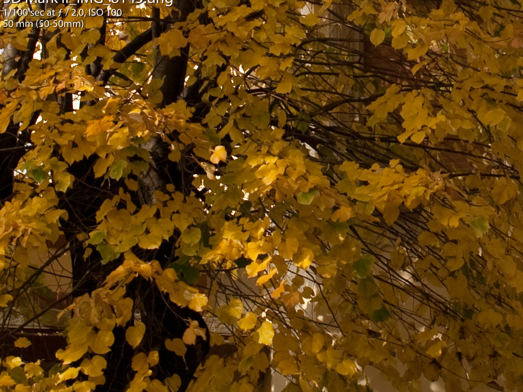
The microcontrast of the lens allows for acceptable readability in the shadows even with very strong light/dark extremes:

You can appreciate the microcontrast in the way the small twigs are rendered above the darkest parts of the trunk. The overall detail rendition is pleasing even if the lens it probably not resolving as a best prime would:
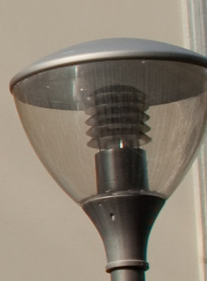
This street lamp is at the extreme right edge of the image, yet it is rendered with very good presence. Lenses with lower microcontrast would give of such things a muddy rendering. Instead the glass keeps the "presence" here. There is a little CA but I would say it's in the acceptable range:
_________________
Orio, Administrator
T*
NE CEDE MALIS AUDENTIOR ITO
Ferrania film is reborn! http://www.filmferrania.it/
Support the Ornano film chemicals company and help them survive!
http://forum.mflenses.com/ornano-chemical-products-t55525.html |
|
| Back to top |
|
 |
LucisPictor


Joined: 26 Feb 2007
Posts: 17633
Location: Oberhessen, Germany / Maidstone ('95-'96)
Expire: 2013-12-03
|
 Posted: Sun Nov 29, 2009 12:43 pm Post subject: Posted: Sun Nov 29, 2009 12:43 pm Post subject: |
 |
|
LucisPictor wrote:
| Orio wrote: |
The 35-70 however is significantly sharper plus it has semi-macro.
|
I don't care about extreme sharpness at all if the overall impression in a photo is as good as in these examples!
These are amazing results, Orio!
_________________
Personal forum activity on pause every now and again (due to job obligations)!
Carsten, former Moderator 
Things ON SALE
Carsten = "KAPCTEH" = "Karusutenu" | T-shirt?.........................My photos from Emilia: http://www.schouler.net/emilia/emilia2011.html
My gear: http://retrocameracs.wordpress.com/ausrustung/
Old list: http://forum.mflenses.com/viewtopic.php?t=65 (Not up-to-date, sorry!) | http://www.lucispictor.de | http://www.alensaweek.wordpress.com |
http://www.retrocamera.de |
|
| Back to top |
|
 |
Orio

Joined: 24 Feb 2007
Posts: 29545
Location: West Emilia
Expire: 2012-12-04
|
 Posted: Mon Nov 30, 2009 1:46 am Post subject: Posted: Mon Nov 30, 2009 1:46 am Post subject: |
 |
|
Orio wrote:
crop from picture #5:
IN this backlight shot the flare is a non-issue and does not harm at all the detail on the leaves:

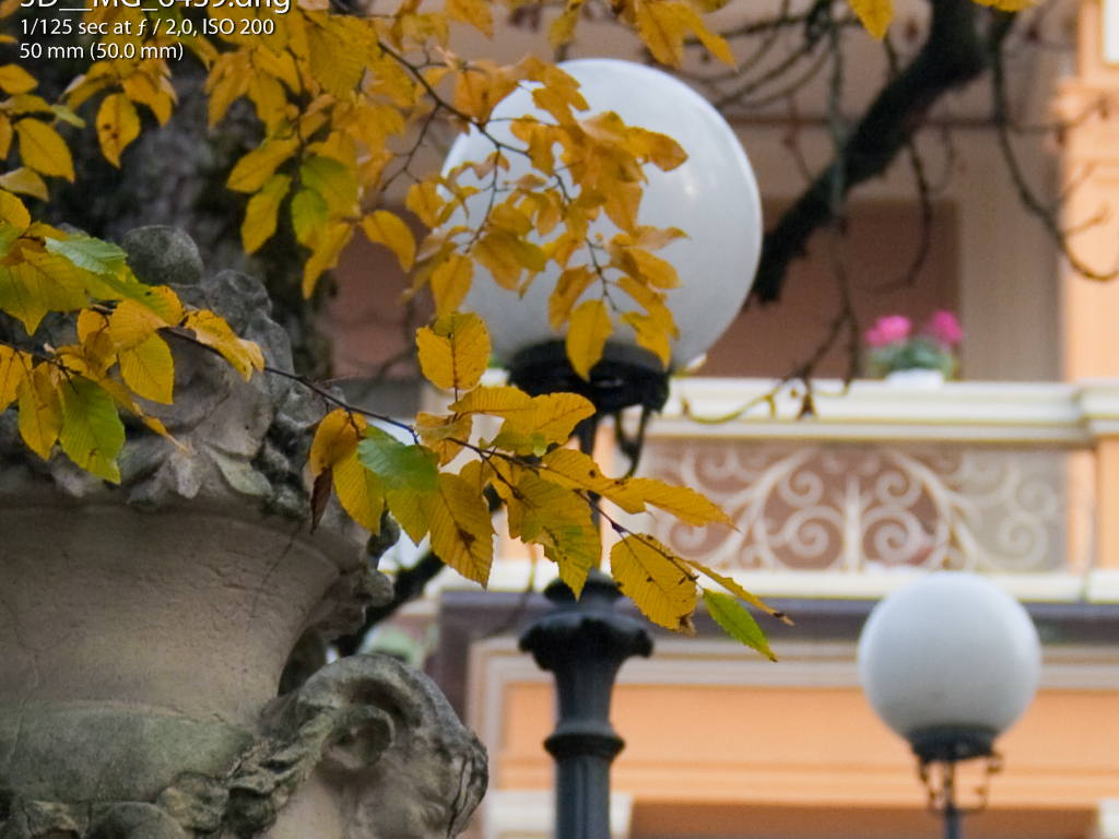
crops from picture #13:
The following two crops show how the lens renders different focal planes in the same image. There is some yellow CA but in the acceptable range.
The transition between the different planes look very natural to me, giving the image an organic feel. The highlight blur is not offending:

_________________
Orio, Administrator
T*
NE CEDE MALIS AUDENTIOR ITO
Ferrania film is reborn! http://www.filmferrania.it/
Support the Ornano film chemicals company and help them survive!
http://forum.mflenses.com/ornano-chemical-products-t55525.html |
|
| Back to top |
|
 |
Orio

Joined: 24 Feb 2007
Posts: 29545
Location: West Emilia
Expire: 2012-12-04
|
 Posted: Mon Nov 30, 2009 1:53 am Post subject: Posted: Mon Nov 30, 2009 1:53 am Post subject: |
 |
|
Orio wrote:
crops from picture #21:
These 3 crops from picture 21 are meant to show the -in my opinion- very nice quality of the 40-80 wide open bokeh.
The first crop shows the focused element. The DOF is quite narrow but enough to show the leaf detail.
The geometric lines of the background acquire a very pleasant organicity and don't look harsh at all as it often happens with many modern day lenses.
Yet, it's structured - not an "amorphous fluff" as in some lenses with super soft bokeh. I like that too. I like to see structure in bokeh:

The second and third crop show a characteristic of this lens: wide open, the blurred parts take on a sort of "glow effect" similar to that of the wide open Volna-9 (to give a common reference example).
The result is a bokeh that in my opinion looks very painterly - something not really common with Contax lenses.
The rendering of the blurred parts is very pleasing and can take an aesthetical value of its own especially if printed large:


_________________
Orio, Administrator
T*
NE CEDE MALIS AUDENTIOR ITO
Ferrania film is reborn! http://www.filmferrania.it/
Support the Ornano film chemicals company and help them survive!
http://forum.mflenses.com/ornano-chemical-products-t55525.html
Last edited by Orio on Mon Nov 30, 2009 2:13 am; edited 3 times in total |
|
| Back to top |
|
 |
Orio

Joined: 24 Feb 2007
Posts: 29545
Location: West Emilia
Expire: 2012-12-04
|
 Posted: Mon Nov 30, 2009 1:59 am Post subject: Posted: Mon Nov 30, 2009 1:59 am Post subject: |
 |
|
Orio wrote:
crop from picture #23:
We get another sample of the painterly bokeh from this crop of picture #23, also wide open:

crop from picture #24:
Again street lamps. I often use street lamps in lens tests because they are amongst the most difficult objects to render.
They often have high contrast with the background, while they sport detail that is very fine (the dust and dirt, the reflections) and very low contrast,
so it can easily escape the lenses that are not optically great performers.
In this sample, you see that you can read all details on the lamps, both the dirt streaks, and the very faint reflections.
There is a little blue CA too in the one of them which is not in perfect focus; again, it seems an acceptable amount:

_________________
Orio, Administrator
T*
NE CEDE MALIS AUDENTIOR ITO
Ferrania film is reborn! http://www.filmferrania.it/
Support the Ornano film chemicals company and help them survive!
http://forum.mflenses.com/ornano-chemical-products-t55525.html |
|
| Back to top |
|
 |
Orio

Joined: 24 Feb 2007
Posts: 29545
Location: West Emilia
Expire: 2012-12-04
|
 Posted: Mon Nov 30, 2009 2:07 am Post subject: Posted: Mon Nov 30, 2009 2:07 am Post subject: |
 |
|
Orio wrote:
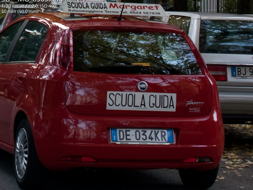
crop from picture #24:
Metal and transparent glass reflections test, passed brilliantly I would say. You can read even small details, and the colour rendition is so faithful that it even renders colour differences in anisotropic reflections such as those of a metal car shell:
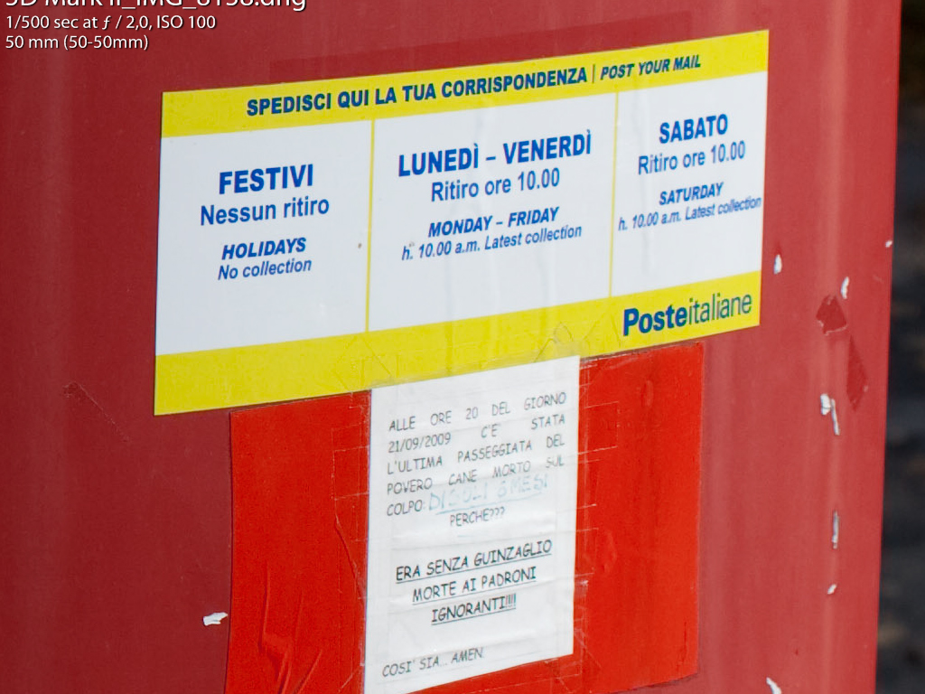
crops from picture # 30:
These two crops are meant to demonstrate performance at f/8.
As you can see from the first crop, at f/8 even small detail is rendered clearly and without optical artefacts. The second crop shows that you can have perfectly sharp in focus detail and very organic bokeh in the same photo at f/8.

_________________
Orio, Administrator
T*
NE CEDE MALIS AUDENTIOR ITO
Ferrania film is reborn! http://www.filmferrania.it/
Support the Ornano film chemicals company and help them survive!
http://forum.mflenses.com/ornano-chemical-products-t55525.html |
|
| Back to top |
|
 |
|
|
|
You cannot post new topics in this forum
You cannot reply to topics in this forum
You cannot edit your posts in this forum
You cannot delete your posts in this forum
You cannot vote in polls in this forum
|
