| View previous topic :: View next topic |
| Author |
Message |
Orio

Joined: 24 Feb 2007
Posts: 29545
Location: West Emilia
Expire: 2012-12-04
|
 Posted: Sat Oct 25, 2008 11:09 pm Post subject: A walk with Flektogon 4/20 Posted: Sat Oct 25, 2008 11:09 pm Post subject: A walk with Flektogon 4/20 |
 |
|
Orio wrote:
Well, I used this lens so many times, it probably didn't make sense to take it out again... but somehow it always ends up in my bag! 
50D:
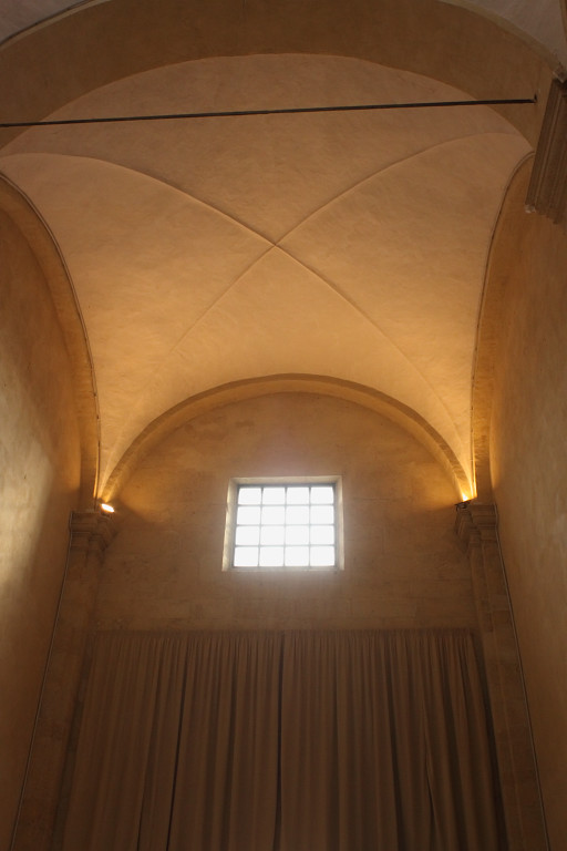
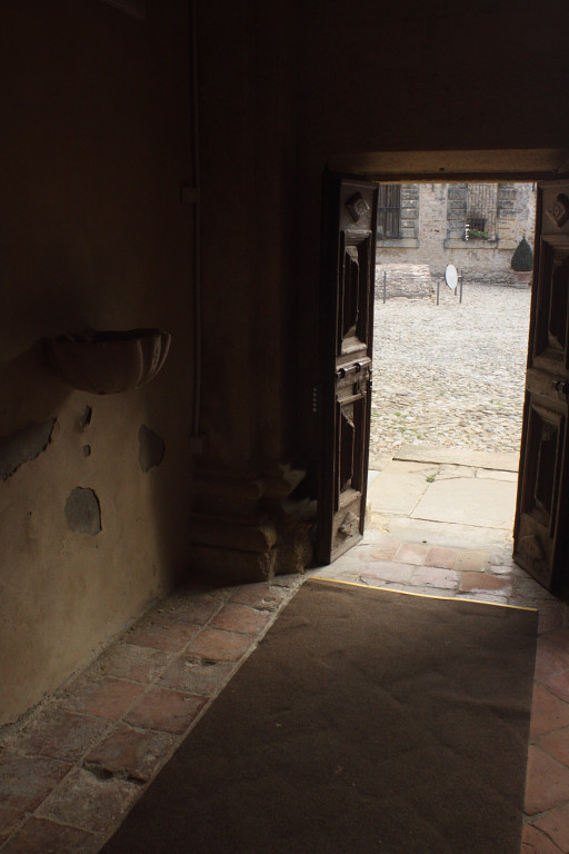
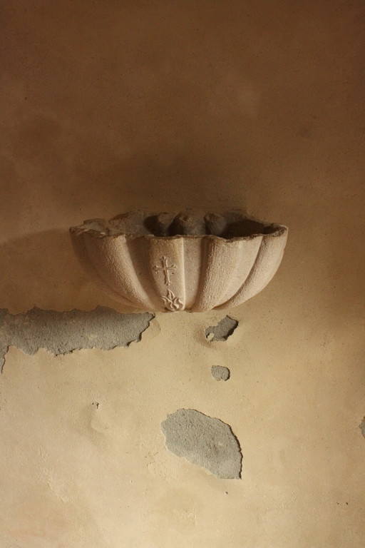
The first three are inside the Oratorio della Madonna delle Grazie (in the castle of Vigoleno).
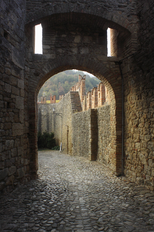
Fourth one is a view of the castle.


These are two larger files, click on thumbnail to enlarge:
in the Oratorio again:

near the exit from the castle:

_________________
Orio, Administrator
T*
NE CEDE MALIS AUDENTIOR ITO
Ferrania film is reborn! http://www.filmferrania.it/
Support the Ornano film chemicals company and help them survive!
http://forum.mflenses.com/ornano-chemical-products-t55525.html |
|
| Back to top |
|
 |
estudleon


Joined: 15 May 2008
Posts: 3754
Location: Argentina
|
 Posted: Sat Oct 25, 2008 11:15 pm Post subject: Posted: Sat Oct 25, 2008 11:15 pm Post subject: |
 |
|
estudleon wrote:
Really greats pics. Orio, I tell you always the same, but your locations and taste for the photo act are impressive. (in my taste, of course).
On the lens quid, I have ambivalent feels. I'm not definite about it. I will take more pics with it.
Rino.
_________________
Konica 2,8/100
CZJ: 4/20, 2,4/35, 1,8/50 aus jena, 3,5/135MC, Pentacon 1,8/50
Pentax S-M-C-1,4/50
Helios 44-3
Mamiya 2,8/135
Misc. : jupiter 9
Stuff used:
A) SRL
Alpa 10 D - kern macro Switar 1,9/50 -black, Kilffit apochromat 2/100.
Asahi pentax spotmatic super takumar 1,4/50
Contaflex super B tessar 2,8/50 Pro-tessar 115
Leica R3 electronic summicron 2/50 elmarit 2,8/35
Konica Autoreflex 3 (2 black and chrome one), TC, T4. 2,8/24, 3,5/28 not MC and MC, 1,8/40, 1,4/50, 1,7/50 MC and not MC, 1,8/85, 3,2/135, 3,5/135, 4/200
Minolta XG9 2,8/35, 2/45, 3,5/135
Nikkormat FTn 1,4/50, 2,8/135
Fujica ST 801, 605, 705n. 3,5/19, 1,4/50, 1,8/55, 4/85, 3,5/135.
Praktica MTL 5 and a lot of M42 lenses.
Voigtlander. Bessamatic m, bessamatix de luxe, bessamatic cs, ultramatic and ultramatic cs.
Skoparex 3,5/35, skopagon 2/40, skopar 2,8/50, skopar X 2,8/50, super lanthar (out of catalogue) 2,8/50, dinarex 3,4/90, dinarex 4,8/100, super dinarex 4/135, super dinarex 4/200, zoomar 2,8/36-83, portrait lens 0, 1 and 2. Curtagon 4/28 and 2,8/35
Canon AV1, 1,8/50
Rolleiflex SL35 and SL35 E. 2,8/35 angulon, 2,8/35 distagon, 1,4/55 rolleinar, 1,8/50 planar, 4/135 tessar, 2,8/135 rolleinar, x2 rollei, M42 to rollei adap.
Etc.
RF
Yashica Minister III
Voightlander Vito, vitomatic I, Vito C, etc.
Leica M. M2, M3 (d.s.) and M4. Schenider 3,4/21, 2/35 summaron 2,8/35 (with eyes). Summicron 2/35 (8 elements with eyes), 2/35 chrome, 2/35 black, 1,4/35 pre asph and aspheric - old -, 2/40 summicron, 2,8/50 elmar, 2/50 7 elements, 2/50 DR, 2/50 - minolta version, 1,4/50 summilux 1966 version, 1,4/75 summilux, 2/90 large version, 2/90 reduced version of 1987, 2,8/90 elmarit large version, 4/135 elmar. |
|
| Back to top |
|
 |
Orio

Joined: 24 Feb 2007
Posts: 29545
Location: West Emilia
Expire: 2012-12-04
|
 Posted: Sat Oct 25, 2008 11:18 pm Post subject: Posted: Sat Oct 25, 2008 11:18 pm Post subject: |
 |
|
Orio wrote:
| estudleon wrote: |
| Really greats pics. Orio, I tell you always the same, but your locations and taste for the photo act are impressive. (in my taste, of course). |
Thanks, Rino.
_________________
Orio, Administrator
T*
NE CEDE MALIS AUDENTIOR ITO
Ferrania film is reborn! http://www.filmferrania.it/
Support the Ornano film chemicals company and help them survive!
http://forum.mflenses.com/ornano-chemical-products-t55525.html |
|
| Back to top |
|
 |
Laurence


Joined: 26 Mar 2007
Posts: 4809
Location: Western Washington State
Expire: 2016-06-19
|
 Posted: Sun Oct 26, 2008 1:30 am Post subject: Posted: Sun Oct 26, 2008 1:30 am Post subject: |
 |
|
Laurence wrote:
It is always a pleasure to read your posts, Orio!
The Flektogon just SINGS, with its beautiful rectilinearity,
and the coloration that is picked up with the combination
of the lens and the 5D processor.
Your prediliction for "seeing" is awesome, Orio.
The doorway shot (#2) belies a feeling of exit.
I feel as if I'm actually standing there, and the angular
view is perfect for contributing to that feeling.
The anomalous outside view of the disc and the black
object leaves me guessing, and draws me through
the doorway.
The hint of architecture on the background
building makes me want to explore. Couple this with
the beautiful shadows of the interior, and especially
the filigree on the left hand side is stunning with its
hint of scalloping and form.
Also, the textural changes on the floor and steps and
street are adding to the sense of reality.
Finally, the lack of distortion brings the image
to a climax of beautiful thought that went into the image.
_________________
Assent, and you are sane;
Demur,—you ’re straightway dangerous,
And handled with a chain.
Emily Dickinson
Cameras and Lenses in Use:
Yashica Mat 124 w/ Yashinon 80/3.5,
CV Apo-Lanthar 90/3.5SL, (Thank you Klaus),
Pentax 645,
Flek 50,
Pentax-A 150
Pentax-A 120 Macro
Voigtlander Vitomatic I w/Color Skopar 50/2.8
Konica TC and zoom lenses (thanks Carsten)
Contax AX
Yashica ML 50/2
Yashica ML 35/2.8
Carl Zeiss Contax 50/1.4
Tamron Adaptall SP 17/3.5
Tamron Adaptall 28/2.5
Tamron Adaptall SP 300/2.8 LD (IF)
|
|
| Back to top |
|
 |
Orio

Joined: 24 Feb 2007
Posts: 29545
Location: West Emilia
Expire: 2012-12-04
|
 Posted: Sun Oct 26, 2008 1:43 am Post subject: Posted: Sun Oct 26, 2008 1:43 am Post subject: |
 |
|
Orio wrote:
Thanks Larry for taking the time to such a detailed comment!
It's uncommon and surely helps me a lot to read what others see in my photos in such accurate detail.
SO thanks very much!
I love photographing in these ancient places such as castles and churches, because they were built by people who know how to use light to an effect.
Today, buildings are built without the awareness of the light. They just think that to lighten a room means to place a window in the most "useful" place, or for God's sake, just turn on that damned bulb light!
Ancient builders instead were very conscious of the illumination in the different hours of the day and mostly aware of the psychological effect of the light on the people inside.
This makes the job of a photographer so much more interesting.
I could photograph for hours in a mediaeval church. And I could do any genre in there, from still life to nudes - well, the priest must be distracted for the latter to be possible 
THese places are the triumph of light as as you know better than me, cameras and lenses are important, software manipulation is powerful, but there is nothing as decisive for a photograph, than a great lighting on the scene while you shoot.
_________________
Orio, Administrator
T*
NE CEDE MALIS AUDENTIOR ITO
Ferrania film is reborn! http://www.filmferrania.it/
Support the Ornano film chemicals company and help them survive!
http://forum.mflenses.com/ornano-chemical-products-t55525.html |
|
| Back to top |
|
 |
Laurence


Joined: 26 Mar 2007
Posts: 4809
Location: Western Washington State
Expire: 2016-06-19
|
 Posted: Sun Oct 26, 2008 2:36 am Post subject: Posted: Sun Oct 26, 2008 2:36 am Post subject: |
 |
|
Laurence wrote:
You are welcome Orio....when a posted image really HITS me, I love to tell my feelings about the image.
Orio wrote: or for God's sake, just turn on that damned bulb light!

I can certainly see what you mean about the placement of openings
to take advantage of the light, especially in a dark castle environment.
I would think you could spend literally years just photographing
the nooks and crannies of these structures. And always...that
available light sings forever.
I'm taking a look at the image looking out to the parapets. (#4).
This is another image that makes me look for a long time. You
were very fortituous to move left the way you did, not only to
create a fairly even border for the archway, but also it takes
advantage of the curving wall. By having that wall curve out and
away to the left, I feel two things: 1) a feeling of balance - the curve
adds more mass to balance the splendid parapets and massive
stonework on the right side. 2) the curvature provides me with a
pathway "out of the scene", and pushes my eye to the woods
beyond. Brilliant.
Speaking of balance, I am seeing in a majority of your work, the
balancing of masses to provide a footing for the scene. I tend to
guess that this is probably a benefit of your time spent painting, as
well as observing the paintings of the masters through all the years.
Their paintings invariable had a balance of sorts, even if a mass
was "balanced" by open space.
The coup de grace here though, is the mimicry of the overhead
arch with the two openings. What a great benefit of the wide angle
lens! This section of the image finalizes the feeling of looking out
and through the whole image, and is a SPLENDID example of the
very thoughtful placement of openings that you described in the last
post.
In the final analysis, you are staying true to your words in allowing the
shadows to be "what they are", rather than using HDR or some other
manipulations. These shadows are superb, and give depth to the image
that would be lost if they were blandly brightened up.
There is a prominent sense of dimensionality here. You certainly
have a wonderful environment for creating your images, Orio. I
imagine that this would be true for black and white as well as
color. The light is the benefactor here, so the coloration or desaturation
of the color, would not matter so much. But the ability to SEE the
light and USE the light, which you exhibit so efficiently, is the
combination that pushes these images over the top and leaves a
conscious impression of beauty to me.
I have to say it again: brilliant, Orio.
_________________
Assent, and you are sane;
Demur,—you ’re straightway dangerous,
And handled with a chain.
Emily Dickinson
Cameras and Lenses in Use:
Yashica Mat 124 w/ Yashinon 80/3.5,
CV Apo-Lanthar 90/3.5SL, (Thank you Klaus),
Pentax 645,
Flek 50,
Pentax-A 150
Pentax-A 120 Macro
Voigtlander Vitomatic I w/Color Skopar 50/2.8
Konica TC and zoom lenses (thanks Carsten)
Contax AX
Yashica ML 50/2
Yashica ML 35/2.8
Carl Zeiss Contax 50/1.4
Tamron Adaptall SP 17/3.5
Tamron Adaptall 28/2.5
Tamron Adaptall SP 300/2.8 LD (IF)
|
|
| Back to top |
|
 |
patrickh


Joined: 23 Aug 2007
Posts: 8551
Location: Oregon
Expire: 2011-11-18
|
 Posted: Sun Oct 26, 2008 6:41 am Post subject: Posted: Sun Oct 26, 2008 6:41 am Post subject: |
 |
|
patrickh wrote:
Orio
Impossible to compare with Laurence's analysis - so thorough and right on the money. I know we tend to post those pictures we like best that we take, but you are able to post so many of them! And I for one enjoy them all (well almost all).
patrickh
_________________
DSLR: Nikon D300 Nikon D200 Nex 5N
MF Zooms: Kiron 28-85/3.5, 28-105/3.2, 75-150/3.5, Nikkor 50-135/3.5 AIS // MF Primes: Nikkor 20/4 AI, 24/2 AI, 28/2 AI, 28/2.8 AIS, 28/3.5 AI, 35/1.4 AIS, 35/2 AIS, 35/2.8 PC, 45/2.8 P, 50/1.4 AIS, 50/1.8 AIS, 50/2 AI, 55/2.8 AIS micro, 55/3.5 AI micro, 85/2 AI, 100/2,8 E, 105/1,8 AIS, 105/2,5 AIS, 135/2 AIS, 135/2.8 AIS, 200/4 AI, 200/4 AIS micro, 300/4.5 AI, 300/4.5 AI ED, Arsat 50/1.4, Kiron 28/2, Vivitar 28/2.5, Panagor 135/2.8, Tamron 28/2.5, Tamron 90/2.5 macro, Vivitar 90/2.5 macro (Tokina) Voigtlander 90/3.5 Vivitar 105/2.5 macro (Kiron) Kaleinar 100/2.8 AI Tamron 135/2.5, Vivitar 135/2.8CF, 200/3.5, Tokina 400/5,6
M42: Vivitar 28/2.5, Tamron 28/2.5, Formula5 28/2.8, Mamiya 28/2.8, Pentacon 29/2.8, Flektogon 35/2.4, Flektogon 35/2.8, Takumar 35/3.5, Curtagon 35/4, Takumar 50/1.4, Volna-6 50/2.8 macro, Mamiya 50/1.4, CZJ Pancolar 50/1,8, Oreston 50/1.8, Takumar 50/2, Industar 50/3.5, Sears 55/1.4, Helios 58/2, Jupiter 85/2, Helios 85/1.5, Takumar 105/2.8, Steinheil macro 105/4.5, Tamron 135/2.5, Jupiter 135/4, CZ 135/4, Steinheil Culminar 135/4,5, Jupiter 135/3.5, Takumar 135/3.5, Tair 135/2.8, Pentacon 135/2.8, CZ 135/2.8, Taika 135/3.5, Takumar 150/4, Jupiter 200/4, Takumar 200/4
Exakta: Topcon 100/2.8(M42), 35/2.8, 58/1.8, 135/2.8, 135/2.8 (M42), Kyoei Acall 135/3.5
C/Y: Yashica 28/2.8, 50/1.7, 135/2.8, Zeiss Planar 50/1.4, Distagon 25/2.8
Hexanon: 28/3.5, 35/2.8, 40/1.8, 50/1.7, 52/1.8, 135/3.2, 135/3.5, 35-70/3.5, 200/3.5
P6 : Mir 38 65/3.5, Biometar 80/2.8, Kaleinar 150/2.8, Sonnar 180/2.8
Minolta SR: 28/2.8, 28/3.5, 35/2.8, 45/2, 50/2, 58/1.4, 50/1.7, 135/2.8, 200/3.5
RF: Industar 53/2.8, Jupiter 8 50/2
Enlarg: Rodagon 50/5,6, 80/5,6, 105/5.6, Vario 44-52/4, 150/5.6 180/5.6 El Nikkor 50/2,8,63/2.8,75/4, 80/5,6, 105/5.6, 135/5.6 Schneider 60/5.6, 80/5.6, 80/4S,100/5.6S,105/5.6,135/5.6, 135/5.6S, 150/5.6S, Leica 95/4 |
|
| Back to top |
|
 |
poilu

Joined: 26 Aug 2007
Posts: 10472
Location: Greece
Expire: 2019-08-29
|
 Posted: Sun Oct 26, 2008 6:48 am Post subject: Posted: Sun Oct 26, 2008 6:48 am Post subject: |
 |
|
poilu wrote:
I wanted to write exactly the same as Larry but he was faster 
_________________
T* |
|
| Back to top |
|
 |
LucisPictor


Joined: 26 Feb 2007
Posts: 17633
Location: Oberhessen, Germany / Maidstone ('95-'96)
Expire: 2013-12-03
|
 Posted: Sun Oct 26, 2008 9:18 am Post subject: Posted: Sun Oct 26, 2008 9:18 am Post subject: |
 |
|
LucisPictor wrote:
Wow, Orio!
Wow, Larry!
This could have been a photo discussion in a university course. This is a very high level we're dealing with here!
Actually, Orio, esp. your fourth shot makes me want to take my Flek and go for a walk!
_________________
Personal forum activity on pause every now and again (due to job obligations)!
Carsten, former Moderator 
Things ON SALE
Carsten = "KAPCTEH" = "Karusutenu" | T-shirt?.........................My photos from Emilia: http://www.schouler.net/emilia/emilia2011.html
My gear: http://retrocameracs.wordpress.com/ausrustung/
Old list: http://forum.mflenses.com/viewtopic.php?t=65 (Not up-to-date, sorry!) | http://www.lucispictor.de | http://www.alensaweek.wordpress.com |
http://www.retrocamera.de |
|
| Back to top |
|
 |
Carlsson


Joined: 26 Jul 2008
Posts: 793
Location: Portugal
|
 Posted: Sun Oct 26, 2008 10:09 am Post subject: Posted: Sun Oct 26, 2008 10:09 am Post subject: |
 |
|
Carlsson wrote:
Thank you for this very nice and detailed set.
| Orio wrote: |
Today, buildings are built without the awareness of the light. They just think that to lighten a room means to place a window in the most "useful" place, or for God's sake, just turn on that damned bulb light!
Ancient builders instead were very conscious of the illumination in the different hours of the day and mostly aware of the psychological effect of the light on the people inside. |
Exactly 
_________________
Contax III, Zeiss Ikon ZM, Contax AX, EOS 5D, R-D1
https://mariaeero.com/contax/ |
|
| Back to top |
|
 |
peterqd


Joined: 28 Feb 2007
Posts: 7448
Location: near High Wycombe, UK
Expire: 2014-01-04
|
 Posted: Sun Oct 26, 2008 10:54 am Post subject: Posted: Sun Oct 26, 2008 10:54 am Post subject: |
 |
|
peterqd wrote:
Great set Orio, I would love to be able to express my feelings as well as Larry, so just because you don't always get such glowing praise, please don't think there is any less appreciation.
About the picture of the vaulted ceiling, I'm curious to know if you have corrected the perspective. With such a wide lens and steep elevation I would have expected to see far more convergence of the verticals. Or is that the Flek in action?
If you'll allow me to say so, your criticism about modern achitecture and light is a little unfair in my view. It's not that we don't know how to use light (although that may sometimes be true), but our hands are tied by so much regulation, at least they are here. A window has to be at least 5% of the floor area for light and 2.5% openable for ventilation. Yet it must not be too big to lose excessive heat. The window must not be too low off the floor that someone is in danger of falling out, nor too high that someone might fall off a ladder cleaning it. There is a minimum permitted amount of visible sky yet it cannot look directly into a neighbours' window or even overlook their garden...... and so on, you get the picture. I don't think the old builders had any of those problems to think about.
_________________
Peter - Moderator |
|
| Back to top |
|
 |
Orio

Joined: 24 Feb 2007
Posts: 29545
Location: West Emilia
Expire: 2012-12-04
|
 Posted: Sun Oct 26, 2008 12:04 pm Post subject: Posted: Sun Oct 26, 2008 12:04 pm Post subject: |
 |
|
Orio wrote:
Thanks guys!
| Laurence wrote: |
Speaking of balance, I am seeing in a majority of your work, the
balancing of masses to provide a footing for the scene. I tend to
guess that this is probably a benefit of your time spent painting, as
well as observing the paintings of the masters through all the years. |
Absolutely, yes. I owe everything to the great masters of painting.
| Quote: |
In the final analysis, you are staying true to your words in allowing the
shadows to be "what they are", rather than using HDR or some other
manipulations. These shadows are superb, and give depth to the image
that would be lost if they were blandly brightened up. |
Yes. Shadows define the light. Without deep shadows, the light seems weaker, and the image loses three-dimensionality value.
Like I said in another thread, shadows are for photography what the pauses are for the music: you don't hear the sound of a pause, but the pauses are what shapes the sounds that you hear.
Also, shadows are the place that is filled by imagination. A room for imagination gives the viewer a chance to make the image their own, by completing them with the mind.
_________________
Orio, Administrator
T*
NE CEDE MALIS AUDENTIOR ITO
Ferrania film is reborn! http://www.filmferrania.it/
Support the Ornano film chemicals company and help them survive!
http://forum.mflenses.com/ornano-chemical-products-t55525.html |
|
| Back to top |
|
 |
Orio

Joined: 24 Feb 2007
Posts: 29545
Location: West Emilia
Expire: 2012-12-04
|
 Posted: Sun Oct 26, 2008 12:08 pm Post subject: Posted: Sun Oct 26, 2008 12:08 pm Post subject: |
 |
|
Orio wrote:
| peterqd wrote: |
About the picture of the vaulted ceiling, I'm curious to know if you have corrected the perspective. With such a wide lens and steep elevation I would have expected to see far more convergence of the verticals. Or is that the Flek in action? |
No software correction 
| peterqd wrote: |
| If you'll allow me to say so, your criticism about modern achitecture and light is a little unfair in my view. It's not that we don't know how to use light (although that may sometimes be true), but our hands are tied by so much regulation, at least they are here. |

Sorry, I didn't mean it as a criticism to today's architecture, more as a criticism of the large majority of the architects who, at least here in Italy, are without culture, without creativity, and without good taste. I hope that in England you have a better generation of architects. Here, they operate without the minimum taste and the minimum awareness of the history of architecture of our places.
It's the fruit of the bad situation of our schools.
_________________
Orio, Administrator
T*
NE CEDE MALIS AUDENTIOR ITO
Ferrania film is reborn! http://www.filmferrania.it/
Support the Ornano film chemicals company and help them survive!
http://forum.mflenses.com/ornano-chemical-products-t55525.html |
|
| Back to top |
|
 |
|
|
