| View previous topic :: View next topic |
| Author |
Message |
stevemark

Joined: 29 Apr 2011
Posts: 3953
Location: Switzerland
|
 Posted: Fri Mar 10, 2023 3:18 pm Post subject: Posted: Fri Mar 10, 2023 3:18 pm Post subject: |
 |
|
stevemark wrote:
| Ernst Dinkla wrote: |
Suppose I would make a fixed shift lens with Sony FE mount.
...
Which focal length to use, how much shift needed ? |
Before doing lots of architecture work I mainly was using 20mm lenses for landscape (occasionally a 50 mm too), 100mm for macro, and 2.8/200 APO for portraits. I still very much like the 20mm pespective, and therefore that would be my favourite lens for shifting as well.
When I got my first Zeiss ZA 2.8/16-35mm back in 2009 (?), I started using it for "pseudo-shifting" work, placing the "20mm section" in the upper field of the image and later cropping the 24 MP / 16mm to something like 16 Mp / "20mm". That was pretty convenient in certain situations, especially when corrcting the distortion of the ZA 16-35mm @ f=16mm. The few millimeters of "shifting" often were enough for "cityscapes", but not for real architecture photos.
When I got the TS-E 4/17mm L in 2016 it seemed "too wide" at first. Later on I dicovered that the additional margin (compared to a 20mm shift) was quite useful in some circumstances, especially for book covers as shown above. Therefore usually I compose my 17mm shift images with some "additional space", later slightly cropping to an angle of maybe 19mm. With 24 MP FF and especially 50 MP FF cameras the resolution of the (slightly) cropped image remains sufficient.
The Canon TS-E lenses have 12 mm shift (half of the 24mm image height when doing landscape format images) - which allows you to place the horizon at the lower edge of the frame. I never felt the need for "more shifting" on the TS-E 17mm.
That said, I may acquire a TS-E 24mm L sooner or later - it would fit perfectly between the TS-E 4/17mm L and the Zeiss PC-Distagon 2.8/35mm (which probably optically is the best 35mm shift lens available).
The PC-Distagon 2.8/35mm only has 10 mm shifting. That's better than the Leica/Schneider 4/35mm Shift, but not enough. I would prefer 12 mm or better 16mm shifting since the 35mm shift often is used in portrait orientation: 10mm shift on 36mm image height is not that much indeed. Here's a sample from the Zeiss PC-Distagon 2.8/35mm (two images stitched together resulting in a 50 MP image, used for a large calendar):
Of course I could have used a "nomal" 24mm lens (cropping the image) plus a high res FF camera as well, but since the image was intended for a large calendar I decided to go for the shift lens.
S
PS I checked the Nikon 19mm Shift as soon as it came out - but since it had more distortion and less image circle than my TS-E 4/17, I refrained from buying it
_________________
www.artaphot.ch |
|
| Back to top |
|
 |
stevemark
Joined: 29 Apr 2011
Posts: 3953
Location: Switzerland
|
| Posted: Sat Mar 11, 2023 12:49 am Post subject: |
|
|
stevemark wrote:
| Ultrapix wrote: |
Before I do something undesirable, may I post my own proposal of how to postproduce this image in a way that is less impactful on the eye? |
Yes sure! I'm always interested in learning something  . If you need the original RAW you can PM me. . If you need the original RAW you can PM me.
S
_________________
www.artaphot.ch |
|
| Back to top |
|
|
Ultrapix

Joined: 06 Jan 2012
Posts: 566
Location: Italy
|
| Posted: Sat Mar 11, 2023 6:59 pm Post subject: |
|
|
Ultrapix wrote:
Thank you, but I must preface this by saying that I have no intention of teaching anything, just proposing a post-production trick of mine, which certainly won't please everyone, but they are my two cents.
The problem I always find in photos where there has been a strong correction of falling lines (optically or digitally in this case it doesn't matter) is the unnatural effect of, for example, very tall bell towers, very stretched spires, eaves and cornices that are much more imposing than in reality. This effect has two causes, one physical and one psychological. The psychological, or rather psycho-visual one, consists in the fact that an observer who sees a building at ground level finds it natural that the higher parts of the structure, being further away from his or her point of view, appear shrunken; this habit of our brain clashes with the opposite effect, caused by the projection being all the more oblique the further one moves away from the centre of the optical projection, which results in a stretching the greater the distance from the optical axis; the eye would like a shrinking effect, and finds the opposite.
My solution, or rather shortcut, is to apply through the software a stepped compression, greater at the top, and zero at the bottom. The more gradual the steps in which this 'counter-distortion' is applied, the less risk there is of the eye perceiving a kind of 'scaling'. One can also create a series of actions in Photoshop for various situations, whereby one click is all it takes to apply this correction.
The following example has been done quickly, but it can be done much better with the needed time, of course.
Thanks for the attention |
|
| Back to top |
|
|
RokkorDoctor

Joined: 27 Nov 2021
Posts: 1415
Location: Kent, UK
Expire: 2025-05-01
|
| Posted: Sat Mar 11, 2023 7:30 pm Post subject: |
|
|
RokkorDoctor wrote:
| Ultrapix wrote: |
Thank you, but I must preface this by saying that I have no intention of teaching anything, just proposing a post-production trick of mine, which certainly won't please everyone, but they are my two cents.
The problem I always find in photos where there has been a strong correction of falling lines (optically or digitally in this case it doesn't matter) is the unnatural effect of, for example, very tall bell towers, very stretched spires, eaves and cornices that are much more imposing than in reality. This effect has two causes, one physical and one psychological. The psychological, or rather psycho-visual one, consists in the fact that an observer who sees a building at ground level finds it natural that the higher parts of the structure, being further away from his or her point of view, appear shrunken; this habit of our brain clashes with the opposite effect, caused by the projection being all the more oblique the further one moves away from the centre of the optical projection, which results in a stretching the greater the distance from the optical axis; the eye would like a shrinking effect, and finds the opposite.
My solution, or rather shortcut, is to apply through the software a stepped compression, greater at the top, and zero at the bottom. The more gradual the steps in which this 'counter-distortion' is applied, the less risk there is of the eye perceiving a kind of 'scaling'. One can also create a series of actions in Photoshop for various situations, whereby one click is all it takes to apply this correction.
The following example has been done quickly, but it can be done much better with the needed time, of course.
Thanks for the attention |
That is pretty much the effect you get when you use the old-style perspective correction in Photoshop (I think CS6 and older; I don't use perspective correction in PS much), whereby only the converging verticals were corrected but no correction for the foreshortening was done. Effectively, the foreshortening is maintained. It is more a linear canvas stretching rather than a proper perspective correction. (That is of course assuming a tilted camera shot with a normal WA lens, not use of a shift lens).
I agree this can look more natural to the eye, especially on UWA shots, but it does depend on what the client wants.
Again, this also very much depends on the intended use of the image and whether the expected viewing distance & position to the print correspond with the centre of perspective when the image was taken.
For a book cover as in this example, where the typical viewing distance does not at all correspond with the original centre of perspective, maintaining the foreshortening as you have simulated looks more natural.
But it remains a compromise; the only "correct" way to get a completely undistorted viewpoint is by reducing the viewing distance to the print such that it corresponds with the centre of perspective. On my monitor that means viewing the above image from a couple of inches from the bottom (eye level with the entrance door of the church, corresponding to the original tripod height), and my eye only a couple of inches or so from the screen. Alternatively it needs to be printed REALLY large and stuck on a tall wall...
_________________
Mark
SONY A7S, A7RII + dust-sealed modded Novoflex/Fotodiox/Rayqual MD-NEX adapters
Minolta SR-1, SRT-101/303, XD7/XD11, XGM, X700
Bronica SQAi
Ricoh GX100
Minolta majority of all Rokkor SR/AR/MC/MD models made
Sigma 14mm/3.5 for SR mount
Tamron SP 60B 300mm/2.8 (Adaptall)
Samyang T-S 24mm/3.5 (Nikon mount, DIY converted to SR mount)
Schneider-Kreuznach PC-Super-Angulon 28mm/2.8 (SR mount)
Bronica PS 35/40/50/65/80/110/135/150/180/200/250mm |
|
| Back to top |
|
|
iangreenhalgh1

Joined: 18 Mar 2011
Posts: 15679
Expire: 2014-01-07
|
| Posted: Sat Mar 11, 2023 10:07 pm Post subject: |
|
|
iangreenhalgh1 wrote:
The left hand one is horrible to my eyes, a total mess where perspective has been thrown out the window, the tower leanng to the left just looks so wrong..
The right hand one with software correction looks immeasurably better.
Which just proves my point, put aside the BS and arrogance and the refusal to accept the new alongside the old and we can have the best of both worlds utilising both old and new tools to achieve better results than previous.
_________________
I don't care who designed it, who made it or what country it comes from - I just enjoy using it! |
|
| Back to top |
|
|
stevemark
Joined: 29 Apr 2011
Posts: 3953
Location: Switzerland
|
| Posted: Sat Mar 11, 2023 10:11 pm Post subject: |
|
|
stevemark wrote:
| Ultrapix wrote: |
...
The problem I always find in photos where there has been a strong correction of falling lines (optically or digitally in this case it doesn't matter) is the unnatural effect of, for example, very tall bell towers, very stretched spires, eaves and cornices that are much more imposing than in reality. |
I completely agree with that.
| Ultrapix wrote: |
My solution, or rather shortcut, is to apply through the software a stepped compression, greater at the top, and zero at the bottom.
The more gradual the steps in which this 'counter-distortion' is applied, the less risk there is of the eye perceiving a kind of 'scaling'.
One can also create a series of actions in Photoshop for various situations, whereby one click is all it takes to apply this correction.
The following example has been done quickly, but it can be done much better with the needed time, of course.
Thanks for the attention |
Yep, I've been doing that occasionally as well.
Now a "real story" from last december, concerning this ...
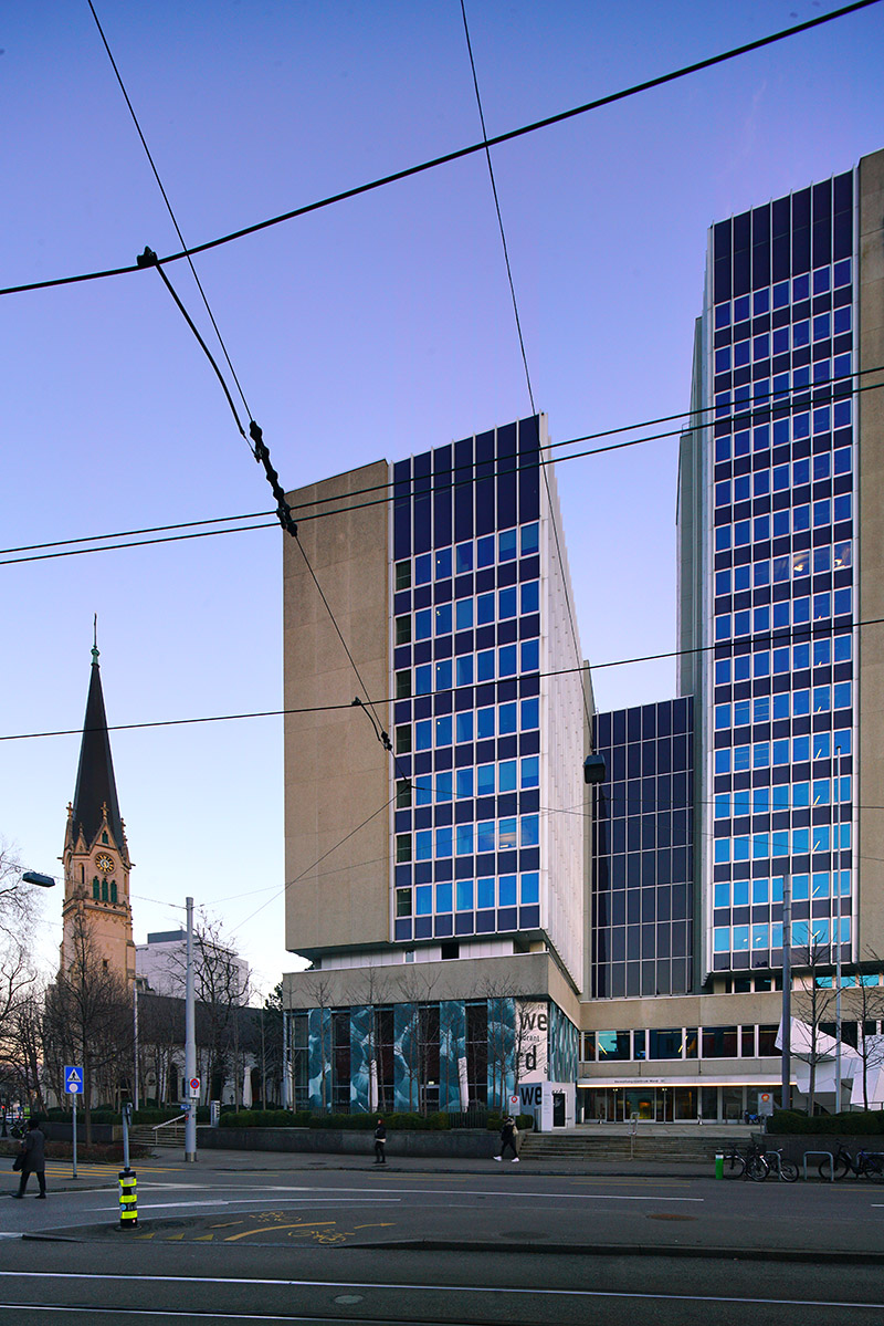
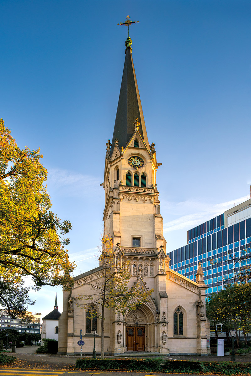
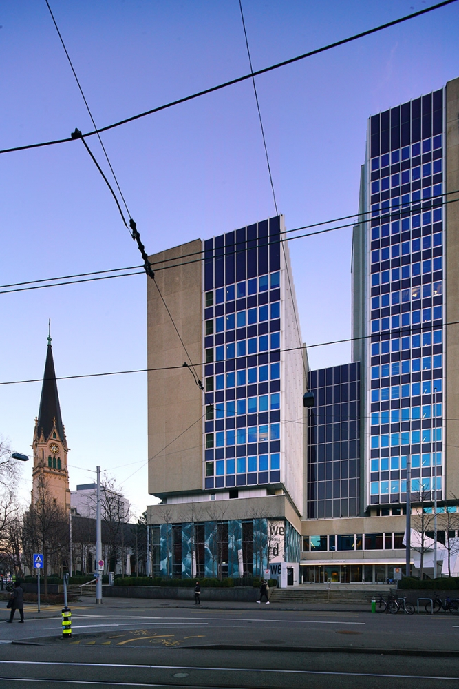
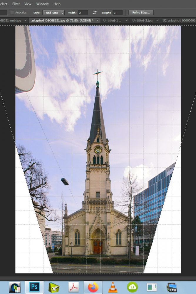
Here's the situation. A tiny poor church from 1878, yet the first "new" catholic church in Zürich, and as such a slightly annoying and
distubing item for Big (protestant) Business in Zurich. What to do? A well known Swiss bank was buying for decades (!!) all the small
private plots alongside the church. Starting in 1970, finally, they were able to erect their "we-are-bigger"-building, at a distance of <10
meters from the church (!!). Not much later they lost interest, and sold their building to the town.
EDIT: All the images shown in this posting are NOT intended for publication in books or for selling (too dull light), but as a preparation for "the real work.
Once the light is "perfect", or at least good, I will know exactly where to go and what to to.
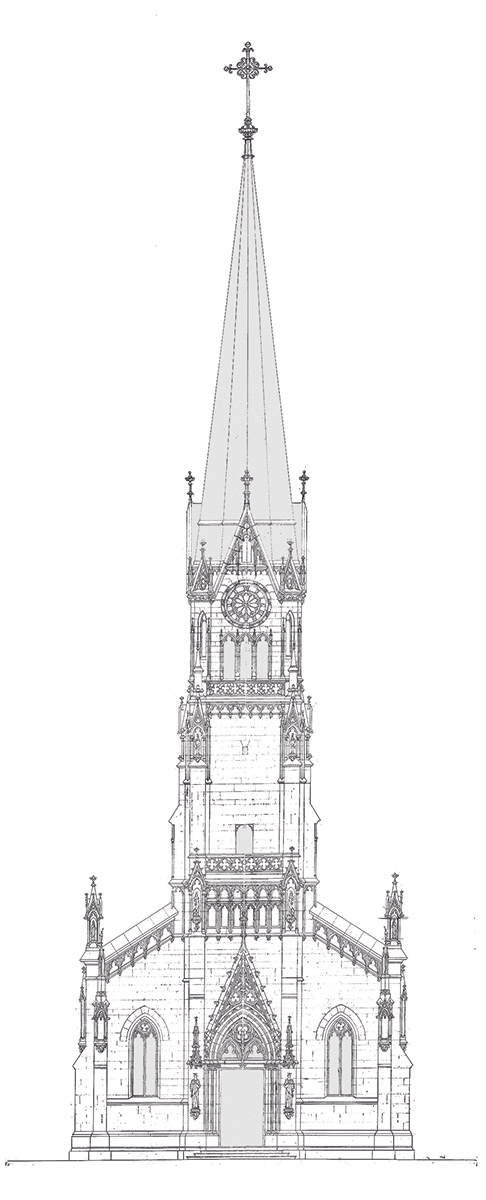
Now I, as a photographer, have to deal with that situation. AND the parish wants to show a frontal view of the tower. The ancient plan
from 1890 looks as follows (small base is the actual church from 1878, huge tower was added around 1890):
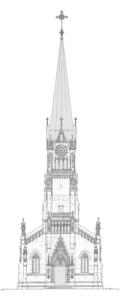
Problem is - standing in front of the tower (looking at the portal as above) I'm not more than 15 m away from the entrance (=tower).
The tower is 60 m high. Now go and figure out ...!
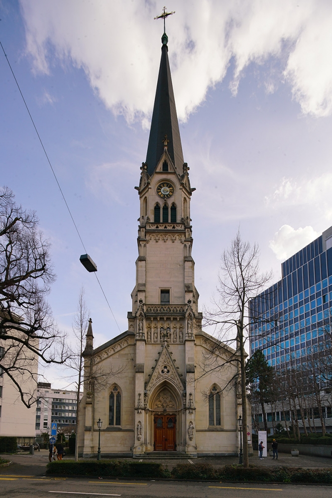
It looks like that (17mm wideangle, not shifted). No way to move furter away, just walls behind me:

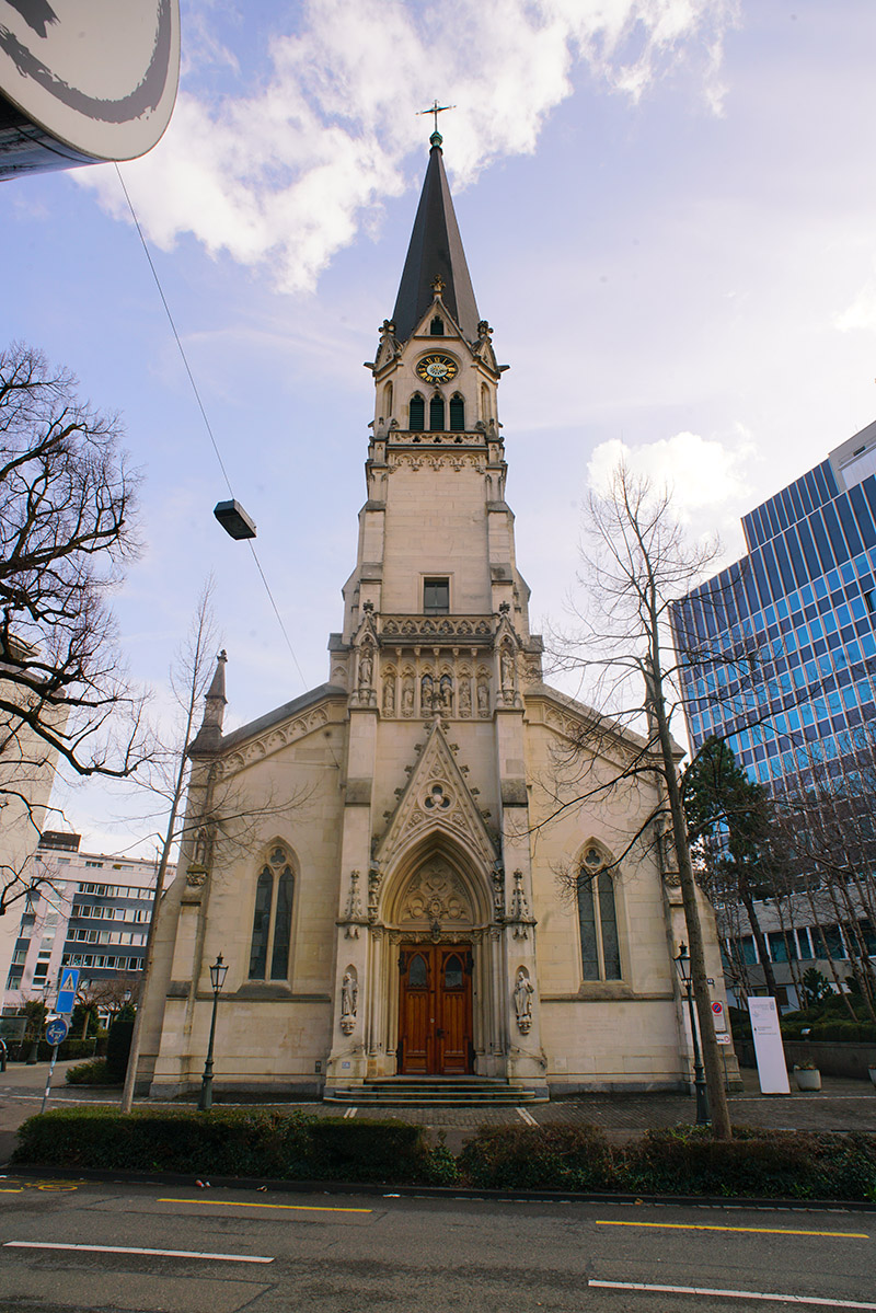
Even the TS-E 17mm can't fully correct the situation:
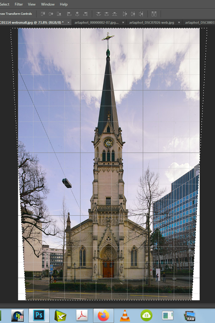
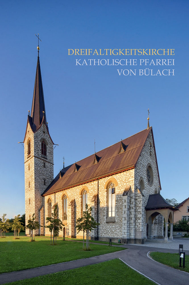
Additinal software correction of the image taken with the fully shifted (!!) TS-E 17mm would result in this:

That looks reasonably similar as the original plan of the building, shown above. However, the partial correction of the converging lines
by photoshop automatically has introduced a shortening of the upper part and an elongation of the lower part (as ultrapix had
suggested to do manually). The tower doesn't look exactly like the plan:
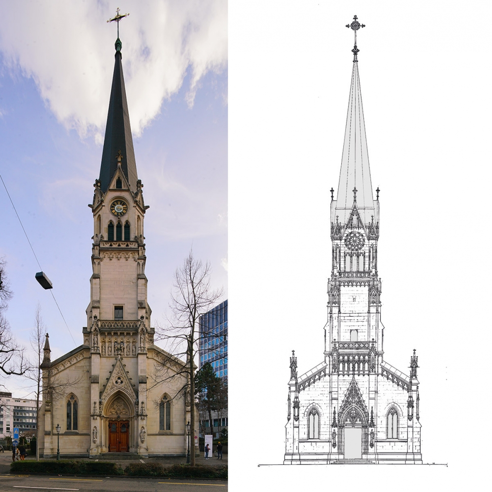
To my eye, something like this would look more "natural" (remember the non-shifted 17mm view above):

Looking at this image, however, the guys paying complained that "the tower is not looking like on the plans ... " .
Situations like this can be rather tricky indeed ...
S
_________________
www.artaphot.ch
Last edited by stevemark on Sat Mar 11, 2023 11:25 pm; edited 5 times in total |
|
| Back to top |
|
|
stevemark
Joined: 29 Apr 2011
Posts: 3953
Location: Switzerland
|
| Posted: Sat Mar 11, 2023 10:46 pm Post subject: |
|
|
stevemark wrote:
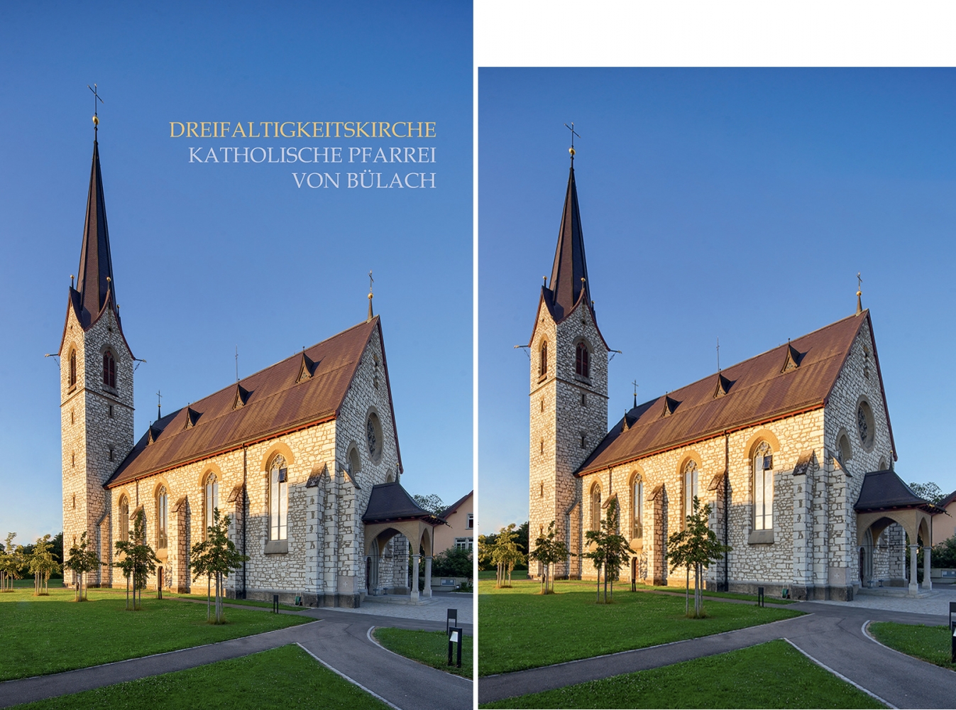
| iangreenhalgh1 wrote: |
The right hand one with software correction looks immeasurably better.
|
The right hand is NOT software correction. It is "fully shifted TS-E 17mm" PLUS software correction .
Even in the image you like (that one corrected by Ultrapix), all correction of the converging lines has been done by shifting.
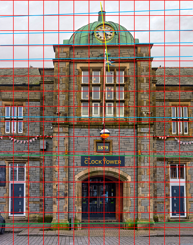
Taking such an image without shift lens (thus by sticking) would have resulted in a crooked and skewed tower: Remeber your stitched image of Millom Tower
I absolutely agree with you that the "fully shifted TS-E 17mm" PLUS software corrected" image looks (to my eyes) better than the "solely shifted" image.
However some clients will not agree .... See my real world example given above ...
S
EDIT: and without stitching (just software correction of the 17mm wideangle image above) I would get that one.
Quite a lot missing indeed . And, more important: Impossible to sell.
_________________
www.artaphot.ch |
|
| Back to top |
|
|
iangreenhalgh1
Joined: 18 Mar 2011
Posts: 15679
Expire: 2014-01-07
|
| Posted: Sat Mar 11, 2023 11:43 pm Post subject: |
|
|
iangreenhalgh1 wrote:
PMSL if only your ability matched your ego.
This image is garbage, the perspective is totally fucked, it looks terrible, the tower gets wider as it rises, the verticals diverge rather than converge, it looks awful.
_________________
I don't care who designed it, who made it or what country it comes from - I just enjoy using it! |
|
| Back to top |
|
|
|
|
|
You cannot post new topics in this forum
You cannot reply to topics in this forum
You cannot edit your posts in this forum
You cannot delete your posts in this forum
You cannot vote in polls in this forum
|