| View previous topic :: View next topic |
| Author |
Message |
Milanos

Joined: 04 Feb 2009
Posts: 110
Location: Vlašim
|
 Posted: Thu Jul 23, 2009 5:34 pm Post subject: Portrait attempts Posted: Thu Jul 23, 2009 5:34 pm Post subject: Portrait attempts |
 |
|
Milanos wrote:
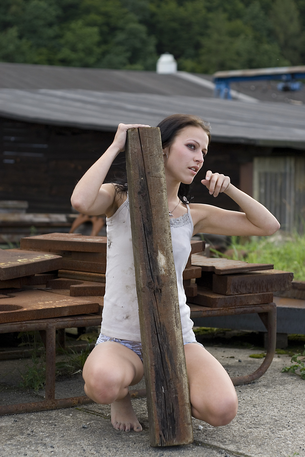
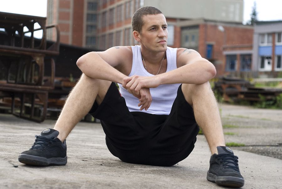
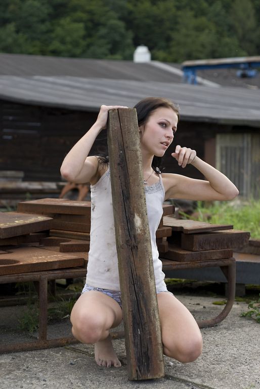
Hi and welcome to my very first portrait attempts which are going to be given to both on the pictures as a gift from me. I mean as a reward that we are good friends. They wanted something unussual, so I decided to go to old factory area...
I´m open to any critic, as these are my first, so what do You thing about them? What to improve, what to take care? any photoshop needed on colours, saturation and so on?
Just a short explanation, photos are taken with my only D200 and a nikkor 50 mm f2 just before rain started.
Here we go...
 |
|
| Back to top |
|
 |
Jesito


Joined: 24 Aug 2007
Posts: 5745
Location: Olivella, Catalonia, (Spain)
Expire: 2015-01-07
|
| Posted: Sun Aug 16, 2009 5:44 am Post subject: |
|
|
Jesito wrote:
Really original compositions, Milanos. Pre-rain situations give a difficult light to manage, but you have resolved it very well.
Thanks for sharing!
Jes.
_________________
Jesito, Moderator 
Jesito's backsack:
Zooms Sigma 70-300, Tamron 35-135 and 70-210 short, 70-210 long, 28-70 CF Macro, 35-70, 35-80, Vivitar 70-210 KA, Tamron 70-250.
Fixed Industar-50, , Tamron 24mm, Tamron 135mm, Sands Hunter 135mm, Pancolar 50mm, Volna-3, many Exakta lenses
DSLR SIGMA SD9 & SD14, EOS 5D, Sony A700 and NEXF3, Oly E-330, E-400, E-450, E-1
TLR/6x6/645 YashicaMat, Petri 6x45, Nettar, Franka Solida, Brilliant
SLR Minolta X300, Fuji STX II, Praktica VLC3, Pentax P30t, EXA500, EXA 1A, Spotmatic(2), Chinon CM-4S, Ricoh, Contax, Konica TC-X , Minolta 5000, 7000i, 3Sxi, EOS 500 and CX
Rangefinders Chinon 35EE, Konica C35 auto, Canonet 28, Yashica Lynx, FED-2, Yashica electro 35, Argus C3 & C4, Regula Cita III, Voigtlander Vitoret (many), Welta Welti-I, Kodak Signette 35, Zorki-4, Bessa-R & L, Minolta Weathermatic, olympus XA2
Compact Film Konica C35V, Voigtlander Vitorets, Canon Prima Super 105, Olympus XA2 and XA3
Compact Digital Olympus C-5050, Aiptek Slim 3000, Canon Powershot A540, Nikon 5200, SIGMA DP1s, Polaroid X530, IXUS55, Kodak 6490, Powershot G9 and G10
CSCCanon EOS-M, Samsung NX100 and NX210, Lumix G5, NEX-F3 |
|
| Back to top |
|
|
zewrak

Joined: 12 Apr 2008
Posts: 1212
|
| Posted: Sun Aug 16, 2009 8:43 am Post subject: |
|
|
zewrak wrote:
Right, I might sound harsh and I am maybe not the one to give critics, I am by no means a professional on the subject (giving criticism nor photography). So take the criticism with a grain of salt.
Picture 1.
There is not many people I want to stare into the crouch of. And none of them are male  . The composition is fine to me. I kind of like that the image is leaning, adds a bit of dynamic in the image. I think that it is a bit too cropped by the foot at the bottom. I like how the arms and hands are placed, thats something thats always hard for me myself, doing something interesting with the arms. I also think that the image really could use some contrast. The face looks a bit flat to me, with no deep shadows, only darker midtones. Also, try getting something shiny next to you, anything that gives some more catchlight in the eyes. Preferably both, there is a small hint of catchlight in his right eye, but the left looks all black to me. . The composition is fine to me. I kind of like that the image is leaning, adds a bit of dynamic in the image. I think that it is a bit too cropped by the foot at the bottom. I like how the arms and hands are placed, thats something thats always hard for me myself, doing something interesting with the arms. I also think that the image really could use some contrast. The face looks a bit flat to me, with no deep shadows, only darker midtones. Also, try getting something shiny next to you, anything that gives some more catchlight in the eyes. Preferably both, there is a small hint of catchlight in his right eye, but the left looks all black to me.
Lastly, I can see in the second picture that there is something, the pole, that gives a "story" to the image, which balances the focus with the model. You think "a model with a pole", rather then "a model". I like that. And it could have been done in this picture aswell. Anything really, a can of soda in his hand. A pack of cigarettes on the ground beside him or whatever really. 
- Crouch, try not to have people spreading their legs to the viewer.
- Lack of contrast.
- Lack of catchlight in eyes.
- Tight crop at bottom, compared to all the other sides that have lots of air.
- Maybe a bit more colour? Im not sure, might be my badly calibrated monitor.
+ Arms and hands adds to the composition, rather then ruining it.
+ Well exposed.
+ Relaxed position, seem rather spontaneus.
Picture 2
This picture is completly in my style. The only negative thing I have to say is that the crop should/could be done differently imho. There is too much air on the top and the left side of the image, for me. Also this image aswell as the first could use some more contrast, but not lacking it as much. Women with dark makeup help here. They give dynamic in the tonal contrast by themselves. I love the arms and hands in this image aswell, well done. I am glad that the pole hides the crouch .
- Crop
+ Dynamics of movement of the model.
+ Intresting pose and expression
+ The pole that adds something to the picture, not making the model the only point of focus.
Very well done for first try. Keep it up.
_________________
My homepage, all manual shots |
|
| Back to top |
|
|
PaulC

Joined: 23 Dec 2008
Posts: 2318
|
| Posted: Sun Aug 16, 2009 10:42 am Post subject: |
|
|
PaulC wrote:
I think the compositions, angle of view and the choice of background show you have considerable creative potential. Zewrak's criticisms are worth thinking about but originality means getting away from established poses and studio-type compositions and you are obviously going for the tough realism, look, which fits your subjects - certainly the first one.
I think the lighting could be better, with the assistance of off-camera flash and reflectors.
_________________
View or buy my photos at:
http://shutterstock.com/g/paulcowan |
|
| Back to top |
|
|
my_photography
Joined: 03 Nov 2008
Posts: 2772
Location: Pearl of the Orient
Expire: 2016-12-25
|
| Posted: Mon Aug 17, 2009 10:26 am Post subject: |
|
|
my_photography wrote:
Overall very nice.
Some minor suggestions:
Pic #1, the light color building on the right is quite distracting to my eye. Maybe you can crop it out?
Pic #2, the background a bit complex.
_________________
Zeiss: CJZ Flektogon 20/2.8, CJZ Flektogon 20/4, , CJZ Pentacon 29/2.8, CJZ Flektogon 35/2.4, CJZ Pancolar 50/1.8, Tessar 50/2.8, Biotar 7.5cm/1.5, CJZ Pancolar 80/1.8, CJZ Sonnar 135/3.5, CJZ Pentacon 135/2.8 CJZ Sonnar 200/2.8
Other Germany: Meyer Primoplan 50/1.8, Meyer Trioplan 100/2.8
Takumar: SMC 50/1.4 Super Tak 55/2, Super Tak 85/1.9, S-M-C 135/3.5, Super Tak 150/4
Russian: Zenith 16/2.8, Mir-24M 2/35, Volna-9 50/2.8, Helios 44M (58/2), Helios 44M-3 MC (58/2), Helios 40 (85/1.5), Tair 11A (135/2.8 )
Others: Sears 28/2.8, Sankor 35/2.8, Enna M�nchen Tele-Ennalyt 135/3.5
Zoom Sigma Zoom 28-85/3.5-4.5
|
|
| Back to top |
|
|
|
|
|
You cannot post new topics in this forum
You cannot reply to topics in this forum
You cannot edit your posts in this forum
You cannot delete your posts in this forum
You cannot vote in polls in this forum
|