| View previous topic :: View next topic |
| Author |
Message |
Laurence


Joined: 26 Mar 2007
Posts: 4809
Location: Western Washington State
Expire: 2016-06-19
|
 Posted: Sat Feb 26, 2011 2:40 am Post subject: NEW Image - Thanks for the Tips! Please Read My First Post Posted: Sat Feb 26, 2011 2:40 am Post subject: NEW Image - Thanks for the Tips! Please Read My First Post |
 |
|
Laurence wrote:
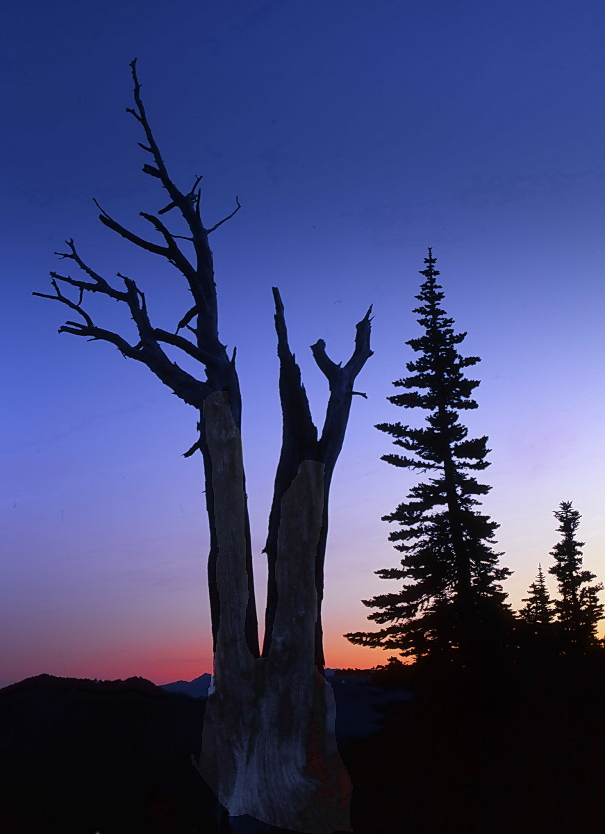
I used the tips, and lo and behold, a MUCH better image. I also happened
to scan on the old Epson 4180 and noticed that there is DEFINITELY a
difference in "banding". The old scanner is better, at least in its current
configuration. Go figure!
I used the tips in relation to ACDSee Pro 3, and the result is similar
to Photoshop. One thing I REALLY like is the Sharpen tool, without
degrading the image. Also, the horizon colors seem more true-to-life.
The sky is still a little messy, and I haven't cloned out any dust, but
overall the image is nicer to me. I also think I could probably utilize
the Lighten tool in the shadows. Also, I am curious to see how the
noise removal , auto color, and auto contrast might work. Supposedly
these do not degrade the image.
Halos are significantly cut down. I still notice artifacts in the sky - these
appeared RIGHT AFTER scanning, without any color manipulations. Also,
the red horizon color took on a different shade right out of the
scanner. 
So, I am happier with this INITIAL image! I'll fool around some more,
of course, to try to optimize the image. It is interesting to me, how the
two different scanners produce some fairly significant variants in the
image that comes right out of the scanner. 
Thanks again for ALL your tips, guys!
Larry
OLD IMAGE
Pentax 645
Pentax-A 75/2.8
f:8 and 1/8 second
Provia 100F
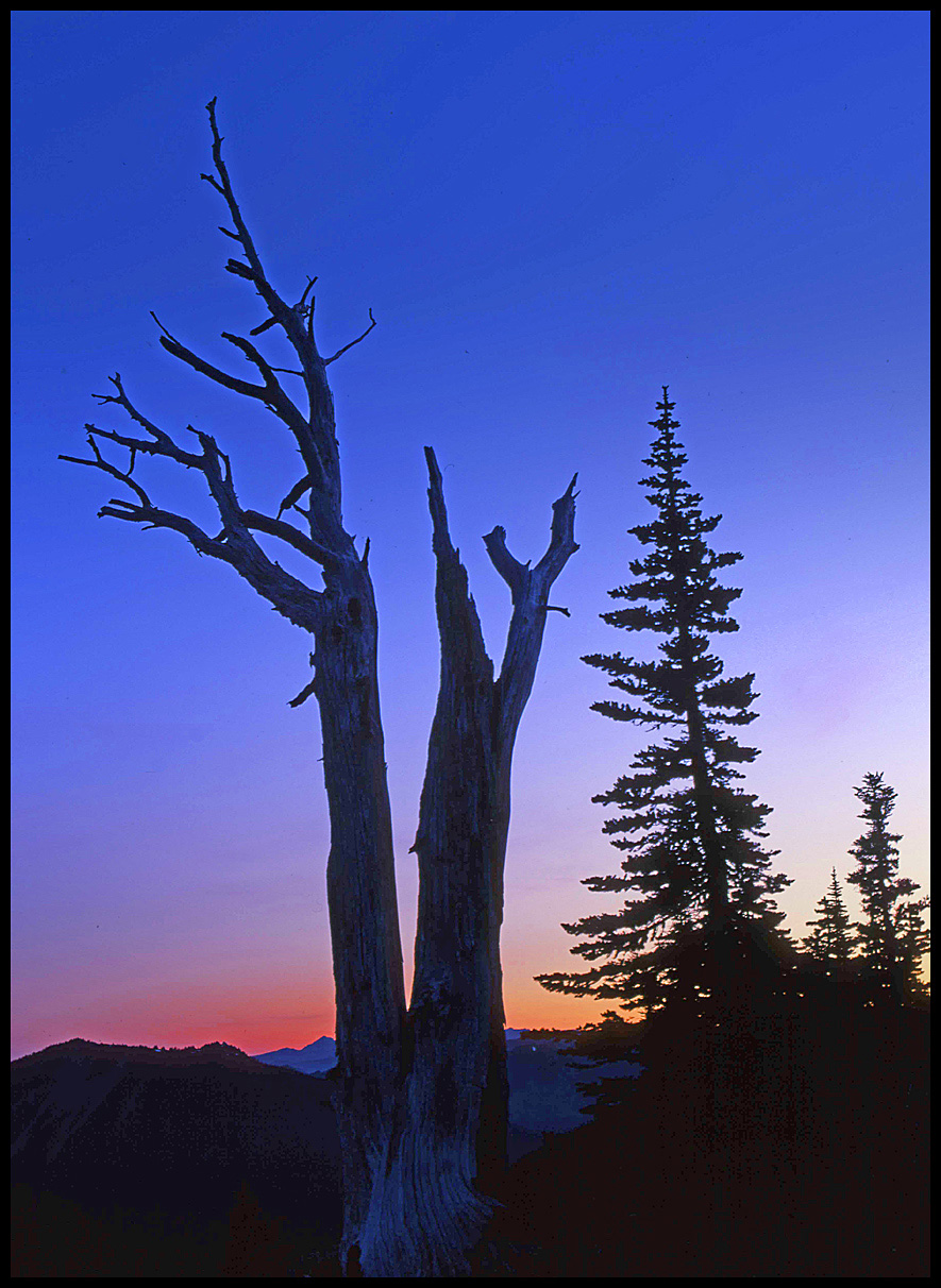
NEW IMAGE
Pentax 645
Pentax-A 75/2.8
f:8 and 1/8 second
Provia 100F

_________________
Assent, and you are sane;
Demur,—you ’re straightway dangerous,
And handled with a chain.
Emily Dickinson
Cameras and Lenses in Use:
Yashica Mat 124 w/ Yashinon 80/3.5,
CV Apo-Lanthar 90/3.5SL, (Thank you Klaus),
Pentax 645,
Flek 50,
Pentax-A 150
Pentax-A 120 Macro
Voigtlander Vitomatic I w/Color Skopar 50/2.8
Konica TC and zoom lenses (thanks Carsten)
Contax AX
Yashica ML 50/2
Yashica ML 35/2.8
Carl Zeiss Contax 50/1.4
Tamron Adaptall SP 17/3.5
Tamron Adaptall 28/2.5
Tamron Adaptall SP 300/2.8 LD (IF)
Last edited by Laurence on Tue Mar 01, 2011 12:16 am; edited 4 times in total |
|
| Back to top |
|
 |
cooltouch

Joined: 15 Jan 2009
Posts: 9096
Location: Houston, Texas
|
| Posted: Sat Feb 26, 2011 3:43 am Post subject: |
|
|
cooltouch wrote:
Once again, a great shot, Larry. Your exposure was just about dead-nuts perfect for slide film. I like the way there is the beginning of color and detail to be seen in the tree's grain at its very base, despite being enveloped in deep shadow.
I'm sure we can all think of an instance when we wished we had a camera at one point in time and didn't. For me, it was when I was commuting to "work" at Fort Lewis (yeah, I was a grunt in the Big Green Machine) early one winter morning and when the bus rounded a curve on the highway, Mt. Rainier sprang into view and the sun was rising directly behind it. There were many small clouds that had become brilliantly illuminated, plus the mountain was afire in the early dawn light. Just a spectacular, and totally unforgettable image. My entire stay at Fort Lewis was worth it for being able to experience that one moment of sunrise.
_________________
Michael
My Gear List: http://michaelmcbroom.com/photo/gear.html
My Gallery: http://michaelmcbroom.com/gallery3/index.php/
My Flickr Page: https://www.flickr.com/photos/11308754@N08/albums
My Music: https://soundcloud.com/michaelmcbroom/albums
My Blog: http://michaelmcbroom.com/blogistan/ |
|
| Back to top |
|
|
Attila

Joined: 24 Feb 2007
Posts: 57865
Location: Hungary
Expire: 2025-11-18
|
| Posted: Sat Feb 26, 2011 11:02 am Post subject: |
|
|
Attila wrote:
Such a beauty picture! I like color of sky pretty much I couldn't reach this success with digital camera in this light situation.
_________________
-------------------------------
Items on sale on Ebay
Sony NEX-7 Carl Zeiss Planar 85mm f1.4, Minolta MD 35mm f1.8, Konica 135mm f2.5, Minolta MD 50mm f1.2, Minolta MD 250mm f5.6, Carl Zeiss Sonnar 180mm f2.8
|
|
| Back to top |
|
|
womble


Joined: 28 Sep 2009
Posts: 987
Location: Hertfordshire
|
| Posted: Sat Feb 26, 2011 1:41 pm Post subject: |
|
|
womble wrote:
Lovely as always Laurence.
Every time I see your images my desire to get a MF Pentax (of either flavour) grows...
Best wishes, Kris.
_________________
Kris Lockyear
Digital: Pentax K-3iii
35mm film SLRs: various Pentax bodies from a H2 to a SF7, favourites the MX and LX
Rangefinder: Zeiss Super Ikonta IV, FED2, Zorkii-4, Industar 26m, Jupiter 8, 11 and 12 lenses
Medium format: various folders, Yashica Mat 124 G. Lubitel 2
LF: Horseman LE 5x4 view camera.
MF lenses (favourites) Pentax "K" 200mm f/2.5; "K" 135mm f/2.5; "K" 50mm f/1.2; "K" 35mm f/2; "K" 30mm f/2.8; "K" 28mm f/3.5 shift; "K" 15mm f/3.5; M 100mm f/2.8; M 40mm f/2.8; Jupiter-9 85mm |
|
| Back to top |
|
|
lahnet

Joined: 10 Apr 2007
Posts: 1164
Location: Denmark
|
| Posted: Sat Feb 26, 2011 3:54 pm Post subject: |
|
|
lahnet wrote:
Top class photo, I admire your talent in seeing motives.
I see some (a lot) of halos on the edges of the tree, specially where the blue colors is deep. Maybe its the scanning...?
_________________
Henrik
Lahnet-Foto
My FLICKR
Gear list |
|
| Back to top |
|
|
cooltouch
Joined: 15 Jan 2009
Posts: 9096
Location: Houston, Texas
|
| Posted: Sat Feb 26, 2011 4:31 pm Post subject: |
|
|
cooltouch wrote:
Might be the USM.
The software I use the most -- Paint Shop Pro -- has a "clarify" command that is a contrast adjustment, similar to "curves," and if the setting is too high for "clarify" it will do the halos.
But the only PP Larry did was USM, so it has to be either that, or the scanner, like you said. If Larry's running his scanner set to an "auto" mode, it might be adjusting the contrast enough to cause this.
_________________
Michael
My Gear List: http://michaelmcbroom.com/photo/gear.html
My Gallery: http://michaelmcbroom.com/gallery3/index.php/
My Flickr Page: https://www.flickr.com/photos/11308754@N08/albums
My Music: https://soundcloud.com/michaelmcbroom/albums
My Blog: http://michaelmcbroom.com/blogistan/ |
|
| Back to top |
|
|
Kram

Joined: 06 Feb 2010
Posts: 1344
Location: Portland, OR
|
| Posted: Sat Feb 26, 2011 7:04 pm Post subject: |
|
|
Kram wrote:
Nice image Larry and if yoy shot that in the past view days, very cold indeedy!
You make me wanna hit the trail! |
|
| Back to top |
|
|
PaulC

Joined: 23 Dec 2008
Posts: 2318
|
| Posted: Sat Feb 26, 2011 8:27 pm Post subject: |
|
|
PaulC wrote:
I agree about the haloes. Looks like the scanner had auto sharpening set. It also looks over-brightened to me, turning silhouettes grey. I'd push the mid-tone slider across to about 80 to fill the shadows.
_________________
View or buy my photos at:
http://shutterstock.com/g/paulcowan |
|
| Back to top |
|
|
Laurence
Joined: 26 Mar 2007
Posts: 4809
Location: Western Washington State
Expire: 2016-06-19
|
| Posted: Sun Feb 27, 2011 1:50 am Post subject: |
|
|
Laurence wrote:
Hello all. THANKS for the suggestions! I'll use those suggestions if I
make a print out of this.
I think that I had Sharpen checked on the Epson software, and I also
applied USM, and certainly DID cause haloing.
As far as the shadowing goes, I didn't do anything for lighting;
however, the tip on the slider is great! I only have Photoshop
Elements 8, but can do the same thing you are suggesting
in a more roundabout way.
What is interesting (to me) is that if the V700 Epson software is used and
set to Professional Mode Automatic, it has a difficult time with images
that have large areas of gradient color.
However the older Epson 4180 Photo scanner does NOT do this ; I'll
try to remember to submit a scan from the 4180 so you can see
what I mean.
Speaking of the 4180, I often don't see a difference from the scan on
that scanner and my V700, at least at 2400dpi resolution. I think that
Epson might have reached a plateau with their flatbeds, once optimized
to 2400. Subsequent upgrades to the scanner don't seem to have really
given a whole lot of difference for the money. Just an opinion, though. 
The main thing I wanted was opinions about the overall image, as I
never know if something is "good or bad" if judging my own images.
So, it sounds like this is a keeper, at least!
Thanks again!
Larry
_________________
Assent, and you are sane;
Demur,—you ’re straightway dangerous,
And handled with a chain.
Emily Dickinson
Cameras and Lenses in Use:
Yashica Mat 124 w/ Yashinon 80/3.5,
CV Apo-Lanthar 90/3.5SL, (Thank you Klaus),
Pentax 645,
Flek 50,
Pentax-A 150
Pentax-A 120 Macro
Voigtlander Vitomatic I w/Color Skopar 50/2.8
Konica TC and zoom lenses (thanks Carsten)
Contax AX
Yashica ML 50/2
Yashica ML 35/2.8
Carl Zeiss Contax 50/1.4
Tamron Adaptall SP 17/3.5
Tamron Adaptall 28/2.5
Tamron Adaptall SP 300/2.8 LD (IF)
|
|
| Back to top |
|
|
shauttra

Joined: 17 Nov 2009
Posts: 778
Location: Latvia
|
| Posted: Sun Feb 27, 2011 5:54 am Post subject: |
|
|
shauttra wrote:
Pinatubo makes great color gradient.
Beautiful photo! 
_________________
Mto-1000, Tair-3, Auto Exaktar 135mm 2,8, Samyang 14mm 2.8,
Jupiter 37A, Carl Zeiss Sonnar 135/3.5,
Helios-44, Mir-1, Revuenon 50/1.4,
Carl Zeiss Pancolar 50/1.8, Samyang 24/1.4, Auto Vivitar 35/2.8
www.radosi.lv
http://shauttra.blogspot.com |
|
| Back to top |
|
|
PaulC
Joined: 23 Dec 2008
Posts: 2318
|
| Posted: Sun Feb 27, 2011 8:26 am Post subject: |
|
|
PaulC wrote:
With my V500 the "pro auto" setting likes to blow out all the highlights and do strange things to the dark end arriving at some average value that I suppose they think reflects what most people are happy with.
I'm still struggling to get output where I keep all the information without distorting the colours. At the moment, I am testing the idea that pulling the sliders for the image out to the edge of the histogram and setting the overall range as wide as possible on the bottom set of sliders maintains the colour if the mid-tone slider is kept at 100. However, the result can have poor contrast and brightness but this can be adjusted using the separate brightness/contrast sliders to give a better result than you get playing around with the histogram and curves.
I've only just hit on this idea and it's worked pretty well for a couple of films but it may not work for all.
I have a feeling that arranging the histogram in this way preserves the orginal exposure balance of the film so it may only work if the exposure was correct in the first place. The trouble with scanning is that it can do so many adjustments that I really can't tell if a negative is "perfectly exposed" or not. Where should the histogram fall in the overall box? Does anybody know? If the graph is shifted far to the left it certainly gives trouble with shadow areas. Too far to the right often seems to be very compressed, so I'm guessing having the middle of it dead centre in the box means a neg is well exposed.
I suppose I could read the instructions, they might say something. But I'm male
_________________
View or buy my photos at:
http://shutterstock.com/g/paulcowan |
|
| Back to top |
|
|
cooltouch
Joined: 15 Jan 2009
Posts: 9096
Location: Houston, Texas
|
| Posted: Sun Feb 27, 2011 3:23 pm Post subject: |
|
|
cooltouch wrote:
Heh. Where's the fun in that?
As to the location of a histogram's curve, you're right, Paul. Correct exposure is to have it centered and with no "clipping" across the top either. Sometimes, though, with something like a deeply saturated blue sky, pure red, etc., I'll get clipping and there's not much that can be done about it.
You know, I didn't mention it earlier because I was not examining Larry's photo with an extremely critical eye, but if you look closely, you'll see some posterization going on in the sky. When I see this in my scans it tells me I've over processed an image. Typically I bumped up the contrast just a bit too much in post.
I have an Epson 4990 and a 3170, and I've been using the Epson Scan software ever since I bought the 3170 new about 7 years ago. I've never had much issues with it. If I have a correctly exposed image, usually I don't mess with the exposure adjustments and I'll leave it on "auto." The only thing I'll typically do is check the box for USM, and I'll have it set to medium. I've found that the level of USM that Epson Scan applies is quite minimal, so I don't worry about any increase in noise it may add because that seems to be minimal as well. The only exception to this is if it is an old image where the color has shifted noticeably, and then I'll click on the color correction setting, and 9 times out of 10, Epson Scan interprets things correctly and gets rid of the color shift.
Larry, If all you did was check ES's USM, I tend not to suspect the scanner is causing the halos and the posterization -- just based on my own experiences. Something else you might want to try though, a tip I picked up from the member "pellicle" over at hybridphoto.com (now dpug.org), is to scan your image reversed, then reverse it in software. I haven't tried this with positives, but I have done it with negatives, and it does seem to work. The results are improved contrast and saturation.
I've just finished looking through a bunch of images I've scanned where lighting was difficult -- especially around sunset where there were shadows and highlighted areas. I couldn't find a single one with halos or posterization. So this tells me that these conditions were most likely caused post-scan.
_________________
Michael
My Gear List: http://michaelmcbroom.com/photo/gear.html
My Gallery: http://michaelmcbroom.com/gallery3/index.php/
My Flickr Page: https://www.flickr.com/photos/11308754@N08/albums
My Music: https://soundcloud.com/michaelmcbroom/albums
My Blog: http://michaelmcbroom.com/blogistan/ |
|
| Back to top |
|
|
Laurence
Joined: 26 Mar 2007
Posts: 4809
Location: Western Washington State
Expire: 2016-06-19
|
| Posted: Sun Feb 27, 2011 6:11 pm Post subject: |
|
|
Laurence wrote:
Good morning...and THANKS you guys for the great information. This
is what I LOVE - suggestions to make an image better, or to at least
give me tips on scanning and post-processing.
Well, I've looked at four images with similar sky tonalities as
this particular image, and none of them had posterization or haloes.
So, all that can lead me to think is that I'm doing something in
post-processing that I'm not aware of?
But that doesn't make sense either to me, as the only thing I
remember doing is USM. I even wrote it down in the little notes that
I keep for images, and it was 20/1/1.
That said, maybe I made a mistake and included what I did with
some scans that I made just before this one. I was "multi-tasking"
with some other things, so who knows?
I don't know too much about post-processing frankly, so that is why I
TRY to use minimal effects from the PSE 8.
I took one of the previous images and applied some of the Shadows /
Highlights sliders and it produced IMMEDIATE posterizing once I hit
a certain degree of strength.
I'm going to do this over again, and see what happens; and I'll keep
notes of each step. Perhaps that will help me see what's going on.
Again, THANKS for the suggestions. This is paramount for improvement,
and I'm grateful that you guys took the time to suggest improvements.
_________________
Assent, and you are sane;
Demur,—you ’re straightway dangerous,
And handled with a chain.
Emily Dickinson
Cameras and Lenses in Use:
Yashica Mat 124 w/ Yashinon 80/3.5,
CV Apo-Lanthar 90/3.5SL, (Thank you Klaus),
Pentax 645,
Flek 50,
Pentax-A 150
Pentax-A 120 Macro
Voigtlander Vitomatic I w/Color Skopar 50/2.8
Konica TC and zoom lenses (thanks Carsten)
Contax AX
Yashica ML 50/2
Yashica ML 35/2.8
Carl Zeiss Contax 50/1.4
Tamron Adaptall SP 17/3.5
Tamron Adaptall 28/2.5
Tamron Adaptall SP 300/2.8 LD (IF)
|
|
| Back to top |
|
|
Attila
Joined: 24 Feb 2007
Posts: 57865
Location: Hungary
Expire: 2025-11-18
|
| Posted: Sun Feb 27, 2011 8:58 pm Post subject: |
|
|
Attila wrote:
Larry take a look on ACDSEE Pro 3.0 now they have clearance sale before 4.0 coming out. Very easy to use it, just a few clicks on every action. I found photoshop is difficult to me. This software works beautifully on scanned tiff , raw file , sharpening, noise reduction , light tunning so easy.
http://store.acdsee.com/store/acd/en_US/DisplayProductDetailsPage/productID.156603200?resid=TWbZnAoHAtUAACSiMEIAAAAV&rests=1298840316811
Trial version is available.
_________________
-------------------------------
Items on sale on Ebay
Sony NEX-7 Carl Zeiss Planar 85mm f1.4, Minolta MD 35mm f1.8, Konica 135mm f2.5, Minolta MD 50mm f1.2, Minolta MD 250mm f5.6, Carl Zeiss Sonnar 180mm f2.8
|
|
| Back to top |
|
|
Laurence
Joined: 26 Mar 2007
Posts: 4809
Location: Western Washington State
Expire: 2016-06-19
|
| Posted: Sun Feb 27, 2011 11:10 pm Post subject: |
|
|
Laurence wrote:
I will do that! THANK YOU for the reference. I am such a busy person
with my work, that I can only rush in and "process" images with scanning
and post work whenever I see an opening of time available. That doesn't
give me time to really learn Photoshop very well.
I'll download it tonight, Attila. 
Thanks again!
_________________
Assent, and you are sane;
Demur,—you ’re straightway dangerous,
And handled with a chain.
Emily Dickinson
Cameras and Lenses in Use:
Yashica Mat 124 w/ Yashinon 80/3.5,
CV Apo-Lanthar 90/3.5SL, (Thank you Klaus),
Pentax 645,
Flek 50,
Pentax-A 150
Pentax-A 120 Macro
Voigtlander Vitomatic I w/Color Skopar 50/2.8
Konica TC and zoom lenses (thanks Carsten)
Contax AX
Yashica ML 50/2
Yashica ML 35/2.8
Carl Zeiss Contax 50/1.4
Tamron Adaptall SP 17/3.5
Tamron Adaptall 28/2.5
Tamron Adaptall SP 300/2.8 LD (IF)
|
|
| Back to top |
|
|
PaulC
Joined: 23 Dec 2008
Posts: 2318
|
| Posted: Tue Mar 01, 2011 6:17 am Post subject: |
|
|
PaulC wrote:
OK. Better. But next we need to look into layers and how you can feather the edge of a selection so it isn't obvious that you have tried to brighten up one area. Also, perhaps, the use of the "magic wand" to select all the bit you want selected and none of the rest.
Are you using photoshop?
_________________
View or buy my photos at:
http://shutterstock.com/g/paulcowan |
|
| Back to top |
|
|
Laurence
Joined: 26 Mar 2007
Posts: 4809
Location: Western Washington State
Expire: 2016-06-19
|
| Posted: Tue Mar 01, 2011 7:39 pm Post subject: |
|
|
Laurence wrote:
| PaulC wrote: |
OK. Better. But next we need to look into layers and how you can feather the edge of a selection so it isn't obvious that you have tried to brighten up one area. Also, perhaps, the use of the "magic wand" to select all the bit you want selected and none of the rest.
Are you using photoshop? |
Hey Paul, I am using photoshop Elements 8. I also recently downloaded
ACDSee Pro 3 which is more "automatic", and has minimal degradation
of the original photo when making changes.
As I still feel photoshop is a very powerful tool, I would appreciate any
thoughts on layers, feathering, etc. I don't want you to have to go out of
your way on this, as time is a valuable commodity. But a quick point-out
of things I could do would be valuable.
Thanks as always,
Larry
_________________
Assent, and you are sane;
Demur,—you ’re straightway dangerous,
And handled with a chain.
Emily Dickinson
Cameras and Lenses in Use:
Yashica Mat 124 w/ Yashinon 80/3.5,
CV Apo-Lanthar 90/3.5SL, (Thank you Klaus),
Pentax 645,
Flek 50,
Pentax-A 150
Pentax-A 120 Macro
Voigtlander Vitomatic I w/Color Skopar 50/2.8
Konica TC and zoom lenses (thanks Carsten)
Contax AX
Yashica ML 50/2
Yashica ML 35/2.8
Carl Zeiss Contax 50/1.4
Tamron Adaptall SP 17/3.5
Tamron Adaptall 28/2.5
Tamron Adaptall SP 300/2.8 LD (IF)
|
|
| Back to top |
|
|
PaulC
Joined: 23 Dec 2008
Posts: 2318
|
| Posted: Tue Mar 01, 2011 9:42 pm Post subject: |
|
|
PaulC wrote:
I'm not sure what you've got in Elements 8 but I can think of two ways to approach this. The best one is probably to make two scans, one for the tree, the other for the background. You can then put the two layers on top of each other and if you have the lighter one on top, select the background using the magic wand tool, put a fairly large "feather" on it (from the "selection" menu), and then delete the background. This should leave the light version of the tree sitting on the dark background with the edges of it faded out so it doesn't have an obvious light to dark transition.
Getting the two layers perfectly on top of each other is a bit complicated, I can't easily explain it but there are tutorials online.
The not quite so good way would be to take either the light or dark version of the image, make a "background copy" using the layers menu, and then use the magic wand or some other tool to roughly select the tree. When you have that done, go to the selection menu, click on "feather" and choose an appropriate number (it depends how large the image is) and then delete either the tree or the background (eraser tool is one way, or just the delete selected instruction) and use the mid-tone slider to adjust the brightness of whichever layer it is that needs adjusting.
Of course, the best way of all would have been to use fill flash in the first place
Anyway, this is a very sketchy instruction since either process is better demonstrated than written about, but the general idea is that if you select something, feather it and then deleted it you end up with a nicely faded edge. If you have two layers on top of each other, then the edges of the deleted bit fade nicely into the other bit.
_________________
View or buy my photos at:
http://shutterstock.com/g/paulcowan |
|
| Back to top |
|
|
Laurence
Joined: 26 Mar 2007
Posts: 4809
Location: Western Washington State
Expire: 2016-06-19
|
| Posted: Wed Mar 02, 2011 6:07 pm Post subject: |
|
|
Laurence wrote:
| PaulC wrote: |
I'm not sure what you've got in Elements 8 but I can think of two ways to approach this. The best one is probably to make two scans, one for the tree, the other for the background. You can then put the two layers on top of each other and if you have the lighter one on top, select the background using the magic wand tool, put a fairly large "feather" on it (from the "selection" menu), and then delete the background. This should leave the light version of the tree sitting on the dark background with the edges of it faded out so it doesn't have an obvious light to dark transition.
Getting the two layers perfectly on top of each other is a bit complicated, I can't easily explain it but there are tutorials online.
The not quite so good way would be to take either the light or dark version of the image, make a "background copy" using the layers menu, and then use the magic wand or some other tool to roughly select the tree. When you have that done, go to the selection menu, click on "feather" and choose an appropriate number (it depends how large the image is) and then delete either the tree or the background (eraser tool is one way, or just the delete selected instruction) and use the mid-tone slider to adjust the brightness of whichever layer it is that needs adjusting.
Of course, the best way of all would have been to use fill flash in the first place
Anyway, this is a very sketchy instruction since either process is better demonstrated than written about, but the general idea is that if you select something, feather it and then deleted it you end up with a nicely faded edge. If you have two layers on top of each other, then the edges of the deleted bit fade nicely into the other bit. |
GREAT info Paul! I can do this, just needed a basic step-by-step, which
you have provided here. I can't thank you enough for taking the time
for this. I will get busy on this the next window of opportunity, as I
would like my images to be as good as possible.
Thanks again! 
_________________
Assent, and you are sane;
Demur,—you ’re straightway dangerous,
And handled with a chain.
Emily Dickinson
Cameras and Lenses in Use:
Yashica Mat 124 w/ Yashinon 80/3.5,
CV Apo-Lanthar 90/3.5SL, (Thank you Klaus),
Pentax 645,
Flek 50,
Pentax-A 150
Pentax-A 120 Macro
Voigtlander Vitomatic I w/Color Skopar 50/2.8
Konica TC and zoom lenses (thanks Carsten)
Contax AX
Yashica ML 50/2
Yashica ML 35/2.8
Carl Zeiss Contax 50/1.4
Tamron Adaptall SP 17/3.5
Tamron Adaptall 28/2.5
Tamron Adaptall SP 300/2.8 LD (IF)
|
|
| Back to top |
|
|
|
|