| View previous topic :: View next topic |
| Author |
Message |
atomstitcher


Joined: 26 Nov 2011
Posts: 67
Location: Oxford, England
|
 Posted: Sun Nov 27, 2011 1:37 am Post subject: Zeiss Distagon T* 2.8/21 ZF.2 - some of my pictures to date Posted: Sun Nov 27, 2011 1:37 am Post subject: Zeiss Distagon T* 2.8/21 ZF.2 - some of my pictures to date |
 |
|
atomstitcher wrote:
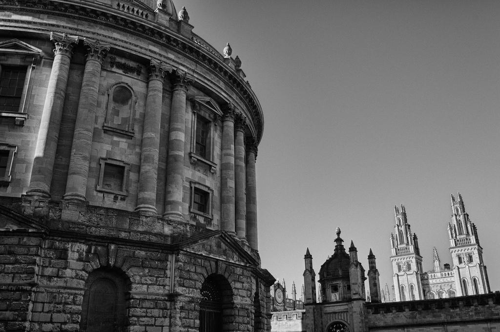
Hi all. I'd just like to share some of my shots taken to date with this amazing lens. I hope you enjoy them.
#1

#2

#3

#4
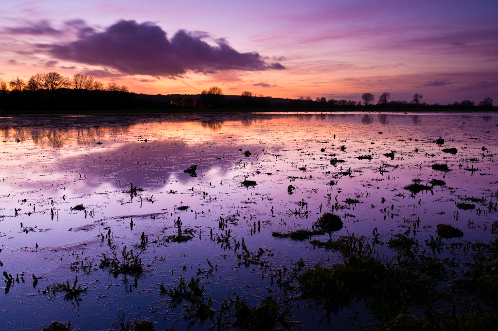
#5

#6

#7
 |
|
| Back to top |
|
 |
adent


Joined: 06 Oct 2011
Posts: 304
Location: United States
|
| Posted: Sun Nov 27, 2011 1:41 am Post subject: |
|
|
adent wrote:
#5  WOW! WOW! |
|
| Back to top |
|
|
rbelyell


Joined: 13 Oct 2009
Posts: 4269
Location: somewhere in the mountains of central NY
Expire: 2014-01-31
|
| Posted: Sun Nov 27, 2011 2:08 am Post subject: |
|
|
rbelyell wrote:
bravo! well done ! half is the great lens but half is the photographer. what camera did you use?
_________________
Epson RD1 + Elmarit 21/2.8; Summarit 50/1.5; Summarit 75/2.5; Elmar-c 90/4; Sankyo Komura 135/2.8, Hektor 135/4.5; Braun Paxina 29 6x6; Photax Boyer Paris; Holga 120 Pano
GREAT STUFF FOR SALE:
Contax T
Hasselblad XPan + 45/4, 90/4
Kodak Retina Reflex IV + full set of Schneider Krueznach lenses
Mercury 2 half frame 35mm
Kodak Pro slr/n
Fuji GM670+100/3.5+65/8!
Praktisix 6x6 medium format + ZeissBiometar 120/2.8
Bessa T 101 Anniversary Edition in Navy Blue
Mamiya Six Folder with Zuiko 75/3.5
Adaptall: Tamron SP 28-85 macro
Cameras: Canon IX
PM for more complete descriptions/pix. All in great shape!
_________________________
'buy me a drink, sing me a song,
take me as i come 'cause i can't stay long' |
|
| Back to top |
|
|
atomstitcher
Joined: 26 Nov 2011
Posts: 67
Location: Oxford, England
|
| Posted: Sun Nov 27, 2011 2:21 am Post subject: |
|
|
atomstitcher wrote:
| rbelyell wrote: |
| bravo! well done ! half is the great lens but half is the photographer. what camera did you use? |
Thanks for the comments 
They're all shot on a Nikon D300s. |
|
| Back to top |
|
|
natebarnz

Joined: 14 Jan 2010
Posts: 331
Location: Los Angeles / Tucson
Expire: 2013-01-23
|
| Posted: Sun Nov 27, 2011 4:14 am Post subject: |
|
|
natebarnz wrote:
fantastic series. Thanks for sharing!
_________________
500D / SPII / FTn / Contax D / 137MA / Contaflex
Contax 28/2 - 35/1.4 - 35/2.8 - 45/2.8 - 50/1.4 - 100/3.5 - 135/2.8
CZJ 20/4 - 35/2.8 - 50/2.8 - 58/2 - 135/3.5
Rokkor PG 58/1.2 - PF 58/1.4 - X 85/1.7
Nikkor S 55/1.2 - H 85/1.8 - P.C. 55/3.5
Helios 44-2 58/2 Meyer Oreston 50/1.8
Elmarit-R 90/2.8 Sears 55/1.4
--> Visit My Picasa Galleries <-- |
|
| Back to top |
|
|
peterqd

Joined: 28 Feb 2007
Posts: 7448
Location: near High Wycombe, UK
Expire: 2014-01-04
|
| Posted: Sun Nov 27, 2011 4:23 am Post subject: |
|
|
peterqd wrote:
Beautiful! When I saw the first one I thought "That's not Oxford!" But I recognise one or two others. Is that Port Meadow in No 3?
_________________
Peter - Moderator |
|
| Back to top |
|
|
atomstitcher
Joined: 26 Nov 2011
Posts: 67
Location: Oxford, England
|
| Posted: Sun Nov 27, 2011 4:28 am Post subject: |
|
|
atomstitcher wrote:
| peterqd wrote: |
| Beautiful! When I saw the first one I thought "That's not Oxford!" But I recognise one or two others. Is that Port Meadow in No 3? |
Yep, 3 and 7 are both Port Meadow. |
|
| Back to top |
|
|
BRunner

Joined: 29 Jul 2009
Posts: 705
Location: Czech Republic
|
| Posted: Sun Nov 27, 2011 8:46 am Post subject: |
|
|
BRunner wrote:
| natebarnz wrote: |
| fantastic series. Thanks for sharing! |
+1
_________________
.: APO-Maniac :. |
|
| Back to top |
|
|
IAZA

Joined: 16 Apr 2010
Posts: 2587
Location: Indonesia
|
| Posted: Sun Nov 27, 2011 4:00 pm Post subject: |
|
|
IAZA wrote:
it looks like picture in calender...well done
_________________
nex5, Olympus EPM1, yashica half 14, Canon eos 650 want to see samples of mine? please click My lenses
and My gallery
~Suat~ |
|
| Back to top |
|
|
poilu
Joined: 26 Aug 2007
Posts: 10471
Location: Greece
Expire: 2019-08-29
|
| Posted: Sun Nov 27, 2011 4:23 pm Post subject: |
|
|
poilu wrote:
superb series, nice selection!
_________________
T* |
|
| Back to top |
|
|
kds315*

Joined: 12 Mar 2008
Posts: 16544
Location: Weinheim, Germany
Expire: 2021-03-09
|
| Posted: Sun Nov 27, 2011 5:09 pm Post subject: |
|
|
kds315* wrote:
Very well done indeed!
_________________
Klaus - Admin
"S'il vient a point, me souviendra" [Thomas Bohier (1460-1523)]
http://www.macrolenses.de for macro and special lens info
http://www.pbase.com/kds315/uv_photos for UV Images and lens/filter info
https://www.flickr.com/photos/kds315/albums my albums using various lenses
http://photographyoftheinvisibleworld.blogspot.com/ my UV BLOG
http://www.travelmeetsfood.com/blog Food + Travel BLOG
https://galeriafotografia.com Architecture + Drone photography
Currently most FAV lens(es):
X80QF f3.2/80mm
Hypergon f11/26mm
ELCAN UV f5.6/52mm
Zeiss UV-Planar f4/60mm
Zeiss UV-Planar f2/62mm
Lomo Уфар-12 f2.5/41mm
Lomo Зуфар-2 f4.0/350mm
Lomo ZIKAR-1A f1.2/100mm
Nikon UV Nikkor f4.5/105mm
Zeiss UV-Sonnar f4.3/105mm
CERCO UV-VIS-NIR f1.8/45mm
CERCO UV-VIS-NIR f4.1/94mm
CERCO UV-VIS-NIR f2.8/100mm
Steinheil Quarzobjektiv f1.8/50mm
Pentax Quartz Takumar f3.5/85mm
Carl Zeiss Jena UV-Objektiv f4/60mm
NYE OPTICAL Lyman-Alpha II f1.1/90mm
NYE OPTICAL Lyman-Alpha I f2.8/200mm
COASTAL OPTICS f4/60mm UV-VIS-IR Apo
COASTAL OPTICS f4.5/105mm UV-Micro-Apo
Pentax Ultra-Achromatic Takumar f4.5/85mm
Pentax Ultra-Achromatic Takumar f5.6/300mm
Rodenstock UV-Rodagon f5.6/60mm + 105mm + 150mm
|
|
| Back to top |
|
|
ManualFocus-G

Joined: 29 Dec 2008
Posts: 6624
Location: United Kingdom
Expire: 2014-11-24
|
| Posted: Sun Nov 27, 2011 5:15 pm Post subject: |
|
|
ManualFocus-G wrote:
Wonderful series, thanks for sharing!
_________________
Graham - Moderator 
Shooter of choice: Fujifilm X-T20 with M42, PB and C/Y lenses
See my Flickr photos at http://www.flickr.com/photos/manualfocus-g |
|
| Back to top |
|
|
torbod

Joined: 31 Jan 2010
Posts: 379
Location: Sweden
|
| Posted: Sun Nov 27, 2011 7:13 pm Post subject: |
|
|
torbod wrote:
Great series. I love #5 BTW.
/T
_________________
For Sale or Trade: Pick from the list below.
Manual Lenses: CV 15 4.5 | MIR-20H 20 3.5 | Elmarit-R 28 2.8 | Flektogon MC 35 2.4 | S-M-C Tak 50 1.4 | Rollei 50 1.8 HFT | Helios 44-3 MC 58 2 | MC ROKKOR-X 58 1.2 | MacroPlanar 60 2.8 | Vega-12b 90 2.8 | Tamron 52B 90 2.5 | CZJ 135 3.5 | Jupiter-21A 200 4 | Tair-3s 300 4.5 | KOHBEPTEP K-1 | Takumar x2 |
Camera: Sony Nex 5N |
|
|
| Back to top |
|
|
pich900

Joined: 10 Jun 2007
Posts: 1745
Location: The Netherlands/Zwolle
Expire: 2012-12-27
|
| Posted: Sun Nov 27, 2011 7:57 pm Post subject: |
|
|
pich900 wrote:
Great serie and great lens for sure....the colours of #5 are just amazing .....
_________________
All my lenses are for sale, nikkor, Angenieux, Zeiss etc.....
Regards,
Pascal
-------------------------------------------------------
Nikon D700 |
|
| Back to top |
|
|
hemmo

Joined: 30 Mar 2010
Posts: 504
Location: Helsinki, Finland
Expire: 2016-12-17
|
| Posted: Sun Nov 27, 2011 10:38 pm Post subject: |
|
|
hemmo wrote:
| pich900 wrote: |
| Great serie and great lens for sure....the colours of #5 are just amazing ..... |
+1
_________________
500px l � .. ? l Jalbum |
|
| Back to top |
|
|
Attila

Joined: 24 Feb 2007
Posts: 57849
Location: Hungary
Expire: 2025-11-18
|
| Posted: Sun Nov 27, 2011 11:37 pm Post subject: |
|
|
Attila wrote:
Not the lens it is YOU! Stunning!!
_________________
-------------------------------
Items on sale on Ebay
Sony NEX-7 Carl Zeiss Planar 85mm f1.4, Minolta MD 35mm f1.8, Konica 135mm f2.5, Minolta MD 50mm f1.2, Minolta MD 250mm f5.6, Carl Zeiss Sonnar 180mm f2.8
|
|
| Back to top |
|
|
atomstitcher
Joined: 26 Nov 2011
Posts: 67
Location: Oxford, England
|
| Posted: Mon Nov 28, 2011 12:08 am Post subject: |
|
|
atomstitcher wrote:
Thanks all for the kind words |
|
| Back to top |
|
|
andyw

Joined: 15 Aug 2009
Posts: 624
Location: Surrey. UK
|
| Posted: Tue Nov 29, 2011 12:51 pm Post subject: |
|
|
andyw wrote:
A W E S O M E !
_________________
Andy
My Flickr |
|
| Back to top |
|
|
themoleman342

Joined: 21 Oct 2007
Posts: 2190
Location: East Coast (CT), U.S.A.
Expire: 2013-01-24
|
| Posted: Tue Nov 29, 2011 9:31 pm Post subject: |
|
|
themoleman342 wrote:
#5 jumps out at me not only for the colors (which are spectacular) but also for the definition between the tiny leaves. I think most 21mm lenses would turn the scene into mud. |
|
| Back to top |
|
|
stingOM

Joined: 27 Sep 2007
Posts: 3168
Location: Ireland
Expire: 2012-12-27
|
| Posted: Tue Nov 29, 2011 9:38 pm Post subject: |
|
|
stingOM wrote:
| adent wrote: |
| #5 WOW! |
+1  Stunning images indeed! Stunning images indeed! |
|
| Back to top |
|
|
Orio

Joined: 24 Feb 2007
Posts: 29545
Location: West Emilia
Expire: 2012-12-04
|
| Posted: Tue Nov 29, 2011 10:58 pm Post subject: |
|
|
Orio wrote:
I like #2 very much (my favourite), and also the delicate nuances of #3
In #5 I like much the composition, but I think that the colours are quite over the top. The super saturation
makes all the greens (moss, ferns, leaves) look the same, and there is a part of trunk that looks almost as orange as the leaves.
Also bringing all colours to the maximum saturation has the effect of flattening the natural depth suggested
by the composition.
In my opinion, of course.
_________________
Orio, Administrator
T*
NE CEDE MALIS AUDENTIOR ITO
Ferrania film is reborn! http://www.filmferrania.it/
Support the Ornano film chemicals company and help them survive!
http://forum.mflenses.com/ornano-chemical-products-t55525.html |
|
| Back to top |
|
|
atomstitcher
Joined: 26 Nov 2011
Posts: 67
Location: Oxford, England
|
| Posted: Wed Nov 30, 2011 1:37 am Post subject: |
|
|
atomstitcher wrote:
| Orio wrote: |
I like #2 very much (my favourite), and also the delicate nuances of #3
In #5 I like much the composition, but I think that the colours are quite over the top. The super saturation
makes all the greens (moss, ferns, leaves) look the same, and there is a part of trunk that looks almost as orange as the leaves.
Also bringing all colours to the maximum saturation has the effect of flattening the natural depth suggested
by the composition.
In my opinion, of course. |
#2 is also one of my favourites that I've ever taken. It's hard to put my finger on exactly why though; I think there's something about the tension in the lines and the contrasting tones which just works well.
Point taken about #5. I also often think I went overboard with the saturation. In fairness it was partly caused by a weird inconsistency in the colours in Opera on my macbook, which caused me to oversaturate the colours in Lightroom to try and get them looking correct after upload; when I then viewed the uploaded image on my desktop it looked too saturated, and that is the version shown here. Oh well, live and learn. I guess the moral of the story is not to do colour editing on my laptop. I appreciate the CC though. |
|
| Back to top |
|
|
Siswono
Joined: 06 Jan 2009
Posts: 98
Location: Hamburg - Germany
|
| Posted: Sat Dec 10, 2011 7:14 pm Post subject: |
|
|
Siswono wrote:
Wooooo ..... excellent!!! |
|
| Back to top |
|
|
jsigone
Joined: 21 Oct 2011
Posts: 30
Location: San Diego, CA
|
| Posted: Mon Dec 12, 2011 4:59 pm Post subject: |
|
|
jsigone wrote:
really nice colors and comp  |
|
| Back to top |
|
|
|
|
|
You cannot post new topics in this forum
You cannot reply to topics in this forum
You cannot edit your posts in this forum
You cannot delete your posts in this forum
You cannot vote in polls in this forum
|


