| View previous topic :: View next topic |
| Author |
Message |
themoleman342


Joined: 21 Oct 2007
Posts: 2190
Location: East Coast (CT), U.S.A.
Expire: 2013-01-24
|
 Posted: Thu Jul 21, 2011 6:47 pm Post subject: Soviet Start - Helios 44 + 40 - Delta 100 Posted: Thu Jul 21, 2011 6:47 pm Post subject: Soviet Start - Helios 44 + 40 - Delta 100 |
 |
|
themoleman342 wrote:
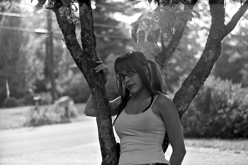
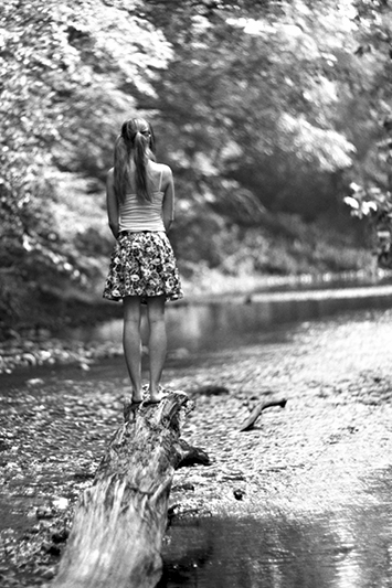
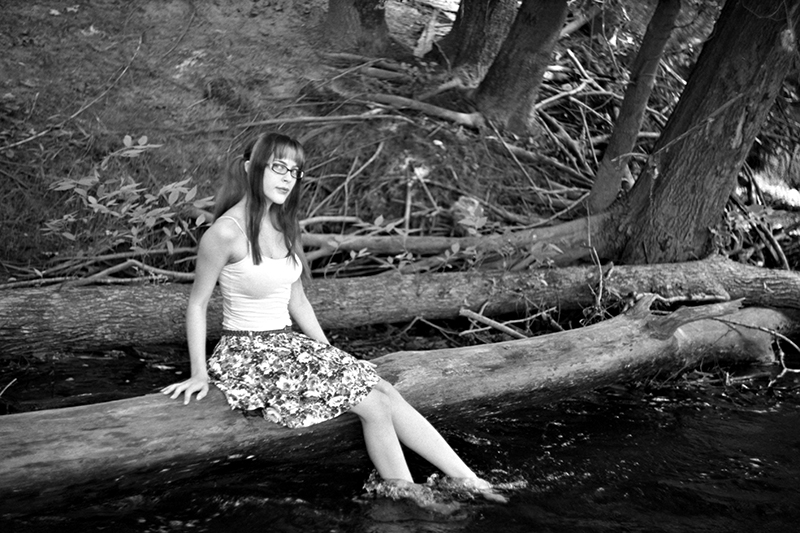
Here are a few pictures of my favorite subject, Anastasia, with the standard start-bayonet mount Helios 44 and Helios 40 (m39 adapter needed). All from the same roll. Taken in ~1/2 hour. Developed in Xtol 1:1 for 7:15 (chems were a little too warm).
I am really looking for some constructive C&Cs, so please. I would greatly greatly appreciate it. More photos to follow from this roll.


Thanks for looking!
~Marc |
|
| Back to top |
|
 |
Nesster


Joined: 24 Apr 2008
Posts: 5883
Location: NJ, USA
Expire: 2014-02-20
|
| Posted: Thu Jul 21, 2011 7:04 pm Post subject: |
|
|
Nesster wrote:
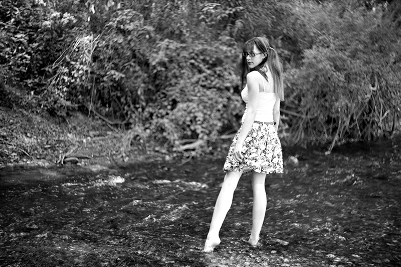
 6 especially pops out! 6 especially pops out!
_________________
-Jussi
Camera photos
Print Photographica
|
|
| Back to top |
|
|
womble

Joined: 28 Sep 2009
Posts: 987
Location: Hertfordshire
|
| Posted: Thu Jul 21, 2011 7:06 pm Post subject: |
|
|
womble wrote:
Personally I really like the sixth one because there is a good separation of the subject from the background, she really pops out of the picture at you. Some of the others don't have the same 'pop' if that is the right word. The first image doesn't work for me because she is in shadow compared to the background and therefore looks a little gray.
I also like the last one! A nice surprising graphic image.
On the whole I think that they are rather good (I am hopeless at photographing people) but as you wanted some C&C I have just said what I feel about them.
Best wishes, Kris.
_________________
Kris Lockyear
Digital: Pentax K-3iii
35mm film SLRs: various Pentax bodies from a H2 to a SF7, favourites the MX and LX
Rangefinder: Zeiss Super Ikonta IV, FED2, Zorkii-4, Industar 26m, Jupiter 8, 11 and 12 lenses
Medium format: various folders, Yashica Mat 124 G. Lubitel 2
LF: Horseman LE 5x4 view camera.
MF lenses (favourites) Pentax "K" 200mm f/2.5; "K" 135mm f/2.5; "K" 50mm f/1.2; "K" 35mm f/2; "K" 30mm f/2.8; "K" 28mm f/3.5 shift; "K" 15mm f/3.5; M 100mm f/2.8; M 40mm f/2.8; Jupiter-9 85mm |
|
| Back to top |
|
|
themoleman342
Joined: 21 Oct 2007
Posts: 2190
Location: East Coast (CT), U.S.A.
Expire: 2013-01-24
|
| Posted: Thu Jul 21, 2011 7:20 pm Post subject: |
|
|
themoleman342 wrote:
Thank you. #1 was a little difficult. I liked the image but it had some considerable flare. I did what I could to salvage it but yes, agreed, it's still not as strong as the others.
Just realized that I forgot to desaturate the 8th so its got a bit of a color tone. I'll fix it when I upload some others. |
|
| Back to top |
|
|
danikatia

Joined: 13 Nov 2009
Posts: 653
Location: Cernobbio Italy
Expire: 2013-10-26
|
| Posted: Thu Jul 21, 2011 9:52 pm Post subject: |
|
|
danikatia wrote:
I like them all!!
_________________
Daniele |
|
| Back to top |
|
|
Orio

Joined: 24 Feb 2007
Posts: 29545
Location: West Emilia
Expire: 2012-12-04
|
| Posted: Thu Jul 21, 2011 10:11 pm Post subject: |
|
|
Orio wrote:
ok, my opinion:
- I really like #1. I like the proximity. I don't mind the flare, it adds to the atmosphere.
- I love the slight colour tone of #8. If an accident, then happy accident.
- in my opinion, the Helios-44 is not the lens for shooting with background of forest. With waters (which flows, a fact that automatically softens the blur), it works magic. With leaves, the background constantly clashes with the foreground for attention.
Solutions? Either use a lens that gives a softer blur (SMC Takumar 1.4/50 for instance), or stop down a bit. Even one stop might help.
Another possiblity: use a soft focus filter (or gel or other tricks like that). Actually gel is better than filter, because you can place gel selectively only where you need it. Gel would soften the background highlights giving the subject more room to breathe.
Of course, you may actually love the "wide open background leaves effect", in which case you may ignore the above 
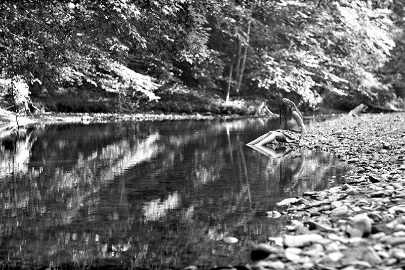
- for some of the poses (namely #4 and #6) I would have definitely used a tele lens of at least 85mm FL.
- overall, I think that some more proximity to the subject would help. Proximity communicates more emotion. it is worth sometimes to sacrifice some background in order to charge the image with more emotion. An example? Photo #8, which, in my opinion, is the best one, together with #1
- congratulations, really an interesting series and a visually challenging one (not banal).
_________________
Orio, Administrator
T*
NE CEDE MALIS AUDENTIOR ITO
Ferrania film is reborn! http://www.filmferrania.it/
Support the Ornano film chemicals company and help them survive!
http://forum.mflenses.com/ornano-chemical-products-t55525.html |
|
| Back to top |
|
|
themoleman342
Joined: 21 Oct 2007
Posts: 2190
Location: East Coast (CT), U.S.A.
Expire: 2013-01-24
|
| Posted: Thu Jul 21, 2011 11:34 pm Post subject: |
|
|
themoleman342 wrote:
Thank you Orio, I value your opinion.
| Quote: |
| - I love the slight colour tone of #8. If an accident, then happy accident. |
It is the tone derived from the negatives themselves. Because scanning as color is always recommended, even for b&w, the scans require saturation for true b&w images. I'm glad you like that though, maybe I will consider a slight digital toning for the series.
In response to your third point. I do actually like the 'swirl' the Helios' produce. I suppose I'm a fan of this non-traditional bokeh in part because the average photography-disinclined person can recognize it. I have and have had many many lenses that create more neutral and soft backgrounds. To me these lenses, aside from available dof, still create an image similar to a quality point-and-shoot. This isn't a bad thing per se, just an attempt to create an image with more character. I know as a member of this forum Helios swirl pictures are common place and perhaps over-saturated but to the common onlooker, at least in my experience, it's considerably unique. That being said, just in terms of mechanics, the Takumar would not be an option. The Start accepts the Helios 44 with a special bayonet and ZM39 lenses via an adapter. I had the Mir 1, Helios 44, Helios 40, and Jupiter 9 with me that day.
| Quote: |
| - for some of the poses (namely #4 and #6) I would have definitely used a tele lens of at least 85mm FL. |
These two photos were in fact taken with the Helios 40.
| Quote: |
| Proximity communicates more emotion. it is worth sometimes to sacrifice some background in order to charge the image with more emotion. An example? Photo #8, which, in my opinion, is the best one, together with #1 |
I have a good deal of photos that are closer to Stasia. I decided to not include them in this initial series because I found these to be more interesting. Maybe I miscalculated...
Thank you, this is the kind of C&Cs I love! This forum is fantastic.
As a side note, I was also using the WLF with the Start camera which makes vertical compositions very difficult...so there are none. |
|
| Back to top |
|
|
Orio
Joined: 24 Feb 2007
Posts: 29545
Location: West Emilia
Expire: 2012-12-04
|
| Posted: Thu Jul 21, 2011 11:42 pm Post subject: |
|
|
Orio wrote:
| themoleman342 wrote: |
| Quote: |
| - for some of the poses (namely #4 and #6) I would have definitely used a tele lens of at least 85mm FL. |
These two photos were in fact taken with the Helios 40. |
OK, then in that case, I'd say increase it to 180mm 
If I make a frame with my hands, and crop out a 20% on the left and a 20% on the right of photo #4, what is left in looks much more powerful to me.
_________________
Orio, Administrator
T*
NE CEDE MALIS AUDENTIOR ITO
Ferrania film is reborn! http://www.filmferrania.it/
Support the Ornano film chemicals company and help them survive!
http://forum.mflenses.com/ornano-chemical-products-t55525.html |
|
| Back to top |
|
|
mmelvis
Joined: 24 May 2010
Posts: 1326
Location: Florida,USA
Expire: 2015-05-09
|
| Posted: Fri Jul 22, 2011 12:52 am Post subject: |
|
|
mmelvis wrote:
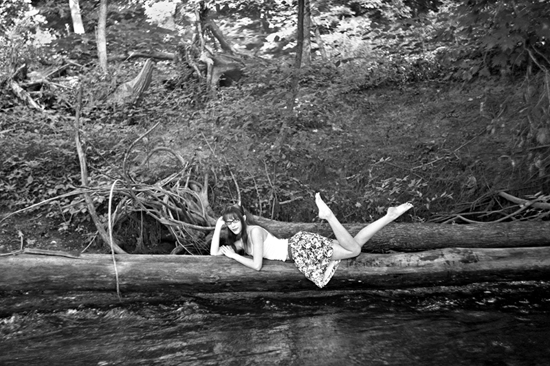
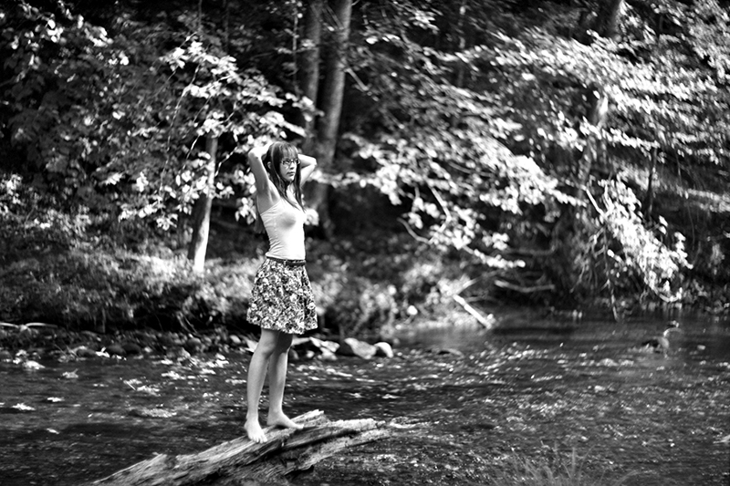
The 4th picture stands out in the group. The model resembles a pixie in the woods. You can only imagine what type of mischief she has been up to or what trouble she is about to cause. The tree roots just off to the side of her head are the entrance to the magical world where she resides. She has only come over to side to visit for a short time. The photo leads the mind to wander and allows you to look into the scene and create your own story. This is what makes this photo my choice of the group. |
|
| Back to top |
|
|
Olivier

Joined: 18 Feb 2009
Posts: 5076
Location: France
Expire: 2015-08-06
|
| Posted: Fri Jul 22, 2011 9:32 pm Post subject: |
|
|
Olivier wrote:
Hello Anastasia.
Welcome back. I'm wondering which colour is her hair.
I like these B&Ws very much. It gives a nice atmosphere.
About C/Cs, I would say same as Orio about the laying pose.
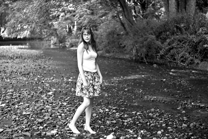
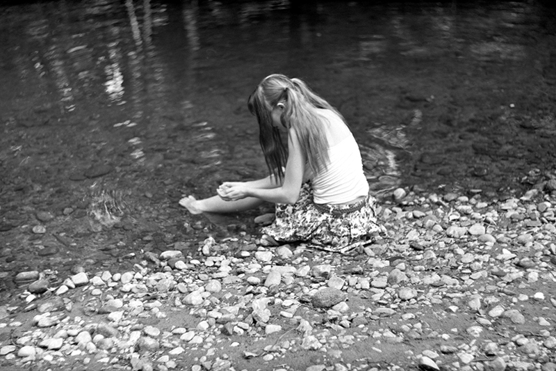
Else, I find that model is often too much centered. For instance, I feel it would add to the photo if she were decentered on #2 and #6.
I would try #5 in vertical (or square).
something like that ?
_________________
Olivier - Moderator 
Dslr : Olympus Pen E-P2 - Fujifilm X-Pro2 - Canon 5D MkII.
SLr and MF lenses : for feedback and helping people, cameras and lenses I own : full list here http://forum.mflenses.com/viewtopic,p,1442740.html#1442740 |
|
| Back to top |
|
|
themoleman342
Joined: 21 Oct 2007
Posts: 2190
Location: East Coast (CT), U.S.A.
Expire: 2013-01-24
|
| Posted: Fri Jul 22, 2011 10:58 pm Post subject: |
|
|
themoleman342 wrote:
| Quote: |
| I'm wondering which colour is her hair. |

| Quote: |
About C/Cs, I would say same as Orio about the laying pose.
Else, I find that model is often too much centered. |
The centered compositions are somewhat a consequence of the camera. This is only my second time using the Start and the focusing screen is very difficult to get used to. It's a very large split-screen (too large) surrounded by matte glass. No fresnel ring or anything. This glass is severely curved at the top making for considerable edge distortion. I felt uncomfortable moving stasia from the center because it would be a total guess on focusing at that point. I'm actually in the process of finding an alternative screen that could be adapted non-destructively.
I really like the cropping you did. Maybe I will revise the set at some point and re-submit them. If people are interested that is... I wanted to show these more-or-less how they were taken.
Some more?
Flare strikes again!

 |
|
| Back to top |
|
|
Orio
Joined: 24 Feb 2007
Posts: 29545
Location: West Emilia
Expire: 2012-12-04
|
| Posted: Fri Jul 22, 2011 11:47 pm Post subject: |
|
|
Orio wrote:
I really like the second one of this second set, but I would have framed differently: put right and upper edge next to Anastasia, and show instead the rest of the bench and her feet. I really miss the feet in this photo.
I find the written bench and the pose of Anastasia very, very good.
_________________
Orio, Administrator
T*
NE CEDE MALIS AUDENTIOR ITO
Ferrania film is reborn! http://www.filmferrania.it/
Support the Ornano film chemicals company and help them survive!
http://forum.mflenses.com/ornano-chemical-products-t55525.html |
|
| Back to top |
|
|
tikkathree

Joined: 19 Jun 2010
Posts: 755
Location: Lovely Suffolk in Great Britain
Expire: 2012-12-28
|
| Posted: Sat Jul 23, 2011 4:45 am Post subject: |
|
|
tikkathree wrote:
Yes, I like them all too. I like the variety among them - in some she's almost overexposed, others she's understated.
It's clear that you enjoy your subject and well done for trying different things.
She looks to be a willing subject too which always helps.
_________________
I used to think digital was fun but then I discovered film, then I found old lenses and then, eventually I found rangefinders.
EOS 5DII, loadsalenses
Canon G9 IR conv,
MF: TLR, 645 and folders
35mm: Oly OM Pro bodies 1, 2, 3 and 4; Soviet RF kit |
|
| Back to top |
|
|
Olivier
Joined: 18 Feb 2009
Posts: 5076
Location: France
Expire: 2015-08-06
|
| Posted: Sat Jul 23, 2011 5:05 pm Post subject: |
|
|
Olivier wrote:
In this second serie, I really love #5 and #6 ! 
_________________
Olivier - Moderator
Dslr : Olympus Pen E-P2 - Fujifilm X-Pro2 - Canon 5D MkII.
SLr and MF lenses : for feedback and helping people, cameras and lenses I own : full list here http://forum.mflenses.com/viewtopic,p,1442740.html#1442740 |
|
| Back to top |
|
|
themoleman342
Joined: 21 Oct 2007
Posts: 2190
Location: East Coast (CT), U.S.A.
Expire: 2013-01-24
|
| Posted: Sat Jul 23, 2011 11:13 pm Post subject: |
|
|
themoleman342 wrote:
So in my last post I mentioned the ground-glass being an issue. I was searching for alternatives that would make no alterations to the mounting or the original glass but be better for focusing on people (something a large split-screen is not great for, imho).
I have many many available plastic screens from various cameras. I even cut one and it works really well, just haven't found an innovative way to secure it. The original ground-glass is quite thick. About ~6mm at it's widest point. The top is curved which, I assume, acts somewhat like fresnel lens breaking but is most likely the cause of the serious edge distortion.
I contacted Steve Hopf, a trusted name in custom large format ground-glass, who also offers smaller pieces for dof and 35mm applications. I gave him the measurements. All said and done it was $20. It should be able to fall into place and clip down just like the original. It will be a matte screen which I'm getting used to now because of the Sony a850. I suspect there will be light falloff towards the edges but it will allow me to compose better towards them because edge distortion will be minimized. The only question is whether it will have an acceptable brightness vs. contrast. But for $20, it was worth a shot. I will report when I get it.
~Marc |
|
| Back to top |
|
|
poilu
Joined: 26 Aug 2007
Posts: 10471
Location: Greece
Expire: 2019-08-29
|
| Posted: Sat Jul 23, 2011 11:34 pm Post subject: |
|
|
poilu wrote:
I am not really in love with this strange bokeh especially in b&w
but I like Anastasia and your compositions
#6 is my favorite
I don't like Olivier crop, decentered don't work for me on this one
_________________
T* |
|
| Back to top |
|
|
|
|
|
You cannot post new topics in this forum
You cannot reply to topics in this forum
You cannot edit your posts in this forum
You cannot delete your posts in this forum
You cannot vote in polls in this forum
|