| View previous topic :: View next topic |
| Author |
Message |
alaios

Joined: 24 Jan 2014
Posts: 724
|
 Posted: Tue Jan 06, 2015 4:45 pm Post subject: Post processing a wedding Posted: Tue Jan 06, 2015 4:45 pm Post subject: Post processing a wedding |
 |
|
alaios wrote:
Hi there,
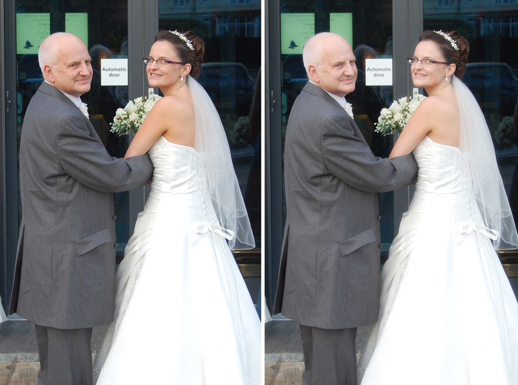
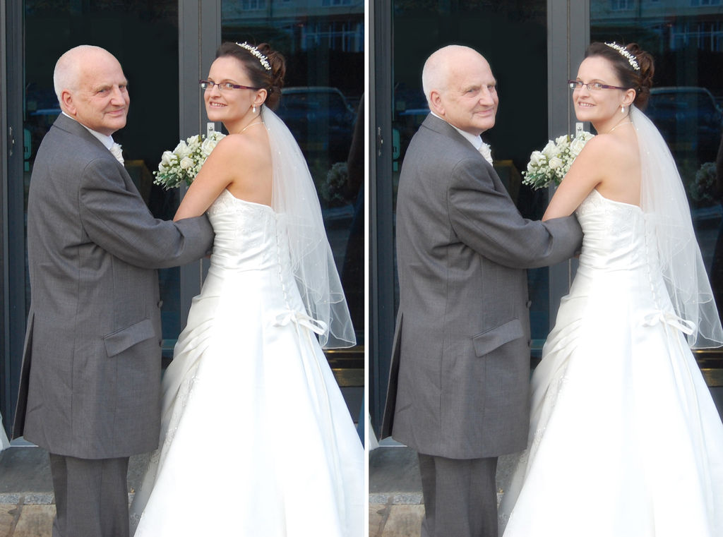
I shot a wedding almost two years ago and my friends found four shots that they liked. I am trying to post process though and thus I wanted to ask you what I could better to improve the shots. Your experienced eye might be able to see better than me.
I am giving below the camera raw and my edits so you can see the before and the after.
Feel free to comment
Regards
Alex
1. Before

1. After

2. Before

2. After

3. Before

3. After

4. Before

4. After

_________________
“The fact is that relatively few photographers ever master their medium. Instead they allow the medium to master them and go on an endless squirrel cage chase from new lens to new paper to new developer to new gadget, never staying with one piece of equipment long enough to learn its full capacities, becoming lost in a maze of technical information that is of little or no use since they don’t know what to do with it”
(written at 1927 by Edward Weston) |
|
| Back to top |
|
 |
poilu

Joined: 26 Aug 2007
Posts: 10472
Location: Greece
Expire: 2019-08-29
|
 Posted: Tue Jan 06, 2015 5:32 pm Post subject: Posted: Tue Jan 06, 2015 5:32 pm Post subject: |
 |
|
poilu wrote:
look fine to me, great job with the microphone
_________________
T* |
|
| Back to top |
|
 |
alaios

Joined: 24 Jan 2014
Posts: 724
|
 Posted: Wed Jan 07, 2015 7:50 pm Post subject: Posted: Wed Jan 07, 2015 7:50 pm Post subject: |
 |
|
alaios wrote:
thanks for the answer
Alex
_________________
“The fact is that relatively few photographers ever master their medium. Instead they allow the medium to master them and go on an endless squirrel cage chase from new lens to new paper to new developer to new gadget, never staying with one piece of equipment long enough to learn its full capacities, becoming lost in a maze of technical information that is of little or no use since they don’t know what to do with it”
(written at 1927 by Edward Weston) |
|
| Back to top |
|
 |
Aanything


Joined: 27 Aug 2011
Posts: 2187
Location: Piacenza, Italy
Expire: 2014-05-30
|
 Posted: Wed Jan 07, 2015 8:48 pm Post subject: Posted: Wed Jan 07, 2015 8:48 pm Post subject: |
 |
|
Aanything wrote:
They look perfectly fine to me too, unless you want to add some glow or highlight diffusion - that some people seem to love in wedding photography.
Maybe you could smooth down some areas of the bride's skin in #2, like the visible vein on her arm or some shadows on her chest that could be lighter, but that's more a matter of the couple's taste.
_________________
C&C and editing of my pics are always welcome
Samples from my lenses
My gear
My Flickr |
|
| Back to top |
|
 |
philslizzy


Joined: 07 Aug 2012
Posts: 4745
Location: Cheshire, England
|
 Posted: Thu Jan 08, 2015 12:43 am Post subject: Posted: Thu Jan 08, 2015 12:43 am Post subject: |
 |
|
philslizzy wrote:
I usually add 'glow' I make a duplicate layer in photoshop. Make sure that foreground colour is black and background colour is white on your toolbar. Then select background image, turn off background copy. Then go in filters > distort > diffuse glow. Switch grain to 0 and adjust the glow amount until the face has almost no details - just the eyes and mouth will be great. Switch on top layer and reduce opacity until you think its good. This has an opacity of 80%. Enough to make a difference but not enough to make it look odd. In print the slight glow looks really good,
left normal, right with glow.
Not the best pic but I have only a few photos that I can use on a public forum.

Oops! I guess this may be better

_________________
Hero in the 'messin-with-cameras-for-the-hell-of-it department'. Official. |
|
| Back to top |
|
 |
alaios

Joined: 24 Jan 2014
Posts: 724
|
 Posted: Thu Jan 08, 2015 8:03 am Post subject: Posted: Thu Jan 08, 2015 8:03 am Post subject: |
 |
|
alaios wrote:
Thanks I did not know the technique
_________________
“The fact is that relatively few photographers ever master their medium. Instead they allow the medium to master them and go on an endless squirrel cage chase from new lens to new paper to new developer to new gadget, never staying with one piece of equipment long enough to learn its full capacities, becoming lost in a maze of technical information that is of little or no use since they don’t know what to do with it”
(written at 1927 by Edward Weston) |
|
| Back to top |
|
 |
|
|
|
You cannot post new topics in this forum
You cannot reply to topics in this forum
You cannot edit your posts in this forum
You cannot delete your posts in this forum
You cannot vote in polls in this forum
|
