Posted: Sat May 21, 2016 6:43 am Post subject: Posted: Sat May 21, 2016 6:43 am Post subject: |
 |
|
kuuan wrote:
| miran wrote: |
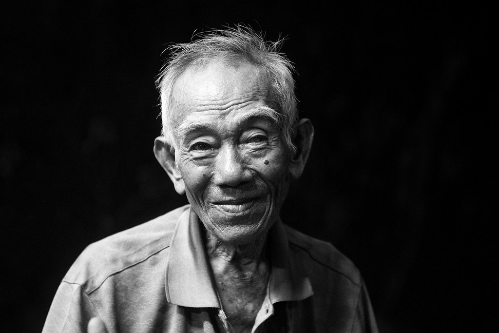
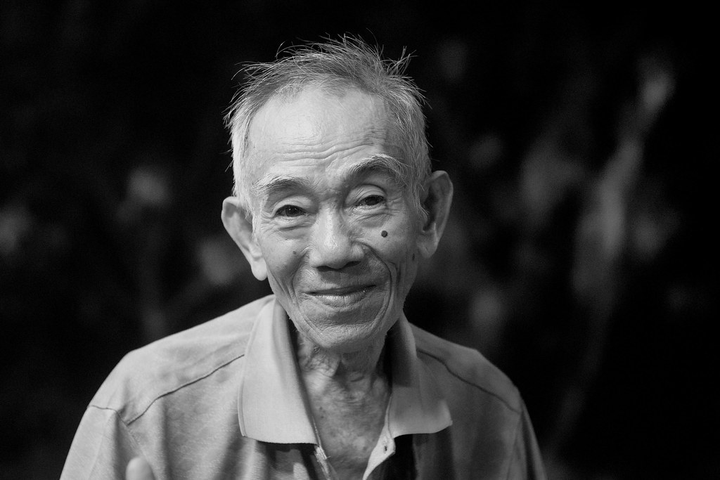
Personally I like #1 best. I like high contrast although the totally black background is a good point. Perhaps a blend between #1 and #2?
Of the colour ones the first one for me is the best.
An excellent shot though, no matter what post processing is applied to it.  |
| cooltouch wrote: |
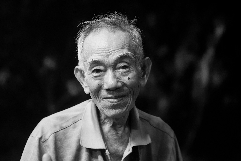
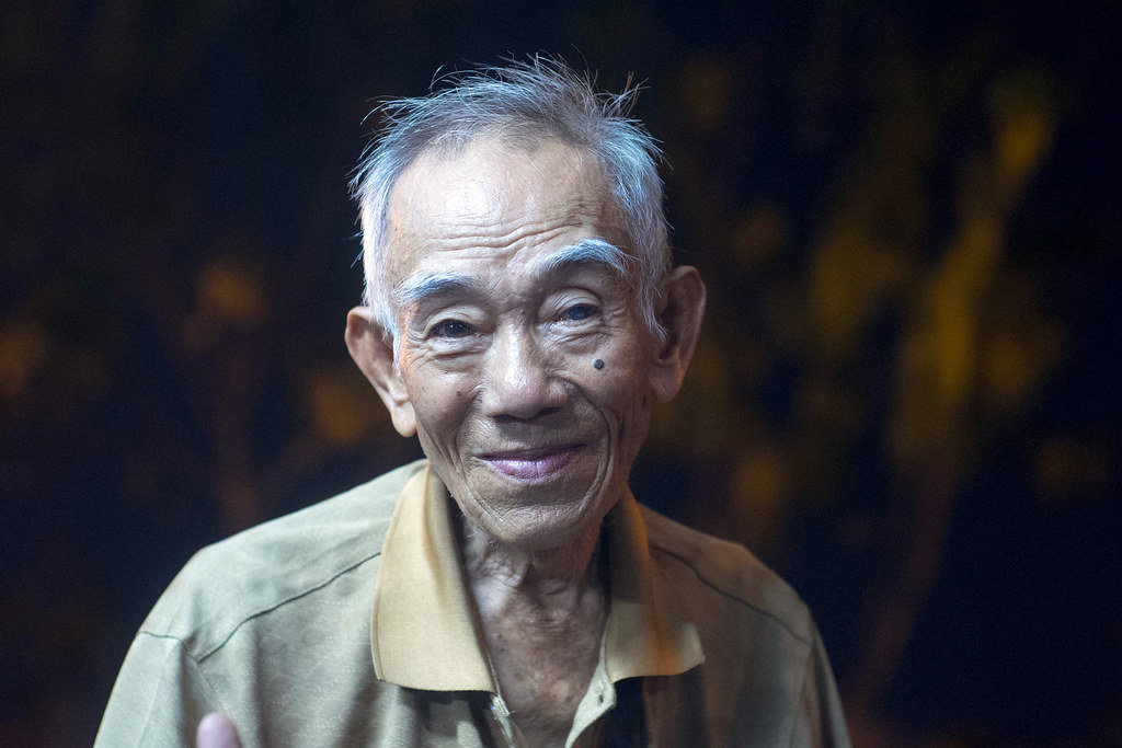
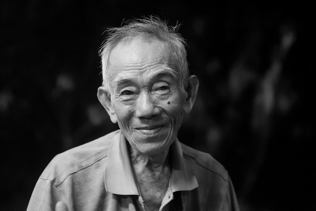
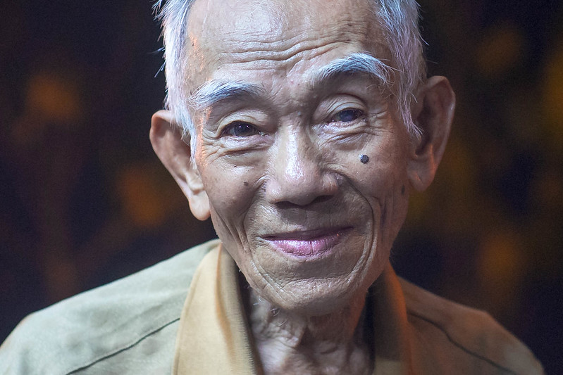
I also prefer #1. Even it has some burn-through on the man's forehead and to the highlights on his shirt shoulder and collar. #2 just makes the burn-through worse. And bringing up the background doesn't really do anything for me. I like its darkness in #1 -- it draws the eyes out toward the subject. The color versions all seem to lack contrast. They have a a sort of milky quality to the shadow areas, which I find distracting. It tells me more contrast needs to be dialed in. #4 appears to be almost identical to #2, and #5 is just too light for my tastes.
I'm curious -- what camera and lens were used for this photo?
Pardon my presumptiveness, but I had to satisfy my own curiosity. So I downloaded the color version (#3) and added contrast to the photo. I was surprised by the amount I had to add to get rid of the milky blueness and, guess what I discovered? The resultant image ended up looking somewhat like a color version of your #1. I also noted that there is actually less burn-through in the forehead and that the shirt showed no burn through at all. So I like this version just as much as I like your number one. And -- I hope you don't mind -- but here's your #3 after the adjustments I made:
 |
thank you for your opinion Miran and Michael ( and sorry for the late reply! )
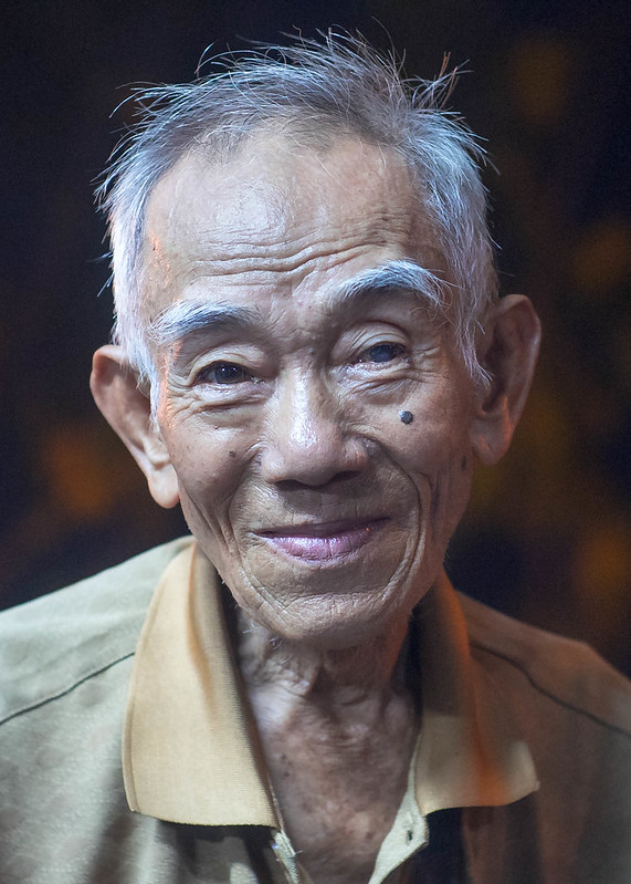
it was the dark only areas of the first, the attempt to get details there, that had made me to try other versions. The first might be the most impressive though.
Michael it was taken with a Canon LTM 1.4/50mm lens on Sony A7. Your color version with the added contrast really does away with some of the milkyness, and it pic really is too blue! It was night and ISO 2500 and WB was quite off, someone at the RF forum had noticed and offered a much warmer version ( of a crop that I had done ):

It was taken while having dinner at a roadside restaurant in Saigon. He stopped there to offer lottery tickets. I liked his old Honda Cub bike and took a photo of it.
[img]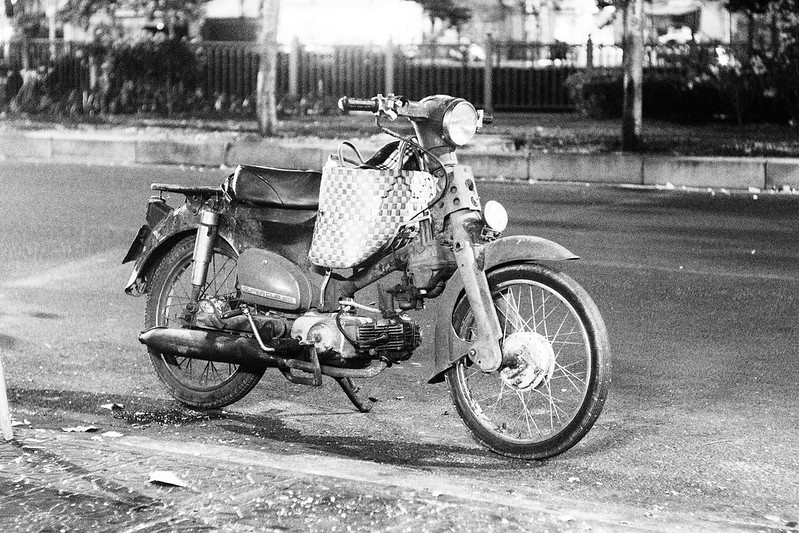 Untitled by andreas, on Flickr[/img] Untitled by andreas, on Flickr[/img]
he had noticed that, pulled up and asked me to 'take his'. It was just a moment and I took 3 fast, almost identical takes, and he was gone again.
[img]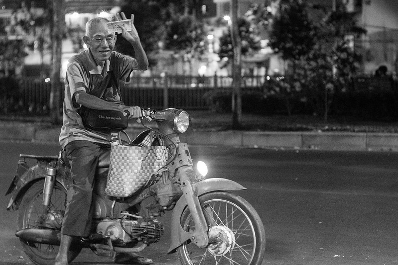 Untitled by andreas, on Flickr[/img] Untitled by andreas, on Flickr[/img]
thank's again for looking and contributing your opinions, even own versions,
cheers, andreas
_________________
my photos on flickr: https://www.flickr.com/photos/kuuan/collections |