| View previous topic :: View next topic |
| Author |
Message |
stevemark

Joined: 29 Apr 2011
Posts: 3952
Location: Switzerland
|
 Posted: Mon Feb 20, 2023 10:20 pm Post subject: Nikkor AiS 1.8/105mm at Lucerne Carneval (Luzerner Fasnacht) Posted: Mon Feb 20, 2023 10:20 pm Post subject: Nikkor AiS 1.8/105mm at Lucerne Carneval (Luzerner Fasnacht) |
 |
|
stevemark wrote:
Usually when taking images of people I work with autofocus cameras, and with lenses such as the AF 1.4/85, AF 2/100, AF 2.8/200 APO and Af 2.8/300 APO. Today, though, I decided to take a not so well known Nikkor with me, the AiS 1.8/105mm. Unlike its famous cousin, the Nikkor 2.5/105mm, the AiS 1.8/105mm isn't that well known. It is a "simple" [5/5] Xenotar construction, and as such has a high resolution, but relatively low contrast. Color aberrations are an isue as well, as can be read in Haruo Sato's story of the lens (https://imaging.nikon.com/history/story/0059/index.htm).
Ah yeah, befor I for get it: all images were taken wide ope at f1.8 since the aperture of my lens has "frozen" ... I ahevn't been using the AiS 1.8/105mm for a while, and obvioulsy the aperture now is stuck "wide open". All images taken with 24 MP FF sony A7II. Images usually just JPGs out of cam, and re-sized to 800 x 1200 px. Images taken in "Portrait" mode and Auto White Balance.
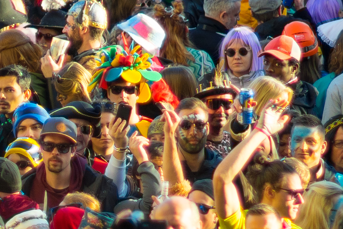
Now let's go to to the Lucerne Carneval  . That's how it looks. Lot's of people, lots of sun and lot's of fun . That's one of the bridges over the Reuss river. People are looking in my direction since on the large stairway between me and the bridge (not visible on the image) there's a music group playing. We call them "Guuggene", and they make a helluva lot of noise. . That's how it looks. Lot's of people, lots of sun and lot's of fun . That's one of the bridges over the Reuss river. People are looking in my direction since on the large stairway between me and the bridge (not visible on the image) there's a music group playing. We call them "Guuggene", and they make a helluva lot of noise.

And here's a 100% crop from the center. Resolution (at f1. is impressive, and there's the typical "glow". Contrast is relatively low, but that's prefect for portraits. More on that later on. is impressive, and there's the typical "glow". Contrast is relatively low, but that's prefect for portraits. More on that later on.

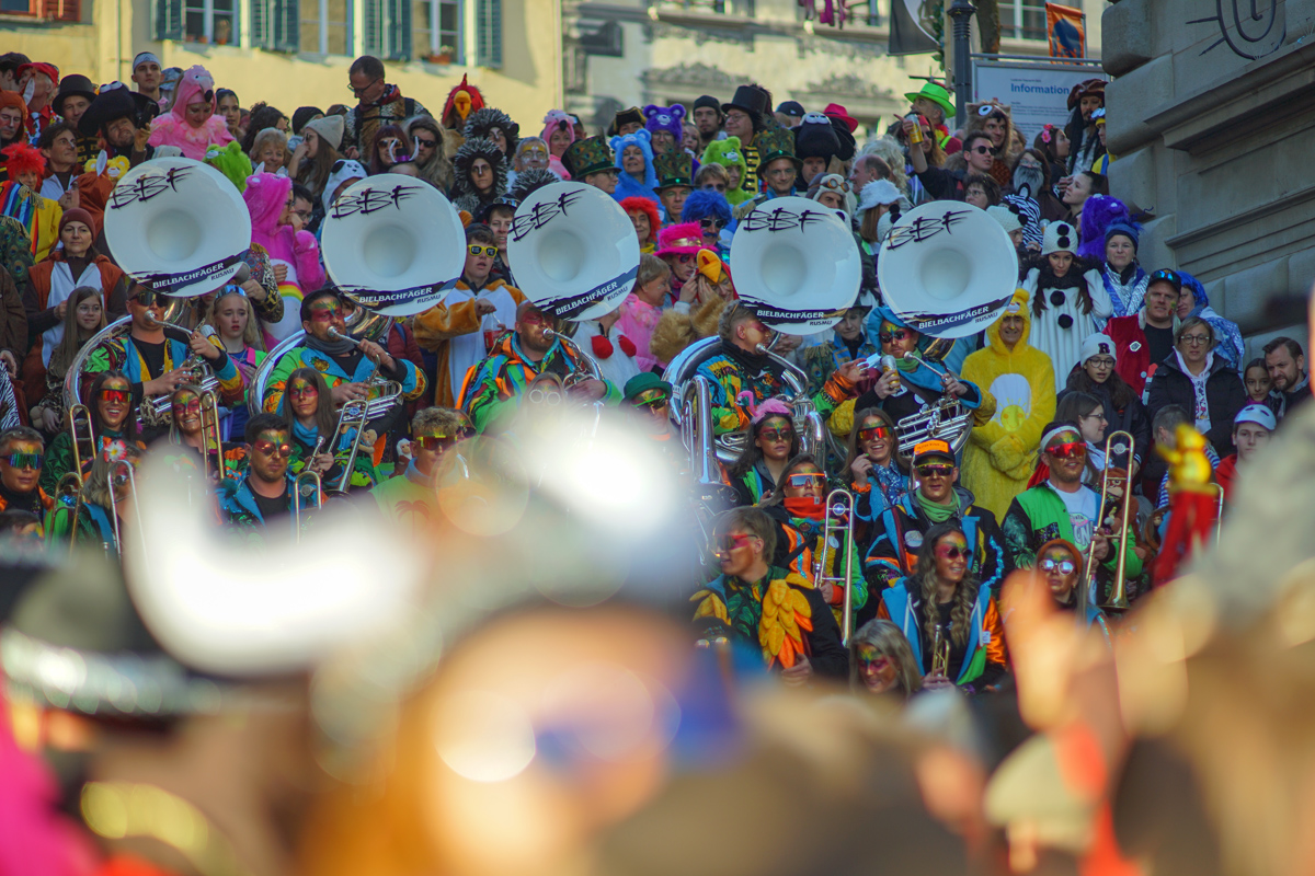
Now here's the view from down there. You can see of the numoeus carnval music groups playing on the stairway. What's interesing here is the forground- abd the backgroud bokeh. Foreground is very smooth, background slighly noisy:

_________________
www.artaphot.ch |
|
| Back to top |
|
 |
stevemark
Joined: 29 Apr 2011
Posts: 3952
Location: Switzerland
|
| Posted: Mon Feb 20, 2023 10:51 pm Post subject: |
|
|
stevemark wrote:
Now let's look at at few masks.
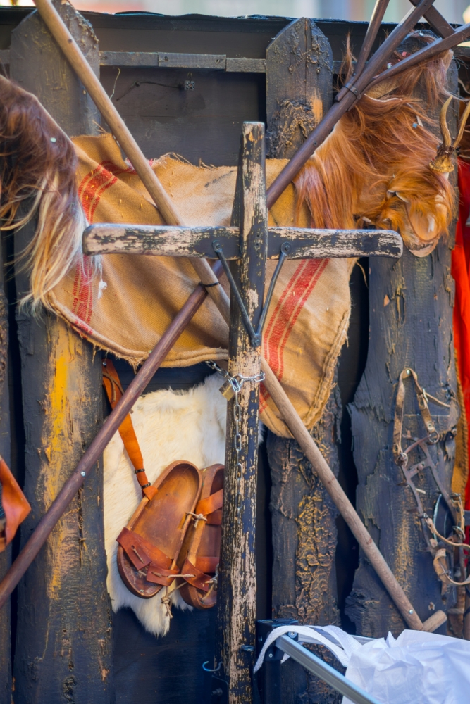
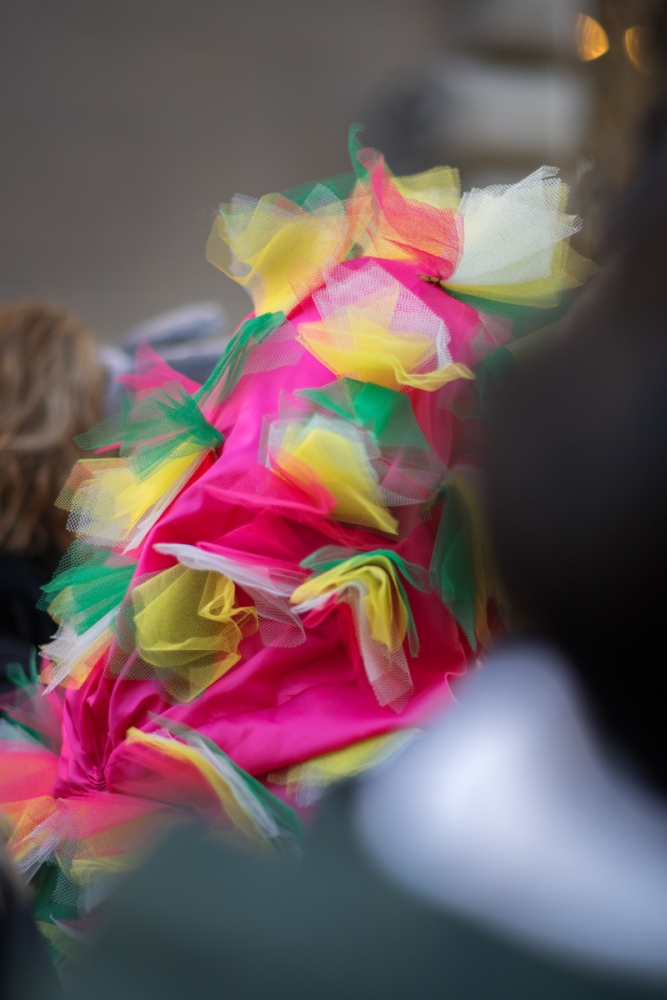
While some music groups - more than hundred "Guuggen" with usually 30-50 musicians each! - actually are playing in the afternoon, their main focus is the evening / night. Which means that quite a lot of those goups are not playing in the afternoon. They leave their stuff somewhere in the streets, enjoying a drink, a chatter or simply the beauty of the scerenery.

And again a 100% crop from the 24 MP FF image (taken at f1.:
Pretty impressive I'd say - although this one (the above 100% crop) is a RAW, "developped" using Photoshop. Sharpening at 45 (Radius 1 px), Detail 45, and magenta defringed.
Some music instruments eagerly awaiting the evening:
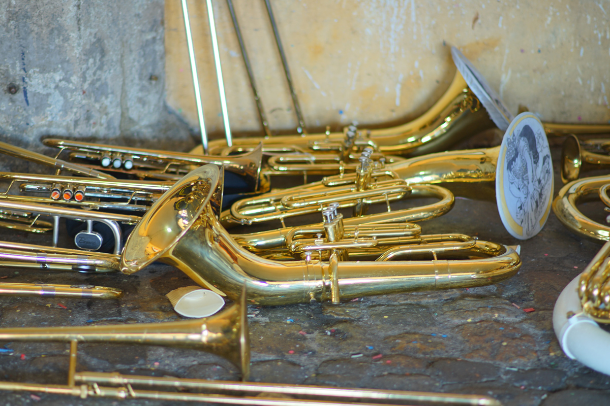
Fringing is quite visible (longitudinal CAs), even on this small image.
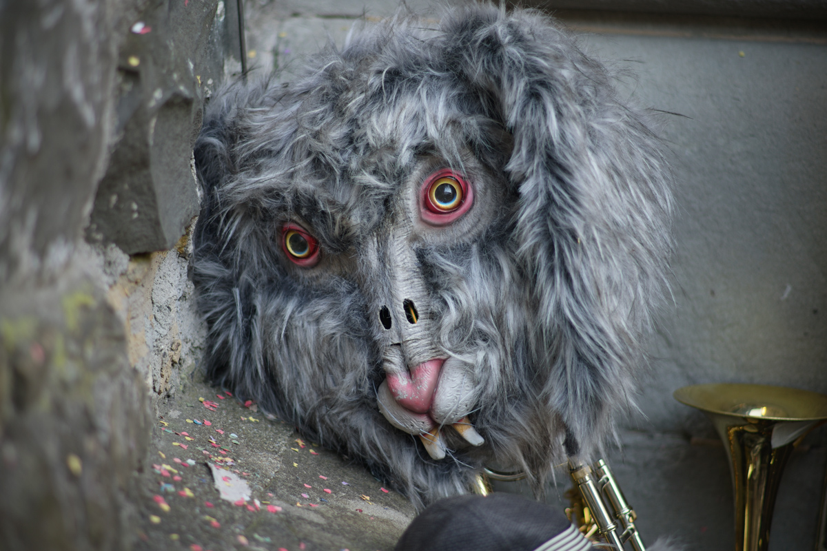
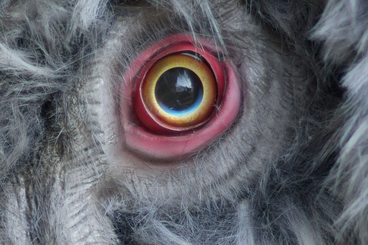
Here's another mask waiting on the street:

Our Lucerne masks usually are not beautiful or nice. During the Fasnacht (carneval) all the mountain spirits from mount Pilatus are descending into town, along with old witches and crazy animals. Death - in one form or another - may be part of the game as well. It's a Catholic area, and that means that the awareness of the transcience of all life is rooted within our culture. To some extent, at least. Some details at the outside of a mobile bar:
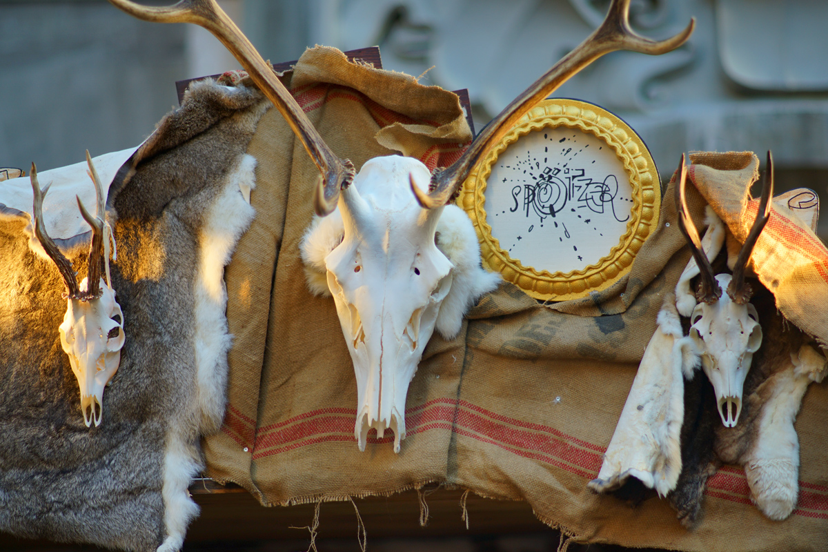
Sometimes you just catch a detail. At these close distances (around 1.2m I'd say) both foreground as well as backgound bokeh is exceptionally smooth. Very nice indeed.
Next posting will be about actual portraits, finally
_________________
www.artaphot.ch |
|
| Back to top |
|
|
stevemark
Joined: 29 Apr 2011
Posts: 3952
Location: Switzerland
|
| Posted: Mon Feb 20, 2023 11:26 pm Post subject: |
|
|
stevemark wrote:
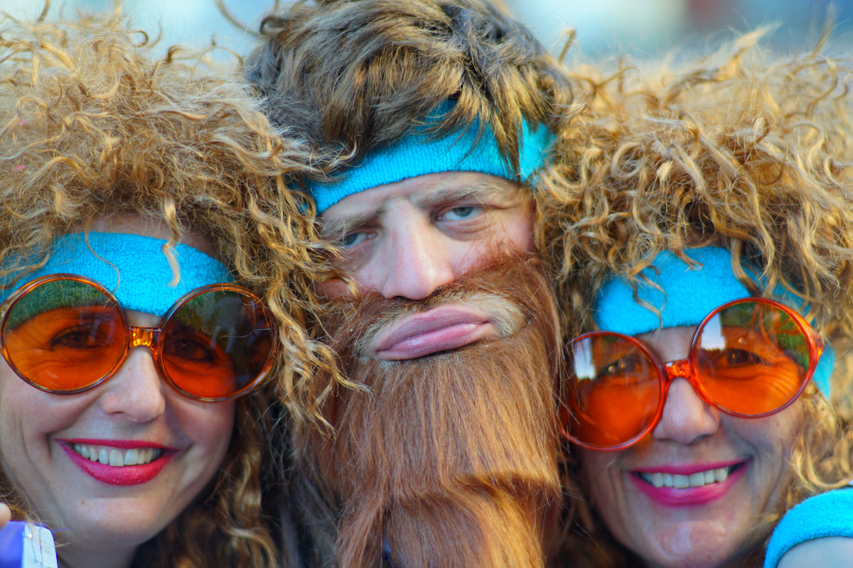
Here are a few portraits - all taken at f1.8 with the Nikkor AiS 1.8/105mm on the Sony A7RII. Three nice girls first
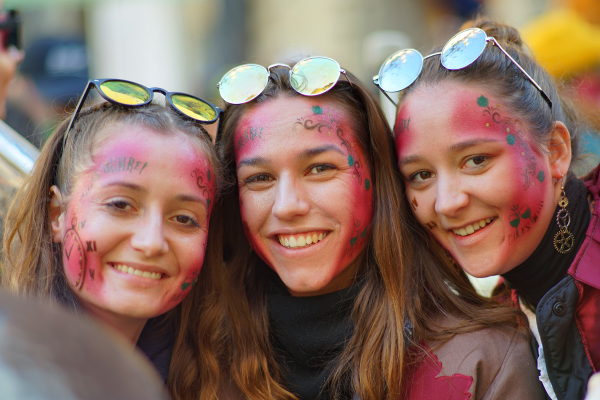
When shooting a portrait of one person, the razor thin DOF of the 1.8/105 isn't much of a problem. Three girls, however, rarely align poperly ...!!
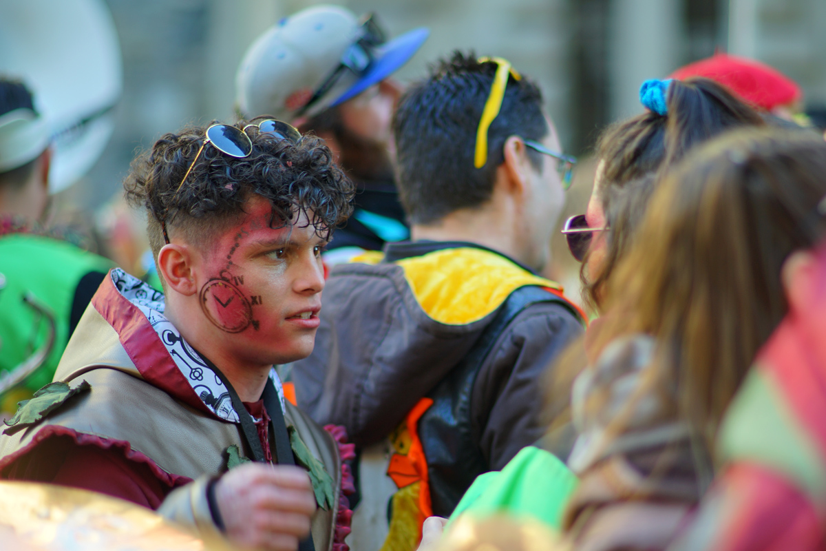
Two guys now, dressed and painted in the style of their music group:

Again, the background is very smooth, and so is the depiction of the skin texture.
Not everyone has a fancy costume. A few utensils, along with a wig and some body paint may be sufficient:


And some, of course, are looking for a new girlfriend ...

And then two of those guys wearing those masks we earlier found laying on the street. They also are part of a "Guugge" (music group):

_________________
www.artaphot.ch |
|
| Back to top |
|
|
Ultrapix

Joined: 06 Jan 2012
Posts: 566
Location: Italy
|
| Posted: Mon Feb 20, 2023 11:37 pm Post subject: |
|
|
Ultrapix wrote:
I like the rendering, and the pictures too, of course |
|
| Back to top |
|
|
Minolfan

Joined: 30 Dec 2008
Posts: 3438
Location: Netherlands
|
| Posted: Tue Feb 21, 2023 12:49 am Post subject: |
|
|
Minolfan wrote:
Nice and funny!
 |
|
| Back to top |
|
|
jamaeolus

Joined: 19 Mar 2014
Posts: 2965
Location: Eugene
Expire: 2015-08-20
|
| Posted: Tue Feb 21, 2023 1:52 am Post subject: |
|
|
jamaeolus wrote:
brilliant colors.
_________________
photos are moments frozen in time |
|
| Back to top |
|
|
visualopsins

Joined: 05 Mar 2009
Posts: 10970
Location: California
Expire: 2025-04-11
|
| Posted: Tue Feb 21, 2023 2:03 am Post subject: |
|
|
visualopsins wrote:
 too much fun! too much fun!
_________________
☮☮☮☮☮☮☮☮☮☮☮☮☮☮☮☮☮☮☮☮☮☮☮☮☮☮☮☮☮☮☮☮ like attracts like! ☮☮☮☮☮☮☮☮☮☮☮☮☮☮☮☮☮☮☮☮☮☮☮☮☮☮☮☮☮☮☮☮
Cameras: Sony ILCE-7RM2, Spotmatics II, F, and ESII, Nikon P4
Lenses:
M42 Asahi Optical Co., Takumar 1:4 f=35mm, 1:2 f=58mm (Sonnar), 1:2.4 f=58mm (Heliar), 1:2.2 f=55mm (Gaussian), 1:2.8 f=105mm (Model I), 1:2.8/105 (Model II), 1:5.6/200, Tele-Takumar 1:5.6/200, 1:6.3/300, Macro-Takumar 1:4/50, Auto-Takumar 1:2.3 f=35, 1:1.8 f=55mm, 1:2.2 f=55mm, Super-TAKUMAR 1:3.5/28 (fat), 1:2/35 (Fat), 1:1.4/50 (8-element), Super-Multi-Coated Fisheye-TAKUMAR 1:4/17, Super-Multi-Coated TAKUMAR 1:4.5/20, 1:3.5/24, 1:3.5/28, 1:2/35, 1:3.5/35, 1:1.8/85, 1:1.9/85 1:2.8/105, 1:3.5/135, 1:2.5/135 (II), 1:4/150, 1:4/200, 1:4/300, 1:4.5/500, Super-Multi-Coated Macro-TAKUMAR 1:4/50, 1:4/100, Super-Multi-Coated Bellows-TAKUMAR 1:4/100, SMC TAKUMAR 1:1.4/50, 1:1.8/55
M42 Carl Zeiss Jena Flektogon 2.4/35
Contax Carl Zeiss Vario-Sonnar T* 28-70mm F3.5-4.5
Pentax K-mount SMC PENTAX-A ZOOM 1:3.5 35~105mm, SMC PENTAX ZOOM 1:4 45~125mm
Nikon Micro-NIKKOR-P-C Auto 1:3.5 f=55mm, NIKKOR-P Auto 105mm f/2.5 Pre-AI (Sonnar), Micro-NIKKOR 105mm 1:4 AI, NIKKOR AI-S 35-135mm f/3,5-4,5
Tamron SP 17mm f/3.5 (51B), Tamron SP 17mm f/3.5 (151B), SP 500mm f/8 (55BB), SP 70-210mm f/3.5 (19AH)
Vivitar 100mm 1:2.8 MC 1:1 Macro Telephoto (Kiron)
|
|
| Back to top |
|
|
Doc Sharptail

Joined: 23 Nov 2020
Posts: 1175
Location: Winnipeg Canada
|
| Posted: Tue Feb 21, 2023 3:57 am Post subject: |
|
|
Doc Sharptail wrote:
Some nice images.
Too bad about the aperture sticking open.
Just a bit curious about in-camera saturation settings, especially with-in the first 3 or 4 frames.
I find with most Nikkors, older, or newer, dialing back exposure 1/3 of a stop to help immensely, which oddly enough on digital, mimics the old ranges of Kodachrome behaviour.
-D.S.
_________________
D-810, F2, FTN.
35mm f2 O.C. nikkor
50 f2 H nikkor, 50 f 1.4 AI-s, 135 f3.5 Q,
50 f2 K nikkor 2x, 28-85mm f3.5-4.5 A/I-s, 35-105 3.5-4.5 A/I-s, 200mm f4 Micro A/I, partial list.
"Ain't no half-way" -S.R.V.
"Oh Yeah... Alright" -Paul Simon |
|
| Back to top |
|
|
caspert79

Joined: 31 Oct 2010
Posts: 3148
Location: The Netherlands
|
| Posted: Tue Feb 21, 2023 5:35 am Post subject: |
|
|
caspert79 wrote:
Very nice images, thus lens its still on my wish list. |
|
| Back to top |
|
|
stevemark
Joined: 29 Apr 2011
Posts: 3952
Location: Switzerland
|
| Posted: Tue Feb 21, 2023 3:35 pm Post subject: |
|
|
stevemark wrote:
| Doc Sharptail wrote: |
Some nice images.
Too bad about the aperture sticking open.
Just a bit curious about in-camera saturation settings, especially with-in the first 3 or 4 frames. |
Sony A7II "Portrait", saturation at +1 (from a range of "-3" to "+3"). Carneval means colors, and especially the images taken in the shadow are OK with a bit more color. The first image (sunlight) may be a bit oversaturated.
Now, when I write this, I notice that usually I like strong colors. My monitor is calibrated for printing purposes, and thus renders the colors quite "truthful" (concerning the result in final printing). I am aware, though, that depending on the calibration of your monitor the colors may look oversaturated - at least that's what I see quite often when clients are looking e . g. at my PDFs on their (non-calibrated) "business" monitors.
| Doc Sharptail wrote: |
I find with most Nikkors, older, or newer, dialing back exposure 1/3 of a stop to help immensely, which oddly enough on digital, mimics the old ranges of Kodachrome behaviour.
-D.S. |
I'll try that and publish the results here.
S
_________________
www.artaphot.ch |
|
| Back to top |
|
|
Doc Sharptail
Joined: 23 Nov 2020
Posts: 1175
Location: Winnipeg Canada
|
| Posted: Tue Feb 21, 2023 5:09 pm Post subject: |
|
|
Doc Sharptail wrote:
| stevemark wrote: |
Sony A7II "Portrait", saturation at +1 (from a range of "-3" to "+3"). Carneval means colors, and especially the images taken in the shadow are OK with a bit more color. The first image (sunlight) may be a bit oversaturated.
Now, when I write this, I notice that usually I like strong colors. My monitor is calibrated for printing purposes, and thus renders the colors quite "truthful" (concerning the result in final printing). I am aware, though, that depending on the calibration of your monitor the colors may look oversaturated - at least that's what I see quite often when clients are looking e . g. at my PDFs on their (non-calibrated) "business" monitors. S |
This is not the first time I've run across this, with this monitor~ the largest pro-book I could afford, and yes, it is most definitely a "business" model.
It is not very good with shadow details from digital B&W either.
-D.S.
_________________
D-810, F2, FTN.
35mm f2 O.C. nikkor
50 f2 H nikkor, 50 f 1.4 AI-s, 135 f3.5 Q,
50 f2 K nikkor 2x, 28-85mm f3.5-4.5 A/I-s, 35-105 3.5-4.5 A/I-s, 200mm f4 Micro A/I, partial list.
"Ain't no half-way" -S.R.V.
"Oh Yeah... Alright" -Paul Simon |
|
| Back to top |
|
|
KEO

Joined: 27 Sep 2018
Posts: 773
Location: USA
|
| Posted: Tue Feb 21, 2023 7:38 pm Post subject: |
|
|
KEO wrote:
I'm lucky enough to have a copy in extremely good condition. Not only is it an excellent lens, it's just really fun to shoot with. If you've never had one in hand, it's actually smaller and lighter than it appears in pictures.
It also works great on the GFX with only a tiny bit of vignetting at certain settings. |
|
| Back to top |
|
|
stevemark
Joined: 29 Apr 2011
Posts: 3952
Location: Switzerland
|
| Posted: Tue Feb 21, 2023 8:27 pm Post subject: |
|
|
stevemark wrote:
| Doc Sharptail wrote: |
This is not the first time I've run across this, with this monitor~ the largest pro-book I could afford, and yes, it is most definitely a "business" model.
It is not very good with shadow details from digital B&W either.
-D.S. |
This may be more an issue of correct calibration than an issue with the monitor itself.
My monitor - an old professional Eizo - has different "preset" calibrations (e. g. "Photo", "Text", "Film", "Custom"), and they look extremely different. All of them are pretty useless for professional work (images / photoshop and DTP). I regularly calibrate my monitor, using an external measuring device. This results in the "correct" color profile for my monitor which then is stored in the color management of the Windows system.
For displaying pictures correctly e. g. in Photoshop, one needs in addition the corresponding image profiles (here in Europe sRGB IEC61966-2.1 for camera sRGBs, and Coated FOGRA 39 for CMYK images ready for offset printing. Probably different in US and Canada). It's easy to make a mess here, resulting either in slight deviations on the screen - or in completely different (often oversaturated) colors.
The color managment systems used at my printer even allow for correcting for the different dyes used in printing, and for the influence of the different papers. There are huge (and I mean huge) differences when printing the same image onto different papers (and using different dyes makes it even more complicated).
The papers used for printing high quality books often are quite thin (the book shouldn't become too heavy), and glossy. They have relatively small amounts of fiber, and much filler. This means that the amount of dye that can be used is limited, thus limiting the color depth on that paper. On the other hand a thick carton (board) used for postcards may have a special additional layer just for "sucking in" the colors. The same photo printed on such a cartboard will look spectacular.
It may help to look at the color management of your system, to start with.
S
_________________
www.artaphot.ch |
|
| Back to top |
|
|
stevemark
Joined: 29 Apr 2011
Posts: 3952
Location: Switzerland
|
| Posted: Tue Feb 21, 2023 8:31 pm Post subject: |
|
|
stevemark wrote:
| KEO wrote: |
| I'm lucky enough to have a copy in extremely good condition. Not only is it an excellent lens, it's just really fun to shoot with. If you've never had one in hand, it's actually smaller and lighter than it appears in pictures. |
Yeah, I can agree on that. The Ai/AiS 2/135mm feels much bigger and heavier to me, and the focus of my sample is quite a bit stiffer that of my AiS 1.8/105mm (which looks like new as well).
| KEO wrote: |
| It also works great on the GFX with only a tiny bit of vignetting at certain settings. |
Interesting, but not unexpected. The lens section of the Ai/AiS 1.8/105mm looks more like a big normal lens (= large image circle) than a like a small tele.
S
_________________
www.artaphot.ch |
|
| Back to top |
|
|
RokkorDoctor

Joined: 27 Nov 2021
Posts: 1413
Location: Kent, UK
Expire: 2025-05-01
|
| Posted: Wed Feb 22, 2023 10:51 am Post subject: |
|
|
RokkorDoctor wrote:
All nice images, looks like a fun festival! Proof that even with aperture stuck wide-open and noticeable lens flaws you can still get very nice rendering.
| stevemark wrote: |
| Doc Sharptail wrote: |
This is not the first time I've run across this, with this monitor~ the largest pro-book I could afford, and yes, it is most definitely a "business" model.
It is not very good with shadow details from digital B&W either.
-D.S. |
This may be more an issue of correct calibration than an issue with the monitor itself.
My monitor - an old professional Eizo - has different "preset" calibrations (e. g. "Photo", "Text", "Film", "Custom"), and they look extremely different. All of them are pretty useless for professional work (images / photoshop and DTP). I regularly calibrate my monitor, using an external measuring device. This results in the "correct" color profile for my monitor which then is stored in the color management of the Windows system. |
Yes, out-of-factory monitor calibration is an issue. With many business monitors I'm not even sure they bother with calibration.
I have no experience with OLD Eizo monitors. My (older) Eizo ColorEdge CG247 does a calibration as part of its initial setup anyway using a built-in sensor that automatically flips up over the screen, and regularly re-calibrates, so out-of-factory calibration is a bit of a non-issue. However, my slightly newer business-model Eizo FlexScan EV2730Q (only has an sRGB gamut panel) came calibrated very accurately out-of-factory under its sRGB setting, when I checked it myself with another external measuring profiler.
| stevemark wrote: |
For displaying pictures correctly e. g. in Photoshop, one needs in addition the corresponding image profiles (here in Europe sRGB IEC61966-2.1 for camera sRGBs, and Coated FOGRA 39 for CMYK images ready for offset printing. Probably different in US and Canada). It's easy to make a mess here, resulting either in slight deviations on the screen - or in completely different (often oversaturated) colors.
The color managment systems used at my printer even allow for correcting for the different dyes used in printing, and for the influence of the different papers. There are huge (and I mean huge) differences when printing the same image onto different papers (and using different dyes makes it even more complicated).
The papers used for printing high quality books often are quite thin (the book shouldn't become too heavy), and glossy. They have relatively small amounts of fiber, and much filler. This means that the amount of dye that can be used is limited, thus limiting the color depth on that paper. On the other hand a thick carton (board) used for postcards may have a special additional layer just for "sucking in" the colors. The same photo printed on such a cartboard will look spectacular.
It may help to look at the color management of your system, to start with.
S |
Yes, ideally every printer should be profiled for every ink/paper combination. Some come with canned profiles valid for the manufacturer's own range of available papers (and official branded inks of course). But as soon as you step away from those brand papers and/or inks every combination needs to be profiled. You can get profiling systems for that, but it is not exactly a 5 minute job and therefore a big incentive to stick with the inks and papers you do have good profiles for.
Colour laser printers, despite their generally much poorer print quality for photos to start with, do have one advantage here; since they use a technology whereby a pigment-loaded polymer get baked onto the paper surface rather than a dye- or pigment-loaded ink that get absorbed into the paper surface, colour laser printers have a more predictable colour consistency across unknown different brands paper stock. They do still need to get some indication of paper stock parameters such as weight and type in order to optimise the toner fusing & adherence process.
Incidentally (and you probably have far more experience with this than I do); I have noticed that dark areas in a print often look blocked up and too dark when viewing under "normal" (domestic) lighting conditions, but once you improve the lighting conditions under which the print is viewed, all of the shadow detail pops out and it looks way better. I would say that print lighting conditions are a big factor too that needs consideration and some level of standardisation that goes beyond colour temperature and CRI.
_________________
Mark
SONY A7S, A7RII + dust-sealed modded Novoflex/Fotodiox/Rayqual MD-NEX adapters
Minolta SR-1, SRT-101/303, XD7/XD11, XGM, X700
Bronica SQAi
Ricoh GX100
Minolta majority of all Rokkor SR/AR/MC/MD models made
Sigma 14mm/3.5 for SR mount
Tamron SP 60B 300mm/2.8 (Adaptall)
Samyang T-S 24mm/3.5 (Nikon mount, DIY converted to SR mount)
Schneider-Kreuznach PC-Super-Angulon 28mm/2.8 (SR mount)
Bronica PS 35/40/50/65/80/110/135/150/180/200/250mm |
|
| Back to top |
|
|
stevemark
Joined: 29 Apr 2011
Posts: 3952
Location: Switzerland
|
| Posted: Wed Feb 22, 2023 11:43 pm Post subject: |
|
|
stevemark wrote:
| RokkorDoctor wrote: |
| stevemark wrote: |
The color managment systems used at my printer even allow for correcting for the different dyes used in printing,
...
|
Yes, ideally every printer should be profiled for every ink/paper combination. |
Sorry, my mistake ...!! I was talking about "my printer's shop" (the place where books are printed), not about a inkjet / laser printer at home. In our (Swiss) German language the word "Drucker" means both the printer (e. g. inkjet printer) as well as the person working on a large printing machine prionting books. So I mixed it up. Sorry.
| RokkorDoctor wrote: |
| Incidentally (and you probably have far more experience with this than I do); I have noticed that dark areas in a print often look blocked up and too dark when viewing under "normal" (domestic) lighting conditions, but once you improve the lighting conditions under which the print is viewed, all of the shadow detail pops out and it looks way better. I would say that print lighting conditions are a big factor too that needs consideration and some level of standardisation that goes beyond colour temperature and CRI. |
Absolutely. In the following I am talking about book printing (offset), not inkjet. The papers used for book printing often have opical brighteners; they convert UV light (sunlight!) into a blueish white (visible) light. This additional light can dramatically alter the entire color balance of an offset print. Whenever I have some of my stuff printed at the printers shop (offset), I am with them at the machine, checking and adjusting the color balance "on line".
The most dramatic color deviations I have ever seen (again talking about printed books or calendars) were in some food shops. Some of the light sources used eg for selling vegetables seem to have strong emissions in the green (probably a discontinuous spectrum), and other light sources used in bakeries or at the butcher's can completely change the perception of reddish an magenta colors (again probably discontinuous emissions either in the violet and / or in the red).
S
_________________
www.artaphot.ch |
|
| Back to top |
|
|
RokkorDoctor
Joined: 27 Nov 2021
Posts: 1413
Location: Kent, UK
Expire: 2025-05-01
|
| Posted: Thu Feb 23, 2023 12:14 pm Post subject: |
|
|
RokkorDoctor wrote:
| stevemark wrote: |
Sorry, my mistake ...!! I was talking about "my printer's shop" (the place where books are printed), not about a inkjet / laser printer at home. In our (Swiss) German language the word "Drucker" means both the printer (e. g. inkjet printer) as well as the person working on a large printing machine prionting books. So I mixed it up. Sorry.
...
S |
I see; you were talking about offset printing. Yes, that is a whole different world of specialised expertise...
EDIT: I should have picked up on that when you said "The color managment systems used at my printer" instead of "in my printer"
_________________
Mark
SONY A7S, A7RII + dust-sealed modded Novoflex/Fotodiox/Rayqual MD-NEX adapters
Minolta SR-1, SRT-101/303, XD7/XD11, XGM, X700
Bronica SQAi
Ricoh GX100
Minolta majority of all Rokkor SR/AR/MC/MD models made
Sigma 14mm/3.5 for SR mount
Tamron SP 60B 300mm/2.8 (Adaptall)
Samyang T-S 24mm/3.5 (Nikon mount, DIY converted to SR mount)
Schneider-Kreuznach PC-Super-Angulon 28mm/2.8 (SR mount)
Bronica PS 35/40/50/65/80/110/135/150/180/200/250mm |
|
| Back to top |
|
|
alex ph
Joined: 16 Mar 2013
Posts: 1672
|
| Posted: Sun Feb 26, 2023 3:27 am Post subject: |
|
|
alex ph wrote:
A joyful coloured multitude, well captured!
From the optical point of view, I know it might sound a sacrilege, this glowy rendering at long distance, together with strong CA, recalls me some Soviet 35mm fast projection lenses. |
|
| Back to top |
|
|
Doc Sharptail
Joined: 23 Nov 2020
Posts: 1175
Location: Winnipeg Canada
|
| Posted: Sun Feb 26, 2023 5:26 pm Post subject: |
|
|
Doc Sharptail wrote:
| alex ph wrote: |
A joyful coloured multitude, well captured!
From the optical point of view, I know it might sound a sacrilege, this glowy rendering at long distance, together with strong CA, recalls me some Soviet 35mm fast projection lenses. |
I was beginning to wonder if I was seeing things 
Just a reminder that the sample lens here has it's aperture stuck open, and results shown are on a par with other contemporaries wide open, especially in that strong cross-lighting.
-D.S.
_________________
D-810, F2, FTN.
35mm f2 O.C. nikkor
50 f2 H nikkor, 50 f 1.4 AI-s, 135 f3.5 Q,
50 f2 K nikkor 2x, 28-85mm f3.5-4.5 A/I-s, 35-105 3.5-4.5 A/I-s, 200mm f4 Micro A/I, partial list.
"Ain't no half-way" -S.R.V.
"Oh Yeah... Alright" -Paul Simon |
|
| Back to top |
|
|
stevemark
Joined: 29 Apr 2011
Posts: 3952
Location: Switzerland
|
| Posted: Tue Feb 28, 2023 4:11 pm Post subject: |
|
|
stevemark wrote:
| Doc Sharptail wrote: |
Just a reminder that the sample lens here has it's aperture stuck open, and results shown are on a par with other contemporaries wide open, especially in that strong cross-lighting.
-D.S. |
Using an (heavy) 1.8/105mm primarily at f5.6 doesn't make sense. The tiny and lightweight Minolta MD 2.5/100mm is excellent, and nearly perfect from f2.5 on.
The "glow" and/or softness of such fast lenses when used wide open (including e. g. the Nikkor 1.2/55, and even the Nikkor 2/50) are part of the fun, especially with b/w portraits.
That said, I wonder what the effective difference between e. g. an Nikkor 2.5/105mm (Sonnar type, "soft") and an Minolta MD-III 2.5/100mm would be. Maybe less than what the internet claims ...?!?
S
_________________
www.artaphot.ch |
|
| Back to top |
|
|
Doc Sharptail
Joined: 23 Nov 2020
Posts: 1175
Location: Winnipeg Canada
|
| Posted: Tue Feb 28, 2023 4:53 pm Post subject: |
|
|
Doc Sharptail wrote:
| stevemark wrote: |
| Doc Sharptail wrote: |
Just a reminder that the sample lens here has it's aperture stuck open, and results shown are on a par with other contemporaries wide open, especially in that strong cross-lighting.
-D.S. |
Using an (heavy) 1.8/105mm primarily at f5.6 doesn't make sense. The tiny and lightweight Minolta MD 2.5/100mm is excellent, and nearly perfect from f2.5 on.
The "glow" and/or softness of such fast lenses when used wide open (including e. g. the Nikkor 1.2/55, and even the Nikkor 2/50) are part of the fun, especially with b/w portraits.
That said, I wonder what the effective difference between e. g. an Nikkor 2.5/105mm (Sonnar type, "soft") and an Minolta MD-III 2.5/100mm would be. Maybe less than what the internet claims ...?!?
S |
I have yet to see that in a 50 f2 nikkor. The bulk of my 50's are "K", or earlier.
I have an A/I-s 50 f1.4 here that does a little worse than what's shown in the images above wide open.
I will be keeping it for it's MFD performance, which still amazes me.
Using a heavy fast telephoto at 5.6? It depends on what I'm doing, and what I want out of the final image.
Sometimes it makes perfect sense 
The earlier DX nikon D-200 camera used to drive me nuts in this respect.
TBH, I'm still learning a lot, even at this late stage of the game, and probably will yet, for a quite a while.
The 105 2.5 Nikkor I had here was a fine lens, but I let it go for something that would perform a little better for the way I wanted to use it.
-D.S.
_________________
D-810, F2, FTN.
35mm f2 O.C. nikkor
50 f2 H nikkor, 50 f 1.4 AI-s, 135 f3.5 Q,
50 f2 K nikkor 2x, 28-85mm f3.5-4.5 A/I-s, 35-105 3.5-4.5 A/I-s, 200mm f4 Micro A/I, partial list.
"Ain't no half-way" -S.R.V.
"Oh Yeah... Alright" -Paul Simon |
|
| Back to top |
|
|
|
|