| View previous topic :: View next topic |
| Author |
Message |
eeyore_nl


Joined: 09 Nov 2008
Posts: 837
Location: Netherlands
|
 Posted: Sun Mar 17, 2024 10:54 am Post subject: (Unexact) color comparison of three 28mm lenses Posted: Sun Mar 17, 2024 10:54 am Post subject: (Unexact) color comparison of three 28mm lenses |
 |
|
eeyore_nl wrote:
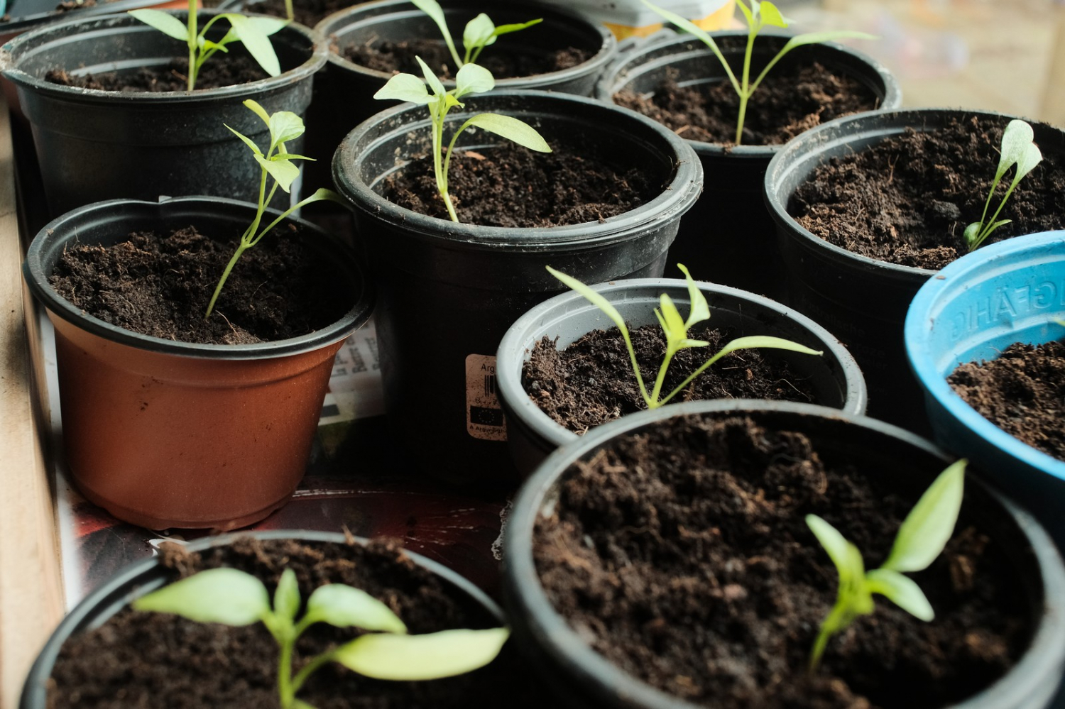
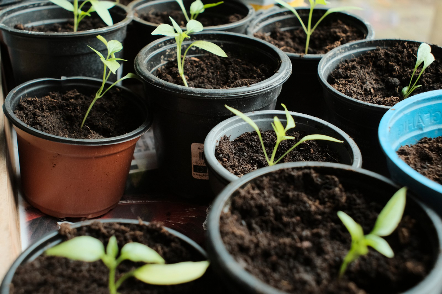
This morning I photographed approximately the same scene (on a tripod, but not lining out the frames rigorously) with my three current 28mm manual focus lenses.
While I kept white balance, ISO value, shutter speed, and apertures the same, I don't consider this a controlled test. However, I think it gives a first impression of the different color renditions of these lenses.
All of these photos were shot at the same aperture (f/5.6), iso1600 and 1/125s, using a Fujifilm X-Pro2 with "Classic Chrome" film simulation and boosted color (+4).
The Canon has a slightly wider field of view than the others, so I cropped that photo minimally.
The light didn't really change between the shots.
#1 is the Canon nFD 28mm f/2.8 shot at f/5.6
#2 is the Panagor (Kiron) 28mm f/2.5 shot at f/5.6
#3 is the Pentax Super-Multi-Coated Takumar 28/3.5 shot at f/5.6
#1
#2
#3
In terms of colors, I don't see a huge difference between the Canon and Panagor lenses, while the Takumar stands out.
I know from experience that the Takumar is slightly sharper (at medium distances) than the Canon, but CA (at the edges) is a bit less controlled than with the Canon.
Overall the Panagor is the weakest one of the three, in my opinion. But the differences between the Panagor and Canon are smaller, than between the Canon and the Pentax.
Looking at the photos in general, my order of preference would be:
#1 the Pentax Super-Multi-Coated Takumar 28/3.5
#2 the Canon nFD 28/2.8
#3 the Panagor 28/2.5
_________________
Fujifilm X-Pro2 / Fujifilm X-T1 / some Sonnar & Takumar lenses |
|
| Back to top |
|
 |
kiddo
Joined: 29 Jun 2018
Posts: 1221
|
| Posted: Sun Mar 17, 2024 8:11 pm Post subject: |
|
|
kiddo wrote:
i,ve read a lot of good things abour smc pentax k 3.5 version, being a little bit better than distagon 2.8 (c/y) but i´ve never got to buy one to compare. Meantime i´m using distagon and canon nFD (when i want to get only an adapter).
By your pictures (low res) it´s easy to see panagor is a different league behind than canon and takumar, besides i´m not sure why are you considering takumar better , at least by that image i see some more details on canon lens (it´s true my sight needs some attention).
nFD lenses (many of them) are not the best in construction (that´s why i have other focal length in FD not nFD), but some of them seem to get some good results. |
|
| Back to top |
|
|
RokkorDoctor

Joined: 27 Nov 2021
Posts: 1405
Location: Kent, UK
Expire: 2025-05-01
|
| Posted: Sun Mar 17, 2024 8:35 pm Post subject: |
|
|
RokkorDoctor wrote:
I'm probably going to make myself look like an idiot, but am I the only one who can't see a lot of difference in colour rendering between these three shots?
(yes, I'm looking on a profiled calibrated monitor, but only sRGB gamut)
_________________
Mark
SONY A7S, A7RII + dust-sealed modded Novoflex/Fotodiox/Rayqual MD-NEX adapters
Minolta SR-1, SRT-101/303, XD7/XD11, XGM, X700
Bronica SQAi
Ricoh GX100
Minolta majority of all Rokkor SR/AR/MC/MD models made
Sigma 14mm/3.5 for SR mount
Tamron SP 60B 300mm/2.8 (Adaptall)
Samyang T-S 24mm/3.5 (Nikon mount, DIY converted to SR mount)
Schneider-Kreuznach PC-Super-Angulon 28mm/2.8 (SR mount)
Bronica PS 35/40/50/65/80/110/135/150/180/200/250mm |
|
| Back to top |
|
|
sergun

Joined: 01 Jun 2017
Posts: 290
Location: наша раша
|
| Posted: Sun Mar 17, 2024 8:47 pm Post subject: |
|
|
sergun wrote:
| kiddo wrote: |
i,ve read a lot of good things abour smc pentax k 3.5 version, being a little bit better than distagon 2.8 (c/y) but i´ve never got to buy one to compare. Meantime i´m using distagon and canon nFD (when i want to get only an adapter).
By your pictures (low res) it´s easy to see panagor is a different league behind than canon and takumar, besides i´m not sure why are you considering takumar better , at least by that image i see some more details on canon lens (it´s true my sight needs some attention).
nFD lenses (many of them) are not the best in construction (that´s why i have other focal length in FD not nFD), but some of them seem to get some good results. |
I had a distagon 28/2.8 and I bought a Pentax K 28/3.5 from Japan expecting better sharpness at the corners. When compared, it turned out that the Distagon is better in this regard, i.e. for the landscape . Pentax sent it back to Japan.
_________________
https://www.flickr.com/photos/105161078@N06/
https://fotoload.ru/fotosets/6661/ |
|
| Back to top |
|
|
kiddo
Joined: 29 Jun 2018
Posts: 1221
|
| Posted: Sun Mar 17, 2024 8:56 pm Post subject: |
|
|
kiddo wrote:
| RokkorDoctor wrote: |
I'm probably going to make myself look like an idiot, but am I the only one who can't see a lot of difference in colour rendering between these three shots?
(yes, I'm looking on a profiled calibrated monitor, but only sRGB gamut) |
i missed that actual thread is about colour, not details (where was my doubt about the reason to choose takumar, maybe on large size images, it would be better) |
|
| Back to top |
|
|
kiddo
Joined: 29 Jun 2018
Posts: 1221
|
| Posted: Sun Mar 17, 2024 8:58 pm Post subject: |
|
|
kiddo wrote:
| sergun wrote: |
| kiddo wrote: |
i,ve read a lot of good things abour smc pentax k 3.5 version, being a little bit better than distagon 2.8 (c/y) but i´ve never got to buy one to compare. Meantime i´m using distagon and canon nFD (when i want to get only an adapter).
By your pictures (low res) it´s easy to see panagor is a different league behind than canon and takumar, besides i´m not sure why are you considering takumar better , at least by that image i see some more details on canon lens (it´s true my sight needs some attention).
nFD lenses (many of them) are not the best in construction (that´s why i have other focal length in FD not nFD), but some of them seem to get some good results. |
I had a distagon 28/2.8 and I bought a Pentax K 28/3.5 from Japan expecting better sharpness at the corners. When compared, it turned out that the Distagon is better in this regard, i.e. for the landscape . Pentax sent it back to Japan. |
if you ´´had´´ distagon, what do you have now? i might assume something better (i don´t want to go for modern lenses) |
|
| Back to top |
|
|
BrianSVP

Joined: 09 Jun 2023
Posts: 335
Location: Philadelphia
|
| Posted: Sun Mar 17, 2024 9:41 pm Post subject: |
|
|
BrianSVP wrote:
Not at all. I actually was pretty surprised to see how close in color they all were as well. I had thought the same when I looked at the photos earlier today on my phone but waited until I could get in front of my calibrated computer monitor to render a judgment.
To the OP: perhaps it might be interesting to do similar comparisons without the film simulation on and the color boost off? Both steps will presumably have the effect of pushing specific ranges of color toward a particular color target, similarly to how tonal compression works, but with hue/saturation dimensions as well. This would have the effect of making the output from each look more similar to each other, while a flatter/more linear profile applied to RAW files might make more subtle differences in colors easier to spot.
The flip side of this is perhaps that using the profile approach the OP did is a good illustration that at least for color rendering, the choice of lens might matter less than we make it out to for real-world workflows.
| RokkorDoctor wrote: |
I'm probably going to make myself look like an idiot, but am I the only one who can't see a lot of difference in colour rendering between these three shots?
(yes, I'm looking on a profiled calibrated monitor, but only sRGB gamut) |
|
|
| Back to top |
|
|
eeyore_nl
Joined: 09 Nov 2008
Posts: 837
Location: Netherlands
|
| Posted: Sun Mar 17, 2024 10:14 pm Post subject: |
|
|
eeyore_nl wrote:
Many replies ... so let my try to answer them:
@kiddo: my observation of the Takumar being sharper and more contrast rich comes from my other experiences with those lenses; the Takumar is sharper than the Canon FD (until something like f/ , but it does have more CA (purple / green fringing). , but it does have more CA (purple / green fringing).
@RokkorDoctor I mainly looked at the colors indeed, for me (on a calibrated screen as well) there is a noticeable difference in the orange and blue tints between the lenses (less in the greens).
@BrianSVP yes, that's a good idea ... I'll try a more neutral film simulation in the X-Pro2, without boosting the colors. Truth be told, I only noticed that I had set the color to +4 when I loaded the images in my PC (and then I was away from the plants). I will also try to find a bit more interesting scene then.
_________________
Fujifilm X-Pro2 / Fujifilm X-T1 / some Sonnar & Takumar lenses |
|
| Back to top |
|
|
visualopsins


Joined: 05 Mar 2009
Posts: 10958
Location: California
Expire: 2025-04-11
|
| Posted: Sun Mar 17, 2024 10:36 pm Post subject: |
|
|
visualopsins wrote:
 I see the Takumar colors are better too! I see the Takumar colors are better too!  Evident comparing the color of the orange & blue pots, also the brown color of the dirt. Evident comparing the color of the orange & blue pots, also the brown color of the dirt.
_________________
☮☮☮☮☮☮☮☮☮☮☮☮☮☮☮☮☮☮☮☮☮☮☮☮☮☮☮☮☮☮☮☮ like attracts like! ☮☮☮☮☮☮☮☮☮☮☮☮☮☮☮☮☮☮☮☮☮☮☮☮☮☮☮☮☮☮☮☮
Cameras: Sony ILCE-7RM2, Spotmatics II, F, and ESII, Nikon P4
Lenses:
M42 Asahi Optical Co., Takumar 1:4 f=35mm, 1:2 f=58mm (Sonnar), 1:2.4 f=58mm (Heliar), 1:2.2 f=55mm (Gaussian), 1:2.8 f=105mm (Model I), 1:2.8/105 (Model II), 1:5.6/200, Tele-Takumar 1:5.6/200, 1:6.3/300, Macro-Takumar 1:4/50, Auto-Takumar 1:2.3 f=35, 1:1.8 f=55mm, 1:2.2 f=55mm, Super-TAKUMAR 1:3.5/28 (fat), 1:2/35 (Fat), 1:1.4/50 (8-element), Super-Multi-Coated Fisheye-TAKUMAR 1:4/17, Super-Multi-Coated TAKUMAR 1:4.5/20, 1:3.5/24, 1:3.5/28, 1:2/35, 1:3.5/35, 1:1.8/85, 1:1.9/85 1:2.8/105, 1:3.5/135, 1:2.5/135 (II), 1:4/150, 1:4/200, 1:4/300, 1:4.5/500, Super-Multi-Coated Macro-TAKUMAR 1:4/50, 1:4/100, Super-Multi-Coated Bellows-TAKUMAR 1:4/100, SMC TAKUMAR 1:1.4/50, 1:1.8/55
M42 Carl Zeiss Jena Flektogon 2.4/35
Contax Carl Zeiss Vario-Sonnar T* 28-70mm F3.5-4.5
Pentax K-mount SMC PENTAX-A ZOOM 1:3.5 35~105mm, SMC PENTAX ZOOM 1:4 45~125mm
Nikon Micro-NIKKOR-P-C Auto 1:3.5 f=55mm, NIKKOR-P Auto 105mm f/2.5 Pre-AI (Sonnar), Micro-NIKKOR 105mm 1:4 AI, NIKKOR AI-S 35-135mm f/3,5-4,5
Tamron SP 17mm f/3.5 (51B), Tamron SP 17mm f/3.5 (151B), SP 500mm f/8 (55BB), SP 70-210mm f/3.5 (19AH)
Vivitar 100mm 1:2.8 MC 1:1 Macro Telephoto (Kiron)
|
|
| Back to top |
|
|
RokkorDoctor
Joined: 27 Nov 2021
Posts: 1405
Location: Kent, UK
Expire: 2025-05-01
|
| Posted: Mon Mar 18, 2024 9:56 am Post subject: |
|
|
RokkorDoctor wrote:
Today I can see a bit more of a difference in colour rendering. I have noticed in the past that my colour perception changes from day to day; sometimes my left and right eye see colours a bit different, on other days they are more similar 
The colours of the Takumar seem a tad higher in saturation, the other two seem a little more washed out. I do notice that on the soil in the pots in the foreground, but I am not entirely convinced this is due to colour rendering alone rather than also an overall lower contrast which washes the colours out just a bit.
Still, I would say these differences are small compared to other lens comparisons I have seen (re. colour rendering).
EDIT: In my experience seeing photos arranged vertically on a monitor makes them harder to compare on colour; most LCD monitors have a more even horizontal colour consistency compared to their vertical consistency, which can be much poorer.
_________________
Mark
SONY A7S, A7RII + dust-sealed modded Novoflex/Fotodiox/Rayqual MD-NEX adapters
Minolta SR-1, SRT-101/303, XD7/XD11, XGM, X700
Bronica SQAi
Ricoh GX100
Minolta majority of all Rokkor SR/AR/MC/MD models made
Sigma 14mm/3.5 for SR mount
Tamron SP 60B 300mm/2.8 (Adaptall)
Samyang T-S 24mm/3.5 (Nikon mount, DIY converted to SR mount)
Schneider-Kreuznach PC-Super-Angulon 28mm/2.8 (SR mount)
Bronica PS 35/40/50/65/80/110/135/150/180/200/250mm |
|
| Back to top |
|
|
visualopsins
Joined: 05 Mar 2009
Posts: 10958
Location: California
Expire: 2025-04-11
|
| Posted: Mon Mar 18, 2024 4:51 pm Post subject: |
|
|
visualopsins wrote:
| RokkorDoctor wrote: |
Today I can see a bit more of a difference in colour rendering. I have noticed in the past that my colour perception changes from day to day; sometimes my left and right eye see colours a bit different, on other days they are more similar
The colours of the Takumar seem a tad higher in saturation, the other two seem a little more washed out. I do notice that on the soil in the pots in the foreground, but I am not entirely convinced this is due to colour rendering alone rather than also an overall lower contrast which washes the colours out just a bit.
Still, I would say these differences are small compared to other lens comparisons I have seen (re. colour rendering).
EDIT: In my experience seeing photos arranged vertically on a monitor makes them harder to compare on colour; most LCD monitors have a more even horizontal colour consistency compared to their vertical consistency, which can be much poorer. |
Very well written! "Me too."
Melanopsin surely plays a role while regulating the production of other opsins to replace those destroyed by detecting light -- differing "white balance" effects, if you will... The size of the reserve supply of melanopsin also affects regulation of its usage.
_________________
☮☮☮☮☮☮☮☮☮☮☮☮☮☮☮☮☮☮☮☮☮☮☮☮☮☮☮☮☮☮☮☮ like attracts like! ☮☮☮☮☮☮☮☮☮☮☮☮☮☮☮☮☮☮☮☮☮☮☮☮☮☮☮☮☮☮☮☮
Cameras: Sony ILCE-7RM2, Spotmatics II, F, and ESII, Nikon P4
Lenses:
M42 Asahi Optical Co., Takumar 1:4 f=35mm, 1:2 f=58mm (Sonnar), 1:2.4 f=58mm (Heliar), 1:2.2 f=55mm (Gaussian), 1:2.8 f=105mm (Model I), 1:2.8/105 (Model II), 1:5.6/200, Tele-Takumar 1:5.6/200, 1:6.3/300, Macro-Takumar 1:4/50, Auto-Takumar 1:2.3 f=35, 1:1.8 f=55mm, 1:2.2 f=55mm, Super-TAKUMAR 1:3.5/28 (fat), 1:2/35 (Fat), 1:1.4/50 (8-element), Super-Multi-Coated Fisheye-TAKUMAR 1:4/17, Super-Multi-Coated TAKUMAR 1:4.5/20, 1:3.5/24, 1:3.5/28, 1:2/35, 1:3.5/35, 1:1.8/85, 1:1.9/85 1:2.8/105, 1:3.5/135, 1:2.5/135 (II), 1:4/150, 1:4/200, 1:4/300, 1:4.5/500, Super-Multi-Coated Macro-TAKUMAR 1:4/50, 1:4/100, Super-Multi-Coated Bellows-TAKUMAR 1:4/100, SMC TAKUMAR 1:1.4/50, 1:1.8/55
M42 Carl Zeiss Jena Flektogon 2.4/35
Contax Carl Zeiss Vario-Sonnar T* 28-70mm F3.5-4.5
Pentax K-mount SMC PENTAX-A ZOOM 1:3.5 35~105mm, SMC PENTAX ZOOM 1:4 45~125mm
Nikon Micro-NIKKOR-P-C Auto 1:3.5 f=55mm, NIKKOR-P Auto 105mm f/2.5 Pre-AI (Sonnar), Micro-NIKKOR 105mm 1:4 AI, NIKKOR AI-S 35-135mm f/3,5-4,5
Tamron SP 17mm f/3.5 (51B), Tamron SP 17mm f/3.5 (151B), SP 500mm f/8 (55BB), SP 70-210mm f/3.5 (19AH)
Vivitar 100mm 1:2.8 MC 1:1 Macro Telephoto (Kiron)
|
|
| Back to top |
|
|
caspert79

Joined: 31 Oct 2010
Posts: 3132
Location: The Netherlands
|
| Posted: Tue Mar 19, 2024 9:20 am Post subject: Re: (Unexact) color comparison of three 28mm lenses |
|
|
caspert79 wrote:
| eeyore_nl wrote: |
| All of these photos were shot at the same aperture (f/5.6), iso1600 and 1/125s, using a Fujifilm X-Pro2 with "Classic Chrome" film simulation and boosted color (+4). |
The fact that the original colors went through post processing makes it a bit difficult to compare them IMO. Maybe better to convert them from RAW to jpeg without any additional PP? It wouldn't surprise me however, that the Takumar would produce the most vivid colors. It's a quality of S-M-C Takumars, although it was more relevant in the film age than nowadays. |
|
| Back to top |
|
|
BrianSVP
Joined: 09 Jun 2023
Posts: 335
Location: Philadelphia
|
| Posted: Tue Mar 19, 2024 1:31 pm Post subject: Re: (Unexact) color comparison of three 28mm lenses |
|
|
BrianSVP wrote:
I do also think that the fact that there is a larger portion of the blue pot on the right in the frame, with portions that are shaded/deeper lends to the impression of that one being slightly more vivid. If you cut it off at the same spot as the other two, the colors appear more similar.
This is not to take away anything form the Tak. It's a favorite of mine, and of the three tested here, all of which I've used, it's my preferred choice, but like I said above, I was fairly surprised at just how little difference there is. To my eye, the Canon looks ever-so-slightly more yellow-greenish in the midtones and highlights, the Panagor is just a tiny bit cooler, and the Takumar stresses the orange/red tones a bit more, but with the most neutral overall tint of the three. All these differences are pretty subtle, though.
| caspert79 wrote: |
| eeyore_nl wrote: |
| All of these photos were shot at the same aperture (f/5.6), iso1600 and 1/125s, using a Fujifilm X-Pro2 with "Classic Chrome" film simulation and boosted color (+4). |
The fact that the original colors went through post processing makes it a bit difficult to compare them IMO. Maybe better to convert them from RAW to jpeg without any additional PP? It wouldn't surprise me however, that the Takumar would produce the most vivid colors. It's a quality of S-M-C Takumars, although it was more relevant in the film age than nowadays. |
|
|
| Back to top |
|
|
alex_d
Joined: 19 Jan 2019
Posts: 377
|
| Posted: Wed Mar 20, 2024 11:00 pm Post subject: |
|
|
alex_d wrote:
Despite having the technology to change picture colors digitally,
men still have a strong desire to compare colors with Japanese lenses.
while, as it looks to me, It appears that the WB and ISO settings were left on auto mode.
_________________
for sale: smc super takumar 135/2.5 M42, Yash ML 50/1/4, Yash DS-M 50/1.4 M42, Yash ML 21/3.5, Yash auto 50/2.8, Mir-1 37/2.5 (new!), Jupiter-9 M42+M39(new!), Jupiter-11 135, FD 100/2.8, Konishiroku Konica 100/2.8, Fujinon T 100/2.8(M42/XF), Minolta PF 58/1.4 + 1.7, Meyer O.G. 100/2.8, Meyer O.G. 50/1.8, Meyer O.G. Lydith 30/3.5, Meyer O.G. Domi 50/2.8 ... and many more |
|
| Back to top |
|
|
visualopsins
Joined: 05 Mar 2009
Posts: 10958
Location: California
Expire: 2025-04-11
|
| Posted: Wed Mar 20, 2024 11:17 pm Post subject: |
|
|
visualopsins wrote:
| alex_d wrote: |
Despite having the technology to change picture colors digitally,
men still have a strong desire to compare colors with Japanese lenses.
while, as it looks to me, It appears that the WB and ISO settings were left on auto mode. |
women too! not only Japanese lenses!
Different color renderings of lenses on the sensor is part of the lens "character", yes?
EXIFs of all three images shoiw Manual White Balance, ISO 1600...
_________________
☮☮☮☮☮☮☮☮☮☮☮☮☮☮☮☮☮☮☮☮☮☮☮☮☮☮☮☮☮☮☮☮ like attracts like! ☮☮☮☮☮☮☮☮☮☮☮☮☮☮☮☮☮☮☮☮☮☮☮☮☮☮☮☮☮☮☮☮
Cameras: Sony ILCE-7RM2, Spotmatics II, F, and ESII, Nikon P4
Lenses:
M42 Asahi Optical Co., Takumar 1:4 f=35mm, 1:2 f=58mm (Sonnar), 1:2.4 f=58mm (Heliar), 1:2.2 f=55mm (Gaussian), 1:2.8 f=105mm (Model I), 1:2.8/105 (Model II), 1:5.6/200, Tele-Takumar 1:5.6/200, 1:6.3/300, Macro-Takumar 1:4/50, Auto-Takumar 1:2.3 f=35, 1:1.8 f=55mm, 1:2.2 f=55mm, Super-TAKUMAR 1:3.5/28 (fat), 1:2/35 (Fat), 1:1.4/50 (8-element), Super-Multi-Coated Fisheye-TAKUMAR 1:4/17, Super-Multi-Coated TAKUMAR 1:4.5/20, 1:3.5/24, 1:3.5/28, 1:2/35, 1:3.5/35, 1:1.8/85, 1:1.9/85 1:2.8/105, 1:3.5/135, 1:2.5/135 (II), 1:4/150, 1:4/200, 1:4/300, 1:4.5/500, Super-Multi-Coated Macro-TAKUMAR 1:4/50, 1:4/100, Super-Multi-Coated Bellows-TAKUMAR 1:4/100, SMC TAKUMAR 1:1.4/50, 1:1.8/55
M42 Carl Zeiss Jena Flektogon 2.4/35
Contax Carl Zeiss Vario-Sonnar T* 28-70mm F3.5-4.5
Pentax K-mount SMC PENTAX-A ZOOM 1:3.5 35~105mm, SMC PENTAX ZOOM 1:4 45~125mm
Nikon Micro-NIKKOR-P-C Auto 1:3.5 f=55mm, NIKKOR-P Auto 105mm f/2.5 Pre-AI (Sonnar), Micro-NIKKOR 105mm 1:4 AI, NIKKOR AI-S 35-135mm f/3,5-4,5
Tamron SP 17mm f/3.5 (51B), Tamron SP 17mm f/3.5 (151B), SP 500mm f/8 (55BB), SP 70-210mm f/3.5 (19AH)
Vivitar 100mm 1:2.8 MC 1:1 Macro Telephoto (Kiron)
|
|
| Back to top |
|
|
|
|


