| View previous topic :: View next topic |
| Author |
Message |
PaulC


Joined: 23 Dec 2008
Posts: 2318
|
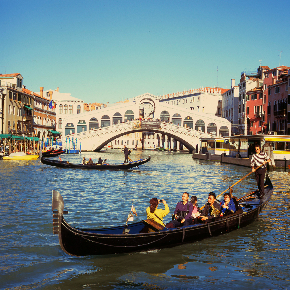
 Posted: Wed Jan 12, 2011 8:18 am Post subject: The Grand Canal Posted: Wed Jan 12, 2011 8:18 am Post subject: The Grand Canal |
 |
|
PaulC wrote:
Pentacon Six with Fuji Velvia 100.
_________________
View or buy my photos at:
http://shutterstock.com/g/paulcowan |
|
| Back to top |
|
 |
Katastrofo

Joined: 26 Feb 2007
Posts: 10405
Location: USA
Expire: 2013-11-19
|
| Posted: Wed Jan 12, 2011 10:45 pm Post subject: |
|
|
Katastrofo wrote:
Great shot, I like it a lot. Think it might be listing to the right some, tho. |
|
| Back to top |
|
|
PaulC
Joined: 23 Dec 2008
Posts: 2318
|
| Posted: Thu Jan 13, 2011 7:57 am Post subject: |
|
|
PaulC wrote:
Well spotted. It seems to be 1 degree out.
_________________
View or buy my photos at:
http://shutterstock.com/g/paulcowan |
|
| Back to top |
|
|
Laurence

Joined: 26 Mar 2007
Posts: 4809
Location: Western Washington State
Expire: 2016-06-19
|
| Posted: Sat Jan 29, 2011 4:06 am Post subject: |
|
|
Laurence wrote:
Paul! This is a stunning image! You really caught the "street scene",
except it's not on a street of course. You took advantage of the Velvia's
colorization to produce a classic looking shot.
_________________
Assent, and you are sane;
Demur,—you ’re straightway dangerous,
And handled with a chain.
Emily Dickinson
Cameras and Lenses in Use:
Yashica Mat 124 w/ Yashinon 80/3.5,
CV Apo-Lanthar 90/3.5SL, (Thank you Klaus),
Pentax 645,
Flek 50,
Pentax-A 150
Pentax-A 120 Macro
Voigtlander Vitomatic I w/Color Skopar 50/2.8
Konica TC and zoom lenses (thanks Carsten)
Contax AX
Yashica ML 50/2
Yashica ML 35/2.8
Carl Zeiss Contax 50/1.4
Tamron Adaptall SP 17/3.5
Tamron Adaptall 28/2.5
Tamron Adaptall SP 300/2.8 LD (IF)
|
|
| Back to top |
|
|
cooltouch

Joined: 15 Jan 2009
Posts: 9096
Location: Houston, Texas
|
| Posted: Sat Jan 29, 2011 8:47 am Post subject: |
|
|
cooltouch wrote:
Very nice, Paul. Great colors.
I have a question about Velvia. I've just shot my first two rolls ever of it -- ISO 50 in my case, one roll of 35mm and one roll of 220. And I was very impressed with both the fineness of grain and the fantastic color saturation. Would you say that the Velvia 100 is close to the 50 in these two areas, or is there a substantial difference?
_________________
Michael
My Gear List: http://michaelmcbroom.com/photo/gear.html
My Gallery: http://michaelmcbroom.com/gallery3/index.php/
My Flickr Page: https://www.flickr.com/photos/11308754@N08/albums
My Music: https://soundcloud.com/michaelmcbroom/albums
My Blog: http://michaelmcbroom.com/blogistan/ |
|
| Back to top |
|
|
PaulC
Joined: 23 Dec 2008
Posts: 2318
|
| Posted: Sat Jan 29, 2011 9:25 am Post subject: |
|
|
PaulC wrote:
I haven't used much of either but I was much happier with the results from Velvia 50 than with Velvia 100. But the blame could easily lie with the photographer.
_________________
View or buy my photos at:
http://shutterstock.com/g/paulcowan |
|
| Back to top |
|
|
peterqd

Joined: 28 Feb 2007
Posts: 7448
Location: near High Wycombe, UK
Expire: 2014-01-04
|
| Posted: Sat Jan 29, 2011 2:27 pm Post subject: |
|
|
peterqd wrote:
It's a great picture, but whenever I see a Velvia shot I get an urge to turn down the color control on the monitor. Sorry :/
_________________
Peter - Moderator |
|
| Back to top |
|
|
eeyore_nl

Joined: 09 Nov 2008
Posts: 837
Location: Netherlands
|
| Posted: Sat Jan 29, 2011 8:17 pm Post subject: |
|
|
eeyore_nl wrote:
| peterqd wrote: |
| It's a great picture, but whenever I see a Velvia shot I get an urge to turn down the color control on the monitor. Sorry :/ |
Yes, it's not a film for the subtle ones 
I do love the picture though!
_________________
Fujifilm X-Pro2 / Fujifilm X-T1 / some Sonnar & Takumar lenses |
|
| Back to top |
|
|
cooltouch
Joined: 15 Jan 2009
Posts: 9096
Location: Houston, Texas
|
| Posted: Sun Jan 30, 2011 1:49 am Post subject: |
|
|
cooltouch wrote:
That's fine by me. I like bold, primary colors. Kodachrome wasn't a film for subtle tones either -- especially yellows and reds. So far, Velvia is the closest I've seen to Kodachrome's saturated colors, although I think it handles greens better. So it has been somewhat cathartic for me, using Velvia while missing Kodachrome.
_________________
Michael
My Gear List: http://michaelmcbroom.com/photo/gear.html
My Gallery: http://michaelmcbroom.com/gallery3/index.php/
My Flickr Page: https://www.flickr.com/photos/11308754@N08/albums
My Music: https://soundcloud.com/michaelmcbroom/albums
My Blog: http://michaelmcbroom.com/blogistan/ |
|
| Back to top |
|
|
PaulC
Joined: 23 Dec 2008
Posts: 2318
|
| Posted: Sun Jan 30, 2011 2:35 pm Post subject: |
|
|
PaulC wrote:
The more I look at it the less I like it. Maybe I need to adjust the white balance and I have lost detail in the bridge...
After scanning it and running it through photoshop, I'm not sure how much of the result is really Velvia and how much of it is me.
_________________
View or buy my photos at:
http://shutterstock.com/g/paulcowan |
|
| Back to top |
|
|
cooltouch
Joined: 15 Jan 2009
Posts: 9096
Location: Houston, Texas
|
| Posted: Sun Jan 30, 2011 6:43 pm Post subject: |
|
|
cooltouch wrote:
Paul, I think it is the Velvia. Or the fact that it is a slide, actually. I was hesitant to offer a criticism at first, but since you've brought it up, I'll mention what I saw. To me, it looked like the image was about 1/2 stop overexposed. Probably not quite a full stop. You had burned through whites, and the sky had turned a sort of turquoise color. These, to me, are symptomatic of overexposure. I can show you examples of slides I have where both these points are present -- burned through whites and turquoise skies -- and in every case, I think the image would have been improved with maybe 1/2 or 2/3 stop less exposure.
Now that I look at the image again, it appears pretty obvious that you've replaced the original with one where you've adjusted the brightness and contrast and saturation even? And to me, your WB is now off. I think your adjustments helped for the most part, and I hope you don't mind, but I "borrowed" you image and adjusted the WB. That's all I did. Turns out that bridge really is pink, isn't it?

_________________
Michael
My Gear List: http://michaelmcbroom.com/photo/gear.html
My Gallery: http://michaelmcbroom.com/gallery3/index.php/
My Flickr Page: https://www.flickr.com/photos/11308754@N08/albums
My Music: https://soundcloud.com/michaelmcbroom/albums
My Blog: http://michaelmcbroom.com/blogistan/
Last edited by cooltouch on Sun Jan 30, 2011 7:13 pm; edited 4 times in total |
|
| Back to top |
|
|
PaulC
Joined: 23 Dec 2008
Posts: 2318
|
| Posted: Sun Jan 30, 2011 6:51 pm Post subject: |
|
|
PaulC wrote:
Yes, that's better the faces are a better colour. Lack of detail in the bridge is still an issue but if there's nothing in the slide then there's nothing I can do about it (and there isn't anything, I just checked).
Now I've got a spotmeter hopefully I won't have these problems. the Pentacon's meter which I was using is a fairly rough approximation.
I'd always rather know what is wrong with something than just be told it's nice, that way I can learn things.
_________________
View or buy my photos at:
http://shutterstock.com/g/paulcowan |
|
| Back to top |
|
|
Laurence
Joined: 26 Mar 2007
Posts: 4809
Location: Western Washington State
Expire: 2016-06-19
|
| Posted: Thu Feb 03, 2011 6:41 pm Post subject: |
|
|
Laurence wrote:
Regarding the question of Velvia 50 or Velvia 100: I have to really get
into a detailed look at the image to tell the differences. I just don't see that
there is as much a difference in coloration, as there is in exposure differences from the camera.
That said, if I DO look very, very closely - Velvia 50 seems a little bit
better in its rendering of the primary colors. But, "better" means how
it looks to MY eyes and is objective.
I like to shoot 50 only because an enlargement could be a tiny bit sharper,
but the essential difference, to me anyway, is not even worth an opinion.
If no 50 is available, I'm very very happy with 100.
_________________
Assent, and you are sane;
Demur,—you ’re straightway dangerous,
And handled with a chain.
Emily Dickinson
Cameras and Lenses in Use:
Yashica Mat 124 w/ Yashinon 80/3.5,
CV Apo-Lanthar 90/3.5SL, (Thank you Klaus),
Pentax 645,
Flek 50,
Pentax-A 150
Pentax-A 120 Macro
Voigtlander Vitomatic I w/Color Skopar 50/2.8
Konica TC and zoom lenses (thanks Carsten)
Contax AX
Yashica ML 50/2
Yashica ML 35/2.8
Carl Zeiss Contax 50/1.4
Tamron Adaptall SP 17/3.5
Tamron Adaptall 28/2.5
Tamron Adaptall SP 300/2.8 LD (IF)
|
|
| Back to top |
|
|
|
|
|
You cannot post new topics in this forum
You cannot reply to topics in this forum
You cannot edit your posts in this forum
You cannot delete your posts in this forum
You cannot vote in polls in this forum
|


