| View previous topic :: View next topic |
| Author |
Message |
rbelyell


Joined: 13 Oct 2009
Posts: 4269
Location: somewhere in the mountains of central NY
Expire: 2014-01-31
|
 Posted: Sat Aug 28, 2010 6:24 pm Post subject: fed 100/6.3-an interesting little lens Posted: Sat Aug 28, 2010 6:24 pm Post subject: fed 100/6.3-an interesting little lens |
 |
|
rbelyell wrote:
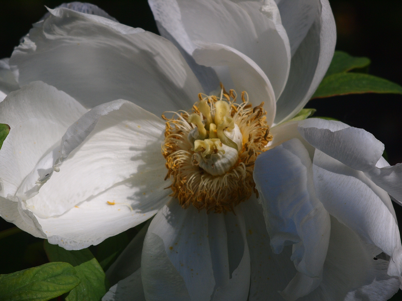
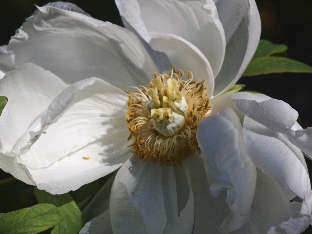
i bought this lens a while ago--a tiny fellow in m39 mount--to use on my ep1. since it is very old and very slow, i think it is somewhat overlooked/and/or seldom used. nonetheless, i think it brings a certain character that is worth knowing about, so i thought i would share some images. hope you enjoy. PLEASE CLICK ON EACH PHOTO FOR BEST RESOLUTION!!! if you dont you will see low contrast/washed out colors!


_________________
Epson RD1 + Elmarit 21/2.8; Summarit 50/1.5; Summarit 75/2.5; Elmar-c 90/4; Sankyo Komura 135/2.8, Hektor 135/4.5; Braun Paxina 29 6x6; Photax Boyer Paris; Holga 120 Pano
GREAT STUFF FOR SALE:
Contax T
Hasselblad XPan + 45/4, 90/4
Kodak Retina Reflex IV + full set of Schneider Krueznach lenses
Mercury 2 half frame 35mm
Kodak Pro slr/n
Fuji GM670+100/3.5+65/8!
Praktisix 6x6 medium format + ZeissBiometar 120/2.8
Bessa T 101 Anniversary Edition in Navy Blue
Mamiya Six Folder with Zuiko 75/3.5
Adaptall: Tamron SP 28-85 macro
Cameras: Canon IX
PM for more complete descriptions/pix. All in great shape!
_________________________
'buy me a drink, sing me a song,
take me as i come 'cause i can't stay long'
Last edited by rbelyell on Sat Sep 11, 2010 2:17 pm; edited 7 times in total |
|
| Back to top |
|
 |
Minolfan

Joined: 30 Dec 2008
Posts: 3438
Location: Netherlands
|
| Posted: Sat Aug 28, 2010 10:50 pm Post subject: |
|
|
Minolfan wrote:
Never seen this lens. Do you have a picture?
Sharpness is not bad at all, contrast and colour just might be not top.
Nice dog! |
|
| Back to top |
|
|
djmike


Joined: 01 Apr 2009
Posts: 930
Location: Taiwan
|
| Posted: Sat Aug 28, 2010 11:58 pm Post subject: |
|
|
djmike wrote:
f6.3? interesting.... and they supposely be sharp if taken at f6.3 or higher.
_________________
DSLR: Canon 400D
SLR: Nikon FM2 + Canon A-1 + Canon AE1-P + Praktica MTL-5B + Pentax Spotmatic F + Fujica ST801 + Voigtlander Bassematic + Voigtlander Vito + Rollei 35S + Rolleiflex SL35 ME + Canon QL17 GIII + Olympus Pen EE-3
Lenses
M42: CZJ Flektogon 35/2.4 + CZJ Flektogon Zebra 35/2.8 + CZJ Pancolar 50/1.8 + CZJ Sonnar 135/3.5 + CZJ Tessar 50/2.8 Chrome + Pentacon 135/2.8 + Pentacon 50/1.8 + SMC Takumar 50/1.4 + SMC Takumar 55/2 + SMC Takumar 135/3.5 + Fujinon 55/1.8 + Jupiter-9 85/2 + Jupiter-37A 135/3.5 + Helios 44-6 58/2
Nikor: Nikkor 50/1.4 + Nikkor 28/3.5 + Nikkor 35-105 Zoom + 36-72 Series E Zoom
Canon: Canon FD + 28/2.8 + 50/1.8 + Canon 35-105 Macro Zoom
Other: Rollei Planar HFT 50/1.8
|
|
| Back to top |
|
|
rbelyell
Joined: 13 Oct 2009
Posts: 4269
Location: somewhere in the mountains of central NY
Expire: 2014-01-31
|
| Posted: Sun Aug 29, 2010 2:51 pm Post subject: |
|
|
rbelyell wrote:
i find the lens quite sharp, even wide open. as i recall most if not all of these were taken at 6.3; none more than f9. if you click on the photos i think you will find the colors most vibrant and pleasing (without clicking colors are very washed out) i did very little, if any, pp on these--maybe taking out some luminance on the yellows. this lens is very kind to greens, so maybe i toned them down a little, that's about it.
here is a very quickly taken picture--the lens is very small and light and a nice 200mm on the ep1, but i think nice for film rf's as well.
_________________
Epson RD1 + Elmarit 21/2.8; Summarit 50/1.5; Summarit 75/2.5; Elmar-c 90/4; Sankyo Komura 135/2.8, Hektor 135/4.5; Braun Paxina 29 6x6; Photax Boyer Paris; Holga 120 Pano
GREAT STUFF FOR SALE:
Contax T
Hasselblad XPan + 45/4, 90/4
Kodak Retina Reflex IV + full set of Schneider Krueznach lenses
Mercury 2 half frame 35mm
Kodak Pro slr/n
Fuji GM670+100/3.5+65/8!
Praktisix 6x6 medium format + ZeissBiometar 120/2.8
Bessa T 101 Anniversary Edition in Navy Blue
Mamiya Six Folder with Zuiko 75/3.5
Adaptall: Tamron SP 28-85 macro
Cameras: Canon IX
PM for more complete descriptions/pix. All in great shape!
_________________________
'buy me a drink, sing me a song,
take me as i come 'cause i can't stay long' |
|
| Back to top |
|
|
AhamB
Joined: 22 Jun 2008
Posts: 733
Location: Germany
|
| Posted: Sun Aug 29, 2010 4:18 pm Post subject: |
|
|
AhamB wrote:
Sharpness seems ok, but... very prominent VEILING GLARE. Worse than I have ever seen, which is why I capitalize it. 
It looks like the shadows are being completely filled in by light from internal reflections (false light).
Why don't you try to do some contrast enhancement, to see if the images can be salvaged somewhat? |
|
| Back to top |
|
|
rbelyell
Joined: 13 Oct 2009
Posts: 4269
Location: somewhere in the mountains of central NY
Expire: 2014-01-31
|
| Posted: Sun Aug 29, 2010 4:27 pm Post subject: |
|
|
rbelyell wrote:
aham, again i ask that people CLICK ON EACH PHOTO in order to obtain best contrast/color/sharpness, which is why i capitalize it!  if you do not do this you will see what seems to be light haze, but in reality is just a constant problem many of us have uploading photos to this site. if you do not do this you will see what seems to be light haze, but in reality is just a constant problem many of us have uploading photos to this site.
if you have the same issue when you click on the photos let me know; i dont see the same effect present at all when the higher rez photos are viewed.
_________________
Epson RD1 + Elmarit 21/2.8; Summarit 50/1.5; Summarit 75/2.5; Elmar-c 90/4; Sankyo Komura 135/2.8, Hektor 135/4.5; Braun Paxina 29 6x6; Photax Boyer Paris; Holga 120 Pano
GREAT STUFF FOR SALE:
Contax T
Hasselblad XPan + 45/4, 90/4
Kodak Retina Reflex IV + full set of Schneider Krueznach lenses
Mercury 2 half frame 35mm
Kodak Pro slr/n
Fuji GM670+100/3.5+65/8!
Praktisix 6x6 medium format + ZeissBiometar 120/2.8
Bessa T 101 Anniversary Edition in Navy Blue
Mamiya Six Folder with Zuiko 75/3.5
Adaptall: Tamron SP 28-85 macro
Cameras: Canon IX
PM for more complete descriptions/pix. All in great shape!
_________________________
'buy me a drink, sing me a song,
take me as i come 'cause i can't stay long' |
|
| Back to top |
|
|
martyn_bannister

Joined: 23 May 2010
Posts: 1151
|
| Posted: Sun Aug 29, 2010 6:06 pm Post subject: |
|
|
martyn_bannister wrote:
Excellent shots (yes I clicked ) Is it me, or is the DOF quite small, even at F6.3? |
|
| Back to top |
|
|
rbelyell
Joined: 13 Oct 2009
Posts: 4269
Location: somewhere in the mountains of central NY
Expire: 2014-01-31
|
| Posted: Sun Aug 29, 2010 6:22 pm Post subject: |
|
|
rbelyell wrote:
thank you martin, both for your kind words and for clicking!!
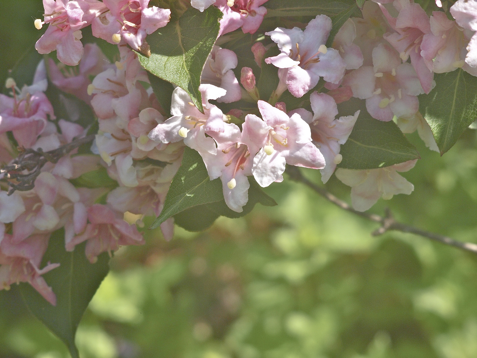
i agree with you, the dof is quite narrow for that aperture setting. i have not done much experimenting with the dof at various apertures. the lens has a stopless aperture ring that goes up to f32, so i would imagine the dof improves around 9-12. as the old cameras were made to shoot at higher apertures, shooting between f9-16 was probably not considered at all unusual for this kind of lens. also, at 100mm it was probably considered a portrait lens--the bokeh in the pink flower shot is pretty cool i think--so the dof probably wasnt such a concern...
i have to say that i am really stunned by the sharpness of this lens for its age and lack of coating...
_________________
Epson RD1 + Elmarit 21/2.8; Summarit 50/1.5; Summarit 75/2.5; Elmar-c 90/4; Sankyo Komura 135/2.8, Hektor 135/4.5; Braun Paxina 29 6x6; Photax Boyer Paris; Holga 120 Pano
GREAT STUFF FOR SALE:
Contax T
Hasselblad XPan + 45/4, 90/4
Kodak Retina Reflex IV + full set of Schneider Krueznach lenses
Mercury 2 half frame 35mm
Kodak Pro slr/n
Fuji GM670+100/3.5+65/8!
Praktisix 6x6 medium format + ZeissBiometar 120/2.8
Bessa T 101 Anniversary Edition in Navy Blue
Mamiya Six Folder with Zuiko 75/3.5
Adaptall: Tamron SP 28-85 macro
Cameras: Canon IX
PM for more complete descriptions/pix. All in great shape!
_________________________
'buy me a drink, sing me a song,
take me as i come 'cause i can't stay long' |
|
| Back to top |
|
|
martyn_bannister
Joined: 23 May 2010
Posts: 1151
|
| Posted: Sun Aug 29, 2010 7:08 pm Post subject: |
|
|
martyn_bannister wrote:
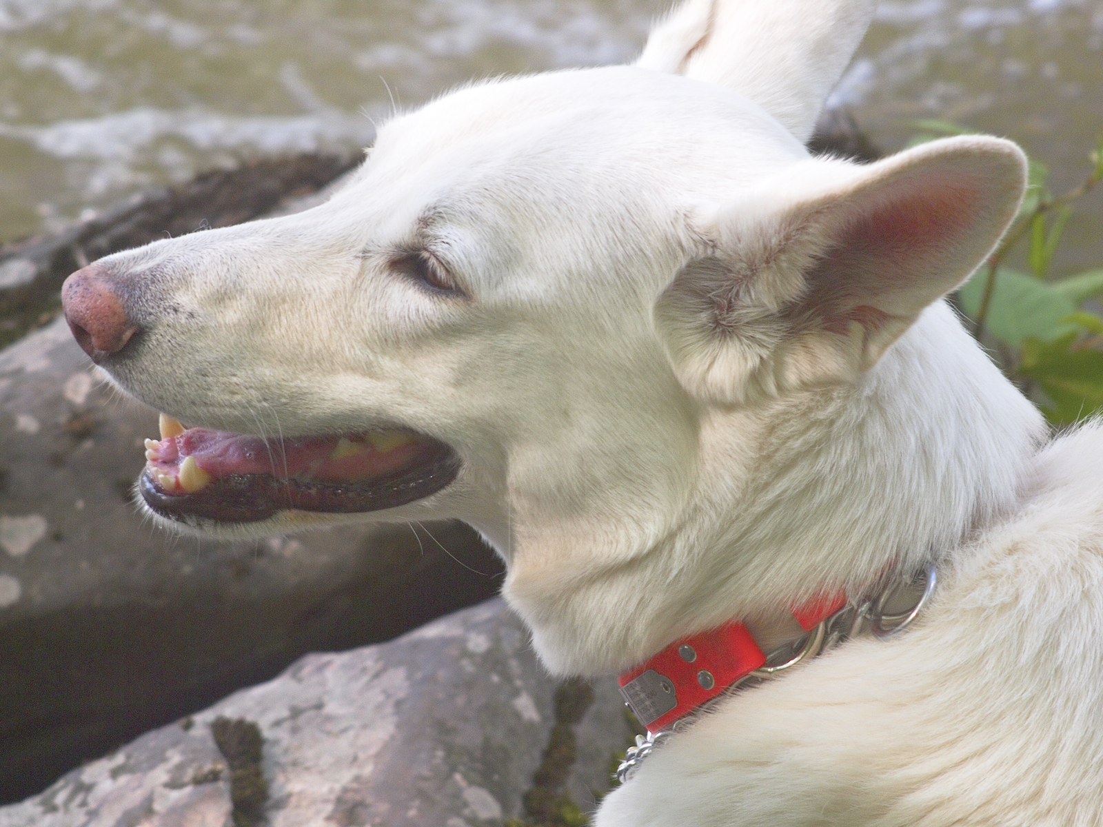
Yes, the last shot of the dog (cute!) is great. Sharpness if very good and colours excellent. Very nice lens well shot. Thanks. |
|
| Back to top |
|
|
AhamB
Joined: 22 Jun 2008
Posts: 733
Location: Germany
|
| Posted: Sun Aug 29, 2010 7:24 pm Post subject: |
|
|
AhamB wrote:
| rbelyell wrote: |
aham, again i ask that people CLICK ON EACH PHOTO in order to obtain best contrast/color/sharpness
if you have the same issue when you click on the photos let me know; i dont see the same effect present at all when the higher rez photos are viewed. |
I did click on the photo's and there is more detail in the bigger size picture of course, but colour and contrast is the same (of course). The colour isn't the problem, but the contrast is very low, especially in the shadows. It's most obvious in the 2nd picture that there is a veil/haze over the entire picture.
Is this lens uncoated? |
|
| Back to top |
|
|
rbelyell
Joined: 13 Oct 2009
Posts: 4269
Location: somewhere in the mountains of central NY
Expire: 2014-01-31
|
| Posted: Sun Aug 29, 2010 7:46 pm Post subject: |
|
|
rbelyell wrote:
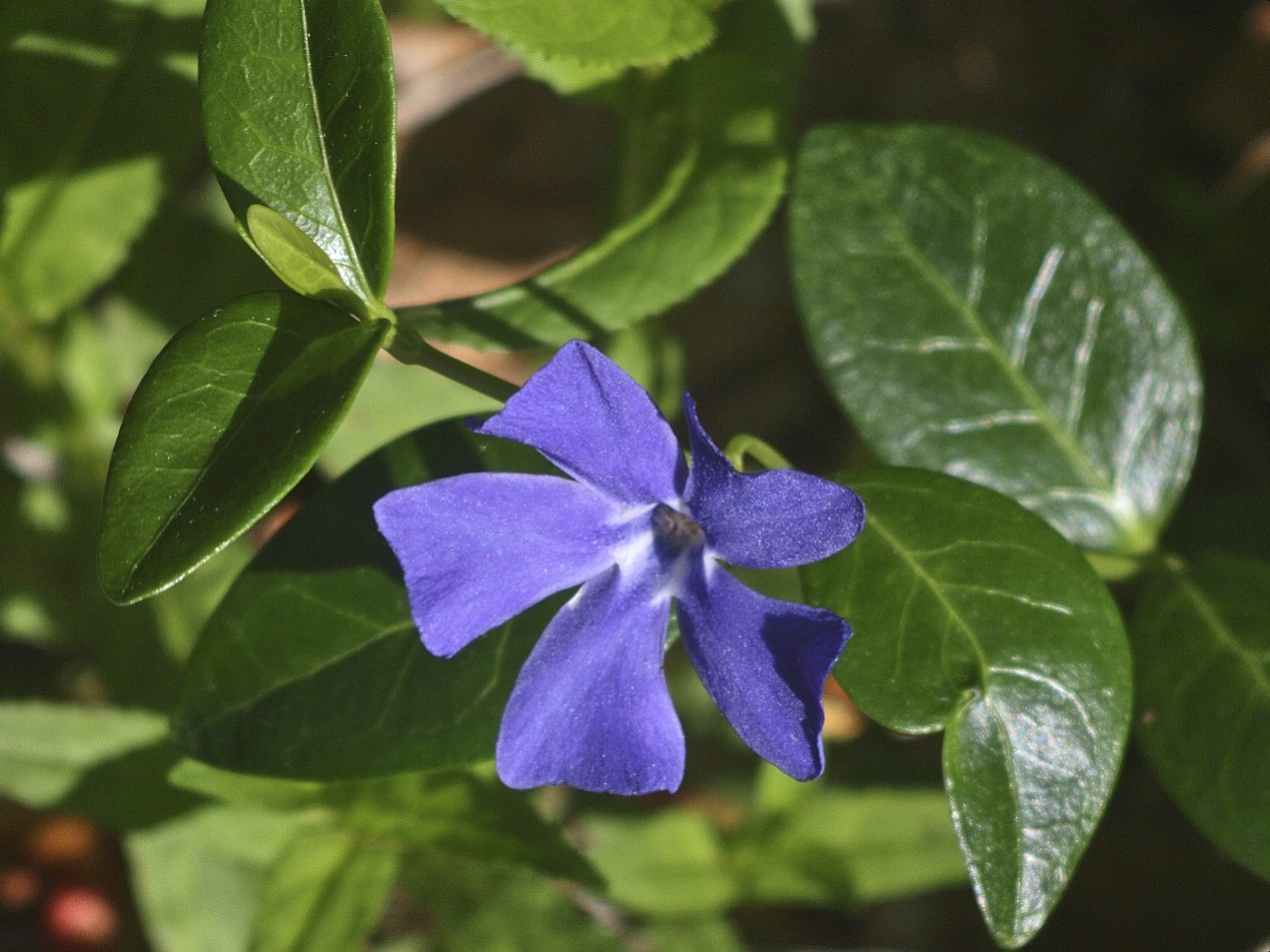
that's very interesting aham, and thank you for the feedback. when i click on them here, and as i see them in my photo editing program, the colors are quite different, much deeper; as is the contrast, much more striking. i find the shots of the violet flower (especially the surrounding leaves) and the dog have much increased contrast and much more vibrant color when i click on them. sorry that didnt come through for you when you do same...
tbh, this is a source of great frustration for me and why i do not post pictures on this site more often. what i see in my editing program (aperture) is NEVER even close to what i see when uploaded on this site. clicking comes much closer, but still not the same...
_________________
Epson RD1 + Elmarit 21/2.8; Summarit 50/1.5; Summarit 75/2.5; Elmar-c 90/4; Sankyo Komura 135/2.8, Hektor 135/4.5; Braun Paxina 29 6x6; Photax Boyer Paris; Holga 120 Pano
GREAT STUFF FOR SALE:
Contax T
Hasselblad XPan + 45/4, 90/4
Kodak Retina Reflex IV + full set of Schneider Krueznach lenses
Mercury 2 half frame 35mm
Kodak Pro slr/n
Fuji GM670+100/3.5+65/8!
Praktisix 6x6 medium format + ZeissBiometar 120/2.8
Bessa T 101 Anniversary Edition in Navy Blue
Mamiya Six Folder with Zuiko 75/3.5
Adaptall: Tamron SP 28-85 macro
Cameras: Canon IX
PM for more complete descriptions/pix. All in great shape!
_________________________
'buy me a drink, sing me a song,
take me as i come 'cause i can't stay long' |
|
| Back to top |
|
|
AhamB
Joined: 22 Jun 2008
Posts: 733
Location: Germany
|
| Posted: Mon Aug 30, 2010 10:26 am Post subject: |
|
|
AhamB wrote:
I see, you're on a Mac. Maybe it's the 1.8 (Mac) vs 2.2 (rest of the world) gamma value problem. I guess your image is just displaying too bright for all users that are not on a Mac.
I don't understand how people deal with this these days. I'd think that by now Apple would have done something about it. I thought I read about (many?) Mac users starting to use a gamma of 2.2 in the past years... that would be the solution. |
|
| Back to top |
|
|
no-X

Joined: 19 Jul 2008
Posts: 2495
Location: Budejky, Czech Republic
|
| Posted: Mon Aug 30, 2010 10:55 am Post subject: |
|
|
no-X wrote:
This lens has really pleasant bokeh and colors. I searched for its optical design and - surprise - it's quite uncommon optical formula a bit similar to Petzval's lens.
It consists of 2 cemented optical groups, so it has only 2 inner air-glass surfaces(!). The lens should be contrasty even without coating. I'd recommend using a deep lens-hood and careful cleaning of the inner optical surfaces (some condensation could be there).

_________________
(almost) complete list of Helios lenses |
|
| Back to top |
|
|
scsambrook

Joined: 29 Mar 2009
Posts: 2167
Location: Glasgow Scotland
Expire: 2011-11-18
|
| Posted: Mon Aug 30, 2010 12:32 pm Post subject: |
|
|
scsambrook wrote:
This is all really interesting - a great little lens for rebelyell and a Big Thank You to no-x for the optical diagramme. I had assumed it was simply a copy of the Leitz 'Mountain Elmar'. Shows the dangers of making assumptions.
_________________
Stephen
Equipment: Pentax DSLR for casual shooting, Lumix G1 and Fuji XE-1 for playing with old lenses, and Leica M8 because I still like the optical rangefinder system. |
|
| Back to top |
|
|
Fretless Pete


Joined: 12 Oct 2009
Posts: 171
Location: UK
|
| Posted: Tue Aug 31, 2010 12:15 pm Post subject: |
|
|
Fretless Pete wrote:
I think i agree with the slight lack of contrast and washed out appearance, but i think they're maybe some camera shake or something too, but in saying that, i think the lens is remarkable, and careful technique would reward.
I guess it doesnt help having the PC / Mac thing either.
But if you dont mind rbelyell , i ran 3 of your pics through PP and i think the shots are mostly pretty good, especially your beautiful dog. That one is excellent. You have a good little lens there
I resized them from the huge 1600 pix of the originals to 1024


_________________
Dogs Trust + RSPB member |
|
| Back to top |
|
|
rbelyell
Joined: 13 Oct 2009
Posts: 4269
Location: somewhere in the mountains of central NY
Expire: 2014-01-31
|
| Posted: Tue Aug 31, 2010 6:59 pm Post subject: |
|
|
rbelyell wrote:
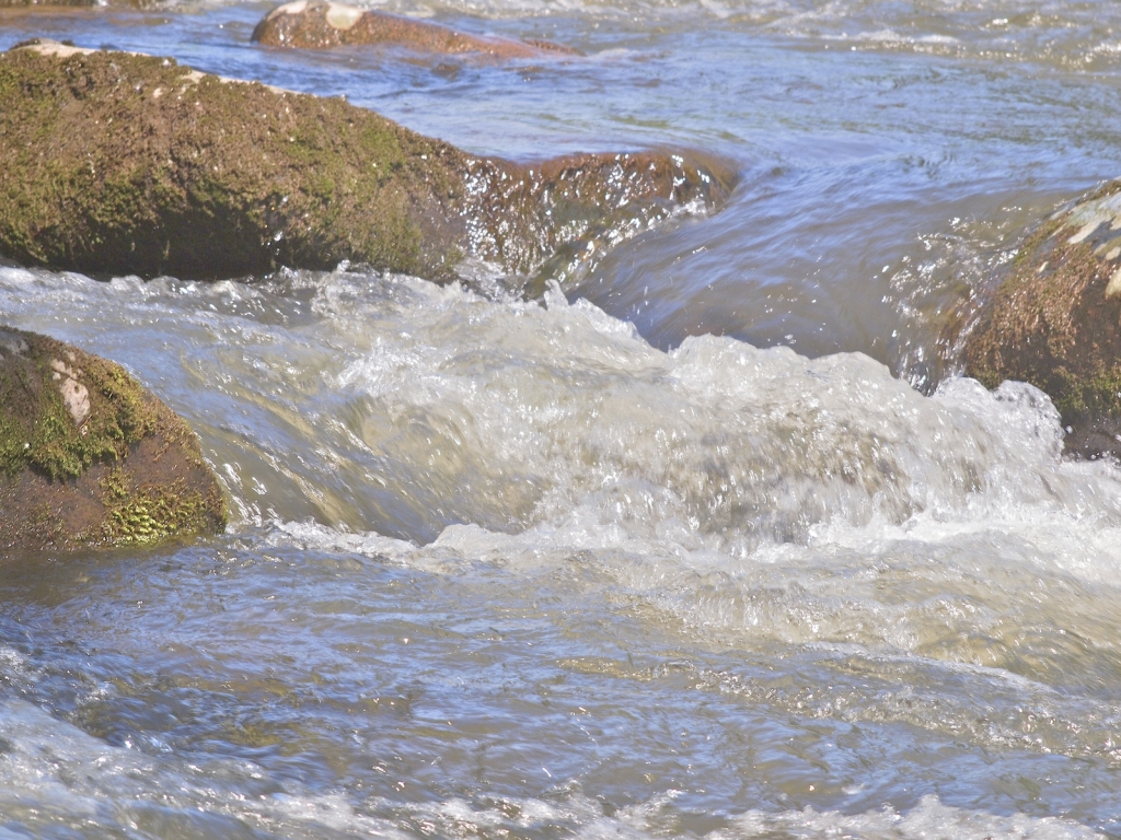
hey pete, that's very interesting. the water scene looks about the same as how i see mine on my monitor; your flower came out better than mine; and my dog came out better than yours (IMHO)--a little too much contrast for me.
what program do you use? do you think i would get better uploading results if i upload at 1024 vs 1600?
thanks
_________________
Epson RD1 + Elmarit 21/2.8; Summarit 50/1.5; Summarit 75/2.5; Elmar-c 90/4; Sankyo Komura 135/2.8, Hektor 135/4.5; Braun Paxina 29 6x6; Photax Boyer Paris; Holga 120 Pano
GREAT STUFF FOR SALE:
Contax T
Hasselblad XPan + 45/4, 90/4
Kodak Retina Reflex IV + full set of Schneider Krueznach lenses
Mercury 2 half frame 35mm
Kodak Pro slr/n
Fuji GM670+100/3.5+65/8!
Praktisix 6x6 medium format + ZeissBiometar 120/2.8
Bessa T 101 Anniversary Edition in Navy Blue
Mamiya Six Folder with Zuiko 75/3.5
Adaptall: Tamron SP 28-85 macro
Cameras: Canon IX
PM for more complete descriptions/pix. All in great shape!
_________________________
'buy me a drink, sing me a song,
take me as i come 'cause i can't stay long' |
|
| Back to top |
|
|
Fretless Pete
Joined: 12 Oct 2009
Posts: 171
Location: UK
|
| Posted: Tue Aug 31, 2010 7:15 pm Post subject: |
|
|
Fretless Pete wrote:
Hi Pal - yes, post process is always down to personal prefs a lot of the time, but i'm happy you like them.
To be honest, i dont think changing from 1600 to 1024 will see much benefit, as the only reason i did that was to make viewing them on the forums easier.
My own photos on my PC are kept at similar size to yours ( 1500 + ) and thats after processing, so i'm not sure this will help at all.
I think, opinions will vary, that perhaps you might need to try a different technique with this lens - possibly stopping down more, as it maybe that its not baffled enough, and too much reflected light inside the tubes can wash out photos and dilute contrast.
On the other hand, you have this thing with the monitors showing differing amounts of contrast and such, so to see whats going, can you load these photos onto a flash memory stick, and take them to a friends PC ( not a Mac ! ) and see whether you can notice any difference in your originals from your Mac, to a friends PC.
_________________
Dogs Trust + RSPB member |
|
| Back to top |
|
|
rbelyell
Joined: 13 Oct 2009
Posts: 4269
Location: somewhere in the mountains of central NY
Expire: 2014-01-31
|
| Posted: Tue Aug 31, 2010 7:32 pm Post subject: |
|
|
rbelyell wrote:
well, i am very happy with the results of the lens. i am always unhappy with posting pictures on this site as they never look as they do on my monitor. i do think it is the gamma difference between macs and pc's, though i noticed much less of a difference when i used lightroom for pp and exporting. now i use aperture and the difference is frightening. if viewed as they appear on this site, without 'clicking' on them, all my pictures look like garbage! i might try uploading pictures through firefox next, as opposed to safari....
_________________
Epson RD1 + Elmarit 21/2.8; Summarit 50/1.5; Summarit 75/2.5; Elmar-c 90/4; Sankyo Komura 135/2.8, Hektor 135/4.5; Braun Paxina 29 6x6; Photax Boyer Paris; Holga 120 Pano
GREAT STUFF FOR SALE:
Contax T
Hasselblad XPan + 45/4, 90/4
Kodak Retina Reflex IV + full set of Schneider Krueznach lenses
Mercury 2 half frame 35mm
Kodak Pro slr/n
Fuji GM670+100/3.5+65/8!
Praktisix 6x6 medium format + ZeissBiometar 120/2.8
Bessa T 101 Anniversary Edition in Navy Blue
Mamiya Six Folder with Zuiko 75/3.5
Adaptall: Tamron SP 28-85 macro
Cameras: Canon IX
PM for more complete descriptions/pix. All in great shape!
_________________________
'buy me a drink, sing me a song,
take me as i come 'cause i can't stay long' |
|
| Back to top |
|
|
Fretless Pete
Joined: 12 Oct 2009
Posts: 171
Location: UK
|
| Posted: Tue Aug 31, 2010 7:37 pm Post subject: |
|
|
Fretless Pete wrote:
I did the clicking thing as you requested, and they didnt change much for me.
AS long as you're happy, thats all that counts, so have fun with that baby ! 
_________________
Dogs Trust + RSPB member |
|
| Back to top |
|
|
trifox

Joined: 14 May 2008
Posts: 3614
Location: UK
Expire: 2014-05-29
|
| Posted: Tue Aug 31, 2010 7:47 pm Post subject: |
|
|
trifox wrote:
where is the CA!!!???
poor APO-LANTHAR hehe
NICE PICTURES and superb lens!!
tf
_________________
Flickr.com |
|
| Back to top |
|
|
AhamB
Joined: 22 Jun 2008
Posts: 733
Location: Germany
|
| Posted: Tue Aug 31, 2010 7:58 pm Post subject: |
|
|
AhamB wrote:
| rbelyell wrote: |
| i might try uploading pictures through firefox next, as opposed to safari.... |
That won't make any difference. The browser doesn't change anything about a file that you upload with it. Viewing images will be different in different browsers though. Safari has colour management enabled by default (afaik) and Firefox does not (you have to enable it in about:config). Then there's still some subtle differences. Internet Explorer and most other browsers are not colour managed and will show your images with the wrong colours (since you used AdobeRGB profile and not sRGB). |
|
| Back to top |
|
|
no-X
Joined: 19 Jul 2008
Posts: 2495
Location: Budejky, Czech Republic
|
| Posted: Tue Aug 31, 2010 7:59 pm Post subject: |
|
|
no-X wrote:
The pictures are displayed slightly different in MSIE nad Firefox (firefox shows slightly more contrast and colors).
trifox: I think for f/6.3 lens even 4 lens elements in 2 groups are enough to correct CA to the level of good APO lens. A už by to rejpání stačilo 
_________________
(almost) complete list of Helios lenses |
|
| Back to top |
|
|
martinsmith99

Joined: 31 Aug 2008
Posts: 6950
Location: S Glos, UK
Expire: 2013-11-18
|
| Posted: Tue Aug 31, 2010 8:02 pm Post subject: |
|
|
martinsmith99 wrote:
I think it looks a good lens. The contrast is similar to my I26M. A lens hood may help a bit.
Can nobody post without SHOUTING the odd word these days? 
_________________
Casual attendance these days |
|
| Back to top |
|
|
spleenone

Joined: 26 Dec 2009
Posts: 1130
Location: Slovakia
|
| Posted: Tue Aug 31, 2010 8:07 pm Post subject: |
|
|
spleenone wrote:
| no-X wrote: |
The pictures are displayed slightly different in MSIE nad Firefox (firefox shows slightly more contrast and colors).
trifox: I think for f/6.3 lens even 4 lens elements in 2 groups are enough to correct CA to the level of good APO lens. A už by to rejpání stačilo |
If is this really true about that FF so I uninstall it right now 
_________________
Shoot on analog mainly with
Nikkor glass
then Pentacon6TL for squares
and Fujica GL690 in case of 6x9
Carpe diem! |
|
| Back to top |
|
|
rbelyell
Joined: 13 Oct 2009
Posts: 4269
Location: somewhere in the mountains of central NY
Expire: 2014-01-31
|
| Posted: Tue Aug 31, 2010 8:53 pm Post subject: |
|
|
rbelyell wrote:
trifox: thanks stan, glad you liked them. not an expensive lens, got it for around $60....
martinsmith: thanks martin. looking at the lens, i dont think there is a way to get a lens hood onto it....will just have to make do....
aham: i just put in a copy of the flower picture uploaded through firefox and located just after that originally uploaded through safari. there is a definite difference, with firefox being improved color and contrast, but still not what i see when i click on photo here or on my monitor at home.
_________________
Epson RD1 + Elmarit 21/2.8; Summarit 50/1.5; Summarit 75/2.5; Elmar-c 90/4; Sankyo Komura 135/2.8, Hektor 135/4.5; Braun Paxina 29 6x6; Photax Boyer Paris; Holga 120 Pano
GREAT STUFF FOR SALE:
Contax T
Hasselblad XPan + 45/4, 90/4
Kodak Retina Reflex IV + full set of Schneider Krueznach lenses
Mercury 2 half frame 35mm
Kodak Pro slr/n
Fuji GM670+100/3.5+65/8!
Praktisix 6x6 medium format + ZeissBiometar 120/2.8
Bessa T 101 Anniversary Edition in Navy Blue
Mamiya Six Folder with Zuiko 75/3.5
Adaptall: Tamron SP 28-85 macro
Cameras: Canon IX
PM for more complete descriptions/pix. All in great shape!
_________________________
'buy me a drink, sing me a song,
take me as i come 'cause i can't stay long' |
|
| Back to top |
|
|
|
|