| View previous topic :: View next topic |
| Author |
Message |
wakarimasen
Joined: 06 Feb 2009
Posts: 2
|
 Posted: Sun Feb 08, 2009 5:38 pm Post subject: What's wrong with this picture? Posted: Sun Feb 08, 2009 5:38 pm Post subject: What's wrong with this picture? |
 |
|
wakarimasen wrote:
Hello folks.
I am trying 35mm film after quite a while of being digital only.
Having bought a few cameras recently (Olympus Trip 35, Fed 2 and a Yashica Electro 35) I loaded a cheap film into the first to try out. To see the results, I took it to a local store and had the film (Colour Truprint ASA200 - a film I found in a drawer!) developed as negatives and scanned.
Having looked at the results on my PC I'm quite disappointed: there are quite a few focussing errors on my part, most of the scans lak detail - especially when viewed at 100%.
My questions:
am I expecting too much from a cheap film?
should I try a different processing store?
can the scanning make a real difference?
Best regards,
RoyM
_________________
tap tap tap... |
|
| Back to top |
|
 |
Attila


Joined: 24 Feb 2007
Posts: 57865
Location: Hungary
Expire: 2025-11-18
|
 Posted: Sun Feb 08, 2009 6:05 pm Post subject: Posted: Sun Feb 08, 2009 6:05 pm Post subject: |
 |
|
Attila wrote:
Hello ,
All of your question can make real difference.
Cheap film
Same film, same scan, same developing lab
Crappy result (lighting was poor)
http://www.mflenses.com/gallery/v/filmcamera/exa2a/
Superb result (lighting was excellent and camera also 
http://www.mflenses.com/gallery/v/filmcamera/yashica_electro_35/
Pro film, pro gear , same scan , pro result
http://www.mflenses.com/gallery/v/filmcamera/Voigtlander/bessa_L_voigtlander_heliar_Tenerife/
_________________
-------------------------------
Items on sale on Ebay
Sony NEX-7 Carl Zeiss Planar 85mm f1.4, Minolta MD 35mm f1.8, Konica 135mm f2.5, Minolta MD 50mm f1.2, Minolta MD 250mm f5.6, Carl Zeiss Sonnar 180mm f2.8
|
|
| Back to top |
|
 |
Attila


Joined: 24 Feb 2007
Posts: 57865
Location: Hungary
Expire: 2025-11-18
|
 Posted: Sun Feb 08, 2009 6:06 pm Post subject: Posted: Sun Feb 08, 2009 6:06 pm Post subject: |
 |
|
Attila wrote:
Some cheap film can be good, same don't. Slide and pro films are always better than any digital camera especially on medium or above format.
_________________
-------------------------------
Items on sale on Ebay
Sony NEX-7 Carl Zeiss Planar 85mm f1.4, Minolta MD 35mm f1.8, Konica 135mm f2.5, Minolta MD 50mm f1.2, Minolta MD 250mm f5.6, Carl Zeiss Sonnar 180mm f2.8
|
|
| Back to top |
|
 |
wakarimasen
Joined: 06 Feb 2009
Posts: 2
|
 Posted: Sun Feb 08, 2009 9:43 pm Post subject: Posted: Sun Feb 08, 2009 9:43 pm Post subject: |
 |
|
wakarimasen wrote:
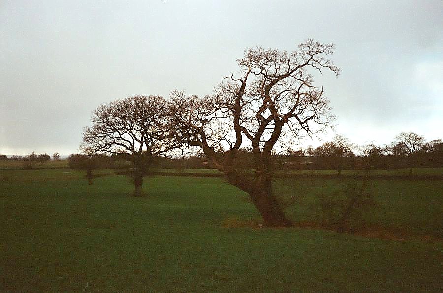
Ok - here is an example. Any comments welcome!
Best regards,
RoyM

_________________
tap tap tap... |
|
| Back to top |
|
 |
spiralcity


Joined: 02 Oct 2008
Posts: 1207
Location: Chicago, U.S.A
|
 Posted: Tue Feb 10, 2009 7:55 am Post subject: Re: What's wrong with this picture? Posted: Tue Feb 10, 2009 7:55 am Post subject: Re: What's wrong with this picture? |
 |
|
spiralcity wrote:
| wakarimasen wrote: |
Hello folks.
I am trying 35mm film after quite a while of being digital only.
Having bought a few cameras recently (Olympus Trip 35, Fed 2 and a Yashica Electro 35) I loaded a cheap film into the first to try out. To see the results, I took it to a local store and had the film (Colour Truprint ASA200 - a film I found in a drawer!) developed as negatives and scanned.
Having looked at the results on my PC I'm quite disappointed: there are quite a few focussing errors on my part, most of the scans lak detail - especially when viewed at 100%.
My questions:
am I expecting too much from a cheap film?
should I try a different processing store?
can the scanning make a real difference?
Best regards,
RoyM |
Exposure here my friend. You basically shot a silhouette, was this the outcome you where looking for?
This is known as a high contrast scene. The sky is big and bright while the foliage and trees are in shadow. you dont have any detail in the foreground.
Take a reading of the darkest shadows that you want to record detail in then close down 1 stop from this reading. So if your shadows called for f/2.8 at 1/60 shoot at f/4 1/60. This will provide for proper exposure of the shadows and also provide good exposure for everything else except the brightest highlights.
Remember that color negative film can handle at best 3 or 4 stops overexposure but at MOST only one stop underexposure. So it should be clear that in a high contrast scene you want to expose for the shadows.
Unless your shooting silhouettes.
If i would have shot this scene I would have walked right up to the furthest tree and took a reading directly from the bark, then i would have stepped back framed my pic and stopped down 1 stop focused and shot. i would also have bracketed a few shots then compared the results.
Results when weight is given to highlights. You get a silhouette.

Midtone adjustment, sharp and saturation. could be better but a quick look at the blocked out shadows here.
 |
|
| Back to top |
|
 |
|
|
|
You cannot post new topics in this forum
You cannot reply to topics in this forum
You cannot edit your posts in this forum
You cannot delete your posts in this forum
You cannot vote in polls in this forum
|
