| View previous topic :: View next topic |
| Author |
Message |
Laurence


Joined: 26 Mar 2007
Posts: 4809
Location: Western Washington State
Expire: 2016-06-19
|
 Posted: Sun Sep 21, 2008 5:12 am Post subject: "Finished" Image - B&W Transparency Posted: Sun Sep 21, 2008 5:12 am Post subject: "Finished" Image - B&W Transparency |
 |
|
Laurence wrote:
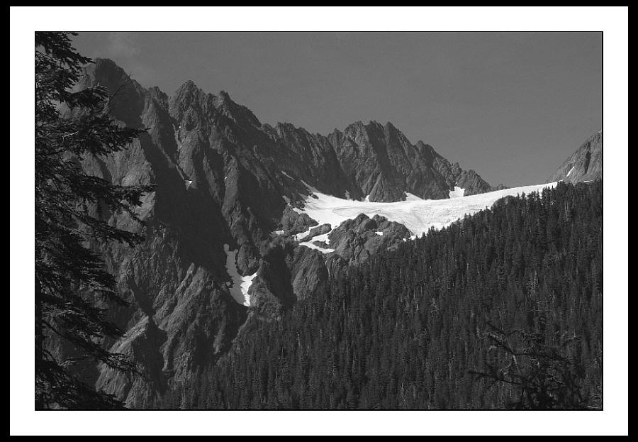
Here's a little more finished image, compared to the "raw" scans in the Oversize Gallery.
This is from the black and white transparency, processed by dr5.
Scanned in Silverfast with Ilford B&W emulation.
In Photoshop - Cropped slightly, Very Light Unsharp Mask @20:1:0.
There are still some anomalies and artifacts from the web sizing,
but this is getting closer to what I want.
I am pleased with the tonalities of Ilford's Delta 100.
I was a bit worried about the low ASA causing some flatness
to the contrast, but after scanning, I think the contrast is extremely
close to what I saw. Of special merit to me, is the
delineation between tones in the foreground trees against
the forested hillsides. There is not a lot of difference in tones
there, but the low ASA produced minimum grain, which pulled
the subtle differences out. Accordingly, this caused better
depth overall. The transparency is cutting-edge sharp. 
There were various views of this pocket glacier along the trail I was traveling.
I actually turned around a came back almost two miles to get
back to this perspective.  I liked the way the glacier was only I liked the way the glacier was only
showing a crescentric bit of its lower lobes, and thus it did not dominate
the image, but actually acted as a balance to the image (in my mind).
The glacier still showed a certain power though, as if the ice was a
plasticine presence, carving and crawling in its inexorable quest to flow.
Interface: Ice, Rock, and Trees -- Mount Anderson
Mamiya Sekor RB67 Pro-S
Sekor 180mm prime lens
Ilford Delta 100 @ASA40
f:16, 1/125th
_________________
Assent, and you are sane;
Demur,—you ’re straightway dangerous,
And handled with a chain.
Emily Dickinson
Cameras and Lenses in Use:
Yashica Mat 124 w/ Yashinon 80/3.5,
CV Apo-Lanthar 90/3.5SL, (Thank you Klaus),
Pentax 645,
Flek 50,
Pentax-A 150
Pentax-A 120 Macro
Voigtlander Vitomatic I w/Color Skopar 50/2.8
Konica TC and zoom lenses (thanks Carsten)
Contax AX
Yashica ML 50/2
Yashica ML 35/2.8
Carl Zeiss Contax 50/1.4
Tamron Adaptall SP 17/3.5
Tamron Adaptall 28/2.5
Tamron Adaptall SP 300/2.8 LD (IF)
Last edited by Laurence on Sun Sep 21, 2008 5:31 am; edited 5 times in total |
|
| Back to top |
|
 |
patrickh

Joined: 23 Aug 2007
Posts: 8551
Location: Oregon
Expire: 2011-11-18
|
| Posted: Sun Sep 21, 2008 5:14 am Post subject: |
|
|
patrickh wrote:
It leaves me speechless. Ansel Adams at his best...
patrickh
_________________
DSLR: Nikon D300 Nikon D200 Nex 5N
MF Zooms: Kiron 28-85/3.5, 28-105/3.2, 75-150/3.5, Nikkor 50-135/3.5 AIS // MF Primes: Nikkor 20/4 AI, 24/2 AI, 28/2 AI, 28/2.8 AIS, 28/3.5 AI, 35/1.4 AIS, 35/2 AIS, 35/2.8 PC, 45/2.8 P, 50/1.4 AIS, 50/1.8 AIS, 50/2 AI, 55/2.8 AIS micro, 55/3.5 AI micro, 85/2 AI, 100/2,8 E, 105/1,8 AIS, 105/2,5 AIS, 135/2 AIS, 135/2.8 AIS, 200/4 AI, 200/4 AIS micro, 300/4.5 AI, 300/4.5 AI ED, Arsat 50/1.4, Kiron 28/2, Vivitar 28/2.5, Panagor 135/2.8, Tamron 28/2.5, Tamron 90/2.5 macro, Vivitar 90/2.5 macro (Tokina) Voigtlander 90/3.5 Vivitar 105/2.5 macro (Kiron) Kaleinar 100/2.8 AI Tamron 135/2.5, Vivitar 135/2.8CF, 200/3.5, Tokina 400/5,6
M42: Vivitar 28/2.5, Tamron 28/2.5, Formula5 28/2.8, Mamiya 28/2.8, Pentacon 29/2.8, Flektogon 35/2.4, Flektogon 35/2.8, Takumar 35/3.5, Curtagon 35/4, Takumar 50/1.4, Volna-6 50/2.8 macro, Mamiya 50/1.4, CZJ Pancolar 50/1,8, Oreston 50/1.8, Takumar 50/2, Industar 50/3.5, Sears 55/1.4, Helios 58/2, Jupiter 85/2, Helios 85/1.5, Takumar 105/2.8, Steinheil macro 105/4.5, Tamron 135/2.5, Jupiter 135/4, CZ 135/4, Steinheil Culminar 135/4,5, Jupiter 135/3.5, Takumar 135/3.5, Tair 135/2.8, Pentacon 135/2.8, CZ 135/2.8, Taika 135/3.5, Takumar 150/4, Jupiter 200/4, Takumar 200/4
Exakta: Topcon 100/2.8(M42), 35/2.8, 58/1.8, 135/2.8, 135/2.8 (M42), Kyoei Acall 135/3.5
C/Y: Yashica 28/2.8, 50/1.7, 135/2.8, Zeiss Planar 50/1.4, Distagon 25/2.8
Hexanon: 28/3.5, 35/2.8, 40/1.8, 50/1.7, 52/1.8, 135/3.2, 135/3.5, 35-70/3.5, 200/3.5
P6 : Mir 38 65/3.5, Biometar 80/2.8, Kaleinar 150/2.8, Sonnar 180/2.8
Minolta SR: 28/2.8, 28/3.5, 35/2.8, 45/2, 50/2, 58/1.4, 50/1.7, 135/2.8, 200/3.5
RF: Industar 53/2.8, Jupiter 8 50/2
Enlarg: Rodagon 50/5,6, 80/5,6, 105/5.6, Vario 44-52/4, 150/5.6 180/5.6 El Nikkor 50/2,8,63/2.8,75/4, 80/5,6, 105/5.6, 135/5.6 Schneider 60/5.6, 80/5.6, 80/4S,100/5.6S,105/5.6,135/5.6, 135/5.6S, 150/5.6S, Leica 95/4 |
|
| Back to top |
|
|
A G Photography


Joined: 11 May 2008
Posts: 1480
Location: Bologna - Italy
|
| Posted: Sun Sep 21, 2008 7:22 am Post subject: |
|
|
A G Photography wrote:
Fantastic!
Ilfors Delta 100 is a very nice B&W film, if you want even less grain you could try Fuji Neopan 100 Acros (it's harder to scan though) and I never tried to develop it under its nominal ASA.
_________________
Alessandro
My Photography Website
My Blog about Photography and Italian Cuisine
My Photostream on Flickr
--------------------------------------------------------
DSLR: Nikon d80, Olympus e410
SLR: Chinon CX, Fujica ST605n, Nikon f601, Pentacon FM, Pentax Spotmatic SPII, Praktica FX, Praktica FX2, Voigtlander VST1, Yashica FX-3, Zeiss Contaflex
RF: Altissa Altix, Zorki Ie, Kiev 4b
Medium Format: Pentacon Six TL, Zeiss Ikonta 520/2, Mockba 4, Voigtlander Bessa I, Agfa Isolette II, Agfa Isola
Large Format: Cambo SC 4x5, Rodenstock Sinaron 150/5.6, Rodenstock Rodagon 150/5.6, Schneider Kreuznach Symmar 180/5.6
Lenses
Nikkors: 28/3.5 AIS, 35/2, 50/1.8, 50/2 H, Micro 55/3.5, Micro 60/2.8, 85/1.8, 135/3.5 AI, 200/4 NAI, 18-55/3.5-5.6, 28-80/3.5-5.6, 55-200/4-5.6
CY: Distagon 28/2.8, Planar 50/1.4, Yashika 50/1.7, Sonnar 135/2.8
CZJ m42-Exakta: Flektogon 20/4, Flektogon 35/2.8, Tessar 40/4.5, Tessar 50/2.8, Pancolar 50/1.8, Pancolar 50/2, Biotar 58/2, Biotar 75/1.5, Tessar 80/2.8, Sonnar 135/3.5, Sonnar 135/4, Triotar 135/4
CZJ P6: Flektogon 50/4, Flektogon 65/2.8, Biometar 80/2.8, Biometar 120/2.8, Sonnar 180/2.8
Meyer-Pentacon: Orestegon 29/2.8, Pentacon 29/2.8, Lydith 30/3.5, Primagon 35/4.5, Helioplan 40/4.5, Domiplan 50/2.8, Primotar 50/3.5, Oreston 50/1.8, Primoplan 58/1.9, Orestor 100/2.8, Trioplan 100/2.8, Helioplan 135/4.5, Orestor 135/2.8, Pentacon 135/2.8, Primotar 135/3.5, Primotar 180/3.5, Telemegor 180/5.5, Orestegor 200/4, Pentacon 200/4, Orestegor 300/4, Telemegor 300/4.5, Telemegor 400/5.5
Schneider-Kreuznach: Curtagon 28/4, Curtagon 35/2.8, Xenon 50/1.9, Xenar 50/2.8, Tele Xenar 135/3.5, Tele Xenar 200/4
Russians: Arsat Zodiak 30/3.5, Mir-I 37/2.8, Volna-9 50/2.8, Industar-50 50/3.5, Industar-61 50/2.8, Helios 44 58/2, Helios 44-2 58/2, Helios 44-M-4 58/2, Volna-3 80/2.8, Helios 40 85/1.5, Jupiter 9 85/2, Jupiter 11 135/4
Others: Chinon-Tomioka 55/1.4, Helios 28/2.8, Isco Iscotar 50/2.8, Konica Hexanon 40/1.8, Ludwig Meritar 50/2.9, Schacht Travegon 35/3.5, Schacht Travenon 135/4.5, Sekor 55/1.8, Sigma MF 28/2.8, S-Takumar, 28/3.5, S-Takumar 50/1.4, S-Takumar 55/1.8, S-Takumar 55/2, Steinheil Quinar 135/2.8, Steinheil Culminar 135/4.5, Vivitar 135/2.8, Voigtlander Ultron 50/1.8, Yashica Yashinon DX 50/1.4, Zuiko MC Auto-W 28/2.8
|
|
| Back to top |
|
|
maddog10

Joined: 08 Apr 2008
Posts: 1072
Location: Maryland, USA
Expire: 2015-02-12
|
| Posted: Sun Sep 21, 2008 12:27 pm Post subject: |
|
|
maddog10 wrote:
This is a beautiful landscape and I beautiful photo.
I think I would probably prefer the color version. I seem to like B&W for some portraits and architectural shots, but love color for landscapes.
That said, a great photo is a great photo and this is a GREAT photo.
_________________
Michael Hill |
|
| Back to top |
|
|
Laurence
Joined: 26 Mar 2007
Posts: 4809
Location: Western Washington State
Expire: 2016-06-19
|
| Posted: Sun Sep 21, 2008 4:07 pm Post subject: |
|
|
Laurence wrote:
| patrickh wrote: |
It leaves me speechless. Ansel Adams at his best...
patrickh |
Geeze patrick! Uhhh...not Ansel by a long shot...but I'll take a compliment for sure! I am happy with the b&w transparencies, which seem to scan very well. Thanks as always, patrick.
_________________
Assent, and you are sane;
Demur,—you ’re straightway dangerous,
And handled with a chain.
Emily Dickinson
Cameras and Lenses in Use:
Yashica Mat 124 w/ Yashinon 80/3.5,
CV Apo-Lanthar 90/3.5SL, (Thank you Klaus),
Pentax 645,
Flek 50,
Pentax-A 150
Pentax-A 120 Macro
Voigtlander Vitomatic I w/Color Skopar 50/2.8
Konica TC and zoom lenses (thanks Carsten)
Contax AX
Yashica ML 50/2
Yashica ML 35/2.8
Carl Zeiss Contax 50/1.4
Tamron Adaptall SP 17/3.5
Tamron Adaptall 28/2.5
Tamron Adaptall SP 300/2.8 LD (IF)
|
|
| Back to top |
|
|
Laurence
Joined: 26 Mar 2007
Posts: 4809
Location: Western Washington State
Expire: 2016-06-19
|
| Posted: Sun Sep 21, 2008 4:12 pm Post subject: |
|
|
Laurence wrote:
| A G Photography wrote: |
Fantastic!
Ilfors Delta 100 is a very nice B&W film, if you want even less grain you could try Fuji Neopan 100 Acros (it's harder to scan though) and I never tried to develop it under its nominal ASA. |
Hello Alessandro: First of all, thank you.
There is a "problem" with Neopan under the dr5 process, in that their labs can only process it in Developer #2, which gives a sepia tone only. Of course, if one is looking for sepia, that is a good thing.
Regarding the nominal ASA, almost all of the black and white emulsions have a lowered ASA recommendation with the dr5 process.
_________________
Assent, and you are sane;
Demur,—you ’re straightway dangerous,
And handled with a chain.
Emily Dickinson
Cameras and Lenses in Use:
Yashica Mat 124 w/ Yashinon 80/3.5,
CV Apo-Lanthar 90/3.5SL, (Thank you Klaus),
Pentax 645,
Flek 50,
Pentax-A 150
Pentax-A 120 Macro
Voigtlander Vitomatic I w/Color Skopar 50/2.8
Konica TC and zoom lenses (thanks Carsten)
Contax AX
Yashica ML 50/2
Yashica ML 35/2.8
Carl Zeiss Contax 50/1.4
Tamron Adaptall SP 17/3.5
Tamron Adaptall 28/2.5
Tamron Adaptall SP 300/2.8 LD (IF)
|
|
| Back to top |
|
|
Laurence
Joined: 26 Mar 2007
Posts: 4809
Location: Western Washington State
Expire: 2016-06-19
|
| Posted: Sun Sep 21, 2008 4:16 pm Post subject: |
|
|
Laurence wrote:
| maddog10 wrote: |
This is a beautiful landscape and I beautiful photo.
I think I would probably prefer the color version. I seem to like B&W for some portraits and architectural shots, but love color for landscapes.
That said, a great photo is a great photo and this is a GREAT photo. |
Thank you Mike! I didn't get the color version of this particular shot, as I left my pack almost two miles up the trail, and came back with just the RB67 and tripod, loaded with the Ilford film. I sort of wished I had brought the film insert with Provia with me, but I'm still glad I did hike back to this spot.
I too, love color for landscapes, and generally prefer it. But I'm finding exciting possibilities with black and white for landscapes. It seems "harder" to me somehow, and that is probably because it's tough for me to visualize something in black and white. This particular image was "easier' to envision though, simply because it held obvious contrasts from hot white to very dark.
_________________
Assent, and you are sane;
Demur,—you ’re straightway dangerous,
And handled with a chain.
Emily Dickinson
Cameras and Lenses in Use:
Yashica Mat 124 w/ Yashinon 80/3.5,
CV Apo-Lanthar 90/3.5SL, (Thank you Klaus),
Pentax 645,
Flek 50,
Pentax-A 150
Pentax-A 120 Macro
Voigtlander Vitomatic I w/Color Skopar 50/2.8
Konica TC and zoom lenses (thanks Carsten)
Contax AX
Yashica ML 50/2
Yashica ML 35/2.8
Carl Zeiss Contax 50/1.4
Tamron Adaptall SP 17/3.5
Tamron Adaptall 28/2.5
Tamron Adaptall SP 300/2.8 LD (IF)
|
|
| Back to top |
|
|
Sven

Joined: 02 Aug 2008
Posts: 818
Location: Linköping Sweden
Expire: 2011-12-29
|
| Posted: Sun Sep 21, 2008 6:08 pm Post subject: |
|
|
Sven wrote:
Impressive photo of an impressive landscape.
_________________
DSLR: Nikon D200, Pentax *istDL, Nikon D100 IR converted
SLR: Pentax Spotmatic, Pentax ME,
Nikkor:N 2.8/24 H 3.5/28, 2/35, 2/50, 1.4/50 1.8/85, 3.5/50-135, E 2.8/100, P C 2.5/105, 2.8/135, 2.8/180 ED, 4/200,
M42: Pentacon 4/200, S Takumar 1.8/55, Meyer Orestor 2.8/135, CZJ Flektogon 2.4/35, CZJ Pancolar 1.8/50, CZJ Sonnar 3.5/135
AF Lenses: Nikkor 1.8/50, Pentax 18-55
Flickr http://www.flickr.com/photos/29261959@N08/
Website http://www.hundbilder.nu/ |
|
| Back to top |
|
|
poilu
Joined: 26 Aug 2007
Posts: 10472
Location: Greece
Expire: 2019-08-29
|
| Posted: Sun Sep 21, 2008 6:23 pm Post subject: |
|
|
poilu wrote:
impressive landscape! is this glacier that dark or did you enhance contrast
_________________
T* |
|
| Back to top |
|
|
Laurence
Joined: 26 Mar 2007
Posts: 4809
Location: Western Washington State
Expire: 2016-06-19
|
| Posted: Sun Sep 21, 2008 6:36 pm Post subject: |
|
|
Laurence wrote:
| Sven wrote: |
| Impressive photo of an impressive landscape. |
Thank you Sven!
Would you believe that when I was in my late 20s (a LONG time ago), I joined two others in a climb of the buttress in the left foreground (goes up behind the trees)? I won't be DOING that kind of stuff any more. I remember it was pushing the limit of our ability, and we took great pains to protect our moves with piton belays and chocks for security.
There are larger glaciers on the north side, we are looking at the south face of the massif.
_________________
Assent, and you are sane;
Demur,—you ’re straightway dangerous,
And handled with a chain.
Emily Dickinson
Cameras and Lenses in Use:
Yashica Mat 124 w/ Yashinon 80/3.5,
CV Apo-Lanthar 90/3.5SL, (Thank you Klaus),
Pentax 645,
Flek 50,
Pentax-A 150
Pentax-A 120 Macro
Voigtlander Vitomatic I w/Color Skopar 50/2.8
Konica TC and zoom lenses (thanks Carsten)
Contax AX
Yashica ML 50/2
Yashica ML 35/2.8
Carl Zeiss Contax 50/1.4
Tamron Adaptall SP 17/3.5
Tamron Adaptall 28/2.5
Tamron Adaptall SP 300/2.8 LD (IF)
|
|
| Back to top |
|
|
Laurence
Joined: 26 Mar 2007
Posts: 4809
Location: Western Washington State
Expire: 2016-06-19
|
| Posted: Sun Sep 21, 2008 6:39 pm Post subject: |
|
|
Laurence wrote:
| poilu wrote: |
| impressive landscape! is this glacier that dark or did you enhance contrast |
Hello poilu! The glacier is spot-on to what was seen with my eyes. There are some ablationary surfaces there, where the firn snow has melted back to uncover the extremely hard ice below. It holds a darker tone because the ice is mixed with rock that was plucked from the headwalls at the upper cirque of the glacier.
This small glacier actually spilled over the cliffs below earlier in my life. I wish I had a good shot of it from then (early 1960s). The recession of the glaciers is a sort of "sad" thing, although I do know it's simply what the Earth does naturally.
I didn't adjust contrast on this one, poilu. I did sharpen ever so slightly, and also cropped out some sticks from the right side and from the lower edge.
_________________
Assent, and you are sane;
Demur,—you ’re straightway dangerous,
And handled with a chain.
Emily Dickinson
Cameras and Lenses in Use:
Yashica Mat 124 w/ Yashinon 80/3.5,
CV Apo-Lanthar 90/3.5SL, (Thank you Klaus),
Pentax 645,
Flek 50,
Pentax-A 150
Pentax-A 120 Macro
Voigtlander Vitomatic I w/Color Skopar 50/2.8
Konica TC and zoom lenses (thanks Carsten)
Contax AX
Yashica ML 50/2
Yashica ML 35/2.8
Carl Zeiss Contax 50/1.4
Tamron Adaptall SP 17/3.5
Tamron Adaptall 28/2.5
Tamron Adaptall SP 300/2.8 LD (IF)
|
|
| Back to top |
|
|
|
|


