| View previous topic :: View next topic |
| Author |
Message |
Laurence


Joined: 26 Mar 2007
Posts: 4809
Location: Western Washington State
Expire: 2016-06-19
|
 Posted: Mon Jul 21, 2008 5:27 pm Post subject: New Scan of Old Image Posted: Mon Jul 21, 2008 5:27 pm Post subject: New Scan of Old Image |
 |
|
Laurence wrote:
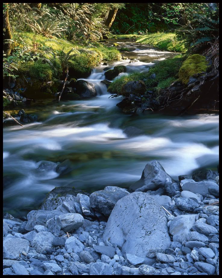
Hey, I'm getting better! (I think  ) )
The previous post of this image was "okay" but didn't have a lot of dimensionality.
I re-scanned with Silverfast, emulating a "cross" between Provia and Velvia, via their advanced settings. I also let Silverfast do its own sharpening algorithm. Does the sharpening seem okay on your monitor? I don't like a lot of manipulation, especially sharpening, and the setting was "super low" in Silverfast.
Seems that the rocks at the bottom got the best output compared to the previous scan with Epson Twain. They were quite blue in the original, and now the tones are simply right on the money with the Silverfast color calibration.
Also, the colors in the creekbed came out just like "real life"! The green "glow" was present to my eyes when looking into the clean, clear water.
The image is a nightmare of contrasts, but Silverfast tamed things down fairly nicely in my opinion. The shadows were brought out with the Histogram (Levels) setting in Silverfast, as I don't have the version of Photoshop that allows for direct shadow recovery.
Anyway, let me know if this is "working"...or not. I would appreciate any pointers or suggestions!
As an aside, this is the little area that I used to take my sleeping bag to, as a youngster. It was great to watch the deer in the meadow, and the steelheads trying to come up that little creek to spawn!
Larry
_________________
Assent, and you are sane;
Demur,�you �re straightway dangerous,
And handled with a chain.
Emily Dickinson
Cameras and Lenses in Use:
Yashica Mat 124 w/ Yashinon 80/3.5,
CV Apo-Lanthar 90/3.5SL, (Thank you Klaus),
Pentax 645,
Flek 50,
Pentax-A 150
Pentax-A 120 Macro
Voigtlander Vitomatic I w/Color Skopar 50/2.8
Konica TC and zoom lenses (thanks Carsten)
Contax AX
Yashica ML 50/2
Yashica ML 35/2.8
Carl Zeiss Contax 50/1.4
Tamron Adaptall SP 17/3.5
Tamron Adaptall 28/2.5
Tamron Adaptall SP 300/2.8 LD (IF)
|
|
| Back to top |
|
 |
Mazero

Joined: 18 Jul 2008
Posts: 44
Location: V�stmanland, Sweden
|
| Posted: Mon Jul 21, 2008 5:30 pm Post subject: |
|
|
Mazero wrote:
It looks great! Wonderful capture! |
|
| Back to top |
|
|
Sandie


Joined: 05 May 2008
Posts: 217
Location: Austria
|
| Posted: Mon Jul 21, 2008 5:31 pm Post subject: |
|
|
Sandie wrote:
The color of the stones is incredible!
May I ask which scanner are you using ?
I am using an Epson Perfection 2480 for negative films, though the results were quite disappointing.
_________________
Canon 5DII + Canon 5D + Canon 350D + Pentax MZ10 + Pracktica BX20 + Mamiya 1000TL + Yashica TL Electro X + Yashica FR1 + Pentax ES II
Carl Zeiss Jena: Flektogon 20/f4, Flektogon 35/f2.4, Pancolar 50/f1.4, Pancolar 50/f1.8, Tessar 50/f2.8, Pancolar 80/f1.8, Sonnar 135/f3.5, Sonnar 135/f4, Sonnar 180/f2.8;
Pentacon: 50/f1.8, 135/f2.8, 200/f4, 300/f4;
Meyer: Orestegon 29/f2.8, Lydith 30/f3.5, Domiplan 50/f2.8, Trioplan 100/f2.8, Orestor 100/f2.8, Telemegor 250/f5.5;
Revuenon: 24/f4(Ennalyt), 28/f3.5(Ennalyt), 200/f3.5(Tomioka);
Yashica: 28/f2.8; 55/f1.2;
Soligor 135/f2.8; 35/f2.8;
Misc: Schacht 50/f2.8; Steinheil 135/f3.5; Mamiya 55/f1.4; Fujinon 135/f3.5; Tokina 70-220/f3.5; Tamron 28/f2.5; Helios 58/f2; Kiron 28/f2; Volna 80/f2.8; Mir 24M 35/f2;Carenar 85-210/f4.5; Olympus 50/f1.8; Chinon 35-80/f3.5-4.9; Pentax 55/f2; |
|
| Back to top |
|
|
Nesster

Joined: 24 Apr 2008
Posts: 5883
Location: NJ, USA
Expire: 2014-02-20
|
| Posted: Mon Jul 21, 2008 5:50 pm Post subject: |
|
|
Nesster wrote:
That is looking mighty good. Inspiring in fact, silverfast, eh? I think I'll have to look into upgrading from my epson software.
Apart from color - and the wonderful water you have flowing - for me a big issue with scans is that they end up looking a bit 'busy', that is, the details aren't quite right. In your scan they look to be just right.
_________________
-Jussi
Camera photos
Print Photographica
|
|
| Back to top |
|
|
Laurence
Joined: 26 Mar 2007
Posts: 4809
Location: Western Washington State
Expire: 2016-06-19
|
| Posted: Mon Jul 21, 2008 6:17 pm Post subject: |
|
|
Laurence wrote:
Mazero wrote: It looks great! Wonderful capture!
Thank you Mazero. Glad it looks good on your monitor.
------------------------------------------------------------------
Sandie wrote: The color of the stones is incredible!
May I ask which scanner are you using ?
I am using an Epson Perfection 2480 for negative films, though the results were quite disappointing.
Sandie, I'm using the Epson V700. I previously had the 2450 which was a VERY decent scanner, especially for 4.5x5 and other sizes of medium format. I too, had difficulty with negative films, but good luck with chromes.
-----------------------------------------------------------------
Nesster wrote: That is looking mighty good. Inspiring in fact, silverfast, eh? I think I'll have to look into upgrading from my epson software.
Apart from color - and the wonderful water you have flowing - for me a big issue with scans is that they end up looking a bit 'busy', that is, the details aren't quite right. In your scan they look to be just right.
Nesstor: Although I used Silverfast's latest program, I happen to also have the Silverfast SE (cut-down program) which has many of the same settings. Since it was a bundled program, I would be glad to send the CD to you, if you would kindly send it back after installing.
I agree with you...many of my scans are STILL looking muddy and busy/garbled in the details, especially with rain forest leaves in the backgrounds. The chromes on the lightbox are sensational, but when scanning, a lot of the "sensational" goes away sometimes. 
Larry
_________________
Assent, and you are sane;
Demur,�you �re straightway dangerous,
And handled with a chain.
Emily Dickinson
Cameras and Lenses in Use:
Yashica Mat 124 w/ Yashinon 80/3.5,
CV Apo-Lanthar 90/3.5SL, (Thank you Klaus),
Pentax 645,
Flek 50,
Pentax-A 150
Pentax-A 120 Macro
Voigtlander Vitomatic I w/Color Skopar 50/2.8
Konica TC and zoom lenses (thanks Carsten)
Contax AX
Yashica ML 50/2
Yashica ML 35/2.8
Carl Zeiss Contax 50/1.4
Tamron Adaptall SP 17/3.5
Tamron Adaptall 28/2.5
Tamron Adaptall SP 300/2.8 LD (IF)
|
|
| Back to top |
|
|
lulalake


Joined: 22 Apr 2007
Posts: 1191
Location: Near Austin Texas
Expire: 2011-11-18
|
| Posted: Mon Jul 21, 2008 6:17 pm Post subject: |
|
|
lulalake wrote:
| Nesster wrote: |
That is looking mighty good. Inspiring in fact, silverfast, eh? I think I'll have to look into upgrading from my epson software.
Apart from color - and the wonderful water you have flowing - for me a big issue with scans is that they end up looking a bit 'busy', that is, the details aren't quite right. In your scan they look to be just right. |
Though I am no great fan of Silverfast, it is a far better and more usable software than Epsonscan.
It does take some fiddling to get it right but that's because of the many different controls that it has. You won''t be dissapointed.
Jules |
|
| Back to top |
|
|
Laurence
Joined: 26 Mar 2007
Posts: 4809
Location: Western Washington State
Expire: 2016-06-19
|
| Posted: Mon Jul 21, 2008 6:19 pm Post subject: |
|
|
Laurence wrote:
| lulalake wrote: |
| Nesster wrote: |
That is looking mighty good. Inspiring in fact, silverfast, eh? I think I'll have to look into upgrading from my epson software.
Apart from color - and the wonderful water you have flowing - for me a big issue with scans is that they end up looking a bit 'busy', that is, the details aren't quite right. In your scan they look to be just right. |
Though I am no great fan of Silverfast, it is a far better and more usable software than Epsonscan.
It does take some fiddling to get it right but that's because of the many different controls that it has. You won''t be dissapointed.
Jules |
Jules, I have heard others indicate that Silverfast is not the best one out there. I will certainly use it for a while, and hopefully get better. This particular image here is helping me to feel better about it. Though not near how I "really want it to be", it's showing promise. I'm still somewhat disappointed with the darks vs. lights, although I DO know that there is only so much you can do with a huge contrast in an image.
As indicated, I'm enamored with the results of the foreground "river rocks". The color is true, and the reason I liked the scene in the first place was the almost "black and white" feel of the rocks against the warmer tones of water. The Epson software rendered this a medium blue. I also liked the 1/3-1/3-1/3 breakup of the main elements for balance.
I'm looking at the little creek coming in to the main Graves Creek channel, and I remember the bit of slower water that you see upstream, harbored two HUGE steelheads spawning when I was a youngster! A good memory, and quite something to see 15-20 pound fish in that small creek!
_________________
Assent, and you are sane;
Demur,�you �re straightway dangerous,
And handled with a chain.
Emily Dickinson
Cameras and Lenses in Use:
Yashica Mat 124 w/ Yashinon 80/3.5,
CV Apo-Lanthar 90/3.5SL, (Thank you Klaus),
Pentax 645,
Flek 50,
Pentax-A 150
Pentax-A 120 Macro
Voigtlander Vitomatic I w/Color Skopar 50/2.8
Konica TC and zoom lenses (thanks Carsten)
Contax AX
Yashica ML 50/2
Yashica ML 35/2.8
Carl Zeiss Contax 50/1.4
Tamron Adaptall SP 17/3.5
Tamron Adaptall 28/2.5
Tamron Adaptall SP 300/2.8 LD (IF)
|
|
| Back to top |
|
|
Laurence
Joined: 26 Mar 2007
Posts: 4809
Location: Western Washington State
Expire: 2016-06-19
|
| Posted: Mon Jul 21, 2008 6:26 pm Post subject: |
|
|
Laurence wrote:
Should I take out that stick on the left bank, where the creek empties into the main stream? Or, just leave it alone? I don't mind a "little" bit of changing a scene, but this might be on the fine line of propriety...
I've decided to pull a 16x20 out of this image, since I have a "free pass" for a 16x20 print via Fuji Printer and their metallic paper. Might as well use the freebie, right?
I think I will re-scan with the same settings, only at 300dpi and 16x20 and 2400dpi , which will make a large file that is "barely" able to be handled by my computer...but it WILL handle it! I could go higher with the printer's "dpi" setting, up to 4800 or so...but no sense in overkill. And the file would be massive.
Not that it's the best image, but for the fact that I would like to have a big print on my wall for the memories the scene gives me. You don't always have to have the best print for enlarging, especially when you have a personal association with a scene.
_________________
Assent, and you are sane;
Demur,�you �re straightway dangerous,
And handled with a chain.
Emily Dickinson
Cameras and Lenses in Use:
Yashica Mat 124 w/ Yashinon 80/3.5,
CV Apo-Lanthar 90/3.5SL, (Thank you Klaus),
Pentax 645,
Flek 50,
Pentax-A 150
Pentax-A 120 Macro
Voigtlander Vitomatic I w/Color Skopar 50/2.8
Konica TC and zoom lenses (thanks Carsten)
Contax AX
Yashica ML 50/2
Yashica ML 35/2.8
Carl Zeiss Contax 50/1.4
Tamron Adaptall SP 17/3.5
Tamron Adaptall 28/2.5
Tamron Adaptall SP 300/2.8 LD (IF)
|
|
| Back to top |
|
|
bob955i
Joined: 15 Apr 2007
Posts: 2495
|
| Posted: Mon Jul 21, 2008 6:54 pm Post subject: |
|
|
bob955i wrote:
I might be more inclined to remove the stick on the LH centre edge of the image Larry as it has less of a connection to the overall scene than the one on the bank IMO.
I'm being a bit picky here though and would sleep on it before choosing either way.  |
|
| Back to top |
|
|
Laurence
Joined: 26 Mar 2007
Posts: 4809
Location: Western Washington State
Expire: 2016-06-19
|
| Posted: Mon Jul 21, 2008 8:27 pm Post subject: |
|
|
Laurence wrote:
| bob955i wrote: |
I might be more inclined to remove the stick on the LH centre edge of the image Larry as it has less of a connection to the overall scene than the one on the bank IMO.
I'm being a bit picky here though and would sleep on it before choosing either way. |
Bob, I saw that one, right after writing the above...that would be the one to remove, for sure. But as you say...I'll sleep on it.
_________________
Assent, and you are sane;
Demur,�you �re straightway dangerous,
And handled with a chain.
Emily Dickinson
Cameras and Lenses in Use:
Yashica Mat 124 w/ Yashinon 80/3.5,
CV Apo-Lanthar 90/3.5SL, (Thank you Klaus),
Pentax 645,
Flek 50,
Pentax-A 150
Pentax-A 120 Macro
Voigtlander Vitomatic I w/Color Skopar 50/2.8
Konica TC and zoom lenses (thanks Carsten)
Contax AX
Yashica ML 50/2
Yashica ML 35/2.8
Carl Zeiss Contax 50/1.4
Tamron Adaptall SP 17/3.5
Tamron Adaptall 28/2.5
Tamron Adaptall SP 300/2.8 LD (IF)
|
|
| Back to top |
|
|
Attila

Joined: 24 Feb 2007
Posts: 57849
Location: Hungary
Expire: 2025-11-18
|
| Posted: Mon Jul 21, 2008 8:45 pm Post subject: |
|
|
Attila wrote:
One of the example why I call you Larry as MAESTRO!
SIMPLE PERFECT!
_________________
-------------------------------
Items on sale on Ebay
Sony NEX-7 Carl Zeiss Planar 85mm f1.4, Minolta MD 35mm f1.8, Konica 135mm f2.5, Minolta MD 50mm f1.2, Minolta MD 250mm f5.6, Carl Zeiss Sonnar 180mm f2.8
|
|
| Back to top |
|
|
maddog10

Joined: 08 Apr 2008
Posts: 1072
Location: Maryland, USA
Expire: 2015-02-12
|
| Posted: Mon Jul 21, 2008 10:44 pm Post subject: |
|
|
maddog10 wrote:
Looks like the stream is the dividing line between life and death. Lush plant growth on the far bank and nothing on the near.
Another excellent sample!
_________________
Michael Hill |
|
| Back to top |
|
|
Laurence
Joined: 26 Mar 2007
Posts: 4809
Location: Western Washington State
Expire: 2016-06-19
|
| Posted: Tue Jul 22, 2008 1:28 am Post subject: |
|
|
Laurence wrote:
Attila, thank you again!
Michael, yes the foreground rocks are, of course, glacial rubble. The Anderson Glacier, White Glacier, and Lindsley Glacier all are at the headwaters and tend to grind off chunks of metamorphic and sedimentary rock. The river sorts these into tiers of gravels, and the sufaces are smooth from all the tumbling.
_________________
Assent, and you are sane;
Demur,�you �re straightway dangerous,
And handled with a chain.
Emily Dickinson
Cameras and Lenses in Use:
Yashica Mat 124 w/ Yashinon 80/3.5,
CV Apo-Lanthar 90/3.5SL, (Thank you Klaus),
Pentax 645,
Flek 50,
Pentax-A 150
Pentax-A 120 Macro
Voigtlander Vitomatic I w/Color Skopar 50/2.8
Konica TC and zoom lenses (thanks Carsten)
Contax AX
Yashica ML 50/2
Yashica ML 35/2.8
Carl Zeiss Contax 50/1.4
Tamron Adaptall SP 17/3.5
Tamron Adaptall 28/2.5
Tamron Adaptall SP 300/2.8 LD (IF)
|
|
| Back to top |
|
|
|
|
|
You cannot post new topics in this forum
You cannot reply to topics in this forum
You cannot edit your posts in this forum
You cannot delete your posts in this forum
You cannot vote in polls in this forum
|


