| View previous topic :: View next topic |
| Author |
Message |
dan_


Joined: 05 Dec 2012
Posts: 1053
Location: Romania
Expire: 2016-12-19
|
 Posted: Tue Jan 17, 2017 6:43 pm Post subject: Van Dyke Brown Print Posted: Tue Jan 17, 2017 6:43 pm Post subject: Van Dyke Brown Print |
 |
|
dan_ wrote:
As I continue my journey into the Van Dyke Brown printing alternative process I'll post here some of my findings (and you can add yours) in the hope that they'll be useful to others interested in trying this old but beautiful technique.
Last edited by dan_ on Tue Jan 17, 2017 7:47 pm; edited 2 times in total |
|
| Back to top |
|
 |
dan_
Joined: 05 Dec 2012
Posts: 1053
Location: Romania
Expire: 2016-12-19
|
| Posted: Tue Jan 17, 2017 6:51 pm Post subject: |
|
|
dan_ wrote:
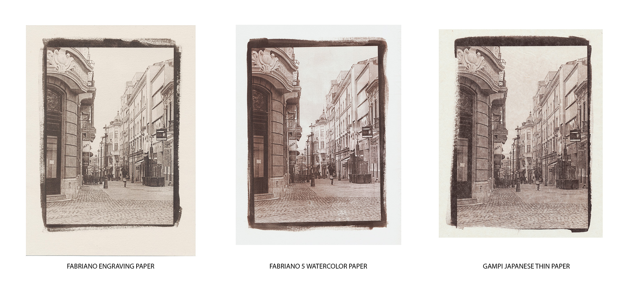
Different papers can produce quite different result. Finding the right paper for each intended output is a laborious process.
Just to show how different papers render the same subject you can see here 3 prints from the same negative, with the same processing but on different papers:

Some characteristics of the papers used:
FABRIANO ENGRAVING - not an easy to work with paper. It is soft but thin and while in water a lot of small fibers and stains become visible but, fortunately, when it dries they all disappear. Its surface shouldn't be touched when wet - it rubs off very easy. I like its soft texture and its color. Somehow the prints resemble old engravings.
FABRIANO 5 - easy to work with it and I'll say that it gives standard good results.
GAMPI JAPANESE THIN PAPER - the most difficult to work with of the 3. It is very thirsty and that's why I applied the emulsion while the paper was in a semi-wet state. Otherwise the emulsion is difficult to apply uniform. In water it becomes transparent and when it dries it is semi-transparent. That is an issue as the dark zones of the photo look stained. In fact there is no stain, just zones of different transparency due to the texture of the paper. If pre-coated with a diluted acrilic painting vernice and pre-mounted on other, thicker paper this issue disappears.
Last edited by dan_ on Tue Jan 17, 2017 7:44 pm; edited 3 times in total |
|
| Back to top |
|
|
kds315*


Joined: 12 Mar 2008
Posts: 16541
Location: Weinheim, Germany
Expire: 2021-03-09
|
| Posted: Tue Jan 17, 2017 7:01 pm Post subject: |
|
|
kds315* wrote:
 Excellent Dan! Excellent Dan!
I really like the Gampi!
_________________
Klaus - Admin
"S'il vient a point, me souviendra" [Thomas Bohier (1460-1523)]
http://www.macrolenses.de for macro and special lens info
http://www.pbase.com/kds315/uv_photos for UV Images and lens/filter info
https://www.flickr.com/photos/kds315/albums my albums using various lenses
http://photographyoftheinvisibleworld.blogspot.com/ my UV BLOG
http://www.travelmeetsfood.com/blog Food + Travel BLOG
https://galeriafotografia.com Architecture + Drone photography
Currently most FAV lens(es):
X80QF f3.2/80mm
Hypergon f11/26mm
ELCAN UV f5.6/52mm
Zeiss UV-Planar f4/60mm
Zeiss UV-Planar f2/62mm
Lomo Уфар-12 f2.5/41mm
Lomo Зуфар-2 f4.0/350mm
Lomo ZIKAR-1A f1.2/100mm
Nikon UV Nikkor f4.5/105mm
Zeiss UV-Sonnar f4.3/105mm
CERCO UV-VIS-NIR f1.8/45mm
CERCO UV-VIS-NIR f4.1/94mm
CERCO UV-VIS-NIR f2.8/100mm
Steinheil Quarzobjektiv f1.8/50mm
Pentax Quartz Takumar f3.5/85mm
Carl Zeiss Jena UV-Objektiv f4/60mm
NYE OPTICAL Lyman-Alpha II f1.1/90mm
NYE OPTICAL Lyman-Alpha I f2.8/200mm
COASTAL OPTICS f4/60mm UV-VIS-IR Apo
COASTAL OPTICS f4.5/105mm UV-Micro-Apo
Pentax Ultra-Achromatic Takumar f4.5/85mm
Pentax Ultra-Achromatic Takumar f5.6/300mm
Rodenstock UV-Rodagon f5.6/60mm + 105mm + 150mm
|
|
| Back to top |
|
|
wolfhansen

Joined: 06 Oct 2013
Posts: 511
Location: Germany, Ruhr Area
|
| Posted: Tue Jan 17, 2017 10:38 pm Post subject: |
|
|
wolfhansen wrote:
very nice, Dan - i like the Gampi print very much
_________________
Greets
Wolfgang |
|
| Back to top |
|
|
dan_
Joined: 05 Dec 2012
Posts: 1053
Location: Romania
Expire: 2016-12-19
|
| Posted: Fri Jan 20, 2017 10:27 am Post subject: |
|
|
dan_ wrote:
Thanks Klaus and wolfhansen. |
|
| Back to top |
|
|
dan_
Joined: 05 Dec 2012
Posts: 1053
Location: Romania
Expire: 2016-12-19
|
| Posted: Mon Jan 23, 2017 4:33 pm Post subject: |
|
|
dan_ wrote:
I like the Gampi paper too, but I still have to find a better way to improve the coating of the paper in order to avoid stains in the dark areas.
One more on Fabriano engraving paper with a slightly different processing:

And my framing intention for the square prints (another variant of the print):
 |
|
| Back to top |
|
|
kds315*
Joined: 12 Mar 2008
Posts: 16541
Location: Weinheim, Germany
Expire: 2021-03-09
|
| Posted: Mon Jan 23, 2017 10:45 pm Post subject: |
|
|
kds315* wrote:

_________________
Klaus - Admin
"S'il vient a point, me souviendra" [Thomas Bohier (1460-1523)]
http://www.macrolenses.de for macro and special lens info
http://www.pbase.com/kds315/uv_photos for UV Images and lens/filter info
https://www.flickr.com/photos/kds315/albums my albums using various lenses
http://photographyoftheinvisibleworld.blogspot.com/ my UV BLOG
http://www.travelmeetsfood.com/blog Food + Travel BLOG
https://galeriafotografia.com Architecture + Drone photography
Currently most FAV lens(es):
X80QF f3.2/80mm
Hypergon f11/26mm
ELCAN UV f5.6/52mm
Zeiss UV-Planar f4/60mm
Zeiss UV-Planar f2/62mm
Lomo Уфар-12 f2.5/41mm
Lomo Зуфар-2 f4.0/350mm
Lomo ZIKAR-1A f1.2/100mm
Nikon UV Nikkor f4.5/105mm
Zeiss UV-Sonnar f4.3/105mm
CERCO UV-VIS-NIR f1.8/45mm
CERCO UV-VIS-NIR f4.1/94mm
CERCO UV-VIS-NIR f2.8/100mm
Steinheil Quarzobjektiv f1.8/50mm
Pentax Quartz Takumar f3.5/85mm
Carl Zeiss Jena UV-Objektiv f4/60mm
NYE OPTICAL Lyman-Alpha II f1.1/90mm
NYE OPTICAL Lyman-Alpha I f2.8/200mm
COASTAL OPTICS f4/60mm UV-VIS-IR Apo
COASTAL OPTICS f4.5/105mm UV-Micro-Apo
Pentax Ultra-Achromatic Takumar f4.5/85mm
Pentax Ultra-Achromatic Takumar f5.6/300mm
Rodenstock UV-Rodagon f5.6/60mm + 105mm + 150mm
|
|
| Back to top |
|
|
dan_
Joined: 05 Dec 2012
Posts: 1053
Location: Romania
Expire: 2016-12-19
|
| Posted: Wed Jan 25, 2017 9:43 am Post subject: |
|
|
dan_ wrote:
 |
|
| Back to top |
|
|
DigiChromeEd

Joined: 29 Dec 2009
Posts: 3462
Location: Northern Ireland
|
| Posted: Wed Jan 25, 2017 4:21 pm Post subject: |
|
|
DigiChromeEd wrote:
Beautiful print process and superb presentation. 
_________________
"I've got a Nikon camera, I like to take a photograph" - Paul Simon |
|
| Back to top |
|
|
dan_
Joined: 05 Dec 2012
Posts: 1053
Location: Romania
Expire: 2016-12-19
|
| Posted: Sat Jan 28, 2017 1:16 am Post subject: |
|
|
dan_ wrote:
Thanks Edgar! |
|
| Back to top |
|
|
dan_
Joined: 05 Dec 2012
Posts: 1053
Location: Romania
Expire: 2016-12-19
|
| Posted: Fri Mar 17, 2017 1:48 am Post subject: |
|
|
dan_ wrote:
SOME THOUGHTS ON THE DIGITAL NEGATIVE PROCESS.
I have lately tested more processes intended for easy produceing a digital negative accorded to the Van Dyke Brown printing capabilities.
Some of them are automatic, developed as Photoshop scripts: ChartThrob and EasyDigital Negatives, others are manual, based on applying PS Curves
All of them are based on the same principles and steps:
1- print a step wedge gray scale on a Pictorico film (inverted, flipped horizontaly and optionally using a chosen UV blocking color instead of black);
2- use the film to make a Van Dyke Brown print of the step wedge;
3- scan the VDB printed step wedge;
4- compare the VDB print with the initial step wedge and then count and build, point by point, a PS Curve to compensate for the gradation response of the VDB process and save it on disk;
5- apply the saved curve to your image, invert it, flip it horizontaly and use the same UV blocking color used for printing the step wedge negative;
6- print the digital negative on Pictorico film.
The resulted digital negative will be, in principle, able to transform an equidistant white to black 100 steps gray scale into an equidistant 100 steps white to brown (the deepest brown your VDB sensitiser/paper combination is capable to print) scale.
As long as the paper, sensitiser and exposure time remain unchanged the saved PS Curve can be used to produce any digital negative you need to make. But the digital negative and your initial image with the PS Curve applied will look very different (very flat tonality) than the final print. That is correct in order to produce a good print. This is the theory.
In reality, as many others noticed, the results are not allways O.K. While a contrasty image will print nicely a less contrasty one will print somehow flat and needs to be further adjusted. You return to Photoshop and change a little the contrast, print another digital negative on Pictorico film and make another VDB print with it. If it is still not O.K. you do it again and again till you are content with the result. Quite laborious and expensive (pictorico film is not cheap) process. Because your image with the needed PS Curve applied looks so flat you'll never know how your changes made in PS will look in the final print until you actually make the print.
Mathematicaly everything in this process is correct. Why the results are not 100% reliable? Well... IMO this process is similar with the old DOLBY system in musical recording. In the Dolby system a wider range of frequencies were compressed using an algorithm into an narrower range in order to be recorded on a tape and then, when the tape was played, the narrow range of frecventyes recorded on it was expanded back to the initial state using an inverse algorithm. In VDB print a wide range of grays are compressed into a narrower range (PS Curve does the compression) so that the VDB process can print it (maximum VDB brown is much less dark than the pure black of the initial image). The problem comes from the fact that, unlike in the DOLBY sistem, there is no final expansion back. It's just like listening a musical casete recorded with Dolby on a player without Dolby capability. It will sound flat. That's why a digital negative made with the actual established processes looks sometimes flat if the initial image you start with is not a contrasty one and that's why you'll need to make further adjustements.
I spent the last weeks trying to find another, different approach to the digital negative problem. IMO the mathematical correctness will not produce the best perceptual image. I have developed (still under testing and tweaking) a Photoshop layout that will allow me to see on the screen the final VDB print (including VDB colors) instead of my initial B/W image and make adjustments directly on it. Then this final print screen image is automatical converted (by an adjustements layer grup) into a digital negative that will produce a VDB print looking very similar (tonality, contrast and color) with the screen image. Unfortunately I don't know so much Java script to make it a Photoshop script, but I may try to make it a VB script for PS CS6 if I'll have the time.
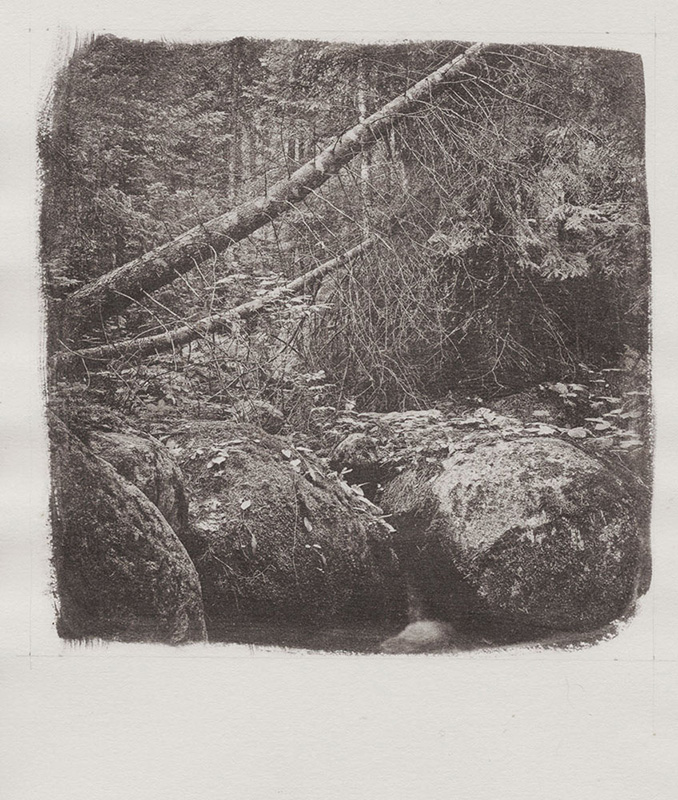
This is a test on Fabriano Artistico paper, made using my new approch on digital negative:
 |
|
| Back to top |
|
|
kds315*
Joined: 12 Mar 2008
Posts: 16541
Location: Weinheim, Germany
Expire: 2021-03-09
|
| Posted: Fri Mar 17, 2017 7:48 am Post subject: |
|
|
kds315* wrote:
very nice Dan and thanks for the detailled explanation of the process!
I do like the printed result a lot!
Btw. the japanese Gampi paper maker has passed, so so Gampi anymore 
_________________
Klaus - Admin
"S'il vient a point, me souviendra" [Thomas Bohier (1460-1523)]
http://www.macrolenses.de for macro and special lens info
http://www.pbase.com/kds315/uv_photos for UV Images and lens/filter info
https://www.flickr.com/photos/kds315/albums my albums using various lenses
http://photographyoftheinvisibleworld.blogspot.com/ my UV BLOG
http://www.travelmeetsfood.com/blog Food + Travel BLOG
https://galeriafotografia.com Architecture + Drone photography
Currently most FAV lens(es):
X80QF f3.2/80mm
Hypergon f11/26mm
ELCAN UV f5.6/52mm
Zeiss UV-Planar f4/60mm
Zeiss UV-Planar f2/62mm
Lomo Уфар-12 f2.5/41mm
Lomo Зуфар-2 f4.0/350mm
Lomo ZIKAR-1A f1.2/100mm
Nikon UV Nikkor f4.5/105mm
Zeiss UV-Sonnar f4.3/105mm
CERCO UV-VIS-NIR f1.8/45mm
CERCO UV-VIS-NIR f4.1/94mm
CERCO UV-VIS-NIR f2.8/100mm
Steinheil Quarzobjektiv f1.8/50mm
Pentax Quartz Takumar f3.5/85mm
Carl Zeiss Jena UV-Objektiv f4/60mm
NYE OPTICAL Lyman-Alpha II f1.1/90mm
NYE OPTICAL Lyman-Alpha I f2.8/200mm
COASTAL OPTICS f4/60mm UV-VIS-IR Apo
COASTAL OPTICS f4.5/105mm UV-Micro-Apo
Pentax Ultra-Achromatic Takumar f4.5/85mm
Pentax Ultra-Achromatic Takumar f5.6/300mm
Rodenstock UV-Rodagon f5.6/60mm + 105mm + 150mm
|
|
| Back to top |
|
|
dan_
Joined: 05 Dec 2012
Posts: 1053
Location: Romania
Expire: 2016-12-19
|
| Posted: Fri Mar 17, 2017 9:36 pm Post subject: |
|
|
dan_ wrote:
Thanks Klaus!
| kds315* wrote: |
| Btw. the japanese Gampi paper maker has passed, so so Gampi anymore |
I didn't know that.
I knew next to nothing about oriental papers before begining the VDB prints. Now I'm enchanted by the very long tradition and the wonderfull diversity of the oriental papers. I wish I'll test them all, but that's not possible, of course .
Anyway, the new paper I'll play with will be some Indian Khadi (100% cotton hand made paper). It is on its way to me.
I've ordered some Gold Chloride (quite expensive at ~100$/100ml of weak 1% solution) and other chemicals, too, and I am going soon to play with gold toning as well. |
|
| Back to top |
|
|
kds315*
Joined: 12 Mar 2008
Posts: 16541
Location: Weinheim, Germany
Expire: 2021-03-09
|
| Posted: Fri Mar 17, 2017 9:49 pm Post subject: |
|
|
kds315* wrote:
| dan_ wrote: |
Thanks Klaus!
| kds315* wrote: |
| Btw. the japanese Gampi paper maker has passed, so so Gampi anymore |
I didn't know that.
I knew next to nothing about oriental papers before begining the VDB prints. Now I'm enchanted by the very long tradition and the wonderfull diversity of the oriental papers. I wish I'll test them all, but that's not possible, of course .
Anyway, the new paper I'll play with will be some Indian Khadi (100% cotton hand made paper). It is on its way to me.
I've ordered some Gold Chloride (quite expensive at ~100$/100ml of weak 1% solution) and other chemicals, too, and I am going soon to play with gold toning as well. |
_________________
Klaus - Admin
"S'il vient a point, me souviendra" [Thomas Bohier (1460-1523)]
http://www.macrolenses.de for macro and special lens info
http://www.pbase.com/kds315/uv_photos for UV Images and lens/filter info
https://www.flickr.com/photos/kds315/albums my albums using various lenses
http://photographyoftheinvisibleworld.blogspot.com/ my UV BLOG
http://www.travelmeetsfood.com/blog Food + Travel BLOG
https://galeriafotografia.com Architecture + Drone photography
Currently most FAV lens(es):
X80QF f3.2/80mm
Hypergon f11/26mm
ELCAN UV f5.6/52mm
Zeiss UV-Planar f4/60mm
Zeiss UV-Planar f2/62mm
Lomo Уфар-12 f2.5/41mm
Lomo Зуфар-2 f4.0/350mm
Lomo ZIKAR-1A f1.2/100mm
Nikon UV Nikkor f4.5/105mm
Zeiss UV-Sonnar f4.3/105mm
CERCO UV-VIS-NIR f1.8/45mm
CERCO UV-VIS-NIR f4.1/94mm
CERCO UV-VIS-NIR f2.8/100mm
Steinheil Quarzobjektiv f1.8/50mm
Pentax Quartz Takumar f3.5/85mm
Carl Zeiss Jena UV-Objektiv f4/60mm
NYE OPTICAL Lyman-Alpha II f1.1/90mm
NYE OPTICAL Lyman-Alpha I f2.8/200mm
COASTAL OPTICS f4/60mm UV-VIS-IR Apo
COASTAL OPTICS f4.5/105mm UV-Micro-Apo
Pentax Ultra-Achromatic Takumar f4.5/85mm
Pentax Ultra-Achromatic Takumar f5.6/300mm
Rodenstock UV-Rodagon f5.6/60mm + 105mm + 150mm
|
|
| Back to top |
|
|
dan_
Joined: 05 Dec 2012
Posts: 1053
Location: Romania
Expire: 2016-12-19
|
| Posted: Sat Mar 25, 2017 8:06 pm Post subject: |
|
|
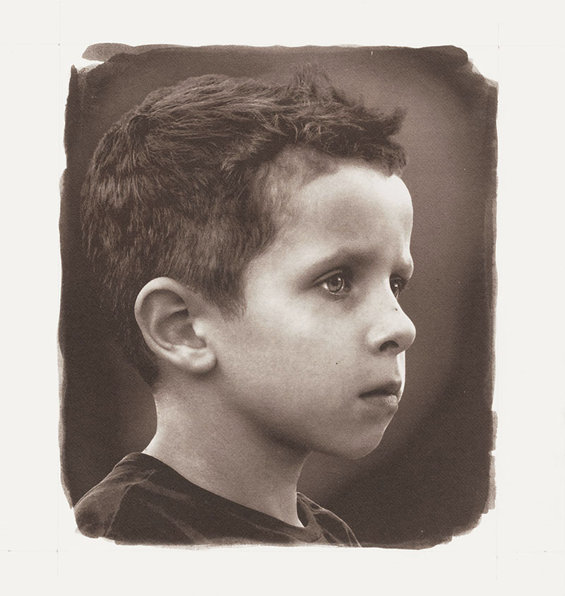
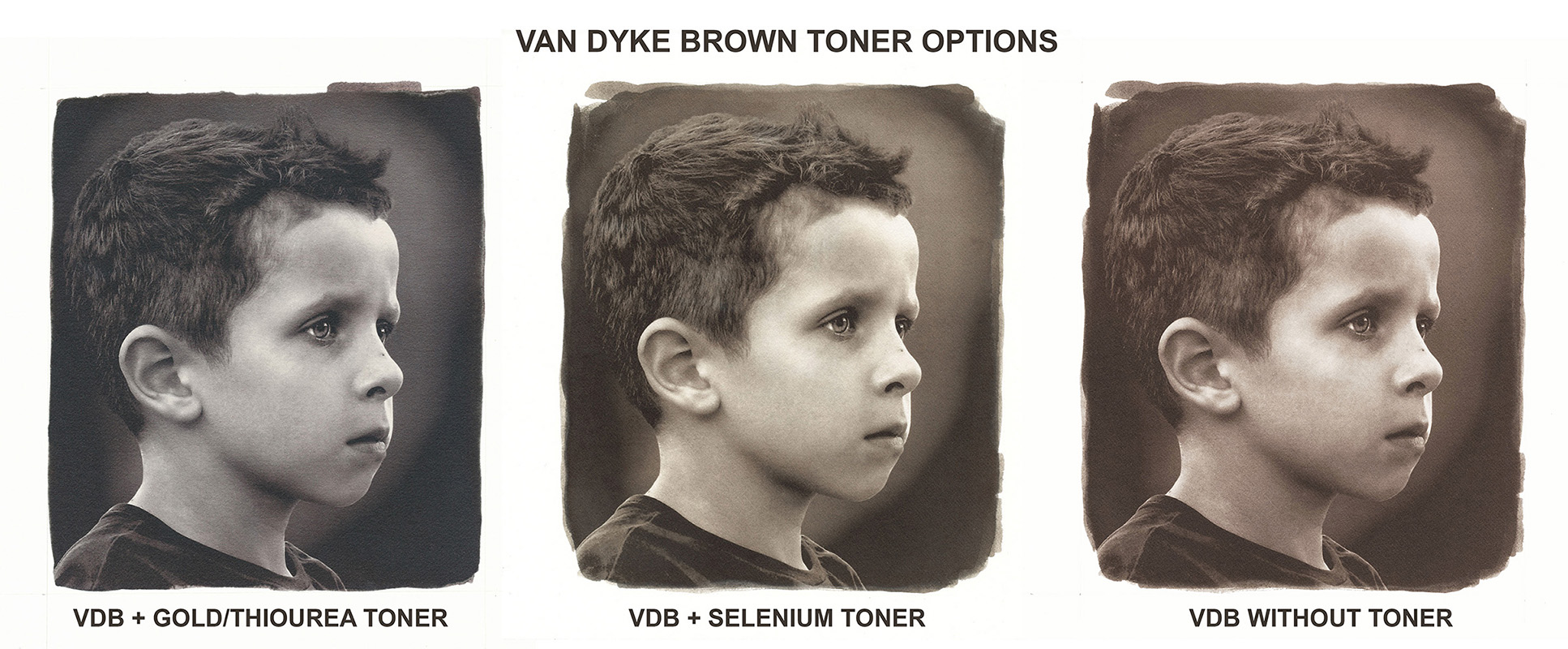
dan_ wrote:
Van Dyke Brown Toner Options - Selenium and Gold/Thiourea
I've used the same image as before to be able to draw conclusions on the most common VDB toner options.
- The Selenium toner was diluted to an 1% solution and the toning time was under 1 min, just till the shadows start to change color. It is an incomplete toning, of course. The intention was only to see the change in color at a level of toning where the shadows are not blanched yet.
- The Gold/Thioureea toning was done to completion with fresh toner and it took ~10min.
The scaner doesn't do justice to the images. Especialy the Gold toned one has much deeper and richer shadows in reality.

The Gold/Thiourea toner is supposed to make the VDB prints as archival as a Platinum/Palladium print (~1000 years?). The paper archival quality is the weak link in this case. |
|
| Back to top |
|
|
kds315*
Joined: 12 Mar 2008
Posts: 16541
Location: Weinheim, Germany
Expire: 2021-03-09
|
| Posted: Sat Mar 25, 2017 10:48 pm Post subject: |
|
|
kds315* wrote:
I really like the results, especially the Gold toner Dan!
Would certainly find buyers on the art market, as they
are into small series, very durable prints like platinum/gold.
_________________
Klaus - Admin
"S'il vient a point, me souviendra" [Thomas Bohier (1460-1523)]
http://www.macrolenses.de for macro and special lens info
http://www.pbase.com/kds315/uv_photos for UV Images and lens/filter info
https://www.flickr.com/photos/kds315/albums my albums using various lenses
http://photographyoftheinvisibleworld.blogspot.com/ my UV BLOG
http://www.travelmeetsfood.com/blog Food + Travel BLOG
https://galeriafotografia.com Architecture + Drone photography
Currently most FAV lens(es):
X80QF f3.2/80mm
Hypergon f11/26mm
ELCAN UV f5.6/52mm
Zeiss UV-Planar f4/60mm
Zeiss UV-Planar f2/62mm
Lomo Уфар-12 f2.5/41mm
Lomo Зуфар-2 f4.0/350mm
Lomo ZIKAR-1A f1.2/100mm
Nikon UV Nikkor f4.5/105mm
Zeiss UV-Sonnar f4.3/105mm
CERCO UV-VIS-NIR f1.8/45mm
CERCO UV-VIS-NIR f4.1/94mm
CERCO UV-VIS-NIR f2.8/100mm
Steinheil Quarzobjektiv f1.8/50mm
Pentax Quartz Takumar f3.5/85mm
Carl Zeiss Jena UV-Objektiv f4/60mm
NYE OPTICAL Lyman-Alpha II f1.1/90mm
NYE OPTICAL Lyman-Alpha I f2.8/200mm
COASTAL OPTICS f4/60mm UV-VIS-IR Apo
COASTAL OPTICS f4.5/105mm UV-Micro-Apo
Pentax Ultra-Achromatic Takumar f4.5/85mm
Pentax Ultra-Achromatic Takumar f5.6/300mm
Rodenstock UV-Rodagon f5.6/60mm + 105mm + 150mm
|
|
| Back to top |
|
|
dan_
Joined: 05 Dec 2012
Posts: 1053
Location: Romania
Expire: 2016-12-19
|
| Posted: Thu Mar 30, 2017 1:24 am Post subject: |
|
|
dan_ wrote:
Thanks for your constant encouragement, Klaus.
I'm only trying to improve my alternative photography printing abilities and this is a sufficient reward for now.
In the past when I tried to make money out of my passions I ended up by spoiling the initial disinterested enthusiasm. This makes me a little reluctant.
But, who knows... |
|
| Back to top |
|
|
dan_
Joined: 05 Dec 2012
Posts: 1053
Location: Romania
Expire: 2016-12-19
|
| Posted: Sun May 28, 2017 8:20 pm Post subject: |
|
|
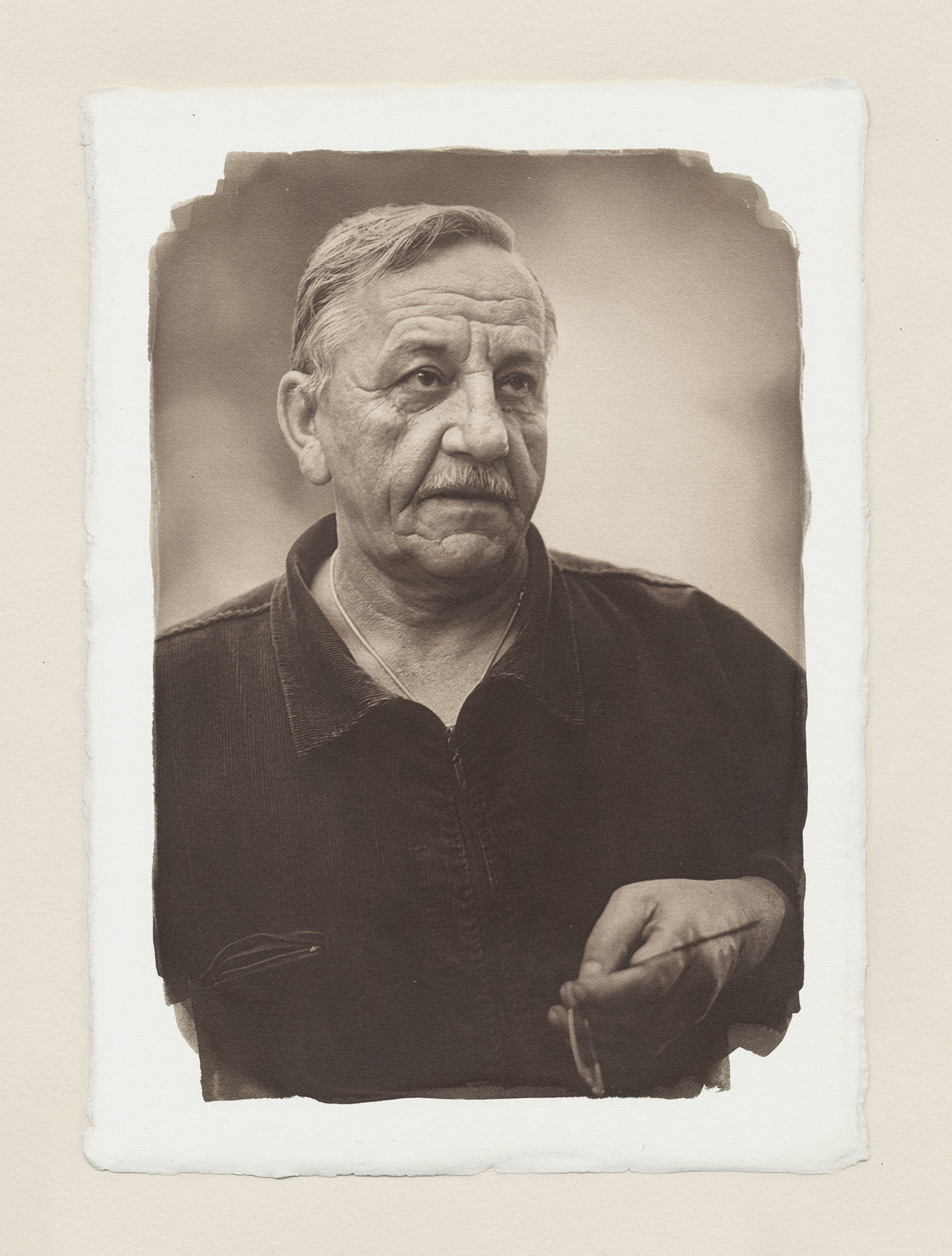
dan_ wrote:
My friend, the painter and Fine Arts teacher Papadopol Constantin.
Double toned VDB on Fabriano Artistico paper - first in a very diluted Selenium toner and then, after 15min of washing, in a 1/2 diluted Gold-Thiourea toner.
 |
|
| Back to top |
|
|
kds315*
Joined: 12 Mar 2008
Posts: 16541
Location: Weinheim, Germany
Expire: 2021-03-09
|
| Posted: Sun May 28, 2017 10:42 pm Post subject: |
|
|
kds315* wrote:
_________________
Klaus - Admin
"S'il vient a point, me souviendra" [Thomas Bohier (1460-1523)]
http://www.macrolenses.de for macro and special lens info
http://www.pbase.com/kds315/uv_photos for UV Images and lens/filter info
https://www.flickr.com/photos/kds315/albums my albums using various lenses
http://photographyoftheinvisibleworld.blogspot.com/ my UV BLOG
http://www.travelmeetsfood.com/blog Food + Travel BLOG
https://galeriafotografia.com Architecture + Drone photography
Currently most FAV lens(es):
X80QF f3.2/80mm
Hypergon f11/26mm
ELCAN UV f5.6/52mm
Zeiss UV-Planar f4/60mm
Zeiss UV-Planar f2/62mm
Lomo Уфар-12 f2.5/41mm
Lomo Зуфар-2 f4.0/350mm
Lomo ZIKAR-1A f1.2/100mm
Nikon UV Nikkor f4.5/105mm
Zeiss UV-Sonnar f4.3/105mm
CERCO UV-VIS-NIR f1.8/45mm
CERCO UV-VIS-NIR f4.1/94mm
CERCO UV-VIS-NIR f2.8/100mm
Steinheil Quarzobjektiv f1.8/50mm
Pentax Quartz Takumar f3.5/85mm
Carl Zeiss Jena UV-Objektiv f4/60mm
NYE OPTICAL Lyman-Alpha II f1.1/90mm
NYE OPTICAL Lyman-Alpha I f2.8/200mm
COASTAL OPTICS f4/60mm UV-VIS-IR Apo
COASTAL OPTICS f4.5/105mm UV-Micro-Apo
Pentax Ultra-Achromatic Takumar f4.5/85mm
Pentax Ultra-Achromatic Takumar f5.6/300mm
Rodenstock UV-Rodagon f5.6/60mm + 105mm + 150mm
|
|
| Back to top |
|
|
dan_
Joined: 05 Dec 2012
Posts: 1053
Location: Romania
Expire: 2016-12-19
|
| Posted: Mon May 29, 2017 9:57 am Post subject: |
|
|
dan_ wrote:
 |
|
| Back to top |
|
|
Sciolist

Joined: 29 Mar 2017
Posts: 1445
Location: Scotland
Expire: 2021-04-16
|
| Posted: Mon May 29, 2017 9:59 am Post subject: |
|
|
Sciolist wrote:
He looks like he could step out of the picture. Beautifully crafted Dan. |
|
| Back to top |
|
|
dan_
Joined: 05 Dec 2012
Posts: 1053
Location: Romania
Expire: 2016-12-19
|
| Posted: Mon May 29, 2017 9:37 pm Post subject: |
|
|
dan_ wrote:
| Sciolist wrote: |
| He looks like he could step out of the picture. Beautifully crafted Dan. |
Thank you! |
|
| Back to top |
|
|
dan_
Joined: 05 Dec 2012
Posts: 1053
Location: Romania
Expire: 2016-12-19
|
| Posted: Mon Jul 03, 2017 12:36 pm Post subject: |
|
|
dan_ wrote:
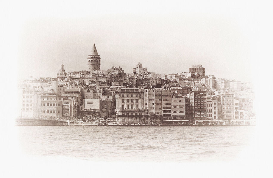
The Galata Tower in Istanbul, Turkey.
I made this print as a gift to a Turkish family-friend on her birthday.
VDB on Fabriano Artistico 100% cotton paper shortly toned in a very diluted Selenium toner.
 |
|
| Back to top |
|
|
dan_
Joined: 05 Dec 2012
Posts: 1053
Location: Romania
Expire: 2016-12-19
|
| Posted: Sun Sep 10, 2017 12:57 am Post subject: |
|
|
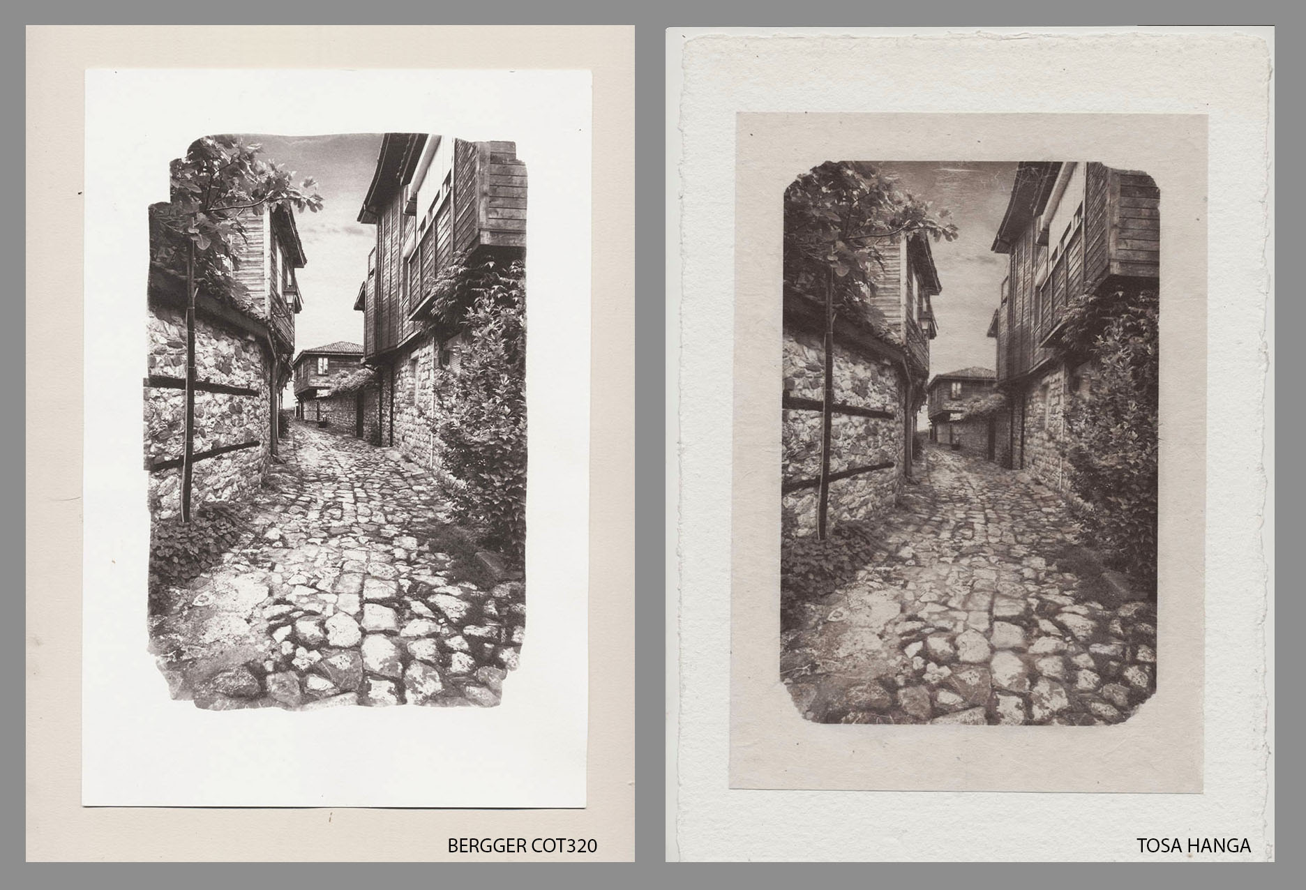
dan_ wrote:
An old street in Nessebar, Bulgaria.
Traditional Balkanic architecture.

Van Dyke Brown print on Japanese Tosa Hanga 70% kozo paper (96g/m2) and Bergger COT320 French 100% coton paper (specially designed and manufactured for Alternative Photography)
The same negative, sensitizer and exposure time for both papers. Both papers are neutral and archival.
BERGGER COT 320
The contrast of the VDB print on Bergger COT320 paper is little higher than I'd like and the colors of the print are a bit different of what I am used with a VDB print.
TOSA HANGA
Quite difficult to work on this traditional Japanese paper. It is hand-made of 70% Kozo and it has a harsh look. It is a very absorbant paper and difficult to sensitize. While being very strong it has a very sensible and easy to scratch surface with visible fine fibers. Should be handled with great care while wet. Probably it should be first sized with a thin layer of gelatine to reduce the absorbance and improve the strength of the surface. I'll try this.
Here it is mounted on a 100% coton Khadi hand-made Indian paper.
This is the first time I've tried the dry-mounting system for the traditional Sumi-e paintings with a Van Dyke Brown print. It works very well for me.
I like the colors of the print on this paper more than on the other paper.
Which of the two images is more on your taste?
Last edited by dan_ on Sun Sep 10, 2017 11:05 am; edited 1 time in total |
|
| Back to top |
|
|
uddhava

Joined: 22 Aug 2012
Posts: 3071
Location: Hungary
Expire: 2021-06-21
|
| Posted: Sun Sep 10, 2017 7:45 am Post subject: |
|
|
uddhava wrote:
Very nice work and explanation.
Thank you for the time and effort.
It is interesting for me to see the prints made on the same
papers I paint on. |
|
| Back to top |
|
|
|
|
|
You cannot post new topics in this forum
You cannot reply to topics in this forum
You cannot edit your posts in this forum
You cannot delete your posts in this forum
You cannot vote in polls in this forum
|