| View previous topic :: View next topic |
| Author |
Message |
ForenSeil


Joined: 15 Apr 2011
Posts: 2726
Location: Kiel, Germany.
|
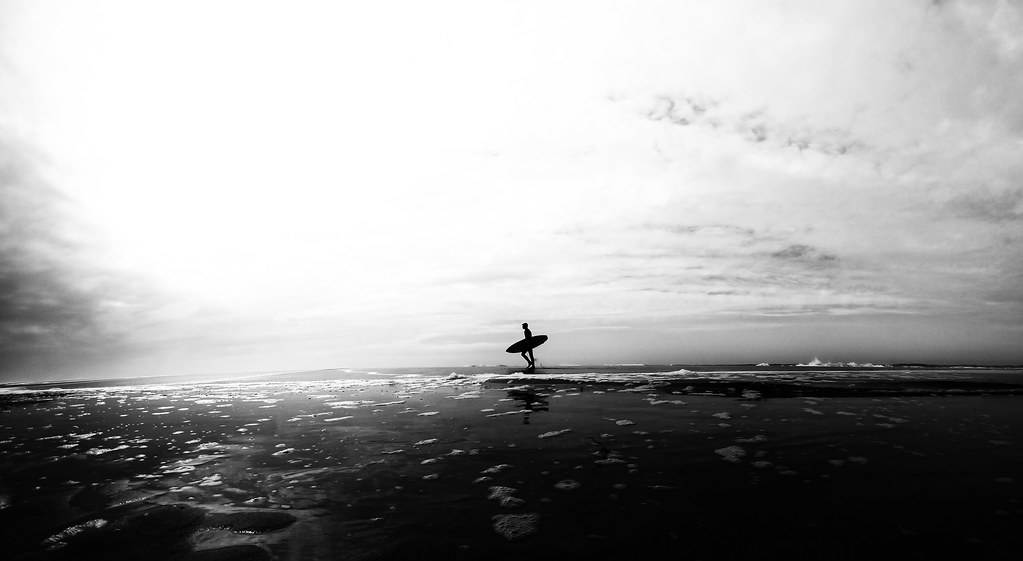
 Posted: Thu Sep 13, 2012 12:09 am Post subject: Surfer silhuette Posted: Thu Sep 13, 2012 12:09 am Post subject: Surfer silhuette |
 |
|
ForenSeil wrote:
_________________
I'm not a collector, I'm a tester 
My camera: Sony A7+Zeiss Sonnar 55/1.8
Current favourite lenses (I have many more):
A few macro-Tominons, Samyang 12/2.8, Noritsu 50.7/9.5, Rodagon 105/5.6 on bellows, Samyang 135/2, Nikon ED 180/2.8, Leitz Elmar-R 250/4, Celestron C8 2000mm F10
Most wanted: Samyang 24/1.4, Samyang 35/1.4, Nikon 200/2 ED
My Blog: http://picturechemistry.own-blog.com/
(German language) |
|
| Back to top |
|
 |
skida


Joined: 02 Mar 2012
Posts: 1826
Location: North East England
|
| Posted: Thu Sep 13, 2012 12:55 am Post subject: |
|
|
skida wrote:
I like the idea and the framing, but that great big burnt-out white area is blinding on my too-bright monitor. |
|
| Back to top |
|
|
ForenSeil
Joined: 15 Apr 2011
Posts: 2726
Location: Kiel, Germany.
|
| Posted: Thu Sep 13, 2012 1:27 am Post subject: |
|
|
ForenSeil wrote:
Thank you
I had some problems to keep details in the hightlights due this bug http://forum.mflenses.com/lightroom-export-often-looses-quality-t51995.html in Lightroom.
Now after upgrading to Lightroom 4 the issues is gone; maybe I should spend some time and search for the original file and export it again.
_________________
I'm not a collector, I'm a tester
My camera: Sony A7+Zeiss Sonnar 55/1.8
Current favourite lenses (I have many more):
A few macro-Tominons, Samyang 12/2.8, Noritsu 50.7/9.5, Rodagon 105/5.6 on bellows, Samyang 135/2, Nikon ED 180/2.8, Leitz Elmar-R 250/4, Celestron C8 2000mm F10
Most wanted: Samyang 24/1.4, Samyang 35/1.4, Nikon 200/2 ED
My Blog: http://picturechemistry.own-blog.com/
(German language) |
|
| Back to top |
|
|
patrickh

Joined: 23 Aug 2007
Posts: 8551
Location: Oregon
Expire: 2011-11-18
|
| Posted: Thu Sep 13, 2012 5:02 am Post subject: |
|
|
patrickh wrote:
I might have preferred the figure to be off-centre?
patrickh
_________________
DSLR: Nikon D300 Nikon D200 Nex 5N
MF Zooms: Kiron 28-85/3.5, 28-105/3.2, 75-150/3.5, Nikkor 50-135/3.5 AIS // MF Primes: Nikkor 20/4 AI, 24/2 AI, 28/2 AI, 28/2.8 AIS, 28/3.5 AI, 35/1.4 AIS, 35/2 AIS, 35/2.8 PC, 45/2.8 P, 50/1.4 AIS, 50/1.8 AIS, 50/2 AI, 55/2.8 AIS micro, 55/3.5 AI micro, 85/2 AI, 100/2,8 E, 105/1,8 AIS, 105/2,5 AIS, 135/2 AIS, 135/2.8 AIS, 200/4 AI, 200/4 AIS micro, 300/4.5 AI, 300/4.5 AI ED, Arsat 50/1.4, Kiron 28/2, Vivitar 28/2.5, Panagor 135/2.8, Tamron 28/2.5, Tamron 90/2.5 macro, Vivitar 90/2.5 macro (Tokina) Voigtlander 90/3.5 Vivitar 105/2.5 macro (Kiron) Kaleinar 100/2.8 AI Tamron 135/2.5, Vivitar 135/2.8CF, 200/3.5, Tokina 400/5,6
M42: Vivitar 28/2.5, Tamron 28/2.5, Formula5 28/2.8, Mamiya 28/2.8, Pentacon 29/2.8, Flektogon 35/2.4, Flektogon 35/2.8, Takumar 35/3.5, Curtagon 35/4, Takumar 50/1.4, Volna-6 50/2.8 macro, Mamiya 50/1.4, CZJ Pancolar 50/1,8, Oreston 50/1.8, Takumar 50/2, Industar 50/3.5, Sears 55/1.4, Helios 58/2, Jupiter 85/2, Helios 85/1.5, Takumar 105/2.8, Steinheil macro 105/4.5, Tamron 135/2.5, Jupiter 135/4, CZ 135/4, Steinheil Culminar 135/4,5, Jupiter 135/3.5, Takumar 135/3.5, Tair 135/2.8, Pentacon 135/2.8, CZ 135/2.8, Taika 135/3.5, Takumar 150/4, Jupiter 200/4, Takumar 200/4
Exakta: Topcon 100/2.8(M42), 35/2.8, 58/1.8, 135/2.8, 135/2.8 (M42), Kyoei Acall 135/3.5
C/Y: Yashica 28/2.8, 50/1.7, 135/2.8, Zeiss Planar 50/1.4, Distagon 25/2.8
Hexanon: 28/3.5, 35/2.8, 40/1.8, 50/1.7, 52/1.8, 135/3.2, 135/3.5, 35-70/3.5, 200/3.5
P6 : Mir 38 65/3.5, Biometar 80/2.8, Kaleinar 150/2.8, Sonnar 180/2.8
Minolta SR: 28/2.8, 28/3.5, 35/2.8, 45/2, 50/2, 58/1.4, 50/1.7, 135/2.8, 200/3.5
RF: Industar 53/2.8, Jupiter 8 50/2
Enlarg: Rodagon 50/5,6, 80/5,6, 105/5.6, Vario 44-52/4, 150/5.6 180/5.6 El Nikkor 50/2,8,63/2.8,75/4, 80/5,6, 105/5.6, 135/5.6 Schneider 60/5.6, 80/5.6, 80/4S,100/5.6S,105/5.6,135/5.6, 135/5.6S, 150/5.6S, Leica 95/4 |
|
| Back to top |
|
|
Orio

Joined: 24 Feb 2007
Posts: 29545
Location: West Emilia
Expire: 2012-12-04
|
| Posted: Thu Sep 13, 2012 7:48 am Post subject: |
|
|
Orio wrote:
Wow... grand! I'd say almost epic.
_________________
Orio, Administrator
T*
NE CEDE MALIS AUDENTIOR ITO
Ferrania film is reborn! http://www.filmferrania.it/
Support the Ornano film chemicals company and help them survive!
http://forum.mflenses.com/ornano-chemical-products-t55525.html |
|
| Back to top |
|
|
ForenSeil
Joined: 15 Apr 2011
Posts: 2726
Location: Kiel, Germany.
|
| Posted: Thu Sep 13, 2012 5:27 pm Post subject: |
|
|
ForenSeil wrote:
Here's another version I made at the same time, surfer not centered and much more detail.
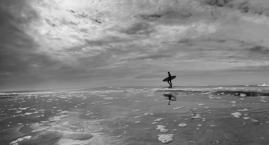
I personally still prefer the first one What do you think?
_________________
I'm not a collector, I'm a tester
My camera: Sony A7+Zeiss Sonnar 55/1.8
Current favourite lenses (I have many more):
A few macro-Tominons, Samyang 12/2.8, Noritsu 50.7/9.5, Rodagon 105/5.6 on bellows, Samyang 135/2, Nikon ED 180/2.8, Leitz Elmar-R 250/4, Celestron C8 2000mm F10
Most wanted: Samyang 24/1.4, Samyang 35/1.4, Nikon 200/2 ED
My Blog: http://picturechemistry.own-blog.com/
(German language) |
|
| Back to top |
|
|
mo

Joined: 27 Aug 2009
Posts: 8982
Location: Australia
Expire: 2016-07-30
|
| Posted: Thu Sep 13, 2012 9:56 pm Post subject: |
|
|
mo wrote:
I like the 2nd one it gives the impression of depth,loneliness...and I like the details in the sand and sky. 
_________________
Moira, Moderator 
Fuji XE-1,Pentax K-01,Panasonic G1,Panasonic G5,Pentax MX
Ricoh Singlex TLS,KR-5,KR-5Super,XR-10
Lenses
Auto Rikenon's 55/1.4, 1.8, 2.8... 50/1.7 Takumar 2/58 Preset Takumar 2.8/105 Auto Takumar 2.2/55, 3.5/35 Super Takumar 1.8/55...Macro Takumar F4/50... CZJ Biotar ALU M42 2/58 CZJ Tessar ALU M42 2.8/50
CZJ DDR Flektogon Zebra M42 2.8/35 CZJ Pancolar M42 2/50 CZJ Pancolar Exakta 2/50
Auto Mamiya/Sekor 1.8/55 ...Auto Mamiya/Sekor 2/50 Auto Mamiya/Sekor 2.8/50 Auto Mamiya/Sekor 200/3.5 Tamron SP500/8 Tamron SP350/5.6 Tamron SP90/2.5
Primoplan 1.9/58 Primagon 4.5/35 Telemegor 5.5/150 Angenieux 3.5/28 Angenieux 3,5/135 Y 2
Canon FL 58/1.2,Canon FL85/1.8,Canon FL 100/3.5,Canon SSC 2.8/100 ,Konica AR 100/2.8, Nikkor P 105/2.5
|
|
| Back to top |
|
|
Excalibur

Joined: 19 Jul 2009
Posts: 5019
Location: UK
Expire: 2014-04-21
|
| Posted: Thu Sep 13, 2012 10:07 pm Post subject: |
|
|
Excalibur wrote:
| mo wrote: |
| I like the 2nd one it gives the impression of depth,loneliness...and I like the details in the sand and sky. |
+1
_________________
Canon A1, AV1, T70 & T90, EOS 300 and EOS300v, Chinon CE and CP-7M. Contax 139, Fuji STX-2, Konica Autoreflex TC, FS-1, FT-1, Minolta X-700, X-300, XD-11, SRT101b, Nikon EM, FM, F4, F90X, Olympus OM2, Pentax S3, Spotmatic, Pentax ME super, Praktica TL 5B, & BC1, , Ricoh KR10super, Yashica T5D, Bronica Etrs, Mamiya RB67 pro AND drum roll:- a Sony Nex 3
.........past gear Tele Rolleiflex and Rollei SL66.
Many lenses from good to excellent. |
|
| Back to top |
|
|
patrickh
Joined: 23 Aug 2007
Posts: 8551
Location: Oregon
Expire: 2011-11-18
|
| Posted: Thu Sep 13, 2012 10:10 pm Post subject: |
|
|
patrickh wrote:
+2 - almost as I envisioned from the first one
patrickh
_________________
DSLR: Nikon D300 Nikon D200 Nex 5N
MF Zooms: Kiron 28-85/3.5, 28-105/3.2, 75-150/3.5, Nikkor 50-135/3.5 AIS // MF Primes: Nikkor 20/4 AI, 24/2 AI, 28/2 AI, 28/2.8 AIS, 28/3.5 AI, 35/1.4 AIS, 35/2 AIS, 35/2.8 PC, 45/2.8 P, 50/1.4 AIS, 50/1.8 AIS, 50/2 AI, 55/2.8 AIS micro, 55/3.5 AI micro, 85/2 AI, 100/2,8 E, 105/1,8 AIS, 105/2,5 AIS, 135/2 AIS, 135/2.8 AIS, 200/4 AI, 200/4 AIS micro, 300/4.5 AI, 300/4.5 AI ED, Arsat 50/1.4, Kiron 28/2, Vivitar 28/2.5, Panagor 135/2.8, Tamron 28/2.5, Tamron 90/2.5 macro, Vivitar 90/2.5 macro (Tokina) Voigtlander 90/3.5 Vivitar 105/2.5 macro (Kiron) Kaleinar 100/2.8 AI Tamron 135/2.5, Vivitar 135/2.8CF, 200/3.5, Tokina 400/5,6
M42: Vivitar 28/2.5, Tamron 28/2.5, Formula5 28/2.8, Mamiya 28/2.8, Pentacon 29/2.8, Flektogon 35/2.4, Flektogon 35/2.8, Takumar 35/3.5, Curtagon 35/4, Takumar 50/1.4, Volna-6 50/2.8 macro, Mamiya 50/1.4, CZJ Pancolar 50/1,8, Oreston 50/1.8, Takumar 50/2, Industar 50/3.5, Sears 55/1.4, Helios 58/2, Jupiter 85/2, Helios 85/1.5, Takumar 105/2.8, Steinheil macro 105/4.5, Tamron 135/2.5, Jupiter 135/4, CZ 135/4, Steinheil Culminar 135/4,5, Jupiter 135/3.5, Takumar 135/3.5, Tair 135/2.8, Pentacon 135/2.8, CZ 135/2.8, Taika 135/3.5, Takumar 150/4, Jupiter 200/4, Takumar 200/4
Exakta: Topcon 100/2.8(M42), 35/2.8, 58/1.8, 135/2.8, 135/2.8 (M42), Kyoei Acall 135/3.5
C/Y: Yashica 28/2.8, 50/1.7, 135/2.8, Zeiss Planar 50/1.4, Distagon 25/2.8
Hexanon: 28/3.5, 35/2.8, 40/1.8, 50/1.7, 52/1.8, 135/3.2, 135/3.5, 35-70/3.5, 200/3.5
P6 : Mir 38 65/3.5, Biometar 80/2.8, Kaleinar 150/2.8, Sonnar 180/2.8
Minolta SR: 28/2.8, 28/3.5, 35/2.8, 45/2, 50/2, 58/1.4, 50/1.7, 135/2.8, 200/3.5
RF: Industar 53/2.8, Jupiter 8 50/2
Enlarg: Rodagon 50/5,6, 80/5,6, 105/5.6, Vario 44-52/4, 150/5.6 180/5.6 El Nikkor 50/2,8,63/2.8,75/4, 80/5,6, 105/5.6, 135/5.6 Schneider 60/5.6, 80/5.6, 80/4S,100/5.6S,105/5.6,135/5.6, 135/5.6S, 150/5.6S, Leica 95/4 |
|
| Back to top |
|
|
Nisseliten


Joined: 26 May 2012
Posts: 332
Location: Sweden
|
| Posted: Thu Sep 13, 2012 10:40 pm Post subject: |
|
|
Nisseliten wrote:
I also prefer the first one, but both a epic.
I wish I managed to take pictures like this 
_________________
DSLR: Canon 550D, Panasonic DMC-GF3
SLR: Leica R3mot electronic, Leica R4s, Leica R4mot electronic. and more.
Medium Format: Many.
Lenses
Leica: 19/2.8, 35/2, 35/2.8x2, 50/2, 60/2.8 macro, 90/2, 90/2.8, 180/3.4, 250/4, 500/8 T-Noflexar 400/5.6
Other: When will it end?!
Canon: 50/1.8, 70-200 f4 IS
|
|
| Back to top |
|
|
David
Joined: 13 Apr 2011
Posts: 1869
Location: Denver, Colorado
Expire: 2013-01-25
|
| Posted: Fri Sep 14, 2012 2:47 am Post subject: |
|
|
David wrote:
I like the bottom half of the first and top of the second. I suggest opening them in the same file stacked as two layers. Put the first image on top. Selectively erase the sky until the two are merged. Flatten the layers, and have a bang-on third version.
_________________
http://www.youtube.com/user/hancockDavidM |
|
| Back to top |
|
|
miran

Joined: 01 Aug 2012
Posts: 1364
Location: Slovenia
|
| Posted: Fri Sep 14, 2012 6:10 am Post subject: |
|
|
miran wrote:
Second one is better imo. I think it'd be even better if you selectively made the bottom darker as in #1. |
|
| Back to top |
|
|
bhargav

Joined: 24 Nov 2011
Posts: 938
Location: Helsinki, Finland
Expire: 2014-11-24
|
| Posted: Mon Oct 01, 2012 5:57 pm Post subject: |
|
|
bhargav wrote:
Technically the second may be better but I like the first one for some reason. It has more atmosphere. But I agree some combination of both could be a killer image!
I too agree- would like to take a pic like this one day!
_________________
http://www.flickr.com/photos/58547200@N00/ |
|
| Back to top |
|
|
|
|


