| View previous topic :: View next topic |
| Author |
Message |
spkennedy3000


Joined: 12 Apr 2007
Posts: 334
Location: London
|
 Posted: Mon Apr 18, 2011 3:06 pm Post subject: Some images from my recent exhibition Posted: Mon Apr 18, 2011 3:06 pm Post subject: Some images from my recent exhibition |
 |
|
spkennedy3000 wrote:
Hi All,
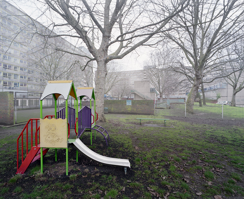
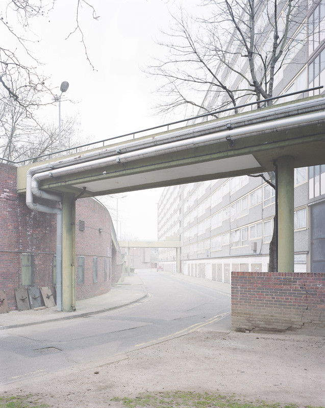
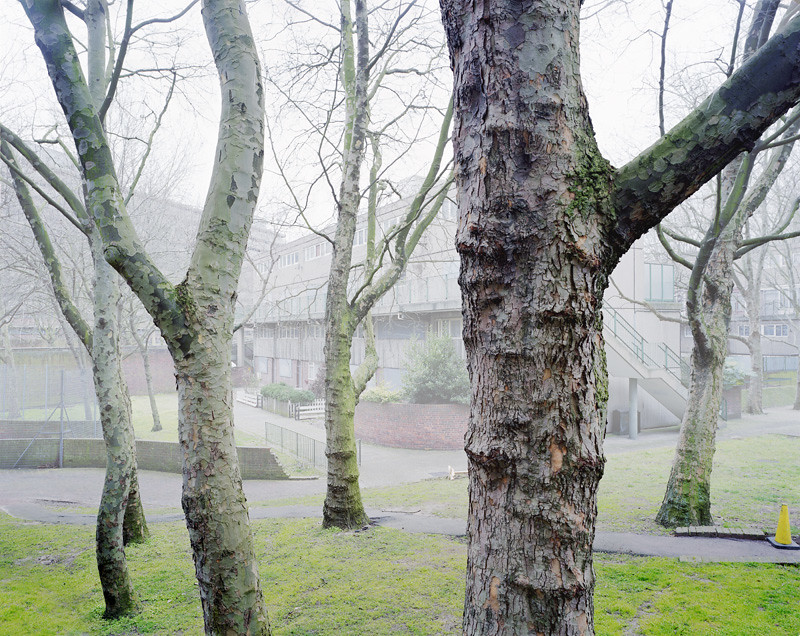
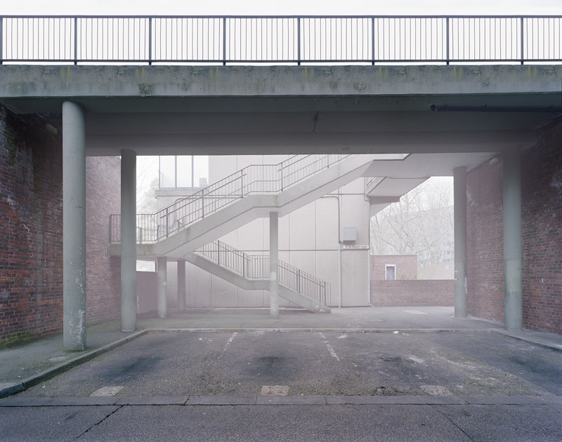
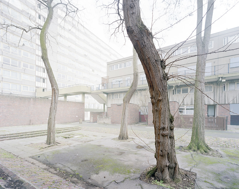
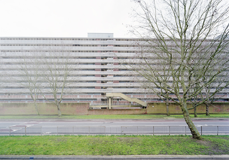
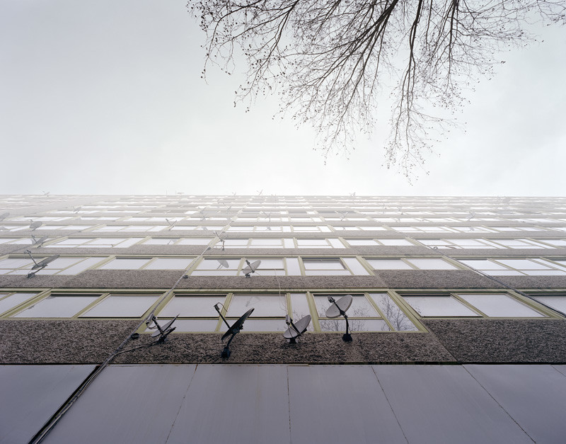
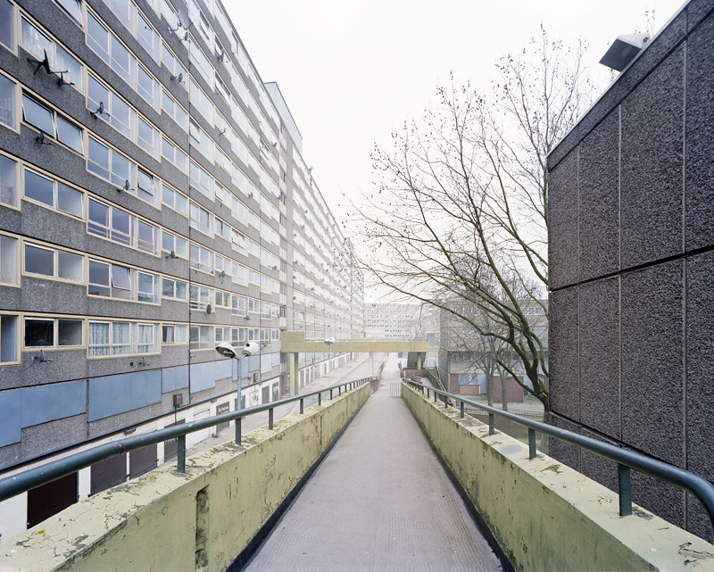
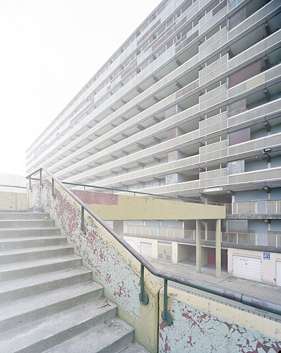
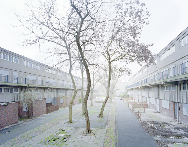
Here are some of the images from my exhibition in November, Heygate Abstracted. A bit later than I had intended but there you go.
The explanation:
This series of images were built up over more than a year of photographing and rephotographing specific views around the Heygate Estate, which nows stands empty and awaiting demolition. The spaces within the photographs were then analysed and augmented.
These were all shot on a Cambo Wide 4x5 system with a Schneider 58mm f5.6 XL, a Schneider 72mm f5.6 XL, or a Nikkor-SW 90mm f4.5. The film is Fuji pro 160s.
If you would like to see the rest of the images or read two reviews of the show, you can find them here:
http://www.simonkennedy.net/Heygate%20abstracted%20Part1.html
http://www.simonkennedy.net/Heygate%20abstracted%20Part2.html
http://www.simonkennedy.net/Heygate%20abstracted%20Part3.html
Would love to hear what you think.
Cheers,
Simon
_________________
G2 21 28 45 90
5d with flek 35mm f2.4 and zuiko 18mm f3.5, zuiko 24mm f2.8, zuiko 28mm f2.8, Canon EF 50mm f1.4, Nikon 105mm f2.5. |
|
| Back to top |
|
 |
Attila


Joined: 24 Feb 2007
Posts: 57849
Location: Hungary
Expire: 2025-11-18
|
| Posted: Mon Apr 18, 2011 4:57 pm Post subject: |
|
|
Attila wrote:
Nice to see you here again Simon! Sorry I don't like these images. You made exceptional images in past , these are just not close to them in my polite opinion.
_________________
-------------------------------
Items on sale on Ebay
Sony NEX-7 Carl Zeiss Planar 85mm f1.4, Minolta MD 35mm f1.8, Konica 135mm f2.5, Minolta MD 50mm f1.2, Minolta MD 250mm f5.6, Carl Zeiss Sonnar 180mm f2.8
|
|
| Back to top |
|
|
spkennedy3000
Joined: 12 Apr 2007
Posts: 334
Location: London
|
| Posted: Mon Apr 18, 2011 5:34 pm Post subject: |
|
|
spkennedy3000 wrote:
Hi Attila -
Thanks for your comment, I am going to try to post a bit more here.
Sorry these did not work for you!
Simon
_________________
G2 21 28 45 90
5d with flek 35mm f2.4 and zuiko 18mm f3.5, zuiko 24mm f2.8, zuiko 28mm f2.8, Canon EF 50mm f1.4, Nikon 105mm f2.5. |
|
| Back to top |
|
|
Katastrofo
Joined: 26 Feb 2007
Posts: 10405
Location: USA
Expire: 2013-11-19
|
| Posted: Mon Apr 18, 2011 5:54 pm Post subject: |
|
|
Katastrofo wrote:
Hi Simon, I like all from 2 on down. #6 the building doesn't look straight in
the frame, but maybe you did it that way for effect. Excellent work! The
lighting gives a certain bleakness to these. |
|
| Back to top |
|
|
Esox lucius


Joined: 26 Aug 2008
Posts: 2441
Location: Helsinki, Finland
Expire: 2011-11-18
|
| Posted: Mon Apr 18, 2011 6:06 pm Post subject: |
|
|
Esox lucius wrote:
Eerie and deserted, the light very well suits a doomed neighbourhood. |
|
| Back to top |
|
|
spkennedy3000
Joined: 12 Apr 2007
Posts: 334
Location: London
|
| Posted: Tue Apr 26, 2011 4:57 pm Post subject: |
|
|
spkennedy3000 wrote:
Thanks Esox and Bill - Bill you are right the facade is at a slight angle. While I did not really want it to be like that, also somehow I did not want to straighten it is PS either...
Cheers!
Simon
_________________
G2 21 28 45 90
5d with flek 35mm f2.4 and zuiko 18mm f3.5, zuiko 24mm f2.8, zuiko 28mm f2.8, Canon EF 50mm f1.4, Nikon 105mm f2.5. |
|
| Back to top |
|
|
Yebisu
Joined: 13 Feb 2011
Posts: 1299
|
| Posted: Wed Apr 27, 2011 1:12 pm Post subject: |
|
|
Yebisu wrote:
I like them all. Great atmosphere. Especially like 4 and 7. |
|
| Back to top |
|
|
|
|
|
You cannot post new topics in this forum
You cannot reply to topics in this forum
You cannot edit your posts in this forum
You cannot delete your posts in this forum
You cannot vote in polls in this forum
|


