| View previous topic :: View next topic |
| Author |
Message |
Attila


Joined: 24 Feb 2007
Posts: 57865
Location: Hungary
Expire: 2025-11-18
|
 Posted: Sun Apr 22, 2012 6:26 pm Post subject: Jupiter-9 RED P 8,5cm f2 KIEV/CONTAX mount 1957 Posted: Sun Apr 22, 2012 6:26 pm Post subject: Jupiter-9 RED P 8,5cm f2 KIEV/CONTAX mount 1957 |
 |
|
Attila wrote:
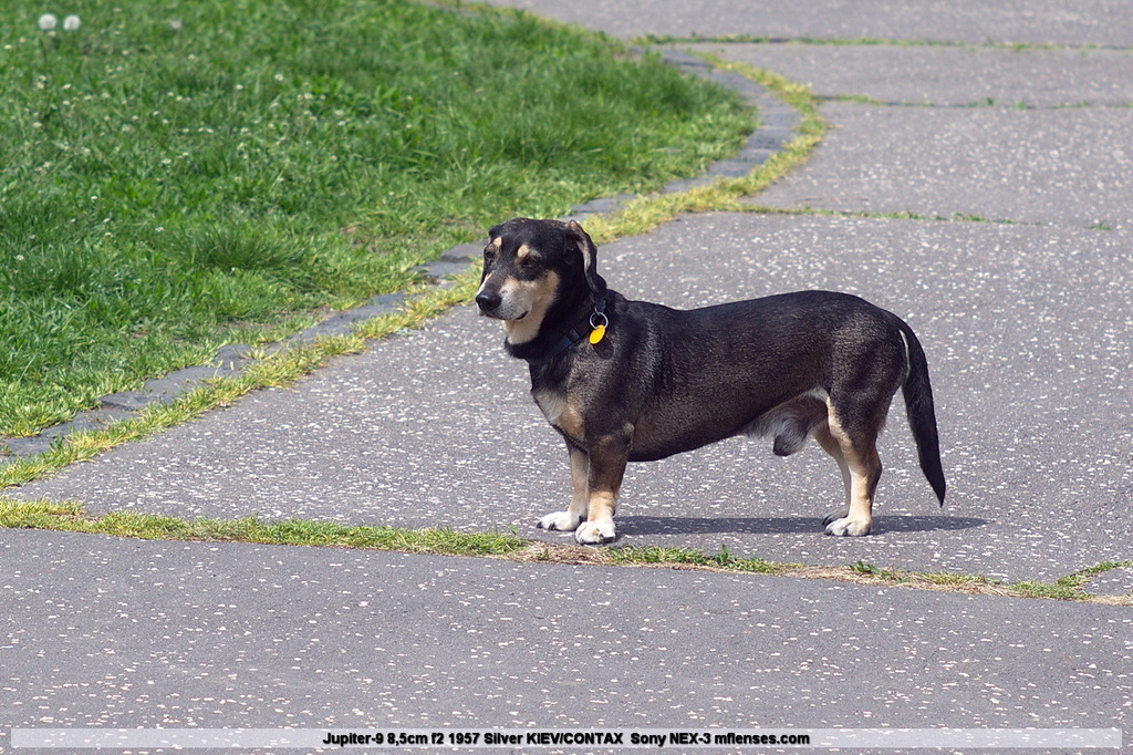
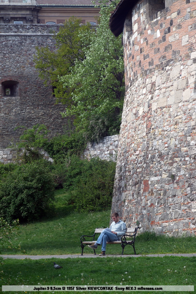
#12,#2 are wide open rest of it F8
#1,#4 are cropped
From any picture if you wish to see untouched raw file let me know, quite amazing due not a well respected lens.
#1
#2

#3
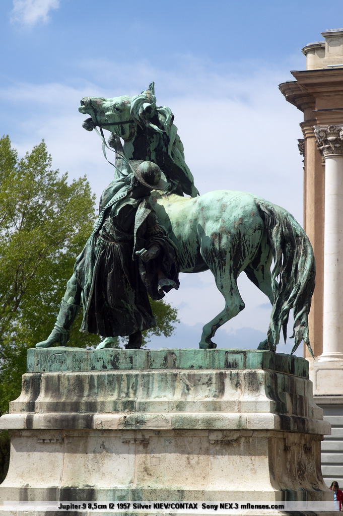
#4

#5
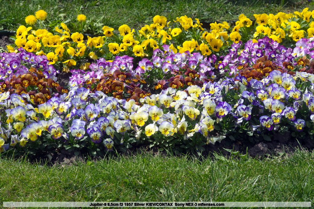
#6
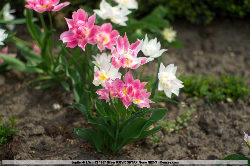
#7

#8

#9
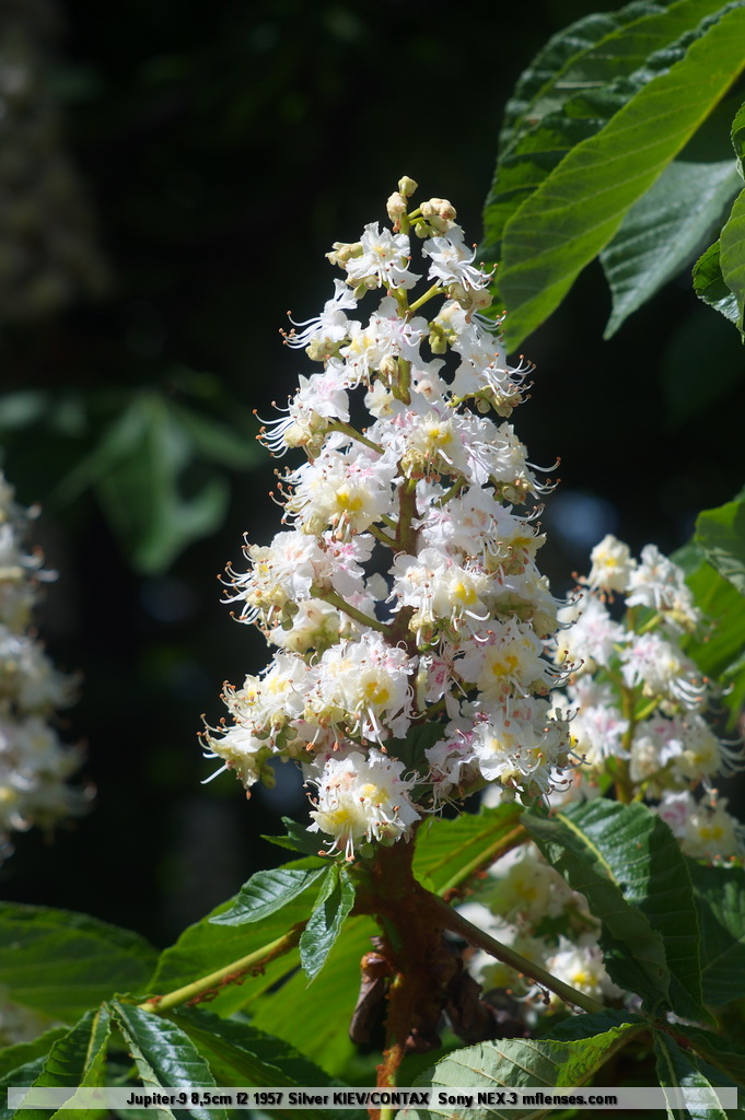
#10
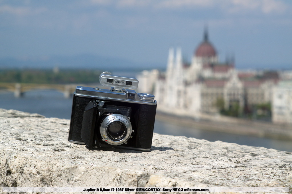
#11
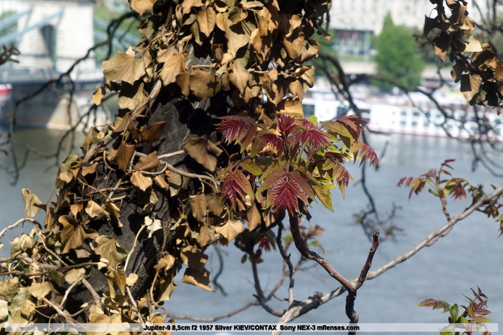
#12
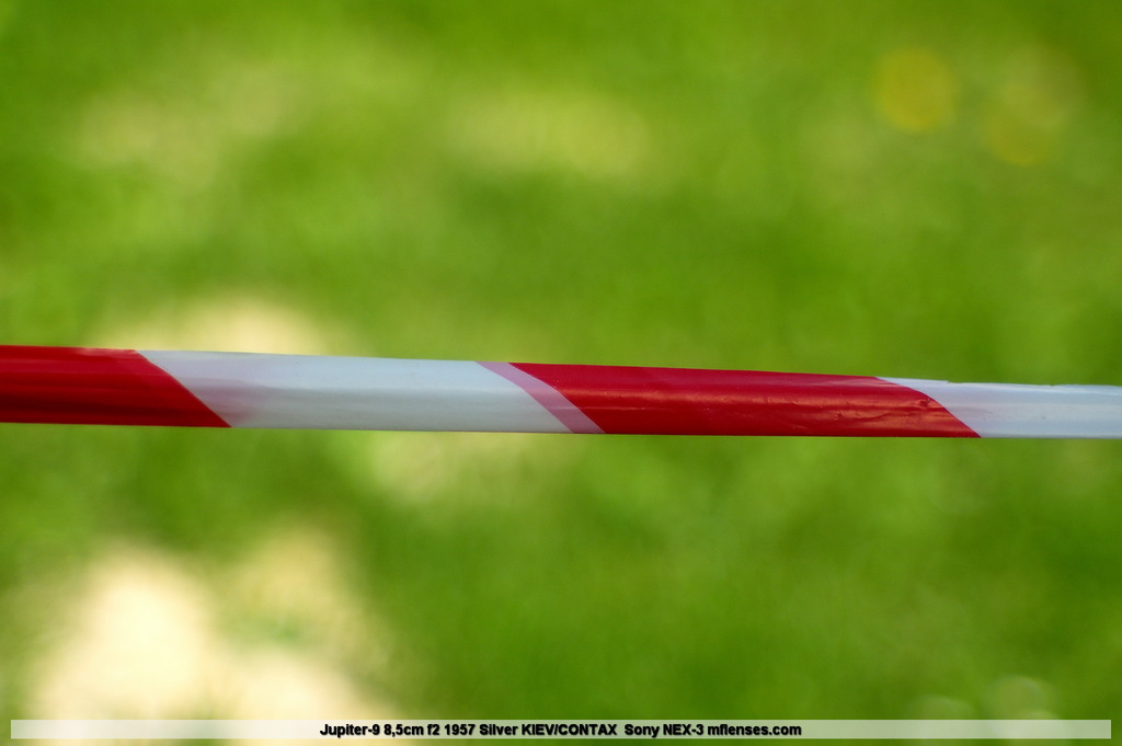
#13
_________________
-------------------------------
Items on sale on Ebay
Sony NEX-7 Carl Zeiss Planar 85mm f1.4, Minolta MD 35mm f1.8, Konica 135mm f2.5, Minolta MD 50mm f1.2, Minolta MD 250mm f5.6, Carl Zeiss Sonnar 180mm f2.8
|
|
| Back to top |
|
 |
iangreenhalgh1


Joined: 18 Mar 2011
Posts: 15679
Expire: 2014-01-07
|
 Posted: Sun Apr 22, 2012 6:35 pm Post subject: Posted: Sun Apr 22, 2012 6:35 pm Post subject: |
 |
|
iangreenhalgh1 wrote:
These are stunning in every aspect, colours, contrast, sharpness, even a good deal of 3D pop. Great series, great lens, congrats.
Now I must find one of these for my Kiev! 
_________________
I don't care who designed it, who made it or what country it comes from - I just enjoy using it! |
|
| Back to top |
|
 |
ManualFocus-G


Joined: 29 Dec 2008
Posts: 6622
Location: United Kingdom
Expire: 2014-11-24
|
 Posted: Sun Apr 22, 2012 7:38 pm Post subject: Posted: Sun Apr 22, 2012 7:38 pm Post subject: |
 |
|
ManualFocus-G wrote:
Woah, what a performer! From the first shot onwards there is great pop and colours 
_________________
Graham - Moderator 
Shooter of choice: Fujifilm X-T20 with M42, PB and C/Y lenses
See my Flickr photos at http://www.flickr.com/photos/manualfocus-g |
|
| Back to top |
|
 |
patrickh


Joined: 23 Aug 2007
Posts: 8551
Location: Oregon
Expire: 2011-11-18
|
 Posted: Sun Apr 22, 2012 8:30 pm Post subject: Posted: Sun Apr 22, 2012 8:30 pm Post subject: |
 |
|
patrickh wrote:
+1 - and great demonstration of yet another relatively unknown lens
patrickh
_________________
DSLR: Nikon D300 Nikon D200 Nex 5N
MF Zooms: Kiron 28-85/3.5, 28-105/3.2, 75-150/3.5, Nikkor 50-135/3.5 AIS // MF Primes: Nikkor 20/4 AI, 24/2 AI, 28/2 AI, 28/2.8 AIS, 28/3.5 AI, 35/1.4 AIS, 35/2 AIS, 35/2.8 PC, 45/2.8 P, 50/1.4 AIS, 50/1.8 AIS, 50/2 AI, 55/2.8 AIS micro, 55/3.5 AI micro, 85/2 AI, 100/2,8 E, 105/1,8 AIS, 105/2,5 AIS, 135/2 AIS, 135/2.8 AIS, 200/4 AI, 200/4 AIS micro, 300/4.5 AI, 300/4.5 AI ED, Arsat 50/1.4, Kiron 28/2, Vivitar 28/2.5, Panagor 135/2.8, Tamron 28/2.5, Tamron 90/2.5 macro, Vivitar 90/2.5 macro (Tokina) Voigtlander 90/3.5 Vivitar 105/2.5 macro (Kiron) Kaleinar 100/2.8 AI Tamron 135/2.5, Vivitar 135/2.8CF, 200/3.5, Tokina 400/5,6
M42: Vivitar 28/2.5, Tamron 28/2.5, Formula5 28/2.8, Mamiya 28/2.8, Pentacon 29/2.8, Flektogon 35/2.4, Flektogon 35/2.8, Takumar 35/3.5, Curtagon 35/4, Takumar 50/1.4, Volna-6 50/2.8 macro, Mamiya 50/1.4, CZJ Pancolar 50/1,8, Oreston 50/1.8, Takumar 50/2, Industar 50/3.5, Sears 55/1.4, Helios 58/2, Jupiter 85/2, Helios 85/1.5, Takumar 105/2.8, Steinheil macro 105/4.5, Tamron 135/2.5, Jupiter 135/4, CZ 135/4, Steinheil Culminar 135/4,5, Jupiter 135/3.5, Takumar 135/3.5, Tair 135/2.8, Pentacon 135/2.8, CZ 135/2.8, Taika 135/3.5, Takumar 150/4, Jupiter 200/4, Takumar 200/4
Exakta: Topcon 100/2.8(M42), 35/2.8, 58/1.8, 135/2.8, 135/2.8 (M42), Kyoei Acall 135/3.5
C/Y: Yashica 28/2.8, 50/1.7, 135/2.8, Zeiss Planar 50/1.4, Distagon 25/2.8
Hexanon: 28/3.5, 35/2.8, 40/1.8, 50/1.7, 52/1.8, 135/3.2, 135/3.5, 35-70/3.5, 200/3.5
P6 : Mir 38 65/3.5, Biometar 80/2.8, Kaleinar 150/2.8, Sonnar 180/2.8
Minolta SR: 28/2.8, 28/3.5, 35/2.8, 45/2, 50/2, 58/1.4, 50/1.7, 135/2.8, 200/3.5
RF: Industar 53/2.8, Jupiter 8 50/2
Enlarg: Rodagon 50/5,6, 80/5,6, 105/5.6, Vario 44-52/4, 150/5.6 180/5.6 El Nikkor 50/2,8,63/2.8,75/4, 80/5,6, 105/5.6, 135/5.6 Schneider 60/5.6, 80/5.6, 80/4S,100/5.6S,105/5.6,135/5.6, 135/5.6S, 150/5.6S, Leica 95/4 |
|
| Back to top |
|
 |
Attila


Joined: 24 Feb 2007
Posts: 57865
Location: Hungary
Expire: 2025-11-18
|
 Posted: Sun May 06, 2012 3:32 pm Post subject: Posted: Sun May 06, 2012 3:32 pm Post subject: |
 |
|
Attila wrote:
Let's start I did move one of may latest thread to here
_________________
-------------------------------
Items on sale on Ebay
Sony NEX-7 Carl Zeiss Planar 85mm f1.4, Minolta MD 35mm f1.8, Konica 135mm f2.5, Minolta MD 50mm f1.2, Minolta MD 250mm f5.6, Carl Zeiss Sonnar 180mm f2.8
|
|
| Back to top |
|
 |
iangreenhalgh1


Joined: 18 Mar 2011
Posts: 15679
Expire: 2014-01-07
|
 Posted: Sun May 06, 2012 3:48 pm Post subject: Posted: Sun May 06, 2012 3:48 pm Post subject: |
 |
|
iangreenhalgh1 wrote:
This is a good series, the only one I don't like is #11 because it's boring, the others are all good. #12 doesn't have a great deal of artistic merit but I understand why you took that shot - to show bokeh and wide open sharpness so I can't criticise it. #6 I would prefer the flowers to be placed to one side or other of the frame to obey the golden thirds rule rather than place in the centre of the frame, but apart from those nitpicks, I don't see anything to criticise in terms of compostion and use of dof which are what I tend to notice most.
I also like the varying subject matter. Buda Castle is a photogenic building but I prefer the way you have found subjects that include human aspects (4, 7, 13) to shots purely of the building itself.
P.S. thanks for creating this section.
_________________
I don't care who designed it, who made it or what country it comes from - I just enjoy using it! |
|
| Back to top |
|
 |
David

Joined: 13 Apr 2011
Posts: 1869
Location: Denver, Colorado
Expire: 2013-01-25
|
 Posted: Sun May 06, 2012 5:45 pm Post subject: Posted: Sun May 06, 2012 5:45 pm Post subject: |
 |
|
David wrote:
Gorgeous Perkeo. That's my favorite folder.
_________________
http://www.youtube.com/user/hancockDavidM |
|
| Back to top |
|
 |
erkie


Joined: 08 Oct 2011
Posts: 308
Location: Missouri
|
 Posted: Sun May 06, 2012 6:16 pm Post subject: Posted: Sun May 06, 2012 6:16 pm Post subject: |
 |
|
erkie wrote:
Whew ! quite a few shots at once  But here goes But here goes 
#1 perfect focus and exposure His face is perhaps a bit too centered in the shot for me ( I do this with some cameras too often) I like the curved roadway ! Nice tonality for A MIDDAY shot.
#2 A shot that displays the qualities of the lens! Much too centered for a landscape oriented shot for me. But thats me 
#3 WOW ! Stunning and EYE Popping ! Can you tell that I like this one ? 
#4 A nice environmetal portrait ! Plenty of space and lines lead back to the subject nicely for me
#5 Again a stunner ! My only nitpic would be to place the flowers farther up to the top to miss the grass or most of it in the top of the frame. the bottom flowers would have fell nicely in the 1/3 line and the grass on top doesn't add to the shot. But thats me 
#6 I'm really not a slave to the rules  Again I like this one but wonder what it would have been like with the central subject placed on the right 1/3 letting the background flowers trail off in the curve to the left ? but the focus and choice of DOF is just breathtaking ! Again I like this one but wonder what it would have been like with the central subject placed on the right 1/3 letting the background flowers trail off in the curve to the left ? but the focus and choice of DOF is just breathtaking !
#7 Another great environmental portrait ! You probably think I'm going to complain about the subject being centered? But I'm not ! It just works for me in this one. I don't know why ? Maybe the gate leaning back towards him from the direction he is looking ? A nice story being told in this one.
#8 I like the subject in this one. the deer looking one way and the lady looking the other makes the centered subject work for me in this one. very high contrast scene handled very well in my opinion.
#9 Nice flower photo. Due to the nature of my career I like Flower phootos  crisp and nice choice of DOF! crisp and nice choice of DOF!
#10 this one not only showcases the lens but has nice ballance and lines ! I like that the camera is tilted inwards !
#11 Pleasing tones and shades.
#12 Not for me  But I think it was meant to showcase the lens. Which it does admirably. But I think it was meant to showcase the lens. Which it does admirably.
#13 I like this a lot! glows on top ballanced with subdued lighting on the bottom. nicely placed subject lends to the feeling of height of buildings !
Of course these are my views and opinions 
Very nice indeed !!!
_________________
I shoot film and meter with digital 
Asahi H3v, Praktica FX3, Retina IIa, Spotmatic sp1000, Fujica V2, Yashica lynx5000, Pentax Sf1, Minolta SRT102, Minolta7000i, Pentax MX, Pentax ME, Pentax Kx
lensesM42- Isco Gottingen Westanar 50/2.8, Isco Gottingen Westron 35/2.8, Rikenon 35/2.8, Spiratone Tc 105/2.5, Spiratone Tc 200/4.5, Sankyo Kohki Komura 300/5, Sankyo Kohki Komura 135/3.5, Auto Tak 35/3.5, Super Tak 150/4, S-M-C Tak 50/1.4, S-M-C Tak 28/3.5, SMC Tak 55/2, Mamya Sekor 55/1.8
K- mount- Helios 44-K-4, Jc penny 28/2.8, Da 18-55, Da 55-300, Pentax F 35-70, SMCP M 50/1.4, SMCP M 50/1.7
|
|
| Back to top |
|
 |
Attila


Joined: 24 Feb 2007
Posts: 57865
Location: Hungary
Expire: 2025-11-18
|
 Posted: Sun May 06, 2012 6:19 pm Post subject: Posted: Sun May 06, 2012 6:19 pm Post subject: |
 |
|
Attila wrote:
Thank you guys! #12 was demo about lens performance , right.
_________________
-------------------------------
Items on sale on Ebay
Sony NEX-7 Carl Zeiss Planar 85mm f1.4, Minolta MD 35mm f1.8, Konica 135mm f2.5, Minolta MD 50mm f1.2, Minolta MD 250mm f5.6, Carl Zeiss Sonnar 180mm f2.8
|
|
| Back to top |
|
 |
Attila


Joined: 24 Feb 2007
Posts: 57865
Location: Hungary
Expire: 2025-11-18
|
 Posted: Sun May 06, 2012 6:20 pm Post subject: Posted: Sun May 06, 2012 6:20 pm Post subject: |
 |
|
Attila wrote:
| David wrote: |
| Gorgeous Perkeo. That's my favorite folder. |
I like them too, pretty fresh purchase. I have two one with Vaskar, one with Color Skopar I think both excellent and small!
_________________
-------------------------------
Items on sale on Ebay
Sony NEX-7 Carl Zeiss Planar 85mm f1.4, Minolta MD 35mm f1.8, Konica 135mm f2.5, Minolta MD 50mm f1.2, Minolta MD 250mm f5.6, Carl Zeiss Sonnar 180mm f2.8
|
|
| Back to top |
|
 |
|
|
|
You cannot post new topics in this forum
You cannot reply to topics in this forum
You cannot edit your posts in this forum
You cannot delete your posts in this forum
You cannot vote in polls in this forum
|
